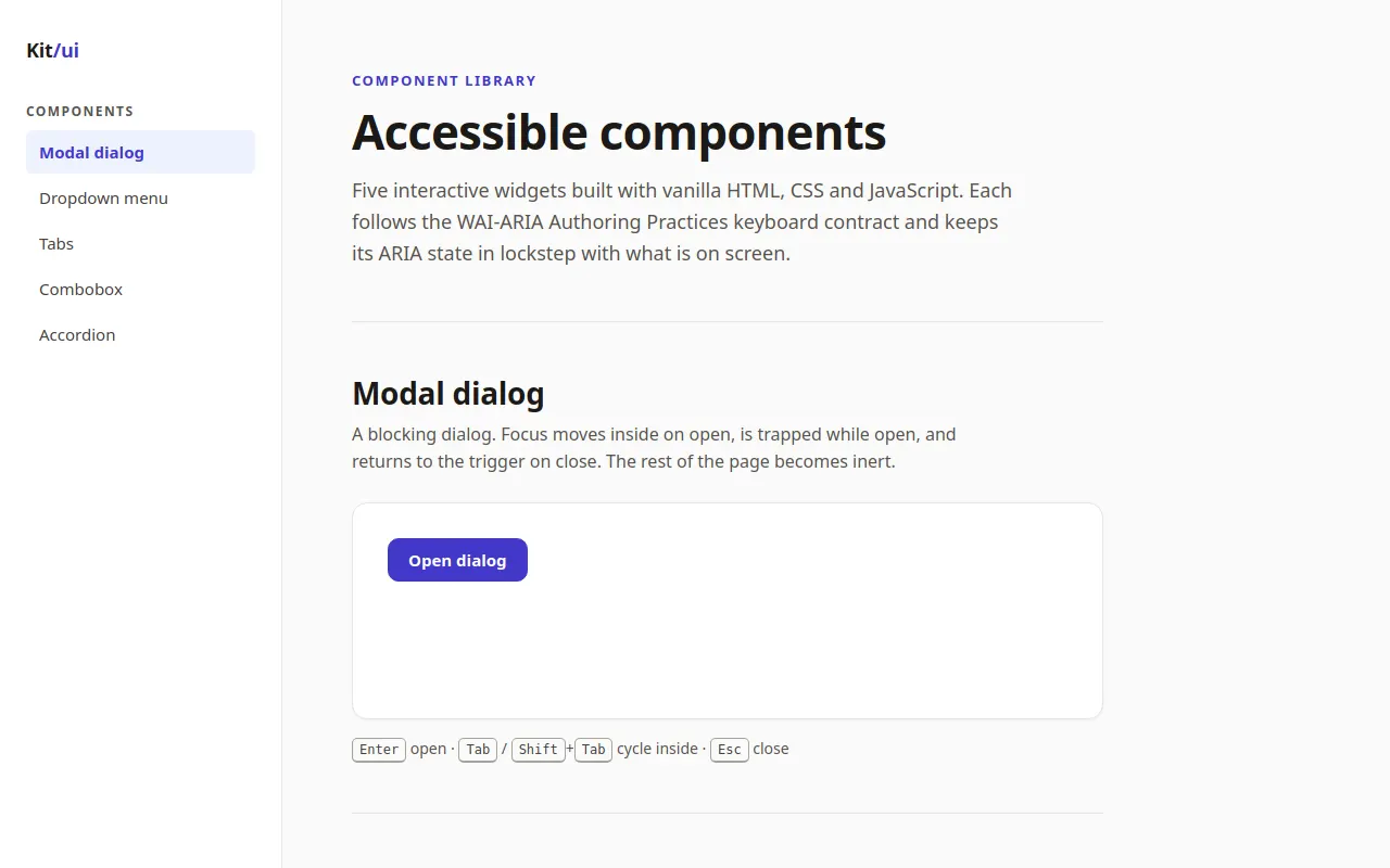
Accessible Components
Claude haiku 5.5 · full
Reviews & generation details
Reviews
No human review yet. Unreviewed does not mean unsuccessful.
Generation context
Task text captured before this run. Effective runtime system instructions were not captured.
Generation prompt · 8a03fc9fb0
# Task: Build an Accessible Component Showcase

Build a polished component library showcase (vanilla JS, no external assets, no CDN, no libraries) where every widget is **genuinely keyboard- and screen-reader-accessible**. The top priority is **correct interaction semantics** — this page must be fully usable without a mouse, following WAI-ARIA Authoring Practices.

## Core Specification

Build one elegant page demoing these five components, each in its own section with a working, interactive example:

**1. Modal Dialog**
- Opens from a button; `role="dialog"`, `aria-modal="true"`, accessible name via `aria-labelledby`
- **Focus trap:** Tab and Shift+Tab cycle only within the dialog while open
- Focus moves into the dialog on open and **returns to the trigger button** on close
- Escape closes; clicking the backdrop closes
- Page behind the dialog is inert (not focusable) while open

**2. Dropdown Menu**
- Button with `aria-haspopup="menu"`, `aria-expanded` reflecting state
- Opens on click, Enter, Space, and Down Arrow (Down Arrow focuses the first item)
- Menu items `role="menuitem"`; **arrow-key navigation** Up/Down (wrapping), Home/End jump to first/last
- Escape closes and returns focus to the button; Tab closes and moves focus naturally onward
- Selecting an item (click or Enter/Space) performs a visible action and closes the menu

**3. Tabs**
- `role="tablist"` / `tab` / `tabpanel` with correct `aria-selected`, `aria-controls`, and `aria-labelledby` wiring
- Exactly **one tab in the tab order** (`tabindex="0"` on the active tab, `-1` on the rest); arrow keys move between tabs (horizontal list: Left/Right)
- Panels: hidden panels use `hidden` (not just CSS off-screen); panel content is reachable by Tab
- At least 3 tabs with meaningfully different content

**4. Combobox (autocomplete)**
- Text input with `role="combobox"`, `aria-expanded`, `aria-controls` pointing at a `listbox`, `aria-activedescendant` tracking the highlighted option
- Typing filters a list of ~20 options; Down/Up moves the highlight, Enter selects, Escape closes the list (and reverts), focus out closes
- Selecting an option fills the input and announces selection state correctly
- Highlighted option visible via scroll-into-view; the listbox must never be keyboard-focusable itself (aria-activedescendant pattern, not roving tabindex)

**5. Accordion / Disclosure Group**
- Buttons (`aria-expanded`, `aria-controls`) toggling associated regions; multiple may be open at once
- Fully operable with Enter/Space; regions animate open/closed without breaking visibility for assistive tech (animate height, toggle `hidden` at the end, not during)

**Global Requirements**
- A skip link ("Skip to main content") as the first focusable element
- Visible, high-contrast focus indicators on **every** interactive element (never `outline: none` without a replacement)
- Logical heading structure (`h1` → `h2` per component section)
- All ARIA attributes kept in sync with visual state at all times — if it looks open, `aria-expanded` says `true`
- Respects `prefers-reduced-motion` for all animations

## Visual Style
- Refined design-system documentation aesthetic: generous whitespace, a sticky left sidebar nav linking to each component section, subtle borders, a restrained two-color accent palette
- Each component section shows the live widget plus a short caption describing its keyboard contract (e.g. "↑↓ navigate · Enter select · Esc close")
- Light theme, excellent typography — this page should look like a component library you'd actually ship

## Technical Requirements
- Vanilla JS; organize the code with clear section comments
- Shared, reusable helpers where natural (focus-trap utility, roving `aria-activedescendant` manager) rather than five copies of the same logic
- Tunable constants block at the top (colors, spacing scale, animation durations)
- No framework, no CSS library — hand-written CSS

## Quality Bar (must hit all)
- The entire page is operable end-to-end with keyboard alone, in a sane focus order
- Focus never escapes the open modal; focus returns to the trigger on close (for modal, menu, and combobox)
- Tab panels are never focusable while hidden; the hidden attribute and visual state never disagree
- Every ARIA relationship points at a real element (no dangling `aria-controls` / `aria-labelledby` IDs)
- Zooming to 200% breaks nothing

## Self-Check Before Finishing
Verify with the browser tools (probe keyboard behavior via dispatched key events and `document.activeElement` assertions):
- Open the modal, press Tab repeatedly → focus cycles within it; Escape → focus is back on the trigger
- Focus the menu button, press Down → menu opens with first item active; Escape → closed, focus on button
- Tab into the tablist → only the active tab receives focus; arrows switch tabs
- Type in the combobox → options filter; arrow + Enter selects; `aria-activedescendant` matches the highlighted option
- Confirm every `aria-controls` / `aria-labelledby` ID on the page resolves to an existing element
Inspect original source 38,787 bytes · SHA-256 f072a9a4c418
<!DOCTYPE html>
<html lang="en">
<head>
<meta charset="utf-8">
<meta name="viewport" content="width=device-width, initial-scale=1">
<title>Accessible Component Showcase</title>
<style>
/* ==========================================================================
   0. DESIGN TOKENS (tunable)
   ========================================================================== */
:root {
  /* colour: warm neutrals + one indigo accent */
  --c-bg: #fafaf9;
  --c-surface: #ffffff;
  --c-ink: #1c1917;
  --c-ink-2: #44403c;
  --c-muted: #57534e;
  --c-line: #e7e5e4;
  --c-line-strong: #a8a29e;
  --c-accent: #4338ca;
  --c-accent-hover: #3730a3;
  --c-accent-soft: #eef2ff;
  --c-focus: #1e1b4b;          /* high-contrast focus ring */

  /* spacing scale */
  --sp-1: 4px; --sp-2: 8px; --sp-3: 12px; --sp-4: 16px;
  --sp-6: 24px; --sp-8: 32px; --sp-12: 48px;

  /* radii + elevation */
  --r-sm: 6px; --r-md: 10px; --r-lg: 14px;
  --shadow-sm: 0 1px 2px rgb(28 25 23 / .05);
  --shadow-md: 0 8px 24px rgb(28 25 23 / .12);
  --shadow-lg: 0 24px 60px rgb(28 25 23 / .25);

  /* motion (JS mirrors the height duration in CONFIG.animationMs) */
  --dur-fast: 150ms;
  --dur-base: 240ms;
  --ease-out: cubic-bezier(.2, .7, .2, 1);

  --font-sans: system-ui, -apple-system, "Segoe UI", Roboto, "Helvetica Neue", Arial, sans-serif;
  --font-mono: ui-monospace, SFMono-Regular, Menlo, Consolas, monospace;
  --sidebar-w: 260px;
}

/* ==========================================================================
   1. BASE + GLOBAL FOCUS
   ========================================================================== */
*, *::before, *::after { box-sizing: border-box; }
html { scroll-behavior: smooth; -webkit-text-size-adjust: 100%; }
body {
  margin: 0;
  background: var(--c-bg);
  color: var(--c-ink);
  font: 16px/1.6 var(--font-sans);
}
[hidden] { display: none !important; }
.sr-only {
  position: absolute !important; width: 1px; height: 1px; padding: 0; margin: -1px;
  overflow: hidden; clip: rect(0 0 0 0); white-space: nowrap; border: 0;
}
:focus-visible { outline: 3px solid var(--c-focus); outline-offset: 2px; border-radius: 4px; }
main:focus, main:focus-visible { outline: none; }

.skip-link {
  position: fixed; left: var(--sp-3); top: -120px; z-index: 300;
  background: var(--c-ink); color: #fff; padding: 10px 16px;
  border-radius: var(--r-sm); font-weight: 600; text-decoration: none;
}
.skip-link:focus { top: var(--sp-3); outline: 3px solid var(--c-focus); outline-offset: 2px; }

/* ==========================================================================
   2. LAYOUT (sticky sidebar + content)
   ========================================================================== */
.layout { display: grid; grid-template-columns: var(--sidebar-w) minmax(0, 1fr); min-height: 100vh; }
.sidebar {
  position: sticky; top: 0; height: 100vh; overflow-y: auto;
  padding: var(--sp-8) var(--sp-6);
  background: var(--c-surface); border-right: 1px solid var(--c-line);
}
.brand { font-weight: 700; font-size: 18px; color: var(--c-ink); text-decoration: none; letter-spacing: -.01em; }
.brand span { color: var(--c-accent); }
.nav-label { margin: var(--sp-8) 0 var(--sp-2); font-size: 12px; text-transform: uppercase; letter-spacing: .12em; color: var(--c-muted); font-weight: 600; }
.nav-list { list-style: none; padding: 0; margin: 0; display: flex; flex-direction: column; gap: 2px; }
.nav-list a {
  display: block; padding: 8px 12px; border-radius: var(--r-sm);
  color: var(--c-ink-2); text-decoration: none; font-size: 15px;
}
.nav-list a:hover { background: var(--c-bg); color: var(--c-ink); }
.nav-list a[aria-current="true"] { background: var(--c-accent-soft); color: var(--c-accent); font-weight: 600; }

main {
  max-width: 820px; width: 100%;
  padding: 64px clamp(24px, 5vw, 72px) 140px;
}
.eyebrow { margin: 0 0 var(--sp-3); font-size: 13px; letter-spacing: .12em; text-transform: uppercase; color: var(--c-accent); font-weight: 600; }
h1 { font-size: 44px; line-height: 1.1; letter-spacing: -.02em; margin: 0 0 var(--sp-4); font-weight: 700; }
h2 { font-size: 28px; line-height: 1.25; letter-spacing: -.01em; margin: 0 0 var(--sp-2); font-weight: 650; }
h3 { font-size: 18px; line-height: 1.35; }
.lead { font-size: 18px; color: var(--c-muted); max-width: 60ch; margin: 0; }
.intro { padding-bottom: var(--sp-12); border-bottom: 1px solid var(--c-line); }
.section { padding: var(--sp-12) 0; border-bottom: 1px solid var(--c-line); }
.section:last-child { border-bottom: 0; }
.desc { color: var(--c-muted); margin: 0 0 var(--sp-6); max-width: 62ch; }
.demo {
  background: var(--c-surface); border: 1px solid var(--c-line);
  border-radius: var(--r-lg); padding: var(--sp-8); box-shadow: var(--shadow-sm);
  min-height: 200px;
}
.keys { margin: var(--sp-4) 0 0; font-size: 14px; color: var(--c-muted); }
kbd {
  font: 500 12px/1 var(--font-mono); background: var(--c-bg); color: var(--c-ink-2);
  border: 1px solid var(--c-line-strong); border-bottom-width: 2px;
  border-radius: 5px; padding: 3px 6px;
}

/* ==========================================================================
   3. SHARED CONTROLS
   ========================================================================== */
.btn {
  font: inherit; font-weight: 600; font-size: 15px; line-height: 1.2;
  display: inline-flex; align-items: center; gap: var(--sp-2);
  padding: 10px 18px; border-radius: var(--r-md);
  border: 1px solid var(--c-accent); background: var(--c-accent); color: #fff;
  cursor: pointer; transition: background var(--dur-fast) ease;
}
.btn:hover { background: var(--c-accent-hover); }
.btn.ghost { background: var(--c-surface); color: var(--c-ink); border-color: var(--c-line-strong); }
.btn.ghost:hover { background: var(--c-bg); }
.icon-btn {
  width: 36px; height: 36px; display: inline-grid; place-items: center;
  border: 1px solid transparent; border-radius: var(--r-sm); background: none;
  font-size: 24px; line-height: 1; color: var(--c-muted); cursor: pointer;
}
.icon-btn:hover { background: var(--c-bg); color: var(--c-ink); }

.field { display: flex; flex-direction: column; gap: 6px; margin-bottom: var(--sp-4); }
.field label { font-weight: 600; font-size: 14px; color: var(--c-ink-2); }
.field input {
  font: inherit; width: 100%; max-width: 360px; padding: 10px 12px;
  border: 1px solid var(--c-line-strong); border-radius: var(--r-md);
  background: #fff; color: var(--c-ink);
}

/* ==========================================================================
   4. DROPDOWN MENU
   ========================================================================== */
.menu-wrap { position: relative; display: inline-block; }
.caret { font-size: 12px; margin-left: 2px; }
.menu {
  position: absolute; z-index: 20; top: calc(100% + 6px); left: 0; min-width: 220px;
  margin: 0; padding: 6px; list-style: none;
  background: var(--c-surface); border: 1px solid var(--c-line);
  border-radius: var(--r-lg); box-shadow: var(--shadow-md);
  animation: pop var(--dur-base) var(--ease-out);
}
.menu [role="menuitem"] {
  padding: 9px 12px; border-radius: var(--r-sm); cursor: pointer; font-size: 15px; color: var(--c-ink);
}
.menu [role="menuitem"]:hover { background: var(--c-accent-soft); color: var(--c-accent); }
.menu [role="menuitem"]:focus { outline: 2px solid var(--c-focus); outline-offset: -2px; background: var(--c-accent-soft); color: var(--c-accent); }
.menu [role="separator"] { height: 1px; background: var(--c-line); margin: 6px 4px; }
.result { margin: var(--sp-4) 0 0; font-size: 14px; color: var(--c-muted); min-height: 1.6em; }

/* ==========================================================================
   5. TABS
   ========================================================================== */
.tablist { display: flex; gap: 4px; border-bottom: 1px solid var(--c-line); margin-bottom: var(--sp-6); }
[role="tab"] {
  font: inherit; font-weight: 600; font-size: 15px; color: var(--c-muted);
  background: none; border: 0; padding: 10px 14px; cursor: pointer;
  border-bottom: 2px solid transparent; margin-bottom: -1px; border-radius: var(--r-sm) var(--r-sm) 0 0;
}
[role="tab"]:hover { color: var(--c-ink); }
[role="tab"][aria-selected="true"] { color: var(--c-accent); border-bottom-color: var(--c-accent); }
.tabpanel h3 { margin: 0 0 var(--sp-2); }
.tabpanel p { margin: 0 0 var(--sp-4); color: var(--c-ink-2); }

/* ==========================================================================
   6. COMBOBOX
   ========================================================================== */
.combo { position: relative; max-width: 360px; }
.combo-wrap { position: relative; }
.combo-wrap input { max-width: none; }
.listbox {
  position: absolute; z-index: 20; left: 0; right: 0; top: calc(100% + 4px);
  margin: 0; padding: 6px; list-style: none; max-height: 240px; overflow-y: auto;
  background: var(--c-surface); border: 1px solid var(--c-line);
  border-radius: var(--r-md); box-shadow: var(--shadow-md);
}
.option {
  display: flex; justify-content: space-between; align-items: center;
  padding: 8px 12px; border-radius: var(--r-sm); cursor: pointer; color: var(--c-ink);
}
.option.is-active { background: var(--c-accent-soft); color: var(--c-accent); }
.option[aria-selected="true"]::after { content: "✓"; font-weight: 700; color: var(--c-accent); }
.help { font-size: 14px; color: var(--c-muted); margin: var(--sp-2) 0 0; }
.result-line { font-size: 14px; color: var(--c-ink-2); margin: var(--sp-3) 0 0; min-height: 1.6em; }

/* ==========================================================================
   7. ACCORDION
   ========================================================================== */
.acc { border-bottom: 1px solid var(--c-line); }
.acc:first-child { border-top: 1px solid var(--c-line); }
.acc-heading { margin: 0; font-size: inherit; line-height: inherit; }
.acc-btn {
  font: inherit; font-weight: 600; font-size: 16px; color: var(--c-ink);
  width: 100%; display: flex; justify-content: space-between; align-items: center; gap: var(--sp-4);
  padding: var(--sp-4) var(--sp-1); background: none; border: 0; text-align: left; cursor: pointer;
}
.acc-btn:hover { color: var(--c-accent); }
.acc-icon {
  flex: none; width: 9px; height: 9px;
  border-right: 2px solid currentColor; border-bottom: 2px solid currentColor;
  transform: rotate(45deg); transition: transform var(--dur-base) var(--ease-out);
}
.acc-btn[aria-expanded="true"] .acc-icon { transform: rotate(-135deg); }
.acc-body { padding: 0 var(--sp-1) var(--sp-4); color: var(--c-ink-2); }
.acc-body p { margin: 0; }
.acc-panel.is-animating { overflow: hidden; transition: height var(--dur-base) var(--ease-out); }

/* ==========================================================================
   8. MODAL DIALOG
   ========================================================================== */
.backdrop {
  position: fixed; inset: 0; z-index: 100; display: grid; place-items: center; padding: var(--sp-6);
  background: rgb(28 25 23 / .45); animation: fade var(--dur-base) ease-out;
}
.dialog {
  width: 100%; max-width: 460px; background: var(--c-surface);
  border-radius: 16px; padding: var(--sp-8); box-shadow: var(--shadow-lg);
  animation: rise var(--dur-base) var(--ease-out);
}
.dialog-head { display: flex; justify-content: space-between; align-items: center; margin-bottom: var(--sp-2); }
.dialog h3 { margin: 0; font-size: 20px; }
.dialog p { margin: 0 0 var(--sp-6); color: var(--c-ink-2); }
.dialog-actions { display: flex; justify-content: flex-end; gap: var(--sp-3); margin-top: var(--sp-6); }

@keyframes fade { from { opacity: 0; } }
@keyframes rise { from { opacity: 0; transform: translateY(8px) scale(.98); } }
@keyframes pop { from { opacity: 0; transform: translateY(-4px); } }

/* ==========================================================================
   9. RESPONSIVE (also covers 200% browser zoom at 1280px wide)
   ========================================================================== */
@media (max-width: 860px) {
  .layout { grid-template-columns: 1fr; }
  .sidebar { position: static; height: auto; border-right: 0; border-bottom: 1px solid var(--c-line); padding: var(--sp-4) var(--sp-6); }
  .nav-label { margin-top: var(--sp-4); }
  .nav-list { flex-direction: row; flex-wrap: wrap; }
  main { padding: var(--sp-8) var(--sp-6) 96px; }
  h1 { font-size: 34px; }
  .demo { padding: var(--sp-6); }
  .tablist { overflow-x: auto; }
}

/* ==========================================================================
   10. REDUCED MOTION
   ========================================================================== */
@media (prefers-reduced-motion: reduce) {
  *, *::before, *::after {
    animation-duration: 1ms !important; animation-iteration-count: 1 !important;
    transition-duration: 1ms !important; scroll-behavior: auto !important;
  }
}
</style>
</head>
<body>

<a class="skip-link" href="#main">Skip to main content</a>

<div class="layout">

  <nav class="sidebar" aria-label="Component sections">
    <a class="brand" href="#top">Kit<span>/ui</span></a>
    <p class="nav-label" aria-hidden="true">Components</p>
    <ul class="nav-list">
      <li><a href="#modal">Modal dialog</a></li>
      <li><a href="#menu">Dropdown menu</a></li>
      <li><a href="#tabs">Tabs</a></li>
      <li><a href="#combobox">Combobox</a></li>
      <li><a href="#accordion">Accordion</a></li>
    </ul>
  </nav>

  <main id="main" tabindex="-1">

    <header class="intro" id="top">
      <p class="eyebrow">Component library</p>
      <h1>Accessible components</h1>
      <p class="lead">Five interactive widgets built with vanilla HTML, CSS and JavaScript. Each follows the WAI-ARIA Authoring Practices keyboard contract and keeps its ARIA state in lockstep with what is on screen.</p>
    </header>

    <!-- 1. MODAL -->
    <section class="section" id="modal" aria-labelledby="modal-heading">
      <h2 id="modal-heading">Modal dialog</h2>
      <p class="desc">A blocking dialog. Focus moves inside on open, is trapped while open, and returns to the trigger on close. The rest of the page becomes inert.</p>
      <div class="demo">
        <button type="button" class="btn" id="modal-trigger" aria-haspopup="dialog">Open dialog</button>
      </div>
      <p class="keys"><kbd>Enter</kbd> open · <kbd>Tab</kbd> / <kbd>Shift</kbd>+<kbd>Tab</kbd> cycle inside · <kbd>Esc</kbd> close</p>
    </section>

    <!-- 2. DROPDOWN MENU -->
    <section class="section" id="menu" aria-labelledby="menu-heading">
      <h2 id="menu-heading">Dropdown menu</h2>
      <p class="desc">A menu button that opens an action list. Arrow keys roam the items with wrapping; selecting an item performs its action and returns focus to the button.</p>
      <div class="demo">
        <div class="menu-wrap" id="menu-wrap">
          <button type="button" class="btn" id="menu-btn" aria-haspopup="menu" aria-expanded="false" aria-controls="menu-list">
            Project actions <span class="caret" aria-hidden="true">▾</span>
          </button>
          <ul role="menu" id="menu-list" class="menu" aria-labelledby="menu-btn" hidden>
            <li role="menuitem" tabindex="-1" data-action="Duplicate">Duplicate</li>
            <li role="menuitem" tabindex="-1" data-action="Rename">Rename</li>
            <li role="menuitem" tabindex="-1" data-action="Copy link">Copy link</li>
            <li role="separator"></li>
            <li role="menuitem" tabindex="-1" data-action="Archive">Archive</li>
          </ul>
        </div>
        <p class="result" id="menu-result">No action taken yet.</p>
      </div>
      <p class="keys"><kbd>Enter</kbd> / <kbd>Space</kbd> / <kbd>↓</kbd> open · <kbd>↑</kbd><kbd>↓</kbd> navigate · <kbd>Home</kbd> / <kbd>End</kbd> jump · <kbd>Esc</kbd> close</p>
    </section>

    <!-- 3. TABS -->
    <section class="section" id="tabs" aria-labelledby="tabs-heading">
      <h2 id="tabs-heading">Tabs</h2>
      <p class="desc">A single tab stop: the tablist is entered on the active tab and arrow keys move between tabs. Panels are removed from layout with <code>hidden</code> when inactive.</p>
      <div class="demo">
        <div class="tablist" role="tablist" aria-label="Account settings">
          <button type="button" role="tab" id="tab-profile" aria-controls="panel-profile" aria-selected="true" tabindex="0">Profile</button>
          <button type="button" role="tab" id="tab-billing" aria-controls="panel-billing" aria-selected="false" tabindex="-1">Billing</button>
          <button type="button" role="tab" id="tab-security" aria-controls="panel-security" aria-selected="false" tabindex="-1">Security</button>
        </div>

        <div role="tabpanel" id="panel-profile" aria-labelledby="tab-profile" tabindex="0" class="tabpanel">
          <h3>Profile</h3>
          <p>This is how your name appears to collaborators across projects.</p>
          <div class="field">
            <label for="profile-name">Display name</label>
            <input id="profile-name" type="text" value="Ada Lovelace">
          </div>
        </div>

        <div role="tabpanel" id="panel-billing" aria-labelledby="tab-billing" tabindex="0" class="tabpanel" hidden>
          <h3>Billing</h3>
          <p>Team plan · $24 per seat / month · renews on 1 May.</p>
          <button type="button" class="btn ghost">Manage plan</button>
        </div>

        <div role="tabpanel" id="panel-security" aria-labelledby="tab-security" tabindex="0" class="tabpanel" hidden>
          <h3>Security</h3>
          <p>Two-factor authentication is enabled. Your last password change was 14 days ago.</p>
          <button type="button" class="btn ghost">Review sessions</button>
        </div>
      </div>
      <p class="keys"><kbd>Tab</kbd> enter tablist · <kbd>←</kbd><kbd>→</kbd> switch tab · <kbd>Home</kbd> / <kbd>End</kbd> first / last · <kbd>Tab</kbd> into panel</p>
    </section>

    <!-- 4. COMBOBOX -->
    <section class="section" id="combobox" aria-labelledby="combobox-heading">
      <h2 id="combobox-heading">Combobox</h2>
      <p class="desc">Autocomplete with the <em>aria-activedescendant</em> pattern. DOM focus never leaves the input; the highlighted option is announced through the input.</p>
      <div class="demo">
        <div class="field combo">
          <label for="combo-input" id="combo-label">Favourite fruit</label>
          <div class="combo-wrap">
            <input id="combo-input" type="text" role="combobox" autocomplete="off"
                   aria-autocomplete="list" aria-expanded="false" aria-controls="combo-list"
                   aria-describedby="combo-help">
            <ul role="listbox" id="combo-list" class="listbox" aria-labelledby="combo-label" hidden></ul>
          </div>
          <p class="help" id="combo-help">Type to filter. Options are listed below as you type.</p>
        </div>
        <p class="result-line" id="combo-count" aria-live="polite"></p>
        <p class="result-line" id="combo-result" aria-live="polite">No fruit selected.</p>
      </div>
      <p class="keys"><kbd>↓</kbd><kbd>↑</kbd> highlight · <kbd>Enter</kbd> select · <kbd>Esc</kbd> close and revert · <kbd>Tab</kbd> leave</p>
    </section>

    <!-- 5. ACCORDION -->
    <section class="section" id="accordion" aria-labelledby="accordion-heading">
      <h2 id="accordion-heading">Accordion</h2>
      <p class="desc">A disclosure group. Each header is a button controlling its own region; several panels may be open at once.</p>
      <div class="demo" style="padding: var(--sp-4) var(--sp-8);">
        <div class="acc">
          <h3 class="acc-heading"><button type="button" class="acc-btn" id="acc-1-btn" aria-expanded="true" aria-controls="acc-1-panel">Shipping and delivery <span class="acc-icon" aria-hidden="true"></span></button></h3>
          <div class="acc-panel" id="acc-1-panel" role="region" aria-labelledby="acc-1-btn">
            <div class="acc-body"><p>Orders ship within two business days. Standard delivery takes three to five days; express delivery arrives the next business day.</p></div>
          </div>
        </div>
        <div class="acc">
          <h3 class="acc-heading"><button type="button" class="acc-btn" id="acc-2-btn" aria-expanded="false" aria-controls="acc-2-panel">Returns and refunds <span class="acc-icon" aria-hidden="true"></span></button></h3>
          <div class="acc-panel" id="acc-2-panel" role="region" aria-labelledby="acc-2-btn" hidden>
            <div class="acc-body"><p>Returns are accepted within 30 days in original condition. Refunds are issued to the original payment method within five days of receipt.</p></div>
          </div>
        </div>
        <div class="acc">
          <h3 class="acc-heading"><button type="button" class="acc-btn" id="acc-3-btn" aria-expanded="false" aria-controls="acc-3-panel">Warranty coverage <span class="acc-icon" aria-hidden="true"></span></button></h3>
          <div class="acc-panel" id="acc-3-panel" role="region" aria-labelledby="acc-3-btn" hidden>
            <div class="acc-body"><p>Every device carries a two-year limited warranty covering manufacturing defects. Accidental damage is covered by the optional plan.</p></div>
          </div>
        </div>
      </div>
      <p class="keys"><kbd>Enter</kbd> / <kbd>Space</kbd> toggle section · <kbd>Tab</kbd> move between headers</p>
    </section>

  </main>
</div>

<!-- Modal sits outside the page layout so the layout can be made inert while it is open -->
<div class="backdrop" id="modal-backdrop" hidden>
  <div class="dialog" id="dialog" role="dialog" aria-modal="true" aria-labelledby="dialog-title" aria-describedby="dialog-desc" tabindex="-1">
    <div class="dialog-head">
      <h3 id="dialog-title">Invite collaborators</h3>
      <button type="button" class="icon-btn" data-close aria-label="Close dialog">×</button>
    </div>
    <p id="dialog-desc">Invitees receive an email with a link to join this project.</p>
    <div class="field">
      <label for="dialog-email">Email address</label>
      <input id="dialog-email" type="email" placeholder="name@company.com">
    </div>
    <div class="dialog-actions">
      <button type="button" class="btn ghost" data-close>Cancel</button>
      <button type="button" class="btn" id="dialog-send" data-close>Send invite</button>
    </div>
  </div>
</div>

<div id="sr-status" class="sr-only" role="status" aria-live="polite"></div>
<script>
(() => {
'use strict';

/* ==========================================================================
   A. TUNABLE CONSTANTS
   Colours, spacing and radii live in the :root block of the stylesheet.
   Motion timing and data are configured here.
   ========================================================================== */
const CONFIG = {
  animationMs: 240,            // accordion height animation (mirrors --dur-base)
  fruits: [
    'Apple', 'Apricot', 'Avocado', 'Banana', 'Blackberry', 'Blueberry',
    'Cantaloupe', 'Cherry', 'Coconut', 'Cranberry', 'Fig', 'Grape',
    'Grapefruit', 'Guava', 'Kiwi', 'Lemon', 'Lime', 'Mango', 'Nectarine',
    'Orange', 'Papaya', 'Peach', 'Pear', 'Pineapple', 'Plum', 'Raspberry',
    'Strawberry', 'Tangerine', 'Watermelon'
  ]
};

/* ==========================================================================
   B. SHARED HELPERS
   ========================================================================== */
const $ = (sel, root = document) => root.querySelector(sel);
const $$ = (sel, root = document) => Array.from(root.querySelectorAll(sel));
const reduceMotion = window.matchMedia('(prefers-reduced-motion: reduce)');

const FOCUSABLE = [
  'a[href]', 'button:not([disabled])', 'input:not([disabled])',
  'select:not([disabled])', 'textarea:not([disabled])',
  '[tabindex]:not([tabindex="-1"])'
].join(',');

/** Visible, focusable descendants of root, in DOM order. */
function focusables(root) {
  return $$(FOCUSABLE, root).filter(el => !el.closest('[hidden]') && el.getClientRects().length > 0);
}

/** Polite live announcement for actions with no other visible feedback. */
const srStatus = $('#sr-status');
function announce(message) {
  srStatus.textContent = '';
  requestAnimationFrame(() => { srStatus.textContent = message; });
}

/**
 * Focus trap utility. While active, Tab / Shift+Tab cycle inside `container`
 * and any focus that escapes is pulled back in.
 */
function createFocusTrap(container) {
  function onKeydown(e) {
    if (e.key !== 'Tab') return;
    const items = focusables(container);
    if (!items.length) { e.preventDefault(); container.focus(); return; }
    const first = items[0];
    const last = items[items.length - 1];
    const active = document.activeElement;
    const inside = container.contains(active);
    if (e.shiftKey) {
      if (!inside || active === first) { e.preventDefault(); last.focus(); }
    } else if (!inside || active === last) {
      e.preventDefault(); first.focus();
    }
  }
  function onFocusIn(e) {
    if (!container.contains(e.target)) {
      const items = focusables(container);
      (items[0] || container).focus();
    }
  }
  return {
    activate() {
      document.addEventListener('keydown', onKeydown, true);
      document.addEventListener('focusin', onFocusIn, true);
    },
    deactivate() {
      document.removeEventListener('keydown', onKeydown, true);
      document.removeEventListener('focusin', onFocusIn, true);
    }
  };
}

/**
 * Roving aria-activedescendant manager. The owner element keeps DOM focus;
 * this tracks which item is "active", mirrors it into aria-activedescendant,
 * applies .is-active and scrolls it into view.
 */
function createActiveDescendant({ owner, getItems, onChange }) {
  let index = -1;
  function set(i) {
    const list = getItems();
    if (i < 0 || !list.length) {
      index = -1;
    } else {
      index = ((i % list.length) + list.length) % list.length;
    }
    list.forEach((el, j) => el.classList.toggle('is-active', j === index));
    if (index >= 0) {
      owner.setAttribute('aria-activedescendant', list[index].id);
      list[index].scrollIntoView({ block: 'nearest' });
    } else {
      owner.removeAttribute('aria-activedescendant');
    }
    if (onChange) onChange(index >= 0 ? list[index] : null);
  }
  return {
    move(delta) {
      const n = getItems().length;
      if (!n) return;
      set(index < 0 ? (delta > 0 ? 0 : n - 1) : index + delta);
    },
    clear() { index = -1; set(-1); },
    get current() { return getItems()[index] || null; }
  };
}

/* ==========================================================================
   C. MODAL DIALOG
   ========================================================================== */
const Modal = (() => {
  const backdrop = $('#modal-backdrop');
  const dialog = $('#dialog');
  const layout = $('.layout');          // the page behind the dialog
  const trap = createFocusTrap(dialog);
  let isOpen = false;
  let returnFocusTo = null;

  function open(trigger) {
    if (isOpen) return;
    isOpen = true;
    returnFocusTo = trigger;
    layout.inert = true;                // page behind is not focusable
    backdrop.hidden = false;
    trap.activate();
    ($('#dialog-email', dialog) || dialog).focus();
  }

  function close() {
    if (!isOpen) return;
    isOpen = false;
    trap.deactivate();
    backdrop.hidden = true;
    layout.inert = false;
    if (returnFocusTo) returnFocusTo.focus();
  }

  $('#modal-trigger').addEventListener('click', e => open(e.currentTarget));
  backdrop.addEventListener('click', e => { if (e.target === backdrop) close(); });
  dialog.addEventListener('click', e => {
    if (e.target.closest('#dialog-send')) {
      const email = $('#dialog-email').value.trim();
      announce(email ? `Invite sent to ${email}.` : 'Invite sent.');
    }
    if (e.target.closest('[data-close]')) close();
  });
  document.addEventListener('keydown', e => {
    if (isOpen && e.key === 'Escape') { e.preventDefault(); close(); }
  });

  return { open, close, get isOpen() { return isOpen; } };
})();

/* ==========================================================================
   D. DROPDOWN MENU
   Button owns open/close state; ARIA is synced on every transition.
   ========================================================================== */
const Menu = (() => {
  const wrap = $('#menu-wrap');
  const btn = $('#menu-btn');
  const list = $('#menu-list');
  const result = $('#menu-result');
  const items = () => $$('[role="menuitem"]', list);
  let isOpen = false;

  function setOpen(open, focusWhich) {
    isOpen = open;
    list.hidden = !open;
    btn.setAttribute('aria-expanded', String(open));
    if (open && focusWhich) {
      const all = items();
      (focusWhich === 'last' ? all[all.length - 1] : all[0]).focus();
    }
  }
  function close(returnFocus) {
    if (!isOpen) return;
    setOpen(false);
    if (returnFocus) btn.focus();
  }
  function activate(item) {
    const action = item.dataset.action;
    result.textContent = `Last action: ${action}.`;
    close(true);
    announce(`${action} selected.`);
  }

  // Button: click (mouse, Enter, Space all synthesise click) toggles.
  btn.addEventListener('click', () => {
    if (isOpen) close(false);
    else setOpen(true, 'first');
  });
  // Down / Up open directly and focus the first / last item.
  btn.addEventListener('keydown', e => {
    if (e.key === 'ArrowDown' || e.key === 'ArrowUp') {
      e.preventDefault();
      setOpen(true, e.key === 'ArrowDown' ? 'first' : 'last');
    }
  });

  list.addEventListener('keydown', e => {
    const all = items();
    const idx = all.indexOf(document.activeElement);
    switch (e.key) {
      case 'ArrowDown': e.preventDefault(); all[(idx + 1) % all.length].focus(); break;
      case 'ArrowUp':   e.preventDefault(); all[(idx - 1 + all.length) % all.length].focus(); break;
      case 'Home':      e.preventDefault(); all[0].focus(); break;
      case 'End':       e.preventDefault(); all[all.length - 1].focus(); break;
      case 'Enter':
      case ' ':
        e.preventDefault();
        if (idx >= 0) activate(all[idx]);
        break;
      case 'Escape':
        e.preventDefault(); close(true); break;
      case 'Tab':
        // Close without preventDefault: focus returns to the button and the
        // browser then moves focus naturally to the next / previous stop.
        close(true); break;
    }
  });

  list.addEventListener('click', e => {
    const item = e.target.closest('[role="menuitem"]');
    if (item) activate(item);
  });

  // Click outside closes the menu.
  document.addEventListener('click', e => {
    if (isOpen && !wrap.contains(e.target)) close(false);
  });
})();

/* ==========================================================================
   E. TABS
   Roving tabindex: only the selected tab is in the tab order.
   Automatic activation: arrow keys select and focus the new tab.
   ========================================================================== */
const Tabs = (() => {
  const tablist = $('[role="tablist"]');
  const tabs = $$('[role="tab"]', tablist);

  function select(tab, moveFocus) {
    tabs.forEach(t => {
      const on = t === tab;
      t.setAttribute('aria-selected', String(on));
      t.tabIndex = on ? 0 : -1;
      const panel = document.getElementById(t.getAttribute('aria-controls'));
      panel.hidden = !on;
    });
    if (moveFocus) tab.focus();
  }

  tabs.forEach(t => t.addEventListener('click', () => select(t, true)));

  tablist.addEventListener('keydown', e => {
    const i = tabs.indexOf(document.activeElement);
    if (i < 0) return;
    let next = null;
    switch (e.key) {
      case 'ArrowRight': next = tabs[(i + 1) % tabs.length]; break;
      case 'ArrowLeft':  next = tabs[(i - 1 + tabs.length) % tabs.length]; break;
      case 'Home':       next = tabs[0]; break;
      case 'End':        next = tabs[tabs.length - 1]; break;
    }
    if (next) { e.preventDefault(); select(next, true); }
  });
})();

/* ==========================================================================
   F. COMBOBOX (aria-activedescendant pattern)
   Focus stays on the input; the listbox is never focusable.
   ========================================================================== */
const Combobox = (() => {
  const input = $('#combo-input');
  const listbox = $('#combo-list');
  const countEl = $('#combo-count');
  const resultEl = $('#combo-result');
  const field = input.closest('.combo');
  let committed = null;     // last selected value (source of truth)
  let filtered = [];
  let isOpen = false;

  const ad = createActiveDescendant({
    owner: input,
    getItems: () => $$('[role="option"]', listbox)
  });

  function render(query) {
    const q = query.trim().toLowerCase();
    filtered = CONFIG.fruits.filter(f => f.toLowerCase().includes(q));
    listbox.innerHTML = '';
    filtered.forEach((fruit, i) => {
      const li = document.createElement('li');
      li.id = `combo-opt-${i}`;
      li.setAttribute('role', 'option');
      li.setAttribute('aria-selected', String(fruit === committed));
      li.className = 'option';
      li.dataset.value = fruit;
      li.textContent = fruit;
      listbox.appendChild(li);
    });
    countEl.textContent = filtered.length
      ? `${filtered.length} of ${CONFIG.fruits.length} options`
      : `No options match “${query}”.`;
  }

  function openList() {
    if (isOpen || !filtered.length) return;
    isOpen = true;
    listbox.hidden = false;
    input.setAttribute('aria-expanded', 'true');
  }
  function closeList() {
    ad.clear();
    if (!isOpen) return;
    isOpen = false;
    listbox.hidden = true;
    input.setAttribute('aria-expanded', 'false');
  }

  function select(value) {
    committed = value;
    input.value = value;
    closeList();
    $$('[role="option"]', listbox).forEach(o =>
      o.setAttribute('aria-selected', String(o.dataset.value === value)));
    resultEl.textContent = `Selected: ${value}.`;
  }

  // Typing filters the list and opens it.
  input.addEventListener('input', () => {
    render(input.value);
    if (filtered.length) openList(); else closeList();
  });

  input.addEventListener('keydown', e => {
    switch (e.key) {
      case 'ArrowDown':
      case 'ArrowUp': {
        e.preventDefault();
        if (!isOpen) {
          // Show the full list when the field still holds the committed value.
          render(input.value === committed ? '' : input.value);
          openList();
        }
        ad.move(e.key === 'ArrowDown' ? 1 : -1);
        break;
      }
      case 'Enter':
        if (isOpen && ad.current) {
          e.preventDefault();
          select(ad.current.dataset.value);
        }
        break;
      case 'Escape':
        e.preventDefault();
        if (isOpen) {
          // Close and revert the text to the committed value.
          input.value = committed || '';
          closeList();
        } else if (input.value !== (committed || '')) {
          input.value = committed || '';
        }
        break;
    }
  });

  // Pointer selection: mousedown keeps focus on the input.
  listbox.addEventListener('mousedown', e => {
    const opt = e.target.closest('[role="option"]');
    if (!opt) return;
    e.preventDefault();
    select(opt.dataset.value);
  });
  listbox.addEventListener('mousemove', e => {
    const opt = e.target.closest('[role="option"]');
    if (opt && opt !== ad.current) {
      const all = $$('[role="option"]', listbox);
      ad.move(all.indexOf(opt) - all.indexOf(ad.current));
    }
  });

  // Focus leaving the combobox closes the list.
  input.addEventListener('blur', () => closeList());
  document.addEventListener('mousedown', e => {
    if (isOpen && !field.contains(e.target)) closeList();
  });

  render('');
  return { select };
})();

/* ==========================================================================
   G. ACCORDION / DISCLOSURE GROUP
   Height animates; `hidden` is set only after collapse completes, and is
   cleared before expand begins. Reduced motion skips the animation.
   ========================================================================== */
const Accordion = (() => {
  const buttons = $$('.acc-btn');

  function setPanel(panel, open) {
    clearTimeout(panel._timer);
    panel.classList.remove('is-animating');
    panel.style.height = '';

    if (reduceMotion.matches) { panel.hidden = !open; return; }

    if (open) {
      panel.hidden = false;
      const target = panel.scrollHeight;
      panel.style.height = '0px';
      panel.classList.add('is-animating');
      void panel.offsetHeight;             // commit the 0px start state
      panel.style.height = target + 'px';
      panel._timer = setTimeout(() => {
        panel.classList.remove('is-animating');
        panel.style.height = '';
      }, CONFIG.animationMs + 20);
    } else {
      panel.hidden = false;                // stay in layout during collapse
      panel.style.height = panel.scrollHeight + 'px';
      panel.classList.add('is-animating');
      void panel.offsetHeight;
      panel.style.height = '0px';
      panel._timer = setTimeout(() => {
        panel.classList.remove('is-animating');
        panel.style.height = '';
        panel.hidden = true;               // hide only once the animation ends
      }, CONFIG.animationMs + 20);
    }
  }

  buttons.forEach(btn => {
    btn.addEventListener('click', () => {
      const panel = document.getElementById(btn.getAttribute('aria-controls'));
      const willOpen = btn.getAttribute('aria-expanded') !== 'true';
      btn.setAttribute('aria-expanded', String(willOpen));
      setPanel(panel, willOpen);
    });
  });
})();

/* ==========================================================================
   H. SIDEBAR SCROLL-SPY
   ========================================================================== */
(() => {
  const links = $$('.nav-list a');
  const map = new Map(links.map(a => [a.getAttribute('href').slice(1), a]));
  if (!('IntersectionObserver' in window)) return;
  const io = new IntersectionObserver(entries => {
    entries.forEach(en => {
      if (!en.isIntersecting) return;
      links.forEach(a => a.removeAttribute('aria-current'));
      const link = map.get(en.target.id);
      if (link) link.setAttribute('aria-current', 'true');
    });
  }, { rootMargin: '-40% 0px -55% 0px' });
  map.forEach((_, id) => { const s = document.getElementById(id); if (s) io.observe(s); });
})();

})();
</script>
</body>
</html>
<!-- agent-meta {"model":"anthropic/claude-haiku-5.5","provider":"openrouter","persona":"full","sessionId":"472274b2-b8d5-42e5-a874-03e5c76708b9","tokensIn":139869,"tokensOut":94940,"tokensTotal":234809,"cost":0.052801650000000006,"turns":7,"toolCalls":7,"failedToolCalls":0,"timestamp":"2026-10-08T02:41:50.248Z"} -->