Accessible Components
Read the current prompt
# Task: Build an Accessible Component Showcase

Build a polished component library showcase (vanilla JS, no external assets, no CDN, no libraries) where every widget is **genuinely keyboard- and screen-reader-accessible**. The top priority is **correct interaction semantics** — this page must be fully usable without a mouse, following WAI-ARIA Authoring Practices.

## Core Specification

Build one elegant page demoing these five components, each in its own section with a working, interactive example:

**1. Modal Dialog**
- Opens from a button; `role="dialog"`, `aria-modal="true"`, accessible name via `aria-labelledby`
- **Focus trap:** Tab and Shift+Tab cycle only within the dialog while open
- Focus moves into the dialog on open and **returns to the trigger button** on close
- Escape closes; clicking the backdrop closes
- Page behind the dialog is inert (not focusable) while open

**2. Dropdown Menu**
- Button with `aria-haspopup="menu"`, `aria-expanded` reflecting state
- Opens on click, Enter, Space, and Down Arrow (Down Arrow focuses the first item)
- Menu items `role="menuitem"`; **arrow-key navigation** Up/Down (wrapping), Home/End jump to first/last
- Escape closes and returns focus to the button; Tab closes and moves focus naturally onward
- Selecting an item (click or Enter/Space) performs a visible action and closes the menu

**3. Tabs**
- `role="tablist"` / `tab` / `tabpanel` with correct `aria-selected`, `aria-controls`, and `aria-labelledby` wiring
- Exactly **one tab in the tab order** (`tabindex="0"` on the active tab, `-1` on the rest); arrow keys move between tabs (horizontal list: Left/Right)
- Panels: hidden panels use `hidden` (not just CSS off-screen); panel content is reachable by Tab
- At least 3 tabs with meaningfully different content

**4. Combobox (autocomplete)**
- Text input with `role="combobox"`, `aria-expanded`, `aria-controls` pointing at a `listbox`, `aria-activedescendant` tracking the highlighted option
- Typing filters a list of ~20 options; Down/Up moves the highlight, Enter selects, Escape closes the list (and reverts), focus out closes
- Selecting an option fills the input and announces selection state correctly
- Highlighted option visible via scroll-into-view; the listbox must never be keyboard-focusable itself (aria-activedescendant pattern, not roving tabindex)

**5. Accordion / Disclosure Group**
- Buttons (`aria-expanded`, `aria-controls`) toggling associated regions; multiple may be open at once
- Fully operable with Enter/Space; regions animate open/closed without breaking visibility for assistive tech (animate height, toggle `hidden` at the end, not during)

**Global Requirements**
- A skip link ("Skip to main content") as the first focusable element
- Visible, high-contrast focus indicators on **every** interactive element (never `outline: none` without a replacement)
- Logical heading structure (`h1` → `h2` per component section)
- All ARIA attributes kept in sync with visual state at all times — if it looks open, `aria-expanded` says `true`
- Respects `prefers-reduced-motion` for all animations

## Visual Style
- Refined design-system documentation aesthetic: generous whitespace, a sticky left sidebar nav linking to each component section, subtle borders, a restrained two-color accent palette
- Each component section shows the live widget plus a short caption describing its keyboard contract (e.g. "↑↓ navigate · Enter select · Esc close")
- Light theme, excellent typography — this page should look like a component library you'd actually ship

## Technical Requirements
- Vanilla JS; organize the code with clear section comments
- Shared, reusable helpers where natural (focus-trap utility, roving `aria-activedescendant` manager) rather than five copies of the same logic
- Tunable constants block at the top (colors, spacing scale, animation durations)
- No framework, no CSS library — hand-written CSS

## Quality Bar (must hit all)
- The entire page is operable end-to-end with keyboard alone, in a sane focus order
- Focus never escapes the open modal; focus returns to the trigger on close (for modal, menu, and combobox)
- Tab panels are never focusable while hidden; the hidden attribute and visual state never disagree
- Every ARIA relationship points at a real element (no dangling `aria-controls` / `aria-labelledby` IDs)
- Zooming to 200% breaks nothing

## Self-Check Before Finishing
Verify with the browser tools (probe keyboard behavior via dispatched key events and `document.activeElement` assertions):
- Open the modal, press Tab repeatedly → focus cycles within it; Escape → focus is back on the trigger
- Focus the menu button, press Down → menu opens with first item active; Escape → closed, focus on button
- Tab into the tablist → only the active tab receives focus; arrows switch tabs
- Type in the combobox → options filter; arrow + Enter selects; `aria-activedescendant` matches the highlighted option
- Confirm every `aria-controls` / `aria-labelledby` ID on the page resolves to an existing element
Recent highlights
Latest results
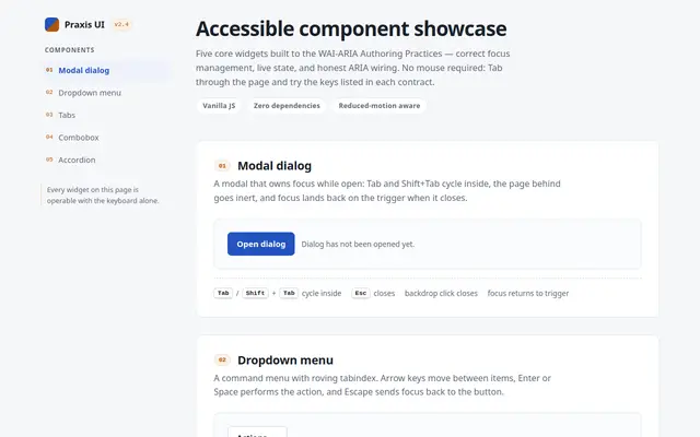
Accessible Components
Swift Qwen3.8 27B GGUF
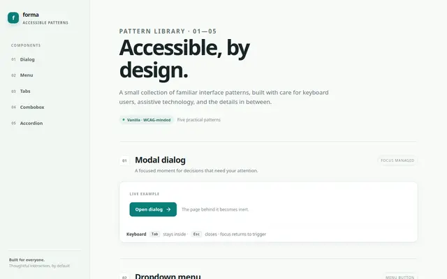
Accessible Components
GPT 6 Luna
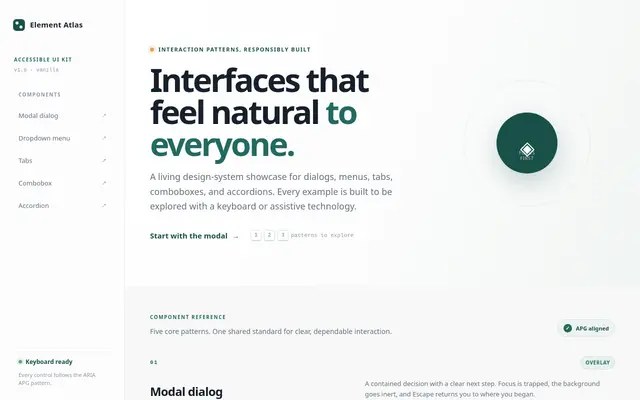
Accessible Components
nex agi Nex N2.5 mini GGUF
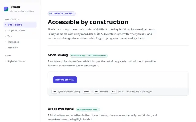
Accessible Components
Deepseek v4.1 Flash
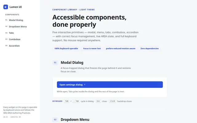
Accessible Components
Qwen 3.8
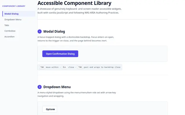
Accessible Components
Tiel Coder 35B A3B GGUF MTP
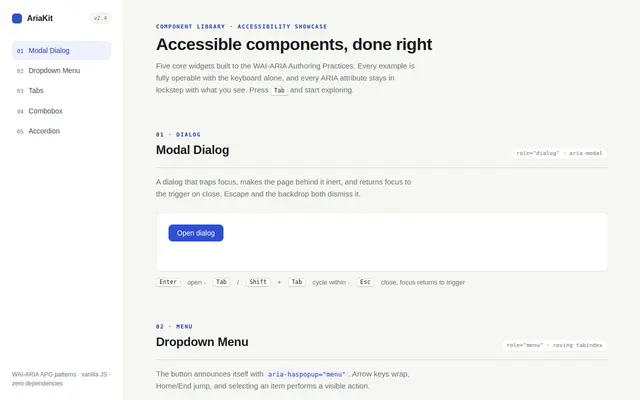
Accessible Components
Qwen 3.8
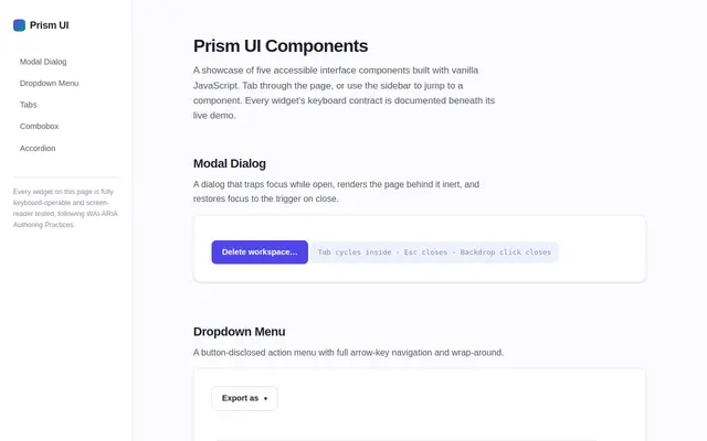
Accessible Components
GLM 5.3 Flash
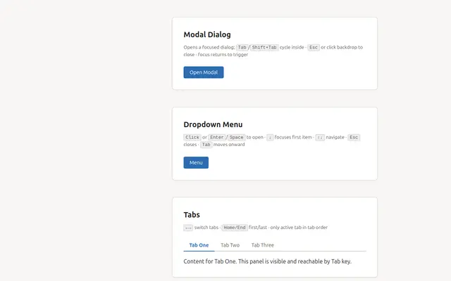
Accessible Components
ling 3.0 Flash
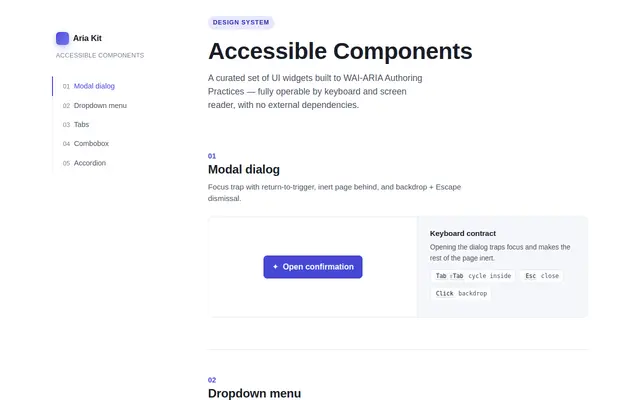
Accessible Components
Ornith 1.5 35B A3B
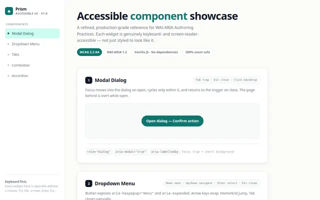
Accessible Components
muse spark 1.2 contributor
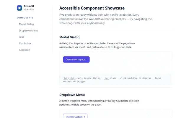
Accessible Components
ox alpha
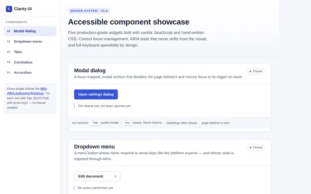
Accessible Components
Qwen 3.8 27B GGUF
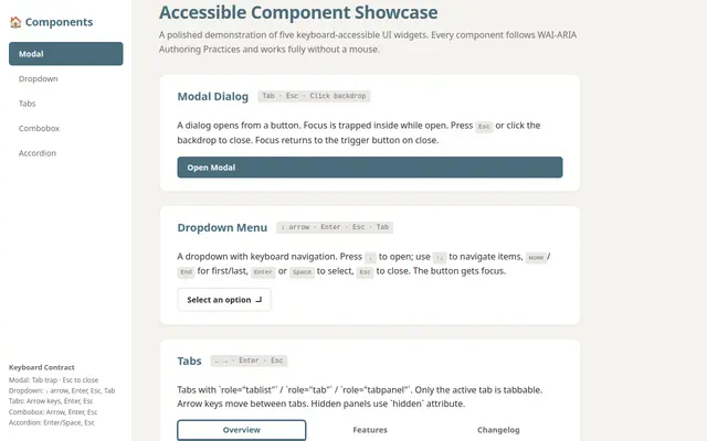
Accessible Components
ling 3.0 tiny:free
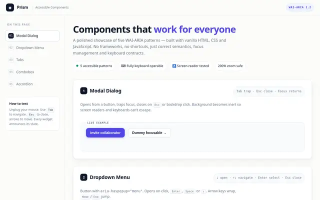
Accessible Components
muse spark 1.2
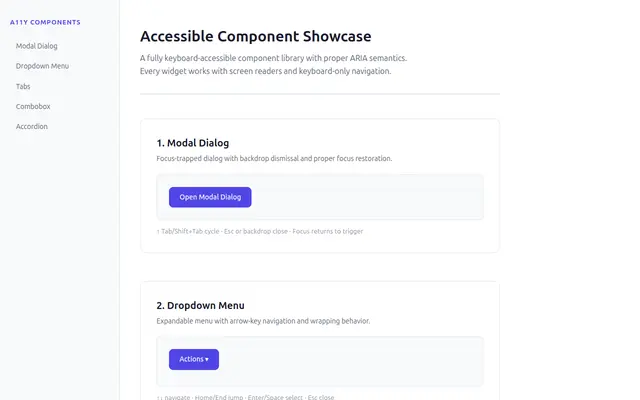
Accessible Components
ThinkingCap Qwen3.6 27B GGUF
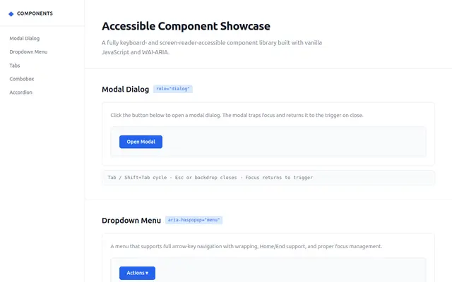
Accessible Components
Qwen 3.6 27B MTP GGUF
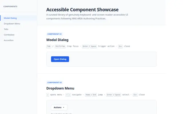
Accessible Components
Qwen 3.7 Flash