Accessible Components
Qwen 3.8 27B GGUF · typescript
Reviews & generation details
Reviews
No human review yet. Unreviewed does not mean unsuccessful.
Generation context
Imported historical artifact. Its exact original instructions and lineage are not known.
Generation prompt · exact text unavailable
See the current prompt for reference. It may differ from the instructions used to generate this artifact.
Inspect original source 69,687 bytes · SHA-256 4bafdb31e8ce
<!doctype html>
<html lang="en">
<head>
<meta charset="utf-8">
<meta name="viewport" content="width=device-width, initial-scale=1">
<title>Clarity UI — Accessible Component Showcase</title>
<style>
/* ── css: base ── */
/* ============ Clarity UI — design tokens & base ============ */
:root {
/* palette — ink + indigo, on warm paper */
--ink: #1c2433;
--ink-2: #4c566c;
--ink-3: #7a8398;
--accent: #3653d9;
--accent-deep: #26379e;
--accent-soft: #e9edfb;
--accent-soft-2: #f1f4fe;
--paper: #f5f6fa;
--card: #ffffff;
--line: #e2e5ee;
--line-strong: #c9cfdd;
--ok: #0f6b45;
--ok-soft: #e3f2ea;
--focus: #0a58ca;
/* spacing scale */
--sp-1: 4px;
--sp-2: 8px;
--sp-3: 12px;
--sp-4: 16px;
--sp-5: 24px;
--sp-6: 32px;
--sp-7: 48px;
/* shape & motion */
--r-sm: 6px;
--r-md: 10px;
--r-lg: 14px;
--dur-1: 120ms;
--dur-2: 180ms;
--dur-3: 240ms;
--shadow-1: 0 1px 2px rgba(24, 32, 60, 0.05), 0 1px 3px rgba(24, 32, 60, 0.04);
--shadow-2: 0 4px 14px rgba(24, 32, 60, 0.10);
--shadow-3: 0 18px 48px rgba(18, 24, 52, 0.22);
--sidebar-w: 248px;
--font-body: -apple-system, BlinkMacSystemFont, "Segoe UI", Roboto, "Helvetica Neue", Arial, sans-serif;
--font-mono: ui-monospace, "SF Mono", "Cascadia Code", Menlo, Consolas, monospace;
}
*, *::before, *::after { box-sizing: border-box; }
html { scroll-behavior: smooth; }
body {
margin: 0;
background: var(--paper);
color: var(--ink);
font-family: var(--font-body);
font-size: 16px;
line-height: 1.55;
-webkit-font-smoothing: antialiased;
text-rendering: optimizeLegibility;
}
/*
* Global focus ring: every keyboard-focusable element gets a visible,
* high-contrast 2px ring. (No outline suppression anywhere on this page.)
*/
a:focus-visible,
button:focus-visible,
input:focus-visible,
select:focus-visible,
textarea:focus-visible,
[tabindex]:focus-visible,
[role="menuitem"]:focus-visible,
[role="tab"]:focus-visible {
outline: 2px solid var(--focus);
outline-offset: 2px;
border-radius: var(--r-sm);
}
h1, h2, h3 { line-height: 1.25; letter-spacing: -0.012em; }
h1 { font-size: 2rem; margin: 0 0 var(--sp-3); font-weight: 700; }
h2 { font-size: 1.35rem; margin: 0 0 var(--sp-2); font-weight: 700; }
h3 { font-size: 1rem; margin: 0; font-weight: 650; }
p { margin: 0 0 var(--sp-3); }
/* ============ skip link ============ */
.skip-link {
position: fixed;
top: var(--sp-2);
left: var(--sp-2);
z-index: 200;
transform: translateY(-260%);
background: var(--accent);
color: #fff;
padding: var(--sp-2) var(--sp-4);
border-radius: var(--r-sm);
font-weight: 600;
text-decoration: none;
box-shadow: var(--shadow-2);
transition: transform var(--dur-1) ease;
}
.skip-link:focus { transform: translateY(0); }
.skip-link:focus-visible { outline: 2px solid #fff; outline-offset: 2px; }
/* ============ layout ============ */
.layout { display: flex; min-height: 100vh; }
.sidebar {
width: var(--sidebar-w);
flex-shrink: 0;
position: sticky;
top: 0;
height: 100vh;
overflow-y: auto;
background: var(--card);
border-right: 1px solid var(--line);
padding: var(--sp-5) var(--sp-4) var(--sp-5);
}
.brand {
display: flex;
align-items: center;
gap: var(--sp-2);
padding: 0 var(--sp-2) var(--sp-4);
border-bottom: 1px solid var(--line);
margin-bottom: var(--sp-4);
font-weight: 750;
font-size: 1.05rem;
letter-spacing: -0.01em;
}
.brand-mark {
width: 26px; height: 26px;
border-radius: 7px;
background: linear-gradient(135deg, var(--accent), var(--accent-deep));
color: #fff;
display: grid;
place-items: center;
font-size: 13px;
font-weight: 800;
}
.sidebar-label {
font-size: 11px;
font-weight: 700;
letter-spacing: 0.09em;
text-transform: uppercase;
color: var(--ink-3);
margin: 0 var(--sp-2) var(--sp-2);
}
.side-nav { display: block; margin: 0; }
.side-nav ul { list-style: none; margin: 0; padding: 0; }
.side-nav a {
display: flex;
align-items: center;
gap: var(--sp-2);
padding: var(--sp-2) var(--sp-3);
margin: 2px 0;
border-radius: var(--r-sm);
color: var(--ink-2);
text-decoration: none;
font-size: 0.92rem;
font-weight: 550;
border: 1px solid transparent;
transition: background var(--dur-1) ease, color var(--dur-1) ease;
}
.side-nav a:hover { background: var(--accent-soft-2); color: var(--ink); }
.side-nav a.active { background: var(--accent-soft); color: var(--accent-deep); font-weight: 650; }
.side-nav .idx {
font-family: var(--font-mono);
font-size: 11px;
color: var(--ink-3);
width: 20px;
flex-shrink: 0;
}
.side-nav a.active .idx { color: var(--accent); }
.sidebar-foot {
margin-top: var(--sp-5);
padding: var(--sp-3);
border: 1px solid var(--line);
border-radius: var(--r-md);
font-size: 0.78rem;
color: var(--ink-2);
background: var(--paper);
}
.sidebar-foot code { font-family: var(--font-mono); font-size: 0.72rem; color: var(--accent-deep); }
.content { flex: 1; min-width: 0; }
.page-head {
padding: var(--sp-6) var(--sp-6) var(--sp-5);
border-bottom: 1px solid var(--line);
background: linear-gradient(180deg, #fff 0%, var(--paper) 100%);
max-width: 900px;
}
.eyebrow {
display: inline-block;
font-size: 12px;
font-weight: 700;
letter-spacing: 0.08em;
text-transform: uppercase;
color: var(--accent);
background: var(--accent-soft);
padding: 3px 10px;
border-radius: 999px;
margin-bottom: var(--sp-3);
}
.lede { font-size: 1.05rem; color: var(--ink-2); max-width: 62ch; }
main { padding: var(--sp-5) var(--sp-6) var(--sp-7); max-width: 900px; }
/* ============ component sections ============ */
.component {
background: var(--card);
border: 1px solid var(--line);
border-radius: var(--r-lg);
box-shadow: var(--shadow-1);
margin-bottom: var(--sp-6);
overflow: hidden;
}
.component-head {
display: flex;
align-items: baseline;
justify-content: space-between;
gap: var(--sp-3);
padding: var(--sp-4) var(--sp-5);
border-bottom: 1px solid var(--line);
}
.component-head h2 { margin: 0; }
.component-desc { color: var(--ink-2); font-size: 0.95rem; margin: 0; }
.stage { padding: var(--sp-5); }
/* keyboard-contract caption */
.caption {
display: flex;
flex-wrap: wrap;
align-items: center;
gap: var(--sp-2);
padding: var(--sp-3) var(--sp-4);
background: var(--paper);
border-top: 1px solid var(--line);
font-size: 0.82rem;
color: var(--ink-2);
}
.caption .cap-label {
font-size: 10.5px;
font-weight: 750;
letter-spacing: 0.08em;
text-transform: uppercase;
color: var(--ink-3);
margin-right: var(--sp-1);
}
kbd {
display: inline-block;
min-width: 22px;
padding: 1px 6px;
border: 1px solid var(--line-strong);
border-bottom-width: 2px;
border-radius: 5px;
background: #fff;
font-family: var(--font-mono);
font-size: 11px;
color: var(--ink);
text-align: center;
box-shadow: 0 1px 0 rgba(24,32,60,0.04);
}
/* ============ shared widget bits ============ */
.btn {
display: inline-flex;
align-items: center;
gap: var(--sp-2);
padding: var(--sp-2) var(--sp-4);
font: inherit;
font-weight: 600;
font-size: 0.92rem;
border-radius: var(--r-sm);
border: 1px solid var(--line-strong);
background: #fff;
color: var(--ink);
cursor: pointer;
transition: background var(--dur-1) ease, border-color var(--dur-1) ease, transform var(--dur-1) ease;
}
.btn:hover { background: var(--accent-soft-2); border-color: var(--accent); }
.btn:active { transform: translateY(1px); }
.btn-primary { background: var(--accent); border-color: var(--accent); color: #fff; }
.btn-primary:hover { background: var(--accent-deep); border-color: var(--accent-deep); }
.btn-danger { background: #b3261e; border-color: #b3261e; color: #fff; }
.btn-danger:hover { background: #8f1d16; border-color: #8f1d16; }
.chip {
display: inline-flex;
align-items: center;
gap: 6px;
font-size: 12px;
font-weight: 650;
padding: 3px 10px;
border-radius: 999px;
border: 1px solid var(--line-strong);
color: var(--ink-2);
background: #fff;
}
.chip .dot { width: 7px; height: 7px; border-radius: 50%; background: var(--ink-3); }
.chip[data-state="open"] { color: var(--accent-deep); border-color: var(--accent); background: var(--accent-soft); }
.chip[data-state="open"] .dot { background: var(--accent); }
.chip[data-state="closed"] { color: var(--ink-3); }
.status-line {
margin-top: var(--sp-4);
min-height: 20px;
font-size: 0.85rem;
color: var(--ink-2);
padding-left: var(--sp-3);
border-left: 3px solid var(--line-strong);
}
.status-line strong { color: var(--ink); }
.sr-only {
position: absolute;
width: 1px; height: 1px;
padding: 0; margin: -1px;
overflow: hidden;
clip: rect(0 0 0 0);
white-space: nowrap;
border: 0;
}
/* page-level inert (applied to main while the modal is open) */
main[aria-disabled="true"] { pointer-events: none; }
/* ============ responsive & motion ============ */
@media (max-width: 900px) {
.layout { flex-direction: column; }
.sidebar {
position: static;
width: 100%;
height: auto;
border-right: 0;
border-bottom: 1px solid var(--line);
display: flex;
align-items: center;
gap: var(--sp-4);
padding: var(--sp-3) var(--sp-4);
flex-wrap: wrap;
}
.brand { border-bottom: 0; padding: 0; margin: 0; }
.sidebar-label, .sidebar-foot { display: none; }
.side-nav ul { display: flex; flex-wrap: wrap; gap: var(--sp-1); }
.side-nav a { padding: var(--sp-1) var(--sp-3); }
.side-nav .idx { display: none; }
main { padding: var(--sp-4); }
.page-head { padding: var(--sp-5) var(--sp-4) var(--sp-4); }
}
@media (prefers-reduced-motion: reduce) {
html { scroll-behavior: auto; }
*, *::before, *::after {
animation-duration: 0.01ms !important;
animation-iteration-count: 1 !important;
transition-duration: 0.01ms !important;
}
}
/* ── css: components ── */
/* ============ 1. Modal dialog ============ */
.modal-backdrop {
position: fixed;
inset: 0;
z-index: 100;
display: grid;
place-items: center;
padding: var(--sp-5);
background: rgba(20, 26, 48, 0.45);
opacity: 0;
transition: opacity var(--dur-2) ease;
}
.modal-backdrop[hidden] { display: none !important; }
.modal-backdrop.is-visible { opacity: 1; }
.modal-dialog {
width: min(520px, 100%);
background: var(--card);
border: 1px solid var(--line);
border-radius: var(--r-lg);
box-shadow: var(--shadow-3);
padding: var(--sp-5);
transform: translateY(10px) scale(0.98);
transition: transform var(--dur-2) ease;
}
.modal-backdrop.is-visible .modal-dialog { transform: none; }
.modal-head {
display: flex;
align-items: flex-start;
justify-content: space-between;
gap: var(--sp-3);
margin-bottom: var(--sp-3);
}
.modal-close {
flex-shrink: 0;
width: 34px; height: 34px;
display: grid;
place-items: center;
border: 1px solid var(--line);
border-radius: var(--r-sm);
background: #fff;
color: var(--ink-2);
cursor: pointer;
font-size: 15px;
line-height: 1;
}
.modal-close:hover { background: var(--accent-soft-2); color: var(--ink); border-color: var(--accent); }
.modal-body { color: var(--ink-2); font-size: 0.95rem; }
.modal-body .note {
margin: var(--sp-3) 0 0;
padding: var(--sp-3);
background: var(--accent-soft-2);
border: 1px solid var(--accent-soft);
border-radius: var(--r-md);
font-size: 0.85rem;
color: var(--ink-2);
}
.modal-body .note code { font-family: var(--font-mono); font-size: 0.8rem; color: var(--accent-deep); }
.modal-foot {
display: flex;
justify-content: flex-end;
gap: var(--sp-2);
margin-top: var(--sp-5);
}
/* ============ 2. Dropdown menu ============ */
.menu-wrap { position: relative; display: inline-block; }
.menu-btn { min-width: 190px; justify-content: flex-start; }
.menu-btn .chev { margin-left: auto; transition: transform var(--dur-1) ease; color: var(--ink-3); font-size: 12px; }
.menu-btn[aria-expanded="true"] .chev { transform: rotate(180deg); }
.menu {
position: absolute;
top: calc(100% + 6px);
left: 0;
z-index: 60;
min-width: 230px;
padding: var(--sp-1);
background: #fff;
border: 1px solid var(--line);
border-radius: var(--r-md);
box-shadow: var(--shadow-2);
}
.menu-item {
display: flex;
align-items: center;
gap: var(--sp-2);
width: 100%;
padding: var(--sp-2) var(--sp-3);
border: 0;
border-radius: var(--r-sm);
background: none;
font: inherit;
font-size: 0.92rem;
color: var(--ink);
text-align: left;
cursor: pointer;
}
.menu-item .mi-icon { width: 20px; text-align: center; color: var(--ink-3); font-size: 14px; }
.menu-item .mi-short {
margin-left: auto;
font-family: var(--font-mono);
font-size: 11px;
color: var(--ink-3);
}
.menu-item[aria-disabled="true"] { color: var(--ink-3); cursor: not-allowed; }
.menu-item.is-focused { background: var(--accent-soft); color: var(--accent-deep); }
.menu-item.is-focused .mi-icon { color: var(--accent); }
.menu-item.is-focused .mi-short { color: var(--accent-deep); }
.menu-sep { height: 1px; margin: var(--sp-1) var(--sp-2); background: var(--line); }
/* ============ 3. Tabs ============ */
.tabs .tablist {
display: flex;
gap: 2px;
border-bottom: 2px solid var(--line);
margin-bottom: var(--sp-4);
}
.tab {
appearance: none;
border: 0;
background: none;
font: inherit;
font-weight: 600;
font-size: 0.95rem;
color: var(--ink-3);
padding: var(--sp-2) var(--sp-4);
margin-bottom: -2px;
cursor: pointer;
border-bottom: 2px solid transparent;
transition: color var(--dur-1) ease, border-color var(--dur-1) ease;
}
.tab:hover { color: var(--ink); }
.tab[aria-selected="true"] { color: var(--accent-deep); border-bottom-color: var(--accent); }
.tab .badge {
display: inline-grid;
place-items: center;
min-width: 18px;
height: 18px;
margin-left: 6px;
padding: 0 5px;
border-radius: 999px;
background: var(--accent-soft);
color: var(--accent-deep);
font-size: 11px;
font-weight: 750;
font-family: var(--font-mono);
}
.tab-panel { padding: var(--sp-2) 0 var(--sp-1); }
.tab-panel h3 { margin-bottom: var(--sp-2); }
.tab-panel p { font-size: 0.95rem; color: var(--ink-2); max-width: 60ch; }
.code-block {
margin: var(--sp-3) 0;
padding: var(--sp-3) var(--sp-4);
background: #0f1526;
border-radius: var(--r-md);
font-family: var(--font-mono);
font-size: 0.8rem;
line-height: 1.6;
color: #c7d2f0;
overflow-x: auto;
}
.code-block .tk { color: #8ab4ff; }
.code-block .st { color: #9fe8c5; }
.link-row { display: flex; gap: var(--sp-3); flex-wrap: wrap; }
.link-row a {
color: var(--accent);
font-weight: 600;
font-size: 0.92rem;
text-decoration: underline;
text-underline-offset: 3px;
}
.link-row a:hover { color: var(--accent-deep); }
.spec-table { width: 100%; border-collapse: collapse; font-size: 0.9rem; margin-top: var(--sp-2); }
.spec-table th, .spec-table td { text-align: left; padding: var(--sp-2) var(--sp-3); border-bottom: 1px solid var(--line); }
.spec-table th { color: var(--ink-3); font-size: 0.75rem; text-transform: uppercase; letter-spacing: 0.06em; }
.spec-table td:first-child { font-weight: 600; }
.spec-table tr:last-child td { border-bottom: 0; }
input.field {
font: inherit;
font-size: 0.95rem;
padding: var(--sp-2) var(--sp-3);
border: 1px solid var(--line-strong);
border-radius: var(--r-sm);
color: var(--ink);
background: #fff;
width: 100%;
max-width: 340px;
}
/* ============ 4. Combobox ============ */
.combo-wrap { position: relative; max-width: 440px; }
.combo-wrap .combo {
padding-right: 40px;
border-color: var(--line-strong);
width: 100%;
max-width: none;
padding: var(--sp-2) var(--sp-3);
padding-left: 34px;
}
.combo-wrap .combo-icon {
position: absolute;
left: 11px;
top: 50%;
transform: translateY(-50%);
color: var(--ink-3);
pointer-events: none;
font-size: 14px;
}
.combo-wrap .combo[aria-expanded="true"] {
border-color: var(--accent);
box-shadow: 0 0 0 3px var(--accent-soft);
}
.combo-list {
position: absolute;
top: calc(100% + 4px);
left: 0; right: 0;
z-index: 50;
margin: 0;
padding: var(--sp-1);
list-style: none;
background: #fff;
border: 1px solid var(--line);
border-radius: var(--r-md);
box-shadow: var(--shadow-2);
max-height: 236px;
overflow-y: auto;
overscroll-behavior: contain;
}
.combo-list[hidden] { display: none !important; }
.combo-opt {
display: flex;
align-items: center;
gap: var(--sp-2);
padding: var(--sp-2) var(--sp-3);
border-radius: var(--r-sm);
font-size: 0.93rem;
color: var(--ink);
}
.combo-opt .rank {
font-family: var(--font-mono);
font-size: 11px;
color: var(--ink-3);
width: 18px;
}
.combo-opt .region { margin-left: auto; font-size: 0.78rem; color: var(--ink-3); }
.combo-opt[aria-selected="true"] { background: var(--accent); color: #fff; }
.combo-opt[aria-selected="true"] .rank, .combo-opt[aria-selected="true"] .region { color: #d6e0ff; }
.combo-opt.has-mark { font-weight: 650; }
.combo-empty {
padding: var(--sp-3);
font-size: 0.88rem;
color: var(--ink-3);
text-align: center;
}
/* ============ 5. Accordion ============ */
.accordion { border: 1px solid var(--line); border-radius: var(--r-md); overflow: hidden; }
.acc-item + .acc-item { border-top: 1px solid var(--line); }
.acc-trigger {
width: 100%;
display: flex;
align-items: center;
gap: var(--sp-3);
padding: var(--sp-3) var(--sp-4);
border: 0;
background: #fff;
font: inherit;
font-weight: 650;
font-size: 0.97rem;
color: var(--ink);
text-align: left;
cursor: pointer;
transition: background var(--dur-1) ease;
}
.acc-trigger:hover { background: var(--accent-soft-2); }
.acc-trigger .acc-num {
font-family: var(--font-mono);
font-size: 11px;
color: var(--ink-3);
width: 22px;
}
.acc-trigger .acc-tick {
margin-left: auto;
width: 22px; height: 22px;
display: grid;
place-items: center;
border-radius: 50%;
border: 1px solid var(--line-strong);
color: var(--ink-3);
font-size: 12px;
transition: transform var(--dur-2) ease, background var(--dur-2) ease, color var(--dur-2) ease, border-color var(--dur-2) ease;
}
.acc-trigger[aria-expanded="true"] .acc-tick {
transform: rotate(45deg);
background: var(--accent);
border-color: var(--accent);
color: #fff;
}
.acc-trigger[aria-expanded="true"] { color: var(--accent-deep); }
.acc-trigger[aria-expanded="true"] .acc-num { color: var(--accent); }
.acc-panel { overflow: hidden; }
.acc-panel[hidden] { display: none !important; }
.acc-inner {
padding: var(--sp-1) var(--sp-4) var(--sp-4) calc(var(--sp-4) + 22px + var(--sp-3));
color: var(--ink-2);
font-size: 0.93rem;
max-width: 62ch;
}
.acc-inner p { margin: var(--sp-2) 0; }
.acc-inner ul { margin: var(--sp-2) 0; padding-left: var(--sp-4); }
.acc-inner li { margin: var(--sp-1) 0; }
/* ============ footer ============ */
.page-foot {
max-width: 900px;
margin: 0 auto;
padding: 0 var(--sp-6) var(--sp-6);
color: var(--ink-3);
font-size: 0.8rem;
}
</style>
</head>
<body>
<div id="app"><a class="skip-link" href="#main-content">Skip to main content</a>
<div class="layout">
<aside class="sidebar">
<div class="brand"><span class="brand-mark" aria-hidden="true">C</span> Clarity UI</div>
<nav class="side-nav" aria-label="Components">
<p class="sidebar-label">Components</p>
<ul>
<li><a href="#modal"><span class="idx" aria-hidden="true">01</span> Modal dialog</a></li>
<li><a href="#menu"><span class="idx" aria-hidden="true">02</span> Dropdown menu</a></li>
<li><a href="#tabs"><span class="idx" aria-hidden="true">03</span> Tabs</a></li>
<li><a href="#combobox"><span class="idx" aria-hidden="true">04</span> Combobox</a></li>
<li><a href="#accordion"><span class="idx" aria-hidden="true">05</span> Accordion</a></li>
</ul>
</nav>
<div class="sidebar-foot">
Every widget follows the <a href="#main-content" style="color:var(--accent);font-weight:600;">WAI-ARIA Authoring Practices</a>. Try each one with <code>Tab</code>, <code>Shift+Tab</code> and arrow keys — no mouse needed.
</div>
</aside>
<div class="content">
<header class="page-head">
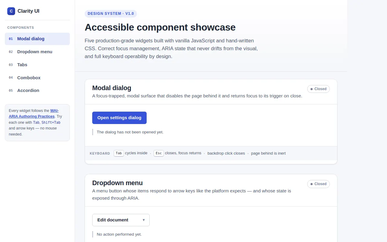
<span class="eyebrow">Design system · v1.0</span>
<h1>Accessible component showcase</h1>
<p class="lede">Five production-grade widgets built with vanilla JavaScript and hand-written CSS. Correct focus management, ARIA state that never drifts from the visual, and full keyboard operability by design.</p>
</header>
<main id="main-content" tabindex="-1">
<!-- 1 ─ Modal dialog -->
<section class="component" id="modal" aria-labelledby="modal-h">
<div class="component-head">
<div>
<h2 id="modal-h">Modal dialog</h2>
<p class="component-desc">A focus-trapped, modal surface that disables the page behind it and returns focus to its trigger on close.</p>
</div>
<span class="chip" id="modal-chip" data-state="closed"><span class="dot" aria-hidden="true"></span><span id="modal-chip-text">Closed</span></span>
</div>
<div class="stage">
<button type="button" class="btn btn-primary" id="modal-open" aria-haspopup="dialog">Open settings dialog</button>
<p class="status-line" id="modal-status">The dialog has not been opened yet.</p>
</div>
<p class="caption">
<span class="cap-label">Keyboard</span>
<span><kbd>Tab</kbd> cycles inside</span><span>·</span>
<span><kbd>Esc</kbd> closes, focus returns</span><span>·</span>
<span>backdrop click closes</span><span>·</span>
<span>page behind is inert</span>
</p>
</section>
<!-- 2 ─ Dropdown menu -->
<section class="component" id="menu" aria-labelledby="menu-h">
<div class="component-head">
<div>
<h2 id="menu-h">Dropdown menu</h2>
<p class="component-desc">A menu button whose items respond to arrow keys like the platform expects — and whose state is exposed through ARIA.</p>
</div>
<span class="chip" id="menu-chip" data-state="closed"><span class="dot" aria-hidden="true"></span><span id="menu-chip-text">Closed</span></span>
</div>
<div class="stage">
<div class="menu-wrap">
<button type="button" class="btn menu-btn" id="menu-btn" aria-haspopup="menu" aria-expanded="false" aria-controls="menu-list">
Edit document <span class="chev" aria-hidden="true">▾</span>
</button>
<ul class="menu" id="menu-list" role="menu" aria-labelledby="menu-btn" hidden="">
<li><button type="button" class="menu-item" role="menuitem" id="mi-cut" data-action="Cut" data-shortcut="⌘X"><span class="mi-icon" aria-hidden="true">✂</span>Cut<span class="mi-short" aria-hidden="true">⌘X</span></button></li>
<li><button type="button" class="menu-item" role="menuitem" id="mi-copy" data-action="Copy" data-shortcut="⌘C"><span class="mi-icon" aria-hidden="true">⧉</span>Copy<span class="mi-short" aria-hidden="true">⌘C</span></button></li>
<li><button type="button" class="menu-item" role="menuitem" id="mi-paste" data-action="Paste" data-shortcut="⌘V"><span class="mi-icon" aria-hidden="true">⎘</span>Paste<span class="mi-short" aria-hidden="true">⌘V</span></button></li>
<li aria-hidden="true"><div class="menu-sep"></div></li>
<li><button type="button" class="menu-item" role="menuitem" id="mi-rename" data-action="Rename"><span class="mi-icon" aria-hidden="true">✎</span>Rename<span class="mi-short" aria-hidden="true"></span></button></li>
<li><button type="button" class="menu-item" role="menuitem" id="mi-share" data-action="Share link"><span class="mi-icon" aria-hidden="true">↗</span>Share link<span class="mi-short" aria-hidden="true"></span></button></li>
<li><button type="button" class="menu-item" role="menuitem" id="mi-duplicate" data-action="Duplicate" aria-disabled="true"><span class="mi-icon" aria-hidden="true">⊞</span>Duplicate<span class="mi-short" aria-hidden="true">soon</span></button></li>
</ul>
</div>
<p class="status-line" id="menu-status">No action performed yet.</p>
</div>
<p class="caption">
<span class="cap-label">Keyboard</span>
<span><kbd>↓</kbd> opens on first item</span><span>·</span>
<span><kbd>↑</kbd><kbd>↓</kbd> wrap around</span><span>·</span>
<span><kbd>Home</kbd>/<kbd>End</kbd> jump</span><span>·</span>
<span><kbd>Esc</kbd> or <kbd>Tab</kbd> close</span>
</p>
</section>
<!-- 3 ─ Tabs -->
<section class="component" id="tabs" aria-labelledby="tabs-h">
<div class="component-head">
<div>
<h2 id="tabs-h">Tabs</h2>
<p class="component-desc">Roving tabindex with <code>aria-selected</code>, <code>aria-controls</code> and <code>aria-labelledby</code> wired end-to-end. Hidden panels are truly removed from the a11y tree.</p>
</div>
</div>
<div class="stage">
<div class="tabs">
<div class="tablist" role="tablist" aria-label="Component documentation" id="tablist">
<button type="button" class="tab" role="tab" id="tab-1" aria-controls="panel-1" aria-selected="true" tabindex="0">Overview</button>
<button type="button" class="tab" role="tab" id="tab-2" aria-controls="panel-2" aria-selected="false" tabindex="-1">Usage<span class="badge" aria-hidden="true">4</span></button>
<button type="button" class="tab" role="tab" id="tab-3" aria-controls="panel-3" aria-selected="false" tabindex="-1">Accessibility</button>
</div>
<div class="tab-panel" role="tabpanel" id="panel-1" aria-labelledby="tab-1" tabindex="0">
<h3>What this component does</h3>
<p>Tabs let users switch between large related views without leaving the page. The selected tab is always reachable with a single <kbd>Tab</kbd> press, and arrow keys move between tabs without hunting for focus.</p>
<div class="link-row">
<a href="#tabs">Anchor link inside the panel</a>
<a href="#modal">Jump to the modal section</a>
</div>
</div>
<div class="tab-panel" role="tabpanel" id="panel-2" aria-labelledby="tab-2" tabindex="0" hidden="">
<h3>Dropping it into your code</h3>
<pre class="code-block" tabindex="0" aria-label="Code sample"><span class="tk">import</span> { Tabs } <span class="tk">from</span> <span class="st">'@clarity/tabs'</span>;
Tabs.mount(document.querySelector(<span class="st">'#docs-tabs'</span>), {
default: <span class="st">'overview'</span>,
animated: <span class="st">true</span>
});</pre>
<p>The <code>Usage</code> tab carries a badge with a count — a visual affordance that never affects the tab's accessible name.</p>
</div>
<div class="tab-panel" role="tabpanel" id="panel-3" aria-labelledby="tab-3" tabindex="0" hidden="">
<h3>Why these patterns</h3>
<table class="spec-table">
<thead><tr><th>Property</th><th>Value</th><th>Meaning</th></tr></thead>
<tbody>
<tr><td>tabindex</td><td>0 on selected only</td><td>one stop in the tab order</td></tr>
<tr><td>aria-selected</td><td>true / false</td><td>announcement on selection</td></tr>
<tr><td>hidden</td><td>on inactive panels</td><td>content leaves the a11y tree</td></tr>
<tr><td>← / →</td><td>roves focus</td><td>with wrap-around</td></tr>
</tbody>
</table>
<p class="link-row" style="margin-top:16px;"><a href="#combobox">Compare with the combobox pattern</a></p>
</div>
</div>
</div>
<p class="caption">
<span class="cap-label">Keyboard</span>
<span><kbd>←</kbd><kbd>→</kbd> move focus & select</span><span>·</span>
<span><kbd>Home</kbd>/<kbd>End</kbd> first/last</span><span>·</span>
<span><kbd>Tab</kbd> enters panel content</span>
</p>
</section>
<!-- 4 ─ Combobox -->
<section class="component" id="combobox" aria-labelledby="combo-h">
<div class="component-head">
<div>
<h2 id="combo-h">Combobox</h2>
<p class="component-desc">An autocomplete input using the <code>aria-activedescendant</code> pattern: the listbox is never focusable, and the highlighted option is tracked on the input itself.</p>
</div>
<span class="chip" id="combo-chip" data-state="closed"><span class="dot" aria-hidden="true"></span><span id="combo-chip-text">Idle</span></span>
</div>
<div class="stage">
<div class="combo-wrap">
<span class="combo-icon" aria-hidden="true">⌕</span>
<input type="text" class="field combo" id="combo-input" role="combobox" aria-expanded="false" aria-controls="combo-listbox" aria-autocomplete="list" aria-labelledby="combo-label combo-input" placeholder="Search for a city…" autocomplete="off" spellcheck="false">
<ul class="combo-list" id="combo-listbox" role="listbox" aria-labelledby="combo-label" hidden=""></ul>
</div>
<label class="sr-only" id="combo-label" for="combo-input">City</label>
<p class="status-line" id="combo-status">Start typing to search 20 cities. Arrow keys highlight, <strong>Enter</strong> selects.</p>
</div>
<p class="caption">
<span class="cap-label">Keyboard</span>
<span>type to filter</span><span>·</span>
<span><kbd>↓</kbd><kbd>↑</kbd> move highlight</span><span>·</span>
<span><kbd>Enter</kbd> selects</span><span>·</span>
<span><kbd>Esc</kbd> closes & reverts</span>
</p>
</section>
<!-- 5 ─ Accordion -->
<section class="component" id="accordion" aria-labelledby="accordion-h">
<div class="component-head">
<div>
<h2 id="accordion-h">Accordion</h2>
<p class="component-desc">A disclosure group where any number of regions may be open at once. Height animates first; <code>hidden</code> is only touched at the end of the transition.</p>
</div>
</div>
<div class="stage">
<div class="accordion" role="group" aria-labelledby="accordion-h">
<div class="acc-item">
<h3><button type="button" class="acc-trigger" id="acc-t1" aria-expanded="true" aria-controls="acc-p1">Installation<span class="acc-num" aria-hidden="true">01</span><span class="acc-tick" aria-hidden="true">+</span></button></h3>
<div class="acc-panel" id="acc-p1" role="region" aria-labelledby="acc-t1">
<div class="acc-inner">
<p>Install from the registry and add the stylesheet once:</p>
<pre class="code-block" aria-label="Install command"><span class="tk">npm</span> install @clarity/ui @clarity/styles</pre>
<p>Clarity UI ships per-component entry points, so only the code you use ends up in your bundle.</p>
</div>
</div>
</div>
<div class="acc-item">
<h3><button type="button" class="acc-trigger" id="acc-t2" aria-expanded="false" aria-controls="acc-p2">Theming & tokens<span class="acc-num" aria-hidden="true">02</span><span class="acc-tick" aria-hidden="true">+</span></button></h3>
<div class="acc-panel" id="acc-p2" role="region" aria-labelledby="acc-t2" hidden="">
<div class="acc-inner">
<p>Every color, radius and duration is a CSS custom property, documented in one constants block:</p>
<ul>
<li><code>--accent</code> · <code>--ink</code> · <code>--paper</code> — the palette</li>
<li><code>--sp-1</code> … <code>--sp-7</code> — the spacing scale</li>
<li><code>--dur-1…3</code> · <code>--r-sm…lg</code> — motion and shape</li>
</ul>
<p>Override any token on <code>:root</code> and the whole system re-skins.</p>
</div>
</div>
</div>
<div class="acc-item">
<h3><button type="button" class="acc-trigger" id="acc-t3" aria-expanded="false" aria-controls="acc-p3">Accessibility checklist<span class="acc-num" aria-hidden="true">03</span><span class="acc-tick" aria-hidden="true">+</span></button></h3>
<div class="acc-panel" id="acc-p3" role="region" aria-labelledby="acc-t3" hidden="">
<div class="acc-inner">
<ul>
<li>Landmarks: one <code>main</code>, labelled <code>nav</code> regions</li>
<li>Headings: a single <code>h1</code>, one <code>h2</code> per section</li>
<li>Focus: visible 2px ring everywhere, never removed</li>
<li>State: <code>aria-expanded</code> / <code>aria-selected</code> always mirror the UI</li>
<li>Motion: honours <code>prefers-reduced-motion</code></li>
</ul>
</div>
</div>
</div>
</div>
</div>
<p class="caption">
<span class="cap-label">Keyboard</span>
<span><kbd>Tab</kbd> reaches every trigger</span><span>·</span>
<span><kbd>Enter</kbd>/<kbd>Space</kbd> toggles</span><span>·</span>
<span>multiple regions may be open</span>
</p>
</section>
</main>
<footer class="page-foot">
<p>Clarity UI — a fictional design system built for accessibility demonstration. Vanilla TS, zero dependencies. View source: every interaction is a few lines of readable JavaScript.</p>
</footer>
</div>
</div><!-- Modal dialog (outside the layout so inert() can cover the whole page) -->
<div class="modal-backdrop" id="modal-backdrop" hidden="">
<div class="modal-dialog" id="modal-dialog" role="dialog" aria-modal="true" aria-labelledby="modal-title" aria-describedby="modal-desc">
<div class="modal-head">
<h3 id="modal-title">Settings</h3>
<button type="button" class="modal-close" id="modal-close" aria-label="Close dialog">✕</button>
</div>
<div class="modal-body">
<p id="modal-desc">This dialog is modal: the page behind is inert, and Tab can not leave. Close it with Esc, the ✕ button, or by clicking the backdrop — focus will return to the trigger.</p>
<label for="modal-theme">Accent intensity</label>
<select id="modal-theme" class="field" style="margin-top:6px;">
<option>Subtle</option>
<option>Balanced</option>
<option>High contrast</option>
</select>
<p class="note">The focus trap is a tiny shared utility (<code>trapFocus</code>) — Escape and Tab/Shift+Tab are handled in one place.</p>
</div>
<div class="modal-foot">
<button type="button" class="btn" id="modal-cancel">Cancel</button>
<button type="button" class="btn btn-primary" id="modal-confirm">Save settings</button>
</div>
</div>
</div></div>
<script>
(function () {
'use strict';
var __mods = {};
var __cache = {};
var __map = {"src/main.ts":{"./config":"src/config.ts","./a11y":"src/a11y.ts","./components/modal":"src/components/modal.ts","./components/menu":"src/components/menu.ts","./components/tabs":"src/components/tabs.ts","./components/combobox":"src/components/combobox.ts","./components/accordion":"src/components/accordion.ts"},"src/a11y.ts":{"./dom":"src/dom.ts"},"src/components/modal.ts":{"../dom":"src/dom.ts","../a11y":"src/a11y.ts","../config":"src/config.ts"},"src/components/menu.ts":{"../dom":"src/dom.ts","../a11y":"src/a11y.ts","../config":"src/config.ts"},"src/components/tabs.ts":{"../dom":"src/dom.ts","../a11y":"src/a11y.ts"},"src/components/combobox.ts":{"../dom":"src/dom.ts","../a11y":"src/a11y.ts","../config":"src/config.ts"},"src/components/accordion.ts":{"../dom":"src/dom.ts","../a11y":"src/a11y.ts","../config":"src/config.ts"}};
function __require(id) {
if (__cache[id]) return __cache[id].exports;
var module = __cache[id] = { exports: {} };
var factory = __mods[id];
if (!factory) throw new Error("Module not found: " + id);
factory(module.exports, function (spec) {
var target = (__map[id] && __map[id][spec]) || spec;
return __require(target);
}, module);
return module.exports;
}
// ── module: src/main.ts ──
__mods["src/main.ts"] = function (exports, require, module) {
"use strict";
Object.defineProperty(exports, "__esModule", { value: true });
exports.start = start;
/**
* ============ Entry ============
* Runs after the DOM is parsed. Wires tokens → CSS, initializes the
* five components, and sets up the sidebar scrollspy.
*/
const config_1 = require("./config");
const a11y_1 = require("./a11y");
const modal_1 = require("./components/modal");
const menu_1 = require("./components/menu");
const tabs_1 = require("./components/tabs");
const combobox_1 = require("./components/combobox");
const accordion_1 = require("./components/accordion");
/** Push tunable constants onto CSS custom properties (single source of truth). */
function applyTokens() {
const r = document.documentElement;
r.style.setProperty('--accent', config_1.CONFIG.colors.accent);
r.style.setProperty('--accent-deep', config_1.CONFIG.colors.accentDeep);
config_1.CONFIG.spacing.forEach((px, i) => r.style.setProperty(`--sp-${i + 1}`, `${px}px`));
r.style.setProperty('--dur-acc', `${config_1.CONFIG.accordionMs}ms`);
}
/** Sidebar link active state following the section in view. */
function scrollSpy() {
const links = Array.from(document.querySelectorAll('.side-nav a'));
const byId = new Map(links.map((a) => [a.getAttribute('href')?.slice(1), a]));
const sections = Array.from(document.querySelectorAll('section.component'));
const io = new IntersectionObserver((entries) => {
for (const e of entries) {
if (e.isIntersecting) {
for (const l of links) {
l.classList.remove('active');
l.removeAttribute('aria-current');
}
const cur = byId.get(e.target.id);
cur?.classList.add('active');
cur?.setAttribute('aria-current', 'true');
}
}
}, { rootMargin: '-20% 0px -65% 0px' });
sections.forEach((s) => io.observe(s));
}
function start() {
document.documentElement.lang = 'en';
applyTokens();
(0, a11y_1.syncAriaState)(true);
(0, modal_1.modalInit)();
(0, menu_1.menuInit)();
(0, tabs_1.tabsInit)();
(0, combobox_1.comboboxInit)();
(0, accordion_1.accordionInit)();
scrollSpy();
}
start();
};
// ── module: src/config.ts ──
__mods["src/config.ts"] = function (exports, require, module) {
"use strict";
Object.defineProperty(exports, "__esModule", { value: true });
exports.CONFIG = void 0;
/**
* ============ Tunable constants ============
* Edit these to re-theme / re-time the whole showcase.
*/
exports.CONFIG = {
colors: {
accent: '#3653d9',
accentDeep: '#26379e',
ink: '#1c2433',
paper: '#f5f6fa',
},
/** spacing scale in px (1 → 7) */
spacing: [4, 8, 12, 16, 24, 32, 48],
/** animation durations in ms */
durations: { fast: 120, base: 180, slow: 240 },
/** accordion height-animation duration (also set as --dur-acc) */
accordionMs: 220,
/** menu: initial index for Down-arrow open */
menu: { initialIndex: 0 },
/** combobox: max results shown in the listbox */
combobox: { maxResults: 20 },
};
};
// ── module: src/dom.ts ──
__mods["src/dom.ts"] = function (exports, require, module) {
"use strict";
/**
* ============ Tiny DOM helpers ============
*/
Object.defineProperty(exports, "__esModule", { value: true });
exports.$ = $;
exports.$all = $all;
exports.el = el;
exports.isFocusable = isFocusable;
exports.focusableIn = focusableIn;
exports.setAttr = setAttr;
function $(sel, root = document) {
return root.querySelector(sel);
}
function $all(sel, root = document) {
return Array.from(root.querySelectorAll(sel));
}
/** Create an element of `tag` with attributes and (optional) text content. */
function el(tag, attrs = {}, text = '') {
const node = document.createElement(tag);
for (const [k, v] of Object.entries(attrs))
node.setAttribute(k, String(v));
if (text)
node.textContent = text;
return node;
}
function isFocusable(node) {
if ('disabled' in node && node.disabled)
return false;
const tag = node.tagName.toLowerCase();
if (tag === 'script' || tag === 'style' || tag === 'link' || tag === 'meta')
return false;
if (node.hasAttribute('tabindex') && !node.hasAttribute('hidden')) {
const ti = node.getAttribute('tabindex') ?? '0';
if (ti !== '' && !isNaN(Number(ti)))
return true;
}
const interactive = ['a', 'button', 'input', 'select', 'textarea'];
if (interactive.includes(tag)) {
if (tag === 'a' && !node.hasAttribute('href'))
return false;
if (tag === 'input' && node.getAttribute('type') === 'hidden')
return false;
return true;
}
return false;
}
/** All currently focusable elements under `root`, in DOM (tab) order. */
function focusableIn(root) {
return $all('*', root).filter((n) => !n.closest('[hidden]') && isFocusable(n));
}
function setAttr(node, key, value) {
if (!node)
return;
if (value === null)
node.removeAttribute(key);
else
node.setAttribute(key, value);
}
};
// ── module: src/a11y.ts ──
__mods["src/a11y.ts"] = function (exports, require, module) {
"use strict";
Object.defineProperty(exports, "__esModule", { value: true });
exports.announce = announce;
exports.syncAriaState = syncAriaState;
exports.trapFocus = trapFocus;
exports.roving = roving;
/**
* ============ Shared a11y primitives ============
* Live region, focus-trap manager, and a generic roving
* highlight manager (aria-activedescendant pattern) for
* menu-style widgets.
*/
const dom_1 = require("./dom");
/* ---------- live region ---------- */
let live = null;
/** Announce `msg` politely to assistive tech. */
function announce(msg) {
if (!live) {
live = (0, dom_1.el)('div', {
class: 'sr-only',
id: 'a11y-live',
role: 'status',
'aria-live': 'polite',
'aria-atomic': 'true',
});
document.body.appendChild(live);
}
live.textContent = '';
// Two frames so AT picks up even an identical re-announcement.
requestAnimationFrame(() => {
if (live)
live.textContent = msg;
});
}
/* ---------- global state sync ---------- */
/**
* Keep `aria-expanded` (menu/accordion/combobox triggers) and
* `aria-selected` (tabs) in lock-step with the DOM: the source of truth
* is always the presence/absence of the `hidden` attribute on the
* controlled element (or on the button itself, for tabs). Call after any
* mutation, and with `force` when a global event (e.g. the modal opening)
* may have changed visibility while components were asleep.
*/
function syncAriaState(force = false) {
if (force) {
for (const b of (0, dom_1.$all)('button[data-sync]'))
delete b.dataset.sync;
}
for (const b of (0, dom_1.$all)('button[aria-expanded]')) {
const target = document.getElementById(b.getAttribute('aria-controls') || '');
if (!target)
continue;
const open = !target.hasAttribute('hidden');
if (b.dataset.sync !== String(open)) {
b.setAttribute('aria-expanded', String(open));
b.dataset.sync = String(open);
}
}
for (const b of (0, dom_1.$all)('button[aria-selected]')) {
const target = document.getElementById(b.getAttribute('aria-controls') || '');
// tabs derive selected-state from their panel's hidden attribute
const selected = target ? !target.hasAttribute('hidden') : !b.hasAttribute('hidden');
if (b.dataset.sync !== String(selected)) {
b.setAttribute('aria-selected', String(selected));
b.dataset.sync = String(selected);
}
}
}
/**
* Make `blockers` inert while `dialog` is open:
* - `inert` property (modern browsers) + `aria-disabled` (fallback)
* - Escape closes via `onEscape`
* - Tab / Shift+Tab cycle inside the dialog
* - focus moves to the first focusable in the dialog
*/
function trapFocus(dialog, blockers, onEscape) {
const restore = [];
for (const r of blockers) {
restore.push([r, r.getAttribute('aria-disabled')]);
r.setAttribute('aria-disabled', 'true');
try {
r.inert = true;
}
catch {
/* attribute-only fallback */
}
}
const keyHandler = (e) => {
if (e.key === 'Escape') {
e.stopPropagation();
onEscape();
return;
}
if (e.key !== 'Tab')
return;
const items = (0, dom_1.focusableIn)(dialog);
if (items.length === 0) {
e.preventDefault();
return;
}
const active = document.activeElement;
if (!active || !dialog.contains(active)) {
// focus wandered out (or never entered) — pull it back in
e.preventDefault();
items[0].focus();
return;
}
const i = items.indexOf(active);
e.preventDefault(); // always move focus manually: deterministic + wraps
if (e.shiftKey) {
items[i <= 0 ? items.length - 1 : i - 1].focus();
}
else {
items[i >= items.length - 1 ? 0 : i + 1].focus();
}
};
document.addEventListener('keydown', keyHandler);
const target = (0, dom_1.focusableIn)(dialog)[0] ?? dialog;
target.focus();
return {
release() {
document.removeEventListener('keydown', keyHandler);
for (const [node, prev] of restore) {
if (prev === null)
node.removeAttribute('aria-disabled');
else
node.setAttribute('aria-disabled', prev);
try {
node.inert = false;
}
catch {
/* ignore */
}
}
},
};
}
/**
* Roving highlight manager for the aria-activedescendant pattern:
* the controlled list itself is never focusable; the *input/button*
* keeps focus while this manager moves the highlight. Hidden or
* aria-disabled items are skipped; navigation wraps by default.
*/
function roving(opts) {
const wrap = opts.wrap ?? true;
let idx = -1;
const items = () => opts
.getItems()
.filter((i) => !i.hasAttribute('hidden') && i.getAttribute('aria-disabled') !== 'true');
function highlight(i) {
const list = items();
if (list.length === 0)
return;
idx = Math.max(0, Math.min(i, list.length - 1));
list.forEach((it, n) => {
const on = n === idx;
it.classList.toggle('is-focused', on);
if (it.hasAttribute('aria-selected'))
it.setAttribute('aria-selected', String(on));
});
opts.onMove?.(idx, list[idx]);
}
return {
items,
index: () => idx,
current: () => {
const list = items();
return idx >= 0 && idx < list.length ? list[idx] : null;
},
highlight,
move(dir) {
const list = items();
if (list.length === 0)
return;
if (idx < 0)
highlight(dir > 0 ? 0 : list.length - 1);
else if (wrap)
highlight((idx + dir + list.length) % list.length);
else
highlight(idx + dir);
},
first: () => highlight(0),
last: () => highlight(items().length - 1),
clear() {
items().forEach((it) => {
it.classList.remove('is-focused');
if (it.hasAttribute('aria-selected'))
it.setAttribute('aria-selected', 'false');
});
idx = -1;
},
};
}
};
// ── module: src/components/modal.ts ──
__mods["src/components/modal.ts"] = function (exports, require, module) {
"use strict";
Object.defineProperty(exports, "__esModule", { value: true });
exports.modalInit = modalInit;
/**
* ============ 1. Modal dialog ============
* role="dialog" aria-modal="true", focus-trapped, inert background,
* focus returns to the trigger on close.
*/
const dom_1 = require("../dom");
const a11y_1 = require("../a11y");
const config_1 = require("../config");
const openBtn = (0, dom_1.$)('#modal-open');
const statusEl = (0, dom_1.$)('#modal-status');
const chip = (0, dom_1.$)('#modal-chip');
const chipText = (0, dom_1.$)('#modal-chip-text');
const backdrop = (0, dom_1.$)('#modal-backdrop');
const dialog = (0, dom_1.$)('#modal-dialog');
const closeBtn = (0, dom_1.$)('#modal-close');
const confirmBtn = (0, dom_1.$)('#modal-confirm');
const cancelBtn = (0, dom_1.$)('#modal-cancel');
const themeSelect = (0, dom_1.$)('#modal-theme');
let trap = null;
let open = false;
let closeTimer = 0;
let hideOnEnd = null;
function setChip(state) {
chip.dataset.state = state;
chipText.textContent = state === 'open' ? 'Open' : 'Closed';
}
function openDialog() {
if (open)
return;
open = true;
window.clearTimeout(closeTimer); // cancel a pending fade-out
if (hideOnEnd) {
backdrop.removeEventListener('transitionend', hideOnEnd);
hideOnEnd = null;
}
backdrop.hidden = false;
// let the browser commit the DOM, then fade in + trap focus
requestAnimationFrame(() => {
backdrop.classList.add('is-visible');
trap = (0, a11y_1.trapFocus)(dialog, [
(0, dom_1.$)('.sidebar'),
(0, dom_1.$)('.page-head'),
(0, dom_1.$)('#main-content'),
], () => closeDialog());
(0, a11y_1.announce)('Settings dialog opened. Focus is trapped inside the dialog.');
});
setChip('open');
statusEl.innerHTML = 'Dialog is open — <strong>Tab cycles inside</strong>, <strong>Esc</strong> closes and returns focus here.';
}
function closeDialog() {
if (!open)
return;
open = false;
backdrop.classList.remove('is-visible');
trap?.release();
trap = null;
hideOnEnd = () => {
backdrop.hidden = true;
backdrop.removeEventListener('transitionend', hideOnEnd);
hideOnEnd = null;
};
backdrop.addEventListener('transitionend', hideOnEnd); // instant under reduced motion
closeTimer = window.setTimeout(hideOnEnd, config_1.CONFIG.durations.base + 40); // safety net
openBtn.focus(); // focus returns to the trigger
setChip('closed');
statusEl.innerHTML = `Closed — focus returned to <strong>“${openBtn.textContent}”</strong>. Theme choice: ${themeSelect.options[themeSelect.selectedIndex].text}.`;
(0, a11y_1.announce)('Dialog closed. Focus returned to the open button.');
}
openBtn.addEventListener('click', openDialog);
closeBtn.addEventListener('click', closeDialog);
cancelBtn.addEventListener('click', closeDialog);
confirmBtn.addEventListener('click', closeDialog);
// Clicking the backdrop itself (not the dialog) closes.
backdrop.addEventListener('mousedown', (e) => {
if (e.target === backdrop)
closeDialog();
});
function modalInit() {
/* dialog markup lives in the static DOM; nothing else to do */
}
};
// ── module: src/components/menu.ts ──
__mods["src/components/menu.ts"] = function (exports, require, module) {
"use strict";
Object.defineProperty(exports, "__esModule", { value: true });
exports.menuInit = menuInit;
/**
* ============ 2. Dropdown menu ============
* WAI "menu button" pattern:
* - button: aria-haspopup="menu", aria-expanded
* - on open, focus moves into the menu (first or last item, depending
* on how it was opened); items use a roving tabindex (0 on the
* current one only, so the menu adds one tab stop)
* - Up/Down wrap, Home/End jump
* - Escape closes and returns focus to the button
* - Tab closes and moves focus naturally onward (Shift+Tab → button)
* - Enter/Space on an item selects it: visible action + close + focus
* back on the button
*/
const dom_1 = require("../dom");
const a11y_1 = require("../a11y");
const config_1 = require("../config");
const btn = (0, dom_1.$)('#menu-btn');
const menu = (0, dom_1.$)('#menu-list');
const statusEl = (0, dom_1.$)('#menu-status');
const chip = (0, dom_1.$)('#menu-chip');
const chipText = (0, dom_1.$)('#menu-chip-text');
let items = []; // selectable items, in order
function setChip(open) {
chip.dataset.state = open ? 'open' : 'closed';
chipText.textContent = open ? 'Open' : 'Closed';
}
function mark(item) {
for (const it of items)
it.classList.toggle('is-focused', it === item);
}
function enabledItems() {
return items.filter((i) => i.getAttribute('aria-disabled') !== 'true');
}
function openMenu(toLast) {
if (!menu.hidden)
return;
menu.hidden = false;
btn.setAttribute('aria-expanded', 'true');
const list = enabledItems();
const target = list.length ? (toLast ? list[list.length - 1] : list[0]) : null;
if (target) {
for (const it of items)
it.tabIndex = it === target ? 0 : -1;
target.focus();
}
mark(target);
setChip(true);
}
function closeMenu(refocus) {
if (menu.hidden)
return;
menu.hidden = true;
btn.setAttribute('aria-expanded', 'false');
mark(null);
setChip(false);
if (refocus === 'button') {
btn.focus();
}
else if (refocus === 'next') {
// natural forward motion: the first focusable element after the button
const all = (0, dom_1.focusableIn)(document.body);
const i = all.indexOf(btn);
const next = i >= 0 ? all[i + 1] : null;
(next ?? btn).focus();
}
}
function select(item) {
const label = item.getAttribute('data-action') || '';
closeMenu(null);
btn.focus();
statusEl.innerHTML = `Action performed: <strong>${label}</strong> — menu closed, focus back on the button.`;
(0, a11y_1.announce)(`${label} selected`);
}
/* ---------- button keys ---------- */
btn.addEventListener('click', () => {
if (menu.hidden)
openMenu(false);
else
closeMenu(null);
});
btn.addEventListener('keydown', (e) => {
const k = e.key;
if (k === 'ArrowDown' || k === ' ' || k === 'Enter') {
e.preventDefault(); // avoid the implicit click() double-firing
openMenu(false);
}
else if (k === 'ArrowUp') {
e.preventDefault();
openMenu(true);
}
else if (k === 'Escape' && !menu.hidden) {
e.preventDefault();
closeMenu('button');
}
});
/* ---------- menu (item) keys: focus lives on the items ---------- */
menu.addEventListener('keydown', (e) => {
const k = e.key;
const current = document.activeElement;
const list = enabledItems();
const idx = current ? list.indexOf(current) : -1;
const goto = (i) => {
const n = list.length;
const next = list[(i + n) % n];
for (const it of items)
it.tabIndex = it === next ? 0 : -1;
next.focus();
mark(next);
};
if (k === 'ArrowDown') {
e.preventDefault();
goto(idx + 1);
}
else if (k === 'ArrowUp') {
e.preventDefault();
goto(idx - 1);
}
else if (k === 'Home') {
e.preventDefault();
goto(0);
}
else if (k === 'End') {
e.preventDefault();
goto(list.length - 1);
}
else if (k === 'Enter' || k === ' ') {
e.preventDefault();
if (current && items.includes(current)) {
if (current.getAttribute('aria-disabled') !== 'true') {
select(current);
}
}
}
else if (k === 'Escape') {
e.preventDefault();
closeMenu('button');
}
else if (k === 'Tab') {
e.preventDefault();
closeMenu(e.shiftKey ? 'button' : 'next');
}
});
/* ---------- pointer ---------- */
menu.addEventListener('click', (e) => {
const item = e.target.closest('[role="menuitem"]');
if (item && item.getAttribute('aria-disabled') !== 'true')
select(item);
});
document.addEventListener('click', (e) => {
if (!menu.hidden && !menu.contains(e.target) && e.target !== btn) {
closeMenu(null);
}
});
function menuInit() {
items = (0, dom_1.$all)('[role="menuitem"]', menu);
for (const it of items)
it.tabIndex = -1; // closed menu: no tab stops
void config_1.CONFIG; // (initial index is first, per APG)
}
};
// ── module: src/components/tabs.ts ──
__mods["src/components/tabs.ts"] = function (exports, require, module) {
"use strict";
Object.defineProperty(exports, "__esModule", { value: true });
exports.tabsInit = tabsInit;
/**
* ============ 3. Tabs ============
* Roving tabindex: the active tab is the only one in the tab order.
* Left/Right (Home/End) move focus AND select. Inactive panels carry
* the `hidden` attribute, so they are never focusable.
*/
const dom_1 = require("../dom");
const a11y_1 = require("../a11y");
const tabs = (0, dom_1.$all)('[role="tab"]');
const panels = (0, dom_1.$all)('[role="tabpanel"]');
function selectTab(tab, focus) {
for (const t of tabs) {
const on = t === tab;
t.setAttribute('aria-selected', String(on));
t.tabIndex = on ? 0 : -1;
const panel = document.getElementById(t.getAttribute('aria-controls') || '');
if (panel) {
if (on)
panel.removeAttribute('hidden');
else
panel.setAttribute('hidden', '');
}
}
if (focus)
tab.focus();
(0, a11y_1.announce)(`${tab.textContent?.trim()} tab selected`);
}
for (const tab of tabs) {
tab.addEventListener('click', () => selectTab(tab, false));
tab.addEventListener('keydown', (e) => {
const k = e.key;
const idx = tabs.indexOf(tab);
let next = null;
if (k === 'ArrowRight')
next = tabs[(idx + 1) % tabs.length];
else if (k === 'ArrowLeft')
next = tabs[(idx - 1 + tabs.length) % tabs.length];
else if (k === 'Home')
next = tabs[0];
else if (k === 'End')
next = tabs[tabs.length - 1];
if (next) {
e.preventDefault();
selectTab(next, true);
}
});
}
function tabsInit() {
// ensure consistent initial state (tab 1 active, others hidden)
const first = tabs[0];
if (first)
selectTab(first, false);
}
};
// ── module: src/components/combobox.ts ──
__mods["src/components/combobox.ts"] = function (exports, require, module) {
"use strict";
Object.defineProperty(exports, "__esModule", { value: true });
exports.comboboxInit = comboboxInit;
/**
* ============ 4. Combobox (autocomplete) ============
* aria-activedescendant pattern: the input keeps focus; the listbox
* is display-managed, never focusable. Typing filters ~20 options,
* arrows move the highlight, Enter selects, Escape closes and reverts,
* blur closes.
*/
const dom_1 = require("../dom");
const a11y_1 = require("../a11y");
const config_1 = require("../config");
const CITIES = [
{ name: 'Amsterdam', country: 'Netherlands', region: 'EU' },
{ name: 'Athens', country: 'Greece', region: 'EU' },
{ name: 'Barcelona', country: 'Spain', region: 'EU' },
{ name: 'Berlin', country: 'Germany', region: 'EU' },
{ name: 'Bogotá', country: 'Colombia', region: 'SA' },
{ name: 'Boston', country: 'USA', region: 'NA' },
{ name: 'Budapest', country: 'Hungary', region: 'EU' },
{ name: 'Cairo', country: 'Egypt', region: 'AF' },
{ name: 'Cape Town', country: 'South Africa', region: 'AF' },
{ name: 'Chicago', country: 'USA', region: 'NA' },
{ name: 'Copenhagen', country: 'Denmark', region: 'EU' },
{ name: 'Prague', country: 'Czechia', region: 'EU' },
{ name: 'Helsinki', country: 'Finland', region: 'EU' },
{ name: 'Kyoto', country: 'Japan', region: 'AP' },
{ name: 'Lisbon', country: 'Portugal', region: 'EU' },
{ name: 'Lyon', country: 'France', region: 'EU' },
{ name: 'Madrid', country: 'Spain', region: 'EU' },
{ name: 'Melbourne', country: 'Australia', region: 'AP' },
{ name: 'Mexico City', country: 'Mexico', region: 'NA' },
{ name: 'Mumbai', country: 'India', region: 'AP' },
];
const input = (0, dom_1.$)('#combo-input');
const listbox = (0, dom_1.$)('#combo-listbox');
const statusEl = (0, dom_1.$)('#combo-status');
const chip = (0, dom_1.$)('#combo-chip');
const chipText = (0, dom_1.$)('#combo-chip-text');
let lastValue = '';
let listOpen = false;
let options = [];
const mgr = (0, a11y_1.roving)({
getItems: () => Array.from(listbox.querySelectorAll('[role="option"]')),
wrap: false,
onMove: (_i, item) => {
input.setAttribute('aria-activedescendant', item.id);
item.scrollIntoView({ block: 'nearest' });
},
});
function setChip(state) {
chip.dataset.state = state;
chipText.textContent = state === 'open' ? 'Open' : 'Idle';
}
function renderList() {
listbox.innerHTML = '';
if (options.length === 0) {
const empty = (0, dom_1.el)('li', { class: 'combo-empty', 'aria-disabled': 'true' });
empty.textContent = 'No matches — try another prefix.';
listbox.appendChild(empty);
return;
}
options.forEach((c, i) => {
const li = (0, dom_1.el)('li', { role: 'option', id: `combo-opt-${i}`, 'data-value': c.name, 'aria-selected': 'false' });
const rank = (0, dom_1.el)('span', { class: 'rank', 'aria-hidden': 'true' }, String(i + 1));
const label = (0, dom_1.el)('span', { class: 'opt-name' }, c.name);
const region = (0, dom_1.el)('span', { class: 'region', 'aria-hidden': 'true' }, c.region);
li.append(rank, label, region);
listbox.appendChild(li);
});
}
function openList(highlightFirst) {
renderList();
listbox.hidden = false;
input.setAttribute('aria-expanded', 'true');
if (highlightFirst && options.length > 0) {
mgr.highlight(0);
}
else {
input.setAttribute('aria-activedescendant', '');
}
setChip('open');
}
function closeList() {
if (!listOpen)
return;
listOpen = false;
listbox.hidden = true;
input.setAttribute('aria-expanded', 'false');
input.setAttribute('aria-activedescendant', '');
mgr.clear();
setChip('closed');
// The value when the list closes becomes the revert target for the
// next Escape (e.g. the just-selected option survives a closed-loop edit).
lastValue = input.value;
}
function selectOption(item) {
if (!item || !item.getAttribute('data-value'))
return;
const value = item.getAttribute('data-value');
input.value = value;
lastValue = value;
closeList();
input.focus();
statusEl.innerHTML = `Selected: <strong>${value}</strong> — the input now holds the full value.`;
(0, a11y_1.announce)(`${value} selected. Combobox closed.`);
}
function filterAndOpen() {
const q = input.value.trim().toLowerCase();
options = q
? CITIES.filter((c) => c.name.toLowerCase().includes(q))
: CITIES.slice();
options = options.slice(0, config_1.CONFIG.combobox.maxResults);
listOpen = true;
openList(true);
(0, a11y_1.announce)(`${options.length} ${options.length === 1 ? 'result' : 'results'}.`);
}
// ---- input events ----
input.addEventListener('input', () => {
// The revert target stays whatever it was when the list last opened
// (captured on focus / first open), so Escape restores the pre-typing value.
filterAndOpen();
});
input.addEventListener('focus', () => {
lastValue = input.value;
filterAndOpen();
});
input.addEventListener('blur', () => {
closeList();
});
input.addEventListener('keydown', (e) => {
const k = e.key;
if (k === 'ArrowDown') {
e.preventDefault();
if (!listOpen) {
lastValue = input.value; // opened by arrow: revert target is the text as-is
filterAndOpen();
}
else {
mgr.move(1);
}
}
else if (k === 'ArrowUp') {
e.preventDefault();
if (listOpen)
mgr.move(-1);
}
else if (k === 'Enter') {
e.preventDefault();
selectOption(mgr.current());
}
else if (k === 'Escape') {
e.preventDefault();
if (listOpen) {
const revert = lastValue;
closeList();
input.value = revert; // revert (closeList already re-captured it)
statusEl.innerHTML = `Closed — input reverted to <strong>“${revert}”</strong>.`;
(0, a11y_1.announce)('Combobox closed, selection reverted.');
}
}
else if (k === 'Tab') {
closeList(); // let the browser move focus afterwards
}
});
listbox.addEventListener('mousedown', (e) => {
const opt = e.target.closest('[role="option"]');
if (opt) {
e.preventDefault(); // keep focus in the input
selectOption(opt);
}
});
function comboboxInit() {
/* data-driven; listbox is populated on first interaction */
}
};
// ── module: src/components/accordion.ts ──
__mods["src/components/accordion.ts"] = function (exports, require, module) {
"use strict";
Object.defineProperty(exports, "__esModule", { value: true });
exports.accordionInit = accordionInit;
/**
* ============ 5. Accordion / disclosure group ============
* Each trigger toggles its own region; multiple may be open.
* Height animates first; `hidden` is only touched at the end of the
* transition (or immediately under prefers-reduced-motion), so the
* accessibility tree and the visual state never disagree.
*/
const dom_1 = require("../dom");
const a11y_1 = require("../a11y");
const config_1 = require("../config");
const reduceMotion = window.matchMedia('(prefers-reduced-motion: reduce)');
const DUR = config_1.CONFIG.accordionMs;
const triggers = (0, dom_1.$all)('.acc-trigger');
function setOpen(trigger, panel, opening, instant) {
const expand = (done) => {
panel.style.height = 'auto';
done();
panel.style.height = '';
};
const collapse = (done) => {
panel.style.height = panel.scrollHeight + 'px';
// force reflow, then animate to 0
void panel.offsetHeight;
panel.style.transition = `height ${DUR}ms ease`;
panel.style.height = '0px';
const finish = () => {
panel.style.transition = '';
panel.style.height = '';
done();
};
panel.addEventListener('transitionend', finish, { once: true });
// safety: if transitionend never fires (tab hidden), finish anyway
window.setTimeout(finish, DUR + 80);
};
if (opening) {
if (instant) {
panel.removeAttribute('hidden');
panel.style.height = '';
}
else {
panel.removeAttribute('hidden');
panel.style.height = '0px';
void panel.offsetHeight;
panel.style.transition = `height ${DUR}ms ease`;
panel.style.height = 'auto';
panel.addEventListener('transitionend', () => {
panel.style.transition = '';
panel.style.height = '';
}, { once: true });
window.setTimeout(() => {
panel.style.transition = '';
panel.style.height = '';
}, DUR + 80);
}
}
else {
if (instant) {
panel.style.height = '';
panel.setAttribute('hidden', '');
}
else {
collapse(() => panel.setAttribute('hidden', ''));
}
}
trigger.setAttribute('aria-expanded', String(opening));
}
for (const trigger of triggers) {
const panel = document.getElementById(trigger.getAttribute('aria-controls') || '');
if (!panel)
continue;
trigger.addEventListener('click', () => {
const opening = trigger.getAttribute('aria-expanded') !== 'true';
setOpen(trigger, panel, opening, reduceMotion.matches);
const name = trigger.textContent?.trim().replace(/\d+$/, '').trim();
(0, a11y_1.announce)(`${name} ${opening ? 'expanded' : 'collapsed'}.`);
});
}
function accordionInit() {
/* triggers are static; listeners attached above */
}
};
// ── entry ──
__require("src/main.ts");
})();
</script>
</body>
</html>
<!-- agent-meta {"model":"unsloth/Qwen3.8-27B-GGUF","provider":"brigid","persona":"typescript","sessionId":"dac0d684-bec9-4611-bebd-59e892df099a","tokensIn":2890125,"tokensOut":172267,"tokensTotal":3062392,"cost":0,"turns":66,"toolCalls":87,"failedToolCalls":3,"timestamp":"2026-08-15T18:03:46.147Z"} -->