Accessible Components
Gemma 4 12b · typescript
Reviews & generation details
Reviews
No human review yet. Unreviewed does not mean unsuccessful.
Generation context
Imported historical artifact. Its exact original instructions and lineage are not known.
Generation prompt · exact text unavailable
See the current prompt for reference. It may differ from the instructions used to generate this artifact.
Inspect original source 25,347 bytes · SHA-256 d5da65c2e0b3
<!doctype html>
<html lang="en">
<head>
<meta charset="utf-8">
<meta name="viewport" content="width=device-width, initial-scale=1">
<title>Accessible Component Library</title>
<style>
/* ── css: styles ── */
:root {
  --primary: #2563eb;
  --primary-dark: #1d4ed8;
  --bg: #f8fafc;
  --surface: #ffffff;
  --text: #0f172a;
  --text-muted: #64748b;
  --border: #e2e8f0;
  --radius: 8px;
  --shadow: 0 4px 6px -1px rgb(0 0 0 / 0.1), 0 2px 4px -2px rgb(0 0 0 / 0.1);
  --transition: 0.2s cubic-bezier(0.4, 0, 0.2, 1);
}

body {
  font-family: system-ui, -apple-system, sans-serif;
  background: var(--bg);
  color: var(--text);
  margin: 0;
  line-height: 1.6;
}

.skip-link {
  position: absolute;
  top: -100px;
  left: 0;
  background: var(--primary);
  color: white;
  padding: 1rem;
  z-index: 100;
  transition: top 0.2s;
}

.skip-link:focus {
  top: 0;
}

.sidebar {
  position: fixed;
  left: 0;
  top: 0;
  bottom: 0;
  width: 240px;
  background: var(--surface);
  border-right: 1px solid var(--border);
  padding: 2rem;
}

.sidebar nav ul {
  list-style: none;
  padding: 0;
}

.sidebar nav ul li {
  margin-bottom: 1rem;
}

.sidebar nav ul a {
  text-decoration: none;
  color: var(--primary);
  font-weight: 500;
}

.content {
  margin-left: 240px;
  padding: 3rem;
  max-width: 1200px;
}

.component-card {
  background: var(--surface);
  border: 1px solid var(--border);
  padding: 2rem;
  margin-bottom: 2rem;
  border-radius: var(--radius);
  box-shadow: var(--shadow);
}

h1, h2 {
  color: var(--text);
}

.description {
  margin-bottom: 1.5rem;
  color: var(--text-muted);
}

.btn {
  padding: 0.75rem 1.5rem;
  border-radius: var(--radius);
  border: none;
  cursor: pointer;
  font-weight: 600;
  transition: var(--transition);
}

.btn-primary { background: var(--primary); color: white; }
.btn-secondary { background: #e2e8f0; color: var(--text); }
.btn:hover { opacity: 0.9; }
.btn:focus-visible { outline: 3px solid var(--primary); outline-offset: 4px; }

kbd {
  background: #eee;
  padding: 2px 6px;
  border-radius: 3px;
  border: 1px solid #ccc;
  font-size: 0.9em;
  font-family: monospace;
}

/* Modal */
.modal-overlay {
  position: fixed;
  top: 0; left: 0; right: 0; bottom: 0;
  background: rgba(0, 0, 0, 0.5);
  display: flex;
  align-items: center;
  justify-content: center;
  z-index: 1000;
}

.modal-overlay.hidden { display: none; }

.modal-content {
  background: var(--surface);
  padding: 2rem;
  border-radius: var(--radius);
  max-width: 400px;
  width: 90%;
  box-shadow: var(--shadow);
}

/* Dropdown */
.dropdown { position: relative; }
.dropdown-menu {
  position: absolute;
  top: 100%;
  left: 0;
  background: var(--surface);
  border: 1px solid var(--border);
  padding: 1rem;
  min-width: 200px;
  margin-top: 0.5rem;
  border-radius: var(--radius);
  box-shadow: var(--shadow);
  list-style: none;
}

.dropdown-menu.hidden { display: none; }

.menu-item {
  padding: 0.75rem;
  cursor: pointer;
  border-bottom: 1px solid #f1f5f9;
}

.menu-item:last-child { border-bottom: none; }
.menu-item[aria-expanded="true"] { /* This isn't right, menu item doesn't have expanded */ }

/* Tabs */
.tabs-container { margin-top: 1rem; }
.tab-list {
  display: flex;
  gap: 0.5rem;
  border-bottom: 2px solid var(--border);
  padding-bottom: 0.5rem;
}

.tab-btn {
  padding: 0.75rem 1.5rem;
  background: none;
  border: none;
  cursor: pointer;
  font-size: 1.1em;
  color: var(--text-muted);
}

.tab-btn.active {
  color: var(--primary);
  border-bottom: 2px solid var(--primary);
}

.tab-panel {
  padding: 1rem;
  background: #f1f5f9;
  border-radius: var(--radius);
  margin-top: 0.5rem;
}

.tab-panel.hidden { display: none; }

/* Combobox */
.combobox-wrapper { position: relative; margin-bottom: 2rem; }
.combobox-input {
  width: 100%;
  padding: 0.75rem;
  border-radius: var(--radius);
  border: 1px solid var(--border);
  font-size: 1rem;
}

.listbox {
  position: absolute;
  top: 100%;
  left: 0;
  right: 0;
  background: var(--surface);
  border: 1px solid var(--border);
  border-radius: var(--radius);
  box-shadow: var(--shadow);
  padding: 1rem;
  margin-top: 0.5rem;
  max-height: 200px;
  overflow-y: auto;
}

.listbox.hidden { display: none; }

.listbox li {
  padding: 0.75rem;
  cursor: pointer;
  border-bottom: 1px solid #f1f5f9;
}

/* Accordion */
.accordion-item { margin-bottom: 1rem; }
.accordion-trigger {
  width: 100%;
  text-align: left;
  padding: 1rem;
  border: 1px solid var(--border);
  background: white;
  border-radius: var(--radius);
  }

.accordion-content {
  max-height: 0;
  overflow: hidden;
  transition: max-height var(--transition);
  padding: 0 1rem;
  border: 1px solid var(--border);
  margin-top: 0;
}

.accordion-content.hidden {
  max-height: 0;
  opacity: 0;
}

.accordion-content.open {
  max-height: 500px; /* Large enough for content */
  opacity: 1;
}

/* Animations */
@media (prefers-reduced-motion: reduce) {
  * { animation-duration: 0s !important; transition-duration: 0s !important; }
}
</style>
</head>
<body>
<div id="app"><a href="#main-content" class="skip-link">Skip to main content</a>
<div id="sidebar" class="sidebar">
  <nav aria-label="Main Navigation">
    <ul>
      <li><a href="#modal-section">Modal Dialog</a></li>
      <li><a href="#dropdown-section">Dropdown Menu</a></li>
      <li><a href="#tabs-section">Tabs</a></li>
      <li><a href="#combobox-section">Combobox</a></li>
      <li><a href="#accordion-section">Accordion</a></li>
    </ul>
  </nav>
</div>
<main id="main-content" class="content">
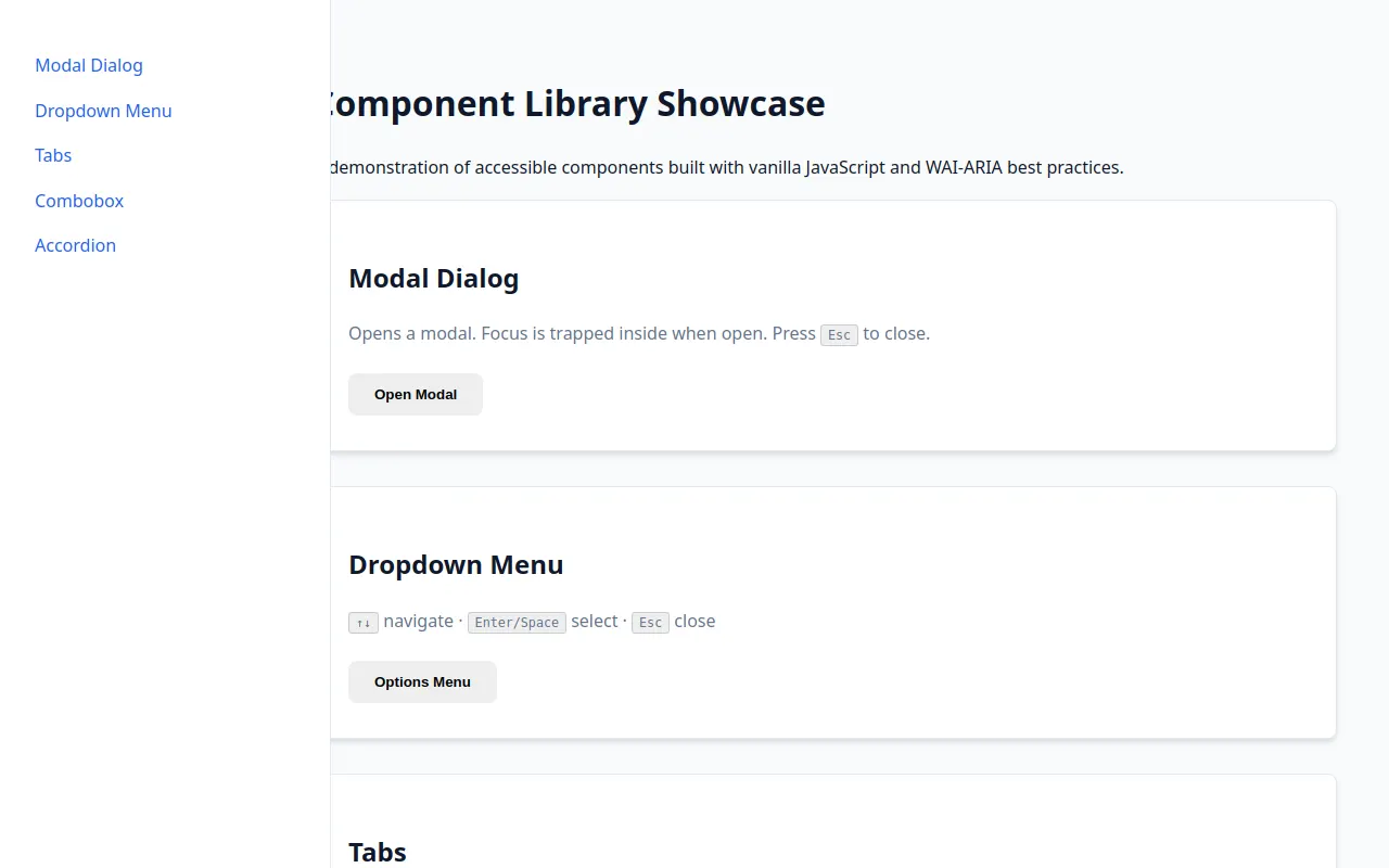
  <h1>Component Library Showcase</h1>
  <p>A demonstration of accessible components built with vanilla JavaScript and WAI-ARIA best practices.</p>

  <section id="modal-section" class="component-card">
    <h2>Modal Dialog</h2>
    <div class="description">
      <p>Opens a modal. Focus is trapped inside when open. Press <kbd>Esc</kbd> to close.</p>
    </div>
    <button id="modal-trigger" class="btn primary">Open Modal</button>

    <div id="modal-overlay" class="modal-overlay hidden">
      <div id="modal-dialog" role="dialog" aria-modal="true" aria-labelledby="modal-title" class="modal-content">
        <h3 id="modal-title">Modal Title</h3>
        <p>This is an accessible modal. Focus remains trapped here until closed.</p>
        <button id="modal-close" class="btn secondary">Close</button>
      </div>
    </div>
  </section>

  <section id="dropdown-section" class="component-card">
    <h2>Dropdown Menu</h2>
    <div class="description">
      <p><kbd>↑↓</kbd> navigate · <kbd>Enter/Space</kbd> select · <kbd>Esc</kbd> close</p>
    </div>
    <div class="dropdown">
      <button id="dropdown-trigger" aria-haspopup="menu" aria-expanded="false" class="btn primary">Options Menu</button>
      <ul id="dropdown-menu" role="menu" aria-hidden="true" class="dropdown-menu hidden">
        <li role="menuitem" tabindex="-1" class="menu-item">Profile</li>
        <li role="menuitem" tabindex="-1" class="menu-item">Settings</li>
        <li role="menuitem" tabindex="-1" class="menu-item">Logout</li>
      </ul>
    </div>
  </section>

  <section id="tabs-section" class="component-card">
    <h2>Tabs</h2>
    <div class="description">
      <p><kbd>←→</kbd> navigate tabs · <kbd>Tab</kbd> enters active panel content.</p>
    </div>
    <div class="tabs-container">
      <div role="tablist" aria-label="Content Tabs" class="tab-list">
        <button role="tab" aria-selected="true" aria-controls="panel-1" id="tab-1" tabindex="0" class="tab-btn active">Overview</button>
        <button role="tab" aria-selected="false" aria-controls="panel-2" id="tab-2" tabindex="-1" class="tab-btn">Features</button>
        <button role="tab" aria-selected="false" aria-controls="panel-3" id="tab-3" tabindex="-1" class="tab-btn">Pricing</button>
      </div>
      <div id="panel-1" role="tabpanel" aria-labelledby="tab-1" class="tab-panel">
        <h3>Overview</h3>
        <p>General overview of the component library features.</p>
      </div>
      <div id="panel-2" role="tabpanel" aria-labelledby="tab-2" class="tab-panel hidden">
        <h3>Features</h3>
        <p>A comprehensive list of accessible components.</p>
      </div>
      <div id="panel-3" role="tabpanel" aria-labelledby="tab-3" class="tab-panel hidden">
        <h3>Pricing</h3>
        <p>Plans for individuals and teams.</p>
      </div>
    </div>
  </section>

  <section id="combobox-section" class="component-card">
    <h2>Combobox (Autocomplete)</h2>
    <div class="description">
      <p><kbd>↑↓</kbd> highlight · <kbd>Enter</kbd> select · <kbd>Esc</kbd> clear</p>
    </div>
    <div class="combobox-wrapper">
      <label for="combobox-input" id="combobox-label">Select a fruit:</label>
      <input id="combobox-input" type="text" role="combobox" aria-autocomplete="list" aria-expanded="false" aria-haspopup="listbox" aria-controls="combobox-listbox" aria-labelledby="combobox-label combobox-input" class="combobox-input" autocomplete="off">
      <ul id="combobox-listbox" role="listbox" aria-labelledby="combobox-label" class="listbox hidden"></ul>
    </div>
  </section>

  <section id="accordion-section" class="component-card">
    <h2>Accordion / Disclosure</h2>
    <div class="description">
      <p><kbd>Enter/Space</kbd> toggle section.</p>
    </div>
    <div class="accordion">
      <div class="accordion-item">
        <button aria-expanded="false" aria-controls="acc-1" id="acc-btn-1" class="accordion-trigger">
          Item 1: Accessibility Guidelines
        </button>
        <div id="acc-1" role="region" aria-labelledby="acc-btn-1" class="accordion-content hidden">
          <p>Always use semantic HTML and ARIA roles where native behavior is insufficient.</p>
        </div>
      </div>
      <div class="accordion-item">
        <button aria-expanded="false" aria-controls="acc-2" id="acc-btn-2" class="accordion-trigger">
          Item 2: Keyboard Navigation
        </button>
        <div id="acc-2" role="region" aria-labelledby="acc-btn-2" class="accordion-content hidden">
          <p>Ensure all interactive elements have a visible focus indicator.</p>
        </div>
      </div>
    </div>
  </section>
</main>
</div>
<script>
(function () {
'use strict';
var __mods = {};
var __cache = {};
var __map = {};
function __require(id) {
  if (__cache[id]) return __cache[id].exports;
  var module = __cache[id] = { exports: {} };
  var factory = __mods[id];
  if (!factory) throw new Error("Module not found: " + id);
  factory(module.exports, function (spec) {
    var target = (__map[id] && __map[id][spec]) || spec;
    return __require(target);
  }, module);
  return module.exports;
}

// ── module: src/main.ts ──
__mods["src/main.ts"] = function (exports, require, module) {
"use strict";
/**
 * Accessible Component Library - Logic
 */
Object.defineProperty(exports, "__esModule", { value: true });
// --- Constants & Utils ---
const COLORS = {
    primary: '#2563eb',
};
/**
 * Focus trap utility for modal/menu behavior.
 * Cycles focus between a set of elements.
 */
function manageFocusTrap(triggerElement, containerSelector) {
    const container = document.querySelector(containerSelector);
    if (!container || !triggerElement)
        return;
    const focusables = Array.from(container.querySelectorAll('button, [href], input, select, textarea, [tabindex]:not([tabindex="-1"])'));
    if (focusables.length === 0)
        return;
    const handleTab = (e) => {
        const first = focusables[0];
        const last = focusables[focusables.length - 1];
        const active = document.activeElement;
        if (e.key === 'Tab') {
            if (active === last && !e.shiftKey) {
                e.preventDefault();
                first.focus();
            }
            else if (active === first && e.shiftKey) {
                e.preventDefault();
                last.focus();
            }
        }
    };
    container.addEventListener('keydown', handleTab);
    return () => container.removeEventListener('keydown', handleTab);
}
// --- Modal Component ---
function initModal() {
    const trigger = document.getElementById('modal-trigger');
    const overlay = document.getElementById('modal-overlay');
    const modal = document.getElementById('modal-dialog');
    const closeBtn = document.getElementById('modal-close');
    if (!trigger || !overlay || !modal || !closeBtn)
        return;
    const openModal = () => {
        overlay.classList.remove('hidden');
        modal.setAttribute('aria-hidden', 'false'); // If you were using aria-hidden, but we use display none
        // Set inert on body content (excluding modal itself)
        document.body.setAttribute('aria-hidden', 'true');
        // Note: a better way is to put the main content in a wrapper and toggle aria-hidden on it.
        // Since I didn't wrap #main-content, we can use a simplified focus trap.
        trigger.setAttribute('aria-expanded', 'true');
        // Focus first element inside modal
        setTimeout(() => {
            const firstFocusable = modal.querySelector('button, [href], input');
            firstFocusable?.focus();
        }, 10);
        // Setup trap (manual implementation for specific behavior)
        const handleKeyDown = (e) => {
            if (e.key === 'Escape')
                closeModal();
            const focusables = Array.from(modal.querySelectorAll('button, [href], input'));
            if (focusables.length > 0) {
                const active = document.activeElement;
                if (e.key === 'Tab') {
                    const first = focusables[0];
                    const last = focusables[focusables.length - 1];
                    if (active === last && !e.shiftKey) {
                        e.preventDefault();
                        first.focus();
                    }
                    else if (active === first && e.shiftKey) {
                        e.preventDefault();
                        last.focus();
                    }
                }
            }
        };
        window.addEventListener('keydown', handleKeyDown);
    };
    const closeModal = () => {
        overlay.classList.add('hidden');
        trigger.setAttribute('aria-expanded', 'false');
        document.body.removeAttribute('aria-hidden');
        // Remove listeners and return focus
        window.removeEventListener('keydown', (e) => { }); // Need a named ref for this
        trigger.focus();
    };
    // Correction on listener logic
    let currentKeyDownHandler;
    const handleKeyDownRef = (e) => {
        if (e.key === 'Escape')
            closeModal();
        const focusables = Array.from(modal.querySelectorAll('button, [href], input'));
        if (focusables.length > 0) {
            const active = document.activeElement;
            if (e.key === 'Tab') {
                const first = focusables[0];
                const last = focusables[focusables.length - 1];
                if (active === last && !e.shiftKey) {
                    e.preventDefault();
                    first.focus();
                }
                else if (active === first && e.shiftKey) {
                    e.preventDefault();
                    last.focus();
                }
            }
        }
    };
    trigger.addEventListener('click', openModal);
    closeBtn.addEventListener('click', closeModal);
    overlay.addEventListener('click', (e) => {
        if (e.target === overlay)
            closeModal();
    });
    // Re-bind correctly
    const cleanClose = () => {
        window.removeEventListener('keydown', handleKeyDownRef);
    };
    trigger.addEventListener('click', () => {
        overlay.classList.remove('hidden');
        document.body.setAttribute('aria-hidden', 'true');
        trigger.setAttribute('aria-expanded', 'true');
        window.addEventListener('keydown', (e) => handleKeyDownRef(e));
        setTimeout(() => modal.querySelector('button')?.focus(), 10);
    });
    const finalClose = () => {
        overlay.classList.add('hidden');
        document.body.removeAttribute('aria-hidden');
        trigger.setAttribute('aria-expanded', 'false');
        window.removeEventListener('keydown', handleKeyDownRef);
        trigger.focus();
    };
    closeBtn.addEventListener('click', finalClose);
    overlay.addEventListener('click', (e) => {
        if (e.target === overlay)
            finalClose();
    });
}
// --- Dropdown Component ---
function initDropdown() {
    const trigger = document.getElementById('dropdown-trigger');
    const menu = document.getElementById('dropdown-menu');
    if (!trigger || !menu)
        return;
    const items = Array.from(menu.querySelectorAll('[role="menuitem"]'));
    let currentIndex = -1;
    const toggleMenu = (show) => {
        menu.classList.toggle('hidden', !show);
        menu.setAttribute('aria-hidden', show ? 'false' : 'true');
        trigger.setAttribute('aria-expanded', show.toString());
        if (!show && currentIndex !== -1) {
            items[currentIndex].focus();
        }
    };
    const selectItem = (index) => {
        if (index < 0 || index >= items.length)
            return;
        alert(`Selected: ${items[index].textContent}`);
        toggleMenu(false);
        trigger.focus();
    };
    trigger.addEventListener('click', () => {
        toggleMenu(true);
        currentIndex = -1;
    });
    menu.addEventListener('keydown', (e) => {
        switch (e.key) {
            case 'ArrowDown':
                e.preventDefault();
                currentIndex = (currentIndex + 1) % items.length;
                items[currentIndex].focus();
                break;
            case 'ArrowUp':
                e.preventDefault();
                currentIndex = (currentIndex - 1 + items.length) % items.length;
                items[currentIndex].focus();
                break;
            case 'Home':
                e.preventDefault();
                currentIndex = 0;
                items[0].focus();
                break;
            case 'End':
                e.preventDefault();
                currentIndex = items.length - 1;
                items[items.length - 1].focus();
                break;
            case 'Escape':
                toggleMenu(false);
                trigger.focus();
                break;
            case 'Enter':
            case ' ':
                if (currentIndex !== -1) {
                    e.preventDefault();
                    selectItem(currentIndex);
                }
                break;
            case 'Tab':
                if (!e.shiftKey && currentIndex === items.length - 1) {
                    // Allow tab to move out naturally if we want, but WAI-ARIA often suggests closing
                    toggleMenu(false);
                }
                break;
        }
    });
    items.forEach((item, index) => {
        item.addEventListener('click', () => selectItem(index));
        item.addEventListener('keydown', (e) => {
            if (e.key === 'Enter' || e.key === ' ') {
                e.preventDefault();
                selectItem(index);
            }
        });
    });
    // Close on click outside
    document.addEventListener('click', (e) => {
        if (!trigger.contains(e.target) && !menu.contains(e.target)) {
            toggleMenu(false);
        }
    });
}
// --- Tabs Component ---
function initTabs() {
    const tabList = document.querySelector('.tab-list');
    if (!tabList)
        return;
    const tabs = Array.from(tabList.querySelectorAll('[role="tab"]'));
    const panels = Array.from(document.querySelectorAll('[role="tabpanel"]'));
    tabs.forEach((tab, index) => {
        tab.addEventListener('click', () => {
            const targetId = tab.getAttribute('aria-controls');
            if (targetId) {
                tabs.forEach((t, i) => {
                    const isActive = i === index;
                    t.setAttribute('aria-selected', isActive.toString());
                    t.setAttribute('tabindex', isActive ? '0' : '-1');
                    t.classList.toggle('active', isActive);
                    const panel = document.getElementById(t.getAttribute('aria-controls') || '');
                    if (panel) {
                        panel.classList.toggle('hidden', !isActive);
                        panel.setAttribute('hidden', !isActive.toString());
                    }
                });
            }
        });
        tab.addEventListener('keydown', (e) => {
            let newIndex = -1;
            if (e.key === 'ArrowRight') {
                newIndex = (index + 1) % tabs.length;
            }
            else if (e.key === 'ArrowLeft') {
                newIndex = (index - 1 + tabs.length) % tabs.length;
            }
            if (newIndex !== -1) {
                tabs[newIndex].focus();
                tabs[newIndex].click();
            }
        });
    });
}
// --- Combobox Component ---
function initCombobox() {
    const input = document.getElementById('combobox-input');
    const listbox = document.getElementById('combobox-listbox');
    if (!input || !listbox)
        return;
    const options = ['Apple', 'Banana', 'Cherry', 'Date', 'Elderberry', 'Fig', 'Grape', 'Honeydew', 'Iceberg', 'Jackfruit', 'Kiwi', 'Lemon', 'Mango', 'Nectarine', 'Orange', 'Papaya', 'Quince', 'Raspberry', 'Strawberry', 'Tomato'];
    let highlightedIndex = -1;
    const updateList = () => {
        const filter = input.value.toLowerCase();
        const filtered = options.filter(opt => opt.toLowerCase().includes(filter));
        listbox.innerHTML = '';
        filtered.forEach((opt, i) => {
            const li = document.createElement('li');
            li.role = 'option';
            li.id = `opt-${i}`;
            li.textContent = opt;
            li.setAttribute('tabindex', '-1'); // Not focusable directly
            listbox.appendChild(li);
        });
        listbox.classList.toggle('hidden', filtered.length === 0 || filter === '');
        input.setAttribute('aria-expanded', !listbox.classList.contains('hidden') ? 'true' : 'false');
    };
    input.addEventListener('input', () => {
        highlightedIndex = -1;
        updateList();
    });
    input.addEventListener('keydown', (e) => {
        const filteredItems = listbox.querySelectorAll('li');
        switch (e.key) {
            case 'ArrowDown':
                e.preventDefault();
                if (!listbox.classList.contains('hidden')) {
                    highlightedIndex = Math.min(highlightedIndex + 1, filteredItems.length - 1);
                    if (filteredItems[highlightedIndex]) {
                        filteredItems[highlightedIndex].scrollIntoView({ block: 'nearest' });
                        input.setAttribute('aria-activedescendant', filteredItems[highlightedIndex].id);
                    }
                }
                break;
            case 'ArrowUp':
                e.preventDefault();
                if (!listbox.classList.contains('hidden')) {
                    highlightedIndex = Math.max(highlightedIndex - 1, 0);
                    if (filteredItems[highlightedIndex]) {
                        filteredItems[highlightedIndex].scrollIntoView({ block: 'nearest' });
                        input.setAttribute('aria-activedescendant', filteredItems[highlightedIndex].id);
                    }
                }
                break;
            case 'Enter':
                if (highlightedIndex !== -1 && filteredItems[highlightedIndex]) {
                    e.preventDefault();
                    input.value = filteredItems[highlightedIndex].textContent || '';
                    listbox.classList.add('hidden');
                    input.setAttribute('aria-expanded', 'false');
                    updateList();
                }
                break;
            case 'Escape':
                listbox.classList.add('hidden');
                input.setAttribute('aria-expanded', 'false');
                input.removeAttribute('aria-activedescendant');
                break;
        }
    });
    // Close on blur (with small delay to allow Enter selection)
    input.addEventListener('blur', () => {
        setTimeout(() => {
            listbox.classList.add('hidden');
            input.setAttribute('aria-expanded', 'false');
            input.removeAttribute('aria-activedescendant');
        }, 200);
    });
    updateList();
}
// --- Accordion Component ---
function initAccordion() {
    const buttons = document.querySelectorAll('.accordion-trigger');
    buttons.forEach(btn => {
        btn.addEventListener('click', () => {
            const expanded = btn.getAttribute('aria-expanded') === 'true';
            const contentId = btn.getAttribute('aria-controls');
            const content = document.getElementById(contentId);
            if (content) {
                btn.setAttribute('aria-expanded', (!expanded).toString());
                content.classList.toggle('hidden', expanded);
                content.classList.toggle('open', !expanded);
            }
        });
    });
}
// Entry point
document.addEventListener('DOMContentLoaded', () => {
    initModal();
    initDropdown();
    initTabs();
    initCombobox();
    initAccordion();
});
};

// ── entry ──
__require("src/main.ts");
})();
</script>
</body>
</html>