Accessible Components
Qwen 3.8 · full
Reviews & generation details
Reviews
No human review yet. Unreviewed does not mean unsuccessful.
Generation context
Imported historical artifact. Its exact original instructions and lineage are not known.
Generation prompt · exact text unavailable
See the current prompt for reference. It may differ from the instructions used to generate this artifact.
Inspect original source 49,382 bytes · SHA-256 af7674196b35
<!DOCTYPE html>
<html lang="en">
<head>
<meta charset="UTF-8">
<meta name="viewport" content="width=device-width, initial-scale=1">
<title>AriaKit — Accessible Component Showcase</title>
<style>
/* ═══════════════════════════════════════════════════════════
Tunable constants (CSS side)
Keep durations in sync with CONFIG.durations in the script.
═══════════════════════════════════════════════════════════ */
:root {
/* palette — restrained two-accent system (indigo + teal) */
--bg: #f6f6f2;
--surface: #ffffff;
--ink: #17191e;
--ink-2: #3f4551;
--muted: #68707e;
--border: #e5e6e0;
--border-2: #d3d5cd;
--accent: #2f4fd0;
--accent-ink: #2440ab;
--accent-soft: #edf0fc;
--accent-2: #0d7a63;
--accent-2-soft: #e5f3ef;
--danger: #b23a2e;
--danger-soft: #fbecea;
--code-bg: #15171c;
--code-ink: #d8dbe3;
--focus-ring: #2f4fd0;
/* spacing scale */
--sp-1: 4px;
--sp-2: 8px;
--sp-3: 12px;
--sp-4: 16px;
--sp-5: 24px;
--sp-6: 32px;
--sp-7: 48px;
--sp-8: 72px;
/* type */
--font-ui: -apple-system, BlinkMacSystemFont, "Segoe UI", "Inter", "Helvetica Neue", Arial, sans-serif;
--font-mono: ui-monospace, "SF Mono", "Cascadia Code", Menlo, Consolas, monospace;
/* motion */
--dur-fast: 140ms;
--dur-med: 220ms;
--dur-slow: 340ms;
/* geometry */
--radius: 10px;
--radius-sm: 7px;
--sidebar-w: 248px;
--shadow-pop: 0 16px 40px rgba(23, 25, 30, 0.16), 0 2px 8px rgba(23, 25, 30, 0.08);
}
/* ═══════════════ Base ═══════════════ */
*, *::before, *::after { box-sizing: border-box; }
html { -webkit-text-size-adjust: 100%; scroll-behavior: smooth; }
body {
margin: 0;
background: var(--bg);
color: var(--ink);
font: 400 16px/1.6 var(--font-ui);
-webkit-font-smoothing: antialiased;
}
::selection { background: var(--accent-soft); }
/* High-contrast focus indicator on every interactive element. */
:focus-visible {
outline: 2px solid var(--focus-ring);
outline-offset: 2px;
}
code {
font: 500 0.86em/1.4 var(--font-mono);
background: var(--accent-soft);
color: var(--accent-ink);
padding: 1px 5px;
border-radius: 4px;
}
.link {
color: var(--accent-ink);
font-weight: 500;
text-decoration: underline;
text-underline-offset: 2px;
}
.link:hover { color: var(--accent); }
pre code { background: none; color: inherit; padding: 0; }
kbd {
display: inline-block;
font: 500 11.5px/1 var(--font-mono);
color: var(--ink);
background: var(--surface);
border: 1px solid var(--border-2);
border-bottom-width: 2px;
border-radius: 4px;
padding: 2px 6px;
white-space: nowrap;
}
.sr-only {
position: absolute;
width: 1px; height: 1px;
padding: 0; margin: -1px;
overflow: hidden;
clip: rect(0 0 0 0);
white-space: nowrap;
border: 0;
}
/* ═══════════════ Skip link ═══════════════ */
.skip-link {
position: absolute;
left: var(--sp-4);
top: -72px;
z-index: 200;
background: var(--ink);
color: #fff;
font-weight: 600;
font-size: 14px;
text-decoration: none;
padding: 10px 18px;
border-radius: 8px;
transition: top var(--dur-fast) ease;
}
.skip-link:focus {
top: var(--sp-4);
outline-offset: 4px;
}
/* ═══════════════ Layout ═══════════════ */
.page {
display: grid;
grid-template-columns: var(--sidebar-w) minmax(0, 1fr);
min-height: 100vh;
}
.sidebar {
position: sticky;
top: 0;
height: 100vh;
overflow: auto;
background: var(--surface);
border-right: 1px solid var(--border);
padding: var(--sp-5);
display: flex;
flex-direction: column;
gap: var(--sp-6);
}
main {
width: 100%;
max-width: 1080px;
margin: 0 auto;
padding: var(--sp-7) clamp(24px, 5vw, 72px) var(--sp-8);
}
main:focus { outline: none; } /* skip-link target; section headings carry the context */
/* ═══════════════ Sidebar ═══════════════ */
.brand { display: flex; align-items: center; gap: 10px; }
.brand-mark {
width: 20px; height: 20px;
border-radius: 6px;
background: var(--accent);
position: relative;
flex: none;
}
.brand-mark::after {
content: "";
position: absolute;
right: 4px; bottom: 4px;
width: 6px; height: 6px;
border-radius: 50%;
background: var(--accent-2);
}
.brand-name { font-weight: 700; font-size: 16px; letter-spacing: -0.01em; }
.brand-chip {
margin-left: auto;
font: 500 11px/1 var(--font-mono);
color: var(--muted);
background: var(--bg);
border: 1px solid var(--border);
border-radius: 999px;
padding: 4px 8px;
}
.side-nav { display: flex; flex-direction: column; gap: 2px; }
.side-nav a {
display: flex;
align-items: baseline;
gap: 10px;
padding: 8px 10px;
border-radius: 8px;
color: var(--ink-2);
text-decoration: none;
font-size: 14px;
font-weight: 500;
transition: background var(--dur-fast) ease, color var(--dur-fast) ease;
}
.side-nav a .idx {
font: 500 11px/1 var(--font-mono);
color: var(--muted);
transition: color var(--dur-fast) ease;
}
.side-nav a:hover { background: var(--bg); color: var(--ink); }
.side-nav a.active { background: var(--accent-soft); color: var(--accent-ink); }
.side-nav a.active .idx { color: var(--accent-ink); }
.side-note {
margin: auto 0 0;
font-size: 12px;
line-height: 1.5;
color: var(--muted);
}
/* ═══════════════ Page head & sections ═══════════════ */
.page-head { margin-bottom: var(--sp-5); }
.eyebrow {
margin: 0;
font: 600 11px/1 var(--font-mono);
letter-spacing: 0.14em;
text-transform: uppercase;
color: var(--accent-ink);
}
h1 {
margin: 10px 0 12px;
font-size: 34px;
line-height: 1.15;
font-weight: 650;
letter-spacing: -0.02em;
}
.lede { margin: 0; color: var(--muted); font-size: 15px; max-width: 62ch; }
.component { margin-top: var(--sp-8); }
.component-head {
display: flex;
align-items: flex-end;
justify-content: space-between;
gap: var(--sp-4);
border-bottom: 1px solid var(--border-2);
padding-bottom: var(--sp-4);
}
.component h2 {
margin: 6px 0 0;
font-size: 24px;
font-weight: 650;
letter-spacing: -0.01em;
}
.component .lede { margin-top: var(--sp-4); }
.pattern-tag {
font: 500 11px/1 var(--font-mono);
color: var(--muted);
background: var(--surface);
border: 1px solid var(--border);
border-radius: 999px;
padding: 6px 10px;
white-space: nowrap;
}
/* demo card + caption */
.demo {
background: var(--surface);
border: 1px solid var(--border);
border-radius: var(--radius);
padding: var(--sp-5);
margin-top: var(--sp-5);
box-shadow: 0 1px 2px rgba(23, 25, 30, 0.04);
}
.caption {
margin: var(--sp-3) 0 0;
font-size: 13px;
color: var(--muted);
display: flex;
flex-wrap: wrap;
gap: 4px 14px;
align-items: center;
}
.status {
margin: 14px 0 0;
min-height: 1.5em;
font-size: 13.5px;
font-weight: 500;
color: var(--accent-2);
}
/* ═══════════════ Buttons ═══════════════ */
.btn {
display: inline-flex;
align-items: center;
gap: 8px;
font: 500 14px/1 var(--font-ui);
padding: 9px 16px;
border-radius: 8px;
border: 1px solid var(--border-2);
background: var(--surface);
color: var(--ink);
cursor: pointer;
transition: background var(--dur-fast) ease, border-color var(--dur-fast) ease, transform var(--dur-fast) ease;
}
.btn:hover { background: var(--bg); }
.btn:active { transform: translateY(1px); }
.btn-primary { background: var(--accent); border-color: var(--accent); color: #fff; }
.btn-primary:hover { background: var(--accent-ink); border-color: var(--accent-ink); }
.chev { flex: none; color: var(--muted); }
.btn .chev { transition: transform var(--dur-med) ease; }
/* ═══════════════ 02 · Dropdown menu ═══════════════ */
.menu-wrap { position: relative; display: inline-block; }
.menu {
position: absolute;
z-index: 60;
top: calc(100% + 6px);
left: 0;
min-width: 236px;
background: var(--surface);
border: 1px solid var(--border);
border-radius: var(--radius);
box-shadow: var(--shadow-pop);
padding: 6px;
display: flex;
flex-direction: column;
gap: 2px;
}
.menu[hidden] { display: none; }
.menu-item {
display: flex;
align-items: center;
gap: 10px;
width: 100%;
text-align: left;
padding: 9px 10px;
border: 0;
background: none;
border-radius: var(--radius-sm);
font: 500 14px/1.2 var(--font-ui);
color: var(--ink);
cursor: pointer;
transition: background var(--dur-fast) ease;
}
.menu-item svg { flex: none; color: var(--muted); }
.menu-item:hover,
.menu-item:focus {
background: var(--accent-soft);
color: var(--accent-ink);
}
.menu-item:hover svg,
.menu-item:focus svg { color: var(--accent-ink); }
.menu-item.danger { color: var(--danger); }
.menu-item.danger svg { color: var(--danger); }
.menu-item.danger:hover,
.menu-item.danger:focus { background: var(--danger-soft); color: var(--danger); }
.menu-sep { height: 1px; background: var(--border); margin: 4px 6px; }
/* ═══════════════ 03 · Tabs ═══════════════ */
.tablist {
display: flex;
gap: 4px;
border-bottom: 1px solid var(--border-2);
}
.tab {
border: 0;
background: none;
padding: 10px 14px;
margin-bottom: -1px;
font: 500 14px/1.2 var(--font-ui);
color: var(--muted);
cursor: pointer;
border-bottom: 2px solid transparent;
transition: color var(--dur-fast) ease, border-color var(--dur-fast) ease;
}
.tab:hover { color: var(--ink); }
.tab[aria-selected="true"] {
color: var(--accent-ink);
font-weight: 600;
border-bottom-color: var(--accent);
}
.tabpanel { padding-top: var(--sp-4); }
.tabpanel p { margin: 0 0 var(--sp-3); max-width: 70ch; font-size: 14.5px; color: var(--ink-2); }
.chips { display: flex; gap: 8px; flex-wrap: wrap; margin-top: 4px; }
.chip {
font: 500 12px/1 var(--font-mono);
padding: 5px 9px;
border-radius: 999px;
background: var(--accent-2-soft);
color: var(--accent-2);
border: 1px solid rgba(13, 122, 99, 0.25);
}
pre {
background: var(--code-bg);
color: var(--code-ink);
padding: 14px 16px;
border-radius: 8px;
overflow: auto;
font: 400 12.5px/1.65 var(--font-mono);
margin: 0;
}
.attr-list { margin: 0; padding-left: 20px; font-size: 14.5px; color: var(--ink-2); }
.attr-list li { margin-bottom: 8px; }
/* ═══════════════ 04 · Combobox ═══════════════ */
.cb-wrap { position: relative; max-width: 400px; }
.cb-label {
display: block;
font-size: 13px;
font-weight: 600;
color: var(--ink-2);
margin-bottom: 6px;
}
.cb-input {
width: 100%;
font: 400 15px/1.4 var(--font-ui);
padding: 10px 12px;
border: 1px solid var(--border-2);
border-radius: 8px;
background: var(--surface);
color: var(--ink);
transition: border-color var(--dur-fast) ease;
}
.cb-input::placeholder { color: var(--muted); }
.cb-input:focus { border-color: var(--accent); }
.cb-listbox {
position: absolute;
z-index: 60;
top: calc(100% + 6px);
left: 0; right: 0;
margin: 0;
padding: 6px;
list-style: none;
background: var(--surface);
border: 1px solid var(--border);
border-radius: var(--radius);
box-shadow: var(--shadow-pop);
max-height: 252px;
overflow: auto;
}
.cb-listbox[hidden] { display: none; }
.cb-option {
padding: 8px 10px;
border-radius: var(--radius-sm);
font-size: 14px;
cursor: pointer;
}
.cb-option.active { background: var(--accent-soft); color: var(--accent-ink); font-weight: 500; }
.cb-empty { padding: 8px 10px; color: var(--muted); font-size: 14px; font-style: italic; }
/* ═══════════════ 05 · Accordion ═══════════════ */
.acc {
border: 1px solid var(--border);
border-radius: var(--radius);
background: var(--surface);
overflow: hidden;
}
.acc-item + .acc-item { border-top: 1px solid var(--border); }
.acc-h { margin: 0; font-size: 15px; }
.acc-btn {
width: 100%;
display: flex;
justify-content: space-between;
align-items: center;
gap: var(--sp-4);
padding: 14px 18px;
border: 0;
background: none;
font: 600 15px/1.3 var(--font-ui);
color: var(--ink);
cursor: pointer;
text-align: left;
transition: background var(--dur-fast) ease;
}
.acc-btn:hover { background: var(--bg); }
.acc-btn .chev { transition: transform var(--dur-med) ease; }
.acc-btn[aria-expanded="true"] .chev { transform: rotate(180deg); }
.acc-region { overflow: hidden; }
.acc-inner { padding: 2px 18px 16px; }
.acc-inner p { margin: 0; font-size: 14.5px; color: var(--ink-2); max-width: 70ch; }
/* ═══════════════ 01 · Modal dialog ═══════════════ */
#modal-root {
position: fixed;
inset: 0;
z-index: 100;
display: grid;
place-items: center;
padding: var(--sp-5);
}
#modal-root[hidden] { display: none; }
.modal-backdrop {
position: absolute;
inset: 0;
background: rgba(23, 25, 30, 0.44);
}
.modal {
position: relative;
width: min(448px, 100%);
background: var(--surface);
border-radius: 14px;
box-shadow: var(--shadow-pop);
padding: var(--sp-6);
}
.modal h2 { margin: 0; font-size: 19px; font-weight: 650; letter-spacing: -0.01em; }
.modal .desc { margin: 8px 0 0; color: var(--muted); font-size: 14.5px; }
.modal .field {
margin-top: 16px;
display: flex;
align-items: center;
gap: 10px;
font-size: 14px;
color: var(--ink-2);
cursor: pointer;
}
.modal .field input { width: 16px; height: 16px; accent-color: var(--accent); }
.modal .actions { margin-top: 22px; display: flex; justify-content: flex-end; gap: 10px; }
/* ═══════════════ Footer ═══════════════ */
.page-foot {
margin-top: var(--sp-8);
border-top: 1px solid var(--border-2);
padding-top: var(--sp-5);
font-size: 13px;
color: var(--muted);
}
.page-foot a { color: var(--accent-ink); }
/* ═══════════════ Motion ═══════════════ */
@media (prefers-reduced-motion: no-preference) {
.modal { animation: pop-in var(--dur-med) cubic-bezier(0.2, 0.9, 0.3, 1.15); }
.modal-backdrop { animation: fade-in var(--dur-med) ease; }
}
@keyframes pop-in {
from { opacity: 0; transform: translateY(8px) scale(0.97); }
}
@keyframes fade-in {
from { opacity: 0; }
}
@media (prefers-reduced-motion: reduce) {
html { scroll-behavior: auto; }
*, *::before, *::after {
animation-duration: 0.01ms !important;
animation-iteration-count: 1 !important;
transition-duration: 0.01ms !important;
}
}
/* ═══════════════ Responsive ═══════════════ */
@media (max-width: 860px) {
.page { grid-template-columns: 1fr; }
.sidebar {
position: static;
height: auto;
flex-direction: row;
align-items: center;
flex-wrap: wrap;
border-right: 0;
border-bottom: 1px solid var(--border);
gap: var(--sp-4);
}
.side-nav { flex-direction: row; flex-wrap: wrap; }
.side-note { display: none; }
.component-head { flex-direction: column; align-items: flex-start; }
h1 { font-size: 28px; }
}
</style>
</head>
<body>
<a class="skip-link" href="#main-content">Skip to main content</a>
<div class="page">
<aside class="sidebar">
<div class="brand">
<span class="brand-mark" aria-hidden="true"></span>
<span class="brand-name">AriaKit</span>
<span class="brand-chip">v2.4</span>
</div>
<nav class="side-nav" aria-label="Components">
<a href="#modal"><span class="idx" aria-hidden="true">01</span> Modal Dialog</a>
<a href="#menu"><span class="idx" aria-hidden="true">02</span> Dropdown Menu</a>
<a href="#tabs"><span class="idx" aria-hidden="true">03</span> Tabs</a>
<a href="#combobox"><span class="idx" aria-hidden="true">04</span> Combobox</a>
<a href="#accordion"><span class="idx" aria-hidden="true">05</span> Accordion</a>
</nav>
<p class="side-note">WAI-ARIA APG patterns · vanilla JS · zero dependencies</p>
</aside>
<main id="main-content" tabindex="-1">
<header class="page-head">
<p class="eyebrow">Component library · Accessibility showcase</p>
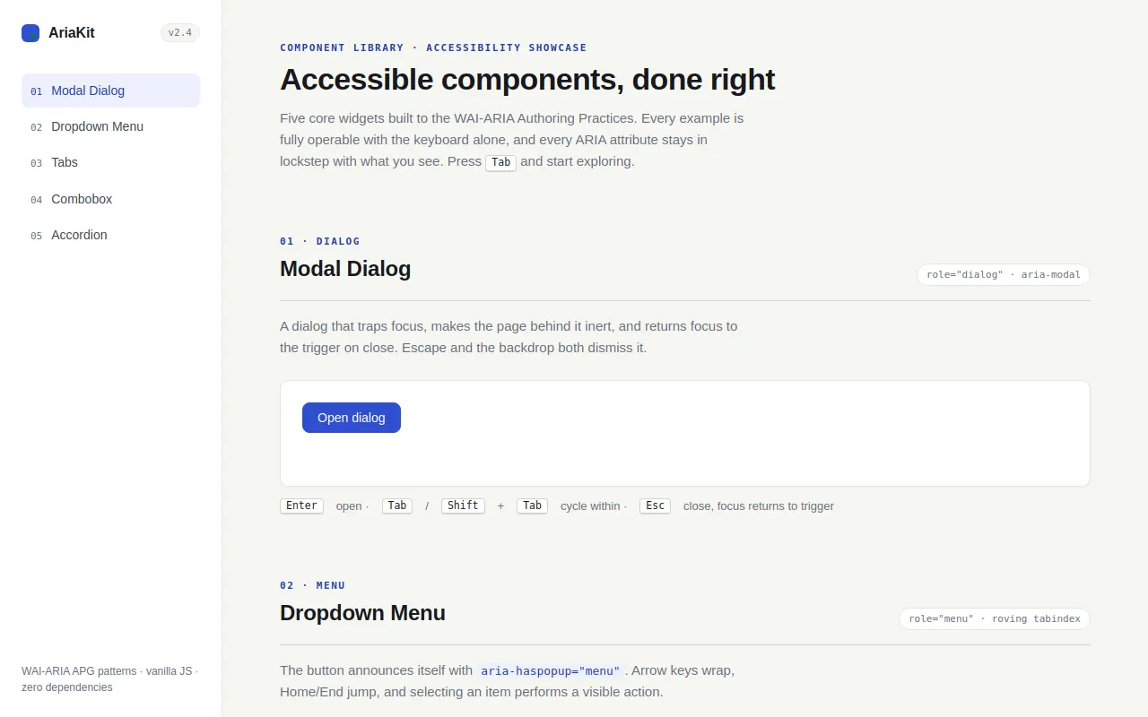
<h1>Accessible components, done right</h1>
<p class="lede">Five core widgets built to the WAI-ARIA Authoring Practices. Every example is fully operable with the keyboard alone, and every ARIA attribute stays in lockstep with what you see. Press <kbd>Tab</kbd> and start exploring.</p>
</header>
<!-- ════════ 01 · Modal dialog ════════ -->
<section id="modal" class="component" aria-labelledby="modal-h">
<header class="component-head">
<div>
<p class="eyebrow">01 · Dialog</p>
<h2 id="modal-h">Modal Dialog</h2>
</div>
<code class="pattern-tag">role="dialog" · aria-modal</code>
</header>
<p class="lede">A dialog that traps focus, makes the page behind it inert, and returns focus to the trigger on close. Escape and the backdrop both dismiss it.</p>
<div class="demo">
<button type="button" class="btn btn-primary" id="modal-trigger">Open dialog</button>
<p class="status" id="modal-status" role="status"></p>
</div>
<p class="caption"><kbd>Enter</kbd> open · <kbd>Tab</kbd>/<kbd>Shift</kbd>+<kbd>Tab</kbd> cycle within · <kbd>Esc</kbd> close, focus returns to trigger</p>
</section>
<!-- ════════ 02 · Dropdown menu ════════ -->
<section id="menu" class="component" aria-labelledby="menu-h">
<header class="component-head">
<div>
<p class="eyebrow">02 · Menu</p>
<h2 id="menu-h">Dropdown Menu</h2>
</div>
<code class="pattern-tag">role="menu" · roving tabindex</code>
</header>
<p class="lede">The button announces itself with <code>aria-haspopup="menu"</code>. Arrow keys wrap, Home/End jump, and selecting an item performs a visible action.</p>
<div class="demo">
<div class="menu-wrap">
<button type="button" class="btn" id="menu-btn" aria-haspopup="menu" aria-expanded="false" aria-controls="menu-list">
Actions
<svg class="chev" width="16" height="16" viewBox="0 0 16 16" fill="none" stroke="currentColor" stroke-width="1.6" stroke-linecap="round" stroke-linejoin="round" aria-hidden="true"><path d="M4 6.5l4 4 4-4"/></svg>
</button>
<div class="menu" id="menu-list" role="menu" aria-label="Actions" aria-orientation="vertical" hidden>
<button type="button" class="menu-item" role="menuitem" tabindex="-1">
<svg width="16" height="16" viewBox="0 0 16 16" fill="none" stroke="currentColor" stroke-width="1.4" stroke-linecap="round" aria-hidden="true"><rect x="2.75" y="2.75" width="10.5" height="10.5" rx="2"/><path d="M8 5.5v5M5.5 8h5"/></svg>
New file
</button>
<button type="button" class="menu-item" role="menuitem" tabindex="-1">
<svg width="16" height="16" viewBox="0 0 16 16" fill="none" stroke="currentColor" stroke-width="1.4" stroke-linecap="round" aria-hidden="true"><circle cx="12.25" cy="3.75" r="1.9"/><circle cx="3.75" cy="8" r="1.9"/><circle cx="12.25" cy="12.25" r="1.9"/><path d="M5.4 7.2l5.2-2.7M5.4 8.8l5.2 2.7"/></svg>
Share…
</button>
<button type="button" class="menu-item" role="menuitem" tabindex="-1">
<svg width="16" height="16" viewBox="0 0 16 16" fill="none" stroke="currentColor" stroke-width="1.4" stroke-linecap="round" stroke-linejoin="round" aria-hidden="true"><path d="M11.3 2.8l1.9 1.9L5.4 12.5l-2.6.9.9-2.6 7.6-8z"/></svg>
Rename
</button>
<div class="menu-sep" aria-hidden="true"></div>
<button type="button" class="menu-item danger" role="menuitem" tabindex="-1">
<svg width="16" height="16" viewBox="0 0 16 16" fill="none" stroke="currentColor" stroke-width="1.4" stroke-linecap="round" aria-hidden="true"><path d="M3 4.5h10M6.5 4.5V3h3v1.5M4.75 4.5l.6 8.5h5.3l.6-8.5"/></svg>
Delete
</button>
</div>
</div>
<p class="status" id="menu-status" role="status"></p>
</div>
<p class="caption"><kbd>↓</kbd> open · <kbd>↑</kbd>/<kbd>↓</kbd> navigate, wraps · <kbd>Home</kbd>/<kbd>End</kbd> jump · <kbd>Enter</kbd> select · <kbd>Esc</kbd> close, focus returns</p>
</section>
<!-- ════════ 03 · Tabs ════════ -->
<section id="tabs" class="component" aria-labelledby="tabs-h">
<header class="component-head">
<div>
<p class="eyebrow">03 · Tabs</p>
<h2 id="tabs-h">Tabs</h2>
</div>
<code class="pattern-tag">role="tablist"</code>
</header>
<p class="lede">Exactly one tab in the tab order at a time. Arrow keys move and activate; hidden panels carry the <code>hidden</code> attribute so they never enter the accessibility tree.</p>
<div class="demo">
<div class="tablist" role="tablist" id="tablist" aria-label="Component documentation">
<button type="button" class="tab" role="tab" id="tab-1" aria-selected="true" aria-controls="tabpanel-1" tabindex="0">Overview</button>
<button type="button" class="tab" role="tab" id="tab-2" aria-selected="false" aria-controls="tabpanel-2" tabindex="-1">Usage</button>
<button type="button" class="tab" role="tab" id="tab-3" aria-selected="false" aria-controls="tabpanel-3" tabindex="-1">Accessibility</button>
</div>
<div class="tabpanel" role="tabpanel" id="tabpanel-1" aria-labelledby="tab-1" tabindex="0">
<p>AriaKit ships five core widgets, each a single self-contained pattern from the WAI-ARIA Authoring Practices. No state is visual-only — every open, selected, or expanded condition is mirrored in ARIA attributes, and every widget is reachable with the keyboard alone.</p>
<div class="chips" aria-hidden="true">
<span class="chip">role=tablist</span>
<span class="chip">roving tabindex</span>
<span class="chip">hidden panels</span>
</div>
</div>
<div class="tabpanel" role="tabpanel" id="tabpanel-2" aria-labelledby="tab-2" tabindex="0" hidden>
<pre><code><div role="tablist" aria-label="Docs">
<button role="tab" id="tab-1" aria-selected="true"
aria-controls="panel-1" tabindex="0">Overview</button>
<button role="tab" id="tab-2" aria-selected="false"
aria-controls="panel-2" tabindex="-1">Usage</button>
</div>
<div role="tabpanel" id="panel-1"
aria-labelledby="tab-1" tabindex="0">…</div></code></pre>
</div>
<div class="tabpanel" role="tabpanel" id="tabpanel-3" aria-labelledby="tab-3" tabindex="0" hidden>
<ul class="attr-list">
<li><code>role="tablist"</code> groups the tabs and announces the set.</li>
<li><code>aria-selected</code> + <code>tabindex</code> keep exactly one tab in the tab order.</li>
<li><code>aria-controls</code> ↔ <code>aria-labelledby</code> link each tab to its panel.</li>
<li><code>hidden</code> removes closed panels from the accessibility tree.</li>
<li>Arrow keys move and activate; <code>Home</code>/<code>End</code> jump.</li>
</ul>
</div>
</div>
<p class="caption"><kbd>←</kbd>/<kbd>→</kbd> move & activate · <kbd>Home</kbd>/<kbd>End</kbd> jump · <kbd>Tab</kbd> into panel content</p>
</section>
<!-- ════════ 04 · Combobox ════════ -->
<section id="combobox" class="component" aria-labelledby="combobox-h">
<header class="component-head">
<div>
<p class="eyebrow">04 · Input</p>
<h2 id="combobox-h">Combobox</h2>
</div>
<code class="pattern-tag">aria-activedescendant</code>
</header>
<p class="lede">The listbox is never focusable — the input owns focus and tracks the highlighted option by ID. Typing filters, and <kbd>Esc</kbd> reverts to the value the list opened with.</p>
<div class="demo">
<div class="cb-wrap">
<label class="cb-label" for="cb-input">Programming language</label>
<input class="cb-input" id="cb-input" type="text" role="combobox"
aria-expanded="false" aria-controls="cb-listbox" aria-autocomplete="list"
placeholder="Type to search — try 'py'" autocomplete="off" spellcheck="false">
<ul class="cb-listbox" id="cb-listbox" role="listbox" aria-label="Programming languages" hidden></ul>
</div>
<p class="status" id="cb-status" role="status">Nothing selected yet.</p>
</div>
<p class="caption"><kbd>Type</kbd> filter · <kbd>↓</kbd>/<kbd>↑</kbd> highlight, wraps · <kbd>Enter</kbd> select · <kbd>Esc</kbd> revert & close</p>
</section>
<!-- ════════ 05 · Accordion ════════ -->
<section id="accordion" class="component" aria-labelledby="accordion-h">
<header class="component-head">
<div>
<p class="eyebrow">05 · Disclosure</p>
<h2 id="accordion-h">Accordion</h2>
</div>
<code class="pattern-tag">aria-expanded</code>
</header>
<p class="lede">Buttons toggle regions; several may be open at once. Height animates via the Web Animations API while <code>hidden</code> is applied only at the end of the animation.</p>
<div class="demo">
<div class="acc">
<div class="acc-item">
<h3 class="acc-h">
<button type="button" class="acc-btn" id="acc-btn-1" aria-expanded="true" aria-controls="acc-panel-1" data-acc-btn>
Keyboard contract
<svg class="chev" width="16" height="16" viewBox="0 0 16 16" fill="none" stroke="currentColor" stroke-width="1.6" stroke-linecap="round" stroke-linejoin="round" aria-hidden="true"><path d="M4 6.5l4 4 4-4"/></svg>
</button>
</h3>
<div class="acc-region" id="acc-panel-1" role="region" aria-labelledby="acc-btn-1">
<div class="acc-inner">
<p><kbd>Enter</kbd> and <kbd>Space</kbd> toggle the region; focus stays on the button, and the content becomes reachable by <kbd>Tab</kbd> while open. Multiple regions may be open at the same time.</p>
<p><a class="link" href="https://www.w3.org/WAI/ARIA/apg/patterns/disclosure/">Read the APG disclosure pattern</a></p>
</div>
</div>
</div>
<div class="acc-item">
<h3 class="acc-h">
<button type="button" class="acc-btn" id="acc-btn-2" aria-expanded="false" aria-controls="acc-panel-2" data-acc-btn>
Screen reader behavior
<svg class="chev" width="16" height="16" viewBox="0 0 16 16" fill="none" stroke="currentColor" stroke-width="1.6" stroke-linecap="round" stroke-linejoin="round" aria-hidden="true"><path d="M4 6.5l4 4 4-4"/></svg>
</button>
</h3>
<div class="acc-region" id="acc-panel-2" role="region" aria-labelledby="acc-btn-2" hidden>
<div class="acc-inner">
<p>Each region uses <code>role="region"</code> with <code>aria-labelledby</code> pointing at its button, so the name is announced when the region is expanded. <code>aria-expanded</code> changes before the animation starts, keeping the state honest.</p>
<p><a class="link" href="https://www.w3.org/WAI/ARIA/apg/patterns/disclosure/">See the ARIA spec for regions</a></p>
</div>
</div>
</div>
<div class="acc-item">
<h3 class="acc-h">
<button type="button" class="acc-btn" id="acc-btn-3" aria-expanded="false" aria-controls="acc-panel-3" data-acc-btn>
Reduced motion
<svg class="chev" width="16" height="16" viewBox="0 0 16 16" fill="none" stroke="currentColor" stroke-width="1.6" stroke-linecap="round" stroke-linejoin="round" aria-hidden="true"><path d="M4 6.5l4 4 4-4"/></svg>
</button>
</h3>
<div class="acc-region" id="acc-panel-3" role="region" aria-labelledby="acc-btn-3" hidden>
<div class="acc-inner">
<p>When <code>prefers-reduced-motion: reduce</code> is set, regions toggle instantly — no height animation, no transitions anywhere on the page.</p>
<p><button type="button" class="btn" id="acc-replay">Replay this animation</button></p>
</div>
</div>
</div>
</div>
</div>
<p class="caption"><kbd>Enter</kbd>/<kbd>Space</kbd> toggle · multiple open at once · <kbd>Tab</kbd> into open content</p>
</section>
<footer class="page-foot">
<p>Built with vanilla HTML, CSS, and JavaScript — no dependencies, no build step. Patterns follow <a href="https://www.w3.org/WAI/ARIA/apg/">WAI-ARIA Authoring Practices 1.2</a>.</p>
</footer>
</main>
</div>
<!-- Modal lives outside <main> so the page can be made inert while it is open -->
<div id="modal-root" hidden>
<div class="modal-backdrop" data-modal-backdrop></div>
<div class="modal" id="dialog" role="dialog" aria-modal="true" aria-labelledby="dialog-title" aria-describedby="dialog-desc" tabindex="-1">
<h2 id="dialog-title">Publish AriaKit v2.4</h2>
<p class="desc" id="dialog-desc">This makes the release available to every project that pins this library. You can unpublish within 24 hours.</p>
<label class="field"><input type="checkbox" id="modal-notify"> Notify all subscribers</label>
<div class="actions">
<button type="button" class="btn" id="modal-cancel">Cancel</button>
<button type="button" class="btn btn-primary" id="modal-confirm">Publish</button>
</div>
</div>
</div>
<div id="sr-live" class="sr-only" role="status" aria-live="polite"></div>
<script>
'use strict';
/* ═══════════════════════════════════════════════════════════
CONFIG — tunable constants
═══════════════════════════════════════════════════════════ */
const CONFIG = {
durations: {
accordion: 260, // ms — accordion region height animation
},
combobox: {
maxVisible: 8, // max options rendered in the listbox
},
nav: {
rootMargin: '-25% 0px -60% 0px', // sidebar active-section tracking band
},
};
/* ═══════════════════════════════════════════════════════════
Utilities
═══════════════════════════════════════════════════════════ */
const $ = (sel, root = document) => root.querySelector(sel);
const $$ = (sel, root = document) => Array.from(root.querySelectorAll(sel));
const prefersReducedMotion = () =>
window.matchMedia && window.matchMedia('(prefers-reduced-motion: reduce)').matches;
/** Focusable, visible, non-inert elements inside `root` (DOM order). */
function focusableElements(root) {
return $$('a[href], button, input, select, textarea, [tabindex]', root).filter(el =>
!el.inert &&
!el.disabled &&
el.getAttribute('tabindex') !== '-1' &&
el.getClientRects().length > 0
);
}
/* Shared polite live region (kept out of <main> so it survives inert). */
const srLive = $('#sr-live');
function announce(message) {
srLive.textContent = '';
window.setTimeout(() => { srLive.textContent = message; }, 30);
}
/* ═══════════════════════════════════════════════════════════
Focus-trap utility
Keeps Tab / Shift+Tab cycling inside `container` while active.
Returns a dispose function.
═══════════════════════════════════════════════════════════ */
function trapFocus(container, { onEscape } = {}) {
const onKeydown = (event) => {
if (event.key === 'Escape' && onEscape) {
onEscape(event);
return;
}
if (event.key !== 'Tab') return;
const focusables = focusableElements(container);
if (focusables.length === 0) {
event.preventDefault();
container.focus();
return;
}
const first = focusables[0];
const last = focusables[focusables.length - 1];
const active = document.activeElement;
const inside = container.contains(active);
if (event.shiftKey) {
if (!inside || active === first || active === container) {
event.preventDefault();
last.focus();
}
} else if (!inside || active === last) {
event.preventDefault();
first.focus();
}
};
document.addEventListener('keydown', onKeydown, true);
return () => document.removeEventListener('keydown', onKeydown, true);
}
/* ═══════════════════════════════════════════════════════════
01 · Modal dialog
role=dialog · aria-modal · focus trap · inert page behind
═══════════════════════════════════════════════════════════ */
const modal = (() => {
const root = $('#modal-root');
const dialog = $('#dialog');
const backdrop = $('[data-modal-backdrop]', root);
const trigger = $('#modal-trigger');
const status = $('#modal-status');
const cancelBtn = $('#modal-cancel');
const confirmBtn = $('#modal-confirm');
const notify = $('#modal-notify');
const pageMain = $('#main-content');
const sidebar = $('.sidebar');
let lastTrigger = null;
let releaseTrap = null;
function open() {
if (!root.hidden) return;
lastTrigger = document.activeElement;
notify.checked = false;
root.hidden = false;
pageMain.inert = true; // page behind is not focusable
sidebar.inert = true;
releaseTrap = trapFocus(root, { onEscape: close });
const first = focusableElements(dialog)[0] || dialog;
first.focus();
status.textContent = 'Dialog opened.';
announce('Dialog opened: ' + $('#dialog-title').textContent);
}
function close() {
if (root.hidden) return;
root.hidden = true;
pageMain.inert = false;
sidebar.inert = false;
if (releaseTrap) { releaseTrap(); releaseTrap = null; }
if (lastTrigger && document.contains(lastTrigger)) lastTrigger.focus();
else dialog.focus();
status.textContent = '';
announce('Dialog closed.');
}
trigger.addEventListener('click', open);
cancelBtn.addEventListener('click', close);
confirmBtn.addEventListener('click', () => {
close();
status.textContent = 'AriaKit v2.4 published ✓';
});
backdrop.addEventListener('click', close);
return { open, close, isOpen: () => !root.hidden, dialog, trigger };
})();
/* ═══════════════════════════════════════════════════════════
02 · Dropdown menu
aria-haspopup=menu · roving tabindex over role=menuitem
═══════════════════════════════════════════════════════════ */
const menu = (() => {
const btn = $('#menu-btn');
const list = $('#menu-list');
const items = $$('.menu-item', list);
const status = $('#menu-status');
let open = false;
function setExpanded(v) { btn.setAttribute('aria-expanded', String(v)); }
function openMenu(initialFocus) {
if (open) return;
open = true;
list.hidden = false;
setExpanded(true);
(initialFocus || items[0]).focus();
}
function closeMenu(returnFocus = true) {
if (!open) return;
open = false;
list.hidden = true;
setExpanded(false);
if (returnFocus) btn.focus();
}
btn.addEventListener('click', () => (open ? closeMenu() : openMenu()));
btn.addEventListener('keydown', (e) => {
if (e.key === 'ArrowDown') { e.preventDefault(); openMenu(); }
else if (e.key === 'ArrowUp') { e.preventDefault(); openMenu(items[items.length - 1]); }
});
list.addEventListener('keydown', (e) => {
const i = items.indexOf(document.activeElement);
switch (e.key) {
case 'ArrowDown': e.preventDefault(); items[(i + 1) % items.length].focus(); break;
case 'ArrowUp': e.preventDefault(); items[(i - 1 + items.length) % items.length].focus(); break;
case 'Home': e.preventDefault(); items[0].focus(); break;
case 'End': e.preventDefault(); items[items.length - 1].focus(); break;
case 'Escape': e.preventDefault(); closeMenu(); break;
case 'Tab': closeMenu(); break; // no preventDefault — focus moves on naturally
}
});
const actions = {
'New file': () => 'Created “Untitled-1”',
'Share…': () => 'Share link copied to clipboard',
'Rename': () => 'Rename field would appear here',
'Delete': () => 'Item deleted',
};
items.forEach(item => item.addEventListener('click', () => {
const label = item.textContent.trim();
status.textContent = actions[label] ? actions[label]() : label;
closeMenu();
}));
document.addEventListener('pointerdown', (e) => {
if (open && !list.contains(e.target) && !btn.contains(e.target)) closeMenu(false);
});
return { isOpen: () => open, btn, list, items };
})();
/* ═══════════════════════════════════════════════════════════
03 · Tabs
roving tabindex · arrow keys move & activate · hidden panels
═══════════════════════════════════════════════════════════ */
const tabs = (() => {
const tablist = $('#tablist');
const tabButtons = $$('.tab', tablist);
function activate(tab, focus = true) {
tabButtons.forEach(t => {
const selected = t === tab;
t.setAttribute('aria-selected', String(selected));
t.tabIndex = selected ? 0 : -1;
document.getElementById(t.getAttribute('aria-controls')).hidden = !selected;
});
if (focus) tab.focus();
}
tablist.addEventListener('keydown', (e) => {
const i = tabButtons.indexOf(document.activeElement);
if (i === -1) return;
let next = null;
if (e.key === 'ArrowRight') next = tabButtons[(i + 1) % tabButtons.length];
else if (e.key === 'ArrowLeft') next = tabButtons[(i - 1 + tabButtons.length) % tabButtons.length];
else if (e.key === 'Home') next = tabButtons[0];
else if (e.key === 'End') next = tabButtons[tabButtons.length - 1];
if (next) { e.preventDefault(); activate(next); }
});
tabButtons.forEach(t => t.addEventListener('click', () => activate(t)));
return { tabButtons, activate };
})();
/* ═══════════════════════════════════════════════════════════
04 · Combobox (autocomplete)
aria-activedescendant pattern — the listbox is never focusable
═══════════════════════════════════════════════════════════ */
const combobox = (() => {
const input = $('#cb-input');
const listbox = $('#cb-listbox');
const status = $('#cb-status');
const OPTIONS = [
'Ada', 'Assembly', 'Bash', 'C', 'C#', 'C++', 'Clojure', 'Dart',
'Elixir', 'Erlang', 'Go', 'Haskell', 'Java', 'JavaScript', 'Kotlin',
'Lua', 'Objective-C', 'PHP', 'Python', 'R', 'Ruby', 'Rust',
'Scala', 'Swift', 'TypeScript',
];
let open = false;
let options = []; // currently rendered option names
let activeIndex = -1; // index into `options`
let valueAtOpen = ''; // value to restore on Escape
function render(matches) {
options = matches.slice(0, CONFIG.combobox.maxVisible);
listbox.innerHTML = '';
if (options.length === 0) {
const li = document.createElement('li');
li.className = 'cb-empty';
li.textContent = 'No matches';
listbox.appendChild(li);
} else {
options.forEach((name, i) => {
const li = document.createElement('li');
li.id = 'cb-opt-' + i;
li.className = 'cb-option';
li.setAttribute('role', 'option');
li.textContent = name;
li.addEventListener('mousedown', (e) => e.preventDefault()); // keep focus on the input
li.addEventListener('click', () => select(i));
listbox.appendChild(li);
});
}
}
function setActive(i) {
activeIndex = i;
Array.from(listbox.children).forEach((li, idx) => {
if (li.classList) li.classList.toggle('active', idx === i);
});
const li = listbox.children[i];
if (li && li.id) {
input.setAttribute('aria-activedescendant', li.id);
li.scrollIntoView({ block: 'nearest' });
} else {
input.removeAttribute('aria-activedescendant');
}
}
function update() {
const q = input.value.trim().toLowerCase();
render(OPTIONS.filter(o => o.toLowerCase().includes(q)));
const selIndex = options.indexOf(input.value);
setActive(selIndex > -1 ? selIndex : (options.length ? 0 : -1));
}
function openList() {
if (open) { update(); return; }
open = true;
valueAtOpen = input.value;
listbox.hidden = false;
input.setAttribute('aria-expanded', 'true');
update();
}
function closeList() {
if (!open) return;
open = false;
listbox.hidden = true;
input.setAttribute('aria-expanded', 'false');
activeIndex = -1;
input.removeAttribute('aria-activedescendant');
}
function select(i) {
const name = options[i];
input.value = name;
closeList();
status.textContent = 'Selected: ' + name;
announce('Selected ' + name);
}
input.addEventListener('input', openList);
input.addEventListener('click', () => { if (!open) openList(); });
input.addEventListener('keydown', (e) => {
if (e.key === 'ArrowDown') {
e.preventDefault();
if (!open) openList();
else if (options.length) setActive((activeIndex + 1) % options.length);
} else if (e.key === 'ArrowUp') {
e.preventDefault();
if (!open) openList();
else if (options.length) setActive((activeIndex - 1 + options.length) % options.length);
} else if (e.key === 'Enter') {
if (open && activeIndex > -1) { e.preventDefault(); select(activeIndex); }
} else if (e.key === 'Escape') {
if (open) {
e.preventDefault();
input.value = valueAtOpen;
closeList();
}
} else if (e.key === 'Tab') {
closeList();
}
});
input.addEventListener('blur', closeList);
return { input, listbox, isOpen: () => open, options: () => options.slice() };
})();
/* ═══════════════════════════════════════════════════════════
05 · Accordion
aria-expanded buttons · height animation · hidden only at end
═══════════════════════════════════════════════════════════ */
const accordion = (() => {
const buttons = $$('[data-acc-btn]');
const DUR = CONFIG.durations.accordion;
function toggle(btn) {
const region = document.getElementById(btn.getAttribute('aria-controls'));
const expanding = btn.getAttribute('aria-expanded') === 'false';
btn.setAttribute('aria-expanded', String(expanding)); // state first, visuals second
if (expanding) {
region.hidden = false;
if (prefersReducedMotion()) { region.style.height = ''; return; }
const to = region.scrollHeight;
region.style.height = '0px';
const anim = region.animate(
[{ height: '0px' }, { height: to + 'px' }],
{ duration: DUR, easing: 'cubic-bezier(0.25, 0.8, 0.35, 1)' }
);
anim.onfinish = () => { region.style.height = ''; };
} else {
if (prefersReducedMotion()) { region.hidden = true; region.style.height = ''; return; }
const from = region.scrollHeight;
region.style.height = from + 'px';
const anim = region.animate(
[{ height: from + 'px' }, { height: '0px' }],
{ duration: DUR, easing: 'cubic-bezier(0.4, 0.1, 0.3, 1)' }
);
anim.onfinish = () => { region.hidden = true; region.style.height = ''; };
}
}
buttons.forEach(btn => btn.addEventListener('click', () => toggle(btn)));
const replay = $('#acc-replay');
const replayBtn = buttons[2];
if (replay) {
replay.addEventListener('click', () => {
const region = document.getElementById(replayBtn.getAttribute('aria-controls'));
if (region.hidden) { toggle(replayBtn); return; }
toggle(replayBtn); // collapse
window.setTimeout(() => toggle(replayBtn), prefersReducedMotion() ? 30 : DUR + 60); // then re-expand
});
}
return { buttons };
})();
/* ═══════════════════════════════════════════════════════════
Sidebar — active section tracking
═══════════════════════════════════════════════════════════ */
const nav = (() => {
const links = $$('.side-nav a');
const setActive = (link) => links.forEach(a => a.classList.toggle('active', a === link));
const io = new IntersectionObserver((entries) => {
entries.forEach(entry => {
if (entry.isIntersecting) {
const link = links.find(a => a.getAttribute('href').slice(1) === entry.target.id);
if (link) setActive(link);
}
});
}, { rootMargin: CONFIG.nav.rootMargin });
links.forEach(a => {
const section = document.getElementById(a.getAttribute('href').slice(1));
if (section) io.observe(section);
});
setActive(links[0]);
return { links };
})();
/* ═══════════════════════════════════════════════════════════
ARIA integrity self-check
Every referenced ID must resolve; tab ↔ panel wiring must hold.
═══════════════════════════════════════════════════════════ */
function checkAriaIntegrity() {
const problems = [];
['aria-controls', 'aria-labelledby', 'aria-describedby'].forEach(attr => {
document.querySelectorAll(`[${attr}]`).forEach(el => {
el.getAttribute(attr).split(/\s+/).filter(Boolean).forEach(id => {
if (!document.getElementById(id)) {
problems.push(`${attr} on <${el.tagName.toLowerCase()} id="${el.id || '(anon)'}"> → missing #${id}`);
}
});
});
});
document.querySelectorAll('[role="tab"]').forEach(tab => {
const panel = document.getElementById(tab.getAttribute('aria-controls'));
if (!panel || panel.getAttribute('aria-labelledby') !== tab.id) {
problems.push(`tab #${tab.id} ↔ panel wiring broken`);
}
});
return { ok: problems.length === 0, problems };
}
/* Debug / test API */
window.__ariaKit = {
config: CONFIG,
modal, menu, tabs, combobox, accordion,
check: checkAriaIntegrity,
focusableElements,
};
const integrity = checkAriaIntegrity();
if (integrity.ok) {
console.info('[AriaKit] ARIA integrity check passed — all referenced IDs resolve.');
} else {
console.warn('[AriaKit] ARIA integrity problems:', integrity.problems);
}
</script>
</body>
</html>
<!-- agent-meta {"model":"Qwen3.8","provider":"brigid","persona":"full","sessionId":"37ca022c-cb9e-43c7-9e80-1cc15a175a78","tokensIn":1318830,"tokensOut":85474,"tokensTotal":1404304,"cost":0,"turns":31,"toolCalls":36,"failedToolCalls":1,"timestamp":"2026-09-01T22:45:30.250Z"} -->