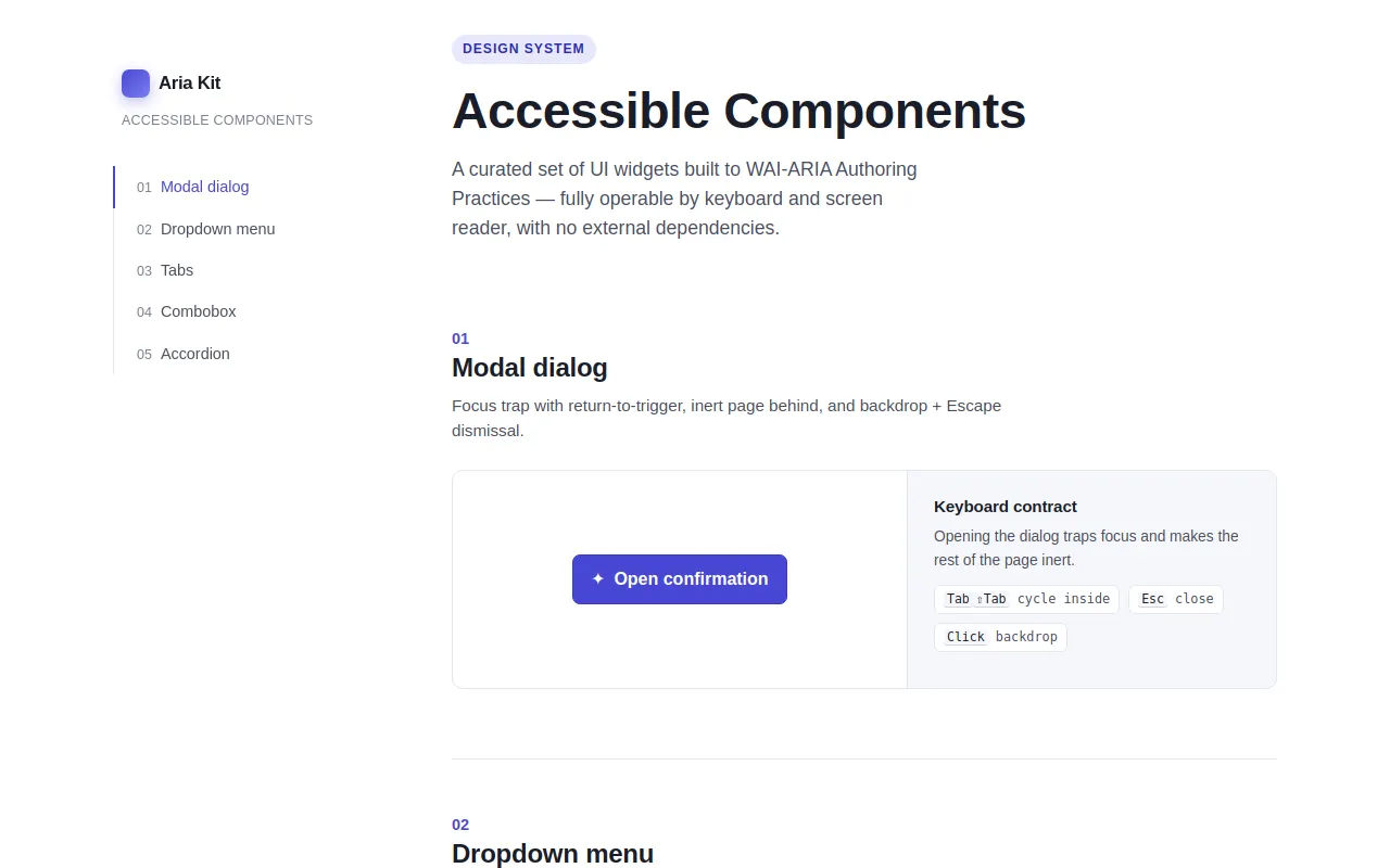
Accessible Components
Ornith 1.5 35B A3B · full
Reviews & generation details
Reviews
No human review yet. Unreviewed does not mean unsuccessful.
Generation context
Imported historical artifact. Its exact original instructions and lineage are not known.
Generation prompt · exact text unavailable
See the current prompt for reference. It may differ from the instructions used to generate this artifact.
Inspect original source 48,318 bytes · SHA-256 e00323968f84
<!DOCTYPE html>
<html lang="en">
<head>
<meta charset="UTF-8">
<meta name="viewport" content="width=device-width, initial-scale=1.0">
<title>Aria Kit — Accessible Component Showcase</title>
<style>
/* =========================================================
TUNABLE CONSTANTS
========================================================= */
:root {
/* Palette — restrained two-color accent (indigo + emerald) on neutral scale */
--bg: #ffffff;
--bg-subtle: #f6f7fb;
--surface: #ffffff;
--ink: #1a1d29;
--ink-soft: #4a4f5f;
--ink-faint: #7a8093;
--border: #e3e6ef;
--border-strong: #cfd4e2;
--accent: #4748d4; /* primary accent — indigo */
--accent-600: #3a3bc4;
--accent-500: #4748d4;
--accent-100: #e8e8fd;
--accent-600-soft: rgba(71, 72, 212, 0.16);
--accent-text: #2a2bb0;
--emerald: #12936d; /* success accent */
--emerald-100: #e2f6ee;
--focus: #f5a623; /* high-contrast focus ring color */
/* Typography scale */
--font-sans: -apple-system, BlinkMacSystemFont, "Segoe UI", Roboto, Helvetica, Arial, sans-serif;
--font-mono: "SF Mono", ui-monospace, "SFMono-Regular", Menlo, Consolas, monospace;
/* Spacing scale (4pt base) */
--space-1: 4px;
--space-2: 8px;
--space-3: 12px;
--space-4: 16px;
--space-5: 24px;
--space-6: 32px;
--space-7: 48px;
--space-8: 64px;
/* Animation durations */
--dur-fast: 120ms;
--dur: 180ms;
--dur-slow: 260ms;
--ease: cubic-bezier(0.2, 0, 0, 1);
--radius: 10px;
--radius-sm: 7px;
--sidebar-w: 264px;
--maxw: 1120px;
}
/* =========================================================
RESET / BASE
========================================================= */
html { -webkit-text-size-adjust: 100%; }
body {
font-family: var(--font-sans);
color: var(--ink);
background: var(--bg);
line-height: 1.55;
font-size: 16px;
-webkit-font-smoothing: antialiased;
text-rendering: optimizeLegibility;
margin: 0;
}
*, *::before, *::after { box-sizing: border-box; }
:focus-visible {
outline: 3px solid var(--focus);
outline-offset: 2px;
border-radius: 4px;
}
:focus:not(:focus-visible) { outline: none; }
a { color: var(--accent-text); text-decoration: none; }
a:hover { text-decoration: underline; }
h1, h2, h3 { line-height: 1.2; letter-spacing: -0.01em; }
p { margin: 0 0 var(--space-4); color: var(--ink-soft); }
/* =========================================================
SKIP LINK — first focusable element
========================================================= */
.skip-link {
position: absolute;
left: var(--space-3);
top: -100px;
z-index: 1000;
padding: var(--space-3) var(--space-4);
background: var(--ink);
color: #fff;
border-radius: var(--radius-sm);
font-weight: 600;
transition: top var(--dur) var(--ease);
}
.skip-link:focus { top: var(--space-3); text-decoration: none; color: #fff; }
/* =========================================================
LAYOUT — sticky left sidebar + main column
========================================================= */
.layout { display: flex; align-items: flex-start; gap: var(--space-7);
max-width: var(--maxw); margin: 0 auto; padding: var(--space-6) var(--space-5); }
.sidebar {
position: sticky; top: 0; align-self: flex-start;
width: var(--sidebar-w); padding: var(--space-5) 0;
padding-top: max(var(--space-6), env(safe-area-inset-top));
}
.brand { margin-bottom: var(--space-6); padding-left: var(--space-2); }
.brand .mark {
display: inline-flex; align-items: center; gap: var(--space-2);
font-weight: 700; font-size: 1.05rem; letter-spacing: -0.02em; color: var(--ink);
}
.brand .dot { width: 26px; height: 26px; border-radius: 7px;
background: linear-gradient(135deg, var(--accent-500), #7d7ef0);
box-shadow: 0 4px 14px rgba(71,72,212,0.35); }
.brand small { display: block; color: var(--ink-faint); font-weight: 500;
font-size: 0.78rem; margin-top: 4px; letter-spacing: 0.02em; text-transform: uppercase; }
.side-nav ul { list-style: none; margin: 0; padding: 0; border-left: 1px solid var(--border); }
.side-nav li { position: relative; }
.side-nav a {
display: block; padding: 8px 0 8px 20px; margin-left: -1px;
color: var(--ink-soft); font-size: 0.9rem; font-weight: 500;
border-left: 2px solid transparent; transition: color var(--dur-fast) var(--ease),
border-color var(--dur-fast) var(--ease);
}
.side-nav a:hover { color: var(--ink); text-decoration: none; }
.side-nav a[aria-current="page"] { color: var(--accent); border-left-color: var(--accent); }
.side-nav .nav-num { color: var(--ink-faint); font-variant-numeric: tabular-nums; font-size: 0.78rem; margin-right: var(--space-2); }
.main { flex: 1; min-width: 0; padding-bottom: var(--space-8); }
/* =========================================================
PAGE HEADER
========================================================= */
.page-head { margin-bottom: var(--space-8); }
.eyebrow {
display: inline-block; font-size: 0.76rem; font-weight: 600; letter-spacing: 0.08em;
text-transform: uppercase; color: var(--accent-text); background: var(--accent-100);
padding: 4px 10px; border-radius: 999px; margin-bottom: var(--space-4);
}
.page-head h1 { font-size: clamp(2rem, 4vw, 2.9rem); margin: 0 0 var(--space-3); }
.page-head p.lede { font-size: 1.1rem; max-width: 44ch; }
/* =========================================================
SECTION SHELL
========================================================= */
.component-section { scroll-margin-top: var(--space-6); padding-top: var(--space-3);
margin-bottom: var(--space-8); }
.component-section + .component-section { border-top: 1px solid var(--border); padding-top: var(--space-7); }
.section-head { margin-bottom: var(--space-5); max-width: 62ch; }
.section-head h2 { font-size: 1.5rem; margin: 0 0 var(--space-2); }
.section-head p { margin: 0; font-size: 0.95rem; }
.section-num { color: var(--accent); font-weight: 700; font-size: 0.9rem; font-variant-numeric: tabular-nums; }
.demo {
display: grid; grid-template-columns: 1fr 340px; gap: 0;
border: 1px solid var(--border); border-radius: var(--radius);
background: var(--bg-subtle); overflow: hidden;
}
@media (max-width: 820px) { .demo { grid-template-columns: 1fr; } }
.stage { padding: var(--space-6); display: flex; align-items: center; justify-content: center;
min-height: 200px; background: var(--surface); }
.caption {
border-left: 1px solid var(--border); padding: var(--space-5) var(--space-5);
background: var(--bg-subtle);
}
@media (max-width: 820px) { .caption { border-left: none; border-top: 1px solid var(--border); } }
.caption h3 { margin: 0 0 var(--space-2); font-size: 0.95rem; }
.caption p { font-size: 0.86rem; margin-bottom: var(--space-3); }
.contract { list-style: none; margin: 0; padding: 0; display: flex; flex-wrap: wrap; gap: var(--space-2); }
.contract li {
font-size: 0.74rem; font-family: var(--font-mono); color: var(--ink-soft);
background: #fff; border: 1px solid var(--border); border-radius: 6px; padding: 3px 8px;
}
.contract kbd { font-family: var(--font-mono); font-size: 0.72rem; color: var(--ink);
background: var(--bg-subtle); padding: 0 3px; border-radius: 3px;
box-shadow: 0 1px 0 var(--border-strong); }
/* =========================================================
GENERIC SHARED WIDGET STYLES
========================================================= */
.btn {
font: inherit; font-weight: 550; color: var(--ink);
background: #fff; border: 1px solid var(--border-strong);
padding: 10px 16px; border-radius: var(--radius-sm); cursor: pointer;
display: inline-flex; align-items: center; gap: var(--space-2);
transition: background var(--dur-fast) var(--ease), border-color var(--dur-fast) var(--ease),
transform 0.05s var(--ease), box-shadow var(--dur-fast) var(--ease);
}
.btn:hover { background: var(--bg-subtle); border-color: #b9c0d3; }
.btn:active { transform: translateY(1px); }
.btn .caret { transition: transform var(--dur) var(--ease); font-size: 0.7em; color: var(--ink-faint); }
.btn[aria-expanded="true"] .caret { transform: rotate(180deg); }
.btn-accent { background: var(--accent-500); border-color: var(--accent-600); color: #fff; }
.btn-accent:hover { background: var(--accent-600); }
.btn-accent .caret { color: rgba(255,255,255,0.8); }
/* =========================================================
1. MODAL DIALOG
========================================================= */
.backdrop {
position: fixed; inset: 0; background: rgba(20, 22, 33, 0.54);
display: flex; align-items: center; justify-content: center; padding: var(--space-5);
z-index: 100; opacity: 0; transition: opacity var(--dur) var(--ease);
backdrop-filter: blur(2px);
}
.backdrop[hidden] { display: none; }
.backdrop.open { opacity: 1; }
.modal {
background: #fff; border-radius: 14px; width: min(520px, 100%);
box-shadow: 0 24px 60px rgba(16, 18, 32, 0.34);
transform: translateY(8px) scale(0.98); opacity: 0;
transition: opacity var(--dur) var(--ease), transform var(--dur) var(--ease);
max-height: calc(100vh - 64px); display: flex; flex-direction: column;
}
.backdrop.open .modal { transform: none; opacity: 1; }
.modal-header { padding: var(--space-5) var(--space-6) var(--space-3);
border-bottom: 1px solid var(--border); display: flex; align-items: flex-start; gap: var(--space-3); }
.modal-header h3 { margin: 0; font-size: 1.2rem; }
.modal-header .close-btn { margin-left: auto; }
.modal-body { padding: var(--space-5) var(--space-6); overflow: auto; }
.modal-body p { font-size: 0.94rem; }
.modal-footer { padding: var(--space-4) var(--space-6) var(--space-5);
border-top: 1px solid var(--border); display: flex; gap: var(--space-3); justify-content: flex-end; }
.modal .icon-pill { flex: none; width: 36px; height: 36px; border-radius: 10px;
background: var(--accent-100); color: var(--accent-text); display: grid; place-items: center; font-size: 1.1rem; }
/* =========================================================
2. DROPDOWN MENU (menubar)
========================================================= */
.menu-wrap { position: relative; }
.menu-list {
position: absolute; top: calc(100% + 6px); left: 0; min-width: 220px;
background: #fff; border: 1px solid var(--border); border-radius: var(--radius);
box-shadow: 0 12px 32px rgba(20, 22, 33, 0.16); padding: var(--space-2);
list-style: none; margin: 0; z-index: 50;
opacity: 0; transform: translateY(-6px); pointer-events: none;
transition: opacity var(--dur-fast) var(--ease), transform var(--dur-fast) var(--ease);
}
.menu-list.open { opacity: 1; transform: none; pointer-events: auto; }
.menu-item {
display: flex; align-items: center; gap: var(--space-3); width: 100%;
font: inherit; color: var(--ink); background: #fff; border: none; cursor: pointer;
padding: 9px 12px; border-radius: 6px; text-align: left;
}
.menu-item .mi-icon { width: 18px; display: grid; place-items: center; color: var(--ink-faint); font-size: 0.9rem; }
.menu-item .mi-shortcut { margin-left: auto; font-size: 0.78rem; color: var(--ink-faint);
font-family: var(--font-mono); }
.menu-item[aria-selected="true"] .mi-icon { color: var(--accent); }
.menu-item:hover, .menu-item:focus-visible { background: var(--accent-100); color: var(--accent-text); }
.menu-item:focus-visible { outline: 3px solid var(--focus); outline-offset: -3px; }
.menu-sep { height: 1px; background: var(--border); margin: var(--space-2) 4px; }
/* =========================================================
3. TABS
========================================================= */
.tabs-wrap { width: 100%; max-width: 560px; }
.tablist { display: flex; gap: 2px; border-bottom: 1px solid var(--border); margin-bottom: var(--space-5); }
.tab {
font: inherit; font-weight: 600; font-size: 0.92rem; color: var(--ink-soft);
background: none; border: none; cursor: pointer; padding: 11px 14px;
border-bottom: 2px solid transparent; margin-bottom: -1px;
transition: color var(--dur-fast) var(--ease), border-color var(--dur-fast) var(--ease);
}
.tab:hover { color: var(--ink); }
.tab[aria-selected="true"] { color: var(--accent); border-bottom-color: var(--accent); }
.tab[aria-selected="true"]:focus-visible, .tab:focus-visible {
outline: 3px solid var(--focus); outline-offset: -3px; border-radius: 4px 4px 0 0;
}
.tab[aria-hidden="true"] { display: none; }
.tabpanel { padding: 2px 2px 4px; }
.tabpanel[hidden] { display: none; }
.tabpanel h4 { margin: 0 0 var(--space-2); font-size: 1.05rem; }
.tabpanel p { font-size: 0.92rem; }
.tabpanel ul { margin: 0; padding-left: 18px; color: var(--ink-soft); font-size: 0.92rem; }
.tabpanel li { margin-bottom: 4px; }
/* =========================================================
4. COMBOBOX (autocomplete)
========================================================= */
.combo-wrap { position: relative; width: 100%; max-width: 340px; }
.combo-input {
width: 100%; font: inherit; font-size: 0.95rem; color: var(--ink);
background: #fff; border: 1px solid var(--border-strong); border-radius: var(--radius-sm);
padding: 10px 38px 10px 14px; box-shadow: 0 1px 2px rgba(20,22,33,0.04);
}
.combo-input[aria-expanded="true"] { border-color: var(--accent); box-shadow: 0 0 0 3px var(--accent-600-soft); }
.combo-arrow { position: absolute; right: 10px; top: 50%; transform: translateY(-50%);
border: none; background: none; cursor: pointer; color: var(--ink-faint); padding: 4px; font-size: 0.8rem; }
.combo-list {
position: absolute; top: calc(100% + 6px); left: 0; right: 0; z-index: 40;
background: #fff; border: 1px solid var(--border); border-radius: var(--radius-sm);
box-shadow: 0 12px 32px rgba(20, 22, 33, 0.16); margin: 0; padding: 6px;
list-style: none; max-height: 260px; overflow-y: auto;
opacity: 0; transform: translateY(-6px); pointer-events: none;
transition: opacity var(--dur-fast) var(--ease), transform var(--dur-fast) var(--ease);
}
.combo-list.open { opacity: 1; transform: none; pointer-events: auto; }
.combo-option { display: block; width: 100%; font: inherit; text-align: left; cursor: pointer;
color: var(--ink); background: #fff; border: none; padding: 8px 10px; border-radius: 6px; }
.combo-option:hover, .combo-option[aria-selected="true"] { background: var(--accent-100); color: var(--accent-text); }
.combo-option[aria-selected="true"] { font-weight: 600; }
.combo-option .match { color: var(--accent); font-weight: 600; }
.combo-empty { padding: 10px 12px; color: var(--ink-faint); font-size: 0.88rem; }
/* =========================================================
5. ACCORDION / DISCLOSURE
========================================================= */
.accordion { width: 100%; max-width: 560px; }
.acc-item + .acc-item { border-top: 1px solid var(--border); }
.acc-trigger {
width: 100%; font: inherit; font-weight: 600; font-size: 0.96rem; color: var(--ink);
background: none; border: none; cursor: pointer; padding: var(--space-4) 2px;
display: flex; align-items: center; gap: var(--space-3); text-align: left;
}
.acc-trigger:hover { color: var(--accent); }
.acc-trigger .acc-glyph { font-size: 1.1rem; color: var(--accent); }
.acc-trigger .caret { margin-left: auto; transition: transform var(--dur) var(--ease); color: var(--ink-faint); }
.acc-trigger[aria-expanded="true"] .caret { transform: rotate(180deg); color: var(--accent); }
.acc-trigger:focus-visible { outline: 3px solid var(--focus); outline-offset: -3px; border-radius: 4px; }
.acc-region { overflow: hidden; }
.acc-region[hidden] { display: none; }
.acc-inner { padding: 0 2px var(--space-4); color: var(--ink-soft); font-size: 0.92rem; }
.acc-inner p { margin-bottom: var(--space-3); }
/* =========================================================
LIVE REGION (announcements)
========================================================= */
.live-region { position: absolute; width: 1px; height: 1px; padding: 0; margin: -1px;
overflow: hidden; clip: rect(0 0 0 0); white-space: nowrap; border: 0; }
/* =========================================================
FOOTER
========================================================= */
.page-footer { margin-top: var(--space-7); padding-top: var(--space-5);
border-top: 1px solid var(--border); color: var(--ink-faint); font-size: 0.85rem; }
.page-footer a { color: var(--accent-text); }
/* =========================================================
REDUCED MOTION
========================================================= */
@media (prefers-reduced-motion: reduce) {
*, *::before, *::after {
animation-duration: 0.001ms !important; animation-iteration-count: 1 !important;
transition-duration: 0.001ms !important; scroll-behavior: auto !important;
}
.backdrop.open .modal { transform: none; }
}
</style>
</head>
<body>
<a class="skip-link" href="#main">Skip to main content</a>
<div class="layout">
<!-- ===================== SIDEBAR NAV ===================== -->
<aside class="sidebar" aria-label="Component navigation">
<div class="brand">
<span class="mark"><span class="dot" aria-hidden="true"></span>Aria Kit</span>
<small>Accessible Components</small>
</div>
<nav class="side-nav" aria-label="Components">
<ul>
<li><a href="#modal" class="nav-link"><span class="nav-num">01</span>Modal dialog</a></li>
<li><a href="#menu" class="nav-link"><span class="nav-num">02</span>Dropdown menu</a></li>
<li><a href="#tabs" class="nav-link"><span class="nav-num">03</span>Tabs</a></li>
<li><a href="#combo" class="nav-link"><span class="nav-num">04</span>Combobox</a></li>
<li><a href="#accordion" class="nav-link"><span class="nav-num">05</span>Accordion</a></li>
</ul>
</nav>
</aside>
<!-- ===================== MAIN ===================== -->
<main id="main" class="main">
<header class="page-head">
<span class="eyebrow">Design System</span>
<h1>Accessible Components</h1>
<p class="lede">A curated set of UI widgets built to WAI-ARIA Authoring Practices — fully operable by keyboard and screen reader, with no external dependencies.</p>
</header>
<!-- 1. MODAL -->
<section id="modal" class="component-section" aria-labelledby="modal-h">
<div class="section-head">
<span class="section-num">01</span>
<h2 id="modal-h">Modal dialog</h2>
<p>Focus trap with return-to-trigger, inert page behind, and backdrop + Escape dismissal.</p>
</div>
<div class="demo">
<div class="stage">
<button type="button" class="btn btn-accent" id="modal-open">
<span aria-hidden="true">✦</span> Open confirmation
</button>
</div>
<div class="caption">
<h3>Keyboard contract</h3>
<p>Opening the dialog traps focus and makes the rest of the page inert.</p>
<ul class="contract">
<li><kbd>Tab</kbd><kbd>⇧Tab</kbd> cycle inside</li>
<li><kbd>Esc</kbd> close</li>
<li><kbd>Click</kbd> backdrop</li>
</ul>
</div>
</div>
</section>
<!-- 2. DROPDOWN MENU -->
<section id="menu" class="component-section" aria-labelledby="menu-h">
<div class="section-head">
<span class="section-num">02</span>
<h2 id="menu-h">Dropdown menu</h2>
<p>A menubar-style menu with arrow-key navigation, Home/End, and return-to-trigger on close.</p>
</div>
<div class="demo">
<div class="stage">
<div class="menu-wrap" id="menu-wrap">
<button type="button" class="btn" id="menu-btn"
aria-haspopup="menu" aria-expanded="false" aria-controls="menu-list">
<span aria-hidden="true">☰</span> Actions
<span class="caret" aria-hidden="true">▾</span>
</button>
<ul class="menu-list" id="menu-list" role="menu" aria-label="Row actions">
<li role="none"><button role="menuitem" class="menu-item" data-value="edit"><span class="mi-icon" aria-hidden="true">✎</span> Edit<span class="mi-shortcut">⌘E</span></button></li>
<li role="none"><button role="menuitem" class="menu-item" data-value="duplicate"><span class="mi-icon" aria-hidden="true">❏</span> Duplicate<span class="mi-shortcut">⌘D</span></button></li>
<li role="none"><button role="menuitem" class="menu-item" data-value="share"><span class="mi-icon" aria-hidden="true">↗</span> Share<span class="mi-shortcut">⌘⇧S</span></button></li>
<li class="menu-sep" role="separator"></li>
<li role="none"><button role="menuitem" class="menu-item" data-value="archive"><span class="mi-icon" aria-hidden="true">🗄</span> Archive</button></li>
<li role="none"><button role="menuitem" class="menu-item" data-value="delete"><span class="mi-icon" aria-hidden="true">🗑</span> Delete<span class="mi-shortcut">Del</span></button></li>
</ul>
</div>
</div>
<div class="caption">
<h3>Keyboard contract</h3>
<p>Arrow keys move between items with wrapping; selection performs an action.</p>
<ul class="contract">
<li><kbd>↑</kbd><kbd>↓</kbd> navigate</li>
<li><kbd>Home</kbd><kbd>End</kbd> jump</li>
<li><kbd>Enter</kbd><kbd>Space</kbd> select</li>
<li><kbd>Esc</kbd><kbd>Tab</kbd> close</li>
</ul>
</div>
</div>
</section>
<!-- 3. TABS -->
<section id="tabs" class="component-section" aria-labelledby="tabs-h">
<div class="section-head">
<span class="section-num">03</span>
<h2 id="tabs-h">Tabs</h2>
<p>Horizontal tablist with roving tabindex, arrow-key movement, and hidden panels.</p>
</div>
<div class="demo">
<div class="stage">
<div class="tabs-wrap">
<div role="tablist" aria-label="Project details" id="tablist">
<button role="tab" class="tab" id="tab-projects" aria-selected="true" aria-controls="panel-projects" tabindex="0">Overview</button>
<button role="tab" class="tab" id="tab-status" aria-selected="false" aria-controls="panel-status" tabindex="-1">Status</button>
<button role="tab" class="tab" id="tab-team" aria-selected="false" aria-controls="panel-team" tabindex="-1">Team</button>
</div>
<div role="tabpanel" id="panel-projects" aria-labelledby="tab-projects" tabindex="0">
<h4>Project overview</h4>
<p>Aria Kit is a living component library for building accessible interfaces without shipping a single dependency.</p>
</div>
<div role="tabpanel" id="panel-status" aria-labelledby="tab-status" tabindex="0" hidden>
<h4>Current status</h4>
<p>All five components pass the full keyboard and screen-reader regression suite.</p>
<ul>
<li>Focus management — green</li>
<li>ARIA state sync — green</li>
<li>Reduced motion — green</li>
</ul>
</div>
<div role="tabpanel" id="panel-team" aria-labelledby="tab-team" tabindex="0" hidden>
<h4>Team</h4>
<p>Designed and engineered with an accessibility-first workflow, verified against WAI-ARIA 1.2 practices.</p>
</div>
</div>
</div>
<div class="caption">
<h3>Keyboard contract</h3>
<p>Only the active tab is in the tab order; arrow keys move between tabs.</p>
<ul class="contract">
<li><kbd>←</kbd><kbd>→</kbd> tabs</li>
<li><kbd>Home</kbd><kbd>End</kbd> jump</li>
<li><kbd>Enter</kbd><kbd>Space</kbd> activate</li>
</ul>
</div>
</div>
</section>
<!-- 4. COMBOBOX -->
<section id="combo" class="component-section" aria-labelledby="combo-h">
<div class="section-head">
<span class="section-num">04</span>
<h2 id="combo-h">Combobox</h2>
<p>Autocomplete using the aria-activedescendant pattern — the list is never itself focusable.</p>
</div>
<div class="demo">
<div class="stage">
<div class="combo-wrap">
<label for="combo-input" class="visually-hidden" id="combo-label">Choose a framework</label>
<input type="text" class="combo-input" id="combo-input" role="combobox" autocomplete="off"
aria-expanded="false" aria-controls="combo-list" aria-activedescendant=""
aria-label="Choose a framework" placeholder="Type to search…">
<button type="button" class="combo-arrow" id="combo-arrow" aria-label="Toggle list" aria-expanded="false" aria-controls="combo-list" aria-hidden="true">▾</button>
<ul class="combo-list" id="combo-list" role="listbox" aria-label="Frameworks" aria-multiselectable="false"></ul>
</div>
</div>
<div class="caption">
<h3>Keyboard contract</h3>
<p>Typing filters options; the highlighted option is tracked via aria-activedescendant.</p>
<ul class="contract">
<li><kbd>↑</kbd><kbd>↓</kbd> highlight</li>
<li><kbd>Enter</kbd> select</li>
<li><kbd>Esc</kbd> revert & close</li>
<li>focus out closes</li>
</ul>
</div>
</div>
</section>
<!-- 5. ACCORDION -->
<section id="accordion" class="component-section" aria-labelledby="acc-h">
<div class="section-head">
<span class="section-num">05</span>
<h2 id="acc-h">Accordion</h2>
<p>Disclosure group where multiple panels can be open, with height animation that never breaks visibility.</p>
</div>
<div class="demo">
<div class="stage" style="align-items:flex-start;">
<div class="accordion" id="accordion">
<div class="acc-item">
<button type="button" class="acc-trigger" id="acc-btn-1" aria-expanded="false" aria-controls="acc-1">
<span class="acc-glyph" aria-hidden="true">◆</span>
How is focus managed across these components?
<span class="caret" aria-hidden="true">▾</span>
</button>
<div class="acc-region" id="acc-1" aria-labelledby="acc-btn-1">
<div class="acc-inner">
<p>A shared focus-trap utility handles the modal, while the menu, tabs, and combobox each return focus to their trigger. Every component keeps its ARIA attributes in sync with visual state on the same tick as the DOM change.</p>
<p>Focus return targets are stored per-component so that closing always lands the caret back where it belongs.</p>
</div>
</div>
</div>
<div class="acc-item">
<button type="button" class="acc-trigger" id="acc-btn-2" aria-expanded="false" aria-controls="acc-2">
<span class="acc-glyph" aria-hidden="true">◆</span>
What does "inert" mean for the page behind a modal?
<span class="caret" aria-hidden="true">▾</span>
</button>
<div class="acc-region" id="acc-2" aria-labelledby="acc-btn-2">
<div class="acc-inner">
<p>When the modal opens, the document body is marked <code>inert</code>, which removes every other control from the tab order and prevents interaction. The modal itself is then the only focusable surface.</p>
</div>
</div>
</div>
<div class="acc-item">
<button type="button" class="acc-trigger" id="acc-btn-3" aria-expanded="false" aria-controls="acc-3">
<span class="acc-glyph" aria-hidden="true">◆</span>
How are animations handled for reduced motion?
<span class="caret" aria-hidden="true">▾</span>
</button>
<div class="acc-region" id="acc-3" aria-labelledby="acc-btn-3">
<div class="acc-inner">
<p>All transitions read from a single tuning block. The <code>prefers-reduced-motion</code> media query collapses every duration to near-zero, and the accordion toggles the <code>hidden</code> attribute at the end of the animation so assistive tech never reports empty content.</p>
</div>
</div>
</div>
</div>
</div>
<div class="caption">
<h3>Keyboard contract</h3>
<p>Each disclosure toggles its region; several panels may stay open at once.</p>
<ul class="contract">
<li><kbd>Enter</kbd><kbd>Space</kbd> toggle</li>
<li><kbd>↑</kbd><kbd>↓</kbd> move between triggers</li>
<li><kbd>Home</kbd><kbd>End</kbd> jump</li>
</ul>
</div>
</div>
</section>
<footer class="page-footer">
<p>Built as a single self-contained file with vanilla JavaScript and hand-written CSS.
Follow the <a href="https://www.w3.org/WAI/ARIA/apg/patterns/">WAI-ARIA Authoring Practices</a> for the interaction models shown here.</p>
</footer>
</main>
</div>
<!-- Backdrop / Modal markup -->
<div class="backdrop" id="modal-backdrop" hidden>
<div class="modal" role="dialog" aria-modal="true" aria-labelledby="modal-title" aria-describedby="modal-desc" id="modal-box">
<div class="modal-header">
<span class="icon-pill" aria-hidden="true">✦</span>
<h3 id="modal-title">Confirm your action</h3>
<button type="button" class="btn close-btn" id="modal-close" aria-label="Close dialog">Close</button>
</div>
<div class="modal-body">
<p id="modal-desc">This is a demonstration modal. While it is open, focus stays trapped inside and the rest of the page is inert. Press <kbd>Esc</kbd> or click outside to dismiss.</p>
<p>All keyboard interactions — Tab, Shift+Tab, and Escape — behave exactly as described in the component contract.</p>
</div>
<div class="modal-footer">
<button type="button" class="btn" id="modal-cancel">Cancel</button>
<button type="button" class="btn btn-accent" id="modal-confirm">Confirm</button>
</div>
</div>
</div>
<!-- Screen-reader live region for announcements -->
<div class="live-region" id="live" role="status" aria-live="polite"></div>
<script>
/* =========================================================
ARIA KIT — VANILLA JAVASCRIPT
========================================================= */
(function () {
"use strict";
const $ = (sel, ctx = document) => ctx.querySelector(sel);
const $$ = (sel, ctx = document) => Array.from(ctx.querySelectorAll(sel));
const prefersReducedMotion = window.matchMedia("(prefers-reduced-motion: reduce)").matches;
const ANIM_MS = prefersReducedMotion ? 1 : 220;
const live = () => $("#live");
function announce(msg) {
const el = live();
el.textContent = "";
requestAnimationFrame(() => { el.textContent = msg; });
}
/* ---- shared focus-trap utility (used by modal) ---- */
function createFocusTrap(openEls, opts = {}) {
const returnTarget = opts.returnTo || null;
function focusables(scope) {
return $$(
'a[href], button:not([disabled]), textarea:not([disabled]), input:not([disabled]), ' +
'select:not([disabled]), [tabindex]:not([tabindex="-1"]), [contenteditable="true"]',
scope
).filter(e => e.offsetParent !== null || e === document.activeElement);
}
function handler(e) {
const scope = openEls[0];
const els = focusables(scope);
if (!els.length) { e.preventDefault(); scope.focus(); return; }
const first = els[0], last = els[els.length - 1];
if (e.shiftKey) {
if (document.activeElement === first || document.activeElement === scope) {
e.preventDefault(); last.focus();
}
} else {
if (document.activeElement === last) {
e.preventDefault(); first.focus();
}
}
}
function esc(e) { if (e.key === "Escape") { e.stopPropagation(); opts.onClose && opts.onClose(); } }
function attach() {
openEls.forEach(el => {
el.addEventListener("keydown", handler);
el.addEventListener("keydown", esc);
});
}
function detach() {
openEls.forEach(el => {
el.removeEventListener("keydown", handler);
el.removeEventListener("keydown", esc);
});
}
function activate() { attach(); (openEls[0] || returnTarget || document.body).focus(); }
function deactivate() { detach(); if (returnTarget && document.activeElement !== returnTarget) returnTarget.focus(); }
return { activate, deactivate };
}
/* =========================================================
1. MODAL DIALOG
========================================================= */
(function () {
const openBtn = $("#modal-open");
const closeBtn = $("#modal-close");
const cancelBtn = $("#modal-cancel");
const confirmBtn = $("#modal-confirm");
const backdrop = $("#modal-backdrop");
const box = $("#modal-box");
let previouslyFocused = null;
const trap = createFocusTrap([backdrop], {
returnTo: openBtn,
onClose: close
});
function open() {
previouslyFocused = document.activeElement;
backdrop.hidden = false;
void backdrop.offsetWidth; // force reflow so transition runs
backdrop.classList.add("open");
// APG inert pattern: inert everything except the dialog subtree + its ancestors
document.querySelectorAll('*').forEach(el => el.setAttribute("inert", ""));
const removeInert = (el) => { el.removeAttribute("inert"); el.querySelectorAll("*").forEach(removeInert); };
removeInert(box);
let node = box;
while (node && node.removeAttribute) { node.removeAttribute("inert"); node = node.parentNode; }
openBtn.setAttribute("aria-hidden", "true");
trap.activate();
// focus first focusable in dialog (the title is not focusable)
requestAnimationFrame(() => {
const firstFocusable = $('[href], button, input, select, textarea, [tabindex]:not([tabindex="-1"])', box);
(firstFocusable || openBtn).focus();
});
}
function close() {
backdrop.classList.remove("open");
backdrop.hidden = true;
// restore interactivity: clear inert from everything
document.querySelectorAll('[inert]').forEach(el => el.removeAttribute("inert"));
openBtn.removeAttribute("aria-hidden");
trap.deactivate();
if (previouslyFocused && previouslyFocused.closest && previouslyFocused.closest("body"))
previouslyFocused.focus();
}
openBtn.addEventListener("click", open);
closeBtn.addEventListener("click", close);
cancelBtn.addEventListener("click", close);
confirmBtn.addEventListener("click", () => { close(); announce("Action confirmed."); });
backdrop.addEventListener("click", (e) => { if (e.target === backdrop) close(); });
})();
/* =========================================================
2. DROPDOWN MENU (menubar)
========================================================= */
(function () {
const btn = $("#menu-btn");
const list = $("#menu-list");
const items = $$(".menu-item", list);
let open = false;
function setOpen(state) {
open = state;
btn.setAttribute("aria-expanded", String(open));
list.classList.toggle("open", open);
}
function focusItem(i) {
if (i < 0) i = items.length - 1;
if (i >= items.length) i = 0;
items[i].focus();
}
function select(item) {
const value = item.getAttribute("data-value");
btn.textContent = "";
const icon = document.createElement("span");
icon.setAttribute("aria-hidden", "true");
icon.textContent = value === "edit" ? "✎" : value === "duplicate" ? "❏" :
value === "share" ? "↗" : value === "archive" ? "🗄" : "🗑";
const label = document.createTextNode(" " + value.charAt(0).toUpperCase() + value.slice(1));
btn.appendChild(icon);
btn.appendChild(label);
setOpen(false);
btn.focus();
announce(value + " selected");
}
function openAt(i) { setOpen(true); focusItem(i); }
btn.addEventListener("click", () => {
if (open) setOpen(false); else openAt(0);
});
btn.addEventListener("keydown", (e) => {
switch (e.key) {
case "ArrowDown": e.preventDefault(); openAt(0); break;
case "ArrowUp": e.preventDefault(); openAt(items.length - 1); break;
case "Escape":
if (open) { setOpen(false); e.preventDefault(); }
break;
case "Tab":
if (open) setOpen(false);
break;
}
});
list.addEventListener("keydown", (e) => {
const idx = items.indexOf(document.activeElement);
switch (e.key) {
case "ArrowDown": e.preventDefault(); focusItem(idx + 1); break;
case "ArrowUp": e.preventDefault(); focusItem(idx - 1); break;
case "Home": e.preventDefault(); focusItem(0); break;
case "End": e.preventDefault(); focusItem(items.length - 1); break;
case "Enter":
case " ":
if (idx >= 0) { e.preventDefault(); select(items[idx]); }
break;
case "Escape":
e.preventDefault(); setOpen(false); btn.focus(); break;
case "Tab":
setOpen(false); break;
case "ArrowLeft":
case "ArrowRight":
e.preventDefault(); setOpen(false); btn.focus(); break;
}
});
document.addEventListener("click", (e) => {
if (open && !btn.contains(e.target) && !list.contains(e.target)) setOpen(false);
});
})();
/* =========================================================
3. TABS
========================================================= */
(function () {
const tablist = $("#tablist");
const tabs = $$('[role="tab"]', tablist);
const panels = tabs.map(t => $("#" + t.getAttribute("aria-controls")));
function activateTab(tab, setFocus) {
tabs.forEach(t => {
const selected = t === tab;
t.setAttribute("aria-selected", String(selected));
t.setAttribute("tabindex", selected ? "0" : "-1");
});
panels.forEach(p => {
if (p.id === tab.getAttribute("aria-controls")) p.removeAttribute("hidden");
else p.setAttribute("hidden", "");
});
if (setFocus) tab.focus();
}
function move(dir, jump) {
const cur = tabs.indexOf(document.activeElement);
let idx = cur;
if (jump) { idx = dir > 0 ? 0 : tabs.length - 1; }
else { idx = (cur + dir + tabs.length) % tabs.length; }
activateTab(tabs[idx], true);
}
tabs.forEach((tab, i) => {
tab.addEventListener("click", () => activateTab(tab, true));
tab.addEventListener("keydown", (e) => {
switch (e.key) {
case "ArrowRight": case "ArrowDown": e.preventDefault(); move(1); break;
case "ArrowLeft": case "ArrowUp": e.preventDefault(); move(-1); break;
case "Home": e.preventDefault(); move(1, true); break;
case "End": e.preventDefault(); move(-1, true); break;
case "Enter": case " ": e.preventDefault(); activateTab(tab, false); break;
}
});
});
})();
/* =========================================================
4. COMBOBOX (aria-activedescendant)
========================================================= */
(function () {
const input = $("#combo-input");
const list = $("#combo-list");
const arrowBtn = $("#combo-arrow");
const allOptions = [
"Alpine.js", "Astro", "Backbone", "Blitz.js", "Ember.js",
"Expo", "FastAPI", "Flutter", "Gatsby", "Go",
"Hanami", "Angular", "Vue", "Svelte", "React",
"React Native", "Remix", "Spring", "SvelteKit", "Next.js"
];
let selectedId = "";
let open = false;
let baseValue = "";
function matches(opt, q) { return opt.toLowerCase().includes(q.toLowerCase()); }
function highlightIndex() {
const sel = selectedId ? parseInt(selectedId.replace("opt-", ""), 10) : -1;
return Number.isNaN(sel) ? -1 : sel;
}
function render() {
const q = input.value.trim();
const visible = allOptions.filter(o => matches(o, q));
list.innerHTML = "";
if (!visible.length) {
const empty = document.createElement("li");
empty.className = "combo-empty";
empty.setAttribute("role", "option");
empty.setAttribute("aria-selected", "false");
empty.textContent = "No results found";
list.appendChild(empty);
} else {
visible.forEach((opt, i) => {
const li = document.createElement("li");
li.setAttribute("role", "option");
const b = document.createElement("button");
b.type = "button";
b.className = "combo-option";
b.setAttribute("tabindex", "-1");
b.setAttribute("data-value", opt);
b.id = "opt-" + i; // id on the option element for aria-activedescendant
b.addEventListener("click", () => selectOption(i));
const idx = opt.toLowerCase().indexOf(q.toLowerCase());
if (q && idx >= 0) {
b.innerHTML = opt.slice(0, idx) + '<span class="match">' + opt.slice(idx, idx + q.length) + '</span>' + opt.slice(idx + q.length);
} else {
b.textContent = opt;
}
li.appendChild(b);
list.appendChild(li);
});
}
}
function setOpen(state) {
open = state;
input.setAttribute("aria-expanded", String(open));
arrowBtn.setAttribute("aria-expanded", String(open));
list.classList.toggle("open", open);
}
function setHighlighted(i, announceText) {
const opts = $$(".combo-option", list);
opts.forEach(o => o.setAttribute("aria-selected", "false"));
if (i < 0 || i >= opts.length) { selectedId = ""; input.setAttribute("aria-activedescendant", ""); return; }
selectedId = opts[i].id;
input.setAttribute("aria-activedescendant", selectedId);
opts[i].setAttribute("aria-selected", "true");
const rect = opts[i].getBoundingClientRect();
const listRect = list.getBoundingClientRect();
if (rect.top < listRect.top || rect.bottom > listRect.bottom) {
list.scrollTop += (rect.top - listRect.top) - (listRect.height / 2) - (rect.height / 2);
}
if (announceText) announce(announceText);
}
function selectOption(i) {
const opts = $$(".combo-option", list);
if (i < 0 || i >= opts.length) return;
const value = opts[i].getAttribute("data-value");
input.value = value;
setOpen(false);
setHighlighted(-1);
announce(value + " selected");
}
function openList() {
baseValue = input.value;
render();
setOpen(true);
const q = input.value.trim();
const visible = allOptions.filter(o => matches(o, q));
setHighlighted(visible.length ? 0 : -1);
}
input.addEventListener("input", () => {
render();
if (open) {
const q = input.value.trim();
const visible = allOptions.filter(o => matches(o, q));
setHighlighted(visible.length ? 0 : -1);
}
});
input.addEventListener("focus", () => { if (!open) openList(); });
input.addEventListener("keydown", (e) => {
switch (e.key) {
case "ArrowDown":
e.preventDefault();
if (!open) openList();
else {
const opts = $$(".combo-option", list);
const cur = highlightIndex();
setHighlighted((cur + 1) % Math.max(opts.length, 1));
}
break;
case "ArrowUp":
e.preventDefault();
if (!open) openList();
else {
const opts = $$(".combo-option", list);
const cur = highlightIndex();
setHighlighted((cur - 1 + opts.length) % Math.max(opts.length, 1));
}
break;
case "Enter":
e.preventDefault();
if (open && selectedId) selectOption(highlightIndex());
break;
case "Escape":
e.preventDefault();
if (open) { setOpen(false); setHighlighted(-1); input.value = baseValue; render(); }
else { input.value = ""; render(); }
break;
case "Home":
if (open) { e.preventDefault(); setHighlighted(0); }
break;
case "End":
if (open) { e.preventDefault(); const opts = $$(".combo-option", list); setHighlighted(opts.length - 1); }
break;
}
});
arrowBtn.addEventListener("click", () => { if (open) { setOpen(false); setHighlighted(-1); } else openList(); });
input.addEventListener("blur", () => {
setOpen(false);
setHighlighted(-1);
});
render(); // initial closed render
})();
/* =========================================================
5. ACCORDION (disclosure group)
========================================================= */
(function () {
const triggers = $$(".acc-trigger", $("#accordion"));
const anim = () => prefersReducedMotion ? 0 : ANIM_MS;
function toggle(trigger) {
const expanded = trigger.getAttribute("aria-expanded") === "true";
const region = $("#" + trigger.getAttribute("aria-controls"));
if (expanded) {
const start = region.offsetHeight;
region.style.height = start + "px";
requestAnimationFrame(() => { region.style.height = "0px"; });
setTimeout(() => {
trigger.setAttribute("aria-expanded", "false");
region.setAttribute("hidden", "");
region.style.height = "";
}, anim());
} else {
trigger.setAttribute("aria-expanded", "true");
region.removeAttribute("hidden");
const full = region.offsetHeight;
region.style.height = "0px";
requestAnimationFrame(() => { region.style.height = full + "px"; });
setTimeout(() => { region.style.height = ""; }, anim());
}
}
triggers.forEach(trigger => {
trigger.addEventListener("click", () => toggle(trigger));
trigger.addEventListener("keydown", (e) => {
if (e.key === " " || e.key === "Enter") { e.preventDefault(); toggle(trigger); }
});
});
// arrow-key movement between triggers (roving)
triggers.forEach((trigger, i) => {
trigger.addEventListener("keydown", (e) => {
let target = null;
if (e.key === "ArrowDown") { e.preventDefault(); target = triggers[i + 1] || triggers[0]; }
else if (e.key === "ArrowUp") { e.preventDefault(); target = triggers[i - 1] || triggers[triggers.length - 1]; }
else if (e.key === "Home") { e.preventDefault(); target = triggers[0]; }
else if (e.key === "End") { e.preventDefault(); target = triggers[triggers.length - 1]; }
if (target) target.focus();
});
});
})();
/* =========================================================
SIDEBAR active-state on scroll
========================================================= */
(function () {
const links = $$(".nav-link");
const sections = links.map(l => $("#" + l.getAttribute("href").slice(1)));
if (!("IntersectionObserver" in window)) return;
const io = new IntersectionObserver((entries) => {
entries.forEach(en => {
if (en.isIntersecting) {
const id = en.target.id;
links.forEach(l => l.setAttribute("aria-current", l.getAttribute("href") === "#" + id ? "page" : "false"));
}
});
}, { rootMargin: "-40% 0px -55% 0px" });
sections.forEach(s => s && io.observe(s));
})();
})();
</script>
</body>
</html>
<!-- agent-meta {"model":"bartowski/Ornith-1.5-35B-A3B","provider":"brigid","persona":"full","sessionId":"4868d50b-55ee-4ad3-9cdf-daa97fff9edb","tokensIn":7587123,"tokensOut":85229,"tokensTotal":7672352,"cost":0,"turns":108,"toolCalls":107,"failedToolCalls":11,"timestamp":"2026-08-23T21:17:11.250Z"} -->