Accessible Components
Swift Qwen3.8 27B GGUF · full
Reviews & generation details
Reviews
No human review yet. Unreviewed does not mean unsuccessful.
Generation context
Imported historical artifact. Its exact original instructions and lineage are not known.
Generation prompt · exact text unavailable
See the current prompt for reference. It may differ from the instructions used to generate this artifact.
Inspect original source 48,176 bytes · SHA-256 b6e9616c1100
<!DOCTYPE html>
<html lang="en">
<head>
<meta charset="UTF-8">
<meta name="viewport" content="width=device-width, initial-scale=1">
<meta name="color-scheme" content="light">
<title>Praxis UI — Accessible Component Showcase</title>
<style>
/* ============================================================
PRACTIS UI — hand-written stylesheet, no frameworks.
Color / spacing / motion values are fallbacks; the JS
TOKENS block (single source of truth) re-applies them to
these custom properties on boot.
============================================================ */
:root {
--bg: #f6f7f9;
--surface: #ffffff;
--ink: #182029;
--muted: #5c6675;
--border: #e3e7ee;
--border-strong: #c9d1dc;
--primary: #2353c0;
--primary-strong: #1a419c;
--primary-soft: #eef2fb;
--accent: #b45309;
--accent-soft: #fbf1e6;
--accent-border: #f0dcc4;
--focus: #1c439e;
--danger: #b42318;
--danger-soft: #fef3f2;
--space-1: 4px; --space-2: 8px; --space-3: 12px; --space-4: 16px;
--space-5: 24px; --space-6: 32px; --space-7: 48px; --space-8: 64px;
--dur-fast: 120ms; --dur-med: 200ms; --dur-slow: 320ms; --dur-accordion: 260ms;
--radius-sm: 6px; --radius-md: 10px; --radius-lg: 12px;
--shadow-1: 0 1px 2px rgba(16, 24, 40, 0.05);
--shadow-2: 0 12px 32px -8px rgba(16, 24, 40, 0.22);
--font-sans: ui-sans-serif, system-ui, -apple-system, "Segoe UI", Roboto, "Helvetica Neue", Arial, sans-serif;
--font-mono: ui-monospace, "SF Mono", SFMono-Regular, Menlo, Consolas, "Liberation Mono", monospace;
}
/* ---------- reset / base ---------- */
*, *::before, *::after { box-sizing: border-box; }
[hidden] { display: none !important; }
html { scroll-behavior: smooth; -webkit-text-size-adjust: 100%; }
body {
margin: 0;
font-family: var(--font-sans);
font-size: 1rem;
line-height: 1.6;
color: var(--ink);
background: var(--bg);
}
::selection { background: var(--primary-soft); }
h1, h2, h3 { line-height: 1.2; }
p { margin: 0; }
/* ---------- focus indicators (never removed, always visible) ---------- */
:focus-visible {
outline: 2px solid var(--focus);
outline-offset: 2px;
border-radius: 4px;
}
/* ---------- utilities ---------- */
.visually-hidden {
position: absolute;
width: 1px; height: 1px;
padding: 0; margin: -1px;
overflow: hidden;
clip: rect(0 0 0 0);
clip-path: inset(50%);
white-space: nowrap;
border: 0;
}
kbd {
font-family: var(--font-mono);
font-size: 0.72rem;
font-weight: 600;
line-height: 1;
color: var(--ink);
background: var(--surface);
border: 1px solid var(--border-strong);
border-bottom-width: 2px;
border-radius: 5px;
padding: 3px 6px;
}
code {
font-family: var(--font-mono);
font-size: 0.85em;
background: #f1f3f7;
border: 1px solid var(--border);
border-radius: 4px;
padding: 1px 5px;
}
.link {
color: var(--primary);
font-weight: 600;
text-decoration: underline;
text-underline-offset: 2px;
}
.link:hover { color: var(--primary-strong); }
/* ---------- skip link (first focusable element) ---------- */
.skip-link {
position: absolute;
left: var(--space-3);
top: var(--space-3);
z-index: 100;
transform: translateY(-300%);
background: var(--primary);
color: #fff;
font-weight: 600;
font-size: 0.95rem;
text-decoration: none;
padding: 10px 18px;
border-radius: var(--radius-sm);
box-shadow: var(--shadow-2);
transition: transform var(--dur-fast) ease;
}
.skip-link:focus-visible { transform: translateY(0); }
/* ---------- app shell ---------- */
.app {
display: grid;
grid-template-columns: 236px minmax(0, 1fr);
gap: var(--space-7);
max-width: 1180px;
margin: 0 auto;
padding: var(--space-6) var(--space-5) var(--space-8);
}
/* ---------- sidebar ---------- */
.sidebar {
position: sticky;
top: var(--space-5);
align-self: start;
display: flex;
flex-direction: column;
gap: var(--space-5);
}
.brand { display: flex; align-items: center; gap: 10px; padding: 0 var(--space-2); }
.brand-mark {
width: 26px; height: 26px;
border-radius: 7px;
background: linear-gradient(135deg, var(--primary) 50%, var(--accent) 50%);
flex: none;
}
.brand-name { font-weight: 700; font-size: 1.05rem; letter-spacing: -0.01em; }
.brand-version {
font-family: var(--font-mono);
font-size: 0.68rem;
color: var(--accent);
background: var(--accent-soft);
border: 1px solid var(--accent-border);
border-radius: 999px;
padding: 2px 7px;
}
.nav-title {
font-size: 0.72rem;
font-weight: 700;
text-transform: uppercase;
letter-spacing: 0.08em;
color: var(--muted);
margin: 0 0 var(--space-2);
padding: 0 var(--space-2);
}
.sidebar nav ul {
list-style: none;
margin: 0;
padding: 0;
display: flex;
flex-direction: column;
gap: 2px;
}
.sidebar nav a {
display: flex;
align-items: center;
gap: 10px;
padding: 8px 10px;
border-radius: 7px;
color: var(--muted);
text-decoration: none;
font-size: 0.9rem;
font-weight: 500;
transition: background var(--dur-fast), color var(--dur-fast);
}
.sidebar nav a:hover { background: var(--surface); color: var(--ink); }
.sidebar nav a[aria-current="true"] {
background: var(--primary-soft);
color: var(--primary);
font-weight: 600;
}
.nav-num { font-family: var(--font-mono); font-size: 0.68rem; color: var(--accent); }
.sidebar-note {
font-size: 0.8rem;
color: var(--muted);
margin: 0;
padding-left: 10px;
border-left: 2px solid var(--accent-border);
}
/* ---------- page header ---------- */
main { min-width: 0; }
.page-head { margin-bottom: var(--space-7); }
.page-head h1 {
margin: 0 0 var(--space-3);
font-size: clamp(1.7rem, 1.1rem + 2.4vw, 2.3rem);
letter-spacing: -0.025em;
line-height: 1.12;
}
.tagline { margin: 0; max-width: 62ch; color: var(--muted); font-size: 1.02rem; }
.chips {
list-style: none;
display: flex;
flex-wrap: wrap;
gap: 8px;
padding: 0;
margin: var(--space-4) 0 0;
}
.chip {
font-size: 0.78rem;
font-weight: 600;
letter-spacing: 0.02em;
color: var(--muted);
background: var(--surface);
border: 1px solid var(--border);
border-radius: 999px;
padding: 4px 12px;
}
/* ---------- component sections ---------- */
.component {
background: var(--surface);
border: 1px solid var(--border);
border-radius: var(--radius-lg);
padding: var(--space-6);
margin-bottom: var(--space-6);
box-shadow: var(--shadow-1);
scroll-margin-top: var(--space-5);
}
.component h2 {
display: flex;
align-items: center;
gap: var(--space-3);
margin: 0 0 var(--space-2);
font-size: 1.35rem;
letter-spacing: -0.015em;
}
.num {
font-family: var(--font-mono);
font-size: 0.72rem;
font-weight: 600;
color: var(--accent);
background: var(--accent-soft);
border: 1px solid var(--accent-border);
border-radius: 999px;
padding: 3px 8px;
}
.lede { color: var(--muted); margin: 0 0 var(--space-5); max-width: 72ch; }
.demo {
background: #fafbfd;
border: 1px solid var(--border);
border-radius: var(--radius-md);
padding: var(--space-5);
margin-bottom: var(--space-4);
}
.demo-row { display: flex; align-items: center; flex-wrap: wrap; gap: var(--space-3); }
.contract {
display: flex;
flex-wrap: wrap;
gap: 8px 18px;
margin: var(--space-4) 0 0;
padding-top: var(--space-4);
border-top: 1px dashed var(--border-strong);
font-size: 0.85rem;
color: var(--muted);
}
.contract span { display: inline-flex; align-items: center; gap: 6px; }
.status { margin: var(--space-3) 0 0; font-size: 0.85rem; color: var(--muted); }
.demo-row .status { margin: 0; }
/* ---------- buttons ---------- */
.btn {
font: inherit;
font-weight: 600;
font-size: 0.925rem;
padding: 9px 16px;
border-radius: 7px;
border: 1px solid var(--border-strong);
background: var(--surface);
color: var(--ink);
cursor: pointer;
display: inline-flex;
align-items: center;
gap: 8px;
transition: background var(--dur-fast), border-color var(--dur-fast), transform var(--dur-fast);
}
.btn:hover { background: #f3f5f9; }
.btn:active { transform: translateY(1px); }
.btn-primary { background: var(--primary); border-color: var(--primary); color: #fff; }
.btn-primary:hover { background: var(--primary-strong); border-color: var(--primary-strong); }
.chev { color: var(--muted); flex: none; }
/* ---------- 01 · modal ---------- */
.modal-overlay {
position: fixed;
inset: 0;
z-index: 50;
display: flex;
align-items: center;
justify-content: center;
padding: var(--space-4);
background: rgba(23, 32, 43, 0.48);
}
.modal {
position: relative;
background: var(--surface);
width: min(480px, 100%);
border-radius: var(--radius-lg);
box-shadow: var(--shadow-2);
padding: var(--space-6);
animation: modal-pop var(--dur-med) ease-out;
}
@keyframes modal-pop {
from { opacity: 0; transform: translateY(8px) scale(0.97); }
}
.modal h2 { margin: 0 0 var(--space-2); font-size: 1.25rem; padding-right: 36px; }
.modal > p { color: var(--muted); font-size: 0.95rem; }
.modal-close {
position: absolute;
top: 12px; right: 12px;
width: 32px; height: 32px;
display: grid;
place-items: center;
border: 0;
background: transparent;
color: var(--muted);
border-radius: 7px;
cursor: pointer;
}
.modal-close:hover { background: #f1f3f7; color: var(--ink); }
.field { margin: var(--space-4) 0 var(--space-5); }
.field label { display: block; font-size: 0.85rem; font-weight: 600; margin-bottom: 6px; }
.field select {
font: inherit;
font-size: 0.95rem;
padding: 9px 12px;
border: 1px solid var(--border-strong);
border-radius: 7px;
background: var(--surface);
color: var(--ink);
min-width: 200px;
}
.modal-actions { display: flex; justify-content: flex-end; gap: 10px; }
/* ---------- 02 · dropdown menu ---------- */
.menu-wrap { position: relative; display: inline-block; }
.menu {
position: absolute;
top: calc(100% + 6px);
left: 0;
z-index: 30;
min-width: 224px;
margin: 0;
padding: 6px;
list-style: none;
background: var(--surface);
border: 1px solid var(--border);
border-radius: var(--radius-md);
box-shadow: var(--shadow-2);
transform-origin: top left;
animation: menu-pop var(--dur-fast) ease-out;
}
@keyframes menu-pop {
from { opacity: 0; transform: translateY(-4px); }
}
.menuitem {
display: flex;
width: 100%;
align-items: center;
gap: 10px;
padding: 8px 10px;
font: inherit;
font-size: 0.925rem;
text-align: left;
border: 0;
background: none;
border-radius: 7px;
cursor: pointer;
color: var(--ink);
}
.menuitem:hover, .menuitem:focus-visible { background: var(--primary-soft); color: var(--primary); }
.menuitem-danger { color: var(--danger); }
.menuitem-danger:hover, .menuitem-danger:focus-visible { background: var(--danger-soft); color: var(--danger); }
.menu-sep { height: 1px; background: var(--border); margin: 6px 8px; }
/* ---------- 03 · tabs ---------- */
.tablist {
display: flex;
gap: 2px;
border-bottom: 1px solid var(--border);
margin-bottom: var(--space-4);
}
.tab {
position: relative;
font: inherit;
font-size: 0.95rem;
font-weight: 600;
padding: 10px 14px;
border: 0;
background: none;
cursor: pointer;
color: var(--muted);
border-radius: 7px 7px 0 0;
}
.tab::after {
content: "";
position: absolute;
left: 10px; right: 10px; bottom: -1px;
height: 2px;
background: var(--primary);
transform: scaleX(0);
transition: transform var(--dur-fast) ease;
}
.tab:hover { color: var(--ink); }
.tab[aria-selected="true"] { color: var(--primary); }
.tab[aria-selected="true"]::after { transform: scaleX(1); }
.tabpanel { padding: var(--space-2) 0 0; }
.tabpanel p { color: var(--muted); font-size: 0.95rem; max-width: 68ch; }
.tabpanel ul { color: var(--muted); font-size: 0.95rem; margin: 0 0 var(--space-3); padding-left: 1.2em; }
.tabpanel pre {
background: #f4f6f9;
border: 1px solid var(--border);
border-radius: 8px;
padding: 14px 16px;
overflow: auto;
font-family: var(--font-mono);
font-size: 0.78rem;
line-height: 1.55;
margin: 0 0 var(--space-3);
}
.tabpanel pre code { background: none; border: 0; padding: 0; font-size: inherit; }
/* ---------- 04 · combobox ---------- */
.combo { max-width: 360px; }
.combo-label { display: block; font-size: 0.85rem; font-weight: 600; margin-bottom: 6px; }
.combo-field { position: relative; }
.combo-input {
width: 100%;
font: inherit;
font-size: 0.95rem;
padding: 10px 38px 10px 12px;
border: 1px solid var(--border-strong);
border-radius: 8px;
background: var(--surface);
color: var(--ink);
}
.combo-input::placeholder { color: #9aa3af; }
.combo-caret {
position: absolute;
right: 12px; top: 50%;
transform: translateY(-50%);
color: var(--muted);
pointer-events: none;
}
.listbox {
position: absolute;
top: calc(100% + 6px);
left: 0; right: 0;
z-index: 20;
margin: 0;
padding: 6px;
list-style: none;
background: var(--surface);
border: 1px solid var(--border);
border-radius: var(--radius-md);
box-shadow: var(--shadow-2);
max-height: 260px;
overflow: auto;
}
.option { padding: 8px 10px; border-radius: 7px; font-size: 0.925rem; cursor: default; }
.option:hover { background: #f2f5fa; }
.option[aria-selected="true"] { background: var(--primary-soft); color: var(--primary); font-weight: 600; }
.option-none { color: var(--muted); font-style: italic; }
/* ---------- 05 · accordion ---------- */
.accordion {
border: 1px solid var(--border);
border-radius: var(--radius-md);
overflow: hidden;
background: var(--surface);
}
.acc-item + .acc-item { border-top: 1px solid var(--border); }
.acc-heading { margin: 0; font-size: 1rem; }
.acc-trigger {
width: 100%;
display: flex;
align-items: center;
justify-content: space-between;
gap: var(--space-3);
padding: 14px 16px;
font: inherit;
font-weight: 600;
font-size: 0.95rem;
text-align: left;
background: var(--surface);
border: 0;
cursor: pointer;
color: var(--ink);
}
.acc-trigger:hover { background: #f7f9fc; }
.acc-trigger .chev { transition: transform var(--dur-med) ease; }
.acc-trigger[aria-expanded="true"] .chev { transform: rotate(180deg); }
.acc-panel { overflow: hidden; }
.acc-inner { padding: 2px 16px 16px; color: var(--muted); font-size: 0.925rem; }
.acc-inner p { margin: 0; max-width: 70ch; }
/* ---------- footer ---------- */
.page-foot {
border-top: 1px solid var(--border);
padding-top: var(--space-5);
margin-top: var(--space-4);
color: var(--muted);
font-size: 0.875rem;
}
.page-foot p { max-width: 72ch; }
/* ---------- responsive ---------- */
@media (max-width: 900px) {
.app { grid-template-columns: 1fr; gap: var(--space-5); padding: var(--space-4); }
.sidebar { position: static; flex-direction: row; align-items: center; flex-wrap: wrap; gap: var(--space-4); }
.sidebar nav ul { flex-direction: row; flex-wrap: wrap; gap: 4px; }
.sidebar-note { display: none; }
.component { padding: var(--space-5); }
}
/* ---------- reduced motion ---------- */
@media (prefers-reduced-motion: reduce) {
html { scroll-behavior: auto; }
*, *::before, *::after {
animation-duration: 0.01ms !important;
animation-iteration-count: 1 !important;
transition-duration: 0.01ms !important;
}
}
</style>
</head>
<body>
<!-- Skip link: first focusable element on the page -->
<a class="skip-link" href="#main">Skip to main content</a>
<div class="app" id="app-root">
<aside class="sidebar">
<div class="brand">
<span class="brand-mark" aria-hidden="true"></span>
<span class="brand-name">Praxis UI</span>
<span class="brand-version">v2.4</span>
</div>
<nav aria-label="Components">
<p class="nav-title">Components</p>
<ul>
<li><a href="#sec-modal"><span class="nav-num" aria-hidden="true">01</span>Modal dialog</a></li>
<li><a href="#sec-menu"><span class="nav-num" aria-hidden="true">02</span>Dropdown menu</a></li>
<li><a href="#sec-tabs"><span class="nav-num" aria-hidden="true">03</span>Tabs</a></li>
<li><a href="#sec-combo"><span class="nav-num" aria-hidden="true">04</span>Combobox</a></li>
<li><a href="#sec-accordion"><span class="nav-num" aria-hidden="true">05</span>Accordion</a></li>
</ul>
</nav>
<p class="sidebar-note">Every widget on this page is operable with the keyboard alone.</p>
</aside>
<main id="main" tabindex="-1">
<header class="page-head">
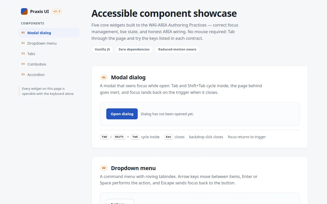
<h1>Accessible component showcase</h1>
<p class="tagline">Five core widgets built to the WAI-ARIA Authoring Practices — correct focus management, live state, and honest ARIA wiring. No mouse required: Tab through the page and try the keys listed in each contract.</p>
<ul class="chips" role="list">
<li class="chip">Vanilla JS</li>
<li class="chip">Zero dependencies</li>
<li class="chip">Reduced-motion aware</li>
</ul>
</header>
<!-- ============ 01 · MODAL DIALOG ============ -->
<section class="component" id="sec-modal" aria-labelledby="h-modal">
<h2 id="h-modal"><span class="num" aria-hidden="true">01</span>Modal dialog</h2>
<p class="lede">A modal that owns focus while open: Tab and Shift+Tab cycle inside, the page behind goes inert, and focus lands back on the trigger when it closes.</p>
<div class="demo demo-row">
<button class="btn btn-primary" id="open-modal-btn" aria-haspopup="dialog" aria-expanded="false">Open dialog</button>
<p class="status" id="modal-status" role="status">Dialog has not been opened yet.</p>
</div>
<p class="contract">
<span><kbd>Tab</kbd> / <kbd>Shift</kbd>+<kbd>Tab</kbd> cycle inside</span>
<span><kbd>Esc</kbd> closes</span>
<span>backdrop click closes</span>
<span>focus returns to trigger</span>
</p>
</section>
<!-- ============ 02 · DROPDOWN MENU ============ -->
<section class="component" id="sec-menu" aria-labelledby="h-menu">
<h2 id="h-menu"><span class="num" aria-hidden="true">02</span>Dropdown menu</h2>
<p class="lede">A command menu with roving tabindex. Arrow keys move between items, Enter or Space performs the action, and Escape sends focus back to the button.</p>
<div class="demo">
<div class="menu-wrap">
<button class="btn" id="menu-btn" aria-haspopup="menu" aria-expanded="false" aria-controls="menu-list">
Actions
<svg class="chev" width="12" height="12" viewBox="0 0 12 12" fill="none" aria-hidden="true"><path d="M2.5 4.5L6 8l3.5-3.5" stroke="currentColor" stroke-width="1.8" stroke-linecap="round" stroke-linejoin="round"/></svg>
</button>
<ul class="menu" id="menu-list" role="menu" hidden>
<li role="none"><button class="menuitem" role="menuitem" tabindex="-1">Rename</button></li>
<li role="none"><button class="menuitem" role="menuitem" tabindex="-1">Duplicate</button></li>
<li role="none"><button class="menuitem" role="menuitem" tabindex="-1">Move to folder…</button></li>
<li role="none"><button class="menuitem" role="menuitem" tabindex="-1">Copy share link</button></li>
<li role="none" class="menu-sep"></li>
<li role="none"><button class="menuitem menuitem-danger" role="menuitem" tabindex="-1">Delete</button></li>
</ul>
</div>
<p class="status" id="menu-status" role="status">No action performed yet.</p>
</div>
<p class="contract">
<span><kbd>↓</kbd> opens on first item</span>
<span><kbd>↑</kbd><kbd>↓</kbd> navigate (wraps)</span>
<span><kbd>Home</kbd>/<kbd>End</kbd> jump</span>
<span><kbd>Enter</kbd> selects</span>
<span><kbd>Esc</kbd> closes → button</span>
<span><kbd>Tab</kbd> closes, moves on</span>
</p>
</section>
<!-- ============ 03 · TABS ============ -->
<section class="component" id="sec-tabs" aria-labelledby="h-tabs">
<h2 id="h-tabs"><span class="num" aria-hidden="true">03</span>Tabs</h2>
<p class="lede">One tab in the tab order, arrows to travel, and the <code>hidden</code> attribute — not CSS — keeping inactive panels out of the accessibility tree.</p>
<div class="demo">
<div class="tablist" role="tablist" aria-label="Tabs demo" id="tablist">
<button class="tab" role="tab" id="tab-overview" aria-selected="true" aria-controls="panel-overview" tabindex="0">Overview</button>
<button class="tab" role="tab" id="tab-behavior" aria-selected="false" aria-controls="panel-behavior" tabindex="-1">Behavior</button>
<button class="tab" role="tab" id="tab-markup" aria-selected="false" aria-controls="panel-markup" tabindex="-1">Markup</button>
</div>
<div class="tabpanel" role="tabpanel" id="panel-overview" aria-labelledby="tab-overview" tabindex="0">
<p>Praxis UI ships five core primitives. Each one exposes its state through ARIA that mirrors what you see on screen — if it looks open, it announces open.</p>
<p style="margin-top:12px"><a class="link" href="#sec-tabs">Read the tab pattern spec</a></p>
</div>
<div class="tabpanel" role="tabpanel" id="panel-behavior" aria-labelledby="tab-behavior" tabindex="0" hidden>
<ul>
<li>Exactly one tab carries <code>tabindex="0"</code>; the rest sit at <code>-1</code>.</li>
<li>Arrow keys move focus <em>and</em> selection together (automatic activation).</li>
<li>Inactive panels use <code>hidden</code>, so their content is unreachable by Tab.</li>
</ul>
<a class="link" href="#sec-tabs">See the full interaction matrix</a>
</div>
<div class="tabpanel" role="tabpanel" id="panel-markup" aria-labelledby="tab-markup" tabindex="0" hidden>
<pre><code><div role="tablist">
<button role="tab" aria-selected="true"
aria-controls="p1" tabindex="0">…</button>
<button role="tab" aria-selected="false"
aria-controls="p2" tabindex="-1">…</button>
</div>
<div role="tabpanel" id="p1" aria-labelledby="tab1">…</div></code></pre>
<a class="link" href="#sec-tabs">Jump back to the live example</a>
</div>
</div>
<p class="contract">
<span><kbd>←</kbd><kbd>→</kbd> switch tabs</span>
<span><kbd>Home</kbd>/<kbd>End</kbd> first / last</span>
<span>only the active tab is tabbable</span>
<span>panel content reachable by <kbd>Tab</kbd></span>
</p>
</section>
<!-- ============ 04 · COMBOBOX ============ -->
<section class="component" id="sec-combo" aria-labelledby="h-combo">
<h2 id="h-combo"><span class="num" aria-hidden="true">04</span>Combobox</h2>
<p class="lede">An autocomplete input using the <code>aria-activedescendant</code> pattern — the listbox is never focusable; the highlight is announced through the input's own ARIA state.</p>
<div class="demo">
<div class="combo" id="combo-wrap">
<label class="combo-label" for="combo-input" id="combo-label">Favorite fruit</label>
<div class="combo-field">
<input class="combo-input" id="combo-input" role="combobox"
aria-expanded="false" aria-controls="combo-listbox"
aria-autocomplete="list" autocomplete="off"
placeholder="Type to search…">
<svg class="combo-caret" width="12" height="12" viewBox="0 0 12 12" fill="none" aria-hidden="true"><path d="M2.5 4.5L6 8l3.5-3.5" stroke="currentColor" stroke-width="1.8" stroke-linecap="round" stroke-linejoin="round"/></svg>
<ul class="listbox" id="combo-listbox" role="listbox" aria-labelledby="combo-label" hidden>
<li class="option" role="option" id="combo-opt-1" aria-selected="false">Apple</li>
<li class="option" role="option" id="combo-opt-2" aria-selected="false">Apricot</li>
<li class="option" role="option" id="combo-opt-3" aria-selected="false">Avocado</li>
<li class="option" role="option" id="combo-opt-4" aria-selected="false">Banana</li>
<li class="option" role="option" id="combo-opt-5" aria-selected="false">Blackberry</li>
<li class="option" role="option" id="combo-opt-6" aria-selected="false">Blueberry</li>
<li class="option" role="option" id="combo-opt-7" aria-selected="false">Cherry</li>
<li class="option" role="option" id="combo-opt-8" aria-selected="false">Coconut</li>
<li class="option" role="option" id="combo-opt-9" aria-selected="false">Cranberry</li>
<li class="option" role="option" id="combo-opt-10" aria-selected="false">Dragonfruit</li>
<li class="option" role="option" id="combo-opt-11" aria-selected="false">Fig</li>
<li class="option" role="option" id="combo-opt-12" aria-selected="false">Grape</li>
<li class="option" role="option" id="combo-opt-13" aria-selected="false">Grapefruit</li>
<li class="option" role="option" id="combo-opt-14" aria-selected="false">Kiwi</li>
<li class="option" role="option" id="combo-opt-15" aria-selected="false">Lemon</li>
<li class="option" role="option" id="combo-opt-16" aria-selected="false">Mango</li>
<li class="option" role="option" id="combo-opt-17" aria-selected="false">Papaya</li>
<li class="option" role="option" id="combo-opt-18" aria-selected="false">Peach</li>
<li class="option" role="option" id="combo-opt-19" aria-selected="false">Pineapple</li>
<li class="option" role="option" id="combo-opt-20" aria-selected="false">Raspberry</li>
<li class="option option-none" role="option" id="combo-none" aria-disabled="true" aria-selected="false" hidden>No matches</li>
</ul>
</div>
</div>
</div>
<p class="contract">
<span><kbd>↓</kbd> opens the list</span>
<span>type to filter</span>
<span><kbd>↑</kbd><kbd>↓</kbd> move highlight</span>
<span><kbd>Enter</kbd> selects</span>
<span><kbd>Esc</kbd> closes + reverts</span>
<span>focus-out closes</span>
</p>
</section>
<!-- ============ 05 · ACCORDION ============ -->
<section class="component" id="sec-accordion" aria-labelledby="h-accordion">
<h2 id="h-accordion"><span class="num" aria-hidden="true">05</span>Accordion</h2>
<p class="lede">Disclosure buttons that animate height with the Web Animations API — <code>hidden</code> is only toggled when the animation finishes, so assistive tech never sees a half-open region.</p>
<div class="demo">
<div class="accordion">
<div class="acc-item">
<h3 class="acc-heading">
<button class="acc-trigger" id="acc-b1" aria-expanded="false" aria-controls="acc-p1">
<span>What is a focus trap, and why does the modal need one?</span>
<svg class="chev" width="12" height="12" viewBox="0 0 12 12" fill="none" aria-hidden="true"><path d="M2.5 4.5L6 8l3.5-3.5" stroke="currentColor" stroke-width="1.8" stroke-linecap="round" stroke-linejoin="round"/></svg>
</button>
</h3>
<div class="acc-panel" id="acc-p1" role="region" aria-labelledby="acc-b1" hidden>
<div class="acc-inner"><p>While a modal is open, Tab and Shift+Tab are intercepted and wrapped inside the dialog. Combined with <code>inert</code> on the background, keyboard focus can never leak into the page behind the dialog.</p></div>
</div>
</div>
<div class="acc-item">
<h3 class="acc-heading">
<button class="acc-trigger" id="acc-b2" aria-expanded="false" aria-controls="acc-p2">
<span>Why does only one tab sit in the tab order?</span>
<svg class="chev" width="12" height="12" viewBox="0 0 12 12" fill="none" aria-hidden="true"><path d="M2.5 4.5L6 8l3.5-3.5" stroke="currentColor" stroke-width="1.8" stroke-linecap="round" stroke-linejoin="round"/></svg>
</button>
</h3>
<div class="acc-panel" id="acc-p2" role="region" aria-labelledby="acc-b2" hidden>
<div class="acc-inner"><p>With <code>tabindex="-1"</code> on inactive tabs, a single Tab press reaches the tablist; arrows do the traveling. Adding every tab to the tab order would force N-1 extra stops before reaching the panel content.</p></div>
</div>
</div>
<div class="acc-item">
<h3 class="acc-heading">
<button class="acc-trigger" id="acc-b3" aria-expanded="false" aria-controls="acc-p3">
<span>How do the accordion animations stay accessible?</span>
<svg class="chev" width="12" height="12" viewBox="0 0 12 12" fill="none" aria-hidden="true"><path d="M2.5 4.5L6 8l3.5-3.5" stroke="currentColor" stroke-width="1.8" stroke-linecap="round" stroke-linejoin="round"/></svg>
</button>
</h3>
<div class="acc-panel" id="acc-p3" role="region" aria-labelledby="acc-b3" hidden>
<div class="acc-inner"><p>Height is animated with WAAPI while the region stays visible; <code>hidden</code> is applied only on <code>finish</code>. When <code>prefers-reduced-motion</code> is set, the animation is skipped and the attribute toggles immediately.</p></div>
</div>
</div>
</div>
</div>
<p class="contract">
<span><kbd>Enter</kbd> / <kbd>Space</kbd> toggle</span>
<span>multiple panels may stay open</span>
<span>animation respects <code>prefers-reduced-motion</code></span>
</p>
</section>
<footer class="page-foot">
<p>Praxis UI is a single HTML file — hand-written CSS and vanilla JS, no frameworks, no CDN. View the source to study the ARIA wiring.</p>
</footer>
</main>
</div>
<!-- Modal lives outside #app-root so the background can be inerted -->
<div class="modal-overlay" id="modal-overlay" hidden>
<div class="modal" id="modal-dialog" role="dialog" aria-modal="true"
aria-labelledby="modal-title" aria-describedby="modal-desc" tabindex="-1">
<button class="modal-close" id="modal-close" aria-label="Close dialog">
<svg width="14" height="14" viewBox="0 0 14 14" fill="none" aria-hidden="true"><path d="M2 2l10 10M12 2L2 12" stroke="currentColor" stroke-width="2" stroke-linecap="round"/></svg>
</button>
<h2 id="modal-title">Schedule a deployment</h2>
<p id="modal-desc">This dialog traps focus while open. The page behind it is inert, so Tab can never escape.</p>
<div class="field">
<label for="modal-env">Environment</label>
<select id="modal-env">
<option>Production</option>
<option>Staging</option>
<option>Preview</option>
</select>
</div>
<div class="modal-actions">
<button class="btn" id="modal-cancel">Cancel</button>
<button class="btn btn-primary" id="modal-confirm">Deploy</button>
</div>
</div>
</div>
<!-- Polite live region for state announcements (combobox etc.) -->
<div class="visually-hidden" aria-live="polite" aria-atomic="true" id="sr-live"></div>
<script>
'use strict';
/* ==================================================================
1 · TUNABLE TOKENS
Single source of truth for colors, spacing and motion. Applied to
CSS custom properties on boot so the whole sheet re-themes from
here.
================================================================== */
const TOKENS = {
colors: {
bg: '#f6f7f9',
surface: '#ffffff',
ink: '#182029',
muted: '#5c6675',
border: '#e3e7ee',
borderStrong: '#c9d1dc',
primary: '#2353c0',
primaryStrong: '#1a419c',
primarySoft: '#eef2fb',
accent: '#b45309',
accentSoft: '#fbf1e6',
accentBorder: '#f0dcc4',
focus: '#1c439e',
danger: '#b42318',
dangerSoft: '#fef3f2',
},
spacing: { s1: 4, s2: 8, s3: 12, s4: 16, s5: 24, s6: 32, s7: 48, s8: 64 },
durations: { fast: 120, med: 200, slow: 320, accordion: 260 },
radius: { sm: 6, md: 10, lg: 12 },
};
function applyTokens() {
const r = document.documentElement.style;
const set = (k, v) => r.setProperty(k, v);
const c = TOKENS.colors;
set('--bg', c.bg); set('--surface', c.surface);
set('--ink', c.ink); set('--muted', c.muted);
set('--border', c.border); set('--border-strong', c.borderStrong);
set('--primary', c.primary); set('--primary-strong', c.primaryStrong);
set('--primary-soft', c.primarySoft);
set('--accent', c.accent); set('--accent-soft', c.accentSoft);
set('--accent-border', c.accentBorder);
set('--focus', c.focus); set('--danger', c.danger); set('--danger-soft', c.dangerSoft);
for (const [k, v] of Object.entries(TOKENS.spacing)) set(`--space-${k}`, v + 'px');
const d = TOKENS.durations;
set('--dur-fast', d.fast + 'ms');
set('--dur-med', d.med + 'ms');
set('--dur-slow', d.slow + 'ms');
set('--dur-accordion', d.accordion + 'ms');
set('--radius-sm', TOKENS.radius.sm + 'px');
set('--radius-md', TOKENS.radius.md + 'px');
set('--radius-lg', TOKENS.radius.lg + 'px');
}
/* ==================================================================
2 · SHARED HELPERS
announce() — polite live-region announcer
setInert() — inert the background while a modal is open
FocusTrap — Tab / Shift+Tab cycling + focus restore
RovingTabindex — roving tabindex for menu items
Activedescendant — aria-activedescendant manager (combobox)
================================================================== */
const $ = (sel, root = document) => root.querySelector(sel);
const $$ = (sel, root = document) => Array.from(root.querySelectorAll(sel));
const FOCUSABLE =
'a[href], button:not([disabled]), input:not([disabled]), select:not([disabled]), ' +
'textarea:not([disabled]), [tabindex]:not([tabindex="-1"])';
const motionQuery = window.matchMedia('(prefers-reduced-motion: reduce)');
const reducedMotion = () => motionQuery.matches;
const srLive = $('#sr-live');
function announce(message) {
srLive.textContent = '';
window.setTimeout(() => { srLive.textContent = message; }, 40);
}
function setInert(el, value) {
if ('inert' in el) { el.inert = value; return; }
/* Fallback for engines without inert: pull focusables out of order */
$$(FOCUSABLE, el).forEach((f) => {
if (value) {
f.dataset.prevTabindex = f.getAttribute('tabindex');
f.setAttribute('tabindex', '-1');
} else if (f.dataset.prevTabindex !== undefined) {
f.setAttribute('tabindex', f.dataset.prevTabindex);
delete f.dataset.prevTabindex;
}
});
}
class FocusTrap {
constructor(container) {
this.container = container;
this.prevFocus = null;
}
focusables() {
return $$(FOCUSABLE, this.container).filter((el) => el.getClientRects().length > 0);
}
activate() {
this.prevFocus = document.activeElement;
this.container.addEventListener('keydown', this._onKeydown);
(this.focusables()[0] || this.container).focus();
}
deactivate(restore = true) {
this.container.removeEventListener('keydown', this._onKeydown);
if (restore && this.prevFocus && typeof this.prevFocus.focus === 'function') {
this.prevFocus.focus();
}
}
_onKeydown = (event) => {
if (event.key !== 'Tab') return;
const els = this.focusables();
if (!els.length) { event.preventDefault(); return; }
const first = els[0];
const last = els[els.length - 1];
const active = document.activeElement;
const inside = this.container.contains(active);
if (event.shiftKey) {
if (active === first || !inside) { event.preventDefault(); last.focus(); }
} else if (active === last || !inside) {
event.preventDefault(); first.focus();
}
};
}
class RovingTabindex {
constructor(items) { this.items = items; }
focus(index) {
const n = this.items.length;
const i = ((index % n) + n) % n;
this.items.forEach((el, j) => el.setAttribute('tabindex', j === i ? '0' : '-1'));
this.items[i].focus();
}
reset() { this.items.forEach((el) => el.setAttribute('tabindex', '-1')); }
}
class Activedescendant {
constructor(input, listbox) {
this.input = input;
this.listbox = listbox;
this.options = [];
this.activeIndex = -1;
}
get active() { return this.options[this.activeIndex] || null; }
setOptions(options) {
this.options = options;
this.activeIndex = -1;
this.render();
}
setActive(index) {
if (!this.options.length) return;
this.activeIndex = ((index % this.options.length) + this.options.length) % this.options.length;
this.render();
}
next() { this.setActive(this.activeIndex + 1); }
prev() { this.setActive(this.activeIndex - 1); }
clear() { this.activeIndex = -1; this.render(); }
render() {
const active = this.active;
this.options.forEach((o) => o.setAttribute('aria-selected', o === active ? 'true' : 'false'));
if (active) {
this.input.setAttribute('aria-activedescendant', active.id);
active.scrollIntoView({ block: 'nearest' });
} else {
this.input.removeAttribute('aria-activedescendant');
}
}
}
/* ==================================================================
3 · MODAL DIALOG
role=dialog + aria-modal; focus trap; inert background;
Escape / backdrop close; focus restored to the trigger.
================================================================== */
const modal = {
overlay: $('#modal-overlay'),
dialog: $('#modal-dialog'),
trigger: $('#open-modal-btn'),
status: $('#modal-status'),
trap: new FocusTrap($('#modal-dialog')),
open() {
this.overlay.hidden = false;
setInert($('#app-root'), true);
this.trigger.setAttribute('aria-expanded', 'true');
this.trap.activate();
document.addEventListener('keydown', this._onEscape);
},
close() {
this.overlay.hidden = true;
setInert($('#app-root'), false);
this.trigger.setAttribute('aria-expanded', 'false');
document.removeEventListener('keydown', this._onEscape);
this.trap.deactivate();
},
_onEscape: (event) => {
if (event.key === 'Escape') { event.preventDefault(); modal.close(); }
},
};
modal.trigger.addEventListener('click', () => modal.open());
$('#modal-close').addEventListener('click', () => modal.close());
$('#modal-cancel').addEventListener('click', () => modal.close());
$('#modal-confirm').addEventListener('click', () => {
modal.status.textContent = `Deployment to ${$('#modal-env').value} scheduled for 02:00 UTC.`;
modal.close();
});
modal.overlay.addEventListener('click', (event) => {
if (event.target === modal.overlay) modal.close();
});
/* ==================================================================
4 · DROPDOWN MENU
aria-haspopup=menu; opens on click / Enter / Space / Down;
roving tabindex; arrows wrap; Home/End; Esc → button;
Tab closes and lets focus continue naturally.
================================================================== */
const menu = {
button: $('#menu-btn'),
list: $('#menu-list'),
items: $$('#menu-list [role="menuitem"]'),
status: $('#menu-status'),
roving: new RovingTabindex($$('#menu-list [role="menuitem"]')),
open(index = 0) {
this.list.hidden = false;
this.button.setAttribute('aria-expanded', 'true');
this.roving.focus(index);
},
close(restoreFocus = true) {
this.list.hidden = true;
this.button.setAttribute('aria-expanded', 'false');
this.roving.reset();
if (restoreFocus) this.button.focus();
},
};
menu.button.addEventListener('click', () => {
if (menu.list.hidden) menu.open(0); else menu.close();
});
menu.button.addEventListener('keydown', (event) => {
if (event.key === 'ArrowDown') { event.preventDefault(); menu.open(0); }
else if (event.key === 'ArrowUp') { event.preventDefault(); menu.open(menu.items.length - 1); }
else if (event.key === 'Escape' && !menu.list.hidden) { event.preventDefault(); menu.close(); }
});
menu.list.addEventListener('keydown', (event) => {
const i = menu.items.indexOf(document.activeElement);
switch (event.key) {
case 'ArrowDown': event.preventDefault(); menu.roving.focus(i + 1); break;
case 'ArrowUp': event.preventDefault(); menu.roving.focus(i - 1); break;
case 'Home': event.preventDefault(); menu.roving.focus(0); break;
case 'End': event.preventDefault(); menu.roving.focus(menu.items.length - 1); break;
case 'Escape': event.preventDefault(); menu.close(); break;
case 'Tab': menu.close(false); break; /* let Tab continue naturally */
}
});
menu.items.forEach((item) => {
item.addEventListener('click', () => {
menu.status.textContent = `“${item.textContent.trim()}” performed on demo-file.txt`;
menu.close();
});
});
/* ==================================================================
5 · TABS
One tab in the tab order (roving tabindex), arrows travel with
automatic activation, panels toggle via the hidden attribute.
================================================================== */
const tabs = {
tabs: $$('#tablist [role="tab"]'),
panels: $$('#sec-tabs [role="tabpanel"]'),
activate(tab, { focus = true } = {}) {
this.tabs.forEach((t) => {
const selected = t === tab;
t.setAttribute('aria-selected', selected ? 'true' : 'false');
t.tabIndex = selected ? 0 : -1;
});
const panelId = tab.getAttribute('aria-controls');
this.panels.forEach((p) => { p.hidden = p.id !== panelId; });
if (focus) tab.focus();
},
move(delta) {
const i = this.tabs.findIndex((t) => t.getAttribute('aria-selected') === 'true');
this.activate(this.tabs[(i + delta + this.tabs.length) % this.tabs.length]);
},
};
tabs.tabs.forEach((tab) => tab.addEventListener('click', () => tabs.activate(tab)));
$('#tablist').addEventListener('keydown', (event) => {
switch (event.key) {
case 'ArrowRight': case 'ArrowDown': event.preventDefault(); tabs.move(1); break;
case 'ArrowLeft': case 'ArrowUp': event.preventDefault(); tabs.move(-1); break;
case 'Home': event.preventDefault(); tabs.activate(tabs.tabs[0]); break;
case 'End': event.preventDefault(); tabs.activate(tabs.tabs[tabs.tabs.length - 1]); break;
}
});
/* ==================================================================
6 · COMBOBOX (autocomplete, aria-activedescendant)
Listbox is never focusable; the highlight lives on the input
via aria-activedescendant. Type filters, arrows move, Enter
selects, Esc reverts, focus-out closes.
================================================================== */
const combo = {
wrap: $('#combo-wrap'),
input: $('#combo-input'),
list: $('#combo-listbox'),
noneRow: $('#combo-none'),
options: $$('#combo-listbox [role="option"]').filter((o) => o.id !== 'combo-none'),
manager: new Activedescendant($('#combo-input'), $('#combo-listbox')),
committed: '',
open() { this.list.hidden = false; this.input.setAttribute('aria-expanded', 'true'); },
close() {
this.list.hidden = true;
this.input.setAttribute('aria-expanded', 'false');
this.manager.clear();
},
filter(text) {
const q = text.trim().toLowerCase();
const visible = this.options.filter((o) => o.textContent.toLowerCase().includes(q));
this.options.forEach((o) => { o.hidden = !visible.includes(o); });
this.noneRow.hidden = visible.length > 0;
this.manager.setOptions(visible);
return visible.length;
},
select(option) {
this.input.value = option.textContent;
this.committed = option.textContent;
this.close();
announce(`Selected ${option.textContent}`);
this.input.focus();
},
};
combo.input.addEventListener('input', () => {
const count = combo.filter(combo.input.value);
combo.open();
if (count) combo.manager.setActive(0);
});
combo.input.addEventListener('keydown', (event) => {
switch (event.key) {
case 'ArrowDown':
event.preventDefault();
if (combo.list.hidden) combo.open();
combo.manager.next();
break;
case 'ArrowUp':
event.preventDefault();
if (combo.list.hidden) combo.open();
combo.manager.prev();
break;
case 'Enter':
if (!combo.list.hidden && combo.manager.active) {
event.preventDefault();
combo.select(combo.manager.active);
}
break;
case 'Escape':
if (!combo.list.hidden) {
event.preventDefault();
combo.input.value = combo.committed; /* revert text */
combo.filter(combo.committed);
combo.close();
}
break;
case 'Tab':
combo.close();
break;
}
});
combo.options.forEach((option) => {
option.addEventListener('click', () => combo.select(option));
});
document.addEventListener('focusin', (event) => {
if (event.target === document) return;
if (!combo.list.hidden && !combo.wrap.contains(event.target)) combo.close();
});
/* ==================================================================
7 · ACCORDION / DISCLOSURE GROUP
Multiple may be open. Height animates via WAAPI; the hidden
attribute is only toggled at the end (or immediately under
prefers-reduced-motion).
================================================================== */
const accordion = {
open(trigger) {
const panel = document.getElementById(trigger.getAttribute('aria-controls'));
trigger.setAttribute('aria-expanded', 'true');
panel.hidden = false;
if (reducedMotion()) { panel.style.height = 'auto'; return; }
panel.getAnimations().forEach((a) => a.cancel());
const height = panel.scrollHeight;
panel.style.height = '0px';
panel.animate(
[{ height: '0px' }, { height: height + 'px' }],
{ duration: TOKENS.durations.accordion, easing: 'cubic-bezier(0.2, 0.7, 0.3, 1)' },
).addEventListener('finish', () => { panel.style.height = 'auto'; }, { once: true });
},
close(trigger) {
const panel = document.getElementById(trigger.getAttribute('aria-controls'));
trigger.setAttribute('aria-expanded', 'false');
if (reducedMotion()) { panel.hidden = true; panel.style.height = ''; return; }
panel.getAnimations().forEach((a) => a.cancel());
const height = panel.scrollHeight;
panel.style.height = height + 'px';
panel.animate(
[{ height: height + 'px' }, { height: '0px' }],
{ duration: TOKENS.durations.accordion, easing: 'cubic-bezier(0.6, 0, 0.8, 0.4)' },
).addEventListener('finish', () => { panel.hidden = true; panel.style.height = ''; }, { once: true });
},
toggle(trigger) {
if (trigger.getAttribute('aria-expanded') === 'true') this.close(trigger);
else this.open(trigger);
},
};
$$('.acc-trigger').forEach((trigger) => trigger.addEventListener('click', () => accordion.toggle(trigger)));
/* ==================================================================
8 · SIDEBAR SCROLL SPY + BOOT
================================================================== */
const navLinks = new Map($$('.sidebar a[href^="#sec-"]').map((a) => [a.hash.slice(1), a]));
const spy = new IntersectionObserver((entries) => {
entries.forEach((entry) => {
if (!entry.isIntersecting) return;
navLinks.forEach((a) => a.removeAttribute('aria-current'));
const link = navLinks.get(entry.target.id);
if (link) link.setAttribute('aria-current', 'true');
});
}, { rootMargin: '-30% 0px -60% 0px' });
$$('.component').forEach((section) => spy.observe(section));
/* Populate the combobox manager with the full option set up front so
ArrowDown before any typing has options to highlight. */
combo.filter(combo.input.value);
applyTokens();
</script>
</body>
</html>
<!-- agent-meta {"model":"ukisai/Swift-Qwen3.8-27B-GGUF","provider":"brigid","persona":"full","sessionId":"f27dd4c1-02f5-494b-aa71-b730d4c73b77","tokensIn":1123146,"tokensOut":60620,"tokensTotal":1183766,"cost":0,"turns":36,"toolCalls":35,"failedToolCalls":14,"timestamp":"2026-09-29T18:27:29.881Z"} -->