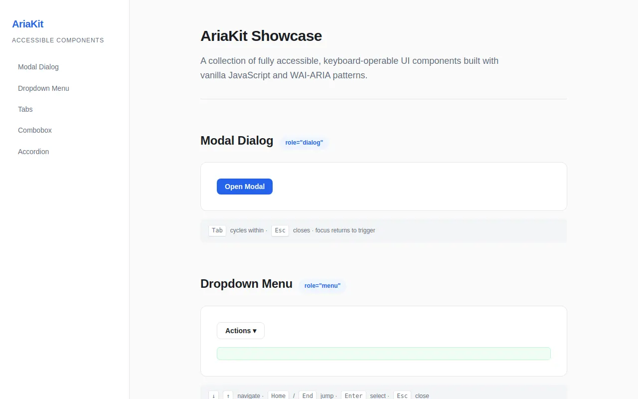
Accessible Components
Qwen 3.6 27b MTP · full
Reviews & generation details
Reviews
No human review yet. Unreviewed does not mean unsuccessful.
Generation context
Imported historical artifact. Its exact original instructions and lineage are not known.
Generation prompt · exact text unavailable
See the current prompt for reference. It may differ from the instructions used to generate this artifact.
Inspect original source 45,253 bytes · SHA-256 c40477f7ffcd
<!DOCTYPE html>
<html lang="en">
<head>
<meta charset="UTF-8">
<meta name="viewport" content="width=device-width, initial-scale=1.0">
<title>AriaKit — Accessible Component Showcase</title>
<style>
/* ============================================================
CONSTANTS & DESIGN TOKENS
============================================================ */
:root {
/* Colors */
--color-bg: #fafafa;
--color-surface: #ffffff;
--color-border: #e2e4e8;
--color-text: #1a1d23;
--color-text-secondary: #5f6b7a;
--color-accent: #2563eb;
--color-accent-hover: #1d4ed8;
--color-accent-light: #eff6ff;
--color-focus-ring: rgba(37, 99, 235, 0.5);
--color-overlay: rgba(0, 0, 0, 0.4);
--color-success: #16a34a;
--color-code-bg: #f3f4f6;
/* Spacing scale */
--space-1: 0.25rem;
--space-2: 0.5rem;
--space-3: 0.75rem;
--space-4: 1rem;
--space-5: 1.25rem;
--space-6: 1.5rem;
--space-8: 2rem;
--space-10: 2.5rem;
--space-12: 3rem;
/* Typography */
--font-sans: -apple-system, BlinkMacSystemFont, "Segoe UI", Roboto, "Helvetica Neue", Arial, sans-serif;
--font-mono: ui-monospace, SFMono-Regular, "SF Mono", Menlo, Consolas, monospace;
--text-xs: 0.75rem;
--text-sm: 0.875rem;
--text-base: 1rem;
--text-lg: 1.125rem;
--text-xl: 1.25rem;
--text-2xl: 1.5rem;
--text-3xl: 1.875rem;
/* Animation durations */
--duration-fast: 150ms;
--duration-normal: 250ms;
--duration-slow: 400ms;
/* Layout */
--sidebar-width: 260px;
--max-content-width: 800px;
--radius-sm: 6px;
--radius-md: 8px;
--radius-lg: 12px;
}
/* ============================================================
RESET & BASE
============================================================ */
*, *::before, *::after { box-sizing: border-box; margin: 0; padding: 0; }
html { scroll-behavior: smooth; font-size: 16px; }
body {
font-family: var(--font-sans);
color: var(--color-text);
background: var(--color-bg);
line-height: 1.6;
-webkit-font-smoothing: antialiased;
}
/* ============================================================
FOCUS INDICATORS (global, high-contrast)
============================================================ */
:focus-visible {
outline: 3px solid var(--color-focus-ring);
outline-offset: 2px;
}
button:focus-visible, [role="button"]:focus-visible,
[role="menuitem"]:focus-visible, [role="option"]:focus-visible,
a:focus-visible, input:focus-visible {
outline: 3px solid var(--color-focus-ring);
outline-offset: 2px;
}
/* ============================================================
SKIP LINK
============================================================ */
.skip-link {
position: absolute;
top: -100%;
left: var(--space-4);
z-index: 10000;
padding: var(--space-2) var(--space-4);
background: var(--color-accent);
color: #fff;
font-weight: 600;
border-radius: var(--radius-sm);
text-decoration: none;
transition: top var(--duration-fast);
}
.skip-link:focus {
top: var(--space-2);
}
/* ============================================================
LAYOUT — SIDEBAR + MAIN
============================================================ */
.page-layout {
display: flex;
min-height: 100vh;
}
.sidebar {
position: sticky;
top: 0;
width: var(--sidebar-width);
height: 100vh;
overflow-y: auto;
background: var(--color-surface);
border-right: 1px solid var(--color-border);
padding: var(--space-8) var(--space-6);
flex-shrink: 0;
}
.sidebar-logo {
font-size: var(--text-xl);
font-weight: 700;
color: var(--color-accent);
margin-bottom: var(--space-2);
letter-spacing: -0.02em;
}
.sidebar-tagline {
font-size: var(--text-xs);
color: var(--color-text-secondary);
text-transform: uppercase;
letter-spacing: 0.08em;
margin-bottom: var(--space-6);
}
.sidebar-nav { list-style: none; }
.sidebar-nav li { margin-bottom: var(--space-1); }
.sidebar-nav a {
display: block;
padding: var(--space-2) var(--space-3);
color: var(--color-text-secondary);
text-decoration: none;
font-size: var(--text-sm);
border-radius: var(--radius-sm);
transition: background var(--duration-fast), color var(--duration-fast);
}
.sidebar-nav a:hover {
background: var(--color-accent-light);
color: var(--color-accent);
}
.sidebar-nav a.active {
background: var(--color-accent-light);
color: var(--color-accent);
font-weight: 600;
}
.main-content {
flex: 1;
max-width: var(--max-content-width);
padding: var(--space-12) var(--space-8);
margin: 0 auto;
}
/* ============================================================
HERO HEADER
============================================================ */
.hero {
margin-bottom: var(--space-12);
padding-bottom: var(--space-8);
border-bottom: 1px solid var(--color-border);
}
.hero h1 {
font-size: var(--text-3xl);
font-weight: 700;
letter-spacing: -0.02em;
margin-bottom: var(--space-3);
}
.hero p {
color: var(--color-text-secondary);
font-size: var(--text-lg);
max-width: 60ch;
}
/* ============================================================
COMPONENT SECTION
============================================================ */
.component-section {
margin-bottom: var(--space-12);
padding-top: var(--space-4);
}
.section-header {
display: flex;
align-items: baseline;
gap: var(--space-3);
margin-bottom: var(--space-6);
}
.section-header h2 {
font-size: var(--text-2xl);
font-weight: 700;
letter-spacing: -0.01em;
}
.section-badge {
display: inline-block;
padding: var(--space-1) var(--space-3);
background: var(--color-accent-light);
color: var(--color-accent);
font-size: var(--text-xs);
font-weight: 600;
border-radius: 99px;
}
.component-demo {
background: var(--color-surface);
border: 1px solid var(--color-border);
border-radius: var(--radius-lg);
padding: var(--space-8);
margin-bottom: var(--space-4);
}
.keyboard-hint {
display: flex;
align-items: center;
gap: var(--space-2);
font-size: var(--text-xs);
color: var(--color-text-secondary);
padding: var(--space-3) var(--space-4);
background: var(--color-code-bg);
border-radius: var(--radius-sm);
}
.kbd {
display: inline-block;
padding: 1px 6px;
font-family: var(--font-mono);
font-size: var(--text-xs);
background: var(--color-surface);
border: 1px solid var(--color-border);
border-radius: 4px;
box-shadow: 0 1px 0 var(--color-border);
}
/* ============================================================
BUTTONS (shared)
============================================================ */
.btn {
display: inline-flex;
align-items: center;
gap: var(--space-2);
padding: var(--space-2) var(--space-4);
font-size: var(--text-sm);
font-weight: 600;
font-family: inherit;
color: #fff;
background: var(--color-accent);
border: none;
border-radius: var(--radius-md);
cursor: pointer;
transition: background var(--duration-fast), transform var(--duration-fast);
}
.btn:hover { background: var(--color-accent-hover); }
.btn:active { transform: scale(0.97); }
.btn-secondary {
color: var(--color-text);
background: var(--color-surface);
border: 1px solid var(--color-border);
}
.btn-secondary:hover { background: var(--color-code-bg); }
/* ============================================================
MODAL DIALOG
============================================================ */
.modal-overlay {
position: fixed;
inset: 0;
z-index: 9000;
display: flex;
align-items: center;
justify-content: center;
background: var(--color-overlay);
opacity: 0;
visibility: hidden;
transition: opacity var(--duration-normal), visibility var(--duration-normal);
}
.modal-overlay.open {
opacity: 1;
visibility: visible;
}
.modal-dialog {
background: var(--color-surface);
border-radius: var(--radius-lg);
box-shadow: 0 25px 60px rgba(0,0,0,0.15);
width: min(90vw, 480px);
padding: var(--space-8);
transform: translateY(20px) scale(0.97);
transition: transform var(--duration-normal);
}
.modal-overlay.open .modal-dialog {
transform: translateY(0) scale(1);
}
.modal-dialog h3 {
font-size: var(--text-xl);
margin-bottom: var(--space-4);
}
.modal-dialog p {
color: var(--color-text-secondary);
margin-bottom: var(--space-6);
line-height: 1.7;
}
.modal-actions {
display: flex;
justify-content: flex-end;
gap: var(--space-3);
}
/* ============================================================
DROPDOWN MENU
============================================================ */
.dropdown-wrapper {
position: relative;
display: inline-block;
}
.menu-list {
position: absolute;
top: calc(100% + 4px);
left: 0;
min-width: 200px;
background: var(--color-surface);
border: 1px solid var(--color-border);
border-radius: var(--radius-md);
box-shadow: 0 8px 30px rgba(0,0,0,0.1);
padding: var(--space-1);
list-style: none;
z-index: 100;
opacity: 0;
visibility: hidden;
transform: translateY(-4px);
transition: opacity var(--duration-fast), transform var(--duration-fast), visibility var(--duration-fast);
}
.menu-list.open {
opacity: 1;
visibility: visible;
transform: translateY(0);
}
[role="menuitem"] {
display: block;
width: 100%;
padding: var(--space-2) var(--space-3);
font-size: var(--text-sm);
text-align: left;
background: none;
border: none;
cursor: pointer;
border-radius: var(--radius-sm);
color: var(--color-text);
font-family: inherit;
}
[role="menuitem"]:hover,
[role="menuitem"].active {
background: var(--color-accent-light);
color: var(--color-accent);
}
.menu-action-result {
margin-top: var(--space-4);
padding: var(--space-3) var(--space-4);
font-size: var(--text-sm);
background: #f0fdf4;
border: 1px solid #bbf7d0;
border-radius: var(--radius-sm);
color: var(--color-success);
}
/* ============================================================
TABS
============================================================ */
.tablist {
display: flex;
gap: 2px;
border-bottom: 2px solid var(--color-border);
margin-bottom: var(--space-6);
}
[role="tab"] {
padding: var(--space-3) var(--space-5);
font-size: var(--text-sm);
font-weight: 600;
font-family: inherit;
background: none;
border: none;
color: var(--color-text-secondary);
cursor: pointer;
position: relative;
transition: color var(--duration-fast);
}
[role="tab"]:hover { color: var(--color-text); }
[role="tab"][aria-selected="true"] {
color: var(--color-accent);
}
[role="tab"][aria-selected="true"]::after {
content: '';
position: absolute;
bottom: -2px;
left: 0;
right: 0;
height: 2px;
background: var(--color-accent);
}
.tabpanel {
padding: var(--space-4) 0;
line-height: 1.7;
color: var(--color-text-secondary);
}
.tabpanel h4 {
font-size: var(--text-base);
color: var(--color-text);
margin-bottom: var(--space-2);
}
/* ============================================================
COMBOBOX
============================================================ */
.combobox-wrapper {
position: relative;
max-width: 360px;
}
.combobox-input {
width: 100%;
padding: var(--space-2) var(--space-4);
font-size: var(--text-sm);
font-family: inherit;
border: 1px solid var(--color-border);
border-radius: var(--radius-md);
background: var(--color-surface);
color: var(--color-text);
}
.combobox-input:focus {
border-color: var(--color-accent);
}
.listbox {
position: absolute;
top: calc(100% + 4px);
left: 0;
right: 0;
max-height: 240px;
overflow-y: auto;
background: var(--color-surface);
border: 1px solid var(--color-border);
border-radius: var(--radius-md);
box-shadow: 0 8px 30px rgba(0,0,0,0.1);
padding: var(--space-1);
list-style: none;
z-index: 100;
opacity: 0;
visibility: hidden;
transform: translateY(-4px);
transition: opacity var(--duration-fast), transform var(--duration-fast), visibility var(--duration-fast);
}
.listbox.open {
opacity: 1;
visibility: visible;
transform: translateY(0);
}
[role="option"] {
padding: var(--space-2) var(--space-3);
font-size: var(--text-sm);
border-radius: var(--radius-sm);
cursor: pointer;
}
[role="option"].highlighted,
[role="option"]:hover {
background: var(--color-accent-light);
color: var(--color-accent);
}
.combobox-selection {
margin-top: var(--space-4);
font-size: var(--text-sm);
color: var(--color-success);
}
/* ============================================================
ACCORDION
============================================================ */
.accordion-item {
border-bottom: 1px solid var(--color-border);
}
.accordion-trigger {
display: flex;
align-items: center;
justify-content: space-between;
width: 100%;
padding: var(--space-4) 0;
font-size: var(--text-base);
font-weight: 600;
font-family: inherit;
background: none;
border: none;
cursor: pointer;
color: var(--color-text);
text-align: left;
}
.accordion-trigger:hover { color: var(--color-accent); }
.accordion-chevron {
display: inline-block;
width: 20px;
height: 20px;
transition: transform var(--duration-normal);
flex-shrink: 0;
}
[aria-expanded="true"] .accordion-chevron {
transform: rotate(180deg);
}
.accordion-panel {
overflow: hidden;
max-height: 0;
transition: max-height var(--duration-slow) ease;
}
.accordion-panel.open {
max-height: 500px;
}
.accordion-content {
padding: 0 0 var(--space-6);
color: var(--color-text-secondary);
line-height: 1.7;
font-size: var(--text-sm);
}
/* ============================================================
REDUCED MOTION
============================================================ */
@media (prefers-reduced-motion: reduce) {
*, *::before, *::after {
animation-duration: 0.01ms !important;
transition-duration: 0.01ms !important;
}
.modal-overlay.open .modal-dialog { transform: none; }
.menu-list.open { transform: none; }
.listbox.open { transform: none; }
}
/* ============================================================
RESPONSIVE
============================================================ */
@media (max-width: 768px) {
.sidebar { display: none; }
.main-content { padding: var(--space-6); }
}
/* Live region for screen reader announcements */
.sr-only {
position: absolute;
width: 1px;
height: 1px;
padding: 0;
margin: -1px;
overflow: hidden;
clip: rect(0, 0, 0, 0);
white-space: nowrap;
border-width: 0;
}
/* Footer */
.page-footer {
margin-top: var(--space-12);
padding-top: var(--space-8);
border-top: 1px solid var(--color-border);
text-align: center;
color: var(--color-text-secondary);
font-size: var(--text-sm);
}
</style>
</head>
<body>
<!-- SKIP LINK -->
<a href="#main-content" class="skip-link">Skip to main content</a>
<!-- SCREEN READER LIVE REGION -->
<div id="aria-live-region" aria-live="polite" aria-atomic="true" class="sr-only"></div>
<div class="page-layout">
<!-- SIDEBAR NAVIGATION -->
<aside class="sidebar" role="complementary" aria-label="Component navigation">
<div class="sidebar-logo">AriaKit</div>
<div class="sidebar-tagline">Accessible Components</div>
<nav aria-label="Components">
<ul class="sidebar-nav">
<li><a href="#modal-dialog" data-section="modal-dialog">Modal Dialog</a></li>
<li><a href="#dropdown-menu" data-section="dropdown-menu">Dropdown Menu</a></li>
<li><a href="#tabs-component" data-section="tabs-component">Tabs</a></li>
<li><a href="#combobox-component" data-section="combobox-component">Combobox</a></li>
<li><a href="#accordion-component" data-section="accordion-component">Accordion</a></li>
</ul>
</nav>
</aside>
<!-- MAIN CONTENT -->
<main id="main-content" class="main-content">
<header class="hero">
<h1>AriaKit Showcase</h1>
<p>A collection of fully accessible, keyboard-operable UI components built with vanilla JavaScript and WAI-ARIA patterns.</p>
</header>
<!-- ============================================
1. MODAL DIALOG
============================================ -->
<section id="modal-dialog" class="component-section">
<div class="section-header">
<h2>Modal Dialog</h2>
<span class="section-badge">role="dialog"</span>
</div>
<div class="component-demo">
<button type="button" class="btn" id="modal-trigger-btn" aria-haspopup="dialog">Open Modal</button>
</div>
<div class="keyboard-hint">
<kbd class="kbd">Tab</kbd> cycles within · <kbd class="kbd">Esc</kbd> closes · focus returns to trigger
</div>
</section>
<!-- MODAL OVERLAY (outside sections) -->
<div class="modal-overlay" id="modal-overlay" role="presentation">
<div class="modal-dialog" role="dialog" aria-modal="true" aria-labelledby="modal-title" aria-describedby="modal-desc">
<h3 id="modal-title">Confirm Action</h3>
<p id="modal-desc">This is a modal dialog. Focus is trapped inside while open. Press Escape or click outside to close, and focus will return to the trigger button.</p>
<div class="modal-actions">
<button type="button" class="btn btn-secondary" id="modal-cancel-btn">Cancel</button>
<button type="button" class="btn" id="modal-confirm-btn">Confirm</button>
</div>
</div>
</div>
<!-- ============================================
2. DROPDOWN MENU
============================================ -->
<section id="dropdown-menu" class="component-section">
<div class="section-header">
<h2>Dropdown Menu</h2>
<span class="section-badge">role="menu"</span>
</div>
<div class="component-demo">
<div class="dropdown-wrapper">
<button type="button" class="btn btn-secondary" id="menu-trigger-btn" aria-haspopup="menu" aria-expanded="false" aria-controls="menu-list-1">
Actions ▾
</button>
<ul class="menu-list" id="menu-list-1" role="menu" aria-labelledby="menu-trigger-btn">
<li><button type="button" role="menuitem" data-action="copy">Copy</button></li>
<li><button type="button" role="menuitem" data-action="paste">Paste</button></li>
<li><button type="button" role="menuitem" data-action="cut">Cut</button></li>
<li><button type="button" role="menuitem" data-action="delete">Delete</button></li>
<li><button type="button" role="menuitem" data-action="rename">Rename…</button></li>
</ul>
</div>
<div id="menu-result" class="menu-action-result" aria-live="polite"></div>
</div>
<div class="keyboard-hint">
<kbd class="kbd">↓</kbd><kbd class="kbd">↑</kbd> navigate · <kbd class="kbd">Home</kbd>/<kbd class="kbd">End</kbd> jump · <kbd class="kbd">Enter</kbd> select · <kbd class="kbd">Esc</kbd> close
</div>
</section>
<!-- ============================================
3. TABS
============================================ -->
<section id="tabs-component" class="component-section">
<div class="section-header">
<h2>Tabs</h2>
<span class="section-badge">role="tablist"</span>
</div>
<div class="component-demo">
<div role="tablist" aria-label="Code examples" id="demo-tablist">
<button role="tab" aria-selected="true" aria-controls="tabpanel-1" id="tab-1" tabindex="0">Overview</button>
<button role="tab" aria-selected="false" aria-controls="tabpanel-2" id="tab-2" tabindex="-1">Features</button>
<button role="tab" aria-selected="false" aria-controls="tabpanel-3" id="tab-3" tabindex="-1">Usage</button>
</div>
<div role="tabpanel" id="tabpanel-1" aria-labelledby="tab-1" tabindex="0">
<h4>AriaKit Overview</h4>
<p>AriaKit is a lightweight, zero-dependency component library focused on accessibility. Every widget follows WAI-ARIA Authoring Practices and is fully operable with keyboard alone.</p>
</div>
<div role="tabpanel" id="tabpanel-2" aria-labelledby="tab-2" tabindex="0" hidden>
<h4>Key Features</h4>
<ul style="padding-left: var(--space-6);">
<li>Focus trapping in modal dialogs</li>
<li>Roving tabindex for tab lists</li>
<li>Aria-activedescendant pattern for comboboxes</li>
<li>Screen reader announcements via live regions</li>
</ul>
</div>
<div role="tabpanel" id="tabpanel-3" aria-labelledby="tab-3" tabindex="0" hidden>
<h4>Usage Example</h4>
<p>All components are initialized automatically on DOMContentLoaded. No API calls needed — just use the markup and interact with keyboard or mouse.</p>
</div>
</div>
<div class="keyboard-hint">
<kbd class="kbd">←</kbd><kbd class="kbd">→</kbd> switch tabs · only active tab is in tab order · panels reachable by <kbd class="kbd">Tab</kbd>
</div>
</section>
<!-- ============================================
4. COMBOBOX (AUTOCOMPLETE)
============================================ -->
<section id="combobox-component" class="component-section">
<div class="section-header">
<h2>Combobox</h2>
<span class="section-badge">role="combobox"</span>
</div>
<div class="component-demo">
<div class="combobox-wrapper" id="combobox-1">
<label for="combobox-input-1" style="display:block; font-size:var(--text-sm); font-weight:600; margin-bottom:var(--space-2);">Select a country</label>
<input type="text" class="combobox-input" id="combobox-input-1" role="combobox" aria-autocomplete="list" aria-expanded="false" aria-controls="listbox-1" aria-activedescendant="" autocomplete="off" placeholder="Start typing…" />
<ul class="listbox" id="listbox-1" role="listbox" aria-labelledby="combobox-input-1"></ul>
</div>
<div id="combobox-selection" class="combobox-selection" aria-live="polite"></div>
</div>
<div class="keyboard-hint">
<kbd class="kbd">↓</kbd><kbd class="kbd">↑</kbd> highlight · <kbd class="kbd">Enter</kbd> select · <kbd class="kbd">Esc</kbd> close & revert · typing filters
</div>
</section>
<!-- ============================================
5. ACCORDION / DISCLOSURE GROUP
============================================ -->
<section id="accordion-component" class="component-section">
<div class="section-header">
<h2>Accordion</h2>
<span class="section-badge">aria-expanded</span>
</div>
<div class="component-demo">
<div class="accordion-group" role="region" aria-label="Frequently asked questions">
<!-- Item 1 -->
<div class="accordion-item">
<button type="button" class="accordion-trigger" id="acc-btn-1" aria-expanded="false" aria-controls="acc-panel-1">
What is WAI-ARIA?
<svg class="accordion-chevron" viewBox="0 0 20 20" fill="currentColor" aria-hidden="true"><path fill-rule="evenodd" d="M5.23 7.21a.75.75 0 011.06.02L10 11.168l3.71-3.938a.75.75 0 111.08 1.04l-4.25 4.5a.75.75 0 01-1.08 0l-4.25-4.5a.75.75 0 01.02-1.06z"/></svg>
</button>
<div class="accordion-panel" id="acc-panel-1" role="region" aria-labelledby="acc-btn-1" hidden>
<div class="accordion-content">WAI-ARIA (Web Accessibility Initiative – Accessible Rich Internet Applications) is a set of attributes that define ways to make web content and applications more accessible to people with disabilities.</div>
</div>
</div>
<!-- Item 2 -->
<div class="accordion-item">
<button type="button" class="accordion-trigger" id="acc-btn-2" aria-expanded="false" aria-controls="acc-panel-2">
How does focus trapping work?
<svg class="accordion-chevron" viewBox="0 0 20 20" fill="currentColor" aria-hidden="true"><path fill-rule="evenodd" d="M5.23 7.21a.75.75 0 011.06.02L10 11.168l3.71-3.938a.75.75 0 111.08 1.04l-4.25 4.5a.75.75 0 01-1.08 0l-4.25-4.5a.75.75 0 01.02-1.06z"/></svg>
</button>
<div class="accordion-panel" id="acc-panel-2" role="region" aria-labelledby="acc-btn-2" hidden>
<div class="accordion-content">Focus trapping intercepts the Tab key within a container, redirecting focus to the first focusable element when reaching the last one (and vice versa with Shift+Tab). This ensures users cannot accidentally tab outside of modal dialogs.</div>
</div>
</div>
<!-- Item 3 -->
<div class="accordion-item">
<button type="button" class="accordion-trigger" id="acc-btn-3" aria-expanded="false" aria-controls="acc-panel-3">
What is the roving tabindex pattern?
<svg class="accordion-chevron" viewBox="0 0 20 20" fill="currentColor" aria-hidden="true"><path fill-rule="evenodd" d="M5.23 7.21a.75.75 0 011.06.02L10 11.168l3.71-3.938a.75.75 0 111.08 1.04l-4.25 4.5a.75.75 0 01-1.08 0l-4.25-4.5a.75.75 0 01.02-1.06z"/></svg>
</button>
<div class="accordion-panel" id="acc-panel-3" role="region" aria-labelledby="acc-btn-3" hidden>
<div class="accordion-content">The roving tabindex pattern ensures only one element in a group (like tabs or radio buttons) has tabindex="0", while others have tabindex="-1". Arrow keys move focus within the group, and Tab moves to the next widget. This creates a single tab stop for the entire group.</div>
</div>
</div>
<!-- Item 4 -->
<div class="accordion-item">
<button type="button" class="accordion-trigger" id="acc-btn-4" aria-expanded="false" aria-controls="acc-panel-4">
Why use aria-activedescendant?
<svg class="accordion-chevron" viewBox="0 0 20 20" fill="currentColor" aria-hidden="true"><path fill-rule="evenodd" d="M5.23 7.21a.75.75 0 011.06.02L10 11.168l3.71-3.938a.75.75 0 111.08 1.04l-4.25 4.5a.75.75 0 01-1.08 0l-4.25-4.5a.75.75 0 01.02-1.06z"/></svg>
</button>
<div class="accordion-panel" id="acc-panel-4" role="region" aria-labelledby="acc-btn-4" hidden>
<div class="accordion-content">The aria-activeddescendant pattern is used when the container (like a combobox input) retains focus while arrow keys navigate child elements. The attribute points to the ID of the currently highlighted option, informing assistive technologies which item is active without moving DOM focus.</div>
</div>
</div>
</div>
</div>
<div class="keyboard-hint">
<kbd class="kbd">Enter</kbd>/<kbd class="kbd">Space</kbd> toggle · multiple panels may be open at once
</div>
</section>
<footer class="page-footer">
<p>AriaKit Showcase — Built with vanilla JS, zero dependencies. All components follow WAI-ARIA Authoring Practices.</p>
</footer>
</main>
</div>
<script>
/* ============================================================
SHARED UTILITIES
============================================================ */
/** Announce a message to screen readers via live region */
function announce(message) {
const el = document.getElementById('aria-live-region');
if (!el) return;
el.textContent = '';
requestAnimationFrame(() => { el.textContent = message; });
}
/** Get all focusable elements within a container */
function getFocusableElements(container) {
const selectors = 'button:not([disabled]), [href], input:not([disabled]), select:not([disabled]), textarea:not([disabled]), [tabindex]:not([tabindex="-1"]), details, summary';
return Array.from(container.querySelectorAll(selectors)).filter(el => {
if (el.hasAttribute('hidden')) return false;
// For overlay content that may not have offsetParent yet, check visibility via computed style
const style = window.getComputedStyle(el);
return style.display !== 'none' && style.visibility !== 'hidden';
});
}
/** Focus trap utility — keeps focus cycling within a container */
function createFocusTrap(container) {
const focusable = () => getFocusableElements(container);
function handleTabKey(e) {
const elements = focusable();
if (elements.length === 0) return;
const first = elements[0];
const last = elements[elements.length - 1];
if (e.shiftKey) {
if (document.activeElement === first || !container.contains(document.activeElement)) {
e.preventDefault();
last.focus();
}
} else {
if (document.activeElement === last || !container.contains(document.activeElement)) {
e.preventDefault();
first.focus();
}
}
}
document.addEventListener('keydown', handleTabKey);
return {
destroy() { document.removeEventListener('keydown', handleTabKey); },
focusFirst() { const els = focusable(); if (els.length) els[0].focus(); }
};
}
/** Check if prefers-reduced-motion is set */
function prefersReducedMotion() {
return window.matchMedia('(prefers-reduced-motion: reduce)').matches;
}
/* ============================================================
1. MODAL DIALOG CONTROLLER
============================================================ */
(function initModal() {
const overlay = document.getElementById('modal-overlay');
const dialog = overlay.querySelector('[role="dialog"]');
const triggerBtn = document.getElementById('modal-trigger-btn');
const cancelBtn = document.getElementById('modal-cancel-btn');
const confirmBtn = document.getElementById('modal-confirm-btn');
let trap = null;
let previouslyFocused = null;
function openModal() {
previouslyFocused = document.activeElement;
overlay.classList.add('open');
// Make page behind inert by setting tabindex on body children
const mainContent = document.getElementById('main-content');
if (mainContent) {
mainContent.setAttribute('aria-hidden', 'true');
mainContent.setAttribute('inert', '');
}
trap = createFocusTrap(dialog);
// Focus first button in dialog directly (reliable after overlay becomes visible)
const firstBtn = dialog.querySelector('button');
if (firstBtn) firstBtn.focus();
announce('Dialog opened: Confirm Action. Press Escape to close.');
}
function closeModal() {
overlay.classList.remove('open');
const mainContent = document.getElementById('main-content');
if (mainContent) {
mainContent.removeAttribute('aria-hidden');
mainContent.removeAttribute('inert');
}
if (trap) { trap.destroy(); trap = null; }
// Return focus to trigger
requestAnimationFrame(() => {
if (previouslyFocused && previouslyFocused.isConnected) {
previouslyFocused.focus();
} else {
triggerBtn.focus();
}
});
announce('Dialog closed.');
}
function handleEscape(e) {
if (e.key === 'Escape' && overlay.classList.contains('open')) {
e.preventDefault();
closeModal();
}
}
// Event listeners
triggerBtn.addEventListener('click', openModal);
cancelBtn.addEventListener('click', closeModal);
confirmBtn.addEventListener('click', () => {
announce('Action confirmed!');
closeModal();
});
// Close on backdrop click
overlay.addEventListener('click', (e) => {
if (e.target === overlay) closeModal();
});
document.addEventListener('keydown', handleEscape);
})();
/* ============================================================
2. DROPDOWN MENU CONTROLLER
============================================================ */
(function initDropdown() {
const trigger = document.getElementById('menu-trigger-btn');
const menu = document.getElementById('menu-list-1');
const items = Array.from(menu.querySelectorAll('[role="menuitem"]'));
const resultEl = document.getElementById('menu-result');
let isOpen = false;
let activeIndex = -1;
function openMenu(focusFirst) {
if (isOpen) return;
isOpen = true;
menu.classList.add('open');
trigger.setAttribute('aria-expanded', 'true');
if (focusFirst !== false) {
setActiveItem(0);
}
announce('Menu opened. Use arrow keys to navigate.');
}
function closeMenu(returnFocus) {
if (!isOpen) return;
isOpen = false;
menu.classList.remove('open');
trigger.setAttribute('aria-expanded', 'false');
setActiveItem(-1);
if (returnFocus !== false) {
requestAnimationFrame(() => trigger.focus());
}
announce('Menu closed.');
}
function setActiveIndex(idx) {
activeIndex = idx;
items.forEach((item, i) => {
item.classList.toggle('active', i === idx);
});
}
function selectItem(index) {
const action = items[index].getAttribute('data-action');
resultEl.textContent = `Action performed: ${action}`;
announce(`Selected: ${action}`);
closeMenu();
}
// Trigger button events
trigger.addEventListener('click', () => {
if (isOpen) closeMenu(); else openMenu(true);
});
trigger.addEventListener('keydown', (e) => {
switch (e.key) {
case 'ArrowDown':
e.preventDefault();
openMenu(true);
break;
case 'Enter':
case ' ':
if (!isOpen) {
e.preventDefault();
openMenu(true);
}
break;
}
});
// Menu item events
items.forEach((item, index) => {
item.addEventListener('click', () => selectItem(index));
item.addEventListener('mouseenter', () => setActiveIndex(index));
item.addEventListener('keydown', (e) => {
if (e.key === 'Enter' || e.key === ' ') {
e.preventDefault();
selectItem(index);
}
});
});
// Global keydown for menu navigation
document.addEventListener('keydown', (e) => {
if (!isOpen) return;
switch (e.key) {
case 'ArrowDown':
e.preventDefault();
setActiveIndex((activeIndex + 1) % items.length);
break;
case 'ArrowUp':
e.preventDefault();
setActiveIndex((activeIndex - 1 + items.length) % items.length);
break;
case 'Home':
e.preventDefault();
setActiveIndex(0);
break;
case 'End':
e.preventDefault();
setActiveIndex(items.length - 1);
break;
case 'Escape':
e.preventDefault();
closeMenu(true);
break;
case 'Tab':
closeMenu(false); // Don't return focus, let Tab move naturally
break;
}
});
// Close on outside click
document.addEventListener('click', (e) => {
if (isOpen && !menu.contains(e.target) && e.target !== trigger) {
closeMenu();
}
});
})();
/* ============================================================
3. TABS CONTROLLER
============================================================ */
(function initTabs() {
const tablist = document.getElementById('demo-tablist');
const tabs = Array.from(tablist.querySelectorAll('[role="tab"]'));
// Build panel map
const panels = {};
tabs.forEach(tab => {
const panelId = tab.getAttribute('aria-controls');
if (panelId) panels[panelId] = document.getElementById(panelId);
});
function activateTab(index, setFocus) {
tabs.forEach((tab, i) => {
const isActive = i === index;
tab.setAttribute('aria-selected', isActive ? 'true' : 'false');
tab.setAttribute('tabindex', isActive ? '0' : '-1');
// Show/hide panels using hidden attribute
const panelId = tab.getAttribute('aria-controls');
const panel = panels[panelId];
if (panel) {
if (isActive) {
panel.removeAttribute('hidden');
} else {
panel.setAttribute('hidden', '');
}
}
});
if (setFocus !== false) {
tabs[index].focus();
}
announce(`Tab activated: ${tabs[index].textContent}`);
}
tablist.addEventListener('keydown', (e) => {
const currentIndex = tabs.indexOf(document.activeElement);
if (currentIndex === -1) return;
let newIndex = currentIndex;
switch (e.key) {
case 'ArrowRight':
e.preventDefault();
newIndex = (currentIndex + 1) % tabs.length;
break;
case 'ArrowLeft':
e.preventDefault();
newIndex = (currentIndex - 1 + tabs.length) % tabs.length;
break;
case 'Home':
e.preventDefault();
newIndex = 0;
break;
case 'End':
e.preventDefault();
newIndex = tabs.length - 1;
break;
default:
return;
}
activateTab(newIndex);
});
// Click handlers
tabs.forEach((tab, index) => {
tab.addEventListener('click', () => activateTab(index));
});
})();
/* ============================================================
4. COMBOBOX CONTROLLER (aria-activedescendant pattern)
============================================================ */
(function initCombobox() {
const input = document.getElementById('combobox-input-1');
const listbox = document.getElementById('listbox-1');
const selectionEl = document.getElementById('combobox-selection');
// ~20 country options
const allOptions = [
'Afghanistan', 'Albania', 'Algeria', 'Andorra', 'Angola',
'Argentina', 'Armenia', 'Australia', 'Austria', 'Azerbaijan',
'Bahamas', 'Bahrain', 'Bangladesh', 'Barbados', 'Belarus',
'Belgium', 'Belize', 'Benin', 'Bhutan', 'Bolivia'
];
let filteredOptions = [...allOptions];
let highlightedIndex = -1;
let isOpen = false;
let originalValue = '';
function renderListbox() {
listbox.innerHTML = '';
if (filteredOptions.length === 0) return;
filteredOptions.forEach((text, i) => {
const li = document.createElement('li');
li.id = `combobox-option-${i}`;
li.setAttribute('role', 'option');
li.setAttribute('aria-selected', 'false');
li.textContent = text;
li.addEventListener('click', () => selectOption(i));
listbox.appendChild(li);
});
if (isOpen) {
listbox.classList.add('open');
}
}
function openListbox() {
isOpen = true;
input.setAttribute('aria-expanded', 'true');
renderListbox();
// Highlight first matching option
const val = input.value.trim().toLowerCase();
if (val) {
highlightedIndex = filteredOptions.findIndex(o => o.toLowerCase().startsWith(val));
if (highlightedIndex === -1) highlightedIndex = 0;
} else {
highlightedIndex = 0;
}
updateHighlight();
announce(`${filteredOptions.length} options available.`);
}
function closeListbox() {
isOpen = false;
input.setAttribute('aria-expanded', 'false');
listbox.classList.remove('open');
highlightedIndex = -1;
input.removeAttribute('aria-activedescendant');
}
function updateHighlight() {
const options = listbox.querySelectorAll('[role="option"]');
// Clear previous highlight
options.forEach(opt => opt.classList.remove('highlighted'));
if (highlightedIndex >= 0 && highlightedIndex < options.length) {
const activeOpt = options[highlightedIndex];
activeOpt.classList.add('highlighted');
input.setAttribute('aria-activedescendant', activeOpt.id);
// Scroll into view
if (!prefersReducedMotion()) {
activeOpt.scrollIntoView({ block: 'nearest' });
} else {
activeOpt.scrollIntoView({ block: 'nearest' });
}
} else {
input.removeAttribute('aria-activedescendant');
}
}
function selectOption(index) {
const selected = filteredOptions[index];
if (selected === undefined) return;
input.value = selected;
selectionEl.textContent = `Selected: ${selected}`;
announce(`Selected: ${selected}`);
closeListbox();
originalValue = '';
}
function filterOptions() {
const val = input.value.trim().toLowerCase();
if (!val) {
filteredOptions = [...allOptions];
} else {
filteredOptions = allOptions.filter(o => o.toLowerCase().includes(val));
}
highlightedIndex = -1;
renderListbox();
if (isOpen && filteredOptions.length > 0) {
// Auto-highlight first match
highlightedIndex = 0;
updateHighlight();
}
}
// Input events
input.addEventListener('input', () => {
filterOptions();
if (!isOpen) openListbox();
});
input.addEventListener('focus', () => {
originalValue = input.value;
filterOptions();
openListbox();
});
// Keyboard navigation
input.addEventListener('keydown', (e) => {
switch (e.key) {
case 'ArrowDown':
e.preventDefault();
if (!isOpen) {
openListbox();
} else {
highlightedIndex = Math.min(highlightedIndex + 1, filteredOptions.length - 1);
updateHighlight();
}
break;
case 'ArrowUp':
e.preventDefault();
if (isOpen) {
highlightedIndex = Math.max(highlightedIndex - 1, 0);
updateHighlight();
}
break;
case 'Enter':
e.preventDefault();
if (isOpen && highlightedIndex >= 0) {
selectOption(highlightedIndex);
}
break;
case 'Escape':
e.preventDefault();
closeListbox();
// Revert to original value
input.value = originalValue;
filterOptions();
input.focus();
break;
}
});
// Close on blur (with a small delay to allow click events)
input.addEventListener('blur', () => {
setTimeout(() => {
if (!input.contains(document.activeElement)) {
closeListbox();
}
}, 150);
});
// Close on outside click
document.addEventListener('click', (e) => {
const wrapper = document.getElementById('combobox-1');
if (isOpen && !wrapper.contains(e.target)) {
closeListbox();
}
});
})();
/* ============================================================
5. ACCORDION CONTROLLER
============================================================ */
(function initAccordion() {
const triggers = document.querySelectorAll('.accordion-trigger');
triggers.forEach(trigger => {
trigger.addEventListener('click', () => {
const panelId = trigger.getAttribute('aria-controls');
const panel = document.getElementById(panelId);
if (!panel) return;
const isExpanded = trigger.getAttribute('aria-expanded') === 'true';
// Toggle state
trigger.setAttribute('aria-expanded', !isExpanded ? 'true' : 'false');
if (isExpanded) {
// Closing: animate then set hidden
panel.classList.remove('open');
// After animation, add hidden attribute
const onTransitionEnd = () => {
if (trigger.getAttribute('aria-expanded') !== 'true') {
panel.setAttribute('hidden', '');
}
panel.removeEventListener('transitionend', onTransitionEnd);
};
panel.addEventListener('transitionend', onTransitionEnd);
// Fallback timeout for browsers that don't fire transitionend reliably
setTimeout(() => {
if (trigger.getAttribute('aria-expanded') !== 'true') {
panel.setAttribute('hidden', '');
}
}, 500);
announce(`${trigger.textContent.trim().split('\n')[0]} collapsed`);
} else {
// Opening: remove hidden, then animate
panel.removeAttribute('hidden');
// Force reflow before adding open class for animation
requestAnimationFrame(() => {
panel.classList.add('open');
});
announce(`${trigger.textContent.trim().split('\n')[0]} expanded`);
}
});
// Keyboard: Enter and Space already work on buttons natively
});
})();
/* ============================================================
SIDEBAR ACTIVE STATE TRACKING
============================================================ */
(function initSidebarNav() {
const links = document.querySelectorAll('.sidebar-nav a');
const sections = Array.from(links).map(link => link.getAttribute('href').slice(1));
function updateActiveLink() {
let currentSection = '';
for (const id of sections) {
const el = document.getElementById(id);
if (!el) continue;
const rect = el.getBoundingClientRect();
if (rect.top <= 150) {
currentSection = id;
}
}
links.forEach(link => {
link.classList.toggle('active', link.getAttribute('href') === `#${currentSection}`);
});
}
window.addEventListener('scroll', updateActiveLink, { passive: true });
updateActiveLink();
})();
/* ============================================================
INITIALIZATION COMPLETE
============================================================ */
</script>
</body>
</html>
<!-- agent-meta {"model":"qwen3.6-27b-mtp","provider":"lmstudio","persona":"full","sessionId":"bcb32b59-38df-406b-babe-923fe948a8db","tokensIn":1098691,"tokensOut":27369,"tokensTotal":1126060,"turns":34,"toolCalls":33,"failedToolCalls":0,"timestamp":"2026-07-29T21:16:38.125Z"} -->