Accessible Components
Qwen 3.6 27b MTP · composer
Reviews & generation details
Reviews
No human review yet. Unreviewed does not mean unsuccessful.
Generation context
Imported historical artifact. Its exact original instructions and lineage are not known.
Generation prompt · exact text unavailable
See the current prompt for reference. It may differ from the instructions used to generate this artifact.
Inspect original source 40,638 bytes · SHA-256 326fab195060
<!doctype html>
<html lang="en">
<head>
<meta charset="utf-8">
<meta name="viewport" content="width=device-width, initial-scale=1">
<title>Accessible Component Showcase</title>
<style>
/* ── css: base ── */
/* === Tunable Constants === */
:root {
/* Colors */
--color-primary: #4f46e5;
--color-primary-hover: #4338ca;
--color-primary-light: #eef2ff;
--color-secondary: #6b7280;
--color-secondary-hover: #4b5563;
--color-bg: #ffffff;
--color-bg-alt: #f9fafb;
--color-text: #111827;
--color-text-muted: #6b7280;
--color-border: #e5e7eb;
--color-border-focus: #4f46e5;
--color-danger: #ef4444;
--color-success: #10b981;
/* Spacing */
--space-xs: 0.25rem;
--space-sm: 0.5rem;
--space-md: 1rem;
--space-lg: 1.5rem;
--space-xl: 2rem;
--space-2xl: 3rem;
/* Typography */
--font-sans: -apple-system, BlinkMacSystemFont, "Segoe UI", Roboto, "Helvetica Neue", Arial, sans-serif;
--font-mono: ui-monospace, SFMono-Regular, "SF Mono", Menlo, Consolas, monospace;
--text-xs: 0.75rem;
--text-sm: 0.875rem;
--text-base: 1rem;
--text-lg: 1.125rem;
--text-xl: 1.5rem;
--text-2xl: 2rem;
/* Animation */
--duration-fast: 100ms;
--duration-normal: 200ms;
--duration-slow: 300ms;
--ease-out: cubic-bezier(0.16, 1, 0.3, 1);
/* Layout */
--sidebar-width: 240px;
--max-content-width: 800px;
--radius-sm: 4px;
--radius-md: 8px;
--radius-lg: 12px;
}
/* === Reset & Base === */
*, *::before, *::after { box-sizing: border-box; margin: 0; padding: 0; }
html { scroll-behavior: smooth; font-size: 16px; }
body {
font-family: var(--font-sans);
color: var(--color-text);
background: var(--color-bg);
line-height: 1.6;
-webkit-font-smoothing: antialiased;
}
/* === Reduced Motion === */
@media (prefers-reduced-motion: reduce) {
*, *::before, *::after {
animation-duration: 0.01ms !important;
animation-iteration-count: 1 !important;
transition-duration: 0.01ms !important;
}
html { scroll-behavior: auto; }
}
/* === Screen Reader Only === */
.sr-only {
position: absolute; width: 1px; height: 1px; padding: 0; margin: -1px;
overflow: hidden; clip: rect(0, 0, 0, 0); white-space: nowrap; border: 0;
}
/* === Skip Link === */
.skip-link {
position: absolute; top: -100%; left: var(--space-md); z-index: 9999;
padding: var(--space-sm) var(--space-md); background: var(--color-primary);
color: #fff; text-decoration: none; font-weight: 600; border-radius: var(--radius-sm);
transition: top var(--duration-fast) ease;
}
.skip-link:focus {
top: var(--space-sm);
}
/* === Focus Indicators (Global) === */
:focus-visible {
outline: 2px solid var(--color-border-focus);
outline-offset: 2px;
}
button:focus-visible, [role="tab"]:focus-visible, [role="menuitem"]:focus-visible,
input:focus-visible, a:focus-visible {
outline: 2px solid var(--color-border-focus);
outline-offset: 2px;
}
/* === Buttons === */
.btn {
display: inline-flex; align-items: center; gap: var(--space-sm);
padding: var(--space-sm) var(--space-lg); font-size: var(--text-sm);
font-weight: 500; border-radius: var(--radius-md); cursor: pointer;
border: 1px solid transparent; transition: background var(--duration-fast), box-shadow var(--duration-fast);
line-height: 1.5; white-space: nowrap;
}
.btn-primary {
background: var(--color-primary); color: #fff; border-color: var(--color-primary);
}
.btn-primary:hover { background: var(--color-primary-hover); }
.btn-secondary {
background: var(--color-bg-alt); color: var(--color-text); border-color: var(--color-border);
}
.btn-secondary:hover { background: #e5e7eb; }
/* === Kbd Hint === */
kbd {
display: inline-block; padding: 1px 6px; font-family: var(--font-mono);
font-size: var(--text-xs); background: var(--color-bg-alt); border: 1px solid var(--color-border);
border-radius: var(--radius-sm); color: var(--color-text-muted);
}
/* === Toast === */
.toast {
position: fixed; bottom: var(--space-lg); right: var(--space-lg); z-index: 9000;
padding: var(--space-md) var(--space-lg); background: #1f2937; color: #fff;
border-radius: var(--radius-md); font-size: var(--text-sm); box-shadow: 0 4px 12px rgba(0,0,0,0.15);
animation: toastIn var(--duration-normal) var(--ease-out);
}
@keyframes toastIn { from { opacity: 0; transform: translateY(8px); } to { opacity: 1; transform: translateY(0); } }
/* ── css: layout ── */
/* === Layout === */
#app {
display: flex; min-height: 100vh;
}
.sidebar {
position: fixed; top: 0; left: 0; bottom: 0; width: var(--sidebar-width);
background: var(--color-bg-alt); border-right: 1px solid var(--color-border);
padding: var(--space-xl) 0; overflow-y: auto; z-index: 100;
}
.sidebar-brand {
padding: 0 var(--space-lg) var(--space-xl); font-size: var(--text-lg);
font-weight: 700; color: var(--color-primary); display: flex; align-items: center; gap: var(--space-sm);
}
.brand-icon { font-size: var(--text-xl); }
.sidebar-nav { list-style: none; }
.sidebar-nav li a {
display: block; padding: var(--space-sm) var(--space-lg); color: var(--color-text-muted);
text-decoration: none; font-size: var(--text-sm); border-left: 3px solid transparent;
transition: color var(--duration-fast), background var(--duration-fast), border-color var(--duration-fast);
}
.sidebar-nav li a:hover { color: var(--color-text); background: rgba(0,0,0,0.04); }
.sidebar-nav li a:focus-visible { outline-offset: -2px; }
.main-content {
margin-left: var(--sidebar-width); flex: 1; max-width: calc(var(--sidebar-width) + var(--max-content-width));
}
.page-header {
padding: var(--space-2xl) var(--space-2xl) var(--space-xl);
border-bottom: 1px solid var(--color-border); background: var(--color-bg);
}
.page-header h1 { font-size: var(--text-2xl); font-weight: 700; margin-bottom: var(--space-sm); }
.page-header p { color: var(--color-text-muted); max-width: 60ch; line-height: 1.7; }
/* === Component Sections === */
.component-section {
padding: var(--space-2xl) var(--space-xl); border-bottom: 1px solid var(--color-border);
}
.component-section h2 {
font-size: var(--text-xl); font-weight: 600; margin-bottom: var(--space-lg);
scroll-margin-top: var(--space-xl);
}
.demo-area {
background: var(--color-bg-alt); border: 1px solid var(--color-border);
border-radius: var(--radius-lg); padding: var(--space-xl); margin-bottom: var(--space-md);
}
.kbd-hint {
font-size: var(--text-xs); color: var(--color-text-muted); font-family: var(--font-mono);
margin-top: var(--space-sm);
}
/* === Panel Content Styles === */
.tabpanel h3, .tabpanel dl dt { font-weight: 600; margin-bottom: var(--space-sm); }
.tabpanel p { margin-bottom: var(--space-md); color: var(--color-text-muted); line-height: 1.7; }
.tabpanel ul { list-style: disc; padding-left: var(--space-lg); margin-bottom: var(--space-md); }
.tabpanel li { margin-bottom: var(--space-xs); color: var(--color-text-muted); }
.tabpanel dd { margin-bottom: var(--space-sm); color: var(--color-text-muted); padding-left: var(--space-md); }
/* === Responsive === */
@media (max-width: 768px) {
.sidebar { display: none; }
.main-content { margin-left: 0; }
}
/* ── css: components ── */
/* === Modal Dialog === */
.modal-backdrop {
position: fixed; inset: 0; z-index: 1000; background: rgba(0, 0, 0, 0.5);
animation: fadeIn var(--duration-normal) ease;
}
@keyframes fadeIn { from { opacity: 0; } to { opacity: 1; } }
.modal-dialog {
position: fixed; inset: 0; z-index: 1001; display: flex; align-items: center; justify-content: center;
padding: var(--space-lg); animation: modalIn var(--duration-normal) var(--ease-out);
}
@keyframes modalIn { from { opacity: 0; transform: scale(0.95) translateY(-8px); } to { opacity: 1; transform: scale(1) translateY(0); } }
.modal-content {
background: var(--color-bg); border-radius: var(--radius-lg); padding: var(--space-xl);
max-width: 480px; width: 100%; box-shadow: 0 20px 60px rgba(0,0,0,0.2);
}
.modal-content h2 { font-size: var(--text-lg); margin-bottom: var(--space-md); }
.modal-content p { color: var(--color-text-muted); margin-bottom: var(--space-md); line-height: 1.7; }
.modal-actions { display: flex; justify-content: flex-end; gap: var(--space-sm); margin-top: var(--space-lg); }
/* === Dropdown Menu === */
.dropdown-container { position: relative; display: inline-block; }
.dropdown-trigger { font-size: var(--text-sm); }
.dropdown-menu {
position: absolute; top: calc(100% + 4px); left: 0; min-width: 200px;
background: var(--color-bg); border: 1px solid var(--color-border);
border-radius: var(--radius-md); box-shadow: 0 4px 16px rgba(0,0,0,0.1);
padding: var(--space-xs) 0; list-style: none; z-index: 50;
animation: dropdownIn var(--duration-fast) ease;
}
@keyframes dropdownIn { from { opacity: 0; transform: translateY(-4px); } to { opacity: 1; transform: translateY(0); } }
.dropdown-menu [role="menuitem"] {
padding: var(--space-sm) var(--space-lg); cursor: pointer; font-size: var(--text-sm);
display: block; width: 100%; text-align: left; background: none; border: none;
}
.dropdown-menu [role="menuitem"]:hover,
.dropdown-menu [role="menuitem"][aria-selected="true"] {
background: var(--color-primary-light); color: var(--color-primary);
}
.dropdown-menu [role="separator"] {
height: 1px; margin: var(--space-xs) 0; padding: 0;
background: var(--color-border); list-style: none;
}
/* === Tabs === */
.tabs-container {
display: flex; border-bottom: 2px solid var(--color-border); gap: 0;
margin-bottom: var(--space-lg);
}
.tab-btn {
padding: var(--space-sm) var(--space-lg); font-size: var(--text-sm); font-weight: 500;
background: none; border: none; cursor: pointer; color: var(--color-text-muted);
position: relative; transition: color var(--duration-fast);
}
.tab-btn:hover { color: var(--color-text); }
.tab-active, .tab-btn[aria-selected="true"] {
color: var(--color-primary); font-weight: 600;
}
.tab-btn::after {
content: ''; position: absolute; bottom: -2px; left: 0; right: 0; height: 2px;
background: var(--color-primary); transform: scaleX(0); transition: transform var(--duration-fast) ease;
}
.tab-active::after, .tab-btn[aria-selected="true"]::after { transform: scaleX(1); }
.tabpanel { padding: var(--space-md) 0; animation: panelIn var(--duration-normal) ease; }
@keyframes panelIn { from { opacity: 0; } to { opacity: 1; } }
/* === Combobox === */
.combobox-wrapper { position: relative; max-width: 400px; width: 100%; }
.combobox-input {
width: 100%; padding: var(--space-sm) var(--space-md); font-size: var(--text-sm);
border: 1px solid var(--color-border); border-radius: var(--radius-md);
background: var(--color-bg); color: var(--color-text); transition: border-color var(--duration-fast), box-shadow var(--duration-fast);
}
.combobox-input:focus {
border-color: var(--color-primary); box-shadow: 0 0 0 3px rgba(79, 70, 229, 0.15);
}
#combobox-listbox {
position: absolute; top: calc(100% + 4px); left: 0; right: 0; max-height: 240px;
overflow-y: auto; background: var(--color-bg); border: 1px solid var(--color-border);
border-radius: var(--radius-md); box-shadow: 0 4px 16px rgba(0,0,0,0.1);
list-style: none; padding: var(--space-xs) 0; z-index: 50;
}
#combobox-listbox li {
padding: var(--space-sm) var(--space-md); font-size: var(--text-sm); cursor: pointer;
}
#combobox-listbox li[aria-selected="true"] {
background: var(--color-primary-light); color: var(--color-primary);
}
/* === Accordion === */
.accordion-group { max-width: 600px; }
.accordion-item + .accordion-item { border-top: 1px solid var(--color-border); }
.accordion-trigger {
display: flex; align-items: center; justify-content: space-between; width: 100%;
padding: var(--space-md) 0; font-size: var(--text-base); font-weight: 500;
background: none; border: none; cursor: pointer; text-align: left; color: var(--color-text);
line-height: 1.5; gap: var(--space-md);
}
.accordion-trigger::after {
content: '+'; font-size: var(--text-lg); font-weight: 400; color: var(--color-text-muted);
flex-shrink: 0; transition: transform var(--duration-normal) ease;
}
.accordion-trigger[aria-expanded="true"]::after { transform: rotate(45deg); }
.accordion-panel { overflow: hidden; }
.accordion-panel p { padding: 0 0 var(--space-lg); color: var(--color-text-muted); line-height: 1.7; }
/* Accordion animation */
.accordion-panel.animating { transition: height var(--duration-slow) ease; }
</style>
</head>
<body>
<a class="skip-link" id="skip-link" href="#main-content">Skip to main content</a>
<nav class="sidebar" aria-label="Component navigation">
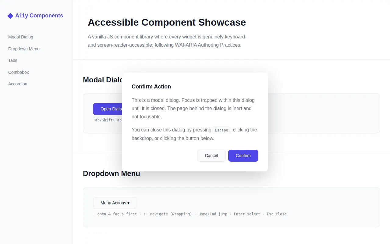
<div class="sidebar-brand"><span class="brand-icon">◆</span> A11y Components</div>
<ul class="sidebar-nav">
<li><a href="#modal-section">Modal Dialog</a></li>
<li><a href="#dropdown-section">Dropdown Menu</a></li>
<li><a href="#tabs-section">Tabs</a></li>
<li><a href="#combobox-section">Combobox</a></li>
<li><a href="#accordion-section">Accordion</a></li>
</ul>
</nav>
<main id="main-content" class="main-content">
<header class="page-header">
<h1>Accessible Component Showcase</h1>
<p>A vanilla JS component library where every widget is genuinely keyboard- and screen-reader-accessible, following WAI-ARIA Authoring Practices.</p>
</header>
<!-- Modal Dialog Section -->
<section id="modal-section" class="component-section">
<h2>Modal Dialog</h2>
<div class="demo-area">
<button type="button" class="btn btn-primary" id="open-modal-btn">Open Dialog</button>
<p class="kbd-hint">Tab/Shift+Tab cycle · Esc close · Click backdrop close</p>
</div>
</section>
<!-- Dropdown Menu Section -->
<section id="dropdown-section" class="component-section">
<h2>Dropdown Menu</h2>
<div class="demo-area">
<div class="dropdown-container" id="dropdown-demo">
<button type="button" class="btn btn-secondary dropdown-trigger" aria-haspopup="menu" aria-expanded="false" id="dropdown-btn">Menu Actions ▾</button>
<ul class="dropdown-menu" role="menu" aria-labelledby="dropdown-btn" id="dropdown-menu-list" hidden="">
<li role="menuitem" tabindex="-1" data-action="copy">Copy</li>
<li role="menuitem" tabindex="-1" data-action="paste">Paste</li>
<li role="separator" aria-orientation="horizontal"></li>
<li role="menuitem" tabindex="-1" data-action="bold"><strong>Bold</strong></li>
<li role="menuitem" tabindex="-1" data-action="italic"><em>Italic</em></li>
<li role="separator" aria-orientation="horizontal"></li>
<li role="menuitem" tabindex="-1" data-action="delete">Delete…</li>
</ul>
</div>
<p class="kbd-hint">↓ open & focus first · ↑↓ navigate (wrapping) · Home/End jump · Enter select · Esc close</p>
</div>
</section>
<!-- Tabs Section -->
<section id="tabs-section" class="component-section">
<h2>Tabs</h2>
<div class="demo-area">
<div class="tabs-container" role="tablist" aria-label="Project information" id="tabs-demo">
<button role="tab" aria-selected="true" tabindex="0" aria-controls="tabpanel-overview" id="tab-overview" class="tab-btn tab-active">Overview</button>
<button role="tab" aria-selected="false" tabindex="-1" aria-controls="tabpanel-features" id="tab-features" class="tab-btn">Features</button>
<button role="tab" aria-selected="false" tabindex="-1" aria-controls="tabpanel-changelog" id="tab-changelog" class="tab-btn">Changelog</button>
</div>
<div role="tabpanel" id="tabpanel-overview" aria-labelledby="tab-overview" class="tabpanel">
<h3>Project Overview</h3>
<p>This component library is built from scratch with accessibility as a first-class concern. Every interaction pattern follows the WAI-ARIA Authoring Practices Guide, ensuring that users of assistive technologies have an experience equal to mouse users.</p>
<p>The library uses zero external dependencies — just vanilla JavaScript and hand-written CSS that respects user preferences like reduced motion.</p>
</div>
<div role="tabpanel" id="tabpanel-features" aria-labelledby="tab-features" class="tabpanel" hidden="">
<h3>Key Features</h3>
<ul>
<li><strong>Focus management:</strong> Focus trapping in modals, roving tabindex in tablists and menus.</li>
<li><strong>Semantic HTML:</strong> Proper roles, states, and properties on every interactive element.</li>
<li><strong>Keyboard support:</strong> Full keyboard operability with logical focus order.</li>
<li><strong>Screen reader tested:</strong> All ARIA relationships point to real elements; no dangling references.</li>
</ul>
</div>
<div role="tabpanel" id="tabpanel-changelog" aria-labelledby="tab-changelog" class="tabpanel" hidden="">
<h3>Changelog</h3>
<dl>
<dt><strong>v1.0.0</strong></dt><dd>Initial release with Modal, Dropdown, Tabs, Combobox, and Accordion components.</dd>
<dt><strong>v1.1.0</strong></dt><dd>Added focus trap utility, aria-activedescendant manager, and prefers-reduced-motion support.</dd>
<dt><strong>v1.2.0</strong></dt><dd>Improved combobox filtering performance; added Home/End navigation to dropdown menus.</dd>
</dl>
</div>
</div>
<p class="kbd-hint">←→ switch tabs · Tab moves into panel content</p>
</section>
<!-- Combobox Section -->
<section id="combobox-section" class="component-section">
<h2>Combobox (Autocomplete)</h2>
<div class="demo-area">
<label for="combobox-input" class="sr-only">Select a programming language</label>
<div class="combobox-wrapper" id="combobox-demo">
<input type="text" role="combobox" aria-autocomplete="list" aria-expanded="false" aria-controls="combobox-listbox" aria-activedescendant="" id="combobox-input" autocomplete="off" placeholder="Search languages…" class="combobox-input">
<ul role="listbox" id="combobox-listbox" aria-label="Programming languages" hidden=""></ul>
</div>
<p class="kbd-hint">Type to filter · ↓↑ highlight · Enter select · Esc close & revert</p>
</div>
</section>
<!-- Accordion Section -->
<section id="accordion-section" class="component-section">
<h2>Accordion / Disclosure Group</h2>
<div class="demo-area">
<div class="accordion-group" id="accordion-demo">
<div class="accordion-item">
<button type="button" aria-expanded="false" aria-controls="acc-panel-1" id="acc-btn-1" class="accordion-trigger">What is this component library?</button>
<div role="region" id="acc-panel-1" aria-labelledby="acc-btn-1" class="accordion-panel" hidden="">
<p>This is a vanilla JavaScript accessible component library showcasing five common UI patterns: Modal Dialog, Dropdown Menu, Tabs, Combobox, and Accordion. Each component follows WAI-ARIA Authoring Practices.</p>
</div>
</div>
<div class="accordion-item">
<button type="button" aria-expanded="false" aria-controls="acc-panel-2" id="acc-btn-2" class="accordion-trigger">How is accessibility implemented?</button>
<div role="region" id="acc-panel-2" aria-labelledby="acc-btn-2" class="accordion-panel" hidden="">
<p>Accessibility is built in from the ground up. We use proper ARIA roles, states, and properties on every element. Focus management follows best practices: focus trapping for modals, roving tabindex for tablists and menus, and aria-activedescendant for comboboxes.</p>
</div>
</div>
<div class="accordion-item">
<button type="button" aria-expanded="false" aria-controls="acc-panel-3" id="acc-btn-3" class="accordion-trigger">Can I use this in production?</button>
<div role="region" id="acc-panel-3" aria-labelledby="acc-btn-3" class="accordion-panel" hidden="">
<p>This is a demonstration of accessible patterns. The code is well-organized with shared utilities and tunable constants, making it easy to adapt for production use. All components respect user preferences like reduced motion.</p>
</div>
</div>
<div class="accordion-item">
<button type="button" aria-expanded="false" aria-controls="acc-panel-4" id="acc-btn-4" class="accordion-trigger">What browsers are supported?</button>
<div role="region" id="acc-panel-4" aria-labelledby="acc-btn-4" class="accordion-panel" hidden="">
<p>All modern browsers that support CSS custom properties and ES2017+ JavaScript. The components use standard DOM APIs available in all evergreen browsers.</p>
</div>
</div>
</div>
</div>
<p class="kbd-hint">Enter/Space toggle · Multiple panels may be open</p>
</section>
<!-- Toast notification area -->
<div id="toast-container" aria-live="polite" aria-atomic="true"></div>
</main>
<!-- Modal Dialog (rendered outside main flow) -->
<div class="modal-backdrop" id="modal-backdrop" hidden=""></div>
<div role="dialog" aria-modal="true" aria-labelledby="modal-title" class="modal-dialog" id="modal-dialog" hidden="">
<div class="modal-content">
<h2 id="modal-title">Confirm Action</h2>
<p>This is a modal dialog. Focus is trapped within this dialog until it is closed. The page behind the dialog is inert and not focusable.</p>
<p>You can close this dialog by pressing <kbd>Escape</kbd>, clicking the backdrop, or clicking the button below.</p>
<div class="modal-actions">
<button type="button" class="btn btn-secondary" id="modal-cancel-btn">Cancel</button>
<button type="button" class="btn btn-primary" id="modal-confirm-btn">Confirm</button>
</div>
</div>
</div>
<script>
'use strict';
// ── function: getFocusableElements ──
// === Shared Utilities ===
/**
* Get all focusable elements within a container.
*/
function getFocusableElements(container) {
const selectors = 'button:not([disabled]), [href], input:not([disabled]), select:not([disabled]), textarea:not([disabled]), [tabindex]:not([tabindex="-1"]), details > summary';
return Array.from(container.querySelectorAll(selectors)).filter(el => !el.hidden && el.offsetParent !== null);
}
// ── function: createFocusTrap ──
/**
* Focus trap utility — keeps focus cycling within a container.
*/
function createFocusTrap(container) {
const focusable = getFocusableElements(container);
if (focusable.length === 0) return { activate: () => {}, deactivate: () => {} };
let handler = null;
function trapHandler(e) {
if (e.key !== 'Tab') return;
const first = focusable[0];
const last = focusable[focusable.length - 1];
if (e.shiftKey) {
if (document.activeElement === first) { e.preventDefault(); last.focus(); }
} else {
if (document.activeElement === last) { e.preventDefault(); first.focus(); }
}
}
return {
activate() { handler = trapHandler; document.addEventListener('keydown', handler); },
deactivate() { if (handler) { document.removeEventListener('keydown', handler); handler = null; } }
};
}
// ── function: showToast ──
/**
* Show a toast notification.
*/
function showToast(message, duration = 2500) {
const container = document.getElementById('toast-container');
const toast = document.createElement('div');
toast.className = 'toast';
toast.textContent = message;
container.appendChild(toast);
setTimeout(() => {
toast.style.opacity = '0';
toast.style.transition = `opacity ${getComputedStyle(document.documentElement).getPropertyValue('--duration-normal')}`;
setTimeout(() => toast.remove(), 300);
}, duration);
}
// ── function: prefersReducedMotion ──
/**
* Check if prefers-reduced-motion is set.
*/
function prefersReducedMotion() {
return window.matchMedia('(prefers-reduced-motion: reduce)').matches;
}
// ── function: initModal ──
// === Modal Dialog Component ===
/**
* Initialize the modal dialog with focus trapping and proper ARIA management.
*/
function initModal() {
const openBtn = document.getElementById('open-modal-btn');
const closeBtns = [document.getElementById('modal-cancel-btn'), document.getElementById('modal-confirm-btn')];
const backdrop = document.getElementById('modal-backdrop');
const dialog = document.getElementById('modal-dialog');
let focusTrap = null;
let triggerElement = null;
function openModal(trigger) {
triggerElement = trigger || openBtn;
dialog.hidden = false;
backdrop.hidden = false;
// Make page behind inert by setting tabindex=-1 on main content temporarily
document.getElementById('main-content').setAttribute('inert', '');
focusTrap = createFocusTrap(dialog);
focusTrap.activate();
// Move focus into the dialog (first focusable element)
requestAnimationFrame(() => {
const firstFocusable = getFocusableElements(dialog)[0];
if (firstFocusable) firstFocusable.focus();
});
}
function closeModal() {
dialog.hidden = true;
backdrop.hidden = true;
document.getElementById('main-content').removeAttribute('inert');
focusTrap.deactivate();
focusTrap = null;
// Return focus to trigger
if (triggerElement) triggerElement.focus();
}
openBtn.addEventListener('click', () => openModal(openBtn));
closeBtns.forEach(btn => btn.addEventListener('click', closeModal));
backdrop.addEventListener('click', closeModal);
dialog.addEventListener('keydown', e => {
if (e.key === 'Escape') { e.preventDefault(); closeModal(); }
});
// Confirm button action
document.getElementById('modal-confirm-btn').addEventListener('click', () => {
showToast('Action confirmed!');
setTimeout(closeModal, 300);
});
}
// ── function: initDropdown ──
// === Dropdown Menu Component ===
/**
* Initialize dropdown menu with arrow-key navigation and proper ARIA management.
*/
function initDropdown() {
const trigger = document.getElementById('dropdown-btn');
const menu = document.getElementById('dropdown-menu-list');
const items = Array.from(menu.querySelectorAll('[role="menuitem"]'));
let isOpen = false;
let activeIndex = -1;
function openMenu(focusFirst) {
if (isOpen) return;
isOpen = true;
menu.hidden = false;
trigger.setAttribute('aria-expanded', 'true');
if (focusFirst) {
activeIndex = 0;
updateActiveItem();
}
}
function closeMenu(returnFocus) {
if (!isOpen) return;
isOpen = false;
menu.hidden = true;
trigger.setAttribute('aria-expanded', 'false');
items.forEach(item => item.removeAttribute('aria-selected'));
activeIndex = -1;
if (returnFocus !== false) trigger.focus();
}
function updateActiveItem() {
items.forEach((item, i) => {
if (i === activeIndex) {
item.setAttribute('aria-selected', 'true');
item.focus();
} else {
item.removeAttribute('aria-selected');
}
});
}
function selectItem(index) {
const item = items[index];
if (!item) return;
const action = item.dataset.action || item.textContent.trim();
showToast(`Selected: ${action}`);
closeMenu(true);
}
// Trigger button events
trigger.addEventListener('click', () => {
isOpen ? closeMenu() : openMenu(false);
});
trigger.addEventListener('keydown', e => {
if (e.key === 'ArrowDown' || e.key === 'Down') {
e.preventDefault();
openMenu(true);
} else if (e.key === 'Enter' || e.key === ' ') {
e.preventDefault();
isOpen ? closeMenu() : openMenu(false);
}
});
// Menu keyboard navigation
menu.addEventListener('keydown', e => {
const key = e.key;
if (key === 'ArrowDown' || key === 'Down') {
e.preventDefault();
activeIndex = (activeIndex + 1) % items.length;
updateActiveItem();
} else if (key === 'ArrowUp' || key === 'Up') {
e.preventDefault();
activeIndex = (activeIndex - 1 + items.length) % items.length;
updateActiveItem();
} else if (key === 'Home') {
e.preventDefault();
activeIndex = 0;
updateActiveItem();
} else if (key === 'End') {
e.preventDefault();
activeIndex = items.length - 1;
updateActiveItem();
} else if (key === 'Enter' || key === ' ') {
e.preventDefault();
selectItem(activeIndex);
} else if (key === 'Escape') {
e.preventDefault();
closeMenu(true);
} else if (key === 'Tab') {
closeMenu(false); // Let Tab move focus naturally
}
});
// Click on menu items
items.forEach((item, index) => {
item.addEventListener('click', () => selectItem(index));
item.addEventListener('mouseenter', () => {
activeIndex = index;
updateActiveItem();
});
});
// Close on outside click
document.addEventListener('click', e => {
if (isOpen && !menu.contains(e.target) && !trigger.contains(e.target)) {
closeMenu(false);
}
});
}
// ── function: initTabs ──
// === Tabs Component ===
/**
* Initialize tabs with roving tabindex and proper ARIA management.
*/
function initTabs() {
const tablist = document.getElementById('tabs-demo');
const tabs = Array.from(tablist.querySelectorAll('[role="tab"]'));
const panels = tabs.map(tab => document.getElementById(tab.getAttribute('aria-controls')));
function activateTab(index, setFocus) {
if (index < 0 || index >= tabs.length) return;
// Deactivate all tabs and hide all panels
tabs.forEach((tab, i) => {
tab.setAttribute('aria-selected', 'false');
tab.setAttribute('tabindex', '-1');
tab.classList.remove('tab-active');
if (panels[i]) panels[i].hidden = true;
});
// Activate selected tab and show its panel
tabs[index].setAttribute('aria-selected', 'true');
tabs[index].setAttribute('tabindex', '0');
tabs[index].classList.add('tab-active');
if (panels[index]) panels[index].hidden = false;
if (setFocus) tabs[index].focus();
}
// Click handler for each tab
tabs.forEach((tab, index) => {
tab.addEventListener('click', () => activateTab(index, true));
});
// Keyboard navigation on the tablist
tablist.addEventListener('keydown', e => {
const currentIndex = tabs.indexOf(document.activeElement);
if (currentIndex === -1) return;
let newIndex = currentIndex;
const key = e.key;
if (key === 'ArrowLeft' || key === 'Left') {
e.preventDefault();
newIndex = (currentIndex - 1 + tabs.length) % tabs.length;
} else if (key === 'ArrowRight' || key === 'Right') {
e.preventDefault();
newIndex = (currentIndex + 1) % tabs.length;
} else if (key === 'Home') {
e.preventDefault();
newIndex = 0;
} else if (key === 'End') {
e.preventDefault();
newIndex = tabs.length - 1;
} else {
return;
}
activateTab(newIndex, true);
});
}
// ── function: initCombobox ──
// === Combobox Component (aria-activedescendant pattern) ===
/**
* Initialize combobox with filtering, arrow-key navigation via aria-activeddescendant.
*/
function initCombobox() {
const input = document.getElementById('combobox-input');
const listbox = document.getElementById('combobox-listbox');
// ~20 programming language options
const allOptions = [
'JavaScript', 'TypeScript', 'Python', 'Rust', 'Go', 'Java', 'C++', 'C#',
'Ruby', 'PHP', 'Swift', 'Kotlin', 'Scala', 'Elixir', 'Haskell', 'Lua',
'Perl', 'Dart', 'Clojure', 'F#'
];
let filteredOptions = [...allOptions];
let activeIndex = -1;
let isOpen = false;
let originalValue = '';
function renderListbox() {
listbox.innerHTML = '';
filteredOptions.forEach((option, i) => {
const li = document.createElement('li');
li.id = `combobox-option-${i}`;
li.setAttribute('role', 'option');
li.setAttribute('aria-selected', 'false');
li.textContent = option;
li.addEventListener('click', () => selectOption(i));
listbox.appendChild(li);
});
if (activeIndex >= 0 && activeIndex < filteredOptions.length) {
const activeEl = document.getElementById(`combobox-option-${activeIndex}`);
if (activeEl) {
activeEl.setAttribute('aria-selected', 'true');
activeEl.scrollIntoView({ block: 'nearest' });
}
}
input.setAttribute('aria-activedescendant',
activeIndex >= 0 && activeIndex < filteredOptions.length ? `combobox-option-${activeIndex}` : '');
}
function openListbox() {
if (filteredOptions.length === 0) return;
isOpen = true;
listbox.hidden = false;
input.setAttribute('aria-expanded', 'true');
activeIndex = -1;
renderListbox();
}
function closeListbox() {
isOpen = false;
listbox.hidden = true;
input.setAttribute('aria-expanded', 'false');
input.removeAttribute('aria-activedescendant');
activeIndex = -1;
}
function selectOption(index) {
if (index < 0 || index >= filteredOptions.length) return;
const selected = filteredOptions[index];
input.value = selected;
originalValue = selected;
showToast(`Selected: ${selected}`);
closeListbox();
}
function filterOptions(query) {
const q = query.toLowerCase().trim();
if (q === '') {
filteredOptions = [...allOptions];
} else {
filteredOptions = allOptions.filter(opt => opt.toLowerCase().includes(q));
}
activeIndex = -1;
}
// Input events
input.addEventListener('input', () => {
filterOptions(input.value);
if (isOpen) openListbox();
else if (input.value.length > 0) openListbox();
});
input.addEventListener('focus', () => {
originalValue = input.value;
if (input.value.length > 0 && !isOpen) openListbox();
});
// Keyboard navigation
input.addEventListener('keydown', e => {
const key = e.key;
if (key === 'ArrowDown' || key === 'Down') {
e.preventDefault();
if (!isOpen) { openListbox(); return; }
activeIndex = Math.min(activeIndex + 1, filteredOptions.length - 1);
renderListbox();
} else if (key === 'ArrowUp' || key === 'Up') {
e.preventDefault();
if (!isOpen) return;
activeIndex = Math.max(activeIndex - 1, 0);
renderListbox();
} else if (key === 'Enter') {
e.preventDefault();
if (isOpen && activeIndex >= 0) selectOption(activeIndex);
} else if (key === 'Escape') {
e.preventDefault();
input.value = originalValue; // Revert to original value
closeListbox();
} else if (key === 'Home') {
e.preventDefault();
activeIndex = 0;
renderListbox();
} else if (key === 'End') {
e.preventDefault();
activeIndex = filteredOptions.length - 1;
renderListbox();
}
});
// Close on blur (focus out)
input.addEventListener('blur', () => {
setTimeout(() => {
if (!listbox.contains(document.activeElement)) closeListbox();
}, 100);
});
// Initialize with empty listbox
renderListbox();
}
// ── function: initAccordion ──
// === Accordion / Disclosure Group Component ===
/**
* Initialize accordion with animated panels and proper ARIA management.
*/
function initAccordion() {
const group = document.getElementById('accordion-demo');
const triggers = Array.from(group.querySelectorAll('.accordion-trigger'));
triggers.forEach(trigger => {
trigger.addEventListener('click', () => togglePanel(trigger));
trigger.addEventListener('keydown', e => {
if (e.key === 'Enter' || e.key === ' ') {
e.preventDefault();
togglePanel(trigger);
}
});
});
function togglePanel(trigger) {
const panelId = trigger.getAttribute('aria-controls');
const panel = document.getElementById(panelId);
if (!panel) return;
const isExpanded = trigger.getAttribute('aria-expanded') === 'true';
if (isExpanded) {
// Collapse: animate height then set hidden
collapsePanel(trigger, panel);
} else {
// Expand: remove hidden, measure, animate to full height
expandPanel(trigger, panel);
}
}
function expandPanel(trigger, panel) {
trigger.setAttribute('aria-expanded', 'true');
panel.hidden = false;
if (prefersReducedMotion()) return;
// Measure natural height
const targetHeight = panel.scrollHeight;
panel.style.height = '0px';
panel.classList.add('animating');
// Force reflow
panel.offsetHeight;
panel.style.height = `${targetHeight}px`;
// After animation, remove constraints
panel.addEventListener('transitionend', function onEnd() {
panel.removeEventListener('transitionend', onEnd);
panel.style.height = '';
panel.classList.remove('animating');
});
// Safety timeout in case transitionend doesn't fire
setTimeout(() => {
if (panel.classList.contains('animating')) {
panel.style.height = '';
panel.classList.remove('animating');
}
}, 500);
}
function collapsePanel(trigger, panel) {
trigger.setAttribute('aria-expanded', 'false');
if (prefersReducedMotion()) {
panel.hidden = true;
return;
}
// Measure current height then animate to 0
const startHeight = panel.scrollHeight;
panel.style.height = `${startHeight}px`;
panel.classList.add('animating');
// Force reflow
panel.offsetHeight;
panel.style.height = '0px';
panel.addEventListener('transitionend', function onEnd() {
panel.removeEventListener('transitionend', onEnd);
panel.hidden = true;
panel.style.height = '';
panel.classList.remove('animating');
});
// Safety timeout
setTimeout(() => {
if (panel.classList.contains('animating')) {
panel.hidden = true;
panel.style.height = '';
panel.classList.remove('animating');
}
}, 500);
}
}
// ── function: initScrollSpy ──
// === Scroll Spy — highlights current section in sidebar nav ===
/**
* Initialize scroll spy to highlight the active section link in the sidebar.
*/
function initScrollSpy() {
const sections = document.querySelectorAll('.component-section');
const navLinks = Array.from(document.querySelectorAll('.sidebar-nav a'));
function updateActiveLink() {
let currentSection = '';
for (const section of sections) {
const rect = section.getBoundingClientRect();
if (rect.top <= 120) {
currentSection = section.id;
}
}
navLinks.forEach(link => {
const href = link.getAttribute('href');
if (href === `#${currentSection}`) {
link.style.color = 'var(--color-primary)';
link.style.borderLeftColor = 'var(--color-primary)';
link.style.fontWeight = '600';
} else {
link.style.color = '';
link.style.borderLeftColor = '';
link.style.fontWeight = '';
}
});
}
// Throttle scroll events
let ticking = false;
window.addEventListener('scroll', () => {
if (!ticking) {
requestAnimationFrame(() => { updateActiveLink(); ticking = false; });
ticking = true;
}
}, { passive: true });
// Initial call
updateActiveLink();
}
// ── main ──
// === Main — Initialize all components on DOM ready ===
document.addEventListener('DOMContentLoaded', () => {
initModal();
initDropdown();
initTabs();
initCombobox();
initAccordion();
initScrollSpy();
// Validate ARIA references (development check)
validateAriaReferences();
});
/**
* Verify all aria-controls and aria-labelledby references point to real elements.
*/
function validateAriaReferences() {
const attrs = ['aria-controls', 'aria-labelledby', 'aria-owns', 'aria-describedby'];
let errors = [];
attrs.forEach(attr => {
document.querySelectorAll(`[${attr}]`).forEach(el => {
const ids = el.getAttribute(attr).split(' ').filter(Boolean);
ids.forEach(id => {
if (!document.getElementById(id)) {
errors.push(`${el.tagName}#${el.id || '(no id)'} has ${attr}="${id}" but no element with that ID exists.`);
}
});
});
});
if (errors.length > 0) {
console.warn('ARIA reference validation failed:', errors);
} else {
console.log('✓ All ARIA references validated successfully.');
}
}
</script>
</body>
</html>
<!-- agent-meta {"model":"qwen3.6-27b-mtp","provider":"lmstudio","persona":"composer","sessionId":"65107199-8e68-4b2d-b0ba-871765c7f605","tokensIn":836112,"tokensOut":27610,"tokensTotal":863722,"turns":35,"toolCalls":34,"failedToolCalls":1,"timestamp":"2026-07-30T00:37:12.772Z"} -->