Accessible Components
Kimi k3 · typescript
Reviews & generation details
Reviews
No human review yet. Unreviewed does not mean unsuccessful.
Generation context
Imported historical artifact. Its exact original instructions and lineage are not known.
Generation prompt · exact text unavailable
See the current prompt for reference. It may differ from the instructions used to generate this artifact.
Inspect original source 14,626 bytes · SHA-256 1a6f2c78e606
<!doctype html>
<html lang="en">
<head>
<meta charset="utf-8">
<meta name="viewport" content="width=device-width, initial-scale=1">
<title>Accessible Component Showcase — a11ykit</title>
<style>
</style>
</head>
<body>
<div id="app-shell">
<a class="skip-link" href="#main">Skip to main content</a>
<div class="page">
<aside class="sidebar">
<p class="brand">a11y<em>kit</em></p>
<p class="tagline">Accessible components in vanilla JavaScript. No libraries, no exceptions.</p>
<nav aria-label="Components">
<ul class="nav-list">
<li><a href="#modal" data-spy="modal"><span class="nav-num">01</span>Modal Dialog</a></li>
<li><a href="#menu" data-spy="menu"><span class="nav-num">02</span>Dropdown Menu</a></li>
<li><a href="#tabs" data-spy="tabs"><span class="nav-num">03</span>Tabs</a></li>
<li><a href="#combobox" data-spy="combobox"><span class="nav-num">04</span>Combobox</a></li>
<li><a href="#accordion" data-spy="accordion"><span class="nav-num">05</span>Accordion</a></li>
</ul>
</nav>
<p class="sidebar-foot">WAI-ARIA APG 1.2 · hand-written CSS</p>
</aside>
<main id="main" class="content" tabindex="-1">
<header class="hero">
<p class="eyebrow">Interaction reference</p>
<h1>Accessible Component Showcase</h1>
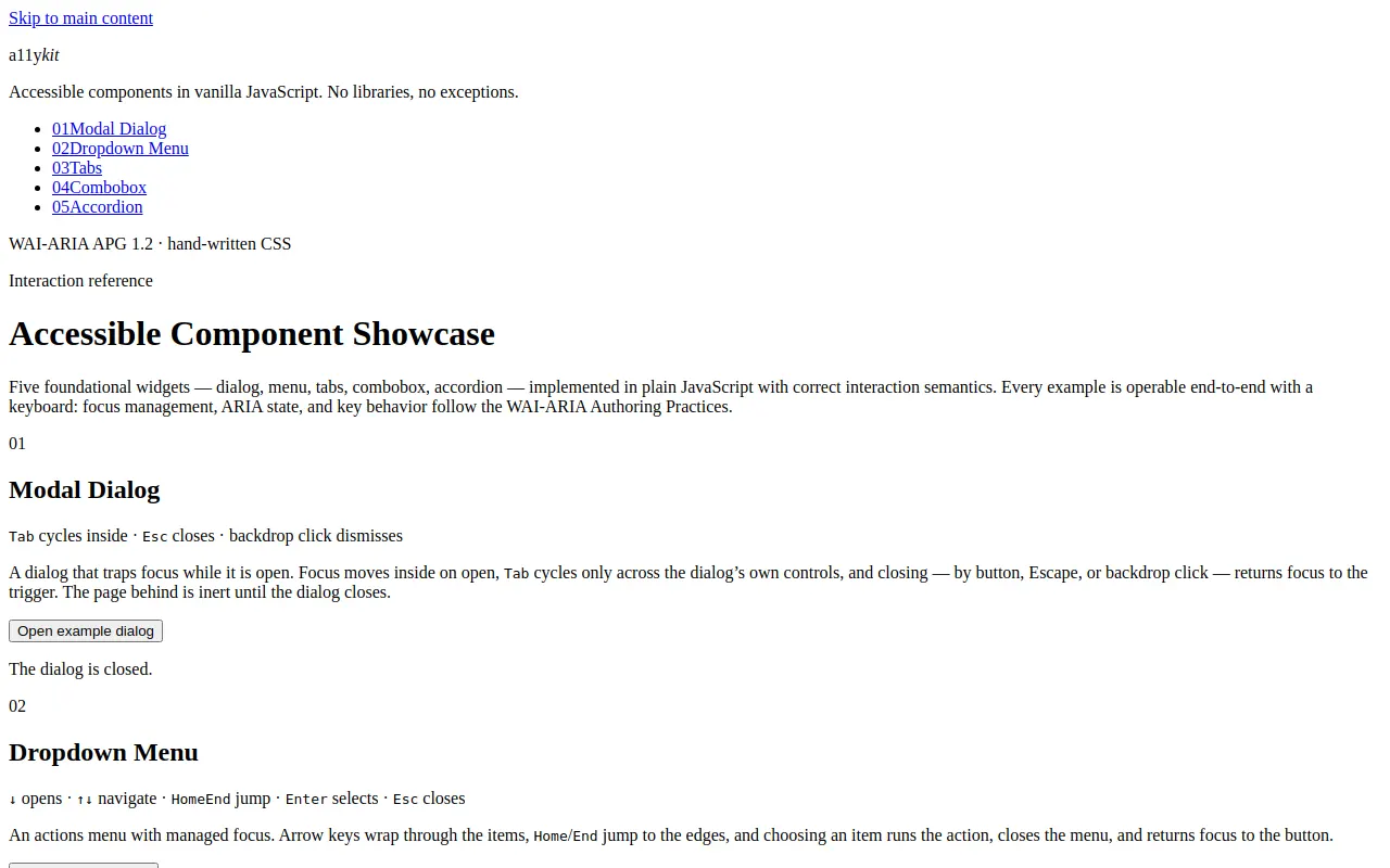
<p class="lead">Five foundational widgets — dialog, menu, tabs, combobox, accordion — implemented in plain JavaScript with correct interaction semantics. Every example is operable end-to-end with a keyboard: focus management, ARIA state, and key behavior follow the WAI-ARIA Authoring Practices.</p>
</header>
<section id="modal" class="component" aria-labelledby="modal-h">
<div class="component-head">
<span class="sec-index" aria-hidden="true">01</span>
<h2 id="modal-h">Modal Dialog</h2>
<p class="contract"><kbd>Tab</kbd> cycles inside · <kbd>Esc</kbd> closes · backdrop click dismisses</p>
</div>
<p class="desc">A dialog that traps focus while it is open. Focus moves inside on open, <kbd>Tab</kbd> cycles only across the dialog’s own controls, and closing — by button, Escape, or backdrop click — returns focus to the trigger. The page behind is inert until the dialog closes.</p>
<div class="demo">
<button id="dialog-trigger" class="btn btn-primary" aria-haspopup="dialog">Open example dialog</button>
<p id="dialog-status" class="status" role="status">The dialog is closed.</p>
</div>
</section>
<section id="menu" class="component" aria-labelledby="menu-h">
<div class="component-head">
<span class="sec-index" aria-hidden="true">02</span>
<h2 id="menu-h">Dropdown Menu</h2>
<p class="contract"><kbd>↓</kbd> opens · <kbd>↑</kbd><kbd>↓</kbd> navigate · <kbd>Home</kbd><kbd>End</kbd> jump · <kbd>Enter</kbd> selects · <kbd>Esc</kbd> closes</p>
</div>
<p class="desc">An actions menu with managed focus. Arrow keys wrap through the items, <kbd>Home</kbd>/<kbd>End</kbd> jump to the edges, and choosing an item runs the action, closes the menu, and returns focus to the button.</p>
<div class="demo">
<div class="menu-wrap">
<button id="menu-button" class="btn" aria-haspopup="menu" aria-expanded="false" aria-controls="actions-menu">
<span>Document actions</span>
<svg class="chev" width="12" height="12" viewBox="0 0 12 12" aria-hidden="true" focusable="false"><path d="M2.5 4.5 6 8l3.5-3.5" fill="none" stroke="currentColor" stroke-width="1.6" stroke-linecap="round" stroke-linejoin="round"></path></svg>
</button>
<ul id="actions-menu" class="menu" role="menu" aria-labelledby="menu-button" hidden="">
<li role="none"><button class="menu-item" role="menuitem" tabindex="-1" data-action="Rename">Rename…</button></li>
<li role="none"><button class="menu-item" role="menuitem" tabindex="-1" data-action="Duplicate">Duplicate</button></li>
<li role="none"><button class="menu-item" role="menuitem" tabindex="-1" data-action="Share">Share…</button></li>
<li role="separator" class="menu-sep"></li>
<li role="none"><button class="menu-item menu-item-danger" role="menuitem" tabindex="-1" data-action="Move to trash">Move to trash</button></li>
</ul>
</div>
<p id="menu-status" class="status" role="status">No action chosen yet.</p>
</div>
</section>
<section id="tabs" class="component" aria-labelledby="tabs-h">
<div class="component-head">
<span class="sec-index" aria-hidden="true">03</span>
<h2 id="tabs-h">Tabs</h2>
<p class="contract"><kbd>←</kbd><kbd>→</kbd> switch · <kbd>Home</kbd><kbd>End</kbd> jump · <kbd>Tab</kbd> enters the panel</p>
</div>
<p class="desc">A single-stop tablist: only the active tab sits in the <kbd>Tab</kbd> order. Arrow keys move between tabs and activate them, and each panel swaps with the <code>hidden</code> attribute so inactive panels are unreachable and unannounced.</p>
<div class="demo">
<div class="tabs">
<div class="tablist" role="tablist" id="demo-tablist" aria-label="Rowan desk lamp details">
<button class="tab" role="tab" id="tab-overview" aria-selected="true" aria-controls="panel-overview">Overview</button>
<button class="tab" role="tab" id="tab-specs" aria-selected="false" aria-controls="panel-specs" tabindex="-1">Specifications</button>
<button class="tab" role="tab" id="tab-reviews" aria-selected="false" aria-controls="panel-reviews" tabindex="-1">Reviews</button>
</div>
<div class="tabpanel" role="tabpanel" id="panel-overview" aria-labelledby="tab-overview" tabindex="0">
<p>The Rowan lamp pairs a machined brass stem with a wide linen shade, throwing a warm pool of light that covers a full desk without glare. A stepped dimmer sits under the shade rim, within easy reach of either hand.</p>
<p class="panel-link"><a class="text-link" href="#panel-overview">Read the setup guide</a></p>
</div>
<div class="tabpanel" role="tabpanel" id="panel-specs" aria-labelledby="tab-specs" tabindex="0" hidden="">
<dl class="spec-list">
<dt>Height</dt><dd>42 cm, adjustable stem</dd>
<dt>Weight</dt><dd>2.4 kg</dd>
<dt>Light source</dt><dd>Replaceable E14 LED, 2700 K</dd>
<dt>Materials</dt><dd>Brushed brass, linen, powder-coated steel base</dd>
</dl>
<p class="panel-link"><a class="text-link" href="#panel-specs">Download the full spec sheet</a></p>
</div>
<div class="tabpanel" role="tabpanel" id="panel-reviews" aria-labelledby="tab-reviews" tabindex="0" hidden="">
<blockquote>
<p>“The dimmer detent is perfect — it clicks into exactly the brightness I want for late reading, every time.”</p>
<cite>— Mara L., verified purchase</cite>
</blockquote>
<p class="panel-link"><a class="text-link" href="#panel-reviews">Write a review</a></p>
</div>
</div>
</div>
</section>
<section id="combobox" class="component" aria-labelledby="combobox-h">
<div class="component-head">
<span class="sec-index" aria-hidden="true">04</span>
<h2 id="combobox-h">Combobox</h2>
<p class="contract">type to filter · <kbd>↑</kbd><kbd>↓</kbd> highlight · <kbd>Enter</kbd> select · <kbd>Esc</kbd> revert</p>
</div>
<p class="desc">An autocomplete that keeps focus in the input. Typing filters twenty-one countries; the highlight lives in <code>aria-activedescendant</code>, so the listbox itself never takes focus. <kbd>Esc</kbd> closes the list and reverts to the last committed selection.</p>
<div class="demo">
<div class="field-combo">
<label class="label" for="country-input" id="country-label">Shipping country</label>
<div class="combo">
<input id="country-input" class="input" type="text" role="combobox" aria-expanded="false" aria-controls="country-listbox" aria-autocomplete="list" autocomplete="off" spellcheck="false" placeholder="Start typing a country…">
<ul id="country-listbox" class="combo-list" role="listbox" aria-labelledby="country-label" hidden=""></ul>
</div>
</div>
<p id="combo-status" class="status" role="status">No country selected.</p>
</div>
</section>
<section id="accordion" class="component" aria-labelledby="accordion-h">
<div class="component-head">
<span class="sec-index" aria-hidden="true">05</span>
<h2 id="accordion-h">Accordion</h2>
<p class="contract"><kbd>Enter</kbd><kbd>Space</kbd> toggle · <kbd>↑</kbd><kbd>↓</kbd> move between headers</p>
</div>
<p class="desc">Independent disclosures — any number can be open at once. Height animates with a measured transition; the region’s <code>hidden</code> attribute flips only when the animation ends, so content is never visually hidden while still exposed to assistive tech.</p>
<div class="demo">
<div class="accordion" id="demo-accordion">
<div class="acc-item">
<h3 class="acc-heading">
<button class="acc-trigger" id="acc-t-1" aria-expanded="true" aria-controls="acc-r-1">
<span>Shipping & delivery</span>
<svg class="chev" width="14" height="14" viewBox="0 0 12 12" aria-hidden="true" focusable="false"><path d="M2.5 4.5 6 8l3.5-3.5" fill="none" stroke="currentColor" stroke-width="1.6" stroke-linecap="round" stroke-linejoin="round"></path></svg>
</button>
</h3>
<div class="acc-region" id="acc-r-1" role="region" aria-labelledby="acc-t-1">
<div class="acc-inner"><p>Orders placed before 14:00 ship the same business day. Standard delivery reaches most EU addresses in two to four working days, and tracking is emailed as soon as the label is printed. The shade travels flat-packed to keep the parcel within standard sizing.</p></div>
</div>
</div>
<div class="acc-item">
<h3 class="acc-heading">
<button class="acc-trigger" id="acc-t-2" aria-expanded="false" aria-controls="acc-r-2">
<span>Returns & exchanges</span>
<svg class="chev" width="14" height="14" viewBox="0 0 12 12" aria-hidden="true" focusable="false"><path d="M2.5 4.5 6 8l3.5-3.5" fill="none" stroke="currentColor" stroke-width="1.6" stroke-linecap="round" stroke-linejoin="round"></path></svg>
</button>
</h3>
<div class="acc-region" id="acc-r-2" role="region" aria-labelledby="acc-t-2" hidden="">
<div class="acc-inner"><p>You have thirty days from delivery to return a lamp for a full refund. Start a return from your order page and we email a prepaid label. Exchanges for a different finish ship free — the replacement leaves before we receive the original back.</p></div>
</div>
</div>
<div class="acc-item">
<h3 class="acc-heading">
<button class="acc-trigger" id="acc-t-3" aria-expanded="false" aria-controls="acc-r-3">
<span>Warranty & repairs</span>
<svg class="chev" width="14" height="14" viewBox="0 0 12 12" aria-hidden="true" focusable="false"><path d="M2.5 4.5 6 8l3.5-3.5" fill="none" stroke="currentColor" stroke-width="1.6" stroke-linecap="round" stroke-linejoin="round"></path></svg>
</button>
</h3>
<div class="acc-region" id="acc-r-3" role="region" aria-labelledby="acc-t-3" hidden="">
<div class="acc-inner"><p>Every Rowan lamp carries a five-year warranty covering the stem mechanism, dimmer, and wiring. If anything fails in normal use we repair or replace it — and we stock spare shades and dimmer modules for at least ten years.</p></div>
</div>
</div>
</div>
</div>
</section>
<footer class="page-foot">
<p>Semantic HTML, hand-written CSS, vanilla JavaScript — no frameworks, no libraries, no external assets. Every widget follows the WAI-ARIA Authoring Practices Guide.</p>
</footer>
</main>
</div>
</div>
<div class="dialog-backdrop" id="dialog-backdrop" hidden="">
<div class="dialog" id="demo-dialog" role="dialog" aria-modal="true" aria-labelledby="dialog-title" aria-describedby="dialog-desc">
<h3 class="dialog-title" id="dialog-title">Archive “Q3 launch plan”?</h3>
<p id="dialog-desc">Archiving moves this draft out of your workspace. You can restore it from the archive within 30 days.</p>
<div class="field">
<label class="label" for="dialog-reason">Note for the archive <span class="label-opt">(optional)</span></label>
<input class="input" id="dialog-reason" type="text">
</div>
<div class="dialog-actions">
<button class="btn" id="dialog-cancel">Cancel</button>
<button class="btn btn-primary" id="dialog-confirm">Archive draft</button>
</div>
</div>
</div>
<script>
(function () {
'use strict';
var __mods = {};
var __cache = {};
var __map = {};
function __require(id) {
if (__cache[id]) return __cache[id].exports;
var module = __cache[id] = { exports: {} };
var factory = __mods[id];
if (!factory) throw new Error("Module not found: " + id);
factory(module.exports, function (spec) {
var target = (__map[id] && __map[id][spec]) || spec;
return __require(target);
}, module);
return module.exports;
}
// ── module: src/main.ts ──
__mods["src/main.ts"] = function (exports, require, module) {
"use strict";
// Entry point. Runs after the DOM is parsed and after any classic
// <script> imports, so document queries and CDN globals are available.
// Import your other modules from here.
Object.defineProperty(exports, "__esModule", { value: true });
exports.start = start;
function start() {
// Replace this with the real startup sequence.
}
start();
};
// ── entry ──
__require("src/main.ts");
})();
</script>
</body>
</html>