Accessible Components
Deepseek v4.1 Flash · full
Reviews & generation details
Reviews
No human review yet. Unreviewed does not mean unsuccessful.
Generation context
Imported historical artifact. Its exact original instructions and lineage are not known.
Generation prompt · exact text unavailable
See the current prompt for reference. It may differ from the instructions used to generate this artifact.
Inspect original source 60,374 bytes · SHA-256 f8543b5b058a
<!DOCTYPE html>
<html lang="en">
<head>
<meta charset="utf-8">
<meta name="viewport" content="width=device-width, initial-scale=1">
<title>Accessible Components — a small, keyboard-first library</title>
<meta name="description" content="Five accessible interaction patterns built to the WAI-ARIA Authoring Practices: modal dialog, dropdown menu, tabs, combobox and accordion.">
<style>
/* ==========================================================================
1. TUNABLE CONSTANTS
========================================================================== */
:root{
/* Palette — restrained, two accents */
--accent: #4640d8;
--accent-strong: #3730b8;
--accent-soft: #eeeeff;
--accent-line: #c9c6f5;
--accent2: #0b7a6e;
--accent2-soft: #e8f6f4;
--accent2-line: #a9d9d2;
--danger: #b3261e;
--ink: #14161b;
--ink-2: #4b5262;
--ink-3: #767e8f;
--bg: #ffffff;
--bg-soft: #f6f7f9;
--bg-sunk: #eef0f4;
--line: #e3e6ec;
--line-2: #cdd2dc;
/* Spacing scale */
--sp-1: 4px;
--sp-2: 8px;
--sp-3: 12px;
--sp-4: 16px;
--sp-5: 24px;
--sp-6: 32px;
--sp-7: 48px;
--sp-8: 72px;
/* Shape + motion */
--radius-sm: 6px;
--radius: 10px;
--radius-lg: 16px;
--dur-fast: 120ms;
--dur: 200ms;
--dur-slow: 260ms;
--ease: cubic-bezier(.2,.75,.3,1);
--focus: #1d4ed8;
--focus-ring: 0 0 0 3px #ffffff, 0 0 0 6px #1d4ed8;
--font-sans: ui-sans-serif, system-ui, -apple-system, "Segoe UI", Roboto, "Helvetica Neue", Arial, sans-serif;
--font-mono: ui-monospace, SFMono-Regular, "SF Mono", Menlo, Consolas, "Liberation Mono", monospace;
--shadow-1: 0 1px 2px rgba(16,20,32,.06), 0 1px 1px rgba(16,20,32,.04);
--shadow-2: 0 4px 14px rgba(16,20,32,.09), 0 2px 4px rgba(16,20,32,.05);
--shadow-3: 0 24px 60px -12px rgba(16,20,32,.32), 0 8px 20px rgba(16,20,32,.12);
--sidebar-w: 264px;
--content-max: 68rem;
color-scheme: light;
}
/* ==========================================================================
2. BASE
========================================================================== */
*,*::before,*::after{ box-sizing: border-box; }
/* The hidden attribute must always win over a display declaration. */
[hidden]{ display: none !important; }
html{ -webkit-text-size-adjust: 100%; }
body{
margin:0;
background: var(--bg);
color: var(--ink);
font-family: var(--font-sans);
font-size: 16px;
line-height: 1.65;
-webkit-font-smoothing: antialiased;
text-rendering: optimizeLegibility;
}
h1,h2,h3,h4{ margin:0; line-height:1.2; letter-spacing:-.021em; font-weight:640; }
p{ margin:0; }
ul{ margin:0; padding:0; list-style:none; }
button{ font: inherit; color: inherit; }
/* Universal focus indicator — never remove without a replacement */
:focus-visible{
outline: 3px solid var(--focus);
outline-offset: 2px;
}
::selection{ background: var(--accent-soft); }
.sr-only{
position:absolute; width:1px; height:1px; padding:0; margin:-1px;
overflow:hidden; clip:rect(0 0 0 0); clip-path: inset(50%); white-space:nowrap; border:0;
}
/* ==========================================================================
3. SKIP LINK
========================================================================== */
.skip-link{
position: fixed;
top: var(--sp-3);
left: var(--sp-3);
z-index: 100;
transform: translateY(-160%);
background: var(--accent);
color:#fff;
font-weight:600;
font-size:.9rem;
padding: 10px 16px;
border-radius: var(--radius);
text-decoration:none;
box-shadow: var(--shadow-2);
transition: transform var(--dur) var(--ease);
}
.skip-link:focus{ transform: translateY(0); outline-color:#fff; }
/* ==========================================================================
4. SHELL / LAYOUT
========================================================================== */
.app{
display: grid;
grid-template-columns: var(--sidebar-w) minmax(0,1fr);
align-items: start;
}
.sidebar{
position: sticky;
top: 0;
height: 100vh;
overflow-y: auto;
padding: var(--sp-6) var(--sp-5) var(--sp-6) var(--sp-5);
border-right: 1px solid var(--line);
background: linear-gradient(180deg,#fbfbfd,#ffffff 40%);
}
.brand{ display:flex; gap:10px; align-items:center; margin-bottom: var(--sp-6); }
.brand__mark{
width:30px; height:30px; border-radius:9px; flex:none;
background:
radial-gradient(circle at 30% 30%, #7c74f0 0 45%, transparent 46%),
linear-gradient(140deg, var(--accent) 0 55%, var(--accent2) 55% 100%);
box-shadow: inset 0 0 0 1px rgba(0,0,0,.06);
}
.brand__name{ font-weight:680; font-size:.98rem; letter-spacing:-.01em; }
.brand__meta{ font-size:.76rem; color:var(--ink-3); letter-spacing:.02em; }
.nav__label{
font-size:.68rem; font-weight:680; letter-spacing:.1em; text-transform:uppercase;
color: var(--ink-3); margin: var(--sp-5) 0 var(--sp-2) 10px;
}
.nav__label:first-of-type{ margin-top:0; }
.nav a{
display:flex; align-items:center; gap:10px;
padding: 7px 10px;
border-radius: var(--radius-sm);
color: var(--ink-2);
font-size:.9rem;
text-decoration:none;
transition: background var(--dur-fast) ease, color var(--dur-fast) ease;
}
.nav a::before{
content:""; width:5px; height:5px; border-radius:50%;
background: var(--line-2); flex:none; transition: background var(--dur-fast) ease;
}
.nav a:hover{ background: var(--bg-sunk); color: var(--ink); }
.nav a[aria-current="true"]{ background: var(--accent-soft); color: var(--accent-strong); font-weight:600; }
.nav a[aria-current="true"]::before{ background: var(--accent); }
.content{ padding: var(--sp-8) var(--sp-7) 140px; max-width: var(--content-max); }
.page-head{ padding-bottom: var(--sp-6); border-bottom:1px solid var(--line); margin-bottom: var(--sp-7); }
.eyebrow{
display:inline-flex; align-items:center; gap:7px;
font-size:.72rem; font-weight:660; letter-spacing:.1em; text-transform:uppercase;
color: var(--accent-strong);
background: var(--accent-soft);
border:1px solid var(--accent-line);
padding:4px 10px; border-radius:999px;
}
.eyebrow::before{ content:""; width:6px; height:6px; border-radius:50%; background:var(--accent2); }
h1{ font-size: clamp(1.9rem, 1.5rem + 1.4vw, 2.6rem); margin: var(--sp-4) 0 var(--sp-3); }
.lede{ font-size:1.08rem; color: var(--ink-2); max-width: 44rem; }
/* ==========================================================================
5. SECTIONS
========================================================================== */
.section{ margin-bottom: var(--sp-8); scroll-margin-top: var(--sp-5); }
.section__head{ display:flex; align-items:baseline; gap: var(--sp-3); flex-wrap:wrap; }
h2{ font-size:1.32rem; }
.section__badge{
font-family: var(--font-mono); font-size:.7rem; font-weight:600;
color: var(--accent2); background: var(--accent2-soft);
border:1px solid var(--accent2-line); border-radius:999px; padding:2px 9px;
letter-spacing:.02em;
}
.section__desc{ color: var(--ink-2); margin-top: var(--sp-3); max-width: 46rem; }
.section__desc + .demo, .section__head + .section__desc + .demo{ margin-top: var(--sp-5); }
/* Demo card */
.demo{
margin-top: var(--sp-5);
border:1px solid var(--line);
border-radius: var(--radius-lg);
background: #fff;
box-shadow: var(--shadow-1);
overflow: visible;
}
.demo__stage{
padding: var(--sp-6);
background:
radial-gradient(circle at 1px 1px, var(--bg-sunk) 1px, transparent 0) 0 0 / 14px 14px,
#fdfdfe;
border-radius: var(--radius-lg) var(--radius-lg) 0 0;
min-height: 96px;
display:flex; flex-wrap:wrap; align-items:flex-start; gap: var(--sp-4);
}
.demo__caption{
border-top:1px solid var(--line);
background: var(--bg-soft);
border-radius: 0 0 var(--radius-lg) var(--radius-lg);
padding: 12px var(--sp-5);
font-size:.82rem;
color: var(--ink-2);
display:flex; flex-wrap:wrap; align-items:center; gap:8px;
}
kbd{
font-family: var(--font-mono); font-size:.72rem; font-weight:600;
padding:2px 6px; border:1px solid var(--line-2); border-bottom-width:2px;
border-radius:5px; background:#fff; color:var(--ink); white-space:nowrap;
}
.demo__caption .sep{ color: var(--line-2); }
/* ==========================================================================
6. BUTTONS
========================================================================== */
.btn{
display:inline-flex; align-items:center; justify-content:center; gap:8px;
padding: 9px 16px;
border-radius: var(--radius);
border:1px solid var(--line-2);
background:#fff;
color: var(--ink);
font-size:.9rem;
font-weight:560;
cursor:pointer;
white-space:nowrap;
transition: background var(--dur-fast) ease, border-color var(--dur-fast) ease, box-shadow var(--dur-fast) ease, transform var(--dur-fast) ease;
box-shadow: var(--shadow-1);
}
.btn:hover{ background: var(--bg-soft); border-color: var(--ink-3); }
.btn:active{ transform: translateY(1px); }
.btn--primary{
background: var(--accent); border-color: var(--accent); color:#fff;
box-shadow: 0 1px 2px rgba(70,64,216,.4);
}
.btn--primary:hover{ background: var(--accent-strong); border-color: var(--accent-strong); }
.btn--danger{ background: var(--danger); border-color: var(--danger); color:#fff; }
.btn--danger:hover{ background:#8f1d17; border-color:#8f1d17; }
.btn--ghost{ background: transparent; box-shadow:none; }
.btn--ghost:hover{ background: var(--bg-sunk); }
.btn__caret{
width:0; height:0; border-left:4px solid transparent; border-right:4px solid transparent;
border-top:5px solid currentColor; opacity:.65; margin-left:2px;
}
.btn[aria-expanded="true"] .btn__caret{ transform: rotate(180deg); }
.btn[aria-expanded="true"]{ background: var(--accent-soft); border-color: var(--accent-line); color: var(--accent-strong); }
/* ==========================================================================
7. MODAL DIALOG
========================================================================== */
.overlay{
position: fixed; inset:0; z-index: 60;
display:grid; place-items:center;
padding: var(--sp-5);
background: rgba(18,20,28,.52);
backdrop-filter: blur(2px);
animation: fade var(--dur) var(--ease);
}
@keyframes fade{ from{ opacity:0 } to{ opacity:1 } }
.dialog{
width: min(30rem, 100%);
max-height: calc(100vh - 2 * var(--sp-5));
overflow:auto;
background:#fff;
border-radius: var(--radius-lg);
box-shadow: var(--shadow-3);
animation: pop var(--dur-slow) var(--ease);
overscroll-behavior: contain;
}
@keyframes pop{ from{ opacity:0; transform: translateY(10px) scale(.985) } to{ opacity:1; transform:none } }
.dialog__head{
display:flex; align-items:flex-start; gap: var(--sp-4);
padding: var(--sp-5) var(--sp-5) var(--sp-3);
}
.dialog__head h2{ font-size:1.12rem; }
.dialog__body{ padding: 0 var(--sp-5) var(--sp-5); color: var(--ink-2); font-size:.94rem; }
.dialog__actions{
display:flex; justify-content:flex-end; gap: var(--sp-3);
padding: var(--sp-4) var(--sp-5);
border-top:1px solid var(--line);
background: var(--bg-soft);
border-radius: 0 0 var(--radius-lg) var(--radius-lg);
}
.icon-btn{
width:34px; height:34px; flex:none; display:grid; place-items:center;
border-radius: var(--radius-sm); border:1px solid transparent; background:transparent;
cursor:pointer; color: var(--ink-3); font-size:1.05rem; line-height:1;
transition: background var(--dur-fast) ease, color var(--dur-fast) ease;
}
.icon-btn:hover{ background: var(--bg-sunk); color: var(--ink); }
.dialog__meta{
margin-top: var(--sp-4); padding: var(--sp-3) var(--sp-4);
border-left:3px solid var(--accent-line); background: var(--accent-soft);
border-radius: 0 var(--radius-sm) var(--radius-sm) 0;
font-size:.83rem; color: var(--accent-strong);
}
body.is-locked{ overflow:hidden; }
/* ==========================================================================
8. DROPDOWN MENU
========================================================================== */
.menu-wrap{ position: relative; display:inline-block; }
.menu{
position: absolute; top: calc(100% + 6px); left:0; z-index: 30;
min-width: 15rem;
padding: 6px;
background:#fff;
border:1px solid var(--line);
border-radius: var(--radius);
box-shadow: var(--shadow-2);
animation: menuIn var(--dur-fast) var(--ease);
}
@keyframes menuIn{ from{ opacity:0; transform: translateY(-4px) } to{ opacity:1; transform:none } }
.menu__item{
display:flex; align-items:center; justify-content:space-between; gap: var(--sp-4);
padding: 8px 10px;
border-radius: var(--radius-sm);
font-size:.9rem;
cursor:pointer;
user-select:none;
outline-offset: -2px;
}
.menu__item:hover, .menu__item[data-active="true"]{ background: var(--bg-sunk); }
.menu__item:focus{ background: var(--accent-soft); color: var(--accent-strong); }
.menu__hint{ font-family: var(--font-mono); font-size:.72rem; color: var(--ink-3); }
.menu__sep{ height:1px; margin:6px 4px; background: var(--line); }
.menu__item--danger{ color: var(--danger); }
.menu__item--danger:focus{ background:#fdecea; color:#8f1d17; }
/* ==========================================================================
9. TABS
========================================================================== */
.tabs{
border:1px solid var(--line);
border-radius: var(--radius-lg);
background:#fff;
box-shadow: var(--shadow-1);
overflow:hidden;
}
.tablist{
display:flex; gap:2px;
padding: 6px 6px 0;
border-bottom:1px solid var(--line);
background: var(--bg-soft);
overflow-x:auto;
}
.tab{
position: relative;
padding: 10px 15px 12px;
border:1px solid transparent;
border-bottom:none;
border-radius: var(--radius-sm) var(--radius-sm) 0 0;
background: transparent;
font-size:.9rem; font-weight:560; color: var(--ink-2);
cursor:pointer;
white-space:nowrap;
transition: color var(--dur-fast) ease, background var(--dur-fast) ease;
}
.tab:hover{ color: var(--ink); background: rgba(0,0,0,.03); }
.tab[aria-selected="true"]{
color: var(--accent-strong);
background:#fff;
box-shadow: inset 0 0 0 1px var(--line);
}
.tab[aria-selected="true"]::after{
content:""; position:absolute; left:0; right:0; bottom:-1px; height:2px; background:#fff;
}
.tab::before{
content:""; position:absolute; left:12px; right:12px; top:0; height:2px;
background: var(--accent); border-radius:2px 2px 0 0; transform: scaleX(0);
transition: transform var(--dur) var(--ease);
}
.tab[aria-selected="true"]::before{ transform: scaleX(1); }
.tabpanel{ padding: var(--sp-5); }
.tabpanel h3{ font-size:1rem; margin-bottom: var(--sp-2); }
.tabpanel p{ color: var(--ink-2); font-size:.94rem; max-width: 52rem; }
.tabpanel ul{ margin-top: var(--sp-3); display:grid; gap:8px; }
.tabpanel li{ position:relative; padding-left:20px; font-size:.92rem; color:var(--ink-2); }
.tabpanel li::before{
content:""; position:absolute; left:4px; top:.6em; width:6px; height:6px; border-radius:2px;
background: var(--accent2);
}
.code{
margin-top: var(--sp-3);
font-family: var(--font-mono); font-size:.8rem; line-height:1.7;
background:#1a1c24; color:#e6e8f0;
padding: var(--sp-4); border-radius: var(--radius);
overflow-x:auto; white-space:pre;
}
.code .t{ color:#a8b6ff; }
.code .a{ color:#7fd8c6; }
/* ==========================================================================
10. COMBOBOX
========================================================================== */
.field{ width: min(26rem, 100%); }
.field__label{ display:block; font-size:.82rem; font-weight:620; color: var(--ink-2); margin-bottom: var(--sp-2); }
.combo{ position: relative; }
.combo__input{
width:100%;
padding: 10px 12px;
font: inherit;
font-size:.95rem;
color: var(--ink);
background:#fff;
border:1px solid var(--line-2);
border-radius: var(--radius);
box-shadow: var(--shadow-1);
transition: border-color var(--dur-fast) ease;
}
.combo__input::placeholder{ color: var(--ink-3); }
.combo__input:hover{ border-color: var(--ink-3); }
.listbox{
position:absolute; top: calc(100% + 5px); left:0; right:0; z-index:20;
max-height: 15.5rem; overflow-y:auto;
padding:5px;
background:#fff;
border:1px solid var(--line);
border-radius: var(--radius);
box-shadow: var(--shadow-2);
overscroll-behavior: contain;
}
.option{
display:flex; align-items:center; justify-content:space-between; gap: var(--sp-3);
padding: 7px 10px;
border-radius: var(--radius-sm);
font-size:.9rem;
cursor:pointer;
}
.option[aria-selected="true"]{ background: var(--accent-soft); color: var(--accent-strong); }
.option[aria-selected="true"]::after{ content:"↵"; font-family:var(--font-mono); font-size:.75rem; opacity:.6; }
.option__empty{ padding: 10px 12px; font-size:.88rem; color: var(--ink-3); }
.pill-row{ display:flex; gap: var(--sp-2); align-items:center; flex-wrap:wrap; margin-top: var(--sp-4); }
.pill{
display:inline-flex; align-items:center; gap:7px;
font-size:.8rem; font-weight:560;
padding: 4px 11px; border-radius:999px;
background: var(--accent2-soft); color:#0a5f56; border:1px solid var(--accent2-line);
}
.pill--muted{ background: var(--bg-soft); color: var(--ink-3); border-color: var(--line); }
/* ==========================================================================
11. ACCORDION
========================================================================== */
.accordion{
border:1px solid var(--line); border-radius: var(--radius-lg);
background:#fff; box-shadow: var(--shadow-1); overflow:hidden;
}
.acc__item + .acc__item{ border-top:1px solid var(--line); }
.acc__btn{
width:100%;
display:flex; align-items:center; gap: var(--sp-4);
padding: var(--sp-4) var(--sp-5);
background:transparent; border:0; cursor:pointer; text-align:left;
font-size:.96rem; font-weight:600;
transition: background var(--dur-fast) ease;
}
.acc__btn:hover{ background: var(--bg-soft); }
.acc__btn[aria-expanded="true"]{ color: var(--accent-strong); }
.acc__chev{
margin-left:auto; flex:none; width:10px; height:10px;
border-right:2px solid currentColor; border-bottom:2px solid currentColor;
transform: rotate(-45deg); opacity:.55;
transition: transform var(--dur) var(--ease);
}
.acc__btn[aria-expanded="true"] .acc__chev{ transform: rotate(45deg); }
.acc__region{
height:auto; overflow:hidden;
transition: height var(--dur-slow) var(--ease), opacity var(--dur-slow) var(--ease);
}
.acc__inner{ padding: 0 var(--sp-5) var(--sp-5); color: var(--ink-2); font-size:.93rem; max-width: 56rem; }
.acc__inner p + p{ margin-top: var(--sp-3); }
/* ==========================================================================
12. ODDS AND ENDS
========================================================================== */
.status-line{
display:inline-flex; align-items:center; gap:8px;
font-size:.85rem; color: var(--ink-2);
padding: 7px 12px; border-radius: var(--radius);
background:#fff; border:1px solid var(--line);
box-shadow: var(--shadow-1);
min-height: 38px;
}
.status-line strong{ color: var(--accent-strong); font-weight:640; }
.status-line--empty{ color: var(--ink-3); }
.toast{
position: fixed; z-index: 70; left:50%; bottom: var(--sp-5); transform: translateX(-50%);
background:#1a1c24; color:#fff; font-size:.88rem; font-weight:520;
padding: 10px 18px; border-radius:999px; box-shadow: var(--shadow-3);
animation: toastIn var(--dur) var(--ease);
}
@keyframes toastIn{ from{ opacity:0; transform: translate(-50%, 8px) } to{ opacity:1; transform: translate(-50%,0) } }
.footer{
margin-top: var(--sp-8); padding-top: var(--sp-5); border-top:1px solid var(--line);
color: var(--ink-3); font-size:.85rem;
}
/* ==========================================================================
13. RESPONSIVE (incl. 200% zoom comfort) & REDUCED MOTION
========================================================================== */
@media (max-width: 56rem){
.app{ grid-template-columns: 1fr; }
.sidebar{
position: static; height:auto; overflow:visible;
border-right:0; border-bottom:1px solid var(--line);
padding: var(--sp-5);
}
.nav ul{ display:flex; flex-wrap:wrap; gap:4px; }
.nav a{ padding:6px 12px; background: var(--bg-soft); }
.content{ padding: var(--sp-6) var(--sp-5) 120px; }
.demo__stage{ padding: var(--sp-5); }
}
@media (max-width: 30rem){
.demo__stage{ padding: var(--sp-4); }
.btn{ width:auto; }
}
@media (prefers-reduced-motion: reduce){
*,*::before,*::after{
animation-duration: .001ms !important;
animation-iteration-count: 1 !important;
transition-duration: .001ms !important;
scroll-behavior: auto !important;
}
}
</style>
</head>
<body>
<a class="skip-link" href="#main">Skip to main content</a>
<div class="app" id="app">
<aside class="sidebar">
<div class="brand">
<span class="brand__mark" aria-hidden="true"></span>
<span>
<span class="brand__name">Prism UI</span><br>
<span class="brand__meta">v1.0 · accessible primitives</span>
</span>
</div>
<nav class="nav" aria-label="Component index">
<p class="nav__label" id="nav-components">Components</p>
<ul aria-labelledby="nav-components">
<li><a href="#modal">Modal dialog</a></li>
<li><a href="#menu">Dropdown menu</a></li>
<li><a href="#tabs">Tabs</a></li>
<li><a href="#combobox">Combobox</a></li>
<li><a href="#accordion">Accordion</a></li>
</ul>
<p class="nav__label" id="nav-notes">Notes</p>
<ul aria-labelledby="nav-notes">
<li><a href="#contract">Keyboard contract</a></li>
</ul>
</nav>
</aside>
<main class="content" id="main" tabindex="-1">
<header class="page-head">
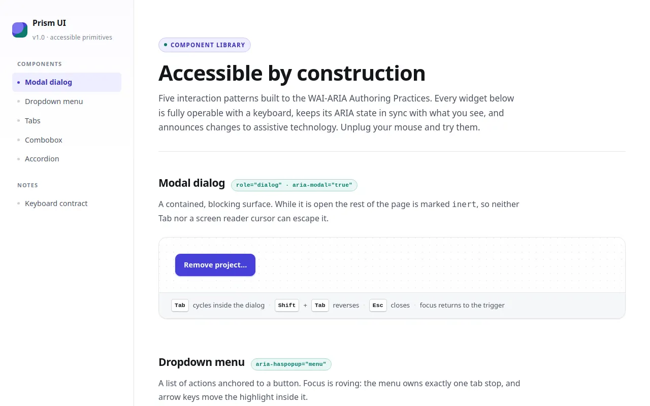
<p class="eyebrow">Component library</p>
<h1>Accessible by construction</h1>
<p class="lede">
Five interaction patterns built to the WAI-ARIA Authoring Practices. Every widget below
is fully operable with a keyboard, keeps its ARIA state in sync with what you see, and
announces changes to assistive technology. Unplug your mouse and try them.
</p>
</header>
<!-- ==================================================================
1. MODAL DIALOG
================================================================== -->
<section class="section" id="modal" aria-labelledby="modal-h">
<div class="section__head">
<h2 id="modal-h">Modal dialog</h2>
<span class="section__badge">role="dialog" · aria-modal="true"</span>
</div>
<p class="section__desc">
A contained, blocking surface. While it is open the rest of the page is marked
<code>inert</code>, so neither Tab nor a screen reader cursor can escape it.
</p>
<div class="demo">
<div class="demo__stage">
<button class="btn btn--primary" id="modal-trigger" aria-haspopup="dialog">Remove project…</button>
</div>
<p class="demo__caption">
<kbd>Tab</kbd> cycles inside the dialog
<span class="sep">·</span> <kbd>Shift</kbd>+<kbd>Tab</kbd> reverses
<span class="sep">·</span> <kbd>Esc</kbd> closes
<span class="sep">·</span> focus returns to the trigger
</p>
</div>
</section>
<!-- ==================================================================
2. DROPDOWN MENU
================================================================== -->
<section class="section" id="menu" aria-labelledby="menu-h">
<div class="section__head">
<h2 id="menu-h">Dropdown menu</h2>
<span class="section__badge">aria-haspopup="menu"</span>
</div>
<p class="section__desc">
A list of actions anchored to a button. Focus is roving: the menu owns exactly one
tab stop, and arrow keys move the highlight inside it.
</p>
<div class="demo">
<div class="demo__stage">
<div class="menu-wrap" id="menu-wrap">
<button class="btn" id="menu-btn" aria-haspopup="menu" aria-expanded="false" aria-controls="menu-list">
Project actions <span class="btn__caret" aria-hidden="true"></span>
</button>
<ul class="menu" id="menu-list" role="menu" aria-labelledby="menu-btn" hidden>
<li class="menu__item" role="menuitem" tabindex="-1" data-action="New file from template">New file from template<span class="menu__hint">⌘N</span></li>
<li class="menu__item" role="menuitem" tabindex="-1" data-action="Duplicate project">Duplicate project<span class="menu__hint">⌘D</span></li>
<li class="menu__item" role="menuitem" tabindex="-1" data-action="Rename project">Rename project<span class="menu__hint">F2</span></li>
<li class="menu__item" role="menuitem" tabindex="-1" data-action="Export as JSON">Export as JSON</li>
<li role="separator" class="menu__sep"></li>
<li class="menu__item menu__item--danger" role="menuitem" tabindex="-1" data-action="Delete project">Delete project</li>
</ul>
</div>
<p class="status-line status-line--empty" id="menu-status">No action yet</p>
</div>
<p class="demo__caption">
<kbd>Enter</kbd> or <kbd>↓</kbd> opens
<span class="sep">·</span> <kbd>↑</kbd><kbd>↓</kbd> navigate
<span class="sep">·</span> <kbd>Home</kbd>/<kbd>End</kbd> jump
<span class="sep">·</span> <kbd>Enter</kbd> activates
<span class="sep">·</span> <kbd>Esc</kbd> closes
</p>
</div>
</section>
<!-- ==================================================================
3. TABS
================================================================== -->
<section class="section" id="tabs" aria-labelledby="tabs-h">
<div class="section__head">
<h2 id="tabs-h">Tabs</h2>
<span class="section__badge">role="tablist"</span>
</div>
<p class="section__desc">
Only the selected tab is in the tab order — arrows move between tabs and activate them,
and panels that are not shown carry the <code>hidden</code> attribute rather than being
merely pushed off-screen.
</p>
<div class="tabs demo">
<div class="tablist" role="tablist" aria-labelledby="tabs-h">
<button class="tab" id="tab-anatomy" role="tab" aria-selected="true" aria-controls="panel-anatomy" tabindex="0">Anatomy</button>
<button class="tab" id="tab-keyboard" role="tab" aria-selected="false" aria-controls="panel-keyboard" tabindex="-1">Keyboard</button>
<button class="tab" id="tab-markup" role="tab" aria-selected="false" aria-controls="panel-markup" tabindex="-1">Markup</button>
</div>
<div class="tabpanel" id="panel-anatomy" role="tabpanel" aria-labelledby="tab-anatomy" tabindex="0">
<h3>What the pattern is made of</h3>
<p>Three parts, all of them labelled: the trigger, the surface it controls, and the state that links them.</p>
<ul>
<li>The trigger carries <code>aria-expanded</code> so the state is readable without sight.</li>
<li>The controlled region is referenced by <code>aria-controls</code>, which must resolve.</li>
<li>Hover, focus and selected styles are deliberately distinct.</li>
</ul>
</div>
<div class="tabpanel" id="panel-keyboard" role="tabpanel" aria-labelledby="tab-keyboard" tabindex="0" hidden>
<h3>Keyboard behaviour</h3>
<p>Arrow keys move and activate in one step (automatic activation). The tab row keeps a single tab stop.</p>
<ul>
<li><kbd>←</kbd> / <kbd>→</kbd> move between tabs, wrapping at both ends.</li>
<li><kbd>Home</kbd> and <kbd>End</kbd> jump to the first and last tab.</li>
<li><kbd>Tab</kbd> moves into the visible panel, whose content is then reachable.</li>
</ul>
</div>
<div class="tabpanel" id="panel-markup" role="tabpanel" aria-labelledby="tab-markup" tabindex="0" hidden>
<h3>Wiring, in full</h3>
<p>Every id below resolves to a real element on this page — that is asserted in the self-test.</p>
<pre class="code"><span class="t"><div</span> role=<span class="a">"tablist"</span> <span class="t">aria-label</span>=<span class="a">"…"</span><span class="t">></span>
<span class="t"><button</span> role=<span class="a">"tab"</span> id=<span class="a">"tab-anatomy"</span>
aria-selected=<span class="a">"true"</span>
aria-controls=<span class="a">"panel-anatomy"</span>
tabindex=<span class="a">"0"</span><span class="t">></span>Anatomy<span class="t"></button></span>
<span class="t"></div></span>
<span class="t"><div</span> role=<span class="a">"tabpanel"</span> id=<span class="a">"panel-anatomy"</span>
aria-labelledby=<span class="a">"tab-anatomy"</span> tabindex=<span class="a">"0"</span><span class="t">></span>…<span class="t"></div></span></pre>
</div>
</div>
<p class="demo__caption" style="border:1px solid var(--line); border-radius:var(--radius-lg); margin-top: var(--sp-4); background:var(--bg-soft);">
<kbd>←</kbd><kbd>→</kbd> switch tabs
<span class="sep">·</span> <kbd>Home</kbd>/<kbd>End</kbd> first / last
<span class="sep">·</span> <kbd>Tab</kbd> enters the open panel
</p>
</section>
<!-- ==================================================================
4. COMBOBOX
================================================================== -->
<section class="section" id="combobox" aria-labelledby="combobox-h">
<div class="section__head">
<h2 id="combobox-h">Combobox</h2>
<span class="section__badge">aria-activedescendant</span>
</div>
<p class="section__desc">
An editable text field with a filtered listbox. The input keeps and owns DOM focus;
the highlighted option is communicated with <code>aria-activedescendant</code>, so the
listbox itself is never focusable.
</p>
<div class="demo">
<div class="demo__stage">
<div class="field">
<label class="field__label" id="fruit-label" for="fruit-input">Preferred fruit</label>
<div class="combo">
<input class="combo__input" id="fruit-input" type="text"
role="combobox" aria-autocomplete="list"
aria-expanded="false" aria-controls="fruit-listbox"
aria-labelledby="fruit-label"
autocomplete="off" spellcheck="false" placeholder="Start typing, e.g. “man”">
<ul class="listbox" id="fruit-listbox" role="listbox" aria-labelledby="fruit-label" hidden></ul>
</div>
<div class="pill-row">
<span class="pill" id="fruit-selection" hidden>Selected: <strong id="fruit-selection-value"></strong></span>
<span class="pill pill--muted" id="fruit-count">28 matches</span>
</div>
</div>
</div>
<p class="demo__caption">
Type to filter <span class="sep">·</span> <kbd>↓</kbd><kbd>↑</kbd> move the highlight
<span class="sep">·</span> <kbd>Enter</kbd> accepts
<span class="sep">·</span> <kbd>Esc</kbd> reverts and closes
</p>
</div>
</section>
<!-- ==================================================================
5. ACCORDION
================================================================== -->
<section class="section" id="accordion" aria-labelledby="accordion-h">
<div class="section__head">
<h2 id="accordion-h">Accordion</h2>
<span class="section__badge">disclosure group</span>
</div>
<p class="section__desc">
Independent disclosures — several may be open at once. Regions animate on height, and
<code>hidden</code> is only applied once the closing animation has finished, so
assistive technology never sees a half-collapsed region.
</p>
<div class="accordion demo">
<div class="acc__item">
<h3>
<button class="acc__btn" id="acc-btn-1" aria-expanded="true" aria-controls="acc-region-1">
Installation <span class="acc__chev" aria-hidden="true"></span>
</button>
</h3>
<div class="acc__region" id="acc-region-1" role="region" aria-labelledby="acc-btn-1">
<div class="acc__inner">
<p>Copy the primitives you need. There is no runtime dependency: each component is a single
behavioural module plus its stylesheet layer.</p>
<p>Nothing is fetched at runtime, so the library works in air-gapped builds, offline docs and
print stylesheets alike.</p>
</div>
</div>
</div>
<div class="acc__item">
<h3>
<button class="acc__btn" id="acc-btn-2" aria-expanded="false" aria-controls="acc-region-2">
Focus management <span class="acc__chev" aria-hidden="true"></span>
</button>
</h3>
<div class="acc__region" id="acc-region-2" role="region" aria-labelledby="acc-btn-2" hidden>
<div class="acc__inner">
<p>The one rule: focus is never destroyed. Closing a surface returns focus to whatever opened
it, and every surface that traps focus offers a documented way out.</p>
<p>Focus indicators here are a 3px ring with a 2px offset — visible against both the tinted stage
background and white cards.</p>
</div>
</div>
</div>
<div class="acc__item">
<h3>
<button class="acc__btn" id="acc-btn-3" aria-expanded="false" aria-controls="acc-region-3">
Motion & preferences <span class="acc__chev" aria-hidden="true"></span>
</button>
</h3>
<div class="acc__region" id="acc-region-3" role="region" aria-labelledby="acc-btn-3" hidden>
<div class="acc__inner">
<p>Every animation is expressed as a duration token, and the whole page collapses to
near-zero durations under <code>prefers-reduced-motion: reduce</code>.</p>
<p>Content stays visible in that mode — the region is opened and closed instantly instead of
sliding.</p>
</div>
</div>
</div>
</div>
<p class="demo__caption" style="border:1px solid var(--line); border-radius:var(--radius-lg); margin-top: var(--sp-4); background:var(--bg-soft);">
<kbd>Tab</kbd> to a header <span class="sep">·</span> <kbd>Enter</kbd> / <kbd>Space</kbd> toggles
<span class="sep">·</span> multiple panels may stay open
</p>
</section>
<!-- ==================================================================
KEYBOARD CONTRACT SUMMARY
================================================================== -->
<section class="section" id="contract" aria-labelledby="contract-h" style="margin-bottom:0">
<div class="section__head"><h2 id="contract-h">Keyboard contract</h2></div>
<p class="section__desc">
The short version, if you only remember one line per component:
</p>
<div class="demo">
<div class="demo__stage" style="display:block">
<ul style="display:grid; gap:10px; font-size:.93rem; color:var(--ink-2)">
<li><strong>Dialog</strong> — Tab is trapped · Esc closes · focus returns to the trigger.</li>
<li><strong>Menu</strong> — ↓ opens and focuses the first item · ↑↓ wrap · Esc closes and refocuses the button.</li>
<li><strong>Tabs</strong> — one tab stop · ←→ activate · hidden panels are <code>hidden</code>.</li>
<li><strong>Combobox</strong> — typing filters · ↑↓ moves <code>aria-activedescendant</code> · Esc reverts.</li>
<li><strong>Accordion</strong> — Enter/Space toggles · height animates · <code>hidden</code> lands at the end.</li>
</ul>
</div>
</div>
<p class="footer">Built with hand-written CSS and vanilla JavaScript. No frameworks, no external assets.</p>
</section>
</main>
</div>
<!-- Modal lives outside the app shell so the shell can be made inert -->
<div class="overlay" id="overlay" hidden>
<div class="dialog" role="dialog" aria-modal="true" id="dialog" aria-labelledby="dialog-title" aria-describedby="dialog-desc">
<div class="dialog__head">
<h2 id="dialog-title">Remove this project?</h2>
<button class="icon-btn" id="dialog-close" type="button" aria-label="Close dialog" style="margin-left:auto">✕</button>
</div>
<div class="dialog__body">
<p id="dialog-desc">
“Atlas Redesign” and its 42 files will be moved to the trash. Members keep read access
for 30 days, after which the project is permanently deleted.
</p>
<p class="dialog__meta">While this dialog is open, the rest of the page is inert: Tab cannot reach it.</p>
</div>
<div class="dialog__actions">
<button class="btn btn--ghost" id="dialog-cancel" type="button" data-autofocus>Cancel</button>
<button class="btn btn--danger" id="dialog-confirm" type="button">Remove project</button>
</div>
</div>
</div>
<p class="sr-only" role="status" aria-live="polite" id="live-region"></p>
<script>
/* ==========================================================================
A. CONSTANTS & SMALL UTILITIES
========================================================================== */
const MOTION = {
fast: 120,
base: 200,
slow: 260
};
const KEY = {
ENTER: 'Enter', SPACE: ' ', ESC: 'Escape',
UP: 'ArrowUp', DOWN: 'ArrowDown', LEFT: 'ArrowLeft', RIGHT: 'ArrowRight',
HOME: 'Home', END: 'End', TAB: 'Tab'
};
const $ = (sel, root = document) => root.querySelector(sel);
const $$ = (sel, root = document) => Array.from(root.querySelectorAll(sel));
const prefersReducedMotion = () =>
window.matchMedia('(prefers-reduced-motion: reduce)').matches;
/** Clamp/wrap an index while stepping through a list. */
function stepIndex(current, delta, length, wrap = true) {
if (length <= 0) return -1;
let next = current + delta;
if (wrap) return (next % length + length) % length;
return Math.max(0, Math.min(length - 1, next));
}
/** Polite announcement for state changes that aren't otherwise obvious. */
const liveRegion = $('#live-region');
let announceTimer = 0;
function announce(message) {
window.clearTimeout(announceTimer);
liveRegion.textContent = '';
announceTimer = window.setTimeout(() => { liveRegion.textContent = message; }, 60);
}
/** Transient toast, purely visual feedback for commits. */
let toastEl = null, toastTimer = 0;
function toast(message) {
if (toastEl) toastEl.remove();
toastEl = document.createElement('div');
toastEl.className = 'toast';
toastEl.setAttribute('aria-hidden', 'true'); // the live region carries the message
toastEl.textContent = message;
document.body.appendChild(toastEl);
window.clearTimeout(toastTimer);
toastTimer = window.setTimeout(() => { toastEl.remove(); toastEl = null; }, 2600);
}
/** Wait for a height transition to finish (with a safety net). */
function onHeightTransitionEnd(el, callback) {
let settled = false;
const done = () => {
if (settled) return;
settled = true;
el.removeEventListener('transitionend', handler);
callback();
};
function handler(event) {
if (event.target !== el || event.propertyName !== 'height') return;
done();
}
el.addEventListener('transitionend', handler);
window.setTimeout(done, MOTION.slow + 180);
}
/* ==========================================================================
B. SHARED HELPER — FOCUS TRAP
Generic modal trap: keeps Tab / Shift+Tab cycling inside a container.
========================================================================== */
const FOCUSABLE_SELECTOR = [
'a[href]', 'button:not([disabled])', 'input:not([disabled]):not([type="hidden"])',
'select:not([disabled])', 'textarea:not([disabled])',
'[tabindex]:not([tabindex="-1"])'
].join(',');
function createFocusTrap(container) {
function focusables() {
return $$(FOCUSABLE_SELECTOR, container)
.filter((el) => el.getClientRects().length > 0 && el.getAttribute('aria-hidden') !== 'true');
}
function onKeydown(event) {
if (event.key !== KEY.TAB) return;
const items = focusables();
if (items.length === 0) { event.preventDefault(); return; }
const first = items[0];
const last = items[items.length - 1];
const active = document.activeElement;
if (!container.contains(active)) {
event.preventDefault();
(event.shiftKey ? last : first).focus();
return;
}
if (event.shiftKey && active === first) {
event.preventDefault();
last.focus();
} else if (!event.shiftKey && active === last) {
event.preventDefault();
first.focus();
}
}
return {
focusables,
activate() { document.addEventListener('keydown', onKeydown, true); },
deactivate() { document.removeEventListener('keydown', onKeydown, true); }
};
}
/* ==========================================================================
C. SHARED HELPER — ARIA-ACTIVEDESCENDANT MANAGER
Renders a listbox, owns the highlight index, and keeps
`aria-activedescendant` on the owning input in sync. The listbox itself
never receives focus.
========================================================================== */
function createActiveDescendantManager({ input, listbox, idPrefix, optionClass = 'option' }) {
let items = [];
let activeIndex = -1;
const optionId = (i) => `${idPrefix}-opt-${i}`;
const nodes = () => Array.from(listbox.children);
function render(nextItems, emptyMessage) {
items = nextItems;
listbox.textContent = '';
items.forEach((item, i) => {
const li = document.createElement('li');
li.id = optionId(i);
li.className = optionClass;
li.setAttribute('role', 'option');
li.setAttribute('aria-selected', 'false');
li.textContent = item.label;
listbox.appendChild(li);
});
if (items.length === 0 && emptyMessage) {
const empty = document.createElement('li');
empty.className = 'option__empty';
empty.setAttribute('role', 'presentation');
empty.textContent = emptyMessage;
listbox.appendChild(empty);
}
setActive(-1);
}
function setActive(index, { scroll = true } = {}) {
if (items.length === 0) { clear(); return; }
activeIndex = Math.max(0, Math.min(items.length - 1, index));
nodes().forEach((node, i) => {
if (node.getAttribute('role') === 'option') {
node.setAttribute('aria-selected', i === activeIndex ? 'true' : 'false');
}
});
input.setAttribute('aria-activedescendant', optionId(activeIndex));
if (scroll) {
const node = document.getElementById(optionId(activeIndex));
if (node) node.scrollIntoView({ block: 'nearest' });
}
}
function clear() {
activeIndex = -1;
input.removeAttribute('aria-activedescendant');
nodes().forEach((node) => {
if (node.getAttribute('role') === 'option') node.setAttribute('aria-selected', 'false');
});
}
return {
render,
setActive,
clear,
move(delta) { if (items.length) setActive(stepIndex(activeIndex, delta, items.length, true)); },
jump(key) { if (items.length) setActive(key === KEY.HOME ? 0 : items.length - 1); },
itemAt(i) { return items[i]; },
activeIndex() { return activeIndex; },
count() { return items.length; }
};
}
/* ==========================================================================
D. COMPONENT — MODAL DIALOG
========================================================================== */
(function initModal() {
const overlay = $('#overlay');
const dialog = $('#dialog');
const appShell = $('#app');
const trigger = $('#modal-trigger');
const cancel = $('#dialog-cancel');
const confirm = $('#dialog-confirm');
const closeBtn = $('#dialog-close');
const trap = createFocusTrap(dialog);
let opener = null;
function open() {
opener = document.activeElement instanceof HTMLElement ? document.activeElement : trigger;
overlay.hidden = false;
appShell.setAttribute('inert', ''); // page behind is not focusable / not announced
document.body.classList.add('is-locked');
trap.activate();
const initial = dialog.querySelector('[data-autofocus]') || trap.focusables()[0];
if (initial) initial.focus();
}
function close() {
if (overlay.hidden) return;
overlay.hidden = true;
appShell.removeAttribute('inert');
document.body.classList.remove('is-locked');
trap.deactivate();
(opener && opener.isConnected ? opener : trigger).focus(); // focus returns to the trigger
}
trigger.addEventListener('click', open);
cancel.addEventListener('click', close);
closeBtn.addEventListener('click', close);
confirm.addEventListener('click', () => {
announce('Project moved to the trash.');
toast('Project moved to the trash');
close();
});
// Escape closes; a click on the backdrop (outside the dialog) closes too.
document.addEventListener('keydown', (event) => {
if (event.key === KEY.ESC && !overlay.hidden) {
event.preventDefault();
close();
}
});
overlay.addEventListener('mousedown', (event) => {
if (event.target === overlay) close();
});
window.__modal = { open, close, isOpen: () => !overlay.hidden };
})();
/* ==========================================================================
E. COMPONENT — DROPDOWN MENU
Roving focus inside the menu; one tab stop lives on the trigger button.
========================================================================== */
(function initMenu() {
const wrap = $('#menu-wrap');
const button = $('#menu-btn');
const menu = $('#menu-list');
const status = $('#menu-status');
const items = $$('[role="menuitem"]', menu);
let open = false;
function openMenu(focusIndex) {
if (!open) {
menu.hidden = false;
button.setAttribute('aria-expanded', 'true');
open = true;
}
if (focusIndex !== null && focusIndex !== undefined) items[focusIndex].focus();
}
function closeMenu({ refocus = false } = {}) {
if (!open) return;
menu.hidden = true;
button.setAttribute('aria-expanded', 'false');
items.forEach((item) => item.removeAttribute('data-active'));
open = false;
if (refocus) button.focus();
}
function activate(item) {
const action = item.dataset.action;
status.classList.remove('status-line--empty');
status.innerHTML = 'Last action: <strong></strong>';
status.querySelector('strong').textContent = action;
announce(`${action} activated.`);
toast(action);
closeMenu({ refocus: true }); // focus returns to the trigger
}
// Click / Enter / Space on the button (buttons emit click for all three).
button.addEventListener('click', () => (open ? closeMenu({ refocus: false }) : openMenu(null)));
button.addEventListener('keydown', (event) => {
if (event.key === KEY.DOWN) {
event.preventDefault();
openMenu(0);
} else if (event.key === KEY.UP) {
event.preventDefault();
openMenu(items.length - 1);
} else if (event.key === KEY.ESC && open) {
event.preventDefault();
closeMenu({ refocus: true });
} else if (event.key === KEY.TAB && open) {
closeMenu({ refocus: false }); // let focus move on naturally
}
});
menu.addEventListener('keydown', (event) => {
const current = items.indexOf(document.activeElement);
switch (event.key) {
case KEY.DOWN: event.preventDefault(); items[stepIndex(current, 1, items.length)].focus(); break;
case KEY.UP: event.preventDefault(); items[stepIndex(current, -1, items.length)].focus(); break;
case KEY.HOME: event.preventDefault(); items[0].focus(); break;
case KEY.END: event.preventDefault(); items[items.length - 1].focus(); break;
case KEY.ESC: event.preventDefault(); closeMenu({ refocus: true }); break;
case KEY.TAB: closeMenu({ refocus: false }); break; // focus moves on naturally
case KEY.ENTER:
case KEY.SPACE:
if (current >= 0) { event.preventDefault(); activate(items[current]); }
break;
default: break;
}
});
items.forEach((item) => {
item.addEventListener('click', () => activate(item));
item.addEventListener('pointerenter', () => {
items.forEach((other) => other.removeAttribute('data-active'));
item.setAttribute('data-active', 'true');
});
item.addEventListener('pointerleave', () => item.removeAttribute('data-active'));
});
// Clicking anywhere outside dismisses the menu.
document.addEventListener('pointerdown', (event) => {
if (open && !wrap.contains(event.target)) closeMenu({ refocus: false });
});
// Tabbing away from an open menu dismisses it, wherever focus currently sits.
document.addEventListener('keydown', (event) => {
if (open && event.key === KEY.TAB) closeMenu({ refocus: false });
}, true);
window.__menu = { openMenu, closeMenu, isOpen: () => open, items };
})();
/* ==========================================================================
F. COMPONENT — TABS
Automatic activation + roving tabindex: exactly one tab stop in the tablist.
========================================================================== */
(function initTabs() {
$$('[role="tablist"]').forEach((tablist) => {
const tabs = $$('[role="tab"]', tablist);
const panels = tabs.map((tab) => document.getElementById(tab.getAttribute('aria-controls')));
function select(index, { moveFocus = false } = {}) {
tabs.forEach((tab, i) => {
const isSelected = i === index;
tab.setAttribute('aria-selected', isSelected ? 'true' : 'false');
tab.tabIndex = isSelected ? 0 : -1; // exactly one tab in the page tab order
panels[i].hidden = !isSelected; // hidden, not merely off-screen
});
if (moveFocus) tabs[index].focus();
}
tabs.forEach((tab, i) => {
tab.addEventListener('click', () => select(i));
tab.addEventListener('keydown', (event) => {
switch (event.key) {
case KEY.LEFT: event.preventDefault(); select(stepIndex(i, -1, tabs.length), { moveFocus: true }); break;
case KEY.RIGHT: event.preventDefault(); select(stepIndex(i, 1, tabs.length), { moveFocus: true }); break;
case KEY.HOME: event.preventDefault(); select(0, { moveFocus: true }); break;
case KEY.END: event.preventDefault(); select(tabs.length - 1, { moveFocus: true }); break;
default: break;
}
});
});
tablist.__select = select;
});
})();
/* ==========================================================================
G. COMPONENT — COMBOBOX (autocomplete)
========================================================================== */
(function initCombobox() {
const input = $('#fruit-input');
const listbox = $('#fruit-listbox');
const countPill = $('#fruit-count');
const selectionPill = $('#fruit-selection');
const selectionValue = $('#fruit-selection-value');
const OPTIONS = [
'Apple', 'Apricot', 'Avocado', 'Banana', 'Blackberry', 'Blueberry', 'Cherry',
'Coconut', 'Date', 'Elderberry', 'Fig', 'Grape', 'Guava', 'Kiwi', 'Lemon',
'Lychee', 'Mango', 'Nectarine', 'Orange', 'Papaya', 'Peach', 'Pear',
'Pineapple', 'Plum', 'Pomegranate', 'Raspberry', 'Strawberry', 'Watermelon'
].map((label) => ({ label, value: label.toLowerCase() }));
const manager = createActiveDescendantManager({
input, listbox, idPrefix: 'fruit'
});
let isOpen = false;
let committedValue = ''; // last accepted value, restored on Escape
let selectedOption = null;
let matches = filter(''); // start with the full list
function filter(query) {
const q = query.trim().toLowerCase();
if (!q) return OPTIONS.slice();
return OPTIONS.filter((opt) => opt.value.includes(q));
}
function syncCount() {
countPill.textContent = `${matches.length} ${matches.length === 1 ? 'match' : 'matches'}`;
}
function openList({ highlightFirst = true } = {}) {
matches = filter(input.value);
manager.render(matches, 'No matching fruit');
isOpen = true;
listbox.hidden = false;
input.setAttribute('aria-expanded', 'true');
syncCount();
if (highlightFirst && matches.length) manager.setActive(0);
}
function closeList() {
if (!isOpen) return;
isOpen = false;
listbox.hidden = true;
input.setAttribute('aria-expanded', 'false');
manager.clear();
}
function choose(index) {
const option = manager.itemAt(index);
if (!option) return;
input.value = option.label;
committedValue = option.label;
selectedOption = option;
selectionValue.textContent = option.label;
selectionPill.hidden = false;
closeList();
announce(`${option.label} selected. ${matches.length} ${matches.length === 1 ? 'option' : 'options'} were available.`);
}
input.addEventListener('input', () => {
matches = filter(input.value);
syncCount();
if (!isOpen) openList();
else {
manager.render(matches, 'No matching fruit');
if (matches.length) manager.setActive(0);
else manager.clear();
}
});
input.addEventListener('focus', () => {
if (!isOpen) openList();
});
input.addEventListener('keydown', (event) => {
switch (event.key) {
case KEY.DOWN:
event.preventDefault();
if (!isOpen) openList();
else if (manager.activeIndex() === -1 && manager.count()) manager.setActive(0);
else manager.move(1);
break;
case KEY.UP:
event.preventDefault();
if (!isOpen) openList({ highlightFirst: false });
else manager.move(-1);
break;
case KEY.HOME:
if (isOpen) { event.preventDefault(); manager.jump(KEY.HOME); }
break;
case KEY.END:
if (isOpen) { event.preventDefault(); manager.jump(KEY.END); }
break;
case KEY.ENTER:
event.preventDefault();
if (isOpen && manager.activeIndex() > -1) choose(manager.activeIndex());
else { committedValue = input.value; announce(`${input.value} entered.`); closeList(); }
break;
case KEY.ESC:
if (isOpen) {
event.preventDefault();
closeList();
input.value = committedValue; // revert the edit
announce('Selection cancelled. Restored ' + (committedValue || 'empty value') + '.');
}
break;
case KEY.TAB:
closeList(); // focus moves on naturally
break;
default: break;
}
});
// Keep DOM focus in the input while picking with a mouse.
listbox.addEventListener('pointerdown', (event) => event.preventDefault());
listbox.addEventListener('click', (event) => {
const option = event.target.closest('[role="option"]');
if (!option) return;
choose(Array.from(listbox.children).indexOf(option));
});
listbox.addEventListener('pointermove', (event) => {
const option = event.target.closest('[role="option"]');
if (!option) return;
const index = Array.from(listbox.children).indexOf(option);
if (index > -1) manager.setActive(index, { scroll: false });
});
input.addEventListener('blur', closeList);
syncCount();
window.__combobox = {
manager, input, listbox,
isOpen: () => isOpen,
openList, closeList, choose,
selected: () => selectedOption
};
})();
/* ==========================================================================
H. COMPONENT — ACCORDION (disclosure group)
Height animates; `hidden` is applied only once closing has finished.
========================================================================== */
(function initAccordion() {
$$('.acc__btn').forEach((button) => {
const region = document.getElementById(button.getAttribute('aria-controls'));
if (!region) return;
function expand() {
button.setAttribute('aria-expanded', 'true');
region.hidden = false; // must be visible to be measurable
if (prefersReducedMotion()) {
region.style.height = ''; region.style.opacity = '';
return;
}
const target = region.scrollHeight;
region.style.height = '0px';
region.style.opacity = '0';
void region.offsetHeight; // flush so the transition starts from 0
requestAnimationFrame(() => {
region.style.height = target + 'px';
region.style.opacity = '1';
});
onHeightTransitionEnd(region, () => {
region.style.height = 'auto'; // never trap content in a fixed height
region.style.opacity = '';
});
}
function collapse() {
button.setAttribute('aria-expanded', 'false');
if (prefersReducedMotion()) {
region.hidden = true;
region.style.height = ''; region.style.opacity = '';
return;
}
region.style.height = region.scrollHeight + 'px';
region.style.opacity = '1';
void region.offsetHeight;
requestAnimationFrame(() => {
region.style.height = '0px';
region.style.opacity = '0';
});
onHeightTransitionEnd(region, () => {
region.hidden = true; // hide only at the very end
region.style.height = '';
region.style.opacity = '';
});
}
button.addEventListener('click', () => {
const isOpen = button.getAttribute('aria-expanded') === 'true';
if (isOpen) collapse(); else expand();
});
});
})();
/* ==========================================================================
I. SIDEBAR — current-section highlighting
========================================================================== */
(function initScrollSpy() {
const links = $$('.nav a[href^="#"]');
const sections = links
.map((link) => document.getElementById(link.getAttribute('href').slice(1)))
.filter(Boolean);
function update() {
const marker = window.innerHeight * 0.28;
let current = sections[0];
sections.forEach((section) => {
if (section.getBoundingClientRect().top <= marker) current = section;
});
links.forEach((link) => {
const match = link.getAttribute('href') === '#' + current.id;
if (match) link.setAttribute('aria-current', 'true');
else link.removeAttribute('aria-current');
});
}
let ticking = false;
window.addEventListener('scroll', () => {
if (ticking) return;
ticking = true;
requestAnimationFrame(() => { update(); ticking = false; });
}, { passive: true });
window.addEventListener('resize', update);
update();
})();
/* ==========================================================================
J. SELF-CHECK — every ARIA relationship must resolve to a real element
========================================================================== */
(function validateAriaRelationships() {
const attributes = ['aria-controls', 'aria-labelledby', 'aria-describedby', 'aria-activedescendant'];
const dangling = [];
attributes.forEach((attr) => {
$$(`[${attr}]`).forEach((el) => {
el.getAttribute(attr).split(/\s+/).filter(Boolean).forEach((id) => {
if (!document.getElementById(id)) dangling.push(`${attr}="${id}" on #${el.id || el.tagName}`);
});
});
});
window.__ariaReport = { dangling, ok: dangling.length === 0 };
if (dangling.length) console.warn('Dangling ARIA references:', dangling);
})();
</script>
</body>
</html>
<!-- agent-meta {"model":"deepseek/deepseek-v4.1-flash","provider":"openrouter","persona":"full","sessionId":"f40bda39-d265-4602-86f9-60d6940dce8a","tokensIn":2391929,"tokensOut":54779,"tokensTotal":2446708,"cost":0.04564932600000001,"turns":37,"toolCalls":37,"failedToolCalls":0,"timestamp":"2026-09-10T17:56:08.766Z"} -->