Accessible Components
Qwen 3.7 Flash · full
Reviews & generation details
Reviews
No human review yet. Unreviewed does not mean unsuccessful.
Generation context
Imported historical artifact. Its exact original instructions and lineage are not known.
Generation prompt · exact text unavailable
See the current prompt for reference. It may differ from the instructions used to generate this artifact.
Inspect original source 53,490 bytes · SHA-256 7504227a41d8
<!DOCTYPE html>
<html lang="en">
<head>
<meta charset="UTF-8">
<meta name="viewport" content="width=device-width, initial-scale=1.0">
<title>Accessible Component Showcase</title>
<style>
/* ============================================================
TOKENS / DESIGN SYSTEM
============================================================ */
:root {
--color-accent: #2563eb;
--color-accent-hover: #1d4ed8;
--color-accent-light: #dbeafe;
--color-bg: #f8fafc;
--color-surface: #ffffff;
--color-text: #1e293b;
--color-text-muted: #64748b;
--color-border: #e2e8f0;
--color-border-focus: #2563eb;
--color-focus-ring: rgba(37, 99, 235, 0.45);
--font-sans: -apple-system, BlinkMacSystemFont, "Segoe UI", Roboto, "Helvetica Neue", Arial, sans-serif;
--font-mono: "SF Mono", "Fira Code", "Fira Mono", Roboto Mono, Consolas, monospace;
--radius: 8px;
--radius-lg: 12px;
--shadow-sm: 0 1px 3px rgba(0,0,0,.06), 0 1px 2px rgba(0,0,0,.04);
--shadow-md: 0 4px 6px rgba(0,0,0,.07), 0 2px 4px rgba(0,0,0,.04);
--shadow-lg: 0 10px 25px rgba(0,0,0,.1), 0 6px 10px rgba(0,0,0,.08);
--duration-fast: 150ms;
--duration-normal: 250ms;
--duration-slow: 350ms;
--sidebar-width: 240px;
--header-height: 64px;
--spacing-xs: 0.25rem;
--spacing-sm: 0.5rem;
--spacing-md: 1rem;
--spacing-lg: 1.5rem;
--spacing-xl: 2rem;
--spacing-2xl: 3rem;
}
/* ============================================================
RESET & BASE
============================================================ */
*, *::before, *::after { box-sizing: border-box; margin: 0; padding: 0; }
html {
scroll-behavior: smooth;
-webkit-text-size-adjust: 100%;
text-size-adjust: 100%;
}
body {
font-family: var(--font-sans);
font-size: 16px;
line-height: 1.6;
color: var(--color-text);
background: var(--color-bg);
-webkit-font-smoothing: antialiased;
-moz-osx-font-smoothing: grayscale;
}
/* ============================================================
SKIP LINK
============================================================ */
.skip-link {
position: absolute;
top: -100%;
left: var(--spacing-md);
background: var(--color-accent);
color: #fff;
padding: var(--spacing-sm) var(--spacing-md);
border-radius: var(--radius);
font-weight: 600;
text-decoration: none;
z-index: 10000;
transition: top var(--duration-fast);
}
.skip-link:focus {
top: var(--spacing-md);
outline: 3px solid var(--color-focus-ring);
outline-offset: 2px;
}
/* ============================================================
GLOBAL FOCUS INDICATORS
============================================================ */
:focus-visible {
outline: 3px solid var(--color-accent);
outline-offset: 2px;
}
button:focus-visible,
a:focus-visible,
input:focus-visible,
select:focus-visible,
textarea:focus-visible,
[tabindex]:focus-visible {
outline: 3px solid var(--color-accent);
outline-offset: 2px;
box-shadow: 0 0 0 5px var(--color-focus-ring);
}
/* Remove outline for mouse clicks, keep for keyboard */
:focus:not(:focus-visible) {
outline: none;
box-shadow: none;
}
/* ============================================================
LAYOUT — SIDEBAR + MAIN
============================================================ */
.page-layout {
display: flex;
min-height: 100vh;
}
.sidebar {
position: fixed;
top: 0;
left: 0;
width: var(--sidebar-width);
height: 100vh;
background: var(--color-surface);
border-right: 1px solid var(--color-border);
padding: var(--spacing-xl) var(--spacing-md);
overflow-y: auto;
z-index: 100;
}
.sidebar-logo {
font-size: 1.125rem;
font-weight: 800;
color: var(--color-accent);
padding: 0 var(--spacing-sm) var(--spacing-lg);
border-bottom: 2px solid var(--color-accent);
margin-bottom: var(--spacing-lg);
letter-spacing: -0.02em;
}
.sidebar nav a {
display: block;
padding: var(--spacing-sm) var(--spacing-md);
color: var(--color-text-muted);
text-decoration: none;
border-radius: var(--radius);
font-size: 0.875rem;
font-weight: 500;
transition: color var(--duration-fast), background var(--duration-fast);
margin-bottom: 2px;
}
.sidebar nav a:hover {
color: var(--color-accent);
background: var(--color-accent-light);
}
.sidebar nav a:focus-visible {
outline: 3px solid var(--color-accent);
outline-offset: 2px;
box-shadow: 0 0 0 5px var(--color-focus-ring);
}
.sidebar nav a[aria-current="true"] {
color: var(--color-accent);
background: var(--color-accent-light);
font-weight: 600;
}
.main-content {
margin-left: var(--sidebar-width);
padding: var(--spacing-2xl);
max-width: 900px;
width: 100%;
}
/* ============================================================
TYPOGRAPHY — HEADINGS
============================================================ */
h1 {
font-size: 2.25rem;
font-weight: 800;
letter-spacing: -0.03em;
color: var(--color-text);
margin-bottom: var(--spacing-xs);
}
.section-desc {
color: var(--color-text-muted);
font-size: 1.0625rem;
max-width: 520px;
margin-bottom: var(--spacing-2xl);
line-height: 1.5;
}
.section-block {
margin-bottom: var(--spacing-3xl);
break-inside: avoid;
}
h2 {
font-size: 1.5rem;
font-weight: 700;
color: var(--color-text);
margin-bottom: var(--spacing-sm);
letter-spacing: -0.015em;
}
h3 {
font-size: 1.125rem;
font-weight: 600;
color: var(--color-text);
margin-bottom: var(--spacing-sm);
}
/* ============================================================
CARD
============================================================ */
.card {
background: var(--color-surface);
border: 1px solid var(--color-border);
border-radius: var(--radius-lg);
padding: var(--spacing-xl);
box-shadow: var(--shadow-sm);
}
.card + .card {
margin-top: var(--spacing-lg);
}
.caption {
margin-top: var(--spacing-md);
font-size: 0.8125rem;
color: var(--color-text-muted);
font-family: var(--font-mono);
background: var(--color-bg);
border: 1px solid var(--color-border);
border-radius: var(--radius);
padding: var(--spacing-sm) var(--spacing-md);
line-height: 1.5;
}
/* ============================================================
BUTTONS (shared styles)
============================================================ */
.btn {
display: inline-flex;
align-items: center;
gap: var(--spacing-sm);
padding: 0.5625rem 1.125rem;
font-size: 0.9375rem;
font-weight: 600;
font-family: inherit;
line-height: 1.3;
border: 2px solid transparent;
border-radius: var(--radius);
cursor: pointer;
transition: background var(--duration-fast), border-color var(--duration-fast);
white-space: nowrap;
}
.btn-primary {
background: var(--color-accent);
color: #fff;
border-color: var(--color-accent);
}
.btn-primary:hover {
background: var(--color-accent-hover);
border-color: var(--color-accent-hover);
}
.btn-secondary {
background: var(--color-surface);
color: var(--color-text);
border-color: var(--color-border);
}
.btn-secondary:hover {
background: var(--color-bg);
border-color: var(--color-text-muted);
}
.btn-ghost {
background: transparent;
color: var(--color-text);
border-color: transparent;
padding: var(--spacing-sm) var(--spacing-md);
}
.btn-ghost:hover {
color: var(--color-accent);
background: var(--color-accent-light);
}
/* ============================================================
MODAL DIALOG
============================================================ */
.modal-backdrop {
position: fixed;
inset: 0;
background: rgba(15, 23, 42, 0.55);
display: flex;
align-items: center;
justify-content: center;
z-index: 1000;
padding: var(--spacing-lg);
opacity: 0;
visibility: hidden;
transition: opacity var(--duration-normal), visibility var(--duration-normal);
}
.modal-backdrop.visible {
opacity: 1;
visibility: visible;
}
.modal-dialog {
background: var(--color-surface);
border-radius: var(--radius-lg);
box-shadow: var(--shadow-lg);
max-width: 520px;
width: 100%;
max-height: 85vh;
overflow-y: auto;
transform: translateY(20px) scale(0.97);
transition: transform var(--duration-normal);
}
.modal-backdrop.visible .modal-dialog {
transform: translateY(0) scale(1);
}
.modal-header {
display: flex;
align-items: center;
justify-content: space-between;
padding: var(--spacing-md) var(--spacing-xl);
border-bottom: 1px solid var(--color-border);
}
.modal-header h3 {
margin: 0;
font-size: 1.125rem;
}
.modal-close {
background: none;
border: none;
cursor: pointer;
padding: var(--spacing-xs);
color: var(--color-text-muted);
border-radius: var(--radius);
display: flex;
align-items: center;
justify-content: center;
transition: color var(--duration-fast);
}
.modal-close:hover {
color: var(--color-text);
background: var(--color-bg);
}
.modal-body {
padding: var(--spacing-xl);
font-size: 0.9375rem;
color: var(--color-text-muted);
line-height: 1.7;
}
.modal-footer {
display: flex;
gap: var(--spacing-sm);
justify-content: flex-end;
padding: var(--spacing-md) var(--spacing-xl);
border-top: 1px solid var(--color-border);
}
.modal-inert {
position: fixed;
inset: 0;
z-index: 999;
pointer-events: none;
}
/* ============================================================
DROPDOWN MENU
============================================================ */
.menu-wrapper {
position: relative;
display: inline-block;
}
.menu-button {
display: inline-flex;
align-items: center;
gap: var(--spacing-sm);
}
.menu-button .chevron {
transition: transform var(--duration-fast);
}
.menu-button[aria-expanded="true"] .chevron {
transform: rotate(180deg);
}
.menu-dropdown {
position: absolute;
top: calc(100% + 4px);
left: 0;
min-width: 220px;
background: var(--color-surface);
border: 1px solid var(--color-border);
border-radius: var(--radius);
box-shadow: var(--shadow-md);
z-index: 50;
padding: var(--spacing-xs);
opacity: 0;
visibility: hidden;
transform: translateY(-6px);
transition: opacity var(--duration-fast), visibility var(--duration-fast), transform var(--duration-fast);
}
.menu-dropdown.open {
opacity: 1;
visibility: visible;
transform: translateY(0);
}
.menu-item {
display: flex;
align-items: center;
gap: var(--spacing-sm);
width: 100%;
padding: var(--spacing-sm) var(--spacing-md);
background: none;
border: none;
font-size: 0.9375rem;
font-family: inherit;
color: var(--color-text);
border-radius: 5px;
cursor: pointer;
text-align: left;
transition: background var(--duration-fast), color var(--duration-fast);
}
.menu-item:hover {
background: var(--color-accent-light);
color: var(--color-accent);
}
.menu-item[aria-selected="true"] {
color: var(--color-accent);
font-weight: 600;
}
.menu-item[aria-selected="true"]::after {
content: "✓";
margin-left: auto;
font-weight: 700;
}
.menu-separator {
height: 1px;
background: var(--color-border);
margin: var(--spacing-xs) 0;
}
/* ============================================================
TABS
============================================================ */
.tablist-wrapper {
border: 1px solid var(--color-border);
border-radius: var(--radius-lg);
overflow: hidden;
background: var(--color-surface);
}
.tablist {
display: flex;
background: var(--color-bg);
border-bottom: 1px solid var(--color-border);
padding: 0;
margin: 0;
}
.tab-btn {
flex: 1;
padding: var(--spacing-md) var(--spacing-lg);
background: none;
border: none;
border-bottom: 3px solid transparent;
font-size: 0.9375rem;
font-weight: 600;
font-family: inherit;
color: var(--color-text-muted);
cursor: pointer;
transition: color var(--duration-fast), border-color var(--duration-fast), background var(--duration-fast);
text-align: center;
white-space: nowrap;
}
.tab-btn:hover {
color: var(--color-accent);
background: var(--color-accent-light);
}
.tab-btn[aria-selected="true"] {
color: var(--color-accent);
border-bottom-color: var(--color-accent);
background: var(--color-surface);
}
tabpanel {
position: relative;
}
.tab-panel {
display: none;
padding: var(--spacing-xl);
font-size: 0.9375rem;
line-height: 1.7;
color: var(--color-text-muted);
}
.tab-panel[hidden] {
display: none;
}
.tab-panel.active {
display: block;
}
.tab-panel h3 {
margin-bottom: var(--spacing-sm);
}
.tab-panel ul {
margin: var(--spacing-sm) 0 var(--spacing-sm) var(--spacing-lg);
}
.tab-panel ul li {
margin-bottom: var(--spacing-xs);
}
/* ============================================================
COMBOBOX
============================================================ */
.combobox-wrapper {
position: relative;
display: inline-block;
width: 100%;
max-width: 400px;
}
.combobox-input {
width: 100%;
padding: 0.625rem 2.5rem 0.625rem var(--spacing-md);
font-size: 0.9375rem;
font-family: inherit;
border: 2px solid var(--color-border);
border-radius: var(--radius);
background: var(--color-surface);
color: var(--color-text);
transition: border-color var(--duration-fast), box-shadow var(--duration-fast);
appearance: none;
}
.combobox-input:focus {
border-color: var(--color-accent);
box-shadow: 0 0 0 4px var(--color-focus-ring);
}
.combobox-input::placeholder {
color: var(--color-text-muted);
}
.combobox-clear {
position: absolute;
right: 8px;
top: 50%;
transform: translateY(-50%);
background: none;
border: none;
cursor: pointer;
padding: 4px;
color: var(--color-text-muted);
border-radius: 4px;
display: none;
transition: color var(--duration-fast);
}
.combobox-clear.visible {
display: flex;
align-items: center;
justify-content: center;
}
.combobox-clear:hover {
color: var(--color-text);
background: var(--color-bg);
}
.combobox-arrow {
position: absolute;
right: 36px;
top: 50%;
transform: translateY(-50%);
pointer-events: none;
color: var(--color-text-muted);
}
.combobox-listbox {
position: absolute;
top: calc(100% + 4px);
left: 0;
right: 0;
max-height: 260px;
overflow-y: auto;
background: var(--color-surface);
border: 1px solid var(--color-border);
border-radius: var(--radius);
box-shadow: var(--shadow-md);
z-index: 50;
padding: var(--spacing-xs);
opacity: 0;
visibility: hidden;
transform: translateY(-6px);
transition: opacity var(--duration-fast), visibility var(--duration-fast), transform var(--duration-fast);
}
.combobox-listbox.open {
opacity: 1;
visibility: visible;
transform: translateY(0);
}
.combobox-option {
display: block;
width: 100%;
padding: var(--spacing-sm) var(--spacing-md);
background: none;
border: none;
font-size: 0.875rem;
font-family: inherit;
color: var(--color-text);
text-align: left;
cursor: pointer;
border-radius: 5px;
transition: background var(--duration-fast);
}
.combobox-option:hover {
background: var(--color-accent-light);
}
.combobox-option.highlighted {
background: var(--color-accent-light);
color: var(--color-accent);
font-weight: 600;
}
.combobox-option[aria-selected="true"] {
color: var(--color-accent);
}
.combobox-empty {
padding: var(--spacing-md);
font-size: 0.875rem;
color: var(--color-text-muted);
text-align: center;
}
/* ============================================================
ACCORDION
============================================================ */
.accordion-section {
border: 1px solid var(--color-border);
border-radius: var(--radius-lg);
overflow: hidden;
background: var(--color-surface);
}
.accordion-button {
display: flex;
align-items: center;
justify-content: space-between;
width: 100%;
padding: var(--spacing-md) var(--spacing-xl);
background: none;
border: none;
border-bottom: 1px solid transparent;
font-size: 1rem;
font-weight: 600;
font-family: inherit;
color: var(--color-text);
cursor: pointer;
text-align: left;
transition: background var(--duration-fast);
}
.accordion-button:hover {
background: var(--color-accent-light);
}
.accordion-button[aria-expanded="true"] {
border-bottom-color: var(--color-border);
color: var(--color-accent);
}
.accordion-chevron {
transition: transform var(--duration-normal);
flex-shrink: 0;
color: var(--color-text-muted);
margin-left: var(--spacing-md);
}
.accordion-button[aria-expanded="true"] .accordion-chevron {
transform: rotate(180deg);
color: var(--color-accent);
}
.accordion-panel {
overflow: hidden;
transition: height var(--duration-slow) ease;
}
.accordion-panel-inner {
padding: var(--spacing-md) var(--spacing-xl);
font-size: 0.9375rem;
line-height: 1.7;
color: var(--color-text-muted);
}
/* ============================================================
TOAST / LIVE REGION
============================================================ */
.toast-container {
position: fixed;
bottom: var(--spacing-xl);
right: var(--spacing-xl);
z-index: 2000;
display: flex;
flex-direction: column;
gap: var(--spacing-sm);
pointer-events: none;
}
.toast {
background: var(--color-text);
color: var(--color-surface);
padding: var(--spacing-sm) var(--spacing-md);
border-radius: var(--radius);
font-size: 0.875rem;
font-weight: 500;
box-shadow: var(--shadow-md);
opacity: 0;
transform: translateY(10px);
transition: opacity var(--duration-fast), transform var(--duration-fast);
pointer-events: auto;
}
.toast.visible {
opacity: 1;
transform: translateY(0);
}
/* ============================================================
REDUCED MOTION
============================================================ */
@media (prefers-reduced-motion: reduce) {
*, *::before, *::after {
animation-duration: 0.01ms !important;
animation-iteration-count: 1 !important;
transition-duration: 0.01ms !important;
scroll-behavior: auto !important;
}
.modal-backdrop {
transition: none;
}
.modal-dialog {
transition: none;
}
.menu-dropdown,
.combobox-listbox {
transition: none;
}
.accordion-panel {
transition: none;
}
.toast {
transition: none;
}
}
/* ============================================================
RESPONSIVE
============================================================ */
@media (max-width: 768px) {
.sidebar { display: none; }
.main-content { margin-left: 0; padding: var(--spacing-lg); }
h1 { font-size: 1.75rem; }
}
</style>
</head>
<body>
<!-- ============================================================
SKIP LINK
============================================================ -->
<a href="#main-content" class="skip-link">Skip to main content</a>
<!-- ============================================================
LAYOUT
============================================================ -->
<div class="page-layout">
<!-- SIDEBAR NAV -->
<aside class="sidebar" role="complementary" aria-label="Component navigation">
<div class="sidebar-logo">Accessible UI</div>
<nav aria-label="Component sections">
<a href="#modal-section" aria-current="false">Dialog / Modal</a>
<a href="#menu-section" aria-current="false">Dropdown Menu</a>
<a href="#tabs-section" aria-current="false">Tabs</a>
<a href="#combobox-section" aria-current="false">Combobox</a>
<a href="#accordion-section" aria-current="false">Accordion</a>
</nav>
</aside>
<!-- MAIN CONTENT -->
<main id="main-content" class="main-content" role="main">
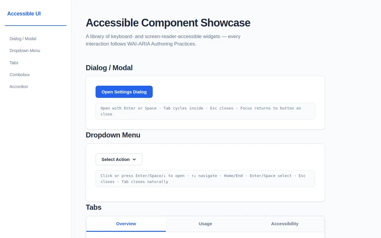
<h1>Accessible Component Showcase</h1>
<p class="section-desc">A library of keyboard- and screen-reader-accessible widgets — every interaction follows WAI-ARIA Authoring Practices.</p>
<!-- ===================== 1. MODAL DIALOG ===================== -->
<section id="modal-section" class="section-block" aria-labelledby="modal-heading">
<h2 id="modal-heading">Dialog / Modal</h2>
<div class="card">
<button id="modal-trigger" class="btn btn-primary" aria-describedby="modal-caption-desc">
Open Settings Dialog
</button>
<p id="modal-caption-desc" style="display:none;">Opens a modal dialog with focus trapping. Tab cycles inside; Esc closes.</p>
<div class="caption">Open with Enter or Space · Tab cycles inside · Esc closes · Focus returns to button on close</div>
</div>
<!-- Modal Backdrop -->
<div id="modal-backdrop" class="modal-backdrop" role="presentation">
<!-- Inert overlay for focus trapping -->
<div class="modal-inert" id="modal-inert" aria-hidden="true"></div>
<div id="modal-dialog" class="modal-dialog"
role="dialog"
aria-modal="true"
aria-labelledby="modal-title"
aria-describedby="modal-desc">
<div class="modal-header">
<h3 id="modal-title">Notification Settings</h3>
<button id="modal-close-x" class="modal-close" aria-label="Close dialog">
<svg width="20" height="20" viewBox="0 0 20 20" fill="none" stroke="currentColor" stroke-width="2" stroke-linecap="round">
<line x1="5" y1="5" x2="15" y2="15"/><line x1="15" y1="5" x2="5" y2="15"/>
</svg>
</button>
</div>
<div class="modal-body" id="modal-desc">
<p>Manage how and when you receive notifications. All settings are saved locally.</p>
<div style="margin-top:1rem;">
<label style="display:flex;align-items:center;gap:.5rem;margin-bottom:.5rem;">
<input type="checkbox" checked> Email notifications
</label>
<label style="display:flex;align-items:center;gap:.5rem;margin-bottom:.5rem;">
<input type="checkbox"> Push notifications
</label>
<label style="display:flex;align-items:center;gap:.5rem;">
<input type="checkbox" checked> Weekly digest
</label>
</div>
</div>
<div class="modal-footer">
<button class="btn btn-secondary" id="modal-cancel">Cancel</button>
<button class="btn btn-primary" id="modal-save">Save Changes</button>
</div>
</div>
</div>
</section>
<!-- ===================== 2. DROPDOWN MENU ===================== -->
<section id="menu-section" class="section-block" aria-labelledby="menu-heading">
<h2 id="menu-heading">Dropdown Menu</h2>
<div class="card">
<div class="menu-wrapper" id="menu-wrapper">
<button id="menu-trigger"
class="btn btn-secondary menu-button"
aria-haspopup="menu"
aria-expanded="false"
aria-controls="menu-list">
<span>Select Action</span>
<svg class="chevron" width="16" height="16" viewBox="0 0 16 16" fill="none" stroke="currentColor" stroke-width="2" stroke-linecap="round" stroke-linejoin="round">
<polyline points="4 6 8 10 12 6"/>
</svg>
</button>
<ul id="menu-list" class="menu-dropdown" role="menu" aria-label="Action menu">
<li role="none"><button role="menuitem" class="menu-item" data-value="new">✦ New File</button></li>
<li role="none"><button role="menuitem" class="menu-item" data-value="open">◈ Open…</button></li>
<li role="none"><button role="menuitem" class="menu-item" data-value="save">⬇ Save</button></li>
<li role="none"><div role="separator" class="menu-separator"></div></li>
<li role="none"><button role="menuitem" class="menu-item" data-value="copy">⧉ Copy</button></li>
<li role="none"><button role="menuitem" class="menu-item" data-value="paste">⧎ Paste</button></li>
<li role="none"><button role="menuitem" class="menu-item" data-value="delete">✕ Delete</button></li>
<li role="none"><div role="separator" class="menu-separator"></div></li>
<li role="none"><button role="menuitem" class="menu-item" data-settings="true">⚙ Settings</button></li>
</ul>
</div>
<div class="caption">Click or press Enter/Space/↓ to open · ↑↓ navigate · Home/End · Enter/Space select · Esc closes · Tab closes naturally</div>
<p id="menu-selection" style="margin-top:var(--spacing-md);color:var(--color-text-muted);font-size:.9375rem;" aria-live="polite"></p>
</div>
</section>
<!-- ===================== 3. TABS ===================== -->
<section id="tabs-section" class="section-block" aria-labelledby="tabs-heading">
<h2 id="tabs-heading">Tabs</h2>
<div class="card" style="padding:0;overflow:hidden;">
<div class="tablist-wrapper">
<div role="tablist" class="tablist" aria-label="Component details">
<button role="tab"
id="tab-1"
class="tab-btn"
aria-selected="true"
aria-controls="tabpanel-1"
tabindex="0">Overview</button>
<button role="tab"
id="tab-2"
class="tab-btn"
aria-selected="false"
aria-controls="tabpanel-2"
tabindex="-1">Usage</button>
<button role="tab"
id="tab-3"
class="tab-btn"
aria-selected="false"
aria-controls="tabpanel-3"
tabindex="-1">Accessibility</button>
</div>
<div role="tabpanel"
id="tabpanel-1"
class="tab-panel active"
aria-labelledby="tab-1"
tabindex="0">
<h3>Overview</h3>
<p>This tabs component follows the WAI-ARIA Tabs pattern. Only the active tab is in the tab order — rest receive <code>tabindex="-1"</code>. Arrow keys move focus horizontally between tabs.</p>
<ul>
<li>Arrow Right — next tab</li>
<li>Arrow Left — previous tab</li>
<li>Home — first tab</li>
<li>End — last tab</li>
</ul>
</div>
<div role="tabpanel"
id="tabpanel-2"
class="tab-panel"
aria-labelledby="tab-2"
hidden
tabindex="0">
<h3>Usage</h3>
<p>To use the tabs component:</p>
<ul>
<li>Wrap tabs in a <div role="tablist"></li>
<li>Each tab button gets <code>role="tab"</code>, <code>aria-selected</code>, <code>aria-controls</code>, and <code>aria-labelledby</code> (on the panel)</li>
<li>Each panel gets <code>role="tabpanel"</code> and <code>hidden</code> when inactive</li>
</ul>
</div>
<div role="tabpanel"
id="tabpanel-3"
class="tab-panel"
aria-labelledby="tab-3"
hidden
tabindex="0">
<h3>Accessibility</h3>
<p>This implementation meets key accessibility criteria:</p>
<ul>
<li>Single element in the tab order within the tablist itself</li>
<li>Arrow-key navigation per WAI-ARIA practices</li>
<li>Hidden panels use the <code>hidden</code> attribute — content is removed from accessibility tree</li>
<li>Active panel is reachable by Tab once activated</li>
<li>Screen readers announce tab state changes via <code>aria-selected</code></li>
</ul>
</div>
</div>
</div>
</section>
<!-- ===================== 4. COMBOBOX ===================== -->
<section id="combobox-section" class="section-block" aria-labelledby="combobox-heading">
<h2 id="combobox-heading">Combobox</h2>
<div class="card">
<div class="combobox-wrapper" id="combobox-wrapper">
<label style="display:block;font-size:.8125rem;font-weight:600;color:var(--color-text-muted);margin-bottom:var(--spacing-sm);">
Select a framework
</label>
<div style="position:relative;">
<input id="combobox-input"
class="combobox-input"
type="text"
role="combobox"
aria-expanded="false"
aria-controls="combobox-listbox"
aria-activedescendant=""
aria-autocomplete="list"
placeholder="Type to search…"
autocomplete="off">
<span class="combobox-arrow">
<svg width="16" height="16" viewBox="0 0 16 16" fill="none" stroke="currentColor" stroke-width="2" stroke-linecap="round" stroke-linejoin="round">
<polyline points="4 6 8 10 12 6"/>
</svg>
</span>
<button id="combobox-clear" class="combobox-clear" aria-label="Clear selection">
<svg width="14" height="14" viewBox="0 0 14 14" fill="none" stroke="currentColor" stroke-width="2" stroke-linecap="round">
<line x1="3" y1="3" x2="11" y2="11"/><line x1="11" y1="3" x2="3" y2="11"/>
</svg>
</button>
</div>
<ul id="combobox-listbox"
class="combobox-listbox"
role="listbox"
aria-label="Frameworks"
tabindex="-1">
<!-- Options injected by JS -->
</ul>
</div>
<p id="combobox-selection" style="margin-top:var(--spacing-md);color:var(--color-text-muted);font-size:.9375rem;" aria-live="polite"></p>
<div class="caption">Type to filter · ↑↓ highlight · Enter/Space select · Esc clear · Focus out closes</div>
</div>
</section>
<!-- ===================== 5. ACCORDION ===================== -->
<section id="accordion-section" class="section-block" aria-labelledby="accordion-heading">
<h2 id="accordion-heading">Accordion / Disclosure Group</h2>
<div class="card" style="padding:0;overflow:hidden;">
<!-- Item 1 -->
<div class="accordion-section">
<button class="accordion-button"
aria-expanded="false"
aria-controls="accordion-panel-1">
<span>What makes these components accessible?</span>
<svg class="accordion-chevron" width="18" height="18" viewBox="0 0 18 18" fill="none" stroke="currentColor" stroke-width="2" stroke-linecap="round" stroke-linejoin="round">
<polyline points="4 7 9 12 14 7"/>
</svg>
</button>
<div id="accordion-panel-1" class="accordion-panel" hidden style="overflow:hidden;">
<div class="accordion-panel-inner">
<p>Accessibility here is built on <strong>correct ARIA semantics</strong>. Every widget uses the right roles, states, and properties so assistive technologies can accurately convey the UI to users. Additionally:</p>
<ul style="margin-top:.5rem;">
<li><strong>Focus management</strong> — focus moves logically, never gets trapped unexpectedly, and returns to the trigger on close.</li>
<li><strong>Full keyboard operation</strong> — every interaction is achievable with keyboard alone.</li>
<li><strong>Visible focus indicators</strong> — a high-contrast outline on every interactive element.</li>
<li><strong>Reduced motion support</strong> — respect for users who prefer fewer animations.</li>
</ul>
</div>
</div>
</div>
<!-- Item 2 -->
<div class="accordion-section">
<button class="accordion-button"
aria-expanded="false"
aria-controls="accordion-panel-2">
<span>Does it support multiple open panels?</span>
<svg class="accordion-chevron" width="18" height="18" viewBox="0 0 18 18" fill="none" stroke="currentColor" stroke-width="2" stroke-linecap="round" stroke-linejoin="round">
<polyline points="4 7 9 12 14 7"/>
</svg>
</button>
<div id="accordion-panel-2" class="accordion-panel" hidden style="overflow:hidden;">
<div class="accordion-panel-inner">
<p>Yes. Unlike a traditional exclusive accordion, this implementation allows <strong>multiple panels to be open simultaneously</strong>. Each section operates independently — clicking one button toggles only its associated panel. This is ideal when you need to compare content across several sections at once.</p>
</div>
</div>
</div>
<!-- Item 3 -->
<div class="accordion-section">
<button class="accordion-button"
aria-expanded="false"
aria-controls="accordion-panel-3">
<span>How does the animation work without breaking accessibility?</span>
<svg class="accordion-chevron" width="18" height="18" viewBox="0 0 18 18" fill="none" stroke="currentColor" stroke-width="2" stroke-linecap="round" stroke-linejoin="round">
<polyline points="4 7 9 12 14 7"/>
</svg>
</button>
<div id="accordion-panel-3" class="accordion-panel" hidden style="overflow:hidden;">
<div class="accordion-panel-inner">
<p>The accordion uses a <strong>height transition</strong> — it animates from <code>height: 0</code> to <code>auto</code>. The <code>hidden</code> attribute is toggled <em>after</em> the animation completes (or immediately in non-reduced-motion contexts). During animation, the content remains in the accessibility tree, so screen reader users aren't confused by disappearing content.</p>
<p style="margin-top:.5rem;">For users who prefer reduced motion, all transitions collapse to <code>0.01ms</code>, making the state change feel instant.</p>
</div>
</div>
</div>
<!-- Item 4 -->
<div class="accordion-section">
<button class="accordion-button"
aria-expanded="false"
aria-controls="accordion-panel-4">
<span>Will this work with zoomed viewports?</span>
<svg class="accordion-chevron" width="18" height="18" viewBox="0 0 18 18" fill="none" stroke="currentColor" stroke-width="2" stroke-linecap="round" stroke-linejoin="round">
<polyline points="4 7 9 12 14 7"/>
</svg>
</button>
<div id="accordion-panel-4" class="accordion-panel" hidden style="overflow:hidden;">
<div class="accordion-panel-inner">
<p>Absolutely. All measurements use <strong>relative units</strong> (rem, em, %) and the layout uses <strong>flexbox</strong> so it adapts fluidly. At 200% zoom the sidebar collapses to mobile layout and content reflows without clipping. Focus indicators are sized at <code>3px</code> with a <code>5px</code> offset glow to remain visible at any magnification.</p>
</div>
</div>
</div>
</div>
</section>
<p style="color:var(--color-text-muted);font-size:.8125rem;margin-top:var(--spacing-3xl);text-align:center;">
Built with vanilla HTML, CSS & JS — zero dependencies.
</p>
</main>
</div>
<!-- Toast live region -->
<div class="toast-container" id="toast-container" aria-live="polite" aria-atomic="true"></div>
<!-- ============================================================
JAVASCRIPT
============================================================ -->
<script>
/* ===========================================================
TOKENS — tunable constants
=========================================================== */
const TOKENS = Object.freeze({
accent: '#2563eb',
accentHover: '#1d4ed8',
accentLight: '#dbeafe',
focusRing: 'rgba(37, 99, 235, 0.45)',
durationFast: 150,
durationNormal:250,
durationSlow: 350,
animDuration: 350, // accordion animation (ms)
toastDuration: 3000 // toast auto-hide (ms)
});
/* ===========================================================
UTILITY HELPERS
=========================================================== */
/** Log to console for debugging */
function dbg(...a) { /* console.log('[a11y]', ...a); */ }
/** Ensure element exists */
function $s(sel, ctx = document) { return ctx.querySelector(sel); }
function $$s(sel, ctx = document) { return [...ctx.querySelectorAll(sel)]; }
/** Toggle a class */
function toggleClass(el, cls, force) {
if (typeof force === 'boolean') el.classList.toggle(cls, force);
else el.classList.toggle(cls);
}
/** Prevent default and stop propagation */
function stop(e) { e.preventDefault(); e.stopPropagation(); }
/** Check if an element is a visible element (usable in focus trap) */
function isVisible(el) {
if (!el || el.offsetWidth === 0 && el.offsetHeight === 0) return false;
const style = window.getComputedStyle(el);
if (style.display === 'none' || style.visibility === 'hidden') return false;
return true;
}
/** Get all focusable elements inside a container */
function getFocusableEls(container) {
const selectors = [
'a[href]', 'button:not([disabled])', 'input:not([disabled])',
'select:not([disabled])', 'textarea:not([disabled])',
'[tabindex]:not([tabindex="-1"])'
].join(', ');
return [...container.querySelectorAll(selectors)].filter(isVisible);
}
/** Show a toast notification */
function showToast(message) {
const container = $s('#toast-container');
const toast = document.createElement('div');
toast.className = 'toast';
toast.textContent = message;
container.appendChild(toast);
// Trigger reflow
requestAnimationFrame(() => {
requestAnimationFrame(() => {
toast.classList.add('visible');
});
});
setTimeout(() => {
toast.classList.remove('visible');
setTimeout(() => toast.remove(), TOKENS.durationFast + 50);
}, TOKENS.toastDuration);
}
/* ===========================================================
1. MODAL DIALOG
=========================================================== */
function initModal() {
const trigger = $s('#modal-trigger');
const backdrop = $s('#modal-backdrop');
const dialog = $s('#modal-dialog');
const closeBtn = $s('#modal-close-x');
const cancelBtn= $s('#modal-cancel');
const saveBtn = $s('#modal-save');
const inert = $s('#modal-inert');
let prevFocus = null;
function openModal() {
prevFocus = document.activeElement;
trigger.setAttribute('aria-disabled', 'true');
// Set page inert (not just overlay — prevent focus behind dialog)
document.body.style.overflow = 'hidden';
// Show modal
toggleClass(backdrop, 'visible', true);
// Focus first focusable element in dialog
requestAnimationFrame(() => {
const focusable = getFocusableEls(dialog);
if (focusable.length > 0) focusable[0].focus();
});
}
function closeModal() {
trigger.setAttribute('aria-disabled', 'false');
document.body.style.overflow = '';
toggleClass(backdrop, 'visible', false);
// Return focus to trigger
requestAnimationFrame(() => {
if (prevFocus && prevFocus.focus) prevFocus.focus();
prevFocus = null;
});
}
// Focus trap
function handleFocusTrap(e) {
if (!backdrop.classList.contains('visible')) return;
if (e.key !== 'Tab') return;
const focusable = getFocusableEls(dialog);
if (focusable.length === 0) return;
const first = focusable[0];
const last = focusable[focusable.length - 1];
if (e.shiftKey) {
if (document.activeElement === first) {
stop(e);
last.focus();
}
} else {
if (document.activeElement === last) {
stop(e);
first.focus();
}
}
}
// Backdrop click
function handleBackdrop(e) {
if (e.target === backdrop || e.target === inert) {
closeModal();
}
}
trigger.addEventListener('click', openModal);
closeBtn.addEventListener('click', closeModal);
cancelBtn.addEventListener('click', closeModal);
saveBtn.addEventListener('click', () => { closeModal(); showToast('Settings saved'); });
backdrop.addEventListener('click', handleBackdrop);
document.addEventListener('focus', handleFocusTrap, true);
}
/* ===========================================================
2. DROPDOWN MENU
=========================================================== */
function initMenu() {
const trigger = $s('#menu-trigger');
const menu = $s('#menu-list');
const items = $$s('[role="menuitem"]', menu);
const selEl = $s('#menu-selection');
let open = false;
function openMenu() {
open = true;
trigger.setAttribute('aria-expanded', 'true');
menu.classList.add('open');
// Focus first item
items[0].focus();
}
function closeMenu() {
open = false;
trigger.setAttribute('aria-expanded', 'false');
menu.classList.remove('open');
trigger.focus();
}
function toggleMenu() {
open ? closeMenu() : openMenu();
}
function activateItem(item) {
const value = item.dataset.value || item.dataset.settings;
selEl.textContent = `Selected: ${value ? value.charAt(0).toUpperCase() + value.slice(1) : 'Settings'}`;
showToast(`Menu action: ${item.textContent.trim()}`);
closeMenu();
}
function focusItem(idx) {
if (idx < 0) idx = items.length - 1;
if (idx >= items.length) idx = 0;
items[idx].focus();
}
function getAllFocusableItems() {
return items; // only actual menuitem buttons
}
trigger.addEventListener('click', toggleMenu);
trigger.addEventListener('keydown', (e) => {
switch (e.key) {
case 'ArrowDown':
stop(e);
openMenu();
break;
case 'Enter':
stop(e);
toggleMenu();
break;
case 'Space':
stop(e);
toggleMenu();
break;
case 'Escape':
if (open) {
stop(e);
closeMenu();
}
break;
}
});
menu.addEventListener('keydown', (e) => {
if (!open) return;
const focusable = getAllFocusableItems();
const currentIdx = focusable.indexOf(document.activeElement);
switch (e.key) {
case 'ArrowDown':
stop(e);
focusItem(currentIdx + 1);
break;
case 'ArrowUp':
stop(e);
focusItem(currentIdx - 1);
break;
case 'Home':
stop(e);
focusItem(0);
break;
case 'End':
stop(e);
focusItem(focusable.length - 1);
break;
case 'Enter':
case ' ':
stop(e);
if (currentIdx >= 0) activateItem(document.activeElement);
break;
case 'Escape':
stop(e);
closeMenu();
break;
case 'Tab':
closeMenu();
// Allow natural tab behavior
break;
}
});
// Click on items
items.forEach(item => {
item.addEventListener('click', (e) => {
stop(e);
activateItem(item);
});
});
// Click outside closes
document.addEventListener('click', (e) => {
if (open && !trigger.contains(e.target) && !menu.contains(e.target)) {
closeMenu();
}
});
// Blur on trigger closes
trigger.addEventListener('blur', (e) => {
if (open && !menu.contains(document.activeElement)) {
closeMenu();
}
});
}
/* ===========================================================
3. TABS
=========================================================== */
function initTabs() {
const tablist = $s('[role="tablist"]');
const tabs = $$s('[role="tab"]', tablist);
const panels = tabs.map(t => $s(t.getAttribute('aria-controls')));
function activateTab(tabIdx) {
tabs.forEach((t, i) => {
const activated = i === tabIdx;
t.setAttribute('aria-selected', String(activated));
t.setAttribute('tabindex', activated ? '0' : '-1');
const panel = panels[i];
if (activated) {
panel.removeAttribute('hidden');
panel.classList.add('active');
} else {
panel.setAttribute('hidden', '');
panel.classList.remove('active');
}
});
}
tabs.forEach((tab, i) => {
tab.addEventListener('click', () => activateTab(i));
tab.addEventListener('keydown', (e) => {
let newIdx = null;
switch (e.key) {
case 'ArrowRight':
stop(e);
newIdx = (i + 1) % tabs.length;
break;
case 'ArrowLeft':
stop(e);
newIdx = (i - 1 + tabs.length) % tabs.length;
break;
case 'Home':
stop(e);
newIdx = 0;
break;
case 'End':
stop(e);
newIdx = tabs.length - 1;
break;
case 'Enter':
case ' ':
stop(e);
newIdx = i;
break;
}
if (newIdx !== null) {
activateTab(newIdx);
tabs[newIdx].focus();
}
});
});
}
/* ===========================================================
4. COMBOBOX (autocomplete)
=========================================================== */
function initCombobox() {
const options = [
'React', 'Vue.js', 'Angular', 'Svelte', 'Solid.js',
'Ember.js', 'Alpine.js', 'Lit', 'Preact', 'Next.js',
'Nuxt', 'Remix', 'Astro', 'Gatsby', 'Midjourney',
'Vite', 'Webpack', 'Rollup', 'esbuild', 'Turbopack'
];
const input = $s('#combobox-input');
const listbox = $s('#combobox-listbox');
const clearBtn = $s('#combobox-clear');
const selEl = $s('#combobox-selection');
let expanded = false;
let activeDesc = '';
let filtered = [];
let userTyped = false;
// Build options in listbox
function renderOptions(list) {
listbox.innerHTML = '';
if (list.length === 0) {
const empty = document.createElement('li');
empty.className = 'combobox-empty';
empty.textContent = 'No results';
listbox.appendChild(empty);
return;
}
list.forEach((opt, idx) => {
const li = document.createElement('li');
li.className = 'combobox-option';
li.id = `cb-option-${idx}`;
li.setAttribute('role', 'option');
li.setAttribute('aria-selected', 'false');
li.textContent = opt;
li.addEventListener('click', () => {
selectOption(opt);
});
listbox.appendChild(li);
});
filtered = list;
}
function updateHighlight(newIdx) {
const allOptions = listbox.querySelectorAll('.combobox-option');
if (filtered.length === 0 || newIdx < 0 || newIdx >= filtered.length) {
// Remove highlight
allOptions.forEach(opt => opt.classList.remove('highlighted'));
input.setAttribute('aria-activedescendant', '');
activeDesc = '';
return;
}
allOptions.forEach(opt => opt.classList.remove('highlighted'));
const target = allOptions[newIdx];
target.classList.add('highlighted');
target.setAttribute('aria-selected', 'true');
activeDesc = target.id;
input.setAttribute('aria-activedescendant', activeDesc);
// Scroll into view
target.scrollIntoView({ block: 'nearest' });
}
function selectOption(value) {
input.value = value;
userTyped = false;
closeList();
selEl.textContent = `Selected: ${value}`;
showToast(`Combobox: ${value}`);
clearBtn.classList.toggle('visible', value !== '');
}
function openList() {
expanded = true;
input.setAttribute('aria-expanded', 'true');
listbox.classList.add('open');
filterAndRender();
// Highlight first if nothing focused
if (filtered.length > 0) {
updateHighlight(0);
}
}
function closeList() {
expanded = false;
input.setAttribute('aria-expanded', 'false');
listbox.classList.remove('open');
activeDesc = '';
input.setAttribute('aria-activedescendant', '');
// Remove all highlights
listbox.querySelectorAll('.combobox-option').forEach(opt => {
opt.classList.remove('highlighted');
opt.setAttribute('aria-selected', 'false');
});
}
function filterAndRender() {
const query = input.value.trim().toLowerCase();
const matched = query
? options.filter(o => o.toLowerCase().includes(query))
: [...options];
renderOptions(matched);
if (matched.length > 0) updateHighlight(0);
else {
listbox.querySelectorAll('.combobox-option').forEach(opt => {
opt.classList.remove('highlighted');
opt.setAttribute('aria-selected', 'false');
});
}
}
// Clear button
clearBtn.addEventListener('click', () => {
input.value = '';
clearBtn.classList.remove('visible');
userTyped = false;
selEl.textContent = '';
filterAndRender();
if (expanded) openList(); // re-open with full list
});
input.addEventListener('input', () => {
userTyped = true;
clearBtn.classList.toggle('visible', input.value !== '');
if (!expanded) {
openList();
} else {
filterAndRender();
}
});
input.addEventListener('keydown', (e) => {
switch (e.key) {
case 'ArrowDown':
stop(e);
if (!expanded) { openList(); return; }
// Find current highlight
const currentOpts = listbox.querySelectorAll('.combobox-option.highlighted');
let curIdx = -1;
filtered.forEach((_, i) => {
if (listbox.querySelector(`#cb-option-${i}`)?.classList.contains('highlighted')) {
curIdx = i;
}
});
updateHighlight(curIdx + 1);
break;
case 'ArrowUp':
stop(e);
if (!expanded) { openList(); return; }
const currentOpts2 = listbox.querySelectorAll('.combobox-option.highlighted');
let curIdx2 = -1;
filtered.forEach((_, i) => {
if (listbox.querySelector(`#cb-option-${i}`)?.classList.contains('highlighted')) {
curIdx2 = i;
}
});
updateHighlight(curIdx2 - 1);
break;
case 'Enter':
stop(e);
if (expanded && filtered.length > 0 && activeDesc) {
const optEl = document.getElementById(activeDesc);
if (optEl) {
const value = optEl.textContent;
selectOption(value);
}
}
break;
case 'Escape':
stop(e);
if (expanded) {
// Revert any partial edits if user typed
closeList();
}
break;
case 'Tab':
// If an option is highlighted, select it
if (expanded && activeDesc) {
const optEl = document.getElementById(activeDesc);
if (optEl) selectOption(optEl.textContent);
}
closeList();
break;
}
});
input.addEventListener('focus', () => {
if (userTyped && filtered.length > 0 && expanded) {
// Keep dropdown open on focus
}
});
// Focus out closes
const wrapper = $s('#combobox-wrapper');
wrapper.addEventListener('focusout', (e) => {
if (!wrapper.contains(e.relatedTarget)) {
closeList();
}
});
// Initialize with all options
renderOptions(options);
}
/* ===========================================================
5. ACCORDION
=========================================================== */
function initAccordion() {
const buttons = $$s('.accordion-button');
buttons.forEach(btn => {
btn.addEventListener('click', () => toggleAccordion(btn));
btn.addEventListener('keydown', (e) => {
switch (e.key) {
case 'Enter':
case ' ':
stop(e);
toggleAccordion(btn);
break;
}
});
});
function toggleAccordion(btn) {
const isExpanded = btn.getAttribute('aria-expanded') === 'true';
const panelId = btn.getAttribute('aria-controls');
const panel = document.getElementById(panelId);
if (!panel) return;
if (isExpanded) {
// Closing
btn.setAttribute('aria-expanded', 'false');
// Animate height to 0
const currentHeight = panel.scrollHeight;
panel.style.height = currentHeight + 'px';
// Force reflow
panel.offsetHeight;
// After animation, hide
setTimeout(() => {
panel.style.height = '0';
panel.setAttribute('hidden', '');
}, TOKENS.animDuration);
} else {
// Opening
btn.setAttribute('aria-expanded', 'true');
panel.removeAttribute('hidden');
// Set initial height
panel.style.height = '0';
// Force reflow
panel.offsetHeight;
const targetHeight = panel.scrollHeight;
panel.style.height = targetHeight + 'px';
// After animation, set to auto
setTimeout(() => {
panel.style.height = 'auto';
}, TOKENS.animDuration);
}
}
}
/* ===========================================================
INIT ALL COMPONENTS
=========================================================== */
document.addEventListener('DOMContentLoaded', () => {
initModal();
initMenu();
initTabs();
initCombobox();
initAccordion();
});
</script>
</body>
</html>