Accessible Components
ThinkingCap Qwen3.6 27B GGUF · typescript
Reviews & generation details
Reviews
No human review yet. Unreviewed does not mean unsuccessful.
Generation context
Imported historical artifact. Its exact original instructions and lineage are not known.
Generation prompt · exact text unavailable
See the current prompt for reference. It may differ from the instructions used to generate this artifact.
Inspect original source 43,277 bytes · SHA-256 6dbe251d45f8
<!doctype html>
<html lang="en">
<head>
<meta charset="utf-8">
<meta name="viewport" content="width=device-width, initial-scale=1">
<title>Accessible Component Showcase</title>
<style>
/* ── css: showcase ── */
/* Reset & base */
*, *::before, *::after { box-sizing: border-box; margin: 0; padding: 0; }
:root {
--bg: #ffffff;
--bg-secondary: #f8f9fb;
--bg-tertiary: #f1f3f5;
--text: #1a1a2e;
--text-secondary: #555b6e;
--text-muted: #888da0;
--accent: #4f46e5;
--accent-light: #eef2ff;
--accent-dark: #3730a3;
--border: #e2e5ea;
--border-dark: #ccd0d9;
--focus-ring: #4f46e5;
--radius-sm: 4px;
--radius-md: 8px;
--radius-lg: 12px;
--radius-xl: 16px;
--sidebar-width: 240px;
--content-max: 800px;
--font: -apple-system, BlinkMacSystemFont, 'Segoe UI', Roboto, Oxygen, Ubuntu, sans-serif;
}
html {
font-size: 16px;
scroll-behavior: smooth;
scroll-padding-top: 20px;
}
body {
font-family: var(--font);
color: var(--text);
background: var(--bg);
line-height: 1.6;
-webkit-font-smoothing: antialiased;
}
/* Skip link */
.skip-link {
position: absolute;
top: -100%;
left: 16px;
background: var(--accent);
color: white;
padding: 8px 16px;
border-radius: var(--radius-md);
font-size: 14px;
font-weight: 600;
text-decoration: none;
z-index: 10000;
transition: top 0.15s;
}
.skip-link:focus { top: 8px; }
/* Layout */
.sidebar {
position: fixed;
top: 0;
left: 0;
width: var(--sidebar-width);
height: 100vh;
background: var(--bg-secondary);
border-right: 1px solid var(--border);
padding: 36px 20px 20px;
overflow-y: auto;
z-index: 100;
display: flex;
flex-direction: column;
}
.sidebar-title {
font-size: 13px;
font-weight: 700;
text-transform: uppercase;
letter-spacing: 0.08em;
color: var(--accent);
margin-bottom: 20px;
line-height: 1.3;
}
.sidebar nav ul { list-style: none; }
.sidebar nav li { margin-bottom: 2px; }
.sidebar nav a {
display: block;
padding: 8px 12px;
color: var(--text-secondary);
text-decoration: none;
font-size: 14px;
border-radius: var(--radius-md);
transition: background 0.15s, color 0.15s;
white-space: nowrap;
}
.sidebar nav a:hover,
.sidebar nav a:focus-visible {
background: var(--accent-light);
color: var(--accent);
}
.main-content {
margin-left: var(--sidebar-width);
max-width: var(--content-max);
padding: 48px 40px;
}
/* Page header */
.page-header {
margin-bottom: 48px;
padding-bottom: 32px;
border-bottom: 2px solid var(--border);
}
.page-header h1 {
font-size: 30px;
font-weight: 700;
margin-bottom: 8px;
color: var(--text);
}
.subtitle {
font-size: 16px;
color: var(--text-secondary);
max-width: 560px;
}
/* Component sections */
.component-section {
margin-bottom: 56px;
padding: 32px;
background: var(--bg);
border: 1px solid var(--border);
border-radius: var(--radius-lg);
}
.section-header { margin-bottom: 20px; }
.section-header h2 {
font-size: 20px;
font-weight: 600;
margin-bottom: 4px;
}
.section-desc {
font-size: 14px;
color: var(--text-secondary);
}
.demo-area {
background: var(--bg-secondary);
border: 1px solid var(--border);
border-radius: var(--radius-md);
padding: 24px;
margin-bottom: 12px;
min-height: 60px;
position: relative;
}
.keyboard-hint {
font-size: 13px;
color: var(--text-muted);
letter-spacing: 0.01em;
}
/* ===== Buttons ===== */
.btn {
display: inline-flex;
align-items: center;
gap: 6px;
padding: 10px 20px;
font-size: 14px;
font-weight: 500;
font-family: var(--font);
border: 1px solid transparent;
border-radius: var(--radius-md);
cursor: pointer;
transition: background 0.15s, border-color 0.15s;
line-height: 1.4;
}
.btn:focus-visible {
outline: 3px solid var(--focus-ring);
outline-offset: 2px;
}
.btn-primary {
background: var(--accent);
color: white;
border-color: var(--accent);
}
.btn-primary:hover { background: var(--accent-dark); }
.btn-secondary {
background: white;
color: var(--text);
border-color: var(--border-dark);
}
.btn-secondary:hover { background: var(--bg-tertiary); }
/* Global focus */
*:focus-visible {
outline: 3px solid var(--focus-ring);
outline-offset: 2px;
}
/* ===== Modal ===== */
.modal-backdrop {
position: fixed;
inset: 0;
background: rgba(15, 23, 42, 0.45);
z-index: 1000;
display: none;
}
.modal-dialog {
position: fixed;
top: 50%;
left: 50%;
transform: translate(-50%, -50%);
z-index: 1001;
background: white;
border-radius: var(--radius-xl);
box-shadow: 0 20px 60px rgba(15, 23, 42, 0.2), 0 4px 16px rgba(15, 23, 42, 0.1);
width: 90%;
max-width: 480px;
max-height: 85vh;
overflow-y: auto;
}
.modal-header { padding: 24px 24px 0; }
.modal-title { font-size: 18px; font-weight: 600; }
.modal-body {
padding: 16px 24px;
font-size: 14px;
color: var(--text-secondary);
line-height: 1.7;
}
.modal-footer {
padding: 16px 24px 24px;
display: flex;
justify-content: flex-end;
gap: 8px;
}
/* ===== Dropdown ===== */
.dropdown-menu {
list-style: none;
position: absolute;
background: white;
border: 1px solid var(--border);
border-radius: var(--radius-md);
box-shadow: 0 8px 24px rgba(15, 23, 42, 0.12);
min-width: 200px;
z-index: 200;
padding: 4px;
}
.dropdown-item {
padding: 10px 16px;
font-size: 14px;
cursor: pointer;
border-radius: var(--radius-sm);
transition: background 0.1s;
}
.dropdown-item:hover,
.dropdown-item:focus-visible {
background: var(--accent-light);
color: var(--accent);
}
/* ===== Tabs ===== */
.tabs-tablist {
display: flex;
gap: 2px;
border-bottom: 2px solid var(--border);
margin-bottom: 20px;
}
.tabs-tab {
padding: 10px 20px;
font-size: 14px;
font-weight: 500;
font-family: var(--font);
background: none;
border: none;
border-bottom: 2px solid transparent;
margin-bottom: -2px;
color: var(--text-secondary);
cursor: pointer;
transition: color 0.15s, border-color 0.15s;
}
.tabs-tab:hover { color: var(--text); }
.tabs-tab[aria-selected="true"] {
color: var(--accent);
border-bottom-color: var(--accent);
font-weight: 600;
}
.tabs-panel { padding: 16px 0; font-size: 14px; line-height: 1.7; }
.tabs-panel ul { margin: 12px 0; padding-left: 20px; }
.tabs-panel li { margin-bottom: 4px; }
.spec-table {
width: 100%;
border-collapse: collapse;
font-size: 14px;
}
.spec-table th, .spec-table td {
text-align: left;
padding: 8px 12px;
border-bottom: 1px solid var(--border);
}
.spec-table th { font-weight: 600; background: var(--bg-tertiary); }
.review {
padding: 12px 0;
border-bottom: 1px solid var(--border);
}
.review:last-child { border-bottom: none; }
.review p { margin-bottom: 4px; font-size: 14px; }
/* ===== Combobox ===== */
.combobox-wrapper {
position: relative;
width: 100%;
max-width: 360px;
}
.combobox-input {
width: 100%;
padding: 10px 14px;
font-size: 14px;
font-family: var(--font);
border: 1px solid var(--border-dark);
border-radius: var(--radius-md);
background: white;
color: var(--text);
transition: border-color 0.15s, box-shadow 0.15s;
}
.combobox-input:focus {
outline: none;
border-color: var(--accent);
box-shadow: 0 0 0 3px var(--accent-light);
}
.combobox-listbox {
position: absolute;
top: calc(100% + 4px);
left: 0;
right: 0;
background: white;
border: 1px solid var(--border);
border-radius: var(--radius-md);
box-shadow: 0 8px 24px rgba(15, 23, 42, 0.12);
max-height: 200px;
overflow-y: auto;
list-style: none;
z-index: 200;
padding: 4px;
}
.combobox-option {
padding: 8px 12px;
font-size: 14px;
cursor: pointer;
border-radius: var(--radius-sm);
transition: background 0.1s;
}
.combobox-option:hover,
.combobox-option-highlighted {
background: var(--accent-light);
color: var(--accent);
}
/* ===== Accordion ===== */
.accordion-item {
border: 1px solid var(--border);
border-radius: var(--radius-md);
margin-bottom: 8px;
overflow: hidden;
background: white;
}
.accordion-button {
width: 100%;
display: flex;
justify-content: space-between;
align-items: center;
padding: 14px 18px;
font-size: 14px;
font-weight: 500;
font-family: var(--font);
background: none;
border: none;
cursor: pointer;
text-align: left;
color: var(--text);
transition: background 0.15s;
}
.accordion-button:hover { background: var(--bg-secondary); }
.accordion-icon {
font-size: 10px;
color: var(--text-muted);
transition: transform 0.2s;
flex-shrink: 0;
}
.accordion-button[aria-expanded="true"] .accordion-icon {
transform: rotate(90deg);
color: var(--accent);
}
.accordion-region { overflow: hidden; }
.accordion-content {
padding: 0 18px 16px;
font-size: 14px;
color: var(--text-secondary);
line-height: 1.7;
}
/* ===== Shared input ===== */
.input {
width: 100%;
padding: 10px 14px;
font-size: 14px;
font-family: var(--font);
border: 1px solid var(--border-dark);
border-radius: var(--radius-md);
background: white;
color: var(--text);
transition: border-color 0.15s, box-shadow 0.15s;
}
.input:focus {
outline: none;
border-color: var(--accent);
box-shadow: 0 0 0 3px var(--accent-light);
}
/* Screen reader only */
.sr-only {
position: absolute;
width: 1px;
height: 1px;
padding: 0;
margin: -1px;
overflow: hidden;
clip: rect(0, 0, 0, 0);
white-space: nowrap;
border: 0;
}
/* Reduced motion */
@media (prefers-reduced-motion: reduce) {
*, *::before, *::after {
animation-duration: 0.01ms !important;
animation-iteration-count: 1 !important;
transition-duration: 0.01ms !important;
}
html { scroll-behavior: auto; }
}
/* Responsive */
@media (max-width: 768px) {
.sidebar { display: none; }
.main-content { margin-left: 0; padding: 24px 16px; }
}
</style>
</head>
<body>
<a href="#main-content" class="skip-link">Skip to main content</a>
<aside class="sidebar" id="sidebar">
<h1 class="sidebar-title">A11y Components</h1>
<nav aria-label="Component navigation">
<ul>
<li><a href="#section-modal">Modal Dialog</a></li>
<li><a href="#section-dropdown">Dropdown Menu</a></li>
<li><a href="#section-tabs">Tabs</a></li>
<li><a href="#section-combobox">Combobox</a></li>
<li><a href="#section-accordion">Accordion</a></li>
</ul>
</nav>
</aside>
<main id="main-content" class="main-content">
<header class="page-header">
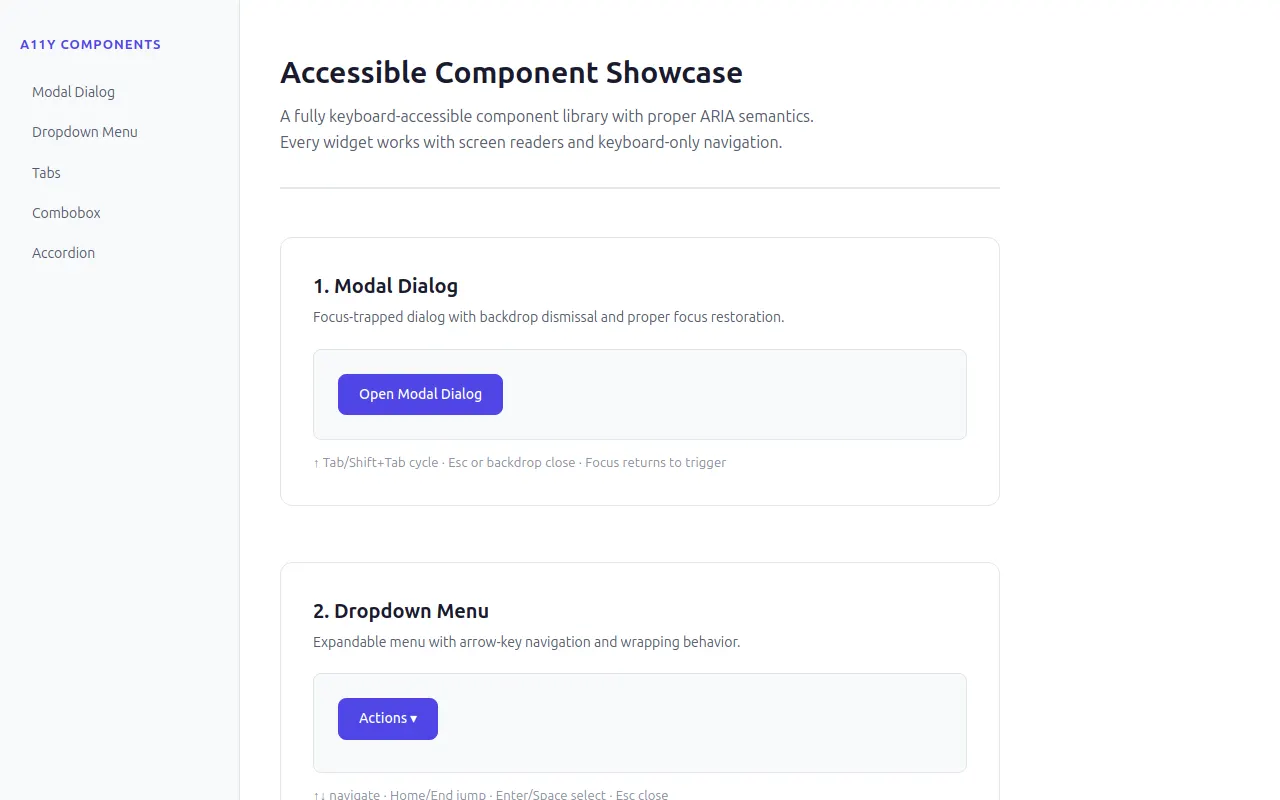
<h1>Accessible Component Showcase</h1>
<p class="subtitle">A fully keyboard-accessible component library with proper ARIA semantics. Every widget works with screen readers and keyboard-only navigation.</p>
</header>
<section id="section-modal" class="component-section">
<div class="section-header">
<h2>1. Modal Dialog</h2>
<p class="section-desc">Focus-trapped dialog with backdrop dismissal and proper focus restoration.</p>
</div>
<div class="demo-area" id="demo-modal"></div>
<p class="keyboard-hint">↑ Tab/Shift+Tab cycle · Esc or backdrop close · Focus returns to trigger</p>
</section>
<section id="section-dropdown" class="component-section">
<div class="section-header">
<h2>2. Dropdown Menu</h2>
<p class="section-desc">Expandable menu with arrow-key navigation and wrapping behavior.</p>
</div>
<div class="demo-area" id="demo-dropdown"></div>
<p class="keyboard-hint">↑↓ navigate · Home/End jump · Enter/Space select · Esc close</p>
</section>
<section id="section-tabs" class="component-section">
<div class="section-header">
<h2>3. Tabs</h2>
<p class="section-desc">Single-tab-order tablist with arrow-key activation and hidden panels.</p>
</div>
<div class="demo-area" id="demo-tabs"></div>
<p class="keyboard-hint">←→ switch tabs · Home/End jump · Only active tab in tab order</p>
</section>
<section id="section-combobox" class="component-section">
<div class="section-header">
<h2>4. Combobox (Autocomplete)</h2>
<p class="section-desc">Text input with filtering listbox and aria-activedescendant highlighting.</p>
</div>
<div class="demo-area" id="demo-combobox"></div>
<p class="keyboard-hint">↑↓ highlight · Enter select · Esc close & revert · Tab dismisses</p>
</section>
<section id="section-accordion" class="component-section">
<div class="section-header">
<h2>5. Accordion / Disclosure</h2>
<p class="section-desc">Expandable regions with animated height and independent control.</p>
</div>
<div class="demo-area" id="demo-accordion"></div>
<p class="keyboard-hint">Enter/Space toggle · Multiple panels may be open simultaneously</p>
</section>
</main>
<script>
(function () {
'use strict';
var __mods = {};
var __cache = {};
var __map = {"src/main.ts":{"./modal":"src/modal.ts","./dropdown":"src/dropdown.ts","./tabs":"src/tabs.ts","./combobox":"src/combobox.ts","./accordion":"src/accordion.ts"},"src/modal.ts":{"./config":"src/config.ts","./utils":"src/utils.ts"},"src/combobox.ts":{"./config":"src/config.ts"},"src/accordion.ts":{"./config":"src/config.ts"}};
function __require(id) {
if (__cache[id]) return __cache[id].exports;
var module = __cache[id] = { exports: {} };
var factory = __mods[id];
if (!factory) throw new Error("Module not found: " + id);
factory(module.exports, function (spec) {
var target = (__map[id] && __map[id][spec]) || spec;
return __require(target);
}, module);
return module.exports;
}
// ── module: src/main.ts ──
__mods["src/main.ts"] = function (exports, require, module) {
"use strict";
Object.defineProperty(exports, "__esModule", { value: true });
const modal_1 = require("./modal");
const dropdown_1 = require("./dropdown");
const tabs_1 = require("./tabs");
const combobox_1 = require("./combobox");
const accordion_1 = require("./accordion");
function start() {
const demoModal = document.getElementById('demo-modal');
const demoDropdown = document.getElementById('demo-dropdown');
const demoTabs = document.getElementById('demo-tabs');
const demoCombobox = document.getElementById('demo-combobox');
const demoAccordion = document.getElementById('demo-accordion');
if (demoModal)
(0, modal_1.initModal)(demoModal);
if (demoDropdown)
(0, dropdown_1.initDropdown)(demoDropdown);
if (demoTabs)
(0, tabs_1.initTabs)(demoTabs);
if (demoCombobox)
(0, combobox_1.initCombobox)(demoCombobox);
if (demoAccordion)
(0, accordion_1.initAccordion)(demoAccordion);
}
start();
};
// ── module: src/config.ts ──
__mods["src/config.ts"] = function (exports, require, module) {
"use strict";
Object.defineProperty(exports, "__esModule", { value: true });
exports.MAIN_CONTENT_MAX_WIDTH = exports.SIDEBAR_WIDTH = exports.COMBOBOX_OPTIONS = exports.FONT = exports.RADIUS = exports.ANIMATION = exports.SPACING = exports.COLORS = void 0;
// Design tokens & constants
exports.COLORS = {
bg: '#ffffff',
bgSecondary: '#f8f9fb',
bgTertiary: '#f1f3f5',
text: '#1a1a2e',
textSecondary: '#555b6e',
textMuted: '#888da0',
accent: '#4f46e5',
accentLight: '#eef2ff',
accentDark: '#3730a3',
border: '#e2e5ea',
borderDark: '#ccd0d9',
focus: '#4f46e5',
success: '#16a34a',
white: '#ffffff',
overlay: 'rgba(15, 23, 42, 0.45)',
shadow: 'rgba(15, 23, 42, 0.08)',
shadowLg: 'rgba(15, 23, 42, 0.14)',
};
exports.SPACING = {
xs: '4px',
sm: '8px',
md: '16px',
lg: '24px',
xl: '32px',
xxl: '48px',
xxxl: '64px',
};
exports.ANIMATION = {
fast: '120ms',
normal: '200ms',
slow: '300ms',
};
exports.RADIUS = {
sm: '4px',
md: '8px',
lg: '12px',
xl: '16px',
};
exports.FONT = {
family: "'Inter', -apple-system, BlinkMacSystemFont, 'Segoe UI', Roboto, sans-serif",
mono: "'JetBrains Mono', 'Fira Code', monospace",
size: {
xs: '12px',
sm: '14px',
base: '16px',
lg: '18px',
xl: '20px',
xxl: '24px',
xxxl: '30px',
},
};
exports.COMBOBOX_OPTIONS = [
'Afghanistan', 'Albania', 'Algeria', 'Andorra', 'Angola',
'Argentina', 'Australia', 'Austria', 'Azerbaijan', 'Bahamas',
'Bangladesh', 'Belgium', 'Belize', 'Benin', 'Bhutan',
'Bolivia', 'Bosnia and Herzegovina', 'Botswana', 'Brazil', 'Brunei',
'Bulgaria', 'Burkina Faso', 'Burundi', 'Cambodia', 'Cameroon',
'Canada', 'Cape Verde', 'Central African Republic', 'Chad', 'Chile',
];
exports.SIDEBAR_WIDTH = '240px';
exports.MAIN_CONTENT_MAX_WIDTH = '800px';
};
// ── module: src/utils.ts ──
__mods["src/utils.ts"] = function (exports, require, module) {
"use strict";
Object.defineProperty(exports, "__esModule", { value: true });
exports.createFocusTrap = createFocusTrap;
exports.prefersReducedMotion = prefersReducedMotion;
exports.setInert = setInert;
exports.debounce = debounce;
// Focus trap utility — confines keyboard focus within a container
function createFocusTrap(container) {
const focusableSelector = [
'a[href]', 'button:not([disabled])', 'input:not([disabled])',
'textarea:not([disabled])', 'select:not([disabled])',
'[tabindex]:not([tabindex="-1"])', '[contenteditable]',
].join(', ');
function getFocusableElements() {
return Array.from(container.querySelectorAll(focusableSelector)).filter(el => !el.hasAttribute('disabled') && el.offsetParent !== null);
}
function handler(e) {
if (e.key !== 'Tab')
return;
const focusable = getFocusableElements();
if (focusable.length === 0)
return;
const first = focusable[0];
const last = focusable[focusable.length - 1];
if (e.shiftKey) {
if (document.activeElement === first || !container.contains(document.activeElement)) {
e.preventDefault();
last.focus();
}
}
else {
if (document.activeElement === last || !container.contains(document.activeElement)) {
e.preventDefault();
first.focus();
}
}
}
document.addEventListener('keydown', handler);
return {
dispose() {
document.removeEventListener('keydown', handler);
},
};
}
// Reduced motion preference
function prefersReducedMotion() {
return window.matchMedia('(prefers-reduced-motion: reduce)').matches;
}
// Toggle page inert for everything outside the modal
function setInert(exceptId, inert) {
if (inert) {
document.body.setAttribute('inert', '');
}
else {
document.body.removeAttribute('inert');
}
return () => {
document.body.removeAttribute('inert');
};
}
// Debounce helper
function debounce(fn, ms) {
let timer;
return ((...args) => {
clearTimeout(timer);
timer = setTimeout(() => fn(...args), ms);
});
}
};
// ── module: src/modal.ts ──
__mods["src/modal.ts"] = function (exports, require, module) {
"use strict";
Object.defineProperty(exports, "__esModule", { value: true });
exports.initModal = initModal;
const utils_1 = require("./utils");
function initModal(container) {
const triggerId = 'modal-trigger';
const dialogId = 'modal-dialog';
const titleId = 'modal-title';
// Build trigger button
const trigger = document.createElement('button');
trigger.id = triggerId;
trigger.className = 'btn btn-primary';
trigger.textContent = 'Open Modal Dialog';
container.appendChild(trigger);
// Build backdrop
const backdrop = document.createElement('div');
backdrop.className = 'modal-backdrop';
backdrop.setAttribute('aria-hidden', 'true');
document.body.appendChild(backdrop);
// Build dialog
const dialog = document.createElement('div');
dialog.id = dialogId;
dialog.className = 'modal-dialog';
dialog.setAttribute('role', 'dialog');
dialog.setAttribute('aria-modal', 'true');
dialog.setAttribute('aria-labelledby', titleId);
dialog.setAttribute('aria-hidden', 'true');
dialog.style.display = 'none';
document.body.appendChild(dialog);
// Dialog header
const header = document.createElement('div');
header.className = 'modal-header';
const title = document.createElement('h2');
title.id = titleId;
title.className = 'modal-title';
title.textContent = 'Confirm Action';
header.appendChild(title);
dialog.appendChild(header);
// Dialog body
const body = document.createElement('div');
body.className = 'modal-body';
const p = document.createElement('p');
p.textContent = 'This modal demonstrates focus trapping, keyboard navigation, and proper ARIA attributes. The focus is trapped within this dialog while it is open.';
body.appendChild(p);
const input = document.createElement('input');
input.type = 'text';
input.className = 'input';
input.placeholder = 'Type something…';
body.appendChild(input);
dialog.appendChild(body);
// Dialog footer
const footer = document.createElement('div');
footer.className = 'modal-footer';
const cancelBtn = document.createElement('button');
cancelBtn.className = 'btn btn-secondary';
cancelBtn.textContent = 'Cancel';
footer.appendChild(cancelBtn);
const confirmBtn = document.createElement('button');
confirmBtn.className = 'btn btn-primary';
confirmBtn.textContent = 'Confirm';
footer.appendChild(confirmBtn);
dialog.appendChild(footer);
let trap = null;
function openDialog() {
dialog.style.display = 'block';
dialog.setAttribute('aria-hidden', 'false');
backdrop.setAttribute('aria-hidden', 'false');
backdrop.style.display = 'block';
trap = (0, utils_1.createFocusTrap)(dialog);
// Focus the first focusable element in the dialog
const firstFocusable = dialog.querySelector('button, input, textarea, select, [tabindex]:not([tabindex="-1"])');
if (firstFocusable)
firstFocusable.focus();
}
function closeDialog() {
dialog.style.display = 'none';
dialog.setAttribute('aria-hidden', 'true');
backdrop.setAttribute('aria-hidden', 'true');
backdrop.style.display = 'none';
trap?.dispose();
trap = null;
trigger.focus();
}
trigger.addEventListener('click', openDialog);
cancelBtn.addEventListener('click', closeDialog);
confirmBtn.addEventListener('click', closeDialog);
backdrop.addEventListener('click', closeDialog);
dialog.addEventListener('keydown', (e) => {
if (e.key === 'Escape') {
e.preventDefault();
closeDialog();
}
});
}
};
// ── module: src/dropdown.ts ──
__mods["src/dropdown.ts"] = function (exports, require, module) {
"use strict";
Object.defineProperty(exports, "__esModule", { value: true });
exports.initDropdown = initDropdown;
function initDropdown(container) {
const menuId = 'dropdown-menu';
const buttonId = 'dropdown-trigger';
// Trigger button
const button = document.createElement('button');
button.id = buttonId;
button.className = 'btn btn-primary dropdown-btn';
button.setAttribute('aria-haspopup', 'menu');
button.setAttribute('aria-expanded', 'false');
button.setAttribute('aria-controls', menuId);
button.textContent = 'Actions ▾';
container.appendChild(button);
// Menu
const menu = document.createElement('ul');
menu.id = menuId;
menu.className = 'dropdown-menu';
menu.setAttribute('role', 'menu');
menu.setAttribute('tabindex', '-1');
menu.style.display = 'none';
container.appendChild(menu);
const actions = [
{ label: 'Edit', action: 'edit' },
{ label: 'Duplicate', action: 'duplicate' },
{ label: 'Move to folder', action: 'move' },
{ label: 'Rename', action: 'rename' },
{ label: 'Delete', action: 'delete' },
];
actions.forEach((item) => {
const li = document.createElement('li');
li.setAttribute('role', 'menuitem');
li.className = 'dropdown-item';
li.textContent = item.label;
li.dataset.action = item.action;
li.addEventListener('click', () => {
selectItem(item.label);
});
li.addEventListener('keydown', (e) => {
if (e.key === 'Enter' || e.key === ' ') {
e.preventDefault();
selectItem(item.label);
}
});
menu.appendChild(li);
});
const menuItems = () => menu.querySelectorAll('[role="menuitem"]');
let activeIndex = -1;
function openMenu() {
menu.style.display = 'block';
button.setAttribute('aria-expanded', 'true');
activeIndex = -1;
}
function closeMenu(restoreFocus = true) {
menu.style.display = 'none';
button.setAttribute('aria-expanded', 'false');
activeIndex = -1;
if (restoreFocus)
button.focus();
}
function selectItem(label) {
const resultEl = container.querySelector('.dropdown-result');
if (resultEl)
resultEl.textContent = `Selected: ${label}`;
closeMenu();
}
function setFocus(index) {
const items = menuItems();
items.forEach((el, i) => {
el.setAttribute('tabindex', i === index ? '0' : '-1');
});
activeIndex = index;
if (items[index])
items[index].focus();
}
// Result display
const result = document.createElement('div');
result.className = 'dropdown-result';
result.style.marginTop = '8px';
result.style.fontSize = '14px';
result.style.color = '#555';
container.appendChild(result);
button.addEventListener('click', () => {
if (menu.style.display === 'block') {
closeMenu();
}
else {
openMenu();
}
});
button.addEventListener('keydown', (e) => {
if (e.key === 'ArrowDown' || e.key === 'Down') {
e.preventDefault();
openMenu();
setFocus(0);
}
else if (e.key === 'Escape') {
e.preventDefault();
closeMenu();
}
});
menu.addEventListener('keydown', (e) => {
const items = menuItems();
if (e.key === 'ArrowDown' || e.key === 'Down') {
e.preventDefault();
const next = (activeIndex + 1) % items.length;
setFocus(next);
}
else if (e.key === 'ArrowUp' || e.key === 'Up') {
e.preventDefault();
const prev = activeIndex <= 0 ? items.length - 1 : activeIndex - 1;
setFocus(prev);
}
else if (e.key === 'Home') {
e.preventDefault();
setFocus(0);
}
else if (e.key === 'End') {
e.preventDefault();
setFocus(items.length - 1);
}
else if (e.key === 'Escape') {
e.preventDefault();
closeMenu();
}
else if (e.key === 'Tab') {
closeMenu(false);
}
});
// Close on outside click
document.addEventListener('click', (e) => {
if (!container.contains(e.target)) {
closeMenu(false);
}
});
}
};
// ── module: src/tabs.ts ──
__mods["src/tabs.ts"] = function (exports, require, module) {
"use strict";
Object.defineProperty(exports, "__esModule", { value: true });
exports.initTabs = initTabs;
function initTabs(container) {
const tablistId = 'tablist';
const tabs = [
{ id: 'tab-1', label: 'Overview', panelId: 'panel-overview' },
{ id: 'tab-2', label: 'Specifications', panelId: 'panel-specs' },
{ id: 'tab-3', label: 'Reviews', panelId: 'panel-reviews' },
];
// Tablist
const tablist = document.createElement('div');
tablist.id = tablistId;
tablist.className = 'tabs-tablist';
tablist.setAttribute('role', 'tablist');
container.appendChild(tablist);
// Panels container
const panelsContainer = document.createElement('div');
panelsContainer.className = 'tabs-panels';
container.appendChild(panelsContainer);
// Create tab buttons
const tabButtons = [];
tabs.forEach((tab, index) => {
const btn = document.createElement('button');
btn.id = tab.id;
btn.className = 'tabs-tab';
btn.setAttribute('role', 'tab');
btn.setAttribute('aria-selected', index === 0 ? 'true' : 'false');
btn.setAttribute('aria-controls', tab.panelId);
btn.setAttribute('tabindex', index === 0 ? '0' : '-1');
btn.textContent = tab.label;
tablist.appendChild(btn);
tabButtons.push(btn);
});
// Panel content data
const panelContents = [
`<p><strong>Arc Flash Shield™</strong> is a comprehensive component library designed for modern web applications. Every component is built from the ground up with accessibility at its core.</p>
<p>Key features include keyboard navigation, ARIA compliance, screen reader support, and responsive design. All components work seamlessly without external dependencies.</p>
<ul><li>Zero dependencies</li><li>Full keyboard support</li><li>WCAG 2.1 AA compliant</li><li>Customizable theming</li></ul>`,
`<table class="spec-table">
<thead><tr><th>Property</th><th>Value</th></tr></thead>
<tbody>
<tr><td>Version</td><td>3.2.0</td></tr>
<tr><td>Components</td><td>24 widgets</td></tr>
<tr><td>Bundle size</td><td>12 KB gzipped</td></tr>
<tr><td>Browser support</td><td>ES2020+</td></tr>
<tr><td>License</td><td>MIT</td></tr>
</tbody>
</table>`,
`<div class="review"><p><strong>"Excellent accessibility."</strong> — Sarah M.</p><p>The tab navigation works flawlessly with screen readers. Finally, a library that gets it right.</p></div>
<div class="review"><p><strong>"Clean and minimal."</strong> — James K.</p><p>Lightweight and easy to customize. The design tokens make theming a breeze.</p></div>
<div class="review"><p><strong>"Production-ready."</strong> — Priya S.</p><p>We've been using this in our enterprise app for 6 months. Zero issues.</p></div>`,
];
// Create panels
tabs.forEach((tab, index) => {
const panel = document.createElement('div');
panel.id = tab.panelId;
panel.className = 'tabs-panel';
panel.setAttribute('role', 'tabpanel');
panel.setAttribute('aria-labelledby', tab.id);
panel.innerHTML = panelContents[index];
if (index !== 0)
panel.hidden = true;
panelsContainer.appendChild(panel);
});
// Tab switching
function activateTab(index) {
tabButtons.forEach((btn, i) => {
const isActive = i === index;
btn.setAttribute('aria-selected', isActive ? 'true' : 'false');
btn.setAttribute('tabindex', isActive ? '0' : '-1');
});
const panels = panelsContainer.querySelectorAll('.tabs-panel');
panels.forEach((panel, i) => {
panel.hidden = i !== index;
});
tabButtons[index].focus();
}
tabButtons.forEach((btn, index) => {
btn.addEventListener('click', () => activateTab(index));
btn.addEventListener('keydown', (e) => {
let newIndex = -1;
if (e.key === 'ArrowRight' || e.key === 'Right') {
e.preventDefault();
newIndex = (index + 1) % tabButtons.length;
}
else if (e.key === 'ArrowLeft' || e.key === 'Left') {
e.preventDefault();
newIndex = (index - 1 + tabButtons.length) % tabButtons.length;
}
else if (e.key === 'Home') {
e.preventDefault();
newIndex = 0;
}
else if (e.key === 'End') {
e.preventDefault();
newIndex = tabButtons.length - 1;
}
if (newIndex >= 0)
activateTab(newIndex);
});
});
}
};
// ── module: src/combobox.ts ──
__mods["src/combobox.ts"] = function (exports, require, module) {
"use strict";
Object.defineProperty(exports, "__esModule", { value: true });
exports.initCombobox = initCombobox;
const config_1 = require("./config");
function initCombobox(container) {
const comboboxId = 'combobox-input';
const listboxId = 'combobox-listbox';
let optionIds = [];
let highlightedIndex = -1;
let currentOptions = [];
let originalValue = '';
// Wrapper
const wrapper = document.createElement('div');
wrapper.className = 'combobox-wrapper';
container.appendChild(wrapper);
// Input
const input = document.createElement('input');
input.id = comboboxId;
input.type = 'text';
input.className = 'combobox-input';
input.setAttribute('role', 'combobox');
input.setAttribute('aria-expanded', 'false');
input.setAttribute('aria-controls', listboxId);
input.setAttribute('aria-autocomplete', 'list');
input.setAttribute('autocomplete', 'off');
input.placeholder = 'Search countries…';
wrapper.appendChild(input);
// Listbox
const listbox = document.createElement('ul');
listbox.id = listboxId;
listbox.className = 'combobox-listbox';
listbox.setAttribute('role', 'listbox');
listbox.setAttribute('tabindex', '-1');
listbox.style.display = 'none';
wrapper.appendChild(listbox);
// Live region for announcements
const liveRegion = document.createElement('div');
liveRegion.id = 'combobox-live';
liveRegion.setAttribute('aria-live', 'polite');
liveRegion.setAttribute('aria-atomic', 'true');
liveRegion.className = 'sr-only';
container.appendChild(liveRegion);
function buildOptions(filtered) {
listbox.innerHTML = '';
optionIds = [];
currentOptions = [];
filtered.forEach((opt, i) => {
const id = `combobox-option-${i}`;
optionIds.push(id);
const li = document.createElement('li');
li.id = id;
li.className = 'combobox-option';
li.setAttribute('role', 'option');
li.setAttribute('aria-selected', 'false');
li.textContent = opt;
listbox.appendChild(li);
currentOptions.push(li);
li.addEventListener('click', () => {
selectOption(opt);
});
});
}
function selectOption(value) {
input.value = value;
originalValue = value;
closeListbox();
liveRegion.textContent = `${value} selected`;
}
function openListbox(filtered) {
buildOptions(filtered);
listbox.style.display = 'block';
input.setAttribute('aria-expanded', 'true');
highlightedIndex = -1;
input.removeAttribute('aria-activedescendant');
liveRegion.textContent = `${filtered.length} options available`;
}
function closeListbox() {
listbox.style.display = 'none';
input.setAttribute('aria-expanded', 'false');
highlightedIndex = -1;
input.removeAttribute('aria-activedescendant');
}
function setHighlight(index) {
highlightedIndex = index;
const id = optionIds[index];
if (id) {
input.setAttribute('aria-activedescendant', id);
const el = document.getElementById(id);
if (el)
el.scrollIntoView({ block: 'nearest' });
}
else {
input.removeAttribute('aria-activedescendant');
}
currentOptions.forEach((opt, i) => {
opt.className = i === index ? 'combobox-option combobox-option-highlighted' : 'combobox-option';
});
}
function filterAndOpen(value) {
const filtered = config_1.COMBOBOX_OPTIONS.filter((opt) => opt.toLowerCase().includes(value.toLowerCase()));
if (filtered.length > 0) {
openListbox(filtered);
}
else {
closeListbox();
}
}
input.addEventListener('input', () => {
const val = input.value.trim();
if (val.length > 0) {
filterAndOpen(val);
}
else {
closeListbox();
}
});
input.addEventListener('keydown', (e) => {
const isOpen = listbox.style.display === 'block';
const count = currentOptions.length;
if ((e.key === 'ArrowDown' || e.key === 'Down') && isOpen) {
e.preventDefault();
const next = highlightedIndex < count - 1 ? highlightedIndex + 1 : 0;
setHighlight(next);
}
else if ((e.key === 'ArrowUp' || e.key === 'Up') && isOpen) {
e.preventDefault();
if (highlightedIndex <= 0) {
setHighlight(count - 1);
}
else {
setHighlight(highlightedIndex - 1);
}
}
else if (e.key === 'Enter' && isOpen && highlightedIndex >= 0) {
e.preventDefault();
const highlighted = currentOptions[highlightedIndex];
if (highlighted) {
selectOption(highlighted.textContent || '');
}
}
else if (e.key === 'Escape') {
e.preventDefault();
input.value = originalValue;
closeListbox();
}
else if (e.key === 'ArrowDown' || e.key === 'Down') {
e.preventDefault();
openListbox(config_1.COMBOBOX_OPTIONS);
setHighlight(0);
}
});
input.addEventListener('blur', () => {
setTimeout(() => {
if (listbox.style.display === 'block') {
closeListbox();
}
}, 100);
});
}
};
// ── module: src/accordion.ts ──
__mods["src/accordion.ts"] = function (exports, require, module) {
"use strict";
Object.defineProperty(exports, "__esModule", { value: true });
exports.initAccordion = initAccordion;
const config_1 = require("./config");
function initAccordion(container) {
const items = [
{
title: 'What makes these components accessible?',
content: 'Every component follows WAI-ARIA Authoring Practices. We use proper roles, states, and properties. Keyboard navigation is fully supported with focus management that ensures users never lose their place. Screen readers receive correct announcements via ARIA live regions and proper label associations.',
},
{
title: 'How does the focus trap work in the modal?',
content: 'When the modal opens, a focus trap is activated that listens for Tab and Shift+Tab events. It identifies all focusable elements within the modal and cycles focus between the first and last element, preventing focus from leaking outside. When the modal closes, focus returns to the trigger button.',
},
{
title: 'Can I use multiple accordions open at once?',
content: 'Yes! This accordion allows multiple panels to be open simultaneously. Each button independently controls its associated panel with aria-expanded and aria-controls attributes properly wired. You can open and close panels in any combination.',
},
{
title: 'What about animations and reduced motion?',
content: 'All animations respect the prefers-reduced-motion media query. When reduced motion is preferred, animations are disabled entirely and panels show/hide instantly. This ensures that users with vestibular disorders are not subjected to unnecessary motion.',
},
];
items.forEach((item, index) => {
const panelId = `accordion-panel-${index}`;
const buttonId = `accordion-btn-${index}`;
const section = document.createElement('div');
section.className = 'accordion-item';
// Button
const button = document.createElement('button');
button.id = buttonId;
button.className = 'accordion-button';
button.setAttribute('aria-expanded', 'false');
button.setAttribute('aria-controls', panelId);
button.textContent = item.title;
// Icon indicator
const icon = document.createElement('span');
icon.className = 'accordion-icon';
icon.setAttribute('aria-hidden', 'true');
icon.textContent = '◆';
button.appendChild(icon);
// Panel region
const region = document.createElement('div');
region.id = panelId;
region.className = 'accordion-region';
region.setAttribute('role', 'region');
region.setAttribute('aria-labelledby', buttonId);
region.hidden = true;
const inner = document.createElement('div');
inner.className = 'accordion-content';
const p = document.createElement('p');
p.textContent = item.content;
inner.appendChild(p);
region.appendChild(inner);
section.appendChild(button);
section.appendChild(region);
container.appendChild(section);
button.addEventListener('click', () => {
togglePanel(button, region);
});
button.addEventListener('keydown', (e) => {
if (e.key === 'Enter' || e.key === ' ') {
e.preventDefault();
togglePanel(button, region);
}
});
});
}
function togglePanel(button, region) {
const isExpanded = button.getAttribute('aria-expanded') === 'true';
if (isExpanded) {
// Close: animate height then set hidden
const currentHeight = region.scrollHeight;
region.hidden = false;
region.style.height = `${currentHeight}px`;
region.style.overflow = 'hidden';
// Force reflow
region.offsetHeight;
region.style.height = '0';
region.style.transition = `height ${config_1.ANIMATION.normal} ease-out`;
setTimeout(() => {
region.hidden = true;
region.style.height = '';
region.style.transition = '';
region.style.overflow = '';
}, 200);
button.setAttribute('aria-expanded', 'false');
}
else {
// Open: set hidden=false, animate from 0 to full height
region.hidden = false;
region.style.height = '0';
region.style.overflow = 'hidden';
region.style.transition = `height ${config_1.ANIMATION.normal} ease-out`;
// Force reflow
region.offsetHeight;
region.style.height = `${region.scrollHeight}px`;
setTimeout(() => {
region.style.height = '';
region.style.transition = '';
region.style.overflow = '';
}, 200);
button.setAttribute('aria-expanded', 'true');
}
}
};
// ── entry ──
__require("src/main.ts");
})();
</script>
</body>
</html>
<!-- agent-meta {"model":"ThinkingCap-Qwen3.6-27B-GGUF","provider":"brigid","persona":"typescript","sessionId":"cd88922d-1494-4b77-b617-629049d13d98","tokensIn":702325,"tokensOut":26199,"tokensTotal":728524,"cost":0,"turns":36,"toolCalls":36,"failedToolCalls":0,"timestamp":"2026-08-03T21:04:42.409Z"} -->