Accessible Components
Tiel Coder 35B A3B GGUF MTP · full
Reviews & generation details
Reviews
No human review yet. Unreviewed does not mean unsuccessful.
Generation context
Imported historical artifact. Its exact original instructions and lineage are not known.
Generation prompt · exact text unavailable
See the current prompt for reference. It may differ from the instructions used to generate this artifact.
Inspect original source 50,016 bytes · SHA-256 799ab0d14fb9
<!DOCTYPE html>
<html lang="en">
<head>
<meta charset="UTF-8">
<meta name="viewport" content="width=device-width, initial-scale=1.0">
<title>Accessible Component Library</title>
<style>
/* ============================================================
TUNABLE CONSTANTS
============================================================ */
:root {
/* Colors — restrained two-color accent palette (indigo + slate) */
--accent: #4f46e5;
--accent-dark: #4338ca;
--accent-light: #eef2ff;
--accent-focus: #6366f1;
--bg: #ffffff;
--bg-subtle: #f8fafc;
--bg-muted: #f1f5f9;
--text: #0f172a;
--text-muted: #475569;
--text-subtle: #94a3b8;
--border: #e2e8f0;
--border-strong: #cbd5e1;
--focus-ring: #4f46e5;
--focus-ring-offset: 2px;
/* Spacing scale */
--space-1: 4px;
--space-2: 8px;
--space-3: 12px;
--space-4: 16px;
--space-5: 24px;
--space-6: 32px;
--space-7: 48px;
--space-8: 64px;
/* Animation durations */
--dur-fast: 120ms;
--dur-medium: 200ms;
--dur-slow: 280ms;
/* Typography */
--font-sans: system-ui, -apple-system, "Segoe UI", Roboto, Helvetica, Arial, sans-serif;
--font-mono: ui-monospace, SFMono-Regular, Menlo, Consolas, monospace;
--radius: 8px;
--radius-sm: 6px;
--shadow-sm: 0 1px 2px rgba(15, 23, 42, 0.08);
--shadow-md: 0 4px 12px rgba(15, 23, 42, 0.12);
--shadow-lg: 0 20px 50px rgba(15, 23, 42, 0.22);
--sidebar-width: 260px;
}
/* ============================================================
RESET & BASE
============================================================ */
*, *::before, *::after {
box-sizing: border-box;
margin: 0;
padding: 0;
}
html {
scroll-behavior: smooth;
scroll-padding-top: 24px;
-webkit-text-size-adjust: 100%;
}
body {
font-family: var(--font-sans);
color: var(--text);
background: var(--bg);
line-height: 1.6;
font-size: 16px;
-webkit-font-smoothing: antialiased;
text-rendering: optimizeLegibility;
}
/* ============================================================
SKIP LINK — first focusable element
============================================================ */
.skip-link {
position: absolute;
top: -100%;
left: var(--space-3);
z-index: 1000;
padding: var(--space-3) var(--space-4);
background: var(--accent);
color: #fff;
border-radius: var(--radius-sm);
text-decoration: none;
font-weight: 600;
box-shadow: var(--shadow-md);
transition: top var(--dur-fast) ease;
}
.skip-link:focus {
top: var(--space-3);
outline: 3px solid var(--focus-ring);
outline-offset: var(--focus-ring-offset);
}
/* ============================================================
VISIBLE FOCUS INDICATOR (global, never removed)
============================================================ */
:focus-visible {
outline: 3px solid var(--focus-ring);
outline-offset: var(--focus-ring-offset);
border-radius: 3px;
}
:focus:not(:focus-visible) {
outline: none;
}
/* ============================================================
LAYOUT — sidebar + main
============================================================ */
.page-wrap {
display: block;
}
.sidebar {
position: fixed;
top: 0;
left: 0;
width: var(--sidebar-width);
height: 100vh;
overflow-y: auto;
background: var(--bg-subtle);
border-right: 1px solid var(--border);
padding: var(--space-6) var(--space-4);
z-index: 100;
}
.sidebar__brand {
font-size: 0.8rem;
font-weight: 700;
letter-spacing: 0.08em;
text-transform: uppercase;
color: var(--accent);
margin-bottom: var(--space-5);
}
.sidebar__nav a {
display: block;
padding: var(--space-2) var(--space-3);
color: var(--text-muted);
text-decoration: none;
font-size: 0.92rem;
border-radius: var(--radius-sm);
border-left: 3px solid transparent;
transition: color var(--dur-fast), background var(--dur-fast), border-color var(--dur-fast);
}
.sidebar__nav a:hover {
color: var(--text);
background: var(--bg-muted);
}
.sidebar__nav a.active {
color: var(--accent-dark);
background: var(--accent-light);
border-left-color: var(--accent);
font-weight: 600;
}
.main {
margin-left: var(--sidebar-width);
padding: var(--space-8) var(--space-7) var(--space-12);
max-width: 900px;
}
.page-header {
margin-bottom: var(--space-8);
padding-bottom: var(--space-6);
border-bottom: 2px solid var(--border);
}
.page-header h1 {
font-size: 2.2rem;
font-weight: 800;
letter-spacing: -0.02em;
line-height: 1.15;
margin-bottom: var(--space-2);
}
.page-header p {
color: var(--text-muted);
font-size: 1.05rem;
max-width: 62ch;
}
/* ============================================================
SECTION STYLES
============================================================ */
.component-section {
margin-bottom: var(--space-8);
padding-bottom: var(--space-6);
border-bottom: 1px solid var(--border);
scroll-margin-top: 24px;
}
.component-section h2 {
font-size: 1.45rem;
font-weight: 750;
letter-spacing: -0.01em;
margin-bottom: var(--space-2);
display: flex;
align-items: center;
gap: var(--space-3);
}
.component-section h2 .num {
display: inline-flex;
align-items: center;
justify-content: center;
width: 28px;
height: 28px;
border-radius: 50%;
background: var(--accent);
color: #fff;
font-size: 0.8rem;
font-weight: 700;
flex-shrink: 0;
}
.component-desc {
color: var(--text-muted);
font-size: 0.95rem;
margin-bottom: var(--space-5);
max-width: 65ch;
}
.demo-area {
background: var(--bg-subtle);
border: 1px solid var(--border);
border-radius: var(--radius);
padding: var(--space-6);
margin-bottom: var(--space-4);
}
.caption {
display: inline-flex;
flex-wrap: wrap;
gap: var(--space-2);
align-items: center;
font-family: var(--font-mono);
font-size: 0.82rem;
color: var(--text-muted);
background: var(--bg-muted);
border: 1px solid var(--border);
border-radius: var(--radius-sm);
padding: var(--space-2) var(--space-3);
}
.caption kbd {
font-family: var(--font-mono);
font-size: 0.78rem;
background: #fff;
border: 1px solid var(--border-strong);
border-bottom-width: 2px;
border-radius: 4px;
padding: 1px 6px;
color: var(--text);
}
/* ============================================================
REUSABLE BUTTONS
============================================================ */
.btn {
display: inline-flex;
align-items: center;
gap: var(--space-2);
font-family: var(--font-sans);
font-size: 0.95rem;
font-weight: 600;
padding: var(--space-3) var(--space-5);
border: 1px solid var(--border-strong);
border-radius: var(--radius-sm);
background: #fff;
color: var(--text);
cursor: pointer;
transition: background var(--dur-fast), border-color var(--dur-fast), box-shadow var(--dur-fast), transform var(--dur-fast);
}
.btn:hover {
background: var(--bg-muted);
}
.btn:active {
transform: translateY(1px);
}
.btn--primary {
background: var(--accent);
border-color: var(--accent);
color: #fff;
}
.btn--primary:hover {
background: var(--accent-dark);
border-color: var(--accent-dark);
}
.btn[aria-expanded] {
padding-right: var(--space-4);
}
/* ============================================================
1. MODAL DIALOG
============================================================ */
.modal-overlay {
position: fixed;
inset: 0;
z-index: 500;
display: flex;
align-items: center;
justify-content: center;
padding: var(--space-5);
background: rgba(15, 23, 42, 0.55);
opacity: 0;
visibility: hidden;
transition: opacity var(--dur-medium) ease, visibility var(--dur-medium) ease;
}
.modal-overlay.is-open {
opacity: 1;
visibility: visible;
}
.modal-overlay.is-open .modal {
transform: scale(1) translateY(0);
opacity: 1;
visibility: visible;
}
.modal {
background: #fff;
border-radius: var(--radius);
box-shadow: var(--shadow-lg);
width: 100%;
max-width: 480px;
max-height: 90vh;
overflow-y: auto;
transform: scale(0.95) translateY(10px);
opacity: 0;
visibility: hidden;
transition: transform var(--dur-medium) ease, opacity var(--dur-medium) ease;
}
.modal__header {
display: flex;
align-items: center;
justify-content: space-between;
padding: var(--space-5) var(--space-6) var(--space-3);
border-bottom: 1px solid var(--border);
}
.modal__title {
font-size: 1.2rem;
font-weight: 700;
}
.modal__body {
padding: var(--space-4) var(--space-6) var(--space-5);
color: var(--text-muted);
}
.modal__footer {
display: flex;
justify-content: flex-end;
gap: var(--space-3);
padding: var(--space-4) var(--space-6) var(--space-5);
}
.modal__close {
display: inline-flex;
align-items: center;
justify-content: center;
width: 34px;
height: 34px;
border: none;
background: transparent;
color: var(--text-muted);
font-size: 1.3rem;
cursor: pointer;
border-radius: var(--radius-sm);
line-height: 1;
}
.modal__close:hover {
background: var(--bg-muted);
color: var(--text);
}
/* ============================================================
2. DROPDOWN MENU (menu role)
============================================================ */
.menu-wrap {
position: relative;
}
.menu-button {
position: relative;
}
.menu-button::after {
content: "";
position: absolute;
right: var(--space-4);
top: 50%;
width: 8px;
height: 8px;
border-right: 2px solid currentColor;
border-bottom: 2px solid currentColor;
transform: translateY(-70%) rotate(45deg);
transition: transform var(--dur-fast) ease;
pointer-events: none;
}
.menu-button[aria-expanded="true"]::after {
transform: translateY(-30%) rotate(-135deg);
}
.menu-popup {
position: absolute;
top: calc(100% + var(--space-2));
left: 0;
min-width: 220px;
background: #fff;
border: 1px solid var(--border);
border-radius: var(--radius-sm);
box-shadow: var(--shadow-md);
padding: var(--space-2);
z-index: 200;
opacity: 0;
visibility: hidden;
transform: translateY(-6px);
transition: opacity var(--dur-fast) ease, visibility var(--dur-fast) ease, transform var(--dur-fast) ease;
}
.menu-popup.is-open {
opacity: 1;
visibility: visible;
transform: translateY(0);
}
.menu-item {
display: block;
width: 100%;
text-align: left;
font-family: var(--font-sans);
font-size: 0.92rem;
padding: var(--space-2) var(--space-3);
border: none;
background: transparent;
color: var(--text);
cursor: pointer;
border-radius: 4px;
line-height: 1.4;
}
.menu-item:hover {
background: var(--bg-muted);
}
.menu-item.is-active {
background: var(--accent);
color: #fff;
}
.menu-sep {
height: 1px;
background: var(--border);
margin: var(--space-2) 0;
}
.menu-result {
margin-top: var(--space-4);
font-size: 0.9rem;
color: var(--accent-dark);
font-weight: 600;
min-height: 1.4em;
}
/* ============================================================
3. TABS
============================================================ */
.tabs-wrap {
max-width: 560px;
}
.tablist {
display: flex;
gap: var(--space-1);
border-bottom: 2px solid var(--border);
}
.tab {
font-family: var(--font-sans);
font-size: 0.95rem;
font-weight: 600;
padding: var(--space-3) var(--space-4);
border: 1px solid transparent;
border-bottom: none;
border-radius: var(--radius-sm) var(--radius-sm) 0 0;
background: transparent;
color: var(--text-muted);
cursor: pointer;
position: relative;
bottom: -2px;
transition: color var(--dur-fast), background var(--dur-fast);
}
.tab:hover {
color: var(--text);
background: var(--bg-muted);
}
.tab[aria-selected="true"] {
color: var(--accent-dark);
background: #fff;
border-color: var(--border);
}
.tab[aria-selected="true"]::after {
content: "";
position: absolute;
left: var(--space-3);
right: var(--space-3);
bottom: -2px;
height: 2px;
background: var(--accent);
}
.tab[aria-selected="true"]:focus-visible {
bottom: -2px;
}
.tabpanel {
padding: var(--space-5) 0;
color: var(--text-muted);
}
.tabpanel h3 {
font-size: 1.05rem;
color: var(--text);
margin-bottom: var(--space-2);
}
.tabpanel ul {
margin: var(--space-2) 0 0 var(--space-5);
}
.tabpanel li {
margin-bottom: var(--space-1);
}
/* ============================================================
4. COMBOBOX (autocomplete)
============================================================ */
.combobox-wrap {
position: relative;
max-width: 360px;
}
.combobox-input {
width: 100%;
font-family: var(--font-sans);
font-size: 0.95rem;
padding: var(--space-3) var(--space-4);
border: 1px solid var(--border-strong);
border-radius: var(--radius-sm);
color: var(--text);
background: #fff;
transition: border-color var(--dur-fast), box-shadow var(--dur-fast);
}
.combobox-input:focus {
border-color: var(--accent);
box-shadow: 0 0 0 3px rgba(79, 70, 229, 0.15);
}
.combobox-list {
position: absolute;
top: calc(100% + var(--space-2));
left: 0;
right: 0;
background: #fff;
border: 1px solid var(--border);
border-radius: var(--radius-sm);
box-shadow: var(--shadow-md);
max-height: 240px;
overflow-y: auto;
z-index: 200;
list-style: none;
padding: var(--space-2);
opacity: 0;
visibility: hidden;
transform: translateY(-6px);
transition: opacity var(--dur-fast) ease, visibility var(--dur-fast) ease, transform var(--dur-fast) ease;
}
.combobox-list.is-open {
opacity: 1;
visibility: visible;
transform: translateY(0);
}
.combobox-option {
padding: var(--space-2) var(--space-3);
border-radius: 4px;
cursor: pointer;
font-size: 0.92rem;
}
.combobox-option .match {
font-weight: 700;
color: var(--accent-dark);
}
.combobox-option.is-active {
background: var(--accent);
color: #fff;
}
.combobox-option.is-active .match {
color: #fff;
}
.combobox-empty {
padding: var(--space-2) var(--space-3);
color: var(--text-subtle);
font-size: 0.9rem;
font-style: italic;
}
.combobox-result {
margin-top: var(--space-4);
font-size: 0.9rem;
color: var(--accent-dark);
font-weight: 600;
min-height: 1.4em;
}
/* ============================================================
5. ACCORDION / DISCLOSURE
============================================================ */
.accordion {
max-width: 560px;
border: 1px solid var(--border);
border-radius: var(--radius);
overflow: hidden;
}
.accordion-item + .accordion-item {
border-top: 1px solid var(--border);
}
.accordion-trigger {
display: flex;
align-items: center;
justify-content: space-between;
gap: var(--space-3);
width: 100%;
font-family: var(--font-sans);
font-size: 1rem;
font-weight: 600;
text-align: left;
padding: var(--space-4) var(--space-5);
border: none;
background: #fff;
color: var(--text);
cursor: pointer;
transition: background var(--dur-fast);
}
.accordion-trigger:hover {
background: var(--bg-subtle);
}
.accordion-trigger .chevron {
width: 10px;
height: 10px;
border-right: 2px solid currentColor;
border-bottom: 2px solid currentColor;
transform: rotate(45deg);
flex-shrink: 0;
transition: transform var(--dur-medium) ease;
}
.accordion-trigger[aria-expanded="true"] .chevron {
transform: rotate(-45deg);
}
.accordion-region {
overflow: hidden;
transition: height var(--dur-medium) ease;
}
.accordion-region[hidden] {
display: none;
}
.accordion-content {
padding: 0 var(--space-5) var(--space-5);
color: var(--text-muted);
font-size: 0.95rem;
}
/* ============================================================
LIVE REGION (visually hidden announcements)
============================================================ */
.live-region {
position: absolute;
width: 1px;
height: 1px;
padding: 0;
margin: -1px;
overflow: hidden;
clip: rect(0 0 0 0);
clip-path: inset(50%);
white-space: nowrap;
border: 0;
}
/* ============================================================
RESPONSIVE
============================================================ */
@media (max-width: 860px) {
.sidebar {
width: 200px;
}
.main {
margin-left: 200px;
padding: var(--space-6) var(--space-4) var(--space-10);
}
}
@media (max-width: 640px) {
.sidebar {
position: static;
width: 100%;
height: auto;
border-right: none;
border-bottom: 1px solid var(--border);
}
.main {
margin-left: 0;
padding: var(--space-5) var(--space-3) var(--space-8);
}
.page-wrap {
display: block;
}
}
/* ============================================================
PREFERS-REDUCED-MOTION
============================================================ */
@media (prefers-reduced-motion: reduce) {
html {
scroll-behavior: auto;
}
*, *::before, *::after {
animation-duration: 0.001ms !important;
animation-iteration-count: 1 !important;
transition-duration: 0.001ms !important;
}
}
</style>
</head>
<body>
<!-- Skip link: first focusable element -->
<a href="#main" class="skip-link">Skip to main content</a>
<!-- Live region for screen-reader announcements -->
<div id="live-region" class="live-region" role="status" aria-live="polite" aria-atomic="true"></div>
<div class="page-wrap">
<!-- Sidebar navigation -->
<aside class="sidebar" aria-label="Component navigation">
<div class="sidebar__brand">Component Library</div>
<nav class="sidebar__nav" id="side-nav">
<a href="#sec-modal">Modal Dialog</a>
<a href="#sec-menu">Dropdown Menu</a>
<a href="#sec-tabs">Tabs</a>
<a href="#sec-combobox">Combobox</a>
<a href="#sec-accordion">Accordion</a>
</nav>
</aside>
<!-- Main content -->
<main id="main" class="main" tabindex="-1">
<header class="page-header">
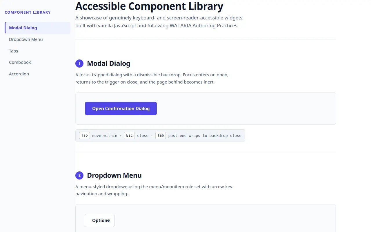
<h1>Accessible Component Library</h1>
<p>A showcase of genuinely keyboard- and screen-reader-accessible widgets, built with vanilla JavaScript and following WAI-ARIA Authoring Practices.</p>
</header>
<!-- 1. MODAL -->
<section id="sec-modal" class="component-section" aria-labelledby="sec-modal-title">
<h2 id="sec-modal-title"><span class="num" aria-hidden="true">1</span> Modal Dialog</h2>
<p class="component-desc">A focus-trapped dialog with a dismissible backdrop. Focus enters on open, returns to the trigger on close, and the page behind becomes inert.</p>
<div class="demo-area">
<button type="button" class="btn btn--primary" id="modal-trigger" aria-haspopup="dialog">Open Confirmation Dialog</button>
</div>
<div class="caption"><kbd>Tab</kbd> move within · <kbd>Esc</kbd> close · <kbd>Tab</kbd> past end wraps to backdrop close</div>
</section>
<!-- 2. DROPDOWN MENU -->
<section id="sec-menu" class="component-section" aria-labelledby="sec-menu-title">
<h2 id="sec-menu-title"><span class="num" aria-hidden="true">2</span> Dropdown Menu</h2>
<p class="component-desc">A menu-styled dropdown using the menu/menuitem role set with arrow-key navigation and wrapping.</p>
<div class="demo-area">
<div class="menu-wrap">
<button type="button" class="btn menu-button" id="menu-trigger" aria-haspopup="menu" aria-expanded="false" aria-controls="menu-popup">Options</button>
<div class="menu-popup" id="menu-popup" role="menu" aria-labelledby="menu-trigger">
<button type="button" class="menu-item" role="menuitem" data-value="edit">Edit</button>
<button type="button" class="menu-item" role="menuitem" data-value="duplicate">Duplicate</button>
<button type="button" class="menu-item" role="menuitem" data-value="share">Share</button>
<div class="menu-sep" role="separator" id="menu-sep-1">Separator</div>
<button type="button" class="menu-item" role="menuitem" data-value="delete">Delete</button>
</div>
</div>
<div class="menu-result" id="menu-result" aria-hidden="true"></div>
</div>
<div class="caption"><kbd>↓</kbd> open & first · <kbd>↑↓</kbd> navigate · <kbd>Home</kbd>/<kbd>End</kbd> jump · <kbd>Enter</kbd>/<kbd>Space</kbd> select · <kbd>Esc</kbd> close · <kbd>Tab</kbd> close & move</div>
</section>
<!-- 3. TABS -->
<section id="sec-tabs" class="component-section" aria-labelledby="sec-tabs-title">
<h2 id="sec-tabs-title"><span class="num" aria-hidden="true">3</span> Tabs</h2>
<p class="component-desc">A single-tabindex tablist with roving tabindex and horizontal arrow-key navigation between tabs.</p>
<div class="demo-area">
<div id="tabs">
<div class="tablist" role="tablist" aria-label="Deployment options">
<button type="button" class="tab" role="tab" id="tab-1" aria-selected="true" aria-controls="panel-1" tabindex="0">Security</button>
<button type="button" class="tab" role="tab" id="tab-2" aria-selected="false" aria-controls="panel-2" tabindex="-1">Billing</button>
<button type="button" class="tab" role="tab" id="tab-3" aria-selected="false" aria-controls="panel-3" tabindex="-1">Notifications</button>
</div>
<div class="tabpanel" role="tabpanel" id="panel-1" aria-labelledby="tab-1" tabindex="0">
<h3>Security settings</h3>
<p>Configure two-factor authentication, API keys, and session timeouts. All secrets are encrypted at rest and rotated automatically every 90 days.</p>
<ul>
<li>Hardware security keys (FIDO2) supported</li>
<li>IP allowlisting for API access</li>
</ul>
</div>
<div class="tabpanel" role="tabpanel" id="panel-2" aria-labelledby="tab-2" tabindex="-1" hidden>
<h3>Billing & invoices</h3>
<p>Manage your subscription tier, payment methods, and download historical invoices. Prices are billed monthly and can be upgraded anytime.</p>
<ul>
<li>Volume discounts for teams over 20</li>
<li>Support for PO-based purchasing</li>
</ul>
</div>
<div class="tabpanel" role="tabpanel" id="panel-3" aria-labelledby="tab-3" tabindex="-1" hidden>
<h3>Notification preferences</h3>
<p>Choose which events reach you and through which channels. Configure webhook endpoints and Slack integrations from here.</p>
<ul>
<li>Custom quiet hours with timezone awareness</li>
<li>Per-event digest scheduling</li>
</ul>
</div>
</div>
</div>
<div class="caption"><kbd>Tab</kbd> into list · <kbd>→</kbd>/<kbd>←</kbd> switch tabs · <kbd>Home</kbd>/<kbd>End</kbd> jump · <kbd>Enter</kbd>/<kbd>Space</kbd> activate</div>
</section>
<!-- 4. COMBOBOX -->
<section id="sec-combobox" class="component-section" aria-labelledby="sec-combobox-title">
<h2 id="sec-combobox-title"><span class="num" aria-hidden="true">4</span> Combobox (Autocomplete)</h2>
<p class="component-desc">An autocomplete combobox using the aria-activedescendant pattern. The listbox is never itself focusable.</p>
<div class="demo-area">
<div class="combobox-wrap">
<label for="combobox" id="combobox-label" style="position:absolute;width:1px;height:1px;padding:0;margin:-1px;overflow:hidden;clip:rect(0 0 0 0);clip-path:inset(50%);">Choose a programming language</label>
<input type="text" class="combobox-input" id="combobox" role="combobox" aria-autocomplete="list" aria-expanded="false" aria-controls="combobox-list" aria-activedescendant="" autocomplete="off" placeholder="Type to search languages…" />
<ul class="combobox-list" id="combobox-list" role="listbox" aria-labelledby="combobox-label"></ul>
</div>
<div class="combobox-result" id="combobox-result" aria-hidden="true"></div>
</div>
<div class="caption"><kbd>↑</kbd>/<kbd>↓</kbd> highlight · <kbd>Enter</kbd> select · <kbd>Esc</kbd> close & revert · <kbd>Home</kbd>/<kbd>End</kbd> jump</div>
</section>
<!-- 5. ACCORDION -->
<section id="sec-accordion" class="component-section" aria-labelledby="sec-accordion-title">
<h2 id="sec-accordion-title"><span class="num" aria-hidden="true">5</span> Accordion</h2>
<p class="component-desc">A disclosure group where multiple panels can be open at once. Regions animate open/closed and toggle <code>hidden</code> only when fully collapsed.</p>
<div class="demo-area">
<div class="accordion" id="accordion">
<div class="accordion-item">
<button type="button" class="accordion-trigger" id="acc-trigger-1" aria-expanded="false" aria-controls="acc-region-1">What is this component library? <span class="chevron" aria-hidden="true"></span></button>
<div class="accordion-region" id="acc-region-1" aria-labelledby="acc-trigger-1" hidden>
<div class="accordion-content">It's a collection of hand-built, accessible UI primitives that follow WAI-ARIA Authoring Practices. Every widget is fully operable with a keyboard and announces its state to screen readers.</div>
</div>
</div>
<div class="accordion-item">
<button type="button" class="accordion-trigger" id="acc-trigger-2" aria-expanded="false" aria-controls="acc-region-2">Is it framework-specific? <span class="chevron" aria-hidden="true"></span></button>
<div class="accordion-region" id="acc-region-2" aria-labelledby="acc-trigger-2" hidden>
<div class="accordion-content">No. It's written in plain HTML, CSS, and vanilla JavaScript with no framework or dependency. You can port each component into any stack.</div>
</div>
</div>
<div class="accordion-item">
<button type="button" class="accordion-trigger" id="acc-trigger-3" aria-expanded="false" aria-controls="acc-region-3">How is motion handled? <span class="chevron" aria-hidden="true"></span></button>
<div class="accordion-region" id="acc-region-3" aria-labelledby="acc-trigger-3" hidden>
<div class="accordion-content">All animations honor <code>prefers-reduced-motion</code>. Height transitions run, and the <code>hidden</code> attribute is toggled only after the region is fully collapsed so assistive tech never sees partially rendered content.</div>
</div>
</div>
</div>
</div>
<div class="caption"><kbd>Enter</kbd>/<kbd>Space</kbd> toggle · <kbd>↑</kbd>/<kbd>↓</kbd> move between triggers · <kbd>Home</kbd>/<kbd>End</kbd> jump</div>
</section>
</main>
</div>
<script>
/* ============================================================
ACCESSIBLE COMPONENT LIBRARY — VANILLA JAVASCRIPT
============================================================
Sections:
1. Shared helpers & utilities (focus trap, live region)
2. Modal Dialog
3. Dropdown Menu (menu role)
4. Tabs
5. Combobox (autocomplete, aria-activedescendant)
6. Accordion / Disclosure
7. Sidebar active-link tracking
============================================================ */
(function () {
"use strict";
/* ==========================================================
1. SHARED HELPERS
========================================================== */
// Live-region announcer — keeps screen readers in sync with state
const liveRegion = document.getElementById("live-region");
let liveTimer = null;
function announce(message) {
if (!liveRegion) return;
liveRegion.textContent = "";
clearTimeout(liveTimer);
liveTimer = setTimeout(function () {
liveRegion.textContent = message;
}, 50);
}
// Collect all focusable elements within a container
const FOCUSABLE_SELECTOR = [
"a[href]",
"button:not([disabled])",
"input:not([disabled])",
"select:not([disabled])",
"textarea:not([disabled])",
"[tabindex]:not([tabindex='-1'])",
"[contenteditable='true']",
].join(",");
function getFocusable(container) {
return Array.prototype.slice.call(
container.querySelectorAll(FOCUSABLE_SELECTOR)
).filter(function (el) {
return el.offsetParent !== null || el === document.body;
});
}
// Generic focus trap — used by the modal
function createFocusTrap(openState) {
function onKeyDown(e) {
if (e.key === "Escape") {
e.preventDefault();
e.stopPropagation();
openState.onEscape(e);
return;
}
if (e.key === "Tab") {
const focusables = getFocusable(openState.trap);
if (focusables.length === 0) {
e.preventDefault();
openState.trap.focus();
return;
}
const first = focusables[0];
const last = focusables[focusables.length - 1];
const active = document.activeElement;
if (e.shiftKey) {
if (active === first || !openState.trap.contains(active)) {
e.preventDefault();
last.focus();
}
} else {
if (active === last || !openState.trap.contains(active)) {
e.preventDefault();
first.focus();
}
}
}
}
return {
activate: function () {
document.addEventListener("keydown", onKeyDown, true);
},
deactivate: function () {
document.removeEventListener("keydown", onKeyDown, true);
},
};
}
/* ==========================================================
2. MODAL DIALOG
========================================================== */
(function initModal() {
const trigger = document.getElementById("modal-trigger");
const overlay = document.createElement("div");
overlay.className = "modal-overlay";
overlay.setAttribute("role", "presentation");
overlay.innerHTML =
'<div class="modal" role="dialog" aria-modal="true" ' +
'aria-labelledby="modal-title" aria-describedby="modal-desc">' +
'<div class="modal__header">' +
'<h3 class="modal__title" id="modal-title">Confirm deployment</h3>' +
'<button type="button" class="modal__close" aria-label="Close dialog">×</button>' +
"</div>" +
'<div class="modal__body" id="modal-desc">' +
"<p>This action will promote the staging branch to production. " +
"All pending changes will become live immediately. Are you sure you want to continue?</p>" +
"</div>" +
'<div class="modal__footer">' +
'<button type="button" class="btn" id="modal-cancel">Cancel</button>' +
'<button type="button" class="btn btn--primary" id="modal-confirm">Deploy now</button>' +
"</div>" +
"</div>";
document.body.appendChild(overlay);
const closeBtn = overlay.querySelector(".modal__close");
const cancelBtn = overlay.querySelector("#modal-cancel");
const confirmBtn = overlay.querySelector("#modal-confirm");
let isOpen = false;
function openModal() {
if (isOpen) return;
isOpen = true;
overlay.classList.add("is-open");
document.body.style.overflow = "hidden";
// Make everything outside the dialog inert
document.querySelectorAll("[inert]").forEach(function (el) {
el.removeAttribute("inert");
});
document.querySelectorAll(".sidebar, main").forEach(function (el) {
el.setAttribute("inert", "");
});
// Focus the dialog's first focusable element (the close button)
closeBtn.focus();
focusTrap.activate();
announce("Deployment confirmation dialog open");
}
function closeModal() {
if (!isOpen) return;
isOpen = false;
overlay.classList.remove("is-open");
document.body.style.overflow = "";
// Restore inert state
document.querySelectorAll("[inert]").forEach(function (el) {
el.removeAttribute("inert");
});
focusTrap.deactivate();
// Return focus to the trigger button
trigger.focus();
announce("Deployment confirmation dialog closed");
}
const focusTrap = createFocusTrap({
trap: overlay.querySelector(".modal"),
onEscape: closeModal,
onClose: closeModal,
});
trigger.addEventListener("click", openModal);
closeBtn.addEventListener("click", closeModal);
cancelBtn.addEventListener("click", closeModal);
confirmBtn.addEventListener("click", function () {
announce("Deployment confirmed. Changes are now live.");
closeModal();
});
// Clicking the backdrop (overlay) closes
overlay.addEventListener("click", function (e) {
if (e.target === overlay) closeModal();
});
})();
/* ==========================================================
3. DROPDOWN MENU (menu role)
========================================================== */
(function initMenu() {
const trigger = document.getElementById("menu-trigger");
const popup = document.getElementById("menu-popup");
const result = document.getElementById("menu-result");
const items = Array.prototype.slice.call(
popup.querySelectorAll('[role="menuitem"]')
);
let isOpen = false;
let activeIndex = -1;
function setMenuState(open) {
isOpen = open;
trigger.setAttribute("aria-expanded", String(open));
popup.classList.toggle("is-open", open);
if (!open) {
activeIndex = -1;
clearActive();
result.textContent = "";
result.setAttribute("aria-hidden", "true");
}
}
function clearActive() {
items.forEach(function (it) {
it.classList.remove("is-active");
});
}
function setActive(index) {
clearActive();
activeIndex = index;
const target = items[activeIndex];
if (target) {
target.classList.add("is-active");
target.scrollIntoView({ block: "nearest" });
}
}
function selectItem(item) {
const label = item.textContent.trim();
setMenuState(false);
trigger.focus();
result.textContent = "Selected: " + label;
result.setAttribute("aria-hidden", "false");
announce("Selected " + label);
}
function openFirst() {
if (!isOpen) {
setMenuState(true);
setActive(0);
}
}
function onKeyDown(e) {
const key = e.key;
if (key === "ArrowDown" || key === "ArrowUp" ||
key === "Home" || key === "End" ||
key === "Enter" || key === " " || key === "Spacebar") {
e.preventDefault();
if (!isOpen) {
openFirst();
return;
}
if (key === "ArrowDown") {
setActive((activeIndex + 1) % items.length);
} else if (key === "ArrowUp") {
setActive((activeIndex - 1 + items.length) % items.length);
} else if (key === "Home") {
setActive(0);
} else if (key === "End") {
setActive(items.length - 1);
} else if (key === "Enter" || key === " " || key === "Spacebar") {
if (activeIndex >= 0) selectItem(items[activeIndex]);
}
} else if (key === "Escape") {
if (isOpen) {
e.preventDefault();
setMenuState(false);
trigger.focus();
announce("Menu closed");
}
} else if (key === "Tab") {
if (isOpen) setMenuState(false);
} else if (key.length === 1 && !key.match(/\s/)) {
// Type-to-select
const idx = items.findIndex(function (it) {
return it.textContent.trim().toLowerCase().indexOf(key.toLowerCase()) === 0;
});
if (idx >= 0) {
if (!isOpen) setMenuState(true);
setActive(idx);
}
}
}
trigger.addEventListener("click", function (e) {
e.stopPropagation();
if (isOpen) {
setMenuState(false);
} else {
setMenuState(true);
setActive(0);
}
});
trigger.addEventListener("keydown", onKeyDown);
items.forEach(function (item) {
item.addEventListener("click", function () {
selectItem(item);
});
});
// Close menu when focus leaves the trigger + popup (Tab simulation)
popup.addEventListener("focusout", function (e) {
if (!isOpen) return;
setTimeout(function () {
if (
!popup.contains(document.activeElement) &&
document.activeElement !== trigger
) {
setMenuState(false);
}
}, 0);
});
// Dismiss on outside click
document.addEventListener("click", function (e) {
if (isOpen && !popup.contains(e.target) && e.target !== trigger) {
setMenuState(false);
trigger.focus();
}
});
})();
/* ==========================================================
4. TABS
========================================================== */
(function initTabs() {
const tablist = document.querySelector('[role="tablist"]');
const tabs = Array.prototype.slice.call(
tablist.querySelectorAll('[role="tab"]')
);
function activateTab(tab, setFocus) {
tabs.forEach(function (t) {
const selected = t === tab;
t.setAttribute("aria-selected", String(selected));
t.setAttribute("tabindex", selected ? "0" : "-1");
const panel = document.getElementById(t.getAttribute("aria-controls"));
if (panel) {
if (t === tab) {
panel.removeAttribute("hidden");
panel.setAttribute("tabindex", "0");
} else {
panel.setAttribute("hidden", "");
panel.setAttribute("tabindex", "-1");
}
}
});
if (setFocus) tab.focus();
}
tabs.forEach(function (tab, i) {
tab.addEventListener("click", function () {
activateTab(tab, false);
announce(tab.textContent.trim() + " panel shown");
});
tab.addEventListener("keydown", function (e) {
let target = null;
const key = e.key;
if (key === "ArrowRight") {
target = tabs[(i + 1) % tabs.length];
} else if (key === "ArrowLeft") {
target = tabs[(i - 1 + tabs.length) % tabs.length];
} else if (key === "Home") {
target = tabs[0];
} else if (key === "End") {
target = tabs[tabs.length - 1];
} else if (key === "Enter" || key === " " || key === "Spacebar") {
e.preventDefault();
activateTab(tab, false);
announce(tab.textContent.trim() + " panel shown");
return;
}
if (target) {
e.preventDefault();
activateTab(target, true);
announce(tab.textContent.trim() + " panel shown");
}
});
});
})();
/* ==========================================================
5. COMBOBOX (autocomplete — aria-activedescendant)
========================================================== */
(function initCombobox() {
const options = [
"TypeScript", "JavaScript", "Python", "Ruby", "Rust", "Go",
"Java", "Kotlin", "Swift", "C#", "C++", "C", "Scala", "Haskell",
"Elixir", "PHP", "Perl", "Lua", "R", "Julia", "Dart", "Clojure",
"F#", "Objective-C", "Shell", "Racket", "Erlang", "OCaml"
];
const input = document.getElementById("combobox");
const listbox = document.getElementById("combobox-list");
const result = document.getElementById("combobox-result");
let isOpen = false;
let activeId = null;
let filtered = [];
let currentValue = "";
function escapeHtml(str) {
return str
.replace(/&/g, "&")
.replace(/</g, "<")
.replace(/>/g, ">");
}
function highlightMatch(text, query) {
if (!query) return escapeHtml(text);
const idx = text.toLowerCase().indexOf(query.toLowerCase());
if (idx === -1) return escapeHtml(text);
const before = text.slice(0, idx);
const match = text.slice(idx, idx + query.length);
const after = text.slice(idx + query.length);
return escapeHtml(before) +
'<span class="match">' + escapeHtml(match) + "</span>" +
escapeHtml(after);
}
function renderList() {
const query = input.value.trim();
filtered = options.filter(function (opt) {
return opt.toLowerCase().indexOf(query.toLowerCase()) !== -1;
});
listbox.innerHTML = "";
if (filtered.length === 0) {
const empty = document.createElement("li");
empty.className = "combobox-empty";
empty.textContent = "No results found";
listbox.appendChild(empty);
} else {
filtered.forEach(function (opt, i) {
const li = document.createElement("li");
li.className = "combobox-option";
li.id = "combobox-option-" + i;
li.setAttribute("role", "option");
li.setAttribute("aria-selected", "false");
li.innerHTML = highlightMatch(opt, query.trim());
li.addEventListener("mouseenter", function () {
setActiveOption(i);
});
li.addEventListener("click", function () {
selectOption(i);
});
listbox.appendChild(li);
});
}
}
function setActiveOption(index) {
if (index < 0 || index >= filtered.length) return;
activeId = "combobox-option-" + index;
input.setAttribute("aria-activedescendant", activeId);
const activeEl = document.getElementById(activeId);
listbox.querySelectorAll(".combobox-option").forEach(function (o) {
o.classList.remove("is-active");
o.setAttribute("aria-selected", "false");
});
if (activeEl) {
activeEl.classList.add("is-active");
activeEl.setAttribute("aria-selected", "true");
activeEl.scrollIntoView({ block: "nearest" });
}
}
function clearActiveOption() {
activeId = null;
input.removeAttribute("aria-activedescendant");
listbox.querySelectorAll(".combobox-option").forEach(function (o) {
o.classList.remove("is-active");
o.setAttribute("aria-selected", "false");
});
}
function setExpanded(open) {
isOpen = open;
input.setAttribute("aria-expanded", String(open));
listbox.classList.toggle("is-open", open);
}
function selectOption(index) {
if (index < 0 || index >= filtered.length) return;
currentValue = filtered[index];
input.value = currentValue;
setExpanded(false);
clearActiveOption();
result.textContent = "Selected: " + currentValue;
result.setAttribute("aria-hidden", "false");
announce(currentValue + " selected");
}
function openList() {
renderList();
setExpanded(true);
if (filtered.length > 0) {
setActiveOption(0);
} else {
clearActiveOption();
}
}
function closeListRevert() {
setExpanded(false);
clearActiveOption();
input.value = currentValue;
}
function ensureList() {
if (listbox.querySelector(".combobox-option").length === 0) {
renderList();
}
}
input.addEventListener("input", function () {
if (isOpen) {
renderList();
if (filtered.length > 0) setActiveOption(0);
else clearActiveOption();
}
});
input.addEventListener("focus", function () {
if (isOpen) {
renderList();
if (filtered.length > 0) setActiveOption(0);
else clearActiveOption();
}
});
input.addEventListener("keydown", function (e) {
const key = e.key;
if (key === "ArrowDown") {
e.preventDefault();
if (!isOpen) {
openList();
} else if (filtered.length > 0) {
setActiveOption(0);
}
} else if (key === "ArrowUp") {
e.preventDefault();
if (!isOpen) {
openList();
} else if (filtered.length > 0) {
setActiveOption(filtered.length - 1);
}
} else if (key === "Home") {
if (isOpen && filtered.length > 0) {
e.preventDefault();
setActiveOption(0);
}
} else if (key === "End") {
if (isOpen && filtered.length > 0) {
e.preventDefault();
setActiveOption(filtered.length - 1);
}
} else if (key === "Enter" || key === " ") {
if (isOpen && activeId) {
e.preventDefault();
const el = document.getElementById(activeId);
if (el) {
const realIndex = Array.prototype.indexOf.call(
listbox.querySelectorAll(".combobox-option"), el
);
selectOption(realIndex);
}
} else if (isOpen && filtered.length === 1) {
e.preventDefault();
selectOption(0);
}
} else if (key === "Escape") {
e.preventDefault();
closeListRevert();
announce("Combobox closed");
}
});
// Focus out closes (but not when selecting an option via keyboard)
input.addEventListener("focusout", function (e) {
if (!isOpen) return;
setTimeout(function () {
if (!listbox.contains(document.activeElement)) {
closeListRevert();
announce("Combobox closed");
}
}, 0);
});
renderList();
listbox.style.display = "none";
})();
/* ==========================================================
6. ACCORDION / DISCLOSURE
========================================================== */
(function initAccordion() {
const triggers = Array.prototype.slice.call(
document.querySelectorAll(".accordion-trigger")
);
function isReducedMotion() {
return window.matchMedia("(prefers-reduced-motion: reduce)").matches;
}
function openRegion(trigger) {
const region = document.getElementById(trigger.getAttribute("aria-controls"));
if (!region) return;
trigger.setAttribute("aria-expanded", "true");
region.hidden = false;
const content = region.querySelector(".accordion-content");
const fullHeight = content.scrollHeight;
if (isReducedMotion()) {
region.style.height = fullHeight + "px";
region.style.height = "";
return;
}
region.style.height = "0px";
region.offsetHeight; // force reflow
region.style.height = fullHeight + "px";
function onEnd(ev) {
if (ev.target !== region) return;
region.removeEventListener("transitionend", onEnd);
region.style.height = "";
}
region.addEventListener("transitionend", onEnd);
}
function closeRegion(trigger) {
const region = document.getElementById(trigger.getAttribute("aria-controls"));
if (!region) return;
trigger.setAttribute("aria-expanded", "false");
if (isReducedMotion()) {
region.hidden = true;
region.style.height = "";
return;
}
// Set explicit height, then collapse to 0
region.style.height = region.scrollHeight + "px";
region.offsetHeight; // force reflow
region.style.height = "0px";
function onEnd(ev) {
if (ev.target !== region) return;
region.removeEventListener("transitionend", onEnd);
region.hidden = true;
region.style.height = "";
}
region.addEventListener("transitionend", onEnd);
}
function toggle(trigger) {
const open = trigger.getAttribute("aria-expanded") === "true";
if (open) {
closeRegion(trigger);
announce(trigger.textContent.replace(/\s*[\u25B2\u25BC].*$/, "").trim() + " collapsed");
} else {
openRegion(trigger);
announce(trigger.textContent.replace(/\s*[\u25B2\u25BC].*$/, "").trim() + " expanded");
}
}
triggers.forEach(function (trigger, i) {
trigger.addEventListener("click", function () {
toggle(trigger);
});
trigger.addEventListener("keydown", function (e) {
const key = e.key;
if (key === "Enter" || key === " " || key === "Spacebar") {
e.preventDefault();
toggle(trigger);
return;
}
let target = null;
if (key === "ArrowDown") {
target = triggers[(i + 1) % triggers.length];
} else if (key === "ArrowUp") {
target = triggers[(i - 1 + triggers.length) % triggers.length];
} else if (key === "Home") {
target = triggers[0];
} else if (key === "End") {
target = triggers[triggers.length - 1];
}
if (target) {
e.preventDefault();
target.focus();
}
});
});
})();
/* ==========================================================
7. SIDEBAR ACTIVE-LINK TRACKING
========================================================== */
(function initSidebar() {
const links = Array.prototype.slice.call(
document.querySelectorAll("#side-nav a")
);
const sections = links.map(function (a) {
return document.querySelector(a.getAttribute("href"));
});
const observer = new IntersectionObserver(
function (entries) {
entries.forEach(function (entry) {
if (entry.isIntersecting) {
const id = entry.target.id;
links.forEach(function (link, i) {
link.classList.toggle("active", sections[i] && sections[i].id === id);
});
}
});
},
{ rootMargin: "-20% 0px -60% 0px", threshold: 0 }
);
sections.forEach(function (sec) {
if (sec) observer.observe(sec);
});
})();
})();
</script>
</body>
</html>
<!-- agent-meta {"model":"peculiar-ragdoll/Tiel-Coder-35B-A3B-GGUF-MTP","provider":"brigid","persona":"full","sessionId":"3f966919-73a3-4dd2-a714-d18f5e180055","tokensIn":9574808,"tokensOut":468191,"tokensTotal":10042999,"cost":0,"turns":105,"toolCalls":104,"failedToolCalls":11,"timestamp":"2026-09-04T22:07:48.369Z"} -->