Accessible Components
thinkingcap qwen3.6 27b · typescript
Reviews & generation details
Reviews
No human review yet. Unreviewed does not mean unsuccessful.
Generation context
Imported historical artifact. Its exact original instructions and lineage are not known.
Generation prompt · exact text unavailable
See the current prompt for reference. It may differ from the instructions used to generate this artifact.
Inspect original source 40,914 bytes · SHA-256 6a33c8009e6e
<!doctype html>
<html lang="en">
<head>
<meta charset="utf-8">
<meta name="viewport" content="width=device-width, initial-scale=1">
<title>Accessible Component Showcase</title>
<style>
/* ── css: base ── */
/* ===== Reset & Base ===== */
*, *::before, *::after {
box-sizing: border-box;
margin: 0;
padding: 0;
}
html {
font-size: 16px;
scroll-behavior: smooth;
-webkit-text-size-adjust: 100%;
}
body {
font-family: -apple-system, BlinkMacSystemFont, 'Segoe UI', Roboto, Oxygen, Ubuntu, Cantarell, sans-serif;
color: #1a1a2e;
background: #ffffff;
line-height: 1.6;
-webkit-font-smoothing: antialiased;
-moz-osx-font-smoothing: grayscale;
}
/* ===== Screen-reader only utility ===== */
.sr-only {
position: absolute;
width: 1px;
height: 1px;
padding: 0;
margin: -1px;
overflow: hidden;
clip: rect(0, 0, 0, 0);
white-space: nowrap;
border-width: 0;
}
/* ===== Skip Link ===== */
.skip-link {
position: absolute;
top: -100%;
left: 50%;
transform: translateX(-50%);
background: #4361ee;
color: #fff;
padding: 12px 24px;
border-radius: 0 0 8px 8px;
font-weight: 600;
z-index: 10000;
text-decoration: none;
transition: top 0.2s ease;
}
.skip-link:focus {
top: 0;
outline: 3px solid #4361ee;
outline-offset: 2px;
}
/* ===== Focus Ring (global) ===== */
*:focus-visible {
outline: 3px solid #4361ee;
outline-offset: 2px;
}
button:focus-visible,
input:focus-visible,
a:focus-visible,
[tabindex]:focus-visible {
outline: 3px solid #4361ee;
outline-offset: 2px;
}
/* ===== Layout ===== */
#layout {
display: flex;
min-height: 100vh;
}
/* ===== Sidebar ===== */
#sidebar {
position: sticky;
top: 0;
width: 240px;
height: 100vh;
overflow-y: auto;
flex-shrink: 0;
background: #f8f9fa;
border-right: 1px solid #dde1e7;
padding: 32px 24px;
}
.sidebar-title {
font-size: 0.75rem;
text-transform: uppercase;
letter-spacing: 0.08em;
color: #555b6e;
margin-bottom: 16px;
font-weight: 600;
}
.sidebar-nav {
list-style: none;
}
.sidebar-nav li {
margin-bottom: 2px;
}
.sidebar-nav a {
display: block;
padding: 8px 12px;
color: #555b6e;
text-decoration: none;
font-size: 0.9rem;
border-radius: 6px;
transition: background 0.15s ease, color 0.15s ease;
}
.sidebar-nav a:hover {
background: #eef1f5;
color: #1a1a2e;
}
.sidebar-nav a:focus-visible {
outline: 3px solid #4361ee;
outline-offset: -1px;
}
/* ===== Main Content ===== */
.main-content {
flex: 1;
max-width: 800px;
padding: 48px 56px;
}
.page-header {
margin-bottom: 48px;
padding-bottom: 32px;
border-bottom: 1px solid #dde1e7;
}
.page-header h1 {
font-size: 2rem;
font-weight: 700;
color: #1a1a2e;
margin-bottom: 8px;
letter-spacing: -0.02em;
}
.subtitle {
font-size: 1.05rem;
color: #555b6e;
max-width: 560px;
}
/* ===== Component Sections ===== */
.component-section {
margin-bottom: 56px;
padding-top: 8px;
scroll-margin-top: 24px;
}
.component-section h2 {
font-size: 1.35rem;
font-weight: 700;
color: #1a1a2e;
margin-bottom: 20px;
letter-spacing: -0.01em;
}
.demo-area {
background: #f8f9fa;
border: 1px solid #dde1e7;
border-radius: 8px;
padding: 32px;
margin-bottom: 12px;
}
.keyboard-hint {
font-size: 0.8rem;
color: #555b6e;
font-family: 'SF Mono', 'Fira Code', monospace;
background: #eef1f5;
display: inline-block;
padding: 4px 12px;
border-radius: 4px;
}
/* ===== Buttons ===== */
.btn {
display: inline-flex;
align-items: center;
justify-content: center;
padding: 10px 20px;
font-size: 0.9rem;
font-weight: 600;
border-radius: 6px;
cursor: pointer;
border: 1px solid transparent;
transition: background 0.15s ease, box-shadow 0.15s ease;
line-height: 1.4;
}
.btn-primary {
background: #4361ee;
color: #fff;
border-color: #4361ee;
}
.btn-primary:hover {
background: #3451d1;
border-color: #3451d1;
}
.btn-secondary {
background: #ffffff;
color: #1a1a2e;
border-color: #dde1e7;
}
.btn-secondary:hover {
background: #f8f9fa;
}
/* ===== Modal ===== */
.modal-backdrop {
position: fixed;
inset: 0;
background: rgba(0, 0, 0, 0.45);
z-index: 1000;
animation: fadeIn 0.2s ease forwards;
}
@keyframes fadeIn {
from { opacity: 0; }
to { opacity: 1; }
}
.modal-dialog {
position: fixed;
top: 50%;
left: 50%;
transform: translate(-50%, -50%);
background: #ffffff;
border-radius: 12px;
padding: 32px;
max-width: 480px;
width: calc(100% - 32px);
z-index: 1001;
box-shadow: 0 20px 60px rgba(0, 0, 0, 0.2), 0 4px 16px rgba(0, 0, 0, 0.1);
animation: modalSlideIn 0.2s ease forwards;
}
@keyframes modalSlideIn {
from { opacity: 0; transform: translate(-50%, -48%); }
to { opacity: 1; transform: translate(-50%, -50%); }
}
.modal-dialog h3 {
font-size: 1.2rem;
margin-bottom: 12px;
color: #1a1a2e;
}
.modal-dialog p {
color: #555b6e;
margin-bottom: 24px;
line-height: 1.6;
}
.modal-actions {
display: flex;
gap: 12px;
justify-content: flex-end;
}
/* ===== Dropdown Menu ===== */
.dropdown-wrapper {
position: relative;
display: inline-block;
}
.dropdown-menu {
position: absolute;
top: calc(100% + 4px);
left: 0;
min-width: 200px;
background: #ffffff;
border: 1px solid #dde1e7;
border-radius: 8px;
box-shadow: 0 8px 32px rgba(0, 0, 0, 0.1), 0 2px 8px rgba(0, 0, 0, 0.05);
list-style: none;
padding: 6px;
z-index: 100;
}
.dropdown-menu button[role="menuitem"] {
display: block;
width: 100%;
text-align: left;
padding: 8px 12px;
font-size: 0.9rem;
color: #1a1a2e;
background: none;
border: none;
border-radius: 4px;
cursor: pointer;
transition: background 0.1s ease;
}
.dropdown-menu button[role="menuitem"]:hover,
.dropdown-menu button[role="menuitem"]:focus-visible {
background: #e8ecff;
color: #4361ee;
}
.menu-divider {
height: 1px;
background: #dde1e7;
margin: 4px 0;
}
/* ===== Tabs ===== */
.tabs-container {
width: 100%;
}
[role="tablist"] {
display: flex;
border-bottom: 2px solid #dde1e7;
gap: 0;
margin-bottom: 0;
}
[role="tab"] {
padding: 12px 24px;
font-size: 0.9rem;
font-weight: 600;
color: #555b6e;
background: none;
border: none;
cursor: pointer;
position: relative;
transition: color 0.15s ease;
}
[role="tab"]:hover {
color: #1a1a2e;
}
[role="tab"].is-active,
[role="tab"][aria-selected="true"] {
color: #4361ee;
}
[role="tab"].is-active::after,
[role="tab"][aria-selected="true"]::after {
content: '';
position: absolute;
bottom: -2px;
left: 0;
right: 0;
height: 2px;
background: #4361ee;
border-radius: 2px 2px 0 0;
}
.tab-panel {
padding: 24px 0 8px;
}
.tab-panel h3 {
font-size: 1.1rem;
margin-bottom: 12px;
color: #1a1a2e;
}
.tab-panel p, .tab-panel ul {
color: #555b6e;
line-height: 1.7;
}
.tab-panel ul {
padding-left: 20px;
margin-top: 8px;
}
.spec-table {
width: 100%;
border-collapse: collapse;
font-size: 0.9rem;
}
.spec-table td {
padding: 8px 12px;
border-bottom: 1px solid #dde1e7;
color: #555b6e;
}
.spec-table td:first-child {
font-weight: 600;
color: #1a1a2e;
width: 40%;
}
.review {
padding: 12px 0;
border-bottom: 1px solid #dde1e7;
}
.review:last-child {
border-bottom: none;
}
.review strong {
color: #1a1a2e;
font-size: 0.95rem;
}
.review p {
margin-top: 4px;
font-size: 0.9rem;
}
/* ===== Combobox ===== */
.combobox-label {
display: block;
font-weight: 600;
font-size: 0.9rem;
color: #1a1a2e;
margin-bottom: 8px;
}
.combobox-wrapper {
position: relative;
max-width: 360px;
}
#combobox-input {
width: 100%;
padding: 10px 14px;
font-size: 0.9rem;
border: 1px solid #dde1e7;
border-radius: 6px;
background: #ffffff;
color: #1a1a2e;
transition: border-color 0.15s ease, box-shadow 0.15s ease;
}
#combobox-input:focus {
border-color: #4361ee;
box-shadow: 0 0 0 3px rgba(67, 97, 238, 0.15);
}
.combobox-listbox {
position: absolute;
top: calc(100% + 4px);
left: 0;
right: 0;
max-height: 220px;
overflow-y: auto;
background: #ffffff;
border: 1px solid #dde1e7;
border-radius: 8px;
box-shadow: 0 8px 32px rgba(0, 0, 0, 0.1);
list-style: none;
padding: 6px;
z-index: 100;
}
.combobox-listbox [role="option"] {
padding: 8px 12px;
font-size: 0.9rem;
color: #1a1a2e;
border-radius: 4px;
cursor: pointer;
transition: background 0.1s ease;
}
.combobox-listbox [role="option"]:hover {
background: #f8f9fa;
}
.combobox-listbox [role="option"][aria-selected="true"] {
background: #e8ecff;
color: #4361ee;
font-weight: 500;
}
/* ===== Accordion ===== */
.accordion-group {
border: 1px solid #dde1e7;
border-radius: 8px;
overflow: hidden;
}
.accordion-trigger {
display: flex;
align-items: center;
justify-content: space-between;
width: 100%;
padding: 16px 20px;
font-size: 0.95rem;
font-weight: 600;
color: #1a1a2e;
background: none;
border: none;
cursor: pointer;
text-align: left;
transition: background 0.15s ease;
position: relative;
}
.accordion-trigger:not(:last-of-type) {
border-bottom: 1px solid #dde1e7;
}
.accordion-trigger:hover {
background: #f8f9fa;
}
/* Chevron indicator */
.accordion-trigger::after {
content: '';
flex-shrink: 0;
width: 8px;
height: 8px;
border-right: 2px solid #555b6e;
border-bottom: 2px solid #555b6e;
transform: rotate(45deg);
transition: transform 0.2s ease;
margin-left: 16px;
}
.accordion-trigger[aria-expanded="true"]::after {
transform: rotate(-135deg);
}
.accordion-panel {
padding: 0 20px;
overflow: hidden;
}
.accordion-panel p {
padding: 16px 0;
color: #555b6e;
line-height: 1.7;
font-size: 0.9rem;
}
/* ===== Reduced Motion ===== */
@media (prefers-reduced-motion: reduce) {
*, *::before, *::after {
animation-duration: 0.01ms !important;
animation-iteration-count: 1 !important;
transition-duration: 0.01ms !important;
}
.modal-dialog {
animation: none;
}
.modal-backdrop {
animation: none;
}
}
/* ===== Responsive ===== */
@media (max-width: 768px) {
#sidebar {
display: none;
}
.main-content {
padding: 32px 24px;
}
.page-header h1 {
font-size: 1.5rem;
}
}
/* ===== High contrast / zoom support ===== */
@media (min-resolution: 192dpi) {
/* Ensure borders remain visible at high DPI */
.component-section,
.demo-area,
.dropdown-menu,
.combobox-listbox,
.accordion-group {
border-width: 1.5px;
}
}
</style>
</head>
<body>
<a class="skip-link" href="#main-content">Skip to main content</a>
<div id="layout">
<nav id="sidebar" aria-label="Component navigation">
<h2 class="sidebar-title">Components</h2>
<ul class="sidebar-nav">
<li><a href="#section-modal">Modal Dialog</a></li>
<li><a href="#section-dropdown">Dropdown Menu</a></li>
<li><a href="#section-tabs">Tabs</a></li>
<li><a href="#section-combobox">Combobox</a></li>
<li><a href="#section-accordion">Accordion</a></li>
</ul>
</nav>
<main id="main-content" class="main-content">
<header class="page-header">
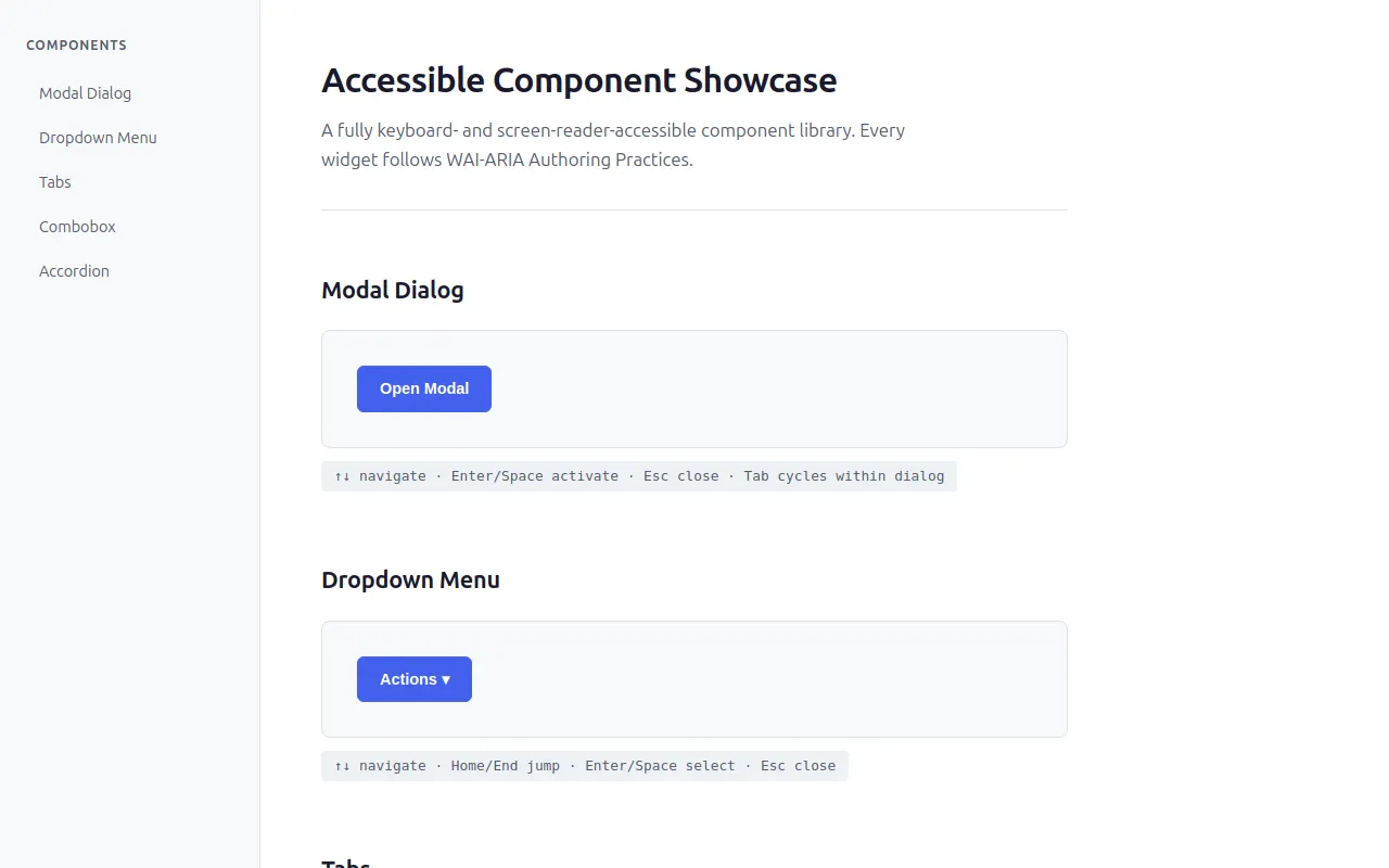
<h1>Accessible Component Showcase</h1>
<p class="subtitle">A fully keyboard- and screen-reader-accessible component library. Every widget follows WAI-ARIA Authoring Practices.</p>
</header>
<!-- Modal Dialog Section -->
<section id="section-modal" class="component-section">
<h2>Modal Dialog</h2>
<div class="demo-area">
<button id="modal-trigger" class="btn btn-primary" aria-haspopup="dialog" aria-expanded="false">Open Modal</button>
<div id="modal-backdrop" class="modal-backdrop" hidden=""></div>
<div id="modal-dialog" class="modal-dialog" role="dialog" aria-modal="true" aria-labelledby="modal-title" hidden="">
<h3 id="modal-title">Dialog Title</h3>
<p>This is a modal dialog. Focus is trapped inside while open. Press Escape or click the backdrop to close.</p>
<div class="modal-actions">
<button class="btn btn-secondary" tabindex="0">Cancel</button>
<button id="modal-close" class="btn btn-primary" tabindex="0">Close Dialog</button>
</div>
</div>
</div>
<p class="keyboard-hint">↑↓ navigate · Enter/Space activate · Esc close · Tab cycles within dialog</p>
</section>
<!-- Dropdown Menu Section -->
<section id="section-dropdown" class="component-section">
<h2>Dropdown Menu</h2>
<div class="demo-area">
<div class="dropdown-wrapper">
<button id="dropdown-trigger" class="btn btn-primary" aria-haspopup="menu" aria-expanded="false" aria-controls="dropdown-menu">Actions ▾</button>
<ul id="dropdown-menu" class="dropdown-menu" role="menu" hidden="">
<li><button role="menuitem" data-action="Copy selected item">Copy</button></li>
<li><button role="menuitem" data-action="Edit selected item">Edit</button></li>
<li><button role="menuitem" data-action="Delete selected item">Delete</button></li>
<li class="menu-divider"></li>
<li><button role="menuitem" data-action="Share with team">Share…</button></li>
</ul>
</div>
</div>
<p class="keyboard-hint">↑↓ navigate · Home/End jump · Enter/Space select · Esc close</p>
</section>
<!-- Tabs Section -->
<section id="section-tabs" class="component-section">
<h2>Tabs</h2>
<div class="demo-area">
<div class="tabs-container">
<div id="tablist" role="tablist" aria-label="Sample tabs">
<button id="tab-overview" role="tab" aria-selected="true" aria-controls="panel-overview" tabindex="0" class="is-active">Overview</button>
<button id="tab-specs" role="tab" aria-selected="false" aria-controls="panel-specs" tabindex="-1">Specifications</button>
<button id="tab-reviews" role="tab" aria-selected="false" aria-controls="panel-reviews" tabindex="-1">Reviews</button>
</div>
<div id="panel-overview" role="tabpanel" aria-labelledby="tab-overview" class="tab-panel">
<h3>Product Overview</h3>
<p>This is a high-quality product designed with accessibility in mind. Every interaction has been carefully crafted to work with keyboard navigation and screen readers.</p>
<ul>
<li>Fully accessible out of the box</li>
<li>No external dependencies required</li>
<li>Built with semantic HTML and ARIA</li>
</ul>
</div>
<div id="panel-specs" role="tabpanel" aria-labelledby="tab-specs" class="tab-panel" hidden="">
<h3>Technical Specifications</h3>
<table class="spec-table">
<tbody>
<tr><td>Framework</td><td>Vanilla JavaScript</td></tr>
<tr><td>CSS</td><td>Hand-written, no framework</td></tr>
<tr><td>A11y Standard</td><td>WAI-ARIA 1.2</td></tr>
<tr><td>Keyboard Support</td><td>Full navigation</td></tr>
</tbody>
</table>
</div>
<div id="panel-reviews" role="tabpanel" aria-labelledby="tab-reviews" class="tab-panel" hidden="">
<h3>User Reviews</h3>
<div class="review">
<strong>"Excellent accessibility"</strong>
<p>I can navigate the entire page with just my keyboard. The focus management is flawless.</p>
</div>
<div class="review">
<strong>"Clean and polished"</strong>
<p>The design is refined and professional. Great attention to detail in every component.</p>
</div>
</div>
</div>
</div>
<p class="keyboard-hint">←→ switch tabs · Home/End jump · Tab enters panel content</p>
</section>
<!-- Combobox Section -->
<section id="section-combobox" class="component-section">
<h2>Combobox (Autocomplete)</h2>
<div class="demo-area">
<label for="combobox-input" class="combobox-label">Select a country</label>
<div class="combobox-wrapper">
<input id="combobox-input" type="text" role="combobox" aria-expanded="false" aria-controls="combobox-listbox" aria-autocomplete="list" autocomplete="off" placeholder="Start typing…">
<ul id="combobox-listbox" class="combobox-listbox" role="listbox" hidden=""></ul>
</div>
</div>
<p class="keyboard-hint">↑↓ highlight · Enter select · Esc close & revert · Tab moves on</p>
</section>
<!-- Accordion Section -->
<section id="section-accordion" class="component-section">
<h2>Accordion / Disclosure Group</h2>
<div class="demo-area">
<div id="accordion-group" class="accordion-group">
<button class="accordion-trigger" aria-expanded="false" aria-controls="acc-panel-1">What is this component library?</button>
<div id="acc-panel-1" class="accordion-panel" hidden="">
<p>This is a fully accessible component showcase built with vanilla JavaScript. Every widget follows WAI-ARIA Authoring Practices and is operable entirely by keyboard.</p>
</div>
<button class="accordion-trigger" aria-expanded="false" aria-controls="acc-panel-2">How does focus management work?</button>
<div id="acc-panel-2" class="accordion-panel" hidden="">
<p>Focus is managed using a reusable FocusTrap utility for modals, roving tabindex for tabs, and aria-activedescendant for the combobox. Each pattern follows W3C recommendations.</p>
</div>
<button class="accordion-trigger" aria-expanded="false" aria-controls="acc-panel-3">Can multiple panels be open at once?</button>
<div id="acc-panel-3" class="accordion-panel" hidden="">
<p>Yes! This accordion allows multiple panels to remain open simultaneously. Each button independently toggles its associated panel with smooth animations that respect prefers-reduced-motion.</p>
</div>
<button class="accordion-trigger" aria-expanded="false" aria-controls="acc-panel-4">Is this production-ready?</button>
<div id="acc-panel-4" class="accordion-panel" hidden="">
<p>The components demonstrate correct ARIA patterns, keyboard navigation, and focus management. They serve as a reference implementation for building accessible UI in any project.</p>
</div>
</div>
</div>
<p class="keyboard-hint">Enter/Space toggle · Multiple panels may be open</p>
</section>
<!-- Live regions (visually hidden, used by screen readers) -->
<div id="dropdown-announcer" role="status" aria-live="polite" class="sr-only"></div>
<div id="combobox-announcer" role="status" aria-live="polite" class="sr-only"></div>
</main>
</div>
<script>
(function () {
'use strict';
var __mods = {};
var __cache = {};
var __map = {"src/main.ts":{"./modal":"src/modal.ts","./dropdown":"src/dropdown.ts","./tabs":"src/tabs.ts","./combobox":"src/combobox.ts","./accordion":"src/accordion.ts"},"src/utils.ts":{"./constants":"src/constants.ts"},"src/modal.ts":{"./constants":"src/constants.ts","./utils":"src/utils.ts"},"src/accordion.ts":{"./constants":"src/constants.ts"}};
function __require(id) {
if (__cache[id]) return __cache[id].exports;
var module = __cache[id] = { exports: {} };
var factory = __mods[id];
if (!factory) throw new Error("Module not found: " + id);
factory(module.exports, function (spec) {
var target = (__map[id] && __map[id][spec]) || spec;
return __require(target);
}, module);
return module.exports;
}
// ── module: src/main.ts ──
__mods["src/main.ts"] = function (exports, require, module) {
"use strict";
Object.defineProperty(exports, "__esModule", { value: true });
const modal_1 = require("./modal");
const dropdown_1 = require("./dropdown");
const tabs_1 = require("./tabs");
const combobox_1 = require("./combobox");
const accordion_1 = require("./accordion");
// Initialize all components once the DOM is ready
(0, modal_1.initModal)();
(0, dropdown_1.initDropdown)();
(0, tabs_1.initTabs)();
(0, combobox_1.initCombobox)();
(0, accordion_1.initAccordion)();
};
// ── module: src/constants.ts ──
__mods["src/constants.ts"] = function (exports, require, module) {
"use strict";
Object.defineProperty(exports, "__esModule", { value: true });
exports.SIDEBAR_WIDTH = exports.BORDER_RADIUS = exports.FOCUS_RING_WIDTH = exports.ANIMATION = exports.SPACING = exports.COLORS = void 0;
// Design tokens and tunable constants
exports.COLORS = {
bg: '#ffffff',
bgSecondary: '#f8f9fa',
bgTertiary: '#eef1f5',
text: '#1a1a2e',
textSecondary: '#555b6e',
accent: '#4361ee',
accentLight: '#e8ecff',
accentDark: '#3451d1',
border: '#dde1e7',
focusRing: '#4361ee',
success: '#2dc653',
white: '#ffffff',
overlay: 'rgba(0, 0, 0, 0.45)',
};
exports.SPACING = {
xs: '4px',
sm: '8px',
md: '16px',
lg: '24px',
xl: '32px',
xxl: '48px',
};
exports.ANIMATION = {
duration: 200, // ms for most transitions
modalFade: 250,
accordionSlide: 300,
};
exports.FOCUS_RING_WIDTH = 3;
exports.BORDER_RADIUS = '8px';
exports.SIDEBAR_WIDTH = '240px';
};
// ── module: src/utils.ts ──
__mods["src/utils.ts"] = function (exports, require, module) {
"use strict";
Object.defineProperty(exports, "__esModule", { value: true });
exports.FocusTrap = void 0;
exports.getFocusableElements = getFocusableElements;
exports.prefersReducedMotion = prefersReducedMotion;
exports.debounce = debounce;
exports.uid = uid;
// Focusable element selector — covers all interactive elements that can receive focus
const FOCUSABLE_SELECTOR = [
'a[href]',
'button:not([disabled])',
'input:not([disabled]):not([type="hidden"])',
'select:not([disabled])',
'textarea:not([disabled])',
'[tabindex]:not([tabindex="-1"])',
'[contenteditable]',
].join(', ');
function getFocusableElements(container) {
return Array.from(container.querySelectorAll(FOCUSABLE_SELECTOR));
}
// Focus trap utility — keeps focus cycling within a container
class FocusTrap {
constructor(container) {
this.previousActiveElement = null;
this.handlerBound = false;
this.handleKeydown = (e) => {
if (e.key !== 'Tab' || !this.handlerBound)
return;
const focusables = getFocusableElements(this.container);
if (focusables.length === 0)
return;
const first = focusables[0];
const last = focusables[focusables.length - 1];
if (e.shiftKey) {
// Shift+Tab: wrap from first to last
if (document.activeElement === first || !this.container.contains(document.activeElement)) {
e.preventDefault();
last.focus();
}
}
else {
// Tab: wrap from last to first
if (document.activeElement === last || !this.container.contains(document.activeElement)) {
e.preventDefault();
first.focus();
}
}
};
this.container = container;
}
activate() {
this.previousActiveElement = document.activeElement;
const focusables = getFocusableElements(this.container);
if (focusables.length > 0) {
focusables[0].focus();
}
this.handlerBound = true;
document.addEventListener('keydown', this.handleKeydown);
}
deactivate() {
document.removeEventListener('keydown', this.handleKeydown);
this.handlerBound = false;
if (this.previousActiveElement && typeof this.previousActiveElement.focus === 'function') {
this.previousActiveElement.focus();
}
}
}
exports.FocusTrap = FocusTrap;
// Reduced motion detection
function prefersReducedMotion() {
return window.matchMedia('(prefers-reduced-motion: reduce)').matches;
}
// Debounce helper
function debounce(fn, ms) {
let timer;
return (...args) => {
clearTimeout(timer);
timer = setTimeout(() => fn(...args), ms);
};
}
// Generate a unique ID
let idCounter = 0;
function uid(prefix = 'id') {
return `${prefix}-${++idCounter}`;
}
};
// ── module: src/modal.ts ──
__mods["src/modal.ts"] = function (exports, require, module) {
"use strict";
Object.defineProperty(exports, "__esModule", { value: true });
exports.initModal = initModal;
const utils_1 = require("./utils");
function initModal() {
const trigger = document.getElementById('modal-trigger');
const dialog = document.getElementById('modal-dialog');
const closeBtn = document.getElementById('modal-close');
const backdrop = document.getElementById('modal-backdrop');
if (!trigger || !dialog)
return;
let trap = null;
function openModal() {
dialog.removeAttribute('hidden');
backdrop.removeAttribute('hidden');
trigger.setAttribute('aria-expanded', 'true');
// Make the rest of the page inert
document.body.setAttribute('inert', '');
trap = new utils_1.FocusTrap(dialog);
trap.activate();
}
function closeModal() {
if (!trap)
return;
trap.deactivate();
trap = null;
dialog.setAttribute('hidden', '');
backdrop.setAttribute('hidden', '');
trigger.setAttribute('aria-expanded', 'false');
// Remove inert from body so page is interactive again
document.body.removeAttribute('inert');
}
trigger.addEventListener('click', openModal);
closeBtn?.addEventListener('click', closeModal);
backdrop?.addEventListener('click', closeModal);
dialog.addEventListener('keydown', (e) => {
if (e.key === 'Escape') {
e.preventDefault();
closeModal();
}
});
}
};
// ── module: src/dropdown.ts ──
__mods["src/dropdown.ts"] = function (exports, require, module) {
"use strict";
Object.defineProperty(exports, "__esModule", { value: true });
exports.initDropdown = initDropdown;
function initDropdown() {
const button = document.getElementById('dropdown-trigger');
const menu = document.getElementById('dropdown-menu');
if (!button || !menu)
return;
const items = Array.from(menu.querySelectorAll('[role="menuitem"]'));
let isOpen = false;
function openMenu(focusFirst = true) {
menu.removeAttribute('hidden');
button.setAttribute('aria-expanded', 'true');
if (focusFirst && items.length > 0) {
items[0].focus();
}
isOpen = true;
}
function closeMenu(returnFocus = true) {
menu.setAttribute('hidden', '');
button.setAttribute('aria-expanded', 'false');
isOpen = false;
if (returnFocus) {
button.focus();
}
}
// Button triggers
button.addEventListener('click', () => {
if (isOpen)
closeMenu();
else
openMenu();
});
button.addEventListener('keydown', (e) => {
if ((e.key === 'Enter' || e.key === ' ') && !isOpen) {
e.preventDefault();
openMenu();
}
if (e.key === 'ArrowDown') {
e.preventDefault();
openMenu(true);
}
});
// Menu item key navigation
menu.addEventListener('keydown', (e) => {
const currentIndex = items.indexOf(document.activeElement);
switch (e.key) {
case 'ArrowDown':
e.preventDefault();
if (currentIndex < items.length - 1) {
items[currentIndex + 1].focus();
}
else {
items[0].focus(); // wrap
}
break;
case 'ArrowUp':
e.preventDefault();
if (currentIndex > 0) {
items[currentIndex - 1].focus();
}
else {
items[items.length - 1].focus(); // wrap
}
break;
case 'Home':
e.preventDefault();
items[0]?.focus();
break;
case 'End':
e.preventDefault();
items[items.length - 1]?.focus();
break;
case 'Escape':
e.preventDefault();
closeMenu(true);
break;
case 'Tab':
closeMenu(false); // let focus move naturally
break;
case 'Enter':
case ' ':
if (document.activeElement && items.includes(document.activeElement)) {
e.preventDefault();
document.activeElement.click();
}
break;
}
});
// Menu item click handlers — perform action and close
items.forEach((item) => {
item.addEventListener('click', () => {
const action = item.getAttribute('data-action');
if (action) {
announceAction(action);
}
closeMenu(true);
});
});
// Close on outside click
document.addEventListener('click', (e) => {
if (!isOpen)
return;
const target = e.target;
if (!menu.contains(target) && !button.contains(target)) {
closeMenu(false);
}
});
}
// Live region for announcements
function announceAction(text) {
let announcer = document.getElementById('dropdown-announcer');
if (!announcer)
return;
announcer.textContent = '';
requestAnimationFrame(() => {
announcer.textContent = text;
});
}
};
// ── module: src/tabs.ts ──
__mods["src/tabs.ts"] = function (exports, require, module) {
"use strict";
Object.defineProperty(exports, "__esModule", { value: true });
exports.initTabs = initTabs;
function initTabs() {
const tablist = document.getElementById('tablist');
if (!tablist)
return;
const tabs = Array.from(tablist.querySelectorAll('[role="tab"]'));
if (tabs.length === 0)
return;
// Activate a specific tab by index
function activateTab(index) {
tabs.forEach((tab, i) => {
const panelId = tab.getAttribute('aria-controls');
const panel = document.getElementById(panelId);
if (i === index) {
tab.setAttribute('aria-selected', 'true');
tab.setAttribute('tabindex', '0');
tab.classList.add('is-active');
panel?.removeAttribute('hidden');
}
else {
tab.setAttribute('aria-selected', 'false');
tab.setAttribute('tabindex', '-1');
tab.classList.remove('is-active');
panel?.setAttribute('hidden', '');
}
});
}
// Click handler for each tab
tabs.forEach((tab, i) => {
tab.addEventListener('click', () => activateTab(i));
});
// Keyboard navigation on the tablist
tablist.addEventListener('keydown', (e) => {
const currentIndex = tabs.indexOf(document.activeElement);
if (currentIndex === -1)
return;
let newIndex = currentIndex;
switch (e.key) {
case 'ArrowRight':
e.preventDefault();
newIndex = (currentIndex + 1) % tabs.length;
break;
case 'ArrowLeft':
e.preventDefault();
newIndex = (currentIndex - 1 + tabs.length) % tabs.length;
break;
case 'Home':
e.preventDefault();
newIndex = 0;
break;
case 'End':
e.preventDefault();
newIndex = tabs.length - 1;
break;
default:
return;
}
activateTab(newIndex);
tabs[newIndex].focus();
});
}
};
// ── module: src/combobox.ts ──
__mods["src/combobox.ts"] = function (exports, require, module) {
"use strict";
Object.defineProperty(exports, "__esModule", { value: true });
exports.initCombobox = initCombobox;
const OPTIONS = [
'Afghanistan', 'Albania', 'Algeria', 'Andorra', 'Angola',
'Argentina', 'Australia', 'Austria', 'Azerbaijan', 'Bahamas',
'Bahrain', 'Bangladesh', 'Barbados', 'Belarus', 'Belgium',
'Benin', 'Bhutan', 'Bolivia', 'Bosnia and Herzegovina', 'Botswana',
];
function initCombobox() {
const input = document.getElementById('combobox-input');
const listbox = document.getElementById('combobox-listbox');
if (!input || !listbox)
return;
let isOpen = false;
let activeIndex = -1;
let originalValue = '';
function renderOptions(filter) {
const filtered = filter === ''
? OPTIONS
: OPTIONS.filter(o => o.toLowerCase().includes(filter.toLowerCase()));
listbox.innerHTML = '';
if (filtered.length === 0)
return;
filtered.forEach((option, i) => {
const el = document.createElement('div');
el.id = `combobox-option-${i}`;
el.setAttribute('role', 'option');
el.setAttribute('aria-selected', 'false');
el.textContent = option;
el.addEventListener('click', () => selectOption(option));
listbox.appendChild(el);
});
}
function openListbox() {
const filter = input.value;
renderOptions(filter);
if (listbox.children.length === 0)
return;
listbox.removeAttribute('hidden');
input.setAttribute('aria-expanded', 'true');
isOpen = true;
}
function closeListbox() {
listbox.setAttribute('hidden', '');
input.setAttribute('aria-expanded', 'false');
input.removeAttribute('aria-activedescendant');
activeIndex = -1;
isOpen = false;
}
function selectOption(value) {
input.value = value;
originalValue = ''; // reset revert state
closeListbox();
announceSelection(value);
}
function setActive(index) {
const options = listbox.querySelectorAll('[role="option"]');
if (index < 0 || index >= options.length)
return;
activeIndex = index;
options.forEach((opt, i) => {
opt.setAttribute('aria-selected', i === index ? 'true' : 'false');
});
input.setAttribute('aria-activedescendant', options[index].id);
// Scroll into view if needed
const reduced = window.matchMedia('(prefers-reduced-motion: reduce)').matches;
options[index].scrollIntoView({ block: 'nearest', behavior: reduced ? 'auto' : 'smooth' });
}
function announceSelection(value) {
let announcer = document.getElementById('combobox-announcer');
if (!announcer)
return;
announcer.textContent = '';
requestAnimationFrame(() => {
announcer.textContent = `${value} selected`;
});
}
// Input events
input.addEventListener('focus', () => {
originalValue = input.value;
openListbox();
});
input.addEventListener('input', () => {
if (!isOpen)
openListbox();
else
renderOptions(input.value);
activeIndex = -1;
input.removeAttribute('aria-activedescendant');
});
input.addEventListener('blur', () => {
// Delay to allow click handlers on options to fire first
requestAnimationFrame(() => {
if (!listbox.contains(document.activeElement)) {
closeListbox();
}
});
});
input.addEventListener('keydown', (e) => {
const options = listbox.querySelectorAll('[role="option"]');
switch (e.key) {
case 'ArrowDown':
e.preventDefault();
if (!isOpen) {
openListbox();
return;
}
setActive(activeIndex < options.length - 1 ? activeIndex + 1 : 0);
break;
case 'ArrowUp':
e.preventDefault();
if (activeIndex > 0) {
setActive(activeIndex - 1);
}
else {
setActive(options.length - 1);
}
break;
case 'Enter':
e.preventDefault();
if (isOpen && activeIndex >= 0 && options[activeIndex]) {
selectOption(options[activeIndex].textContent);
}
break;
case 'Escape':
e.preventDefault();
// Revert to original value
input.value = originalValue;
closeListbox();
break;
case 'Tab':
closeListbox();
break;
}
});
// Initial render (hidden)
listbox.setAttribute('hidden', '');
}
};
// ── module: src/accordion.ts ──
__mods["src/accordion.ts"] = function (exports, require, module) {
"use strict";
Object.defineProperty(exports, "__esModule", { value: true });
exports.initAccordion = initAccordion;
const constants_1 = require("./constants");
function initAccordion() {
const group = document.getElementById('accordion-group');
if (!group)
return;
const buttons = Array.from(group.querySelectorAll('.accordion-trigger'));
buttons.forEach((button) => {
button.addEventListener('click', () => togglePanel(button));
button.addEventListener('keydown', (e) => {
if (e.key === 'Enter' || e.key === ' ') {
e.preventDefault();
togglePanel(button);
}
});
});
}
function togglePanel(button) {
const panelId = button.getAttribute('aria-controls');
const panel = document.getElementById(panelId);
if (!panel)
return;
const isExpanded = button.getAttribute('aria-expanded') === 'true';
if (isExpanded) {
// Collapse: animate height then set hidden
collapsePanel(button, panel);
}
else {
// Expand: remove hidden first, then animate
expandPanel(button, panel);
}
}
function expandPanel(button, panel) {
const reduced = window.matchMedia('(prefers-reduced-motion: reduce)').matches;
button.setAttribute('aria-expanded', 'true');
panel.removeAttribute('hidden');
// Measure natural height
const targetHeight = panel.scrollHeight;
panel.style.height = '0px';
panel.style.overflow = 'hidden';
if (reduced) {
panel.style.height = '';
panel.style.overflow = '';
return;
}
// Force reflow so the browser registers height: 0 before animating
panel.offsetHeight; // eslint-disable-line @typescript-eslint/no-unused-expressions
panel.style.transition = `height ${constants_1.ANIMATION.accordionSlide}ms ease`;
panel.style.height = `${targetHeight}px`;
// After animation, remove constraints
setTimeout(() => {
if (button.getAttribute('aria-expanded') === 'true') {
panel.style.height = '';
panel.style.overflow = '';
panel.style.transition = '';
}
}, constants_1.ANIMATION.accordionSlide);
}
function collapsePanel(button, panel) {
const reduced = window.matchMedia('(prefers-reduced-motion: reduce)').matches;
if (reduced) {
button.setAttribute('aria-expanded', 'false');
panel.setAttribute('hidden', '');
return;
}
// Measure current height
const startHeight = panel.scrollHeight;
panel.style.height = `${startHeight}px`;
panel.style.overflow = 'hidden';
// Force reflow
panel.offsetHeight; // eslint-disable-line @typescript-eslint/no-unused-expressions
button.setAttribute('aria-expanded', 'false');
panel.style.transition = `height ${constants_1.ANIMATION.accordionSlide}ms ease`;
panel.style.height = '0px';
// After animation, set hidden and clean up styles
setTimeout(() => {
if (button.getAttribute('aria-expanded') === 'false') {
panel.setAttribute('hidden', '');
panel.style.height = '';
panel.style.overflow = '';
panel.style.transition = '';
}
}, constants_1.ANIMATION.accordionSlide);
}
};
// ── entry ──
__require("src/main.ts");
})();
</script>
</body>
</html>
<!-- agent-meta {"model":"thinkingcap-qwen3.6-27b","provider":"lmstudio","persona":"typescript","sessionId":"65449ae3-ccaf-440d-9e01-f3943c95cacd","tokensIn":855378,"tokensOut":20272,"tokensTotal":875650,"turns":36,"toolCalls":35,"failedToolCalls":0,"timestamp":"2026-07-31T06:20:48.759Z"} -->