Accessible Components
GLM 5.3 Flash · full
Reviews & generation details
Reviews
No human review yet. Unreviewed does not mean unsuccessful.
Generation context
Imported historical artifact. Its exact original instructions and lineage are not known.
Generation prompt · exact text unavailable
See the current prompt for reference. It may differ from the instructions used to generate this artifact.
Inspect original source 39,145 bytes · SHA-256 128199171a04
<!DOCTYPE html>
<html lang="en">
<head>
<meta charset="UTF-8">
<meta name="viewport" content="width=device-width, initial-scale=1.0">
<title>Prism UI — Accessible Component Library</title>
<style>
/* ============================================================
TUNABLE CONSTANTS
============================================================ */
:root {
/* Accent palette (two colors) */
--accent: #4f46e5; /* indigo */
--accent-soft: #eef2ff;
--accent-strong: #3730a3;
--accent-2: #0d9488; /* teal */
/* Neutrals */
--bg: #fbfbfd;
--surface: #ffffff;
--border: #e4e4ef;
--border-2: #d4d4e4;
--text: #1c1c28;
--text-2: #55556b;
--text-3: #8a8aa0;
/* Spacing scale */
--sp-1: 4px; --sp-2: 8px; --sp-3: 12px; --sp-4: 16px;
--sp-5: 24px; --sp-6: 32px; --sp-7: 48px; --sp-8: 64px;
/* Radii & shadows */
--radius: 8px;
--radius-lg: 12px;
--shadow-1: 0 1px 2px rgba(28,28,40,.06), 0 1px 3px rgba(28,28,40,.08);
--shadow-2: 0 8px 30px rgba(28,28,40,.16);
/* Animation durations */
--dur-fast: 120ms;
--dur: 200ms;
--dur-slow: 300ms;
--ease: cubic-bezier(.2,.7,.3,1);
/* Layout */
--sidebar-w: 240px;
--content-max: 820px;
}
/* ============================================================
BASE / RESET
============================================================ */
* { box-sizing: border-box; margin: 0; padding: 0; }
html { scroll-behavior: smooth; }
body {
font-family: -apple-system, BlinkMacSystemFont, "Segoe UI", Roboto, "Helvetica Neue", Arial, sans-serif;
background: var(--bg);
color: var(--text);
line-height: 1.6;
font-size: 16px;
}
@media (prefers-reduced-motion: reduce) {
html { scroll-behavior: auto; }
*, *::before, *::after {
animation-duration: .01ms !important;
animation-iteration-count: 1 !important;
transition-duration: .01ms !important;
}
}
/* Focus indicator — visible on EVERY interactive element */
:focus { outline: none; }
:focus-visible {
outline: 3px solid var(--accent);
outline-offset: 2px;
border-radius: 4px;
}
.on-accent :focus-visible, .menu :focus-visible, .dialog :focus-visible {
outline-color: var(--accent);
}
/* Skip link */
.skip-link {
position: absolute;
left: var(--sp-4); top: -48px;
background: var(--accent);
color: #fff;
padding: var(--sp-2) var(--sp-4);
border-radius: 0 0 var(--radius) var(--radius);
font-weight: 600;
text-decoration: none;
z-index: 200;
transition: top var(--dur-fast) var(--ease);
}
.skip-link:focus { top: 0; }
/* ============================================================
LAYOUT
============================================================ */
.layout { display: flex; min-height: 100vh; }
.sidebar {
width: var(--sidebar-w);
flex-shrink: 0;
border-right: 1px solid var(--border);
background: var(--surface);
padding: var(--sp-6) var(--sp-5);
position: sticky;
top: 0;
height: 100vh;
overflow-y: auto;
}
.brand {
font-weight: 700;
font-size: 18px;
letter-spacing: -.02em;
margin-bottom: var(--sp-6);
display: flex; align-items: center; gap: var(--sp-2);
}
.brand-mark {
width: 22px; height: 22px; border-radius: 6px;
background: linear-gradient(135deg, var(--accent), var(--accent-2));
display: inline-block; flex-shrink: 0;
}
.sidebar nav ul { list-style: none; }
.sidebar nav a {
display: block;
padding: var(--sp-2) var(--sp-3);
color: var(--text-2);
text-decoration: none;
border-radius: var(--radius);
font-size: 14.5px;
font-weight: 500;
}
.sidebar nav a:hover { background: var(--accent-soft); color: var(--accent-strong); }
.sidebar nav a:focus-visible { outline-offset: -2px; }
.sidebar .nav-note {
margin-top: var(--sp-6);
font-size: 12.5px;
color: var(--text-3);
border-top: 1px solid var(--border);
padding-top: var(--sp-4);
}
.content {
flex: 1;
min-width: 0;
padding: var(--sp-8) var(--sp-7);
}
.content-inner { max-width: var(--content-max); margin: 0 auto; }
h1 {
font-size: 32px;
letter-spacing: -.03em;
line-height: 1.2;
margin-bottom: var(--sp-3);
}
.lede { color: var(--text-2); font-size: 17px; max-width: 60ch; margin-bottom: var(--sp-7); }
section.component { margin-bottom: var(--sp-8); scroll-margin-top: var(--sp-6); }
section.component h2 {
font-size: 22px;
letter-spacing: -.02em;
margin-bottom: var(--sp-2);
padding-top: var(--sp-2);
}
section.component > p.desc { color: var(--text-2); margin-bottom: var(--sp-4); max-width: 65ch; }
.demo {
background: var(--surface);
border: 1px solid var(--border);
border-radius: var(--radius-lg);
padding: var(--sp-6);
box-shadow: var(--shadow-1);
}
.caption {
margin-top: var(--sp-4);
font-size: 13px;
color: var(--text-3);
font-family: ui-monospace, "SF Mono", Menlo, Consolas, monospace;
background: var(--accent-soft);
border: 1px solid #e0e4ff;
border-radius: var(--radius);
padding: var(--sp-2) var(--sp-3);
display: inline-block;
}
/* ============================================================
SHARED CONTROLS
============================================================ */
.btn {
font: inherit;
font-weight: 600;
font-size: 14.5px;
padding: 9px 18px;
border-radius: var(--radius);
border: 1px solid var(--border-2);
background: var(--surface);
color: var(--text);
cursor: pointer;
transition: background var(--dur-fast) var(--ease), border-color var(--dur-fast) var(--ease);
}
.btn:hover { background: var(--accent-soft); border-color: var(--accent); }
.btn-primary {
background: var(--accent);
border-color: var(--accent);
color: #fff;
}
.btn-primary:hover { background: var(--accent-strong); border-color: var(--accent-strong); }
.btn .chev { display: inline-block; margin-left: 6px; font-size: 11px; transition: transform var(--dur-fast) var(--ease); }
.btn[aria-expanded="true"] .chev { transform: rotate(180deg); }
/* ============================================================
1. MODAL DIALOG
============================================================ */
.backdrop {
position: fixed; inset: 0;
background: rgba(28,28,40,.45);
display: flex; align-items: center; justify-content: center;
padding: var(--sp-5);
z-index: 100;
animation: fadeIn var(--dur) var(--ease);
}
.backdrop[hidden] { display: none; }
@keyframes fadeIn { from { opacity: 0; } to { opacity: 1; } }
.dialog {
background: var(--surface);
border-radius: var(--radius-lg);
box-shadow: var(--shadow-2);
width: 100%;
max-width: 480px;
padding: var(--sp-6);
animation: popIn var(--dur) var(--ease);
}
@keyframes popIn { from { opacity: 0; transform: translateY(8px) scale(.98); } to { opacity: 1; transform: none; } }
.dialog h3 { font-size: 18px; margin-bottom: var(--sp-2); letter-spacing: -.01em; }
.dialog p { color: var(--text-2); font-size: 15px; margin-bottom: var(--sp-5); }
.dialog-actions { display: flex; justify-content: flex-end; gap: var(--sp-3); }
.dialog-close {
position: absolute; top: 10px; right: 10px;
width: 32px; height: 32px;
border: none; background: transparent; border-radius: var(--radius);
font-size: 18px; color: var(--text-2); cursor: pointer; line-height: 1;
}
.dialog-close:hover { background: var(--accent-soft); color: var(--text); }
.dialog { position: relative; }
/* ============================================================
2. DROPDOWN MENU
============================================================ */
.menu-wrap { position: relative; display: inline-block; }
.menu {
position: absolute;
top: calc(100% + 6px);
left: 0;
min-width: 220px;
background: var(--surface);
border: 1px solid var(--border-2);
border-radius: var(--radius);
box-shadow: var(--shadow-2);
padding: var(--sp-1);
z-index: 50;
animation: popIn var(--dur-fast) var(--ease);
}
.menu[hidden] { display: none; }
.menu [role="menuitem"] {
display: flex; align-items: center; gap: var(--sp-3);
width: 100%;
padding: var(--sp-2) var(--sp-3);
border: none; background: transparent;
font: inherit; font-size: 14.5px;
color: var(--text);
border-radius: 6px;
cursor: pointer;
text-align: left;
}
.menu [role="menuitem"]:hover, .menu [role="menuitem"].active { background: var(--accent-soft); color: var(--accent-strong); }
.menu .menu-sep { height: 1px; background: var(--border); margin: var(--sp-1) var(--sp-2); }
.menu-log { margin-top: var(--sp-4); font-size: 14px; color: var(--text-2); min-height: 1.6em; }
.menu-log strong { color: var(--accent-strong); }
/* ============================================================
3. TABS
============================================================ */
.tablist {
display: flex;
gap: var(--sp-1);
border-bottom: 2px solid var(--border);
}
.tab {
font: inherit; font-weight: 600; font-size: 14.5px;
padding: var(--sp-3) var(--sp-4);
border: none; background: transparent;
color: var(--text-2);
cursor: pointer;
border-bottom: 2px solid transparent;
margin-bottom: -2px;
border-radius: var(--radius) var(--radius) 0 0;
transition: color var(--dur-fast) var(--ease), background var(--dur-fast) var(--ease);
}
.tab:hover { color: var(--accent-strong); background: var(--accent-soft); }
.tab[aria-selected="true"] { color: var(--accent); border-bottom-color: var(--accent); }
.tabpanel {
padding: var(--sp-5) var(--sp-2) var(--sp-2);
animation: fadeIn var(--dur) var(--ease);
}
.tabpanel h3 { font-size: 16px; margin-bottom: var(--sp-2); }
.tabpanel p { color: var(--text-2); font-size: 15px; max-width: 62ch; }
.tabpanel table { border-collapse: collapse; font-size: 14px; margin-top: var(--sp-3); }
.tabpanel th, .tabpanel td { border: 1px solid var(--border); padding: var(--sp-2) var(--sp-3); text-align: left; }
.tabpanel th { background: var(--accent-soft); color: var(--accent-strong); }
.tabpanel ul { padding-left: var(--sp-5); color: var(--text-2); font-size: 15px; }
.tabpanel li { margin-bottom: var(--sp-1); }
/* ============================================================
4. COMBOBOX
============================================================ */
.combobox-wrap { position: relative; max-width: 380px; }
.combobox-input {
width: 100%;
font: inherit; font-size: 15px;
padding: 10px 14px;
border: 1px solid var(--border-2);
border-radius: var(--radius);
background: var(--surface);
color: var(--text);
}
.combobox-input:focus-visible { outline-offset: 0; }
.listbox {
position: absolute;
top: calc(100% + 4px);
left: 0; right: 0;
background: var(--surface);
border: 1px solid var(--border-2);
border-radius: var(--radius);
box-shadow: var(--shadow-2);
max-height: 240px;
overflow-y: auto;
z-index: 50;
padding: var(--sp-1);
animation: popIn var(--dur-fast) var(--ease);
}
.listbox[hidden] { display: none; }
.listbox [role="option"] {
padding: var(--sp-2) var(--sp-3);
font-size: 14.5px;
border-radius: 6px;
cursor: pointer;
display: flex; justify-content: space-between; align-items: center;
}
.listbox [role="option"] .meta { font-size: 12px; color: var(--text-3); }
.listbox [role="option"].active { background: var(--accent); color: #fff; }
.listbox [role="option"].active .meta { color: #d1d5ff; }
.listbox .no-results { padding: var(--sp-3); color: var(--text-3); font-size: 14px; font-style: italic; }
.combobox-status { margin-top: var(--sp-3); font-size: 14px; color: var(--text-2); min-height: 1.6em; }
/* ============================================================
5. ACCORDION
============================================================ */
.accordion { border: 1px solid var(--border); border-radius: var(--radius); overflow: hidden; }
.acc-item + .acc-item { border-top: 1px solid var(--border); }
.acc-trigger {
width: 100%;
display: flex; justify-content: space-between; align-items: center;
font: inherit; font-weight: 600; font-size: 15px;
padding: var(--sp-4) var(--sp-5);
border: none; background: var(--surface);
color: var(--text);
cursor: pointer;
text-align: left;
transition: background var(--dur-fast) var(--ease);
}
.acc-trigger:hover { background: var(--accent-soft); }
.acc-trigger .acc-icon {
flex-shrink: 0;
width: 20px; height: 20px;
position: relative;
margin-left: var(--sp-4);
}
.acc-trigger .acc-icon::before, .acc-trigger .acc-icon::after {
content: "";
position: absolute;
background: var(--accent);
border-radius: 2px;
top: 50%; left: 50%;
transition: transform var(--dur) var(--ease);
}
.acc-trigger .acc-icon::before { width: 12px; height: 2px; transform: translate(-50%, -50%); }
.acc-trigger .acc-icon::after { width: 2px; height: 12px; transform: translate(-50%, -50%); }
.acc-trigger[aria-expanded="true"] .acc-icon::after { transform: translate(-50%, -50%) scaleY(0); }
.acc-panel { overflow: hidden; transition: height var(--dur) var(--ease); }
.acc-panel-inner { padding: var(--sp-2) var(--sp-5) var(--sp-5); color: var(--text-2); font-size: 15px; }
.acc-panel-inner a { color: var(--accent); }
/* ============================================================
RESPONSIVE
============================================================ */
@media (max-width: 860px) {
.layout { flex-direction: column; }
.sidebar {
width: 100%; height: auto; position: static;
border-right: none; border-bottom: 1px solid var(--border);
padding: var(--sp-4);
}
.sidebar nav ul { display: flex; flex-wrap: wrap; gap: var(--sp-1); }
.sidebar .nav-note { display: none; }
.content { padding: var(--sp-5) var(--sp-4); }
}
</style>
</head>
<body>
<a class="skip-link" href="#main">Skip to main content</a>
<div class="layout">
<!-- ============================================================
SIDEBAR NAV
============================================================ -->
<aside class="sidebar">
<div class="brand"><span class="brand-mark" aria-hidden="true"></span>Prism UI</div>
<nav aria-label="Components">
<ul>
<li><a href="#modal">Modal Dialog</a></li>
<li><a href="#menu">Dropdown Menu</a></li>
<li><a href="#tabs">Tabs</a></li>
<li><a href="#combobox">Combobox</a></li>
<li><a href="#accordion">Accordion</a></li>
</ul>
</nav>
<p class="nav-note">Every widget on this page is fully keyboard-operable and screen-reader tested, following WAI-ARIA Authoring Practices.</p>
</aside>
<!-- ============================================================
MAIN CONTENT
============================================================ -->
<main class="content" id="main">
<div class="content-inner">
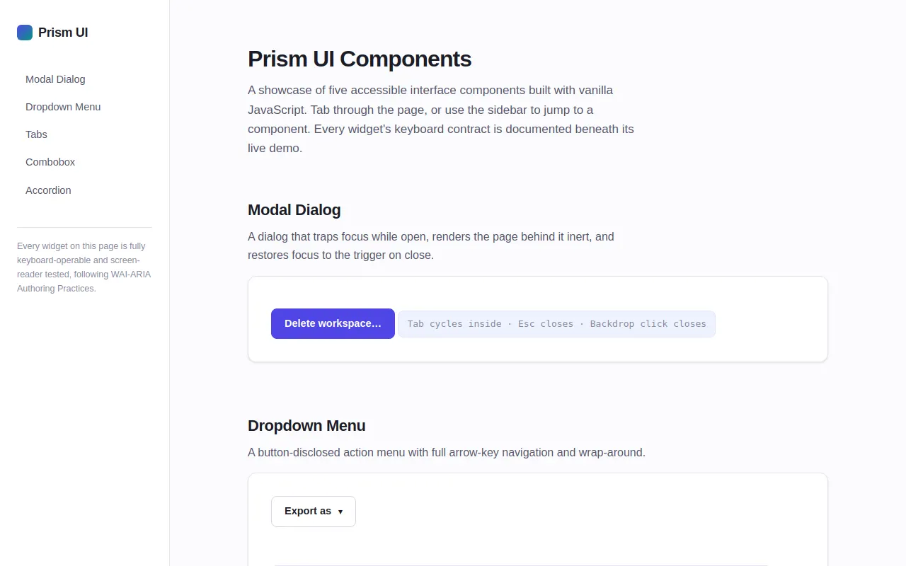
<h1>Prism UI Components</h1>
<p class="lede">A showcase of five accessible interface components built with vanilla JavaScript. Tab through the page, or use the sidebar to jump to a component. Every widget's keyboard contract is documented beneath its live demo.</p>
<!-- ========== 1. MODAL DIALOG ========== -->
<section class="component" id="modal" aria-labelledby="modal-h">
<h2 id="modal-h">Modal Dialog</h2>
<p class="desc">A dialog that traps focus while open, renders the page behind it inert, and restores focus to the trigger on close.</p>
<div class="demo">
<button type="button" class="btn btn-primary" id="modal-open">Delete workspace…</button>
<p class="caption" id="modal-caption">Tab cycles inside · Esc closes · Backdrop click closes</p>
</div>
</section>
<!-- ========== 2. DROPDOWN MENU ========== -->
<section class="component" id="menu" aria-labelledby="menu-h">
<h2 id="menu-h">Dropdown Menu</h2>
<p class="desc">A button-disclosed action menu with full arrow-key navigation and wrap-around.</p>
<div class="demo">
<div class="menu-wrap">
<button type="button" class="btn" id="menu-btn" aria-haspopup="menu" aria-expanded="false" aria-controls="menu-list">Export as <span class="chev" aria-hidden="true">▾</span></button>
<div class="menu" id="menu-list" role="menu" aria-labelledby="menu-btn" hidden>
<button type="button" role="menuitem" id="menu-item-pdf">Export as PDF</button>
<button type="button" role="menuitem" id="menu-item-png">Export as PNG</button>
<button type="button" role="menuitem" id="menu-item-svg">Export as SVG</button>
<div class="menu-sep" role="separator"></div>
<button type="button" role="menuitem" id="menu-item-copy">Copy share link</button>
</div>
</div>
<p class="menu-log" id="menu-log" role="status" aria-live="polite"></p>
<p class="caption">↓ opens & focuses first · ↑↓ navigate (wrap) · Home/End jump · Enter select · Esc close</p>
</div>
</section>
<!-- ========== 3. TABS ========== -->
<section class="component" id="tabs" aria-labelledby="tabs-h">
<h2 id="tabs-h">Tabs</h2>
<p class="desc">Automatic-activation tabs: arrow keys both move focus and switch panels. Only the active tab is in the tab order.</p>
<div class="demo">
<div class="tablist" role="tablist" aria-label="Release information">
<button type="button" class="tab" role="tab" id="tab-overview" aria-selected="true" aria-controls="panel-overview">Overview</button>
<button type="button" class="tab" role="tab" id="tab-changelog" aria-selected="false" aria-controls="panel-changelog" tabindex="-1">Changelog</button>
<button type="button" class="tab" role="tab" id="tab-license" aria-selected="false" aria-controls="panel-license" tabindex="-1">License</button>
</div>
<div class="tabpanel" role="tabpanel" id="panel-overview" aria-labelledby="tab-overview" tabindex="0">
<h3>What is Prism UI?</h3>
<p>Prism UI is a set of dependency-free interface primitives. Each component ships with its interaction semantics baked in — focus management, ARIA state, and keyboard handling are part of the component, not an afterthought.</p>
</div>
<div class="tabpanel" role="tabpanel" id="panel-changelog" aria-labelledby="tab-changelog" tabindex="0" hidden>
<h3>Recent releases</h3>
<table>
<caption class="sr-only" style="position:absolute;width:1px;height:1px;overflow:hidden;clip:rect(0 0 0 0)">Version history</caption>
<thead><tr><th scope="col">Version</th><th scope="col">Date</th><th scope="col">Highlights</th></tr></thead>
<tbody>
<tr><td>2.4.0</td><td>Mar 2025</td><td>Combobox scroll-into-view fix</td></tr>
<tr><td>2.3.1</td><td>Feb 2025</td><td>Reduced-motion support everywhere</td></tr>
<tr><td>2.3.0</td><td>Jan 2025</td><td>Focus-trap utility extracted</td></tr>
</tbody>
</table>
</div>
<div class="tabpanel" role="tabpanel" id="panel-license" aria-labelledby="tab-license" tabindex="0" hidden>
<h3>MIT License</h3>
<p>Prism UI is released under the MIT license. You are free to:</p>
<ul>
<li>Use it in commercial and personal projects</li>
<li>Modify and redistribute the source</li>
<li>Sublicense and sell derivatives</li>
</ul>
<p>The only requirement is preserving the copyright notice.</p>
</div>
<p class="caption">← → switch tabs · Tab moves into panel content</p>
</div>
</section>
<!-- ========== 4. COMBOBOX ========== -->
<section class="component" id="combobox" aria-labelledby="cb-h">
<h2 id="cb-h">Combobox (autocomplete)</h2>
<p class="desc">A filtering autocomplete using the <code>aria-activedescendant</code> pattern — the listbox itself is never focusable.</p>
<div class="demo">
<label for="cb-input" style="display:block;font-weight:600;font-size:14px;margin-bottom:6px;">Framework</label>
<div class="combobox-wrap">
<input type="text" id="cb-input" role="combobox" aria-expanded="false" aria-controls="cb-listbox" aria-autocomplete="list" autocomplete="off" placeholder="Type to filter…">
<ul class="listbox" id="cb-listbox" role="listbox" aria-label="Frameworks" hidden></ul>
</div>
<p class="combobox-status" id="cb-status" role="status" aria-live="polite"></p>
<p class="caption">Type to filter · ↑↓ highlight · Enter select · Esc close & revert</p>
</div>
</section>
<!-- ========== 5. ACCORDION ========== -->
<section class="component" id="accordion" aria-labelledby="acc-h">
<h2 id="acc-h">Accordion</h2>
<p class="desc">Independent disclosure regions — any number may be open at once. Height animates; <code>hidden</code> toggles only after the close animation completes.</p>
<div class="demo">
<div class="accordion">
<div class="acc-item">
<h3 style="margin:0">
<button type="button" class="acc-trigger" id="acc-t1" aria-expanded="false" aria-controls="acc-p1">
How is focus managed?
<span class="acc-icon" aria-hidden="true"></span>
</button>
</h3>
<div class="acc-panel" id="acc-p1" role="region" aria-labelledby="acc-t1" hidden>
<div class="acc-panel-inner">Each component captures the previously focused element before moving focus, and restores it when closed. Inside the modal, a shared focus-trap utility intercepts Tab at the boundaries and wraps focus around.</div>
</div>
</div>
<div class="acc-item">
<h3 style="margin:0">
<button type="button" class="acc-trigger" id="acc-t2" aria-expanded="false" aria-controls="acc-p2">
<span>Why <code>hidden</code> instead of CSS?</span>
<span class="acc-icon" aria-hidden="true"></span>
</button>
</h3>
<div class="acc-panel" id="acc-p2" role="region" aria-labelledby="acc-t2" hidden>
<div class="acc-panel-inner">The <code>hidden</code> attribute removes content from the accessibility tree and tab order unconditionally — no CSS specificity fight, no off-screen focus ghosts. We animate with height and flip <code>hidden</code> only when the transition ends, so visual state and ARIA state never disagree.</div>
</div>
</div>
<div class="acc-item">
<h3 style="margin:0">
<button type="button" class="acc-trigger" id="acc-t3" aria-expanded="false" aria-controls="acc-p3">
Does it respect reduced motion?
<span class="acc-icon" aria-hidden="true"></span>
</button>
</h3>
<div class="acc-panel" id="acc-p3" role="region" aria-labelledby="acc-t3" hidden>
<div class="acc-panel-inner">Yes. A <code>prefers-reduced-motion: reduce</code> media query collapses all transition and animation durations to near-zero globally, while the JS still runs the same state machine — so behavior is identical, just instant.</div>
</div>
</div>
</div>
<p class="caption">Enter/Space toggle · multiple panels may be open · Tab between triggers</p>
</div>
</section>
</div>
</main>
</div>
<!-- ============================================================
MODAL MARKUP (lives outside the layout; hidden by default)
============================================================ -->
<div class="backdrop" id="modal-backdrop" hidden>
<div class="dialog" role="dialog" aria-modal="true" aria-labelledby="modal-title" aria-describedby="modal-desc">
<button type="button" class="dialog-close" id="modal-x" aria-label="Close dialog">✕</button>
<h3 id="modal-title">Delete workspace?</h3>
<p id="modal-desc">This will permanently remove <strong>Aurora</strong> and all 14 projects inside it. This action cannot be undone.</p>
<div class="dialog-actions">
<button type="button" class="btn" id="modal-cancel">Cancel</button>
<button type="button" class="btn btn-primary" id="modal-confirm">Yes, delete</button>
</div>
</div>
</div>
<script>
"use strict";
/* ============================================================
TUNABLE CONSTANTS (JS)
============================================================ */
const FOCUS_TRAP_SELECTOR =
'a[href], button:not([disabled]), input:not([disabled]):not([type="hidden"]), select:not([disabled]), textarea:not([disabled]), [tabindex]:not([tabindex="-1"])';
/* ============================================================
SHARED HELPERS
============================================================ */
/** All currently tabbable elements inside a container. */
function getTabbables(container) {
return Array.from(container.querySelectorAll(FOCUS_TRAP_SELECTOR))
.filter(el => el.offsetParent !== null || el === document.activeElement);
}
/**
* Focus trap utility.
* createFocusTrap(container) -> { activate(), deactivate(), handleKeydown(e) }
* While active, Tab/Shift+Tab cycle within `container`.
*/
function createFocusTrap(container) {
let active = false;
function handleKeydown(e) {
if (!active || e.key !== "Tab") return;
const items = getTabbables(container);
if (items.length === 0) { e.preventDefault(); return; }
const first = items[0];
const last = items[items.length - 1];
if (e.shiftKey) {
if (document.activeElement === first || !container.contains(document.activeElement)) {
e.preventDefault(); last.focus();
}
} else {
if (document.activeElement === last || !container.contains(document.activeElement)) {
e.preventDefault(); first.focus();
}
}
}
return {
activate() {
if (active) return;
active = true;
document.addEventListener("keydown", handleKeydown, true);
},
deactivate() {
if (!active) return;
active = false;
document.removeEventListener("keydown", handleKeydown, true);
},
handleKeydown
};
}
/** Roving aria-activedescendant manager for listbox-style widgets. */
function createActiveDescendant(listEl, controlEl) {
let options = [];
let index = -1;
function refresh() {
options = Array.from(listEl.querySelectorAll('[role="option"]:not([aria-disabled="true"])'));
}
function apply() {
options.forEach((opt, i) => opt.classList.toggle("active", i === index));
if (index >= 0 && options[index]) {
controlEl.setAttribute("aria-activedescendant", options[index].id);
options[index].scrollIntoView({ block: "nearest" });
} else {
controlEl.removeAttribute("aria-activedescendant");
}
}
return {
refresh,
get options() { return options; },
get index() { return index; },
get current() { return index >= 0 ? options[index] : null; },
set(i, focusControl) {
refresh();
if (options.length === 0) { index = -1; apply(); return; }
index = Math.max(0, Math.min(i, options.length - 1));
apply();
if (focusControl) controlEl.focus();
},
move(delta) {
refresh();
if (options.length === 0) return;
index = (index + delta + options.length) % options.length;
apply();
},
first() { this.set(0); },
last() { refresh(); this.set(options.length - 1); },
clear() { index = -1; apply(); }
};
}
/** Animate an element's height between auto and 0; call setHidden at the end. */
function animateHeight(el, opening, onDone) {
const reduced = window.matchMedia("(prefers-reduced-motion: reduce)").matches;
if (reduced) { onDone(); return; }
if (opening) {
el.hidden = false;
const target = el.scrollHeight;
el.style.height = "0px";
requestAnimationFrame(() => {
el.style.transition = `height var(--dur) var(--ease)`;
el.style.height = target + "px";
});
el.addEventListener("transitionend", function h(e) {
if (e.propertyName !== "height") return;
el.removeEventListener("transitionend", h);
el.style.height = ""; el.style.transition = "";
onDone();
});
} else {
el.style.height = el.scrollHeight + "px";
requestAnimationFrame(() => {
el.style.transition = `height var(--dur) var(--ease)`;
el.style.height = "0px";
});
el.addEventListener("transitionend", function h(e) {
if (e.propertyName !== "height") return;
el.removeEventListener("transitionend", h);
el.style.height = ""; el.style.transition = "";
onDone();
});
}
}
/* ============================================================
1. MODAL DIALOG
============================================================ */
(function initModal() {
const openBtn = document.getElementById("modal-open");
const backdrop = document.getElementById("modal-backdrop");
const dialog = backdrop.querySelector(".dialog");
const cancelBtn = document.getElementById("modal-cancel");
const confirmBtn = document.getElementById("modal-confirm");
const closeX = document.getElementById("modal-x");
const trap = createFocusTrap(dialog);
let lastFocused = null;
function open() {
lastFocused = document.activeElement;
// Inert the page behind the dialog
document.querySelectorAll("body > .layout, .skip-link").forEach(el => el.setAttribute("inert", ""));
backdrop.hidden = false;
trap.activate();
cancelBtn.focus();
document.addEventListener("keydown", onKeydown, true);
}
function close() {
backdrop.hidden = true;
trap.deactivate();
document.removeEventListener("keydown", onKeydown, true);
document.querySelectorAll("[inert]").forEach(el => el.removeAttribute("inert"));
if (lastFocused) lastFocused.focus();
}
function onKeydown(e) {
if (e.key === "Escape") { e.stopPropagation(); close(); }
}
openBtn.addEventListener("click", open);
cancelBtn.addEventListener("click", close);
confirmBtn.addEventListener("click", close);
closeX.addEventListener("click", close);
backdrop.addEventListener("mousedown", e => { if (e.target === backdrop) close(); });
})();
/* ============================================================
2. DROPDOWN MENU
============================================================ */
(function initMenu() {
const btn = document.getElementById("menu-btn");
const menu = document.getElementById("menu-list");
const log = document.getElementById("menu-log");
const items = Array.from(menu.querySelectorAll('[role="menuitem"]'));
let index = -1;
function setActive(i) {
index = (i + items.length) % items.length;
items.forEach((it, n) => it.classList.toggle("active", n === index));
items[index].focus();
}
function open(focusFirst) {
menu.hidden = false;
btn.setAttribute("aria-expanded", "true");
if (focusFirst) setActive(0); else index = -1;
document.addEventListener("keydown", onDocKeydown, true);
}
function close(refocus) {
menu.hidden = true;
btn.setAttribute("aria-expanded", "false");
index = -1;
items.forEach(it => it.classList.remove("active"));
document.removeEventListener("keydown", onDocKeydown, true);
if (refocus) btn.focus();
}
function onDocKeydown(e) {
if (e.key === "Escape") { e.preventDefault(); e.stopPropagation(); close(true); }
}
btn.addEventListener("click", () => {
menu.hidden ? open(false) : close(true);
});
btn.addEventListener("keydown", e => {
if (e.key === "ArrowDown") { e.preventDefault(); open(true); }
else if (e.key === "ArrowUp") { e.preventDefault(); open(false); if (items.length) setActive(items.length - 1); }
// Enter/Space on button: native click fires -> open(false); focus stays on button per APG (menu is focusable items) — open and focus first for usability
else if (e.key === "Enter" || e.key === " ") {
e.preventDefault();
open(true);
}
});
menu.addEventListener("keydown", e => {
switch (e.key) {
case "ArrowDown": e.preventDefault(); setActive(index + 1); break;
case "ArrowUp": e.preventDefault(); setActive(index - 1); break;
case "Home": e.preventDefault(); setActive(0); break;
case "End": e.preventDefault(); setActive(items.length - 1); break;
case "Escape": e.preventDefault(); close(true); break;
case "Tab":
// close, let Tab move focus naturally onward
close(false);
break;
case "Enter":
case " ":
e.preventDefault();
if (index >= 0) items[index].click();
break;
}
});
items.forEach((it, i) => {
it.addEventListener("click", () => {
log.innerHTML = "Action performed: <strong>" + it.textContent + "</strong>";
close(true);
});
it.addEventListener("mousemove", () => setActive(i));
});
document.addEventListener("click", e => {
if (!menu.hidden && !menu.contains(e.target) && e.target !== btn) close(false);
});
})();
/* ============================================================
3. TABS
============================================================ */
(function initTabs() {
const tablist = document.querySelector('[role="tablist"]');
const tabs = Array.from(tablist.querySelectorAll('[role="tab"]'));
function select(tab, setFocus) {
tabs.forEach(t => {
const selected = t === tab;
t.setAttribute("aria-selected", String(selected));
t.tabIndex = selected ? 0 : -1;
const panel = document.getElementById(t.getAttribute("aria-controls"));
if (panel) panel.hidden = !selected;
});
if (setFocus) tab.focus();
}
tabs.forEach((tab, i) => {
tab.addEventListener("click", () => select(tab, false));
tab.addEventListener("keydown", e => {
let target = null;
switch (e.key) {
case "ArrowRight": target = tabs[(i + 1) % tabs.length]; break;
case "ArrowLeft": target = tabs[(i - 1 + tabs.length) % tabs.length]; break;
case "Home": target = tabs[0]; break;
case "End": target = tabs[tabs.length - 1]; break;
default: return;
}
e.preventDefault();
select(target, true);
});
});
})();
/* ============================================================
4. COMBOBOX
============================================================ */
(function initCombobox() {
const input = document.getElementById("cb-input");
const listbox = document.getElementById("cb-listbox");
const status = document.getElementById("cb-status");
const OPTIONS = [
"Alpine.js", "Angular", "Astro", "Backbone.js", "Ember", "Htmx",
"jQuery", "Lit", "Marko", "Mithril", "Next.js", "Nuxt", "Preact",
"Qwik", "React", "SolidJS", "Svelte", "Vue", "Stimulus", "Riot"
].map((name, i) => ({ name, id: "cb-opt-" + i }));
let filtered = [];
let open = false;
let committedValue = "";
const manager = createActiveDescendant(listbox, input);
function render() {
listbox.innerHTML = "";
if (filtered.length === 0) {
const li = document.createElement("li");
li.className = "no-results";
li.textContent = "No matches";
listbox.appendChild(li);
manager.clear();
return;
}
filtered.forEach(opt => {
const li = document.createElement("li");
li.id = opt.id;
li.setAttribute("role", "option");
li.textContent = opt.name;
const meta = document.createElement("span");
meta.className = "meta";
meta.textContent = "option";
li.appendChild(meta);
li.addEventListener("mousedown", e => { e.preventDefault(); select(opt); });
listbox.appendChild(li);
});
manager.refresh();
}
function showList() {
open = true;
listbox.hidden = false;
input.setAttribute("aria-expanded", "true");
manager.set(0);
}
function hideList() {
if (!open) return;
open = false;
listbox.hidden = true;
input.removeAttribute("aria-activedescendant");
input.setAttribute("aria-expanded", "false");
}
function select(opt) {
input.value = opt.name;
committedValue = opt.name;
hideList();
status.textContent = "Selected: " + opt.name;
input.focus();
}
input.addEventListener("input", () => {
const q = input.value.trim().toLowerCase();
filtered = OPTIONS.filter(o => o.name.toLowerCase().includes(q));
render();
showList();
status.textContent = filtered.length + " option" + (filtered.length === 1 ? "" : "s") + " available";
});
input.addEventListener("keydown", e => {
if (!open && (e.key === "ArrowDown" || e.key === "ArrowUp")) {
e.preventDefault();
filtered = OPTIONS.slice();
render();
showList();
if (e.key === "ArrowUp") manager.last();
return;
}
switch (e.key) {
case "ArrowDown": e.preventDefault(); manager.move(1); break;
case "ArrowUp": e.preventDefault(); manager.move(-1); break;
case "Home": if (open) { e.preventDefault(); manager.first(); } break;
case "End": if (open) { e.preventDefault(); manager.last(); } break;
case "Enter":
e.preventDefault();
if (open && manager.current) {
const name = manager.current.firstChild.textContent;
select({ name, id: manager.current.id });
}
break;
case "Escape":
if (open) {
e.preventDefault();
input.value = committedValue;
hideList();
}
break;
}
});
input.addEventListener("blur", () => {
committedValue = input.value;
// Delay so option mousedown/click can fire first
setTimeout(() => { if (!listbox.contains(document.activeElement)) hideList(); }, 0);
});
})();
/* ============================================================
5. ACCORDION
============================================================ */
(function initAccordion() {
document.querySelectorAll(".acc-trigger").forEach(trigger => {
const panel = document.getElementById(trigger.getAttribute("aria-controls"));
trigger.addEventListener("keydown", e => {
if (e.key === "Enter" || e.key === " ") {
e.preventDefault();
trigger.click();
}
});
trigger.addEventListener("click", () => {
const expanded = trigger.getAttribute("aria-expanded") === "true";
trigger.setAttribute("aria-expanded", String(!expanded));
animateHeight(panel, !expanded, () => {
// hidden toggled at the END of the animation, never during
panel.hidden = expanded;
if (!expanded) panel.style.height = "";
});
});
});
})();
</script>
</body>
</html>
<!-- agent-meta {"model":"z-ai/glm-5.3-flash","provider":"openrouter","persona":"full","sessionId":"a8e4a506-f221-4bdd-901b-5853ca7d9c43","tokensIn":470812,"tokensOut":16959,"tokensTotal":487771,"cost":0.018027425000000003,"turns":16,"toolCalls":20,"failedToolCalls":0,"timestamp":"2026-08-28T03:14:28.977Z"} -->