Accessible Components
Deepseek v4 Flash 0731 · typescript
Reviews & generation details
Reviews
No human review yet. Unreviewed does not mean unsuccessful.
Generation context
Imported historical artifact. Its exact original instructions and lineage are not known.
Generation prompt · exact text unavailable
See the current prompt for reference. It may differ from the instructions used to generate this artifact.
Inspect original source 39,375 bytes · SHA-256 46564c32ff15
<!doctype html>
<html lang="en">
<head>
<meta charset="utf-8">
<meta name="viewport" content="width=device-width, initial-scale=1">
<title>Accessible Component Library</title>
<style>
/* ── css: tokens ── */
:root{
/* Tunable design tokens */
--accent: #4f46e5; /* primary accent (indigo) */
--accent-strong: #4338ca;
--accent-2: #0d9488; /* secondary accent (teal) */
--ink: #1f2430; /* primary text */
--ink-soft: #5b6270; /* secondary text */
--muted: #8a90a0;
--line: #e4e7ee; /* borders */
--line-strong: #cdd3df;
--bg: #ffffff;
--bg-soft: #f7f8fb;
--bg-tint: #eef0fb;
--danger: #b91c1c;
--radius: 10px;
--radius-sm: 7px;
--space-1: 4px;
--space-2: 8px;
--space-3: 12px;
--space-4: 16px;
--space-5: 24px;
--space-6: 32px;
--dur-fast: 140ms;
--dur: 220ms;
--dur-slow: 340ms;
--ease: cubic-bezier(.4,0,.2,1);
--shadow-lg: 0 24px 60px -18px rgba(20,25,50,.35);
--shadow-sm: 0 4px 14px -6px rgba(20,25,50,.18);
}
*{box-sizing:border-box}
html{scroll-behavior:smooth}
body{
margin:0;
font-family: system-ui, -apple-system, "Segoe UI", Roboto, Helvetica, Arial, sans-serif;
color: var(--ink);
background: var(--bg);
line-height: 1.6;
-webkit-font-smoothing: antialiased;
}
h1,h2,h3,p{margin:0}
h1{font-size: 2.1rem; letter-spacing:-.02em; line-height:1.15}
h2{font-size:1.35rem; letter-spacing:-.01em}
h3{font-size:1.05rem}
code{font-family: ui-monospace, SFMono-Regular, Menlo, Consolas, monospace;
background: var(--bg-tint); color: var(--accent-strong);
padding:.1em .45em; border-radius:5px; font-size:.9em}
/* ── css: layout ── */
/* Skip link */
.skip-link{
position:absolute; left:-999px; top:0; z-index:200;
background: var(--accent); color:#fff; font-weight:600;
padding: var(--space-3) var(--space-5); border-radius: 0 0 var(--radius-sm) 0;
text-decoration:none;
}
.skip-link:focus-visible{ left:0 }
/* Masthead + layout */
.page{ min-height:100vh; display:flex; flex-direction:column }
.masthead{
border-bottom:1px solid var(--line);
background: linear-gradient(180deg,#fff, #fbfcfe);
}
.brand{ display:flex; gap:var(--space-3); align-items:center; padding: var(--space-5) var(--space-6) }
.brand-mark{
width:38px; height:38px; border-radius:10px; flex:0 0 auto;
background: linear-gradient(135deg, var(--accent), var(--accent-2));
box-shadow: var(--shadow-sm);
}
.brand-name{ font-weight:800; font-size:1.15rem; letter-spacing:-.01em }
.brand-sub{ color:var(--ink-soft); font-size:.9rem }
.layout{
display:grid; grid-template-columns: 250px 1fr; gap: 0;
max-width: 1180px; margin: 0 auto; width:100%;
flex:1;
}
.sidebar{
border-right:1px solid var(--line);
padding: var(--space-6) var(--space-5);
position: sticky; top:0; align-self:start; height:100vh;
}
.nav-label{
font-size:.72rem; text-transform:uppercase; letter-spacing:.12em;
color:var(--muted); margin-bottom: var(--space-3);
}
.nav-list{ list-style:none; margin:0; padding:0; display:flex; flex-direction:column; gap:2px }
.nav-list a{
display:block; padding: var(--space-2) var(--space-3); border-radius: var(--radius-sm);
color:var(--ink-soft); text-decoration:none; font-size:.95rem;
}
.nav-list a:hover{ background: var(--bg-soft); color: var(--ink) }
.nav-list a[aria-current]{ background: var(--bg-tint); color: var(--accent-strong); font-weight:600 }
.main{ padding: var(--space-6) var(--space-6) var(--space-8) }
.lead{ color:var(--ink-soft); max-width:66ch; margin: var(--space-3) 0 var(--space-6) }
.section{
border:1px solid var(--line); border-radius: var(--radius);
padding: var(--space-5) var(--space-6); margin-bottom: var(--space-5);
background: var(--bg); scroll-margin-top: var(--space-5);
}
.section h2{ margin-bottom: var(--space-1) }
.caption{
color:var(--muted); font-size:.88rem; margin-bottom: var(--space-4);
font-family: ui-monospace, Menlo, Consolas, monospace;
}
.demo{ margin-top: var(--space-2) }
.footer{
border-top:1px solid var(--line); color:var(--muted); font-size:.85rem;
padding: var(--space-5) 0 0; margin-top: var(--space-5);
}
/* Responsive: collapse the sidebar on narrow / zoomed viewports */
@media (max-width: 880px){
.layout{ grid-template-columns: 1fr }
.sidebar{
position:static; height:auto; border-right:none; border-bottom:1px solid var(--line);
padding: var(--space-4) var(--space-5);
}
.nav-list{ flex-direction:row; flex-wrap:wrap; gap: var(--space-2) }
.nav-label{ margin-bottom: var(--space-2) }
}
/* ── css: focus ── */
/* Globally visible, high-contrast focus indicator on every interactive element */
a:focus-visible, button:focus-visible, input:focus-visible,
[tabindex]:focus-visible{
outline: 3px solid var(--accent);
outline-offset: 2px;
border-radius: 4px;
box-shadow: 0 0 0 6px rgba(79,70,229,.15);
}
[role="tab"]:focus-visible, [role="menuitem"]:focus-visible,
[role="option"]:focus-visible{ outline-offset: -2px }
.btn{
appearance:none; border:1px solid var(--line-strong); background:#fff;
color:var(--ink); font:inherit; font-weight:550; cursor:pointer;
padding: var(--space-2) var(--space-4); border-radius: var(--radius-sm);
transition: border-color var(--dur-fast) var(--ease), background var(--dur-fast) var(--ease),
transform var(--dur-fast) var(--ease), box-shadow var(--dur-fast) var(--ease);
}
.btn:hover{ border-color: var(--accent); color:var(--accent-strong) }
.btn:active{ transform: translateY(1px) }
.btn-primary{ background: var(--accent); border-color: var(--accent); color:#fff }
.btn-primary:hover{ background: var(--accent-strong); color:#fff }
.output{
display:inline-block; margin-left: var(--space-4); padding: var(--space-2) var(--space-3);
background: var(--bg-soft); border:1px dashed var(--line-strong); border-radius: var(--radius-sm);
color:var(--ink-soft); font-size:.9rem; font-weight:600;
}
/* ── css: components1 ── */
.overlay{
position:fixed; inset:0; z-index:100;
background: rgba(20,25,50,.5);
display:grid; place-items:center; padding: var(--space-4);
}
.overlay[hidden]{ display:none }
/* ── css: components2 ── */
/* ===== Tabs ===== */
.tabs{ border:1px solid var(--line); border-radius: var(--radius); overflow:hidden }
.tablist{
display:flex; gap:2px; padding:6px 6px 0; background: var(--bg-soft);
border-bottom:2px solid var(--line);
}
[role="tab"]{
appearance:none; background:transparent; border:none; font:inherit; font-weight:600;
padding: var(--space-2) var(--space-4); color:var(--ink-soft);
border-radius: 7px 7px 0 0; cursor:pointer;
}
[role="tab"]:hover{ color:var(--ink) }
[role="tab"][aria-selected="true"]{
color:var(--accent-strong); background:#fff; border-bottom:3px solid var(--accent);
margin-bottom:-1px;
}
.panel{ padding: var(--space-4) var(--space-5) }
.panel[hidden]{ display:none }
.panel p{ color:var(--ink-soft); max-width:60ch }
/* ===== Combobox ===== */
.combo{ position:relative; max-width:340px }
.combo label{ display:block; font-weight:600; margin-bottom: var(--space-2) }
.combo-field{ position:relative }
#combo-input{
width:100%; font:inherit; padding: var(--space-3) var(--space-4);
border:1.5px solid var(--line-strong); border-radius: var(--radius-sm);
appearance:none;
}
#combo-input[aria-expanded="true"]{ border-color: var(--accent); border-radius: var(--radius-sm) var(--radius-sm) 0 0 }
#combo-listbox{
position:absolute; top:100%; left:0; right:0; z-index:40; max-height:230px; overflow:auto;
margin:0; padding:6px; list-style:none;
background:#fff; border:1.5px solid var(--accent); border-top:none;
border-radius: 0 0 var(--radius-sm) var(--radius-sm); box-shadow: var(--shadow-sm);
}
#combo-listbox[hidden]{ display:none }
#combo-listbox li{ padding: var(--space-2) var(--space-3); border-radius:6px; font-size:.95rem; cursor:pointer }
#combo-listbox li[aria-selected="true"]{ background: var(--bg-tint); color: var(--accent-strong); font-weight:600 }
#combo-listbox li.highlighted{ background: var(--accent); color:#fff }
#combo-listbox .empty{ color:var(--muted); font-style:italic }
/* ===== Accordion ===== */
.accordion{ border:1px solid var(--line); border-radius: var(--radius); overflow:hidden }
.acc-item + .acc-item{ border-top:1px solid var(--line) }
.acc-h{ margin:0 }
.acc-h button{
width:100%; appearance:none; background:#fff; border:none; font:inherit; font-weight:650;
text-align:left; cursor:pointer; padding: var(--space-4) var(--space-5);
display:flex; justify-content:space-between; align-items:center; gap: var(--space-3);
color:var(--ink);
}
.acc-h button:hover{ background: var(--bg-soft) }
.acc-h .chev{ color:var(--accent); transition: transform var(--dur) var(--ease); flex:0 0 auto }
.acc-h button[aria-expanded="true"] .chev{ transform: rotate(180deg) }
/* Height animation via grid rows — hidden toggled at animation end in JS */
.acc-panel{
display:grid; grid-template-rows: 0fr;
transition: grid-template-rows var(--dur) var(--ease);
}
.acc-panel[hidden]{ display:none }
.acc-panel.open{ grid-template-rows: 1fr }
.acc-panel > .acc-inner{ overflow:hidden; min-height:0 }
.acc-inner p{
padding: 0 var(--space-5) var(--space-4); color:var(--ink-soft);
}
/* ── css: motion ── */
/* Reduce motion when requested */
@media (prefers-reduced-motion: reduce){
html{ scroll-behavior:auto }
*, *::before, *::after{
animation-duration: .001ms !important;
animation-iteration-count: 1 !important;
transition-duration: .001ms !important;
}
.acc-panel{ transition: none }
}
</style>
</head>
<body>
<a class="skip-link" href="#main">Skip to main content</a>
<div class="page" id="page">
<header class="masthead">
<div class="brand">
<span class="brand-mark" aria-hidden="true"></span>
<div>
<p class="brand-name">A11y UI</p>
<p class="brand-sub">A keyboard- and screen-reader-first component library</p>
</div>
</div>
</header>
<div class="layout">
<aside class="sidebar">
<nav aria-label="Components">
<p class="nav-label">Components</p>
<ul class="nav-list">
<li><a href="#section-modal">Modal Dialog</a></li>
<li><a href="#section-menu">Dropdown Menu</a></li>
<li><a href="#section-tabs">Tabs</a></li>
<li><a href="#section-combobox">Combobox</a></li>
<li><a href="#section-accordion">Accordion</a></li>
</ul>
</nav>
</aside>
<main id="main" class="main">
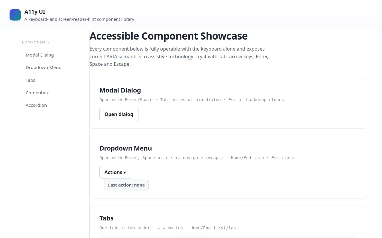
<h1>Accessible Component Showcase</h1>
<p class="lead">Every component below is fully operable with the keyboard alone and exposes correct ARIA semantics to assistive technology. Try it with Tab, arrow keys, Enter, Space and Escape.</p>
<!-- ===== 1. Modal Dialog ===== -->
<section id="section-modal" class="section" aria-labelledby="h-modal">
<h2 id="h-modal">Modal Dialog</h2>
<p class="caption">Open with Enter/Space · Tab cycles within dialog · Esc or backdrop closes</p>
<div class="demo">
<button id="modal-trigger" class="btn">Open dialog</button>
</div>
</section>
<!-- ===== 2. Dropdown Menu ===== -->
<section id="section-menu" class="section" aria-labelledby="h-menu">
<h2 id="h-menu">Dropdown Menu</h2>
<p class="caption">Open with Enter, Space or ↓ · ↑↓ navigate (wraps) · Home/End jump · Esc closes</p>
<div class="demo demo-menu">
<div class="menu-wrap">
<button id="menu-button" class="btn" aria-haspopup="menu" aria-expanded="false" aria-controls="menu-list">
Actions <span class="caret" aria-hidden="true">▾</span>
</button>
<ul id="menu-list" role="menu" hidden="">
<li role="menuitem" tabindex="-1">New Project</li>
<li role="menuitem" tabindex="-1">Rename…</li>
<li role="menuitem" tabindex="-1" aria-disabled="true">Duplicate</li>
<li role="menuitem" tabindex="-1">Move to…</li>
<li role="separator" aria-hidden="true"></li>
<li role="menuitem" tabindex="-1">Delete</li>
</ul>
</div>
<output id="menu-output" class="output">Last action: none</output>
</div>
</section>
<!-- ===== 3. Tabs ===== -->
<section id="section-tabs" class="section" aria-labelledby="h-tabs">
<h2 id="h-tabs">Tabs</h2>
<p class="caption">One tab in tab order · ← → switch · Home/End first/last</p>
<div class="demo">
<div class="tabs" id="tabs">
<div role="tablist" aria-label="Sample content" class="tablist">
<button role="tab" id="tab-1" aria-selected="true" aria-controls="panel-1" tabindex="0">Apples</button>
<button role="tab" id="tab-2" aria-selected="false" aria-controls="panel-2" tabindex="-1">Bananas</button>
<button role="tab" id="tab-3" aria-selected="false" aria-controls="panel-3" tabindex="-1">Cherries</button>
</div>
<div class="panel" role="tabpanel" id="panel-1" aria-labelledby="tab-1" tabindex="0">
<p><strong>Apples</strong> are crisp and sweet. They store well and come in many varieties — from tart Granny Smith to honeyed Fuji. Perfect for snacks, pies and cider.</p>
</div>
<div class="panel" role="tabpanel" id="panel-2" aria-labelledby="tab-2" hidden="">
<p><strong>Bananas</strong> are soft, creamy and energy-rich. Naturally wrapped, they travel easily and ripen after picking. Great in smoothies, cereals and baking.</p>
</div>
<div class="panel" role="tabpanel" id="panel-3" aria-labelledby="tab-3" hidden="">
<p><strong>Cherries</strong> are small, juicy and burst with flavor. Their short season makes them a summer treat. Enjoy fresh, in pies, or preserved as jam.</p>
</div>
</div>
</div>
</section>
<!-- ===== 4. Combobox ===== -->
<section id="section-combobox" class="section" aria-labelledby="h-combobox">
<h2 id="h-combobox">Combobox (Autocomplete)</h2>
<p class="caption">Type to filter · ↑↓ move highlight · Enter select · Esc close & revert</p>
<div class="demo">
<div class="combo">
<label id="combo-label" for="combo-input">Choose a fruit</label>
<div class="combo-field">
<input id="combo-input" role="combobox" aria-expanded="false" aria-controls="combo-listbox" aria-activedescendant="" aria-autocomplete="list" aria-labelledby="combo-label" autocomplete="off" spellcheck="false" placeholder="Start typing…">
</div>
<ul id="combo-listbox" role="listbox" aria-label="Available fruits" hidden=""></ul>
</div>
<output id="combo-output" class="output">Selected: none</output>
</div>
</section>
<!-- ===== 5. Accordion ===== -->
<section id="section-accordion" class="section" aria-labelledby="h-accordion">
<h2 id="h-accordion">Accordion / Disclosure Group</h2>
<p class="caption">Enter or Space toggles · multiple panels may be open at once</p>
<div class="demo">
<div class="accordion" id="accordion">
<div class="acc-item">
<h3 class="acc-h">
<button id="acc-btn-1" aria-expanded="false" aria-controls="acc-panel-1">Why is accessibility important?</button>
</h3>
<div id="acc-panel-1" class="acc-panel" role="region" aria-labelledby="acc-btn-1" hidden="">
<div class="acc-inner"><p>Accessibility ensures everyone can use your product — including people relying on a keyboard, a screen reader, or high contrast display. It is both a legal and an ethical baseline for the web.</p></div>
</div>
</div>
<div class="acc-item">
<h3 class="acc-h">
<button id="acc-btn-2" aria-expanded="false" aria-controls="acc-panel-2">What is the roving tabindex pattern?</button></h3>
<div id="acc-panel-2" class="acc-panel" role="region" aria-labelledby="acc-btn-2" hidden="">
<div class="acc-inner"><p>Roving tabindex keeps only one element of a widget in the tab order (tabindex="0") while the rest have tabindex="-1". Arrow keys move focus among them, updating which one holds tabindex="0".</p></div>
</div>
</div>
<div class="acc-item">
<h3 class="acc-h">
<button id="acc-btn-3" aria-expanded="false" aria-controls="acc-panel-3">Why animate with hidden toggled at the end?</button></h3>
<div id="acc-panel-3" class="acc-panel" role="region" aria-labelledby="acc-btn-3" hidden="">
<div class="acc-inner"><p>Applying the <code>hidden</code> attribute only after the collapse animation finishes keeps the content available to assistive technology for the whole transition, so nothing is announced prematurely.</p></div>
</div>
</div>
</div>
</div>
</section>
<footer class="footer">
<p>Built with vanilla HTML, CSS and JavaScript. No frameworks, no libraries — just correct semantics.</p>
</footer>
</main>
</div>
</div>
<!-- Modal overlay lives outside the inert region -->
<div id="modal-root" class="overlay" hidden="">
<div class="modal" role="dialog" aria-modal="true" aria-labelledby="modal-title" aria-describedby="modal-desc" tabindex="-1">
<h3 id="modal-title" class="modal-title">Confirm archive</h3>
<p id="modal-desc" class="modal-desc">Archiving hides this project from your active list. It can be restored later from the archive. Focus is trapped inside this dialog until you close it.</p>
<div class="modal-actions">
<button id="modal-close" class="btn">Cancel</button>
<a id="modal-link" class="modal-link" href="#modal-desc">View details <span aria-hidden="true">↗</span></a>
<button id="modal-save" class="btn btn-primary">Archive project</button>
</div>
</div>
</div>
<script>
(function () {
'use strict';
var __mods = {};
var __cache = {};
var __map = {"src/main.ts":{"./modal":"src/modal.ts","./menu":"src/menu.ts","./tabs":"src/tabs.ts","./combobox":"src/combobox.ts","./accordion":"src/accordion.ts"},"src/modal.ts":{"./focus-trap":"src/focus-trap.ts"},"src/accordion.ts":{"./constants":"src/constants.ts"}};
function __require(id) {
if (__cache[id]) return __cache[id].exports;
var module = __cache[id] = { exports: {} };
var factory = __mods[id];
if (!factory) throw new Error("Module not found: " + id);
factory(module.exports, function (spec) {
var target = (__map[id] && __map[id][spec]) || spec;
return __require(target);
}, module);
return module.exports;
}
// ── module: src/main.ts ──
__mods["src/main.ts"] = function (exports, require, module) {
"use strict";
Object.defineProperty(exports, "__esModule", { value: true });
exports.start = start;
// ===========================================================================
// Entry — wires up every accessible component.
// ===========================================================================
const modal_1 = require("./modal");
const menu_1 = require("./menu");
const tabs_1 = require("./tabs");
const combobox_1 = require("./combobox");
const accordion_1 = require("./accordion");
function initScrollSpy() {
const sections = Array.from(document.querySelectorAll('.section'));
const links = Array.from(document.querySelectorAll('.nav-list a'));
const byId = new Map(sections.map((s) => [s.id, s]));
const io = new IntersectionObserver((entries) => {
const visible = entries
.filter((e) => e.isIntersecting)
.sort((a, b) => a.boundingClientRect.top - b.boundingClientRect.top)[0];
if (!visible)
return;
links.forEach((l) => {
if (l.getAttribute('href') === '#' + visible.target.id)
l.setAttribute('aria-current', 'true');
else
l.removeAttribute('aria-current');
});
}, { rootMargin: '-20% 0px -70% 0px' });
sections.forEach((s) => io.observe(s));
}
function start() {
(0, modal_1.initModal)();
(0, menu_1.initMenu)();
(0, tabs_1.initTabs)();
(0, combobox_1.initCombobox)();
(0, accordion_1.initAccordion)();
initScrollSpy();
}
start();
};
// ── module: src/constants.ts ──
__mods["src/constants.ts"] = function (exports, require, module) {
"use strict";
// ===========================================================================
// Tunable constants + shared timing helpers (block at the top of the program)
// ===========================================================================
Object.defineProperty(exports, "__esModule", { value: true });
exports.DUR_SLOW = exports.DUR = exports.DUR_FAST = void 0;
exports.prefersReducedMotion = prefersReducedMotion;
exports.animate = animate;
exports.DUR_FAST = 140;
exports.DUR = 220;
exports.DUR_SLOW = 340;
/** True when the user has asked the OS to reduce motion. */
function prefersReducedMotion() {
return typeof matchMedia !== 'undefined' &&
matchMedia('(prefers-reduced-motion: reduce)').matches;
}
/** Resolves after `ms` (or ~0ms when reduced motion is requested). */
function animate(ms) {
return new Promise((resolve) => setTimeout(resolve, prefersReducedMotion() ? 0 : ms));
}
};
// ── module: src/focus-trap.ts ──
__mods["src/focus-trap.ts"] = function (exports, require, module) {
"use strict";
// ===========================================================================
// Reusable focus-trap utility (used by the modal dialog).
// Traps Tab / Shift+Tab inside `container` while active.
// ===========================================================================
Object.defineProperty(exports, "__esModule", { value: true });
exports.createFocusTrap = createFocusTrap;
const TABBABLE = [
'a[href]',
'button:not([disabled])',
'input:not([disabled])',
'select:not([disabled])',
'textarea:not([disabled])',
'[tabindex]:not([tabindex="-1"])',
].join(', ');
function isTabbable(el) {
return !el.hasAttribute('hidden') && !el.closest('[hidden]') && el.offsetParent !== null;
}
function createFocusTrap(container, opts = {}) {
let active = false;
const onKeydown = (e) => {
if (e.key !== 'Tab')
return;
const focusables = Array.from(container.querySelectorAll(TABBABLE)).filter(isTabbable);
if (focusables.length === 0) {
e.preventDefault();
return;
}
const focused = document.activeElement;
const idx = focusables.indexOf(focused);
const first = focusables[0];
const last = focusables[focusables.length - 1];
if (e.shiftKey) {
// On the first element (or no element inside) → wrap to the last.
if (idx <= 0) {
e.preventDefault();
last.focus();
}
}
else if (idx === -1 || idx === focusables.length - 1) {
// After the last element → wrap to the first.
e.preventDefault();
first.focus();
}
};
return {
activate() {
if (active)
return;
active = true;
document.addEventListener('keydown', onKeydown);
},
deactivate() {
if (!active)
return;
active = false;
document.removeEventListener('keydown', onKeydown);
opts.onDeactivate?.();
},
get isActive() {
return active;
},
};
}
};
// ── module: src/modal.ts ──
__mods["src/modal.ts"] = function (exports, require, module) {
"use strict";
Object.defineProperty(exports, "__esModule", { value: true });
exports.initModal = initModal;
// ===========================================================================
// Modal Dialog — focus trap, focus return, Escape / backdrop close, inert page
// ===========================================================================
const focus_trap_1 = require("./focus-trap");
function initModal() {
const trigger = document.getElementById('modal-trigger');
const root = document.getElementById('modal-root');
const dialog = root.querySelector('.modal');
const page = document.getElementById('page');
const trap = (0, focus_trap_1.createFocusTrap)(dialog);
const onEscape = (e) => {
if (e.key === 'Escape')
close();
};
function setInert(on) {
if (on)
page.setAttribute('inert', '');
else
page.removeAttribute('inert');
}
function open() {
root.hidden = false;
setInert(true); // page behind becomes inert (not focusable)
trap.activate();
document.addEventListener('keydown', onEscape);
dialog.focus(); // move focus into the dialog
}
function close() {
document.removeEventListener('keydown', onEscape);
trap.deactivate();
setInert(false);
root.hidden = true;
trigger.focus(); // focus returns to the trigger
}
trigger.addEventListener('click', open);
const closeButtons = [document.getElementById('modal-close'), document.getElementById('modal-save')];
closeButtons.forEach((b) => b?.addEventListener('click', close));
// Clicking the backdrop (not the dialog) closes.
root.addEventListener('click', (e) => {
if (e.target === root)
close();
});
}
};
// ── module: src/menu.ts ──
__mods["src/menu.ts"] = function (exports, require, module) {
"use strict";
// ===========================================================================
// Dropdown Menu — aria-haspopup/expanded, open triggers, arrow-key nav,
// Home/End, Escape returns focus, Tab moves on, selection performs action.
// ===========================================================================
Object.defineProperty(exports, "__esModule", { value: true });
exports.initMenu = initMenu;
function initMenu() {
const button = document.getElementById('menu-button');
const list = document.getElementById('menu-list');
const output = document.getElementById('menu-output');
const all = Array.from(list.querySelectorAll('li[role="menuitem"]'));
const enabled = all.filter((li) => li.getAttribute('aria-disabled') !== 'true');
let open = false;
let activeIndex = 0;
function report(action) {
output.textContent = 'Last action: ' + action;
}
function openMenu(moveFocus) {
if (open)
return;
open = true;
button.setAttribute('aria-expanded', 'true');
list.hidden = false;
activeIndex = 0;
if (moveFocus)
focusActive();
}
function closeMenu(returnFocus) {
if (!open)
return;
open = false;
button.setAttribute('aria-expanded', 'false');
list.hidden = true;
all.forEach((li) => {
li.classList.remove('focused');
li.tabIndex = -1;
});
if (returnFocus)
button.focus();
}
function focusActive() {
all.forEach((li) => {
li.classList.remove('focused');
li.tabIndex = -1;
});
const li = enabled[activeIndex];
li.classList.add('focused');
li.tabIndex = 0; // roving tabindex on the active item
li.focus();
}
function wrap(i) {
return (i + enabled.length) % enabled.length;
}
function choose(li) {
if (!li)
return;
report(li.textContent.trim());
closeMenu(true);
}
// Open from the button: click, Enter, Space, ArrowDown.
// Keyboard open moves focus to the first item immediately; pointer open
// defers it until after the browser finishes the click's focus handling.
button.addEventListener('click', () => {
openMenu(false);
requestAnimationFrame(() => {
if (open)
focusActive();
});
});
button.addEventListener('keydown', (e) => {
if (e.key === 'ArrowDown' || e.key === 'Enter' || e.key === ' ') {
e.preventDefault();
if (open)
focusActive(); // opened by pointer earlier — move focus into the menu
else
openMenu(true);
}
});
// Navigation + selection while the menu is open.
list.addEventListener('keydown', (e) => {
if (!open)
return;
switch (e.key) {
case 'ArrowDown':
e.preventDefault();
activeIndex = wrap(activeIndex + 1);
focusActive();
break;
case 'ArrowUp':
e.preventDefault();
activeIndex = wrap(activeIndex - 1);
focusActive();
break;
case 'Home':
e.preventDefault();
activeIndex = 0;
focusActive();
break;
case 'End':
e.preventDefault();
activeIndex = enabled.length - 1;
focusActive();
break;
case 'Escape':
e.preventDefault();
closeMenu(true);
break;
case 'Tab':
// Let Tab move to the next element outside the menu naturally.
closeMenu(false);
break;
case 'Enter':
case ' ':
e.preventDefault();
choose(enabled[activeIndex]);
break;
}
});
list.addEventListener('click', (e) => {
const li = e.target.closest('li[role="menuitem"]');
if (!li || li.getAttribute('aria-disabled') === 'true')
return;
choose(li);
});
}
};
// ── module: src/tabs.ts ──
__mods["src/tabs.ts"] = function (exports, require, module) {
"use strict";
// ===========================================================================
// Tabs — roving tabindex (one tab in tab order), arrow-key switching,
// hidden panels via the `hidden` attribute, aria wiring kept in sync.
// ===========================================================================
Object.defineProperty(exports, "__esModule", { value: true });
exports.initTabs = initTabs;
function initTabs() {
const tabs = Array.from(document.querySelectorAll('#tabs [role="tab"]'));
const panels = Array.from(document.querySelectorAll('#tabs [role="tabpanel"]'));
const tablist = document.querySelector('#tabs [role="tablist"]');
function activate(tab) {
tabs.forEach((t) => {
const selected = t === tab;
t.setAttribute('aria-selected', String(selected));
t.tabIndex = selected ? 0 : -1;
});
panels.forEach((p) => {
p.hidden = p.id !== tab.getAttribute('aria-controls');
});
tab.focus();
}
tablist.addEventListener('keydown', (e) => {
const idx = tabs.indexOf(document.activeElement);
if (idx === -1)
return;
let next = -1;
switch (e.key) {
case 'ArrowRight':
next = (idx + 1) % tabs.length;
break;
case 'ArrowLeft':
next = (idx - 1 + tabs.length) % tabs.length;
break;
case 'Home':
next = 0;
break;
case 'End':
next = tabs.length - 1;
break;
default: return;
}
e.preventDefault();
activate(tabs[next]);
});
tabs.forEach((t) => {
t.addEventListener('click', () => activate(t));
t.addEventListener('keydown', (e) => {
if (e.key === 'Enter' || e.key === ' ') {
e.preventDefault();
activate(t);
}
});
});
}
};
// ── module: src/combobox.ts ──
__mods["src/combobox.ts"] = function (exports, require, module) {
"use strict";
// ===========================================================================
// Combobox (autocomplete) — aria-activedescendant pattern. The input keeps
// keyboard focus at all times; the listbox is never itself focusable.
// ===========================================================================
Object.defineProperty(exports, "__esModule", { value: true });
exports.initCombobox = initCombobox;
const OPTIONS = [
'Apple', 'Apricot', 'Avocado', 'Banana', 'Blackberry', 'Blueberry',
'Cantaloupe', 'Cherry', 'Coconut', 'Cranberry', 'Fig', 'Grape',
'Grapefruit', 'Kiwi', 'Lemon', 'Lime', 'Mango', 'Nectarine',
'Orange', 'Papaya', 'Peach', 'Pear', 'Pineapple', 'Plum',
'Raspberry', 'Strawberry', 'Watermelon',
];
function initCombobox() {
const input = document.getElementById('combo-input');
const list = document.getElementById('combo-listbox');
const output = document.getElementById('combo-output');
// Announce selections to assistive tech.
output.setAttribute('aria-live', 'polite');
let highlighted = -1; // index into the currently rendered <li> list
let committed = '';
function open() {
list.hidden = false;
input.setAttribute('aria-expanded', 'true');
}
function close() {
list.hidden = true;
input.setAttribute('aria-expanded', 'false');
input.setAttribute('aria-activedescendant', '');
highlighted = -1;
}
function render(items) {
list.textContent = '';
if (items.length === 0) {
const li = document.createElement('li');
li.className = 'empty';
li.textContent = 'No matches';
list.appendChild(li);
highlighted = -1;
return;
}
items.forEach((value, i) => {
const li = document.createElement('li');
li.setAttribute('role', 'option');
li.id = 'opt-' + i;
li.textContent = value;
li.addEventListener('click', () => select(value));
list.appendChild(li);
});
highlighted = 0;
setHighlight();
}
function setHighlight() {
const lis = Array.from(list.querySelectorAll('li[role="option"]'));
lis.forEach((li, i) => {
li.classList.toggle('highlighted', i === highlighted);
li.setAttribute('aria-selected', String(i === highlighted));
});
if (highlighted >= 0 && highlighted < lis.length) {
input.setAttribute('aria-activedescendant', lis[highlighted].id);
lis[highlighted].scrollIntoView({ block: 'nearest' });
}
}
function select(value) {
input.value = value;
committed = value;
output.textContent = 'Selected: ' + value;
close();
}
// Typing filters the list (case-insensitive).
input.addEventListener('input', () => {
const q = input.value.trim().toLowerCase();
const matches = q ? OPTIONS.filter((o) => o.toLowerCase().includes(q)) : OPTIONS;
render(matches);
open();
});
input.addEventListener('keydown', (e) => {
const lis = Array.from(list.querySelectorAll('li[role="option"]'));
const openState = !list.hidden;
switch (e.key) {
case 'ArrowDown':
e.preventDefault();
if (!openState || lis.length === 0) {
render(OPTIONS);
open();
}
else {
highlighted = (highlighted + 1 + lis.length) % lis.length;
setHighlight();
}
break;
case 'ArrowUp':
e.preventDefault();
if (!openState || lis.length === 0) {
render(OPTIONS);
open();
}
else {
highlighted = (highlighted - 1 + lis.length) % lis.length;
setHighlight();
}
break;
case 'Enter':
if (openState && highlighted >= 0 && highlighted < lis.length) {
e.preventDefault();
select(lis[highlighted].textContent);
}
break;
case 'Escape':
if (openState) {
e.preventDefault();
input.value = committed; // revert to last committed value
close();
}
break;
}
});
input.addEventListener('blur', () => {
// Close when focus leaves the combobox.
setTimeout(() => { if (document.activeElement !== input)
close(); }, 0);
});
}
};
// ── module: src/accordion.ts ──
__mods["src/accordion.ts"] = function (exports, require, module) {
"use strict";
Object.defineProperty(exports, "__esModule", { value: true });
exports.initAccordion = initAccordion;
// ===========================================================================
// Accordion (disclosure group) — buttons toggle regions; several may be open
// at once. Height animates fluidly; the `hidden` attribute is toggled at the
// END of the animation so content never disappears from assistive tech early.
// ===========================================================================
const constants_1 = require("./constants");
function initAccordion() {
const items = Array.from(document.querySelectorAll('.acc-item'));
items.forEach((item) => {
const btn = item.querySelector('.acc-h button');
const panelId = btn.getAttribute('aria-controls');
const panel = document.getElementById(panelId);
btn.addEventListener('click', () => toggle(btn, panel));
});
function toggle(btn, panel) {
const isOpen = btn.getAttribute('aria-expanded') === 'true';
if (isOpen) {
// Collapse: keep visible during animation, hide only at the end.
btn.setAttribute('aria-expanded', 'false');
panel.classList.remove('open');
(0, constants_1.animate)(constants_1.DUR).then(() => {
if (btn.getAttribute('aria-expanded') !== 'true')
panel.hidden = true;
});
}
else {
// Expand: reveal, then animate open.
btn.setAttribute('aria-expanded', 'true');
panel.hidden = false;
requestAnimationFrame(() => {
requestAnimationFrame(() => panel.classList.add('open'));
});
}
}
}
};
// ── entry ──
__require("src/main.ts");
})();
</script>
</body>
</html>
<!-- agent-meta {"model":"deepseek/deepseek-v4-flash-0731","provider":"openrouter","persona":"typescript","sessionId":"ef826723-ee72-44cd-bc35-69a23994760d","tokensIn":2455879,"tokensOut":51108,"tokensTotal":2506987,"cost":0.06058042200000001,"turns":65,"toolCalls":67,"failedToolCalls":1,"timestamp":"2026-08-01T16:55:18.110Z"} -->