Accessible Components
Qwen 3.8 · typescript
Reviews & generation details
Reviews
No human review yet. Unreviewed does not mean unsuccessful.
Generation context
Imported historical artifact. Its exact original instructions and lineage are not known.
Generation prompt · exact text unavailable
See the current prompt for reference. It may differ from the instructions used to generate this artifact.
Inspect original source 65,278 bytes · SHA-256 92588e076fe3
<!doctype html>
<html lang="en">
<head>
<meta charset="utf-8">
<meta name="viewport" content="width=device-width, initial-scale=1">
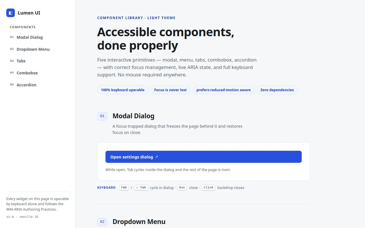
<title>Lumen UI — Accessible Component Showcase</title>
<style>
/* ── css: base ── */
/* ── Design tokens (mirror of src/constants.ts) ─────────────── */
:root {
--bg: #f6f7f9;
--surface: #ffffff;
--ink: #181c22;
--ink-2: #545d6b;
--line: #e3e7ed;
--line-strong: #c9d0da;
--accent: #2750df;
--accent-deep: #1c3cb4;
--accent-tint: #eaeffe;
--accent-tint-2: #f2f5fe;
--danger: #ce3a4b;
--radius: 10px;
--radius-s: 7px;
--shadow-pop: 0 4px 14px rgba(20, 32, 60, .08), 0 14px 34px rgba(20, 32, 60, .12);
--shadow-menu: 0 2px 8px rgba(20, 32, 60, .07), 0 10px 22px rgba(20, 32, 60, .10);
--font: "Inter", "SF Pro Text", "Segoe UI", system-ui, -apple-system, "Helvetica Neue", Arial, sans-serif;
--mono: "SFMono-Regular", "JetBrains Mono", Consolas, "Liberation Mono", Menlo, monospace;
}
*, *::before, *::after { box-sizing: border-box; }
/* Author rules that set `display` (e.g. .modal-backdrop{display:flex})
override the UA stylesheet's [hidden] default — pin it back down. */
[hidden] { display: none !important; }
html { scroll-behavior: smooth; }
body {
margin: 0;
background: var(--bg);
color: var(--ink);
font-family: var(--font);
font-size: 16px;
line-height: 1.55;
-webkit-font-smoothing: antialiased;
text-rendering: optimizeLegibility;
}
h1, h2, h3, p { margin: 0; }
button { font: inherit; color: inherit; }
a { color: var(--accent-deep); }
code {
font-family: var(--mono);
font-size: .855em;
background: var(--accent-tint-2);
border: 1px solid var(--line);
border-radius: 5px;
padding: .08em .35em;
color: var(--accent-deep);
}
::selection { background: var(--accent-tint); }
/* ── Focus: visible everywhere, high contrast ───────────────── */
:focus-visible {
outline: 2.5px solid var(--accent);
outline-offset: 2px;
border-radius: 4px;
}
.btn:focus-visible,
.menu-item:focus-visible,
.tab:focus-visible { outline-offset: -4px; }
.skip-link:focus-visible { outline-offset: 4px; }
/* Programmatic focus (no mouse) also shows the ring on our own widgets */
.btn:focus, .menu-item:focus, .tab:focus, .field-input:focus,
.acc-btn:focus, .modal-close:focus {
outline: 2.5px solid var(--accent);
outline-offset: 2px;
}
.btn:focus, .menu-item:focus, .tab:focus, .acc-btn:focus { outline-offset: -4px; }
/* Main landmark: receives focus from the skip link without stealing the ring */
#main:focus-visible { outline: none; }
/* ── Skip link ──────────────────────────────────────────────── */
.skip-link {
position: fixed;
top: 10px;
left: 10px;
z-index: 200;
transform: translateY(-260%);
background: var(--ink);
color: #fff;
padding: .6em 1.1em;
border-radius: var(--radius-s);
font-weight: 600;
font-size: 14px;
text-decoration: none;
box-shadow: var(--shadow-pop);
transition: transform .18s ease;
}
.skip-link:hover, .skip-link:focus { transform: translateY(0); }
.skip-link:focus-visible { outline-color: #fff; }
/* ── SR-only + live region ──────────────────────────────────── */
.sr-only {
position: absolute;
width: 1px; height: 1px;
padding: 0; margin: -1px;
overflow: hidden;
clip: rect(0 0 0 0);
white-space: nowrap;
border: 0;
}
.live-region {
position: fixed;
right: 14px;
bottom: 14px;
z-index: 190;
max-width: 46ch;
background: var(--ink);
color: #fff;
font-size: 13px;
line-height: 1.4;
padding: .65em .95em;
border-radius: var(--radius-s);
box-shadow: var(--shadow-pop);
opacity: 0;
transform: translateY(8px);
pointer-events: none;
transition: opacity .22s ease, transform .22s ease;
}
.live-region.is-on { opacity: 1; transform: translateY(0); }
kbd {
font-family: var(--mono);
font-size: 11.5px;
line-height: 1;
color: var(--ink);
background: var(--surface);
border: 1px solid var(--line-strong);
border-bottom-width: 2px;
border-radius: 5px;
padding: 3px 6px;
margin: 0 1px;
white-space: nowrap;
}
/* ── css: layout ── */
/* ── Page grid ─────────────────────────────────────────────── */
.page {
min-height: 100vh;
display: grid;
grid-template-columns: 264px minmax(0, 1fr);
}
/* ── Sidebar ───────────────────────────────────────────────── */
.sidebar {
position: sticky;
top: 0;
align-self: start;
height: 100vh;
display: flex;
flex-direction: column;
gap: 26px;
padding: 30px 22px;
background: var(--surface);
border-right: 1px solid var(--line);
overflow-y: auto;
}
.brand { display: flex; align-items: center; gap: 10px; }
.brand-mark {
display: inline-flex;
align-items: center;
justify-content: center;
width: 30px; height: 30px;
border-radius: 8px;
background: var(--accent);
color: #fff;
font-size: 15px;
flex: none;
}
.brand-name { font-weight: 700; letter-spacing: .01em; }
.nav-kicker {
font-size: 11px;
font-weight: 700;
text-transform: uppercase;
letter-spacing: .12em;
color: var(--ink-2);
margin: 0 0 8px;
padding-left: 12px;
}
.nav-list {
list-style: none;
margin: 0;
padding: 0;
display: flex;
flex-direction: column;
gap: 2px;
}
.nav-link {
display: flex;
align-items: center;
gap: 10px;
padding: 8px 12px;
border-radius: var(--radius-s);
color: var(--ink-2);
text-decoration: none;
font-size: 14px;
font-weight: 550;
border: 1px solid transparent;
transition: background .15s ease, color .15s ease, border-color .15s ease;
}
.nav-link:hover { background: var(--accent-tint-2); color: var(--ink); }
.nav-link.is-active {
background: var(--accent-tint);
border-color: #d3ddfb;
color: var(--accent-deep);
font-weight: 650;
}
.nav-num {
font-family: var(--mono);
font-size: 11px;
color: var(--ink-2);
opacity: .8;
}
.nav-link.is-active .nav-num { color: var(--accent-deep); }
.sidebar-foot {
margin-top: auto;
border-top: 1px solid var(--line);
padding-top: 16px;
display: flex;
flex-direction: column;
gap: 8px;
}
.foot-note { font-size: 12.5px; color: var(--ink-2); line-height: 1.5; }
.foot-meta { font-family: var(--mono); font-size: 11px; color: var(--ink-2); }
/* ── Content column ────────────────────────────────────────── */
.content {
padding: 54px clamp(28px, 6vw, 84px) 70px;
max-width: 900px;
width: 100%;
}
.masthead { margin-bottom: 58px; }
.eyebrow {
font-size: 12px;
font-weight: 700;
letter-spacing: .14em;
text-transform: uppercase;
color: var(--accent-deep);
margin-bottom: 14px;
}
.masthead h1 {
font-size: clamp(30px, 4vw, 42px);
line-height: 1.12;
letter-spacing: -.02em;
font-weight: 750;
max-width: 22ch;
}
.lede {
margin-top: 16px;
font-size: 17px;
color: var(--ink-2);
max-width: 58ch;
}
.chips {
list-style: none;
display: flex;
flex-wrap: wrap;
gap: 8px;
padding: 0;
margin: 24px 0 0;
}
.chip {
font-size: 12.5px;
font-weight: 600;
color: var(--accent-deep);
background: var(--accent-tint-2);
border: 1px solid #d8e1fa;
border-radius: 999px;
padding: 5px 12px;
}
/* ── Sections ──────────────────────────────────────────────── */
.sections { display: flex; flex-direction: column; }
.sec {
padding: 44px 0 46px;
border-top: 1px solid var(--line);
scroll-margin-top: 26px;
}
.sec:first-child { border-top: none; padding-top: 0; }
.sec-head { display: flex; gap: 18px; align-items: flex-start; }
.sec-index {
font-family: var(--mono);
font-size: 13px;
color: var(--accent-deep);
background: var(--accent-tint);
border: 1px solid #d3ddfb;
border-radius: 8px;
padding: 4px 9px;
margin-top: 4px;
flex: none;
}
.sec h2 {
font-size: 23px;
letter-spacing: -.015em;
font-weight: 700;
}
.sec-blurb {
margin-top: 6px;
color: var(--ink-2);
font-size: 14.5px;
max-width: 56ch;
}
.demo {
margin-top: 24px;
background: var(--surface);
border: 1px solid var(--line);
border-radius: var(--radius);
padding: 28px;
display: flex;
flex-direction: column;
gap: 14px;
min-height: 110px;
}
.hint {
font-size: 13px;
color: var(--ink-2);
max-width: 60ch;
}
.kbd-cap {
margin-top: 14px;
font-size: 12.5px;
color: var(--ink-2);
display: flex;
flex-wrap: wrap;
align-items: center;
gap: 6px;
}
.cap-label {
font-size: 10.5px;
font-weight: 700;
text-transform: uppercase;
letter-spacing: .1em;
color: var(--accent-deep);
margin-right: 4px;
}
/* ── Footer ────────────────────────────────────────────────── */
.page-foot {
margin-top: 20px;
padding-top: 22px;
border-top: 1px solid var(--line);
display: flex;
flex-wrap: wrap;
gap: 12px;
justify-content: space-between;
align-items: center;
font-size: 13px;
color: var(--ink-2);
}
.page-foot p { margin: 0; }
/* ── Prose inside panels ───────────────────────────────────── */
.prose-list { margin: 10px 0 0; padding-left: 20px; display: grid; gap: 6px; font-size: 14.5px; }
.prose-link { font-weight: 600; }
/* ── Responsive: single column, collapsible nav ────────────── */
@media (max-width: 860px) {
.page { grid-template-columns: 1fr; }
.sidebar {
position: static;
height: auto;
border-right: none;
border-bottom: 1px solid var(--line);
gap: 16px;
padding: 20px;
}
.sidebar nav { display: none; }
.sidebar-foot { display: none; }
.content { padding: 36px 20px 60px; }
}
/* ── css: components ── */
/* ── Buttons & fields ──────────────────────────────────────── */
.btn {
display: inline-flex;
align-items: center;
gap: 8px;
background: var(--surface);
border: 1px solid var(--line-strong);
border-radius: var(--radius-s);
padding: 9px 16px;
font-size: 14.5px;
font-weight: 600;
color: var(--ink);
cursor: pointer;
transition: background .15s ease, border-color .15s ease, color .15s ease, box-shadow .15s ease;
}
.btn:hover { border-color: var(--accent); background: var(--accent-tint-2); }
.btn:active { background: var(--accent-tint); }
.btn-caret { font-size: 13px; }
.btn-primary {
background: var(--accent);
border-color: var(--accent);
color: #fff;
box-shadow: 0 1px 2px rgba(28, 60, 180, .25);
}
.btn-primary:hover { background: var(--accent-deep); border-color: var(--accent-deep); }
.btn-primary:active { background: var(--accent-deep); }
.field-label {
font-size: 13px;
font-weight: 650;
color: var(--ink);
}
.field-input {
width: 100%;
max-width: 420px;
background: var(--surface);
border: 1px solid var(--line-strong);
border-radius: var(--radius-s);
padding: 9px 12px;
font: inherit;
font-size: 14.5px;
color: var(--ink);
transition: border-color .15s ease, box-shadow .15s ease;
}
.field-input::placeholder { color: #98a1ae; }
.field-input:hover { border-color: var(--accent); }
select.field-input {
appearance: none;
background-image: linear-gradient(45deg, transparent 50%, var(--ink-2) 50%),
linear-gradient(135deg, var(--ink-2) 50%, transparent 50%);
background-position: calc(100% - 17px) 55%, calc(100% - 12px) 55%;
background-size: 5px 5px;
background-repeat: no-repeat;
padding-right: 34px;
}
/* ── 01 · Modal ────────────────────────────────────────────── */
.modal-backdrop {
position: fixed;
inset: 0;
z-index: 100;
background: rgba(22, 27, 34, .45);
display: flex;
align-items: center;
justify-content: center;
padding: 24px;
}
.modal-card {
position: relative;
width: min(480px, 100%);
background: var(--surface);
border: 1px solid var(--line);
border-radius: var(--radius);
box-shadow: var(--shadow-pop);
padding: 28px 28px 24px;
}
.modal-title { font-size: 19px; letter-spacing: -.01em; margin-bottom: 6px; }
.modal-body { font-size: 14px; color: var(--ink-2); margin-bottom: 18px; }
.modal-field { display: flex; flex-direction: column; gap: 6px; margin-bottom: 16px; }
.modal-actions {
display: flex;
justify-content: flex-end;
gap: 10px;
margin-top: 22px;
padding-top: 18px;
border-top: 1px solid var(--line);
}
.modal-close {
position: absolute;
top: 12px;
right: 12px;
display: inline-flex;
align-items: center;
justify-content: center;
width: 32px; height: 32px;
border: 1px solid transparent;
border-radius: var(--radius-s);
background: transparent;
color: var(--ink-2);
font-size: 14px;
cursor: pointer;
transition: background .15s ease, color .15s ease;
}
.modal-close:hover { background: var(--accent-tint); color: var(--ink); }
/* ── 02 · Dropdown menu ────────────────────────────────────── */
.menu-root { position: relative; display: inline-block; }
.chev { font-size: 12px; transition: transform .18s ease; }
.menu-root.is-open .chev { transform: rotate(180deg); }
.menu-list {
position: absolute;
top: calc(100% + 8px);
left: 0;
z-index: 60;
min-width: 218px;
list-style: none;
margin: 0;
padding: 6px;
background: var(--surface);
border: 1px solid var(--line);
border-radius: var(--radius);
box-shadow: var(--shadow-menu);
}
.menu-item {
display: block;
width: 100%;
text-align: left;
background: none;
border: none;
border-radius: var(--radius-s);
padding: 9px 12px;
font-size: 14.5px;
color: var(--ink);
cursor: pointer;
}
.menu-item:hover, .menu-item:focus { background: var(--accent-tint); color: var(--accent-deep); }
.menu-item-danger { color: var(--danger); }
.menu-item-danger:hover, .menu-item-danger:focus { background: #fbebed; color: var(--danger); }
.menu-list [role="separator"] {
height: 1px;
margin: 6px 8px;
background: var(--line);
}
/* ── 03 · Tabs ─────────────────────────────────────────────── */
.tabs { display: flex; flex-direction: column; }
.tablist {
display: flex;
gap: 4px;
border-bottom: 1px solid var(--line);
position: relative;
}
.tab {
appearance: none;
background: none;
border: none;
border-bottom: 2px solid transparent;
margin-bottom: -1px;
padding: 10px 16px;
font-size: 14.5px;
font-weight: 600;
color: var(--ink-2);
cursor: pointer;
border-radius: var(--radius-s) var(--radius-s) 0 0;
transition: color .15s ease, background .15s ease;
}
.tab:hover { color: var(--ink); background: var(--accent-tint-2); }
.tab[aria-selected="true"] {
color: var(--accent-deep);
border-bottom-color: var(--accent);
}
.tabpanel {
padding: 22px 4px 6px;
font-size: 14.5px;
line-height: 1.6;
}
.tabpanel h3 { font-size: 16px; margin-bottom: 10px; letter-spacing: -.01em; }
.tabpanel p { margin-bottom: 10px; color: #3c4552; }
.api-table {
width: 100%;
border-collapse: collapse;
margin-top: 10px;
font-size: 13.5px;
}
.api-table th, .api-table td {
text-align: left;
padding: 8px 12px;
border: 1px solid var(--line);
}
.api-table th { background: var(--accent-tint-2); font-weight: 650; }
/* ── 04 · Combobox ─────────────────────────────────────────── */
.combo { position: relative; max-width: 440px; }
.combo-list {
position: absolute;
top: calc(100% + 6px);
left: 0;
right: 0;
z-index: 60;
max-height: 264px;
overflow-y: auto;
list-style: none;
margin: 0;
padding: 5px;
background: var(--surface);
border: 1px solid var(--line);
border-radius: var(--radius);
box-shadow: var(--shadow-menu);
}
.combo-opt {
padding: 8px 12px;
border-radius: var(--radius-s);
font-size: 14.5px;
cursor: pointer;
color: var(--ink);
}
.combo-opt mark {
background: var(--accent-tint);
color: var(--accent-deep);
font-weight: 700;
border-radius: 2px;
padding: 0;
}
.combo-opt.is-active { background: var(--accent-tint); color: var(--accent-deep); font-weight: 600; }
.combo-empty { padding: 10px 12px; font-size: 13.5px; color: var(--ink-2); font-style: italic; }
/* ── 05 · Accordion ────────────────────────────────────────── */
.accordion { display: flex; flex-direction: column; }
.acc-item {
border: 1px solid var(--line);
border-radius: var(--radius);
background: var(--surface);
}
.acc-item + .acc-item { margin-top: 10px; }
.acc-item:has(.acc-btn[aria-expanded="true"]) { border-color: #c7d3f7; }
.acc-h3 { margin: 0; font-size: inherit; font-weight: inherit; }
.acc-btn {
display: flex;
align-items: center;
justify-content: space-between;
gap: 12px;
width: 100%;
background: none;
border: none;
border-radius: var(--radius);
padding: 15px 18px;
font-size: 15px;
font-weight: 650;
text-align: left;
cursor: pointer;
color: var(--ink);
transition: background .15s ease;
}
.acc-btn:hover { background: var(--accent-tint-2); }
.acc-icon {
display: inline-flex;
align-items: center;
justify-content: center;
width: 22px; height: 22px;
flex: none;
font-size: 15px;
font-weight: 500;
color: var(--accent-deep);
background: var(--accent-tint);
border-radius: 6px;
transition: transform .22s ease;
}
.acc-btn[aria-expanded="true"] .acc-icon { transform: rotate(45deg); }
.acc-panel { overflow: hidden; height: auto; }
.acc-panel-inner { padding: 2px 18px 18px; font-size: 14.5px; color: #3c4552; }
.acc-panel-inner p { margin-bottom: 8px; }
.acc-link { margin-bottom: 0; }
/* ── css: motion ── */
/* ── Motion: entrance animations (JS-driven for the modal so
the inert/focus choreography stays in one place) ─────────── */
@keyframes backdrop-in { from { opacity: 0; } to { opacity: 1; } }
@keyframes card-in {
from { opacity: 0; transform: translateY(12px) scale(.98); }
to { opacity: 1; transform: none; }
}
@keyframes menu-in {
from { opacity: 0; transform: translateY(-4px) scale(.985); }
to { opacity: 1; transform: none; }
}
@keyframes combo-in {
from { opacity: 0; transform: translateY(-3px); }
to { opacity: 1; transform: none; }
}
.modal-backdrop { animation: backdrop-in .2s ease both; }
.modal-card { animation: card-in .24s cubic-bezier(.2, .9, .3, 1.2) both; }
.menu-list[role="menu"] { animation: menu-in .16s ease both; }
.combo-list { animation: combo-in .14s ease both; }
/* ── prefers-reduced-motion: kill all of it ────────────────── */
@media (prefers-reduced-motion: reduce) {
html { scroll-behavior: auto; }
*, *::before, *::after {
animation-duration: .001ms !important;
animation-iteration-count: 1 !important;
transition-duration: .001ms !important;
}
}
</style>
</head>
<body>
<div class="page">
<a class="skip-link" href="#main">Skip to main content</a>
<aside class="sidebar" aria-label="Component navigation">
<div class="brand">
<span class="brand-mark" aria-hidden="true">◧</span>
<span class="brand-name">Lumen UI</span>
</div>
<nav>
<p class="nav-kicker" id="nav-kicker">Components</p>
<ul class="nav-list" aria-labelledby="nav-kicker">
<li><a class="nav-link" href="#modal" data-sec="modal"><span class="nav-num" aria-hidden="true">01</span> Modal Dialog</a></li>
<li><a class="nav-link" href="#menu" data-sec="menu"><span class="nav-num" aria-hidden="true">02</span> Dropdown Menu</a></li>
<li><a class="nav-link" href="#tabs" data-sec="tabs"><span class="nav-num" aria-hidden="true">03</span> Tabs</a></li>
<li><a class="nav-link" href="#combobox" data-sec="combobox"><span class="nav-num" aria-hidden="true">04</span> Combobox</a></li>
<li><a class="nav-link" href="#accordion" data-sec="accordion"><span class="nav-num" aria-hidden="true">05</span> Accordion</a></li>
</ul>
</nav>
<div class="sidebar-foot">
<p class="foot-note">Every widget on this page is operable by keyboard alone and follows the WAI-ARIA Authoring Practices.</p>
<p class="foot-meta">v1.0 · vanilla JS</p>
</div>
</aside>
<main class="content" id="main" tabindex="-1">
<header class="masthead">
<p class="eyebrow">Component library · light theme</p>
<h1>Accessible components, done properly</h1>
<p class="lede">Five interactive primitives — modal, menu, tabs, combobox, accordion — with correct focus management, live ARIA state, and full keyboard support. No mouse required anywhere.</p>
<ul class="chips" aria-label="Interaction guarantees">
<li class="chip">100% keyboard operable</li>
<li class="chip">Focus is never lost</li>
<li class="chip">prefers-reduced-motion aware</li>
<li class="chip">Zero dependencies</li>
</ul>
</header>
<div class="sections">
<!-- ══════════════ 01 · MODAL DIALOG ══════════════ -->
<section class="sec" id="modal" aria-labelledby="modal-h" data-sec="modal">
<div class="sec-head">
<p class="sec-index">01</p>
<div>
<h2 id="modal-h">Modal Dialog</h2>
<p class="sec-blurb">A focus-trapped dialog that freezes the page behind it and restores focus on close.</p>
</div>
</div>
<div class="demo">
<button class="btn btn-primary" id="modal-open" type="button">
Open settings dialog
<span class="btn-caret" aria-hidden="true">↗</span>
</button>
<p class="hint">While open, Tab cycles inside the dialog and the rest of the page is inert.</p>
</div>
<p class="kbd-cap"><span class="cap-label">Keyboard</span>
<kbd>Tab</kbd>/<kbd>⇧ Tab</kbd> cycle in dialog · <kbd>Esc</kbd> close · <kbd>click</kbd> backdrop closes</p>
</section>
<!-- ══════════════ 02 · DROPDOWN MENU ══════════════ -->
<section class="sec" id="menu" aria-labelledby="menu-h" data-sec="menu">
<div class="sec-head">
<p class="sec-index">02</p>
<div>
<h2 id="menu-h">Dropdown Menu</h2>
<p class="sec-blurb">A popup menu with full roving keyboard navigation and natural Tab exit.</p>
</div>
</div>
<div class="demo">
<div class="menu-root">
<button class="btn" id="menu-btn" type="button" aria-haspopup="menu" aria-expanded="false" aria-controls="menu-list">
Actions
<span class="chev" aria-hidden="true">▾</span>
</button>
<ul class="menu-list" role="menu" id="menu-list" hidden="">
<li role="none"><button type="button" role="menuitem" class="menu-item" id="menu-1" data-label="Duplicate">Duplicate</button></li>
<li role="none"><button type="button" role="menuitem" class="menu-item" id="menu-2" data-label="Rename">Rename</button></li>
<li role="none"><button type="button" role="menuitem" class="menu-item" id="menu-3" data-label="Move to archive">Move to archive</button></li>
<li role="separator" aria-hidden="true"></li>
<li role="none"><button type="button" role="menuitem" class="menu-item menu-item-danger" id="menu-4" data-label="Delete">Delete</button></li>
</ul>
</div>
<p class="hint" id="menu-status">Nothing selected yet. The menu announces each choice.</p>
</div>
<p class="kbd-cap"><span class="cap-label">Keyboard</span>
<kbd>↓</kbd> open & focus first · <kbd>↑</kbd>/<kbd>↓</kbd> navigate (wraps) · <kbd>Home</kbd>/<kbd>End</kbd> jump · <kbd>Enter</kbd> select · <kbd>Esc</kbd> back to button · <kbd>Tab</kbd> exits</p>
</section>
<!-- ══════════════ 03 · TABS ══════════════ -->
<section class="sec" id="tabs" aria-labelledby="tabs-h" data-sec="tabs">
<div class="sec-head">
<p class="sec-index">03</p>
<div>
<h2 id="tabs-h">Tabs</h2>
<p class="sec-blurb">Roving tabindex with a roving-tabindex tab strip — only the active tab is in the tab order.</p>
</div>
</div>
<div class="demo">
<div class="tabs" id="tabs-root">
<div role="tablist" aria-label="Component overview" class="tablist">
<button role="tab" class="tab" id="tab-0" type="button" aria-selected="true" aria-controls="panel-0" tabindex="0">Overview</button>
<button role="tab" class="tab" id="tab-1" type="button" aria-selected="false" aria-controls="panel-1" tabindex="-1">Usage</button>
<button role="tab" class="tab" id="tab-2" type="button" aria-selected="false" aria-controls="panel-2" tabindex="-1">API</button>
</div>
<div role="tabpanel" class="tabpanel" id="panel-0" aria-labelledby="tab-0" tabindex="0">
<h3>What this is</h3>
<p>A dependency-free tab component following the WAI-ARIA Tabs pattern. Inactive panels carry the <code>hidden</code> attribute, so their content is removed from both the accessibility tree and the tab order.</p>
<ul class="prose-list">
<li>Only the active tab is focusable (<code>tabindex="0"</code>)</li>
<li>Arrow keys move between tabs without leaving the strip</li>
<li>Every <code>aria-controls</code> resolves to a real panel</li>
</ul>
</div>
<div role="tabpanel" class="tabpanel" id="panel-1" aria-labelledby="tab-1" tabindex="0" hidden="">
<h3>How to use it</h3>
<p>Copy the markup, attach the behaviour, done. Panels may contain any interactive content — links, buttons, forms — and once a tab is activated you can Tab straight into its panel.</p>
<p><a class="prose-link" href="#tabs">Read the pattern on WAI-ARIA APG ↗</a></p>
</div>
<div role="tabpanel" class="tabpanel" id="panel-2" aria-labelledby="tab-2" tabindex="0" hidden="">
<h3>API surface</h3>
<table class="api-table">
<thead><tr><th scope="col">Attribute</th><th scope="col">Role</th></tr></thead>
<tbody>
<tr><td><code>aria-selected</code></td><td>true on the active tab, false on the rest</td></tr>
<tr><td><code>aria-controls</code></td><td>tab → its panel</td></tr>
<tr><td><code>aria-labelledby</code></td><td>panel → its tab</td></tr>
<tr><td><code>tabindex</code></td><td>roving: 0 active, −1 others</td></tr>
</tbody>
</table>
</div>
</div>
</div>
<p class="kbd-cap"><span class="cap-label">Keyboard</span>
<kbd>←</kbd>/<kbd>→</kbd> switch tabs (wraps) · <kbd>Home</kbd>/<kbd>End</kbd> jump · <kbd>Tab</kbd> enters the panel</p>
</section>
<!-- ══════════════ 04 · COMBOBOX ══════════════ -->
<section class="sec" id="combobox" aria-labelledby="cb-h" data-sec="combobox">
<div class="sec-head">
<p class="sec-index">04</p>
<div>
<h2 id="cb-h">Combobox (Autocomplete)</h2>
<p class="sec-blurb">A typeahead select using the aria-activedescendant pattern — the listbox is never focusable.</p>
</div>
</div>
<div class="demo">
<label class="field-label" for="cb-input">Design region</label>
<div class="combo">
<input class="field-input" id="cb-input" type="text" role="combobox" aria-expanded="false" aria-controls="cb-listbox" aria-autocomplete="list" aria-activedescendant="" autocomplete="off" placeholder="Start typing — e.g. “fr” or “ber”">
<ul role="listbox" id="cb-listbox" class="combo-list" tabindex="-1" hidden=""></ul>
</div>
<p class="hint" id="cb-status">No selection yet. Arrow keys move the highlight; the input stays focused the whole time.</p>
</div>
<p class="kbd-cap"><span class="cap-label">Keyboard</span>
type to filter · <kbd>↓</kbd>/<kbd>↑</kbd> highlight · <kbd>Enter</kbd> select · <kbd>Esc</kbd> close & revert · <kbd>Tab</kbd>/<kbd>click</kbd> away closes</p>
</section>
<!-- ══════════════ 05 · ACCORDION ══════════════ -->
<section class="sec" id="accordion" aria-labelledby="acc-h" data-sec="accordion">
<div class="sec-head">
<p class="sec-index">05</p>
<div>
<h2 id="acc-h">Accordion / Disclosure Group</h2>
<p class="sec-blurb">Independent regions that can all be open at once, with height animations that never hide content from assistive tech.</p>
</div>
</div>
<div class="demo">
<div class="accordion" id="acc-root">
<div class="acc-item">
<h3 class="acc-h3">
<button class="acc-btn" type="button" id="acc-1-btn" aria-expanded="true" aria-controls="acc-1-panel">
<span class="acc-text">Focus management</span>
<span class="acc-icon" aria-hidden="true">+</span>
</button>
</h3>
<div class="acc-panel" id="acc-1-panel">
<div class="acc-panel-inner">
<p>When a transient widget opens, focus moves into it; when it closes, focus returns to the control that opened it. The accordion follows the same contract on a smaller scale: its header button keeps focus while its region animates.</p>
<p class="acc-link"><a class="prose-link" href="#modal">See it in the modal dialog ↑</a></p>
</div>
</div>
</div>
<div class="acc-item">
<h3 class="acc-h3">
<button class="acc-btn" type="button" id="acc-2-btn" aria-expanded="false" aria-controls="acc-2-panel">
<span class="acc-text">ARIA state</span>
<span class="acc-icon" aria-hidden="true">+</span>
</button>
</h3>
<div class="acc-panel" id="acc-2-panel" hidden="">
<div class="acc-panel-inner">
<p><code>aria-expanded</code> and <code>aria-controls</code> describe the region from the button; the region itself needs no role in this pattern. Both attributes flip atomically with the animation, so screen readers never describe a state the user cannot see.</p>
</div>
</div>
</div>
<div class="acc-item">
<h3 class="acc-h3">
<button class="acc-btn" type="button" id="acc-3-btn" aria-expanded="false" aria-controls="acc-3-panel">
<span class="acc-text">Animation & reduced motion</span>
<span class="acc-icon" aria-hidden="true">+</span>
</button>
</h3>
<div class="acc-panel" id="acc-3-panel" hidden="">
<div class="acc-panel-inner">
<p>Regions animate by interpolating <code>height</code> with <code>overflow: hidden</code>. The <code>hidden</code> attribute is only toggled once the transition settles — never mid-flight — and under <code>prefers-reduced-motion</code> the animation is skipped entirely.</p>
</div>
</div>
</div>
</div>
</div>
<p class="kbd-cap"><span class="cap-label">Keyboard</span>
<kbd>Tab</kbd> to a header · <kbd>Enter</kbd>/<kbd>Space</kbd> toggles it · multiple regions can be open simultaneously</p>
</section>
</div>
<footer class="page-foot">
<p>Built as a single HTML file · hand-written CSS & vanilla JS · follows WAI-ARIA Authoring Practices 1.2</p>
<p class="foot-key" aria-hidden="true"><kbd>Tab</kbd> <kbd>Shift</kbd>+<kbd>Tab</kbd> <kbd>Enter</kbd> <kbd>Esc</kbd> <kbd>↑</kbd> <kbd>↓</kbd> <kbd>←</kbd> <kbd>→</kbd> <kbd>Home</kbd> <kbd>End</kbd></p>
</footer>
</main>
</div>
<div class="modal-backdrop" id="modal-backdrop" hidden="">
<div class="modal-card" role="dialog" aria-modal="true" aria-labelledby="modal-title" id="modal-card">
<button class="modal-close" id="modal-close" type="button" aria-label="Close settings dialog">
<span aria-hidden="true">✕</span>
</button>
<h3 id="modal-title" class="modal-title">Notification settings</h3>
<p class="modal-body">Choose what Lumen should tell you about. This dialog traps focus — keep pressing Tab and you will never leave it.</p>
<div class="modal-field">
<label class="field-label" for="modal-email">Digest email</label>
<input class="field-input" type="email" id="modal-email" placeholder="you@example.com" autocomplete="off">
</div>
<div class="modal-field">
<label class="field-label" for="modal-freq">Summary frequency</label>
<select class="field-input" id="modal-freq">
<option>Every day</option>
<option>Weekly</option>
<option>Never</option>
</select>
</div>
<div class="modal-actions">
<button class="btn" id="modal-cancel" type="button">Cancel</button>
<button class="btn btn-primary" id="modal-confirm" type="button">Save changes</button>
</div>
</div>
</div><div class="live-region" aria-live="polite" role="status" id="live-region"></div>
<script>
(function () {
'use strict';
var __mods = {};
var __cache = {};
var __map = {"src/main.ts":{"./accordion":"src/accordion.ts","./combobox":"src/combobox.ts","./menu":"src/menu.ts","./modal":"src/modal.ts","./nav":"src/nav.ts","./tabs":"src/tabs.ts"},"src/a11y.ts":{"./constants":"src/constants.ts"},"src/modal.ts":{"./a11y":"src/a11y.ts","./constants":"src/constants.ts"},"src/menu.ts":{"./a11y":"src/a11y.ts"},"src/tabs.ts":{"./a11y":"src/a11y.ts"},"src/combobox.ts":{"./a11y":"src/a11y.ts"},"src/accordion.ts":{"./a11y":"src/a11y.ts","./constants":"src/constants.ts"},"src/nav.ts":{"./a11y":"src/a11y.ts"}};
function __require(id) {
if (__cache[id]) return __cache[id].exports;
var module = __cache[id] = { exports: {} };
var factory = __mods[id];
if (!factory) throw new Error("Module not found: " + id);
factory(module.exports, function (spec) {
var target = (__map[id] && __map[id][spec]) || spec;
return __require(target);
}, module);
return module.exports;
}
// ── module: src/main.ts ──
__mods["src/main.ts"] = function (exports, require, module) {
"use strict";
/* ═══════════════════════════════════════════════════════════════
ENTRY — boots every component module on the already-parsed DOM.
═══════════════════════════════════════════════════════════════ */
Object.defineProperty(exports, "__esModule", { value: true });
exports.start = start;
const accordion_1 = require("./accordion");
const combobox_1 = require("./combobox");
const menu_1 = require("./menu");
const modal_1 = require("./modal");
const nav_1 = require("./nav");
const tabs_1 = require("./tabs");
function start() {
(0, modal_1.initModal)();
(0, menu_1.initMenu)();
(0, tabs_1.initTabs)();
(0, combobox_1.initCombobox)();
(0, accordion_1.initAccordion)();
(0, nav_1.initNav)();
}
start();
};
// ── module: src/constants.ts ──
__mods["src/constants.ts"] = function (exports, require, module) {
"use strict";
/* ═══════════════════════════════════════════════════════════════
TUNABLE CONSTANTS — the dials for the whole page.
Colors here mirror the CSS custom properties in the "base" block;
keep the two in sync when retheming.
═══════════════════════════════════════════════════════════════ */
Object.defineProperty(exports, "__esModule", { value: true });
exports.C = void 0;
exports.reducedMotion = reducedMotion;
exports.C = {
colors: {
bg: '#f6f7f9',
surface: '#ffffff',
ink: '#181c22',
inkSecondary: '#545d6b',
line: '#e3e7ed',
accent: '#2750df',
accentDeep: '#1c3cb4',
accentTint: '#eaeffe',
danger: '#ce3a4b',
},
spacing: {
section: 44, // px between component sections
demoPad: 28, // px padding inside demo cards
},
durations: {
modal: 240, // ms — dialog entrance
menu: 160, // ms — menu pop
accordion: 240, // ms — region height animation
toast: 2600, // ms — live-region toast display
},
breakpoints: {
sidebar: 860, // px — below this the page goes single-column
},
};
/* Motion preference, live-checked on every animation. */
const mq = window.matchMedia('(prefers-reduced-motion: reduce)');
function reducedMotion() {
return mq.matches;
}
};
// ── module: src/a11y.ts ──
__mods["src/a11y.ts"] = function (exports, require, module) {
"use strict";
/* ═══════════════════════════════════════════════════════════════
SHARED ACCESSIBILITY HELPERS
DOM lookups, the focus-trap utility, and the polite live region.
Every component module builds on these instead of re-implementing.
═══════════════════════════════════════════════════════════════ */
Object.defineProperty(exports, "__esModule", { value: true });
exports.FocusTrap = void 0;
exports.$ = $;
exports.$$ = $$;
exports.focusables = focusables;
exports.firstFocusableOf = firstFocusableOf;
exports.announce = announce;
const constants_1 = require("./constants");
/* ── DOM helpers ─────────────────────────────────────────── */
function $(sel) {
const el = document.querySelector(sel);
if (!el)
throw new Error(`Missing element: ${sel}`);
return el;
}
function $$(sel) {
return Array.from(document.querySelectorAll(sel));
}
/* Focusable elements inside a root, in document order. */
function focusables(root) {
const SEL = 'a[href], button:not([disabled]), input:not([disabled]):not([type="hidden"]), ' +
'select:not([disabled]), textarea:not([disabled]), [tabindex]:not([tabindex="-1"])';
return Array.from(document.querySelectorAll(SEL)).filter((el) => {
if (!root.contains(el))
return false;
// An inert node between the element and the root (exclusive) blocks
// focusability. Nodes above the root don't apply — the trap's host
// is focusable by definition (the dialog lives outside the inert
// page while the page wrapper is the inert subtree).
for (let anc = el.parentElement; anc && anc !== root; anc = anc.parentElement) {
if (anc.hasAttribute('inert'))
return false;
}
// Skip elements inside hidden subtrees (display:none via `hidden`).
return el.getClientRects().length > 0 || el.offsetParent !== null;
});
}
function firstFocusableOf(root) {
return focusables(root)[0] ?? root;
}
class FocusTrap {
constructor(target) {
this.target = target;
this.lastActive = null;
this.onKey = (e) => {
if (e.key === 'Escape') {
e.stopPropagation();
this.target.onEscape();
return;
}
if (e.key !== 'Tab')
return;
// Compute the next focusable explicitly and focus it ourselves:
// deterministic in real browsers *and* in test harnesses where a
// synthetic Tab never performs the native focus move.
const els = focusables(this.target.host);
if (!els.length) {
e.preventDefault();
return;
}
const dir = e.shiftKey ? -1 : 1;
const active = document.activeElement;
const i = active ? els.indexOf(active) : -1;
const next = i === -1 ? (dir === 1 ? 0 : els.length - 1) : (i + dir + els.length) % els.length;
e.preventDefault();
els[next].focus();
};
}
open(initialFocus) {
this.lastActive = document.activeElement ?? null;
document.addEventListener('keydown', this.onKey, true);
(initialFocus ?? firstFocusableOf(this.target.host)).focus();
}
close() {
document.removeEventListener('keydown', this.onKey, true);
if (this.lastActive && document.contains(this.lastActive)) {
this.lastActive.focus();
}
}
}
exports.FocusTrap = FocusTrap;
/* ── Polite live region (visual toast + SR announcement) ─── */
let toastTimer;
let clearTimer;
function announce(msg) {
const el = $('#live-region');
window.clearTimeout(toastTimer);
window.clearTimeout(clearTimer);
el.textContent = msg;
el.classList.add('is-on');
toastTimer = window.setTimeout(() => {
el.classList.remove('is-on');
clearTimer = window.setTimeout(() => {
if (el.textContent === msg)
el.textContent = '';
}, 300);
}, constants_1.C.durations.toast);
}
};
// ── module: src/modal.ts ──
__mods["src/modal.ts"] = function (exports, require, module) {
"use strict";
/* ═══════════════════════════════════════════════════════════════
01 · MODAL DIALOG
role="dialog" + aria-modal, focus trap limited to the dialog,
inert page behind, Escape / backdrop / button all close and
restore focus to the trigger.
═══════════════════════════════════════════════════════════════ */
Object.defineProperty(exports, "__esModule", { value: true });
exports.initModal = initModal;
const a11y_1 = require("./a11y");
const constants_1 = require("./constants");
function initModal() {
const trigger = (0, a11y_1.$)('#modal-open');
const backdrop = (0, a11y_1.$)('#modal-backdrop');
const closeBtn = (0, a11y_1.$)('#modal-close');
const cancelBtn = (0, a11y_1.$)('#modal-cancel');
const confirmBtn = (0, a11y_1.$)('#modal-confirm');
// Everything behind the dialog: the page wrapper (sidebar + main).
// Never inert <body> — the dialog is its descendant and would die too.
const page = document.querySelector('.page');
// The trap cycles Tab inside the dialog container only.
const trap = new a11y_1.FocusTrap({
host: backdrop,
onEscape: () => close(),
});
function open() {
if (!backdrop.hidden)
return;
backdrop.hidden = false;
if ((0, constants_1.reducedMotion)()) {
backdrop.style.animation = 'none';
backdrop.firstElementChild.style.animation = 'none';
}
// Freeze everything behind the dialog (real browsers make inert
// subtrees unfocusable and invisible to assistive tech; the trap
// scans the backdrop, so Tab cycles only inside the dialog).
page?.setAttribute('inert', '');
trap.open(closeBtn);
(0, a11y_1.announce)('Dialog opened: Notification settings');
}
function close() {
if (backdrop.hidden)
return;
page?.removeAttribute('inert'); // un-inert first so the trigger can take focus
trap.close(); // returns focus to the trigger
backdrop.hidden = true;
}
trigger.addEventListener('click', open);
closeBtn.addEventListener('click', close);
cancelBtn.addEventListener('click', close);
confirmBtn.addEventListener('click', () => {
close();
(0, a11y_1.announce)('Settings saved');
});
backdrop.addEventListener('mousedown', (e) => {
if (e.target === backdrop)
close();
});
}
};
// ── module: src/menu.ts ──
__mods["src/menu.ts"] = function (exports, require, module) {
"use strict";
/* ═══════════════════════════════════════════════════════════════
02 · DROPDOWN MENU
aria-haspopup="menu" button; click / Enter / Space / ↓ to open;
roving focus through menuitems (↑↓ wrap, Home/End); Esc returns
focus to the button; Tab closes and moves on naturally.
═══════════════════════════════════════════════════════════════ */
Object.defineProperty(exports, "__esModule", { value: true });
exports.initMenu = initMenu;
const a11y_1 = require("./a11y");
function initMenu() {
const btn = (0, a11y_1.$)('#menu-btn');
const list = (0, a11y_1.$)('#menu-list');
const status = (0, a11y_1.$)('#menu-status');
const root = btn.parentElement;
let open = false;
const items = () => Array.from(list.querySelectorAll('[role="menuitem"]'));
function openMenu(focusFirst) {
if (open)
return;
open = true;
list.hidden = false;
btn.setAttribute('aria-expanded', 'true');
root.classList.add('is-open');
if (focusFirst)
items()[0]?.focus();
}
function closeMenu(refocus) {
if (!open)
return;
open = false;
list.hidden = true;
btn.setAttribute('aria-expanded', 'false');
root.classList.remove('is-open');
if (refocus)
btn.focus();
}
function choose(item) {
const label = item.dataset.label ?? item.textContent ?? '';
closeMenu(false);
btn.focus();
status.textContent = `Selected: ${label}`;
(0, a11y_1.announce)(`Selected ${label}`);
}
/* Button: toggle on click; open on keyboard activation. */
btn.addEventListener('click', () => (open ? closeMenu(false) : openMenu(false)));
btn.addEventListener('keydown', (e) => {
if (e.key === 'ArrowDown' || e.key === 'Enter' || e.key === ' ') {
e.preventDefault(); // we own activation — suppress the native click
openMenu(e.key === 'ArrowDown');
}
else if (e.key === 'Escape') {
closeMenu(true);
}
});
// Space activates buttons on keyup; kill it so our keydown handling is the only path.
btn.addEventListener('keyup', (e) => {
if (e.key === ' ')
e.preventDefault();
});
/* Menu: full roving-focus keyboard navigation. */
// Items are real buttons: suppress native Space activation (we own it in keydown).
list.addEventListener('keyup', (e) => {
if (e.key === ' ')
e.preventDefault();
});
list.addEventListener('keydown', (e) => {
const list2 = items();
const i = list2.indexOf(document.activeElement);
switch (e.key) {
case 'ArrowDown':
e.preventDefault();
list2[(i + 1) % list2.length]?.focus();
break;
case 'ArrowUp':
e.preventDefault();
list2[(i - 1 + list2.length) % list2.length]?.focus();
break;
case 'Home':
e.preventDefault();
list2[0]?.focus();
break;
case 'End':
e.preventDefault();
list2[list2.length - 1]?.focus();
break;
case 'Escape':
e.preventDefault();
closeMenu(true);
break;
case 'Tab':
closeMenu(false); // let the browser move focus onward naturally
break;
case 'Enter':
case ' ':
e.preventDefault();
choose(document.activeElement);
break;
}
});
list.addEventListener('click', (e) => {
const item = e.target.closest('[role="menuitem"]');
if (item)
choose(item);
});
/* Outside interaction dismisses without stealing focus. */
document.addEventListener('pointerdown', (e) => {
if (open && !root.contains(e.target))
closeMenu(false);
});
window.addEventListener('blur', () => closeMenu(false));
}
};
// ── module: src/tabs.ts ──
__mods["src/tabs.ts"] = function (exports, require, module) {
"use strict";
/* ═══════════════════════════════════════════════════════════════
03 · TABS
Roving tabindex: only the active tab sits in the tab order.
Arrow keys (←/→, wrap) plus Home/End; panels use the `hidden`
attribute so their content is fully out of the tab order.
═══════════════════════════════════════════════════════════════ */
Object.defineProperty(exports, "__esModule", { value: true });
exports.initTabs = initTabs;
const a11y_1 = require("./a11y");
function initTabs() {
const tabs = (0, a11y_1.$$)('[role="tab"]');
function select(tab, viaKeyboard) {
tabs.forEach((t) => {
const active = t === tab;
t.setAttribute('aria-selected', String(active));
t.tabIndex = active ? 0 : -1;
const panel = document.getElementById(t.getAttribute('aria-controls') ?? '');
if (panel)
panel.toggleAttribute('hidden', !active);
});
tab.focus({ preventScroll: true });
if (viaKeyboard)
(0, a11y_1.announce)(`Tab selected: ${tab.textContent?.trim()}`);
}
tabs.forEach((tab, i) => {
tab.addEventListener('click', () => select(tab, false));
tab.addEventListener('keydown', (e) => {
let n = null;
if (e.key === 'ArrowRight')
n = (i + 1) % tabs.length;
else if (e.key === 'ArrowLeft')
n = (i - 1 + tabs.length) % tabs.length;
else if (e.key === 'Home')
n = 0;
else if (e.key === 'End')
n = tabs.length - 1;
if (n !== null) {
e.preventDefault();
select(tabs[n], true);
}
});
});
}
};
// ── module: src/combobox.ts ──
__mods["src/combobox.ts"] = function (exports, require, module) {
"use strict";
/* ═══════════════════════════════════════════════════════════════
04 · COMBOBOX (autocomplete) — APG pattern #18
The input keeps focus the whole time; the listbox is never
focusable. aria-activedescendant tracks the highlighted option,
↑/↓ move it (wrapping), Enter selects, Esc closes & reverts,
focus-out closes. Typing filters ~20 options with match
highlighting.
═══════════════════════════════════════════════════════════════ */
Object.defineProperty(exports, "__esModule", { value: true });
exports.initCombobox = initCombobox;
const a11y_1 = require("./a11y");
const OPTIONS = [
'Aarhus', 'Accra', 'Amsterdam', 'Anchorage', 'Athens',
'Auckland', 'Baghdad', 'Bangkok', 'Belo Horizonte', 'Berlin',
'Bogotá', 'Boston', 'Brasília', 'Brisbane', 'Brussels',
'Buenos Aires', 'Cairo', 'Calcutta', 'Cape Town', 'Casablanca',
'Chicago', 'Ciudad de México', 'Copenhagen', 'Dubai', 'Dublin',
'Frankfurt', 'Geneva', 'Hamburg', 'Honolulu', 'Jakarta',
'Kathmandu', 'Kigali', 'Lisbon', 'London', 'Los Angeles',
'Madrid', 'Melbourne', 'Mexico City', 'Montevideo', 'Mumbai',
'Nairobi', 'New Delhi', 'New York', 'Oslo', 'Osaka',
'Palo Alto', 'Paris', 'Portland', 'Prague', 'Reykjavík',
'Rome', 'Rotterdam', 'São Paulo', 'San Francisco', 'Santiago',
'Seoul', 'Singapore', 'Sydney', 'Taipei', 'Tbilisi',
'Tehran', 'Toronto', 'Tokyo', 'Vienna', 'Vancouver', 'Wrocław',
'Zurich',
];
function initCombobox() {
const input = (0, a11y_1.$)('#cb-input');
const listbox = (0, a11y_1.$)('#cb-listbox');
const status = (0, a11y_1.$)('#cb-status');
let open = false;
let options = [];
let active = -1;
// Revert point: the value when the input gained focus. Escape restores
// it; Tab-away and selections keep what the user has.
let openValue = '';
/* ── Rendering ─────────────────────────────────────────── */
function escapeHtml(s) {
return s.replace(/&/g, '&').replace(/</g, '<').replace(/>/g, '>');
}
function render() {
const q = input.value.trim().toLowerCase();
options = OPTIONS.filter((o) => !q || o.toLowerCase().includes(q));
if (active >= options.length)
active = options.length - 1;
if (!options.length) {
listbox.innerHTML = '<li class="combo-empty" role="presentation">No matches for “' + escapeHtml(input.value) + '”</li>';
setActive(-1);
}
else {
listbox.innerHTML = options
.map((o, i) => `<li class="combo-opt" role="option" id="cb-opt-${i}" aria-selected="false">${escapeHtml(o)}</li>`)
.join('');
setActive(active < 0 ? 0 : active);
}
}
function setActive(i) {
active = i;
const kids = Array.from(listbox.children);
kids.forEach((k, j) => {
const on = j === i;
k.classList.toggle('is-active', on);
k.setAttribute('aria-selected', String(on));
if (on) {
const id = k.id;
input.setAttribute('aria-activedescendant', id);
k.scrollIntoView({ block: 'nearest' });
}
});
if (i < 0)
input.setAttribute('aria-activedescendant', '');
}
/* ── Open / close lifecycle ────────────────────────────── */
function openList() {
open = true;
render();
listbox.hidden = false;
input.setAttribute('aria-expanded', 'true');
}
/** Close the list. Without `commit` the field reverts to openValue
* (Escape); with `commit` the typed text is kept (Tab / pointer). */
function closeList(commit = false) {
if (!open)
return;
open = false;
if (!commit)
input.value = openValue; // revert
listbox.hidden = true;
input.setAttribute('aria-expanded', 'false');
input.setAttribute('aria-activedescendant', '');
active = -1;
}
function select(i) {
const value = options[i];
if (value === undefined)
return;
input.value = value;
openValue = value;
closeList(true);
input.focus();
status.textContent = `Selected: ${value}`;
(0, a11y_1.announce)(`Selected ${value}`);
}
/* ── Events on the input ───────────────────────────────── */
input.addEventListener('input', () => openList());
input.addEventListener('keydown', (e) => {
switch (e.key) {
case 'ArrowDown':
e.preventDefault();
if (!open) {
openList();
setActive(0);
}
else if (active < options.length - 1) {
setActive(active + 1);
}
break;
case 'ArrowUp':
e.preventDefault();
if (!open) {
openList();
setActive(options.length - 1);
}
else if (active > 0) {
setActive(active - 1);
}
break;
case 'Enter':
if (open && active >= 0) {
e.preventDefault();
select(active);
}
break;
case 'Escape':
if (open) {
e.preventDefault();
closeList(); // closes and reverts to openValue
}
break;
case 'Tab':
if (open)
closeList(true); // let focus leave; keep typed text
break;
}
});
input.addEventListener('focus', () => {
openValue = input.value; // new session → new revert point
if (input.value)
openList();
});
input.addEventListener('blur', (e) => {
// Pointer down inside the listbox defers closing to the click.
const intoList = e.relatedTarget?.nodeType === 1 && listbox.contains(e.relatedTarget);
if (open && !intoList)
closeList(true); // keep text on focus-out
});
input.addEventListener('click', () => openList());
/* ── Events on the listbox (pointer only) ──────────────── */
listbox.addEventListener('mousedown', (e) => {
e.preventDefault(); // keep focus on the input
});
listbox.addEventListener('click', (e) => {
const li = e.target.closest('[role="option"]');
if (!li)
return;
const i = options.findIndex((o) => li.textContent === o);
if (i >= 0)
select(i);
});
}
};
// ── module: src/accordion.ts ──
__mods["src/accordion.ts"] = function (exports, require, module) {
"use strict";
/* ═══════════════════════════════════════════════════════════════
05 · ACCORDION / DISCLOSURE GROUP
Independent buttons (aria-expanded + aria-controls) toggling
sibling regions. Height animates via JS interpolation; the
`hidden` attribute is flipped only when the motion settles,
and skipped entirely under prefers-reduced-motion. Every
toggle first cancels any running animation, so mid-flight
reversals always resolve cleanly.
═══════════════════════════════════════════════════════════════ */
Object.defineProperty(exports, "__esModule", { value: true });
exports.initAccordion = initAccordion;
const a11y_1 = require("./a11y");
const constants_1 = require("./constants");
function initAccordion() {
(0, a11y_1.$$)('.acc-btn').forEach((btn) => {
const panel = document.getElementById(btn.getAttribute('aria-controls') ?? '');
if (panel)
bindItem(btn, panel);
});
}
function bindItem(btn, panel) {
let endListener = null;
function cancelRunning() {
if (endListener) {
panel.removeEventListener('transitionend', endListener);
endListener = null;
}
panel.getAnimations().forEach((a) => a.cancel());
panel.style.transition = '';
}
/** Animate the region's height to its expanded / collapsed target.
* `onSettled` fires when the height is finalised — on expand that
* is natural height (no hidden involved), on collapse it sets
* `hidden` so content is never hidden mid-flight. */
function settle(onSettled) {
if ((0, constants_1.reducedMotion)()) {
panel.style.height = '';
panel.style.overflow = '';
onSettled();
return;
}
const from = panel.getBoundingClientRect().height;
const expanding = btn.getAttribute('aria-expanded') === 'true';
const target = expanding ? panel.scrollHeight : 0;
panel.style.overflow = 'hidden';
panel.style.height = from + 'px';
panel.getBoundingClientRect(); // commit so the transition has a start
panel.style.transition = `height ${constants_1.C.durations.accordion}ms cubic-bezier(.3,.7,.3,1)`;
panel.style.height = target + 'px';
endListener = (e) => {
if (e.propertyName !== 'height')
return;
panel.removeEventListener('transitionend', endListener);
endListener = null;
panel.style.height = '';
panel.style.overflow = '';
panel.style.transition = '';
onSettled();
};
panel.addEventListener('transitionend', endListener);
}
btn.addEventListener('click', () => {
const expanding = btn.getAttribute('aria-expanded') !== 'true';
btn.setAttribute('aria-expanded', String(expanding));
cancelRunning();
if (expanding) {
panel.hidden = false; // visible & announced immediately
settle(() => { }); // grow to natural height
}
else {
settle(() => {
panel.hidden = true; // toggle hidden only once motion settles
});
}
(0, a11y_1.announce)(`${btn.textContent?.trim() || 'Region'} ${expanding ? 'expanded' : 'collapsed'}`);
});
}
};
// ── module: src/nav.ts ──
__mods["src/nav.ts"] = function (exports, require, module) {
"use strict";
/* ═══════════════════════════════════════════════════════════════
SIDEBAR NAV
Anchor links with a scroll-spy (IntersectionObserver) that marks
the visible section, plus instant jump on click.
═══════════════════════════════════════════════════════════════ */
Object.defineProperty(exports, "__esModule", { value: true });
exports.initNav = initNav;
const a11y_1 = require("./a11y");
function initNav() {
const links = (0, a11y_1.$$)('.nav-link');
const sections = (0, a11y_1.$$)('main section[data-sec]');
function mark(id) {
links.forEach((a) => a.classList.toggle('is-active', a.getAttribute('href') === '#' + id));
}
const io = new IntersectionObserver((entries) => {
for (const entry of entries) {
if (entry.isIntersecting)
mark(entry.target.id);
}
}, { rootMargin: '-30% 0px -55% 0px' });
sections.forEach((s) => io.observe(s));
links.forEach((a) => a.addEventListener('click', (e) => {
const href = a.getAttribute('href') ?? '';
const target = document.querySelector(href);
if (target) {
e.preventDefault();
target.scrollIntoView({ behavior: 'auto', block: 'start' });
mark(href.slice(1));
}
}));
}
};
// ── entry ──
__require("src/main.ts");
})();
</script>
</body>
</html>
<!-- agent-meta {"model":"Qwen3.8","provider":"brigid","persona":"typescript","sessionId":"22c6375c-dab1-4b8f-98ac-9f6dca2cf71f","tokensIn":4288994,"tokensOut":138579,"tokensTotal":4427573,"cost":0,"turns":88,"toolCalls":112,"failedToolCalls":2,"timestamp":"2026-09-09T09:30:45.230Z"} -->