Accessible Components
Qwen 3.6 27B MTP GGUF · typescript
Reviews & generation details
Reviews
No human review yet. Unreviewed does not mean unsuccessful.
Generation context
Imported historical artifact. Its exact original instructions and lineage are not known.
Generation prompt · exact text unavailable
See the current prompt for reference. It may differ from the instructions used to generate this artifact.
Inspect original source 59,527 bytes · SHA-256 f926b6fabd23
<!doctype html>
<html lang="en">
<head>
<meta charset="utf-8">
<meta name="viewport" content="width=device-width, initial-scale=1">
<title>Accessible Component Showcase</title>
<style>
/* ── css: base ── */
/* ── Reset & Base ───────────────────────────────────────────── */
*, *::before, *::after {
box-sizing: border-box;
margin: 0;
padding: 0;
}
html {
font-size: 16px;
-webkit-text-size-adjust: 100%;
scroll-behavior: smooth;
}
@media (prefers-reduced-motion: reduce) {
html {
scroll-behavior: auto;
}
}
body {
font-family: -apple-system, BlinkMacSystemFont, 'Segoe UI', Roboto, Oxygen, Ubuntu, Cantarell, sans-serif;
line-height: 1.6;
color: #111827;
background: #f6f8fa;
-webkit-font-smoothing: antialiased;
-moz-osx-font-smoothing: grayscale;
}
/* ── Screen-reader only utility ─────────────────────────────── */
.sr-only {
position: absolute;
width: 1px;
height: 1px;
padding: 0;
margin: -1px;
overflow: hidden;
clip: rect(0, 0, 0, 0);
white-space: nowrap;
border: 0;
}
/* ── Focus Indicators ───────────────────────────────────────── */
:focus-visible {
outline: 2px solid #2563eb;
outline-offset: 2px;
}
/* Ensure buttons and links always have visible focus */
button:focus-visible,
a:focus-visible,
input:focus-visible,
select:focus-visible,
textarea:focus-visible,
[tabindex]:focus-visible {
outline: 2px solid #2563eb;
outline-offset: 2px;
}
/* ── Skip Link ──────────────────────────────────────────────── */
.skip-link {
position: absolute;
top: -100%;
left: 50%;
transform: translateX(-50%);
background: #2563eb;
color: #ffffff;
padding: 8px 24px;
border-radius: 0 0 8px 8px;
font-size: 0.875rem;
font-weight: 600;
text-decoration: none;
z-index: 10000;
transition: top 0.15s ease;
}
.skip-link:focus {
top: 0;
outline: 2px solid #2563eb;
outline-offset: 2px;
}
/* ── Layout ─────────────────────────────────────────────────── */
.layout {
display: flex;
min-height: 100vh;
}
.sidebar {
width: 240px;
min-width: 240px;
background: #ffffff;
border-right: 1px solid #e5e7eb;
padding: 24px 0;
position: fixed;
top: 0;
left: 0;
bottom: 0;
overflow-y: auto;
z-index: 100;
}
.sidebar-header {
display: flex;
align-items: center;
gap: 10px;
padding: 0 24px 20px;
border-bottom: 1px solid #e5e7eb;
font-weight: 700;
font-size: 0.875rem;
color: #111827;
letter-spacing: 0.025em;
text-transform: uppercase;
}
.sidebar-logo {
color: #2563eb;
font-size: 1.125rem;
}
.sidebar-nav {
list-style: none;
padding: 16px 0 0;
}
.sidebar-nav li {
margin: 0;
}
.sidebar-link {
display: block;
padding: 8px 24px;
color: #6b7280;
text-decoration: none;
font-size: 0.875rem;
font-weight: 500;
border-left: 3px solid transparent;
transition: color 0.15s, background-color 0.15s, border-color 0.15s;
}
.sidebar-link:hover {
color: #111827;
background: #f3f4f6;
}
.sidebar-link:focus-visible {
outline: none;
color: #2563eb;
background: #dbeafe;
border-left-color: #2563eb;
}
.main {
margin-left: 240px;
flex: 1;
min-width: 0;
}
/* ── Page Header ────────────────────────────────────────────── */
.page-header {
padding: 48px 48px 32px;
border-bottom: 1px solid #e5e7eb;
background: #ffffff;
}
.page-header h1 {
font-size: 2rem;
font-weight: 800;
letter-spacing: -0.025em;
color: #111827;
margin-bottom: 8px;
}
.subtitle {
font-size: 1.0625rem;
color: #6b7280;
max-width: 640px;
line-height: 1.6;
}
/* ── Component Section ──────────────────────────────────────── */
.component-section {
padding: 40px 48px;
border-bottom: 1px solid #e5e7eb;
background: #ffffff;
}
.section-header {
display: flex;
align-items: center;
gap: 12px;
margin-bottom: 20px;
}
.section-header h2 {
font-size: 1.375rem;
font-weight: 700;
color: #111827;
letter-spacing: -0.01em;
}
.badge {
display: inline-block;
font-family: 'SF Mono', 'Fira Code', 'Consolas', monospace;
font-size: 0.75rem;
font-weight: 500;
color: #2563eb;
background: #dbeafe;
padding: 2px 8px;
border-radius: 4px;
letter-spacing: 0.01em;
}
/* ── Component Card ─────────────────────────────────────────── */
.component-card {
background: #ffffff;
border: 1px solid #e5e7eb;
border-radius: 8px;
overflow: hidden;
}
.card-body {
padding: 24px;
}
.card-body p {
color: #6b7280;
font-size: 0.9375rem;
margin-bottom: 20px;
line-height: 1.6;
}
.demo-area {
padding: 24px;
background: #f9fafb;
border: 1px solid #e5e7eb;
border-radius: 6px;
min-height: 60px;
display: flex;
align-items: flex-start;
gap: 12px;
flex-wrap: wrap;
}
/* ── Hint Bar ───────────────────────────────────────────────── */
.hint {
margin-top: 12px;
padding: 10px 16px;
background: #f9fafb;
border: 1px solid #e5e7eb;
border-radius: 6px;
font-size: 0.8125rem;
color: #6b7280;
font-family: 'SF Mono', 'Fira Code', 'Consolas', monospace;
letter-spacing: 0.01em;
}
/* ── Buttons ────────────────────────────────────────────────── */
.btn {
display: inline-flex;
align-items: center;
gap: 6px;
padding: 8px 20px;
font-size: 0.875rem;
font-weight: 600;
font-family: inherit;
border: 1px solid transparent;
border-radius: 6px;
cursor: pointer;
transition: background-color 0.15s, border-color 0.15s, box-shadow 0.15s, transform 0.1s;
line-height: 1.4;
}
.btn:active {
transform: scale(0.97);
}
.btn-primary {
background: #2563eb;
color: #ffffff;
border-color: #2563eb;
}
.btn-primary:hover {
background: #1d4ed8;
border-color: #1d4ed8;
}
.btn-primary:focus-visible {
box-shadow: 0 0 0 3px rgba(37, 99, 235, 0.35);
}
.btn-secondary {
background: #ffffff;
color: #374151;
border-color: #d1d5db;
}
.btn-secondary:hover {
background: #f9fafb;
border-color: #9ca3af;
}
.btn-secondary:focus-visible {
box-shadow: 0 0 0 3px rgba(37, 99, 235, 0.35);
}
/* ── Feedback Message ───────────────────────────────────────── */
.feedback {
padding: 6px 12px;
font-size: 0.8125rem;
color: #059669;
background: #ecfdf5;
border-radius: 4px;
margin-top: 8px;
width: 100%;
min-height: 1.5em;
}
/* ── Status Badge ───────────────────────────────────────────── */
.status-badge {
display: inline-block;
padding: 2px 10px;
border-radius: 12px;
font-size: 0.75rem;
font-weight: 600;
letter-spacing: 0.025em;
}
.status-active {
background: #dcfce7;
color: #059669;
}
/* ── Page Footer ────────────────────────────────────────────── */
.page-footer {
padding: 24px 48px;
border-top: 1px solid #e5e7eb;
background: #ffffff;
text-align: center;
font-size: 0.8125rem;
color: #9ca3af;
}
.page-footer a {
color: #6b7280;
}
.page-footer a:hover {
color: #2563eb;
}
/* ── css: modal ── */
/* ── Modal ──────────────────────────────────────────────────── */
.modal-overlay {
position: fixed;
inset: 0;
background: rgba(0, 0, 0, 0.35);
display: flex;
align-items: center;
justify-content: center;
z-index: 1000;
opacity: 0;
transition: opacity 0.2s ease;
}
.modal-overlay.modal-open {
opacity: 1;
}
@media (prefers-reduced-motion: reduce) {
.modal-overlay {
transition: none;
}
}
.modal-dialog {
background: #ffffff;
border-radius: 12px;
box-shadow: 0 20px 60px rgba(0, 0, 0, 0.15);
width: 90%;
max-width: 480px;
max-height: 85vh;
overflow-y: auto;
transform: translateY(10px) scale(0.98);
transition: transform 0.2s ease;
}
.modal-overlay.modal-open .modal-dialog {
transform: translateY(0) scale(1);
}
@media (prefers-reduced-motion: reduce) {
.modal-dialog {
transition: none;
}
}
.modal-header {
display: flex;
align-items: center;
justify-content: space-between;
padding: 20px 24px;
border-bottom: 1px solid #e5e7eb;
}
.modal-header h3 {
font-size: 1.125rem;
font-weight: 700;
color: #111827;
}
.modal-close {
background: none;
border: none;
cursor: pointer;
color: #6b7280;
font-size: 1.25rem;
padding: 4px 8px;
border-radius: 4px;
line-height: 1;
}
.modal-close:hover {
background: #f3f4f6;
color: #111827;
}
.modal-body {
padding: 24px;
}
.modal-body p {
color: #4b5563;
font-size: 0.9375rem;
line-height: 1.6;
margin-bottom: 16px;
}
.modal-body p:last-child {
margin-bottom: 0;
}
.modal-footer {
display: flex;
justify-content: flex-end;
gap: 8px;
padding: 16px 24px;
border-top: 1px solid #e5e7eb;
background: #f9fafb;
border-radius: 0 0 12px 12px;
}
/* ── css: dropdown ── */
/* ── Dropdown ───────────────────────────────────────────────── */
.dropdown-container {
position: relative;
display: inline-block;
}
.dropdown-menu {
position: absolute;
top: calc(100% + 4px);
left: 0;
min-width: 180px;
background: #ffffff;
border: 1px solid #e5e7eb;
border-radius: 8px;
box-shadow: 0 4px 20px rgba(0, 0, 0, 0.08), 0 1px 4px rgba(0, 0, 0, 0.04);
padding: 4px;
list-style: none;
z-index: 200;
display: none;
}
.dropdown-menu.dropdown-open {
display: block;
}
.dropdown-menu [role="menuitem"] {
padding: 8px 12px;
cursor: pointer;
border-radius: 4px;
font-size: 0.875rem;
color: #374151;
border: none;
background: none;
font-family: inherit;
list-style: none;
white-space: nowrap;
}
.dropdown-menu [role="menuitem"].active,
.dropdown-menu [role="menuitem"]:hover {
background: #2563eb;
color: #ffffff;
}
.dropdown-menu [role="menuitem"]:focus-visible {
outline: 2px solid #2563eb;
outline-offset: -2px;
}
.dropdown-menu [role="separator"] {
height: 1px;
background: #e5e7eb;
margin: 4px 8px;
padding: 0;
}
.menu-danger {
color: #dc2626 !important;
}
.dropdown-menu [role="menuitem"].menu-danger:hover,
.dropdown-menu [role="menuitem"].menu-danger.active {
background: #dc2626;
color: #ffffff !important;
}
/* ── css: tabs ── */
/* ── Tabs ───────────────────────────────────────────────────── */
.tabs-root {
width: 100%;
}
.tablist {
display: flex;
gap: 0;
border-bottom: 2px solid #e5e7eb;
margin-bottom: 0;
}
.tab {
padding: 10px 20px;
font-size: 0.875rem;
font-weight: 500;
font-family: inherit;
background: none;
border: none;
border-bottom: 2px solid transparent;
margin-bottom: -2px;
cursor: pointer;
color: #6b7280;
transition: color 0.15s, border-color 0.15s;
white-space: nowrap;
}
.tab:hover {
color: #374151;
}
.tab[aria-selected="true"] {
color: #2563eb;
border-bottom-color: #2563eb;
font-weight: 600;
}
.tab:focus-visible {
outline: 2px solid #2563eb;
outline-offset: -2px;
}
.tabpanel {
padding: 20px;
border: 1px solid #e5e7eb;
border-top: none;
border-radius: 0 0 6px 6px;
background: #ffffff;
}
.tabpanel h3 {
font-size: 1rem;
font-weight: 600;
color: #111827;
margin-bottom: 12px;
}
.tabpanel p {
color: #4b5563;
font-size: 0.875rem;
line-height: 1.6;
margin-bottom: 12px;
}
.tabpanel p:last-child {
margin-bottom: 0;
}
.tabpanel ul {
list-style: none;
padding: 0;
}
.tabpanel ul li {
padding: 6px 0 6px 20px;
position: relative;
font-size: 0.875rem;
color: #4b5563;
}
.tabpanel ul li::before {
content: '✓';
position: absolute;
left: 0;
color: #059669;
font-weight: 700;
}
.review-card {
padding: 12px 16px;
background: #f9fafb;
border: 1px solid #e5e7eb;
border-radius: 6px;
margin-bottom: 10px;
}
.review-card:last-child {
margin-bottom: 0;
}
.review-stars {
color: #f59e0b;
font-size: 0.875rem;
margin-bottom: 4px;
}
.review-card p {
font-size: 0.875rem;
color: #374151;
font-style: italic;
}
.review-card cite {
display: block;
margin-top: 6px;
font-size: 0.8125rem;
color: #9ca3af;
font-style: normal;
}
/* ── css: combobox ── */
/* ── Combobox ───────────────────────────────────────────────── */
.combobox-container {
position: relative;
width: 100%;
max-width: 360px;
}
.combobox-container label {
display: block;
font-size: 0.8125rem;
font-weight: 600;
color: #374151;
margin-bottom: 6px;
}
.combobox-input-wrap {
position: relative;
display: flex;
align-items: center;
}
.combobox-input {
width: 100%;
padding: 8px 36px 8px 12px;
font-size: 0.875rem;
font-family: inherit;
border: 1px solid #d1d5db;
border-radius: 6px;
background: #ffffff;
color: #111827;
transition: border-color 0.15s, box-shadow 0.15s;
}
.combobox-input:focus {
outline: none;
border-color: #2563eb;
box-shadow: 0 0 0 3px rgba(37, 99, 235, 0.15);
}
.combobox-clear {
position: absolute;
right: 4px;
top: 50%;
transform: translateY(-50%);
background: #e5e7eb;
border: none;
border-radius: 50%;
width: 20px;
height: 20px;
font-size: 0.75rem;
line-height: 1;
cursor: pointer;
color: #6b7280;
display: flex;
align-items: center;
justify-content: center;
}
.combobox-clear:hover {
background: #d1d5db;
color: #374151;
}
.combobox-listbox {
position: absolute;
top: calc(100% + 20px);
left: 0;
right: 0;
max-height: 200px;
overflow-y: auto;
background: #ffffff;
border: 1px solid #d1d5db;
border-radius: 6px;
box-shadow: 0 4px 20px rgba(0, 0, 0, 0.08);
list-style: none;
padding: 4px;
z-index: 200;
}
.combobox-listbox li {
padding: 8px 12px;
font-size: 0.875rem;
color: #374151;
border-radius: 4px;
cursor: pointer;
}
.combobox-listbox li[aria-selected="true"] {
background: #2563eb;
color: #ffffff;
}
.combobox-listbox li:hover:not([aria-selected="true"]) {
background: #f3f4f6;
}
.combobox-listbox li:active {
background: #1d4ed8;
color: #ffffff;
}
/* ── css: accordion ── */
/* ── Accordion ──────────────────────────────────────────────── */
.accordion {
width: 100%;
}
.accordion-item {
border: 1px solid #e5e7eb;
border-radius: 6px;
margin-bottom: 8px;
overflow: hidden;
background: #ffffff;
}
.accordion-item:last-child {
margin-bottom: 0;
}
.accordion-trigger {
display: flex;
align-items: center;
justify-content: space-between;
width: 100%;
padding: 14px 16px;
background: none;
border: none;
cursor: pointer;
font-size: 0.9375rem;
font-weight: 500;
font-family: inherit;
color: #111827;
text-align: left;
line-height: 1.5;
gap: 12px;
transition: background-color 0.15s;
}
.accordion-trigger:hover {
background: #f9fafb;
}
.accordion-trigger:focus-visible {
outline: 2px solid #2563eb;
outline-offset: -2px;
}
.accordion-trigger[aria-expanded="true"] {
background: #f9fafb;
}
.accordion-trigger[aria-expanded="true"] .accordion-icon {
transform: rotate(45deg);
}
.accordion-icon {
flex-shrink: 0;
font-size: 1.125rem;
font-weight: 400;
color: #6b7280;
transition: transform 0.2s ease;
width: 20px;
text-align: center;
}
@media (prefers-reduced-motion: reduce) {
.accordion-icon {
transition: none;
}
}
.accordion-panel {
border-top: 1px solid #e5e7eb;
}
.accordion-content {
padding: 16px;
}
.accordion-content p {
font-size: 0.875rem;
color: #4b5563;
line-height: 1.6;
}
.accordion-content code {
font-family: 'SF Mono', 'Fira Code', 'Consolas', monospace;
background: #f3f4f6;
padding: 1px 5px;
border-radius: 3px;
font-size: 0.8125rem;
}
/* ── Responsive ─────────────────────────────────────────────── */
@media (max-width: 768px) {
.sidebar {
display: none;
}
.main {
margin-left: 0;
}
.page-header {
padding: 32px 20px 24px;
}
.component-section {
padding: 24px 20px;
}
.page-footer {
padding: 20px;
}
}
/* ── 200% Zoom Safety ───────────────────────────────────────── */
@media (min-resolution: 192dpi) {
.demo-area {
padding: 20px;
}
.btn {
padding: 10px 22px;
}
}
</style>
</head>
<body>
<a href="#main-content" id="skip-link" class="skip-link">Skip to main content</a>
<div class="layout" id="layout">
<nav class="sidebar" id="sidebar" aria-label="Component navigation">
<div class="sidebar-header">
<span class="sidebar-logo">◆</span>
<span>Components</span>
</div>
<ul class="sidebar-nav">
<li><a href="#modal" class="sidebar-link">Modal Dialog</a></li>
<li><a href="#dropdown" class="sidebar-link">Dropdown Menu</a></li>
<li><a href="#tabs" class="sidebar-link">Tabs</a></li>
<li><a href="#combobox" class="sidebar-link">Combobox</a></li>
<li><a href="#accordion" class="sidebar-link">Accordion</a></li>
</ul>
</nav>
<main id="main-content" class="main">
<header class="page-header">
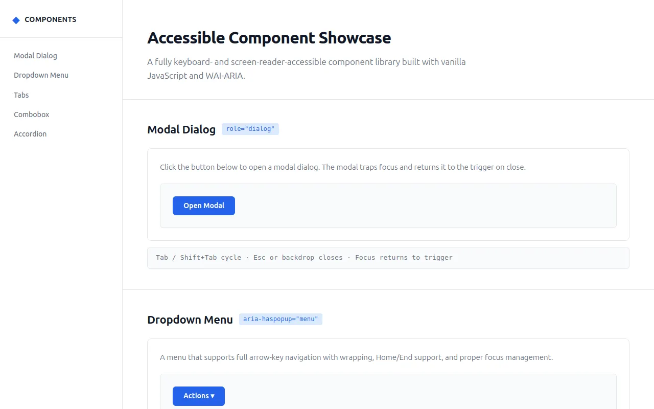
<h1>Accessible Component Showcase</h1>
<p class="subtitle">A fully keyboard- and screen-reader-accessible component library built with vanilla JavaScript and WAI-ARIA.</p>
</header>
<section class="component-section" id="modal">
<div class="section-header">
<h2>Modal Dialog</h2>
<span class="badge">role="dialog"</span>
</div>
<div class="component-card" id="modal-demo">
<div class="card-body">
<p>Click the button below to open a modal dialog. The modal traps focus and returns it to the trigger on close.</p>
<div class="demo-area">
<button id="modal-trigger" class="btn btn-primary">Open Modal</button>
</div>
</div>
</div>
<div class="hint">Tab / Shift+Tab cycle · Esc or backdrop closes · Focus returns to trigger</div>
</section>
<section class="component-section" id="dropdown">
<div class="section-header">
<h2>Dropdown Menu</h2>
<span class="badge">aria-haspopup="menu"</span>
</div>
<div class="component-card" id="dropdown-demo">
<div class="card-body">
<p>A menu that supports full arrow-key navigation with wrapping, Home/End support, and proper focus management.</p>
<div class="demo-area">
<div class="dropdown-container" id="dropdown-root">
<button id="dropdown-trigger" class="btn btn-primary" aria-haspopup="menu" aria-expanded="false" aria-controls="dropdown-menu">
Actions ▾
</button>
<ul id="dropdown-menu" class="dropdown-menu" role="menu" aria-label="Actions menu">
<li role="menuitem" tabindex="-1" data-action="edit">Edit</li>
<li role="menuitem" tabindex="-1" data-action="duplicate">Duplicate</li>
<li role="menuitem" tabindex="-1" data-action="share">Share</li>
<li role="separator"></li>
<li role="menuitem" tabindex="-1" data-action="delete" class="menu-danger">Delete</li>
</ul>
</div>
<div id="dropdown-feedback" class="feedback" aria-live="polite"></div>
</div>
</div>
</div>
<div class="hint">↓/Enter/Space open · ↑↓ navigate (wrapping) · Home/End jump · Esc close · Tab dismisses</div>
</section>
<section class="component-section" id="tabs">
<div class="section-header">
<h2>Tabs</h2>
<span class="badge">role="tablist"</span>
</div>
<div class="component-card" id="tabs-demo">
<div class="card-body">
<p>A tabbed interface with correct roving tabindex — only the active tab is in the tab order.</p>
<div class="demo-area">
<div id="tabs-root" class="tabs-root">
<div role="tablist" id="tablist" aria-label="Project details" class="tablist">
<button role="tab" id="tab-overview" aria-controls="panel-overview" aria-selected="true" tabindex="0" class="tab">Overview</button>
<button role="tab" id="tab-features" aria-controls="panel-features" aria-selected="false" tabindex="-1" class="tab">Features</button>
<button role="tab" id="tab-reviews" aria-controls="panel-reviews" aria-selected="false" tabindex="-1" class="tab">Reviews</button>
</div>
<div id="panel-overview" role="tabpanel" aria-labelledby="tab-overview" class="tabpanel" tabindex="0">
<h3>Project Overview</h3>
<p>This accessible component showcase demonstrates five interactive UI components built to WAI-ARIA Authoring Practices. Each component is fully keyboard-operable and screen-reader-friendly.</p>
<p><strong>Status:</strong> <span class="status-badge status-active">Production Ready</span></p>
</div>
<div id="panel-features" role="tabpanel" aria-labelledby="tab-features" class="tabpanel" hidden="" tabindex="0">
<h3>Features</h3>
<ul>
<li>Modal dialog with focus trapping and backdrop</li>
<li>Dropdown menu with arrow-key navigation and wrapping</li>
<li>Tab panel interface with roving tabindex</li>
<li>Combobox with aria-activedescendant pattern</li>
<li>Animated accordion with reduced-motion support</li>
</ul>
</div>
<div id="panel-reviews" role="tabpanel" aria-labelledby="tab-reviews" class="tabpanel" hidden="" tabindex="0">
<h3>Reviews</h3>
<div class="review-card">
<div class="review-stars">★★★★★</div>
<p>"Finally, a component library that actually works with screen readers!"</p>
<cite>— Accessible Dev Weekly</cite>
</div>
<div class="review-card">
<div class="review-stars">★★★★★</div>
<p>"The keyboard navigation is flawless. This is how it should be done."</p>
<cite>— WCAG Champion Blog</cite>
</div>
</div>
</div>
</div>
</div>
</div>
<div class="hint">←→ switch tabs · Tab moves to panel content · Only active tab is in tab order</div>
</section>
<section class="component-section" id="combobox">
<div class="section-header">
<h2>Combobox</h2>
<span class="badge">aria-activedescendant</span>
</div>
<div class="component-card" id="combobox-demo">
<div class="card-body">
<p>An autocomplete combobox that filters options as you type. Uses aria-activedescendant — the listbox itself is never focusable.</p>
<div class="demo-area">
<div class="combobox-container" id="combobox-root">
<label id="combobox-label" for="combobox-input">Select a country</label>
<div class="combobox-input-wrap">
<input id="combobox-input" role="combobox" type="text" autocomplete="off" aria-labelledby="combobox-label" aria-expanded="false" aria-controls="combobox-listbox" aria-autocomplete="list" aria-activedescendant="" class="combobox-input">
<button id="combobox-clear" class="combobox-clear" aria-label="Clear selection" hidden="" tabindex="-1">✕</button>
</div>
<ul id="combobox-listbox" class="combobox-listbox" role="listbox" aria-label="Country suggestions" hidden=""></ul>
<div id="combobox-feedback" class="feedback" aria-live="polite"></div>
</div>
</div>
</div>
</div>
<div class="hint">Type to filter · ↑↓ highlight · Enter select · Esc close (reverts) · blur dismisses</div>
</section>
<section class="component-section" id="accordion">
<div class="section-header">
<h2>Accordion</h2>
<span class="badge">aria-expanded</span>
</div>
<div class="component-card" id="accordion-demo">
<div class="card-body">
<p>A disclosure group where multiple sections may be open simultaneously. Animations respect prefers-reduced-motion.</p>
<div class="demo-area">
<div class="accordion" id="accordion-root">
<div class="accordion-item">
<button class="accordion-trigger" aria-expanded="false" aria-controls="accordion-panel-1" id="accordion-btn-1">
<span>What makes this component library accessible?</span>
<span class="accordion-icon" aria-hidden="true">+</span>
</button>
<div class="accordion-panel" id="accordion-panel-1" role="region" aria-labelledby="accordion-btn-1" hidden="">
<div class="accordion-content">
<p>Every component follows the WAI-ARIA Authoring Practices Guide. This means proper roles, states, and properties are always kept in sync with visual state. Focus management, keyboard navigation, and screen reader announcements are designed in from the start.</p>
</div>
</div>
</div>
<div class="accordion-item">
<button class="accordion-trigger" aria-expanded="false" aria-controls="accordion-panel-2" id="accordion-btn-2">
<span>How does the focus trap work?</span>
<span class="accordion-icon" aria-hidden="true">+</span>
</button>
<div class="accordion-panel" id="accordion-panel-2" role="region" aria-labelledby="accordion-btn-2" hidden="">
<div class="accordion-content">
<p>The focus trap listens for Tab and Shift+Tab key events inside the modal. When focus reaches the last (or first, with Shift+Tab) focusable element, it cycles to the first (or last) instead. On close, focus returns to the trigger button.</p>
</div>
</div>
</div>
<div class="accordion-item">
<button class="accordion-trigger" aria-expanded="false" aria-controls="accordion-panel-3" id="accordion-btn-3">
<span>Does it support reduced motion?</span>
<span class="accordion-icon" aria-hidden="true">+</span>
</button>
<div class="accordion-panel" id="accordion-panel-3" role="region" aria-labelledby="accordion-btn-3" hidden="">
<div class="accordion-content">
<p>Yes. All components check <code>prefers-reduced-motion</code> and skip animations when the user prefers it. For the accordion, this means panels appear/disappear instantly without the height animation.</p>
</div>
</div>
</div>
</div>
</div>
</div>
</div>
<div class="hint">Enter/Space toggle · Multiple panels may be open · Animations skip with reduced motion</div>
</section>
<footer class="page-footer">
<p>Built to <a href="https://www.w3.org/WAI/ARIA/apg/">WAI-ARIA Authoring Practices</a> · Vanilla JavaScript · No dependencies</p>
</footer>
</main>
</div>
<script>
(function () {
'use strict';
var __mods = {};
var __cache = {};
var __map = {"src/main.ts":{"./modal":"src/modal.ts","./dropdown":"src/dropdown.ts","./tabs":"src/tabs.ts","./combobox":"src/combobox.ts","./accordion":"src/accordion.ts"},"src/utils.ts":{"./config":"src/config.ts"},"src/modal.ts":{"./utils":"src/utils.ts"},"src/dropdown.ts":{"./utils":"src/utils.ts"},"src/tabs.ts":{"./utils":"src/utils.ts"},"src/combobox.ts":{"./utils":"src/utils.ts"},"src/accordion.ts":{"./utils":"src/utils.ts"}};
function __require(id) {
if (__cache[id]) return __cache[id].exports;
var module = __cache[id] = { exports: {} };
var factory = __mods[id];
if (!factory) throw new Error("Module not found: " + id);
factory(module.exports, function (spec) {
var target = (__map[id] && __map[id][spec]) || spec;
return __require(target);
}, module);
return module.exports;
}
// ── module: src/main.ts ──
__mods["src/main.ts"] = function (exports, require, module) {
"use strict";
Object.defineProperty(exports, "__esModule", { value: true });
// ── Entry Point ──────────────────────────────────────────────
const modal_1 = require("./modal");
const dropdown_1 = require("./dropdown");
const tabs_1 = require("./tabs");
const combobox_1 = require("./combobox");
const accordion_1 = require("./accordion");
// Initialize all components
(0, modal_1.initModal)();
(0, dropdown_1.initDropdown)();
(0, tabs_1.initTabs)();
(0, combobox_1.initCombobox)();
(0, accordion_1.initAccordion)();
};
// ── module: src/config.ts ──
__mods["src/config.ts"] = function (exports, require, module) {
"use strict";
// ── Design Tokens & Tunable Constants ────────────────────────────
Object.defineProperty(exports, "__esModule", { value: true });
exports.monoFont = exports.fontFamily = exports.anim = exports.radius = exports.spacing = exports.colors = void 0;
exports.colors = {
bg: '#ffffff',
bgPage: '#f6f8fa',
bgSidebar: '#ffffff',
bgCard: '#ffffff',
bgOverlay: 'rgba(0,0,0,0.35)',
bgHover: '#f3f4f6',
bgActive: '#e5e7eb',
bgPanel: '#f9fafb',
border: '#e5e7eb',
borderStrong: '#d1d5db',
text: '#111827',
textMuted: '#6b7280',
textLight: '#9ca3af',
accent: '#2563eb',
accentHover: '#1d4ed8',
accentLight: '#dbeafe',
focusRing: '#2563eb',
success: '#059669',
white: '#ffffff',
};
exports.spacing = {
xs: '4px',
sm: '8px',
md: '16px',
lg: '24px',
xl: '32px',
xxl: '48px',
};
exports.radius = {
sm: '4px',
md: '8px',
lg: '12px',
};
exports.anim = {
duration: 150, // ms for most transitions
modalDuration: 200, // ms for modal overlay
accordionDuration: 250, // ms for accordion height
};
exports.fontFamily = "'Inter', -apple-system, BlinkMacSystemFont, 'Segoe UI', Roboto, sans-serif";
exports.monoFont = "'JetBrains Mono', 'Fira Code', 'Cascadia Code', monospace";
};
// ── module: src/utils.ts ──
__mods["src/utils.ts"] = function (exports, require, module) {
"use strict";
Object.defineProperty(exports, "__esModule", { value: true });
exports.prefersReducedMotion = prefersReducedMotion;
exports.getFocusableElements = getFocusableElements;
exports.createFocusTrap = createFocusTrap;
exports.announce = announce;
exports.ensureVisible = ensureVisible;
exports.el = el;
exports.animateHeight = animateHeight;
// Check user preference for reduced motion
function prefersReducedMotion() {
return window.matchMedia('(prefers-reduced-motion: reduce)').matches;
}
// Get focusable elements within a container
function getFocusableElements(container) {
const selectors = [
'a[href]',
'button:not([disabled])',
'input:not([disabled])',
'select:not([disabled])',
'textarea:not([disabled])',
'[tabindex]:not([tabindex="-1"])',
'[contenteditable]',
];
return Array.from(container.querySelectorAll(selectors.join(', ')));
}
// Focus-trap helper: keeps focus cycling within a container
function createFocusTrap(container) {
const focusables = () => getFocusableElements(container).filter(el => {
const style = getComputedStyle(el);
return style.display !== 'none' && style.visibility !== 'hidden' && !el.hidden;
});
let active = true;
const handler = (e) => {
if (!active)
return;
if (e.key !== 'Tab')
return;
const els = focusables();
if (!els.length)
return;
const first = els[0];
const last = els[els.length - 1];
if (e.shiftKey) {
if (document.activeElement === first || !container.contains(document.activeElement)) {
e.preventDefault();
last.focus();
}
}
else {
if (document.activeElement === last || !container.contains(document.activeElement)) {
e.preventDefault();
first.focus();
}
}
};
container.addEventListener('keydown', handler);
return {
destroy() {
container.removeEventListener('keydown', handler);
},
deactivate() {
active = false;
},
activate() {
active = true;
},
};
}
// Announce a message to screen readers
function announce(msg) {
let el = document.getElementById('sr-announcer');
if (!el) {
el = document.createElement('div');
el.id = 'sr-announcer';
el.setAttribute('role', 'status');
el.setAttribute('aria-live', 'polite');
el.setAttribute('aria-atomic', 'true');
el.className = 'sr-only';
document.body.appendChild(el);
}
// Clear then set to trigger announcement
el.textContent = '';
requestAnimationFrame(() => {
el.textContent = msg;
});
}
// Smooth-scroll an element into view if it's outside the visible container
function ensureVisible(target, container) {
const tRect = target.getBoundingClientRect();
const cRect = container.getBoundingClientRect();
if (tRect.bottom > cRect.bottom) {
container.scrollTop += (tRect.bottom - cRect.bottom);
}
else if (tRect.top < cRect.top) {
container.scrollTop -= (cRect.top - tRect.top);
}
}
// Create a DOM element with attributes and text content
function el(tag, attrs = {}, text) {
const element = document.createElement(tag);
for (const [k, v] of Object.entries(attrs)) {
element.setAttribute(k, v);
}
if (text !== undefined)
element.textContent = text;
return element;
}
// Animate height open/close
function animateHeight(element, open, durationMs) {
return new Promise(resolve => {
if (open) {
element.removeAttribute('hidden');
const start = 0;
const end = element.scrollHeight;
element.style.height = '0px';
element.style.overflow = 'hidden';
requestAnimationFrame(() => {
const startTime = performance.now();
function tick(now) {
const progress = Math.min((now - startTime) / durationMs, 1);
const eased = easeOutCubic(progress);
element.style.height = `${start + (end - start) * eased}px`;
if (progress < 1) {
requestAnimationFrame(tick);
}
else {
element.style.height = '';
element.style.overflow = '';
resolve();
}
}
requestAnimationFrame(tick);
});
}
else {
const start = element.scrollHeight;
element.style.height = `${start}px`;
element.style.overflow = 'hidden';
// Force reflow
element.offsetHeight;
requestAnimationFrame(() => {
const startTime = performance.now();
function tick(now) {
const progress = Math.min((now - startTime) / durationMs, 1);
const eased = easeOutCubic(progress);
element.style.height = `${start * (1 - eased)}px`;
if (progress < 1) {
requestAnimationFrame(tick);
}
else {
element.style.height = '';
element.style.overflow = '';
element.setAttribute('hidden', '');
resolve();
}
}
requestAnimationFrame(tick);
});
}
});
}
function easeOutCubic(t) {
return 1 - Math.pow(1 - t, 3);
}
};
// ── module: src/modal.ts ──
__mods["src/modal.ts"] = function (exports, require, module) {
"use strict";
Object.defineProperty(exports, "__esModule", { value: true });
exports.initModal = initModal;
// ── Modal Dialog Component ───────────────────────────────────
const utils_1 = require("./utils");
function initModal() {
const trigger = document.getElementById('modal-trigger');
if (!trigger)
return;
// Create modal overlay and dialog dynamically
const overlay = document.createElement('div');
overlay.className = 'modal-overlay';
overlay.setAttribute('aria-hidden', 'true');
const dialog = document.createElement('div');
dialog.className = 'modal-dialog';
dialog.setAttribute('role', 'dialog');
dialog.setAttribute('aria-modal', 'true');
dialog.setAttribute('aria-labelledby', 'modal-title');
dialog.setAttribute('aria-describedby', 'modal-desc');
const header = document.createElement('div');
header.className = 'modal-header';
const title = document.createElement('h3');
title.id = 'modal-title';
title.textContent = 'Dialog Title';
const closeBtn = document.createElement('button');
closeBtn.className = 'modal-close';
closeBtn.setAttribute('aria-label', 'Close dialog');
closeBtn.textContent = '×';
header.appendChild(title);
header.appendChild(closeBtn);
const body = document.createElement('div');
body.className = 'modal-body';
body.id = 'modal-desc';
body.innerHTML = `
<p>This is an accessible modal dialog. While it's open, keyboard focus is trapped inside the dialog — pressing Tab or Shift+Tab cycles through the focusable elements.</p>
<p>The page behind the modal is inert and cannot receive focus. Press Escape, click the backdrop, or use the close button to dismiss.</p>
`;
const footer = document.createElement('div');
footer.className = 'modal-footer';
const confirmBtn = document.createElement('button');
confirmBtn.className = 'btn btn-primary';
confirmBtn.textContent = 'Confirm';
const cancelBtn = document.createElement('button');
cancelBtn.className = 'btn btn-secondary';
cancelBtn.textContent = 'Cancel';
footer.appendChild(cancelBtn);
footer.appendChild(confirmBtn);
dialog.appendChild(header);
dialog.appendChild(body);
dialog.appendChild(footer);
overlay.appendChild(dialog);
document.body.appendChild(overlay);
let focusTrap = null;
function open() {
overlay.setAttribute('aria-hidden', 'false');
overlay.style.display = 'flex';
document.body.style.overflow = 'hidden';
// Allow the display:flex to take effect before adding open class
requestAnimationFrame(() => {
if (!(0, utils_1.prefersReducedMotion)()) {
overlay.classList.add('modal-open');
}
});
// Create focus trap
focusTrap = (0, utils_1.createFocusTrap)(overlay);
// Focus the first focusable element
requestAnimationFrame(() => {
closeBtn.focus();
});
(0, utils_1.announce)('Dialog opened. Focus is trapped within the dialog.');
}
function close() {
overlay.classList.remove('modal-open');
const duration = (0, utils_1.prefersReducedMotion)() ? 0 : 200;
setTimeout(() => {
overlay.style.display = 'none';
overlay.setAttribute('aria-hidden', 'true');
document.body.style.overflow = '';
// Destroy focus trap
if (focusTrap) {
focusTrap.destroy();
focusTrap = null;
}
// Return focus to trigger
trigger.focus();
(0, utils_1.announce)('Dialog closed.');
}, duration);
}
// Trigger button
trigger.addEventListener('click', open);
// Close button
closeBtn.addEventListener('click', close);
// Confirm and Cancel
confirmBtn.addEventListener('click', () => {
(0, utils_1.announce)('Action confirmed.');
close();
});
cancelBtn.addEventListener('click', close);
// Backdrop click
overlay.addEventListener('click', (e) => {
if (e.target === overlay)
close();
});
// Escape key
overlay.addEventListener('keydown', (e) => {
if (e.key === 'Escape')
close();
});
}
};
// ── module: src/dropdown.ts ──
__mods["src/dropdown.ts"] = function (exports, require, module) {
"use strict";
Object.defineProperty(exports, "__esModule", { value: true });
exports.initDropdown = initDropdown;
// ── Dropdown Menu Component ──────────────────────────────────
const utils_1 = require("./utils");
function initDropdown() {
const trigger = document.getElementById('dropdown-trigger');
const menu = document.getElementById('dropdown-menu');
const feedback = document.getElementById('dropdown-feedback');
if (!trigger || !menu)
return;
const state = {
trigger,
menu,
items: menu.querySelectorAll('[role="menuitem"]'),
isOpen: false,
activeIndex: -1,
};
function setActiveIndex(index) {
// Remove active class from current
if (state.activeIndex >= 0 && state.activeIndex < state.items.length) {
state.items[state.activeIndex].classList.remove('active');
}
state.activeIndex = index;
// Add active class to new
if (state.activeIndex >= 0 && state.activeIndex < state.items.length) {
state.items[state.activeIndex].classList.add('active');
}
}
function open() {
state.isOpen = true;
trigger.setAttribute('aria-expanded', 'true');
menu.classList.add('dropdown-open');
setActiveIndex(0);
(0, utils_1.announce)('Menu opened');
}
function close(returnFocus = true) {
state.isOpen = false;
trigger.setAttribute('aria-expanded', 'false');
menu.classList.remove('dropdown-open');
setActiveIndex(-1);
if (returnFocus) {
trigger.focus();
}
(0, utils_1.announce)('Menu closed');
}
function selectItem(index) {
const item = state.items[index];
if (!item)
return;
const action = item.getAttribute('data-action') || item.textContent || 'unknown';
close(true);
feedback.textContent = `Action performed: ${action}`;
(0, utils_1.announce)(`Selected: ${action}`);
setTimeout(() => { feedback.textContent = ''; }, 2000);
}
// Trigger click
trigger.addEventListener('click', () => {
if (state.isOpen) {
close(true);
}
else {
open();
}
});
// Trigger keyboard
trigger.addEventListener('keydown', (e) => {
if (e.key === 'ArrowDown' || e.key === 'Down') {
e.preventDefault();
if (!state.isOpen)
open();
// Focus first item
setActiveIndex(0);
state.items[0]?.focus();
}
else if (e.key === 'Enter' || e.key === ' ') {
e.preventDefault();
if (!state.isOpen)
open();
else
close(true);
}
else if (e.key === 'Escape' && state.isOpen) {
e.preventDefault();
close(true);
}
});
// Menu keyboard
menu.addEventListener('keydown', (e) => {
if (!state.isOpen)
return;
const len = state.items.length;
switch (e.key) {
case 'ArrowDown':
case 'Down':
e.preventDefault();
if (state.activeIndex < len - 1) {
setActiveIndex(state.activeIndex + 1);
}
else {
setActiveIndex(0); // wrap
}
state.items[state.activeIndex]?.focus();
break;
case 'ArrowUp':
case 'Up':
e.preventDefault();
if (state.activeIndex > 0) {
setActiveIndex(state.activeIndex - 1);
}
else {
setActiveIndex(len - 1); // wrap
}
state.items[state.activeIndex]?.focus();
break;
case 'Home':
e.preventDefault();
setActiveIndex(0);
state.items[0]?.focus();
break;
case 'End':
e.preventDefault();
setActiveIndex(len - 1);
state.items[len - 1]?.focus();
break;
case 'Enter':
case ' ':
e.preventDefault();
if (state.activeIndex >= 0) {
selectItem(state.activeIndex);
}
break;
case 'Escape':
e.preventDefault();
close(true);
break;
case 'Tab':
// Tab closes and moves focus naturally
close(false);
break;
}
});
// Menu item clicks
state.items.forEach((item, index) => {
item.addEventListener('click', () => {
selectItem(index);
});
item.addEventListener('mouseenter', () => {
setActiveIndex(index);
});
});
// Close on outside click
document.addEventListener('click', (e) => {
if (state.isOpen && !menu.contains(e.target) && e.target !== trigger) {
close(false);
}
});
}
};
// ── module: src/tabs.ts ──
__mods["src/tabs.ts"] = function (exports, require, module) {
"use strict";
Object.defineProperty(exports, "__esModule", { value: true });
exports.initTabs = initTabs;
// ── Tabs Component ───────────────────────────────────────────
const utils_1 = require("./utils");
function initTabs() {
const tablist = document.getElementById('tablist');
if (!tablist)
return;
const tabs = Array.from(tablist.querySelectorAll('button[role="tab"]'));
if (!tabs.length)
return;
function activateTab(tab) {
// Deactivate all tabs
tabs.forEach(t => {
t.setAttribute('aria-selected', 'false');
t.setAttribute('tabindex', '-1');
const panelId = t.getAttribute('aria-controls');
if (panelId) {
const panel = document.getElementById(panelId);
if (panel)
panel.setAttribute('hidden', '');
}
});
// Activate the selected tab
tab.setAttribute('aria-selected', 'true');
tab.setAttribute('tabindex', '0');
const panelId = tab.getAttribute('aria-controls');
if (panelId) {
const panel = document.getElementById(panelId);
if (panel)
panel.removeAttribute('hidden');
}
(0, utils_1.announce)(`Tab activated: ${tab.textContent}`);
}
// Tab click
tabs.forEach(tab => {
tab.addEventListener('click', () => {
activateTab(tab);
tab.focus();
});
});
// Tablist keyboard
tablist.addEventListener('keydown', (e) => {
const currentTab = document.activeElement;
const currentIndex = tabs.indexOf(currentTab);
if (currentIndex === -1)
return;
let targetIndex = -1;
switch (e.key) {
case 'ArrowRight':
case 'Right':
e.preventDefault();
targetIndex = (currentIndex + 1) % tabs.length;
break;
case 'ArrowLeft':
case 'Left':
e.preventDefault();
targetIndex = (currentIndex - 1 + tabs.length) % tabs.length;
break;
case 'Home':
e.preventDefault();
targetIndex = 0;
break;
case 'End':
e.preventDefault();
targetIndex = tabs.length - 1;
break;
default:
return;
}
if (targetIndex >= 0) {
activateTab(tabs[targetIndex]);
tabs[targetIndex].focus();
}
});
}
};
// ── module: src/combobox.ts ──
__mods["src/combobox.ts"] = function (exports, require, module) {
"use strict";
Object.defineProperty(exports, "__esModule", { value: true });
exports.initCombobox = initCombobox;
// ── Combobox (Autocomplete) Component ───────────────────────
const utils_1 = require("./utils");
const COUNTRIES = [
'Australia', 'Austria', 'Bangladesh', 'Belgium', 'Brazil',
'Canada', 'Chile', 'China', 'Colombia', 'Czech Republic',
'Denmark', 'Egypt', 'Finland', 'France', 'Germany',
'Greece', 'India', 'Indonesia', 'Ireland', 'Italy',
'Japan', 'Kenya', 'Malaysia', 'Mexico', 'Netherlands',
'New Zealand', 'Nigeria', 'Norway', 'Pakistan', 'Poland',
'Portugal', 'Romania', 'Russia', 'Singapore', 'South Africa',
'South Korea', 'Spain', 'Sweden', 'Switzerland', 'Thailand',
'Turkey', 'Ukraine', 'United Kingdom', 'United States', 'Vietnam',
];
function initCombobox() {
const input = document.getElementById('combobox-input');
const listbox = document.getElementById('combobox-listbox');
const clearBtn = document.getElementById('combobox-clear');
const feedback = document.getElementById('combobox-feedback');
if (!input || !listbox)
return;
const state = {
input,
listbox,
options: [],
clearBtn,
isOpen: false,
activeIndex: -1,
originalValue: '',
filteredItems: [],
};
function createOption(text, id) {
const li = document.createElement('li');
li.id = id;
li.setAttribute('role', 'option');
li.setAttribute('aria-selected', 'false');
li.textContent = text;
li.setAttribute('data-value', text);
return li;
}
function filterAndRender() {
const query = input.value.toLowerCase().trim();
state.filteredItems = COUNTRIES.filter(c => c.toLowerCase().includes(query)).slice(0, 10);
listbox.innerHTML = '';
if (state.filteredItems.length === 0) {
close();
return;
}
state.filteredItems.forEach((item, i) => {
const option = createOption(item, `combobox-option-${i}`);
listbox.appendChild(option);
option.addEventListener('click', () => {
selectItem(i);
});
option.addEventListener('mouseenter', () => {
setActiveIndex(i);
});
});
state.options = listbox.querySelectorAll('[role="option"]');
state.activeIndex = -1;
open();
const count = state.filteredItems.length;
(0, utils_1.announce)(`${count} result${count !== 1 ? 's' : ''} available`);
}
function open() {
state.isOpen = true;
listbox.removeAttribute('hidden');
input.setAttribute('aria-expanded', 'true');
}
function close() {
state.isOpen = false;
listbox.setAttribute('hidden', '');
input.setAttribute('aria-expanded', 'false');
input.setAttribute('aria-activedescendant', '');
state.activeIndex = -1;
}
function setActiveIndex(index) {
if (state.activeIndex >= 0 && state.activeIndex < state.options.length) {
state.options[state.activeIndex].setAttribute('aria-selected', 'false');
}
state.activeIndex = index;
if (state.activeIndex >= 0 && state.activeIndex < state.options.length) {
const active = state.options[state.activeIndex];
active.setAttribute('aria-selected', 'true');
input.setAttribute('aria-activedescendant', active.id);
(0, utils_1.ensureVisible)(active, listbox);
}
else {
input.setAttribute('aria-activedescendant', '');
}
}
function selectItem(index) {
const option = state.options[index];
if (!option)
return;
const value = option.getAttribute('data-value') || option.textContent || '';
input.value = value;
state.originalValue = value;
close();
updateClearButton();
feedback.textContent = `Selected: ${value}`;
(0, utils_1.announce)(`Selected ${value}`);
setTimeout(() => { feedback.textContent = ''; }, 2000);
}
function updateClearButton() {
if (input.value) {
clearBtn.hidden = false;
}
else {
clearBtn.hidden = true;
}
}
// Input events
input.addEventListener('input', () => {
state.originalValue = input.value;
updateClearButton();
filterAndRender();
});
input.addEventListener('focus', () => {
if (input.value) {
filterAndRender();
}
updateClearButton();
});
input.addEventListener('blur', () => {
// Delay to allow click on option to fire first
setTimeout(() => {
if (!listbox.contains(document.activeElement)) {
close();
}
}, 100);
});
input.addEventListener('keydown', (e) => {
if (!state.isOpen && e.key !== 'ArrowDown' && e.key !== 'ArrowUp')
return;
switch (e.key) {
case 'ArrowDown':
case 'Down':
e.preventDefault();
if (!state.isOpen) {
filterAndRender();
}
else {
setActiveIndex(state.activeIndex < state.options.length - 1 ? state.activeIndex + 1 : state.activeIndex);
}
break;
case 'ArrowUp':
case 'Up':
e.preventDefault();
if (state.isOpen) {
setActiveIndex(state.activeIndex > 0 ? state.activeIndex - 1 : state.activeIndex);
}
break;
case 'Enter':
e.preventDefault();
if (state.isOpen && state.activeIndex >= 0) {
selectItem(state.activeIndex);
}
break;
case 'Escape':
e.preventDefault();
close();
input.value = state.originalValue;
(0, utils_1.announce)('List closed');
break;
case 'Tab':
close();
break;
}
});
// Clear button
clearBtn.addEventListener('click', () => {
input.value = '';
state.originalValue = '';
updateClearButton();
close();
input.focus();
(0, utils_1.announce)('Selection cleared');
});
}
};
// ── module: src/accordion.ts ──
__mods["src/accordion.ts"] = function (exports, require, module) {
"use strict";
Object.defineProperty(exports, "__esModule", { value: true });
exports.initAccordion = initAccordion;
// ── Accordion / Disclosure Group Component ──────────────────
const utils_1 = require("./utils");
function initAccordion() {
const root = document.getElementById('accordion-root');
if (!root)
return;
const triggers = root.querySelectorAll('.accordion-trigger');
triggers.forEach(trigger => {
let animating = false;
const pendingQueue = [];
let queueFlush = false;
async function toggle() {
if (animating) {
pendingQueue.push(true); // mark that another toggle was requested
return;
}
animating = true;
const expanded = trigger.getAttribute('aria-expanded') === 'true';
const panelId = trigger.getAttribute('aria-controls');
const panel = panelId ? document.getElementById(panelId) : null;
if (!panel) {
animating = false;
return;
}
const newState = !expanded;
if (newState) {
trigger.setAttribute('aria-expanded', 'true');
}
else {
trigger.setAttribute('aria-expanded', 'false');
}
const noAnim = (0, utils_1.prefersReducedMotion)();
if (noAnim) {
if (newState) {
panel.removeAttribute('hidden');
}
else {
panel.setAttribute('hidden', '');
}
}
else {
await (0, utils_1.animateHeight)(panel, newState, 250);
}
animating = false;
// Process any queued toggles
if (pendingQueue.length > 0) {
const wasRequested = pendingQueue.pop();
if (wasRequested) {
await toggle();
}
}
}
trigger.addEventListener('click', () => {
pendingQueue.push(false);
toggle();
});
});
}
};
// ── entry ──
__require("src/main.ts");
})();
</script>
</body>
</html>
<!-- agent-meta {"model":"Qwen3.6-27B-MTP-GGUF","provider":"brigid","persona":"typescript","sessionId":"526d0bb5-a85a-4d03-9306-a79fe810c09c","tokensIn":934113,"tokensOut":28464,"tokensTotal":962577,"cost":0,"turns":38,"toolCalls":37,"failedToolCalls":2,"timestamp":"2026-08-02T06:21:13.385Z"} -->