Accessible Components
Qwen 3.6 27b MTP · typescript
Reviews & generation details
Reviews
No human review yet. Unreviewed does not mean unsuccessful.
Generation context
Imported historical artifact. Its exact original instructions and lineage are not known.
Generation prompt · exact text unavailable
See the current prompt for reference. It may differ from the instructions used to generate this artifact.
Inspect original source 52,098 bytes · SHA-256 b3a8f9182ee1
<!doctype html>
<html lang="en">
<head>
<meta charset="utf-8">
<meta name="viewport" content="width=device-width, initial-scale=1">
<title>Accessible Component Showcase</title>
<style>
/* ── css: base ── */
/* === Design Tokens === */
:root {
--color-bg: #fafafa;
--color-surface: #ffffff;
--color-border: #e2e4e8;
--color-text: #1a1d23;
--color-text-secondary: #5f6b7a;
--color-accent: #2563eb;
--color-accent-hover: #1d4ed8;
--color-accent-light: #eff6ff;
--color-focus-ring: rgba(37, 99, 235, 0.4);
--color-overlay: rgba(0, 0, 0, 0.5);
--radius-sm: 6px;
--radius-md: 10px;
--spacing-xs: 4px;
--spacing-sm: 8px;
--spacing-md: 16px;
--spacing-lg: 24px;
--spacing-xl: 32px;
--spacing-xxl: 48px;
--font-sans: -apple-system, BlinkMacSystemFont, "Segoe UI", Roboto, "Helvetica Neue", Arial, sans-serif;
--font-mono: "SF Mono", "Fira Code", "Cascadia Code", Consolas, monospace;
--transition-fast: 120ms ease;
--transition-normal: 200ms ease;
}
/* === Reset & Base === */
*, *::before, *::after { box-sizing: border-box; margin: 0; padding: 0; }
html {
font-size: 16px;
scroll-behavior: smooth;
-webkit-text-size-adjust: 100%;
}
body {
font-family: var(--font-sans);
color: var(--color-text);
background: var(--color-bg);
line-height: 1.6;
min-height: 100vh;
}
/* === Skip Link === */
.skip-link {
position: absolute;
top: -100%;
left: var(--spacing-md);
background: var(--color-accent);
color: #fff;
padding: var(--spacing-sm) var(--spacing-md);
border-radius: var(--radius-sm);
font-weight: 600;
z-index: 10000;
text-decoration: none;
transition: top var(--transition-fast);
}
.skip-link:focus {
top: var(--spacing-md);
outline: 3px solid var(--color-focus-ring);
outline-offset: 2px;
}
/* === Focus Indicators (Global) === */
*:focus-visible {
outline: 3px solid var(--color-accent);
outline-offset: 2px;
}
button:focus-visible,
a:focus-visible,
input:focus-visible,
[tabindex]:focus-visible {
outline: 3px solid var(--color-accent);
outline-offset: 2px;
}
/* === Reduced Motion === */
@media (prefers-reduced-motion: reduce) {
*, *::before, *::after {
animation-duration: 0.01ms !important;
animation-iteration-count: 1 !important;
transition-duration: 0.01ms !important;
scroll-behavior: auto !important;
}
}
/* === Buttons (Shared) === */
.btn {
display: inline-flex;
align-items: center;
gap: var(--spacing-sm);
padding: 8px 16px;
font-size: 0.9375rem;
font-family: inherit;
font-weight: 500;
line-height: 1.4;
border: 2px solid transparent;
border-radius: var(--radius-sm);
cursor: pointer;
transition: background var(--transition-fast), border-color var(--transition-fast), box-shadow var(--transition-fast);
}
.btn-primary {
background: var(--color-accent);
color: #fff;
}
.btn-primary:hover { background: var(--color-accent-hover); }
.btn-secondary {
background: var(--color-surface);
color: var(--color-text);
border-color: var(--color-border);
}
.btn-secondary:hover { border-color: var(--color-accent); color: var(--color-accent); }
.btn-icon {
padding: 4px;
background: none;
border: none;
cursor: pointer;
display: inline-flex;
align-items: center;
}
/* === Keyboard Hint Badges === */
.kbd-group {
font-size: 0.8125rem;
color: var(--color-text-secondary);
background: var(--color-accent-light);
padding: 3px 10px;
border-radius: 99px;
font-family: var(--font-mono);
white-space: nowrap;
}
code {
font-family: var(--font-mono);
background: #f1f3f5;
padding: 2px 6px;
border-radius: 4px;
font-size: 0.875em;
}
/* ── css: layout ── */
/* === Layout === */
.layout {
display: flex;
min-height: 100vh;
}
.sidebar {
position: sticky;
top: 0;
width: 240px;
min-width: 240px;
height: 100vh;
background: var(--color-surface);
border-right: 1px solid var(--color-border);
padding: var(--spacing-xl) var(--spacing-lg);
overflow-y: auto;
}
.sidebar-title {
font-size: 0.75rem;
text-transform: uppercase;
letter-spacing: 0.08em;
color: var(--color-text-secondary);
margin-bottom: var(--spacing-md);
padding-left: var(--spacing-sm);
}
.sidebar-nav {
list-style: none;
}
.sidebar-nav li { margin-bottom: 2px; }
.sidebar-nav a {
display: block;
padding: 6px var(--spacing-sm);
color: var(--color-text-secondary);
text-decoration: none;
font-size: 0.9375rem;
border-radius: var(--radius-sm);
transition: background var(--transition-fast), color var(--transition-fast);
}
.sidebar-nav a:hover {
background: var(--color-accent-light);
color: var(--color-accent);
}
.sidebar-nav a:focus-visible {
outline-offset: -2px;
}
.content {
flex: 1;
max-width: 860px;
padding: var(--spacing-xxl) var(--spacing-xxl) var(--spacing-xxl) var(--spacing-xl);
}
.page-header {
margin-bottom: var(--spacing-xxl);
padding-bottom: var(--spacing-lg);
border-bottom: 2px solid var(--color-border);
}
.page-header h1 {
font-size: 2rem;
font-weight: 700;
letter-spacing: -0.02em;
margin-bottom: var(--spacing-sm);
}
.page-header p {
color: var(--color-text-secondary);
font-size: 1.0625rem;
max-width: 640px;
}
/* === Component Sections === */
.component-section {
margin-bottom: var(--spacing-xxl);
padding-top: var(--spacing-md);
scroll-margin-top: var(--spacing-xl);
}
.section-header {
display: flex;
align-items: center;
gap: var(--spacing-md);
margin-bottom: var(--spacing-sm);
flex-wrap: wrap;
}
.section-header h2 {
font-size: 1.5rem;
font-weight: 700;
letter-spacing: -0.01em;
}
.section-desc {
color: var(--color-text-secondary);
margin-bottom: var(--spacing-lg);
max-width: 640px;
}
.demo-area {
background: var(--color-surface);
border: 1px solid var(--color-border);
border-radius: var(--radius-md);
padding: var(--spacing-xl);
min-height: 80px;
}
/* === Responsive === */
@media (max-width: 768px) {
.layout { flex-direction: column; }
.sidebar {
position: relative;
width: 100%;
height: auto;
border-right: none;
border-bottom: 1px solid var(--color-border);
padding: var(--spacing-md) var(--spacing-lg);
}
.content {
padding: var(--spacing-lg);
}
}
@media (min-resolution: 192dpi) {
/* High-DPI adjustments */
}
/* === Zoom to 200% resilience === */
@media (max-width: 430px) {
.content { padding: var(--spacing-md); }
.demo-area { padding: var(--spacing-md); }
}
/* ── css: components ── */
/* === Modal === */
.modal-overlay {
position: fixed;
inset: 0;
background: var(--color-overlay);
display: flex;
align-items: center;
justify-content: center;
z-index: 1000;
opacity: 0;
transition: opacity var(--transition-normal);
}
.modal-overlay.open { opacity: 1; }
.modal-dialog {
background: var(--color-surface);
border-radius: var(--radius-md);
box-shadow: 0 25px 60px rgba(0,0,0,0.15), 0 4px 12px rgba(0,0,0,0.08);
max-width: 520px;
width: calc(100% - var(--spacing-xl));
max-height: 90vh;
overflow-y: auto;
transform: translateY(20px) scale(0.97);
transition: transform var(--transition-normal);
}
.modal-overlay.open .modal-dialog {
transform: translateY(0) scale(1);
}
.modal-header {
display: flex;
align-items: center;
justify-content: space-between;
padding: var(--spacing-lg) var(--spacing-xl);
border-bottom: 1px solid var(--color-border);
}
.modal-header h3 {
font-size: 1.25rem;
font-weight: 600;
}
.modal-close-btn {
background: none;
border: none;
cursor: pointer;
padding: 4px;
display: flex;
align-items: center;
justify-content: center;
color: var(--color-text-secondary);
transition: color var(--transition-fast);
}
.modal-close-btn:hover { color: var(--color-text); }
.modal-body { padding: var(--spacing-xl); }
.modal-footer {
display: flex;
justify-content: flex-end;
gap: var(--spacing-sm);
padding: var(--spacing-md) var(--spacing-xl) var(--spacing-lg);
border-top: 1px solid var(--color-border);
}
/* === Dropdown Menu === */
.dropdown-wrapper { position: relative; display: inline-block; }
.dropdown-menu {
position: absolute;
top: calc(100% + 4px);
left: 0;
min-width: 200px;
background: var(--color-surface);
border: 1px solid var(--color-border);
border-radius: var(--radius-sm);
box-shadow: 0 8px 24px rgba(0,0,0,0.1), 0 2px 6px rgba(0,0,0,0.05);
padding: 4px;
z-index: 100;
list-style: none;
opacity: 0;
visibility: hidden;
transform: translateY(-8px);
transition: opacity var(--transition-fast), transform var(--transition-fast), visibility var(--transition-fast);
}
.dropdown-menu.open {
opacity: 1;
visibility: visible;
transform: translateY(0);
}
.dropdown-menu-item {
display: block;
width: 100%;
padding: 8px 12px;
font-size: 0.9375rem;
font-family: inherit;
background: none;
border: none;
border-radius: var(--radius-sm);
cursor: pointer;
text-align: left;
color: var(--color-text);
transition: background var(--transition-fast), color var(--transition-fast);
}
.dropdown-menu-item:hover,
.dropdown-menu-item.active {
background: var(--color-accent-light);
color: var(--color-accent);
}
/* === Tabs === */
.tabs-container { width: 100%; }
.tablist {
display: flex;
gap: 2px;
border-bottom: 2px solid var(--color-border);
margin-bottom: var(--spacing-lg);
}
.tab-btn {
padding: 10px 20px;
font-size: 0.9375rem;
font-family: inherit;
font-weight: 500;
background: none;
border: none;
border-bottom: 2px solid transparent;
margin-bottom: -2px;
cursor: pointer;
color: var(--color-text-secondary);
transition: color var(--transition-fast), border-color var(--transition-fast);
}
.tab-btn:hover { color: var(--color-text); }
.tab-btn[aria-selected="true"] {
color: var(--color-accent);
border-bottom-color: var(--color-accent);
font-weight: 600;
}
.tab-panel { display: none; }
.tab-panel:not([hidden]) { display: block; }
/* === Combobox === */
.combobox-wrapper { position: relative; max-width: 400px; width: 100%; }
.combobox-input {
width: 100%;
padding: 10px 14px;
font-size: 0.9375rem;
font-family: inherit;
border: 2px solid var(--color-border);
border-radius: var(--radius-sm);
background: var(--color-surface);
color: var(--color-text);
transition: border-color var(--transition-fast), box-shadow var(--transition-fast);
}
.combobox-input:focus {
border-color: var(--color-accent);
box-shadow: 0 0 0 3px var(--color-focus-ring);
outline: none;
}
.combobox-listbox {
position: absolute;
top: calc(100% + 4px);
left: 0;
right: 0;
max-height: 220px;
overflow-y: auto;
background: var(--color-surface);
border: 1px solid var(--color-border);
border-radius: var(--radius-sm);
box-shadow: 0 8px 24px rgba(0,0,0,0.1), 0 2px 6px rgba(0,0,0,0.05);
z-index: 100;
list-style: none;
padding: 4px;
}
.combobox-option {
padding: 8px 12px;
font-size: 0.9375rem;
border-radius: var(--radius-sm);
cursor: pointer;
transition: background var(--transition-fast);
}
.combobox-option:hover { background: #f1f3f5; }
.combobox-option.active {
background: var(--color-accent-light);
color: var(--color-accent);
}
/* === Accordion === */
.accordion-item {
border-bottom: 1px solid var(--color-border);
}
.accordion-trigger {
display: flex;
align-items: center;
justify-content: space-between;
width: 100%;
padding: var(--spacing-md) 0;
font-size: 1rem;
font-family: inherit;
font-weight: 600;
background: none;
border: none;
cursor: pointer;
color: var(--color-text);
text-align: left;
transition: color var(--transition-fast);
}
.accordion-trigger:hover { color: var(--color-accent); }
.accordion-chevron {
display: inline-flex;
transition: transform var(--transition-normal);
flex-shrink: 0;
margin-left: var(--spacing-md);
}
.accordion-trigger[aria-expanded="true"] .accordion-chevron {
transform: rotate(180deg);
}
.accordion-region-wrapper {
overflow: hidden;
transition: height var(--transition-normal);
}
.accordion-region {
padding: 0 0 var(--spacing-md) 0;
color: var(--color-text-secondary);
line-height: 1.7;
}
/* === Demo Action Feedback === */
.action-feedback {
margin-top: var(--spacing-md);
padding: var(--spacing-sm) var(--spacing-md);
background: #f0fdf4;
border: 1px solid #bbf7d0;
border-radius: var(--radius-sm);
font-size: 0.875rem;
color: #166534;
}
.action-feedback[hidden] { display: none; }
</style>
</head>
<body>
<a class="skip-link" id="skip-link" href="#main-content">Skip to main content</a>
<div class="layout">
<nav class="sidebar" aria-label="Component navigation">
<h1 class="sidebar-title">Components</h1>
<ul class="sidebar-nav">
<li><a href="#modal-section">Modal Dialog</a></li>
<li><a href="#dropdown-section">Dropdown Menu</a></li>
<li><a href="#tabs-section">Tabs</a></li>
<li><a href="#combobox-section">Combobox</a></li>
<li><a href="#accordion-section">Accordion</a></li>
</ul>
</nav>
<main id="main-content" class="content">
<header class="page-header">
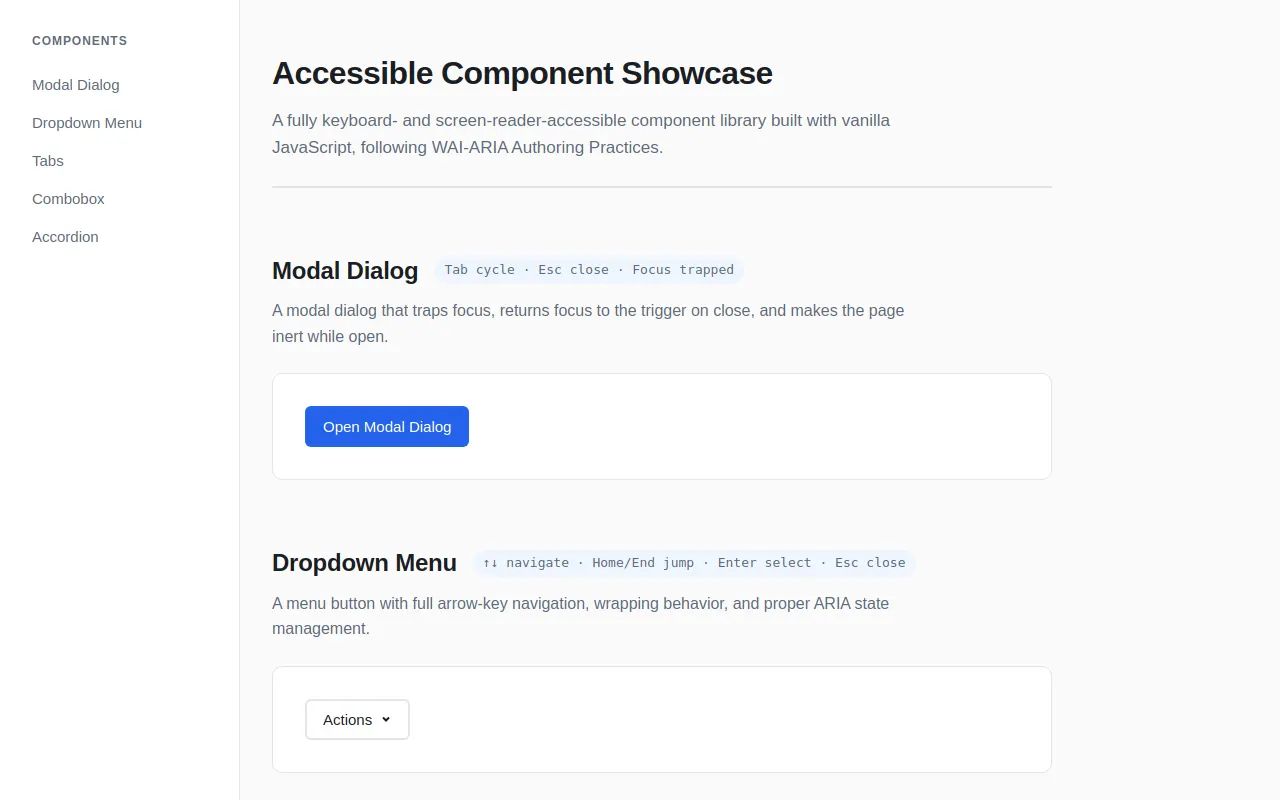
<h1>Accessible Component Showcase</h1>
<p>A fully keyboard- and screen-reader-accessible component library built with vanilla JavaScript, following WAI-ARIA Authoring Practices.</p>
</header>
<!-- Modal Section -->
<section id="modal-section" class="component-section">
<div class="section-header">
<h2>Modal Dialog</h2>
<span class="kbd-group">Tab cycle · Esc close · Focus trapped</span>
</div>
<p class="section-desc">A modal dialog that traps focus, returns focus to the trigger on close, and makes the page inert while open.</p>
<div id="modal-demo" class="demo-area"></div>
</section>
<!-- Dropdown Section -->
<section id="dropdown-section" class="component-section">
<div class="section-header">
<h2>Dropdown Menu</h2>
<span class="kbd-group">↑↓ navigate · Home/End jump · Enter select · Esc close</span>
</div>
<p class="section-desc">A menu button with full arrow-key navigation, wrapping behavior, and proper ARIA state management.</p>
<div id="dropdown-demo" class="demo-area"></div>
</section>
<!-- Tabs Section -->
<section id="tabs-section" class="component-section">
<div class="section-header">
<h2>Tabs</h2>
<span class="kbd-group">←→ switch · Only active tab in tab order</span>
</div>
<p class="section-desc">Tab panels with roving tabindex — only the active tab is focusable. Hidden panels use the <code>hidden</code> attribute.</p>
<div id="tabs-demo" class="demo-area"></div>
</section>
<!-- Combobox Section -->
<section id="combobox-section" class="component-section">
<div class="section-header">
<h2>Combobox</h2>
<span class="kbd-group">Type filter · ↑↓ highlight · Enter select · Esc revert</span>
</div>
<p class="section-desc">An autocomplete combobox using the aria-activedescendant pattern — the listbox itself is never keyboard-focusable.</p>
<div id="combobox-demo" class="demo-area"></div>
</section>
<!-- Accordion Section -->
<section id="accordion-section" class="component-section">
<div class="section-header">
<h2>Accordion</h2>
<span class="kbd-group">Enter/Space toggle · Multiple open</span>
</div>
<p class="section-desc">Disclosure widgets that can be independently toggled. Regions animate height while remaining accessible.</p>
<div id="accordion-demo" class="demo-area"></div>
</section>
</main>
</div>
<script>
(function () {
'use strict';
var __mods = {};
var __cache = {};
var __map = {"src/main.ts":{"./modal":"src/modal.ts","./dropdown":"src/dropdown.ts","./tabs":"src/tabs.ts","./combobox":"src/combobox.ts","./accordion":"src/accordion.ts"},"src/modal.ts":{"./utils":"src/utils.ts"},"src/dropdown.ts":{"./utils":"src/utils.ts"},"src/tabs.ts":{"./utils":"src/utils.ts"},"src/combobox.ts":{"./utils":"src/utils.ts"},"src/accordion.ts":{"./utils":"src/utils.ts"}};
function __require(id) {
if (__cache[id]) return __cache[id].exports;
var module = __cache[id] = { exports: {} };
var factory = __mods[id];
if (!factory) throw new Error("Module not found: " + id);
factory(module.exports, function (spec) {
var target = (__map[id] && __map[id][spec]) || spec;
return __require(target);
}, module);
return module.exports;
}
// ── module: src/main.ts ──
__mods["src/main.ts"] = function (exports, require, module) {
"use strict";
Object.defineProperty(exports, "__esModule", { value: true });
// === Entry Point — Wire up all component demos ===
const modal_1 = require("./modal");
const dropdown_1 = require("./dropdown");
const tabs_1 = require("./tabs");
const combobox_1 = require("./combobox");
const accordion_1 = require("./accordion");
function main() {
// Initialize each component in its demo container
const modalDemo = document.getElementById('modal-demo');
if (modalDemo)
(0, modal_1.initModal)(modalDemo);
const dropdownDemo = document.getElementById('dropdown-demo');
if (dropdownDemo)
(0, dropdown_1.initDropdown)(dropdownDemo);
const tabsDemo = document.getElementById('tabs-demo');
if (tabsDemo)
(0, tabs_1.initTabs)(tabsDemo);
const comboboxDemo = document.getElementById('combobox-demo');
if (comboboxDemo)
(0, combobox_1.initCombobox)(comboboxDemo);
const accordionDemo = document.getElementById('accordion-demo');
if (accordionDemo)
(0, accordion_1.initAccordion)(accordionDemo);
}
main();
};
// ── module: src/utils.ts ──
__mods["src/utils.ts"] = function (exports, require, module) {
"use strict";
// === Shared Utilities for Accessible Components ===
Object.defineProperty(exports, "__esModule", { value: true });
exports.ActiveDescendantManager = void 0;
exports.prefersReducedMotion = prefersReducedMotion;
exports.getFocusableElements = getFocusableElements;
exports.createFocusTrap = createFocusTrap;
exports.debounce = debounce;
exports.uid = uid;
/** Check if prefers-reduced-motion is active */
function prefersReducedMotion() {
return window.matchMedia('(prefers-reduced-motion: reduce)').matches;
}
/** Get all focusable elements within a container */
function getFocusableElements(container) {
const selectors = [
'a[href]',
'button:not([disabled])',
'input:not([disabled]):not([type="hidden"])',
'select:not([disabled])',
'textarea:not([disabled])',
'[tabindex]:not([tabindex="-1"])',
'[contenteditable]'
].join(', ');
return Array.from(container.querySelectorAll(selectors)).filter(el => !el.hasAttribute('hidden') && el.offsetParent !== null);
}
/** Focus-trap utility: keeps focus cycling within a container */
function createFocusTrap(container) {
const focusable = getFocusableElements(container);
if (focusable.length === 0)
return;
// Focus the first element
focusable[0].focus();
function handleKeyDown(e) {
if (e.key !== 'Tab')
return;
const firstEl = focusable[0];
const lastEl = focusable[focusable.length - 1];
if (e.shiftKey) {
// Shift+Tab: if on first element, wrap to last
if (document.activeElement === firstEl || !container.contains(document.activeElement)) {
e.preventDefault();
lastEl.focus();
}
}
else {
// Tab: if on last element, wrap to first
if (document.activeElement === lastEl || !container.contains(document.activeElement)) {
e.preventDefault();
firstEl.focus();
}
}
}
container.addEventListener('keydown', handleKeyDown);
return () => container.removeEventListener('keydown', handleKeyDown);
}
/** aria-activedescendant manager for combobox/listbox patterns */
class ActiveDescendantManager {
constructor(listboxId) {
this.options = [];
this.activeIndex = -1;
this.listboxId = listboxId;
}
setOptions(options) {
this.options = options;
this.activeIndex = -1;
}
getActiveIndex() { return this.activeIndex; }
setActive(index) {
const prevActive = this.getActiveElement();
if (prevActive)
prevActive.classList.remove('active');
this.activeIndex = index;
const newActive = this.getActiveElement();
if (newActive) {
newActive.classList.add('active');
// Scroll into view
newActive.scrollIntoView({ block: 'nearest' });
}
}
getActiveElement() {
return this.activeIndex >= 0 && this.activeIndex < this.options.length
? this.options[this.activeIndex]
: null;
}
getActiveId() {
const el = this.getActiveElement();
return el?.id;
}
clear() {
const prev = this.getActiveElement();
if (prev)
prev.classList.remove('active');
this.activeIndex = -1;
}
next() {
if (this.options.length === 0)
return -1;
this.activeIndex = (this.activeIndex + 1) % this.options.length;
return this.activeIndex;
}
prev() {
if (this.options.length === 0)
return -1;
this.activeIndex = (this.activeIndex - 1 + this.options.length) % this.options.length;
return this.activeIndex;
}
first() {
if (this.options.length > 0)
this.activeIndex = 0;
return this.activeIndex;
}
last() {
if (this.options.length > 0)
this.activeIndex = this.options.length - 1;
return this.activeIndex;
}
}
exports.ActiveDescendantManager = ActiveDescendantManager;
/** Debounce utility */
function debounce(fn, ms) {
let timer;
return ((...args) => {
clearTimeout(timer);
timer = setTimeout(() => fn(...args), ms);
});
}
/** Generate a unique ID */
let _idCounter = 0;
function uid(prefix) {
return `${prefix}-${++_idCounter}`;
}
};
// ── module: src/modal.ts ──
__mods["src/modal.ts"] = function (exports, require, module) {
"use strict";
Object.defineProperty(exports, "__esModule", { value: true });
exports.initModal = initModal;
// === Modal Dialog Component ===
const utils_1 = require("./utils");
function initModal(container) {
const dialogId = (0, utils_1.uid)('modal');
const titleId = `${dialogId}-title`;
const closeBtnId = `${dialogId}-close`;
// Build DOM
container.innerHTML = `
<button class="btn btn-primary" id="${dialogId}-trigger">Open Modal Dialog</button>
<div class="modal-overlay" id="${dialogId}-overlay" hidden>
<div
role="dialog"
aria-modal="true"
aria-labelledby="${titleId}"
id="${dialogId}"
class="modal-dialog"
>
<div class="modal-header">
<h3 id="${titleId}">Confirm Action</h3>
<button
type="button"
class="modal-close-btn"
id="${closeBtnId}"
aria-label="Close dialog"
>
<svg width="20" height="20" viewBox="0 0 20 20" fill="none" stroke="currentColor" stroke-width="2">
<path d="M5 5l10 10M15 5L5 15"/>
</svg>
</button>
</div>
<div class="modal-body">
<p>This is a modal dialog. Focus is trapped within this dialog while it is open.</p>
<p style="margin-top:8px;">Try pressing <kbd>Tab</kbd> — focus will cycle between the elements inside. Press <kbd>Escape</kbd> or click outside to close, and focus will return to the trigger button.</p>
<label style="display:flex;align-items:center;gap:8px;margin-top:16px;">
<input type="checkbox" id="${dialogId}-check"> I acknowledge this is a demo
</label>
</div>
<div class="modal-footer">
<button type="button" class="btn btn-secondary modal-cancel-btn">Cancel</button>
<button type="button" class="btn btn-primary modal-confirm-btn">Confirm</button>
</div>
</div>
</div>
`;
const trigger = container.querySelector(`#${dialogId}-trigger`);
const overlay = container.querySelector(`#${dialogId}-overlay`);
const dialog = container.querySelector(`#${dialogId}`);
const closeBtn = container.querySelector(`#${closeBtnId}`);
const cancelBtn = container.querySelector('.modal-cancel-btn');
const confirmBtn = container.querySelector('.modal-confirm-btn');
let cleanupTrap;
let escapeHandler;
function openModal() {
overlay.removeAttribute('hidden');
// Force reflow for transition
requestAnimationFrame(() => {
overlay.classList.add('open');
});
// Make page behind inert
document.body.style.overflow = 'hidden';
// Set up focus trap
cleanupTrap = (0, utils_1.createFocusTrap)(dialog);
// Escape key closes
escapeHandler = (e) => {
if (e.key === 'Escape')
closeModal();
};
dialog.addEventListener('keydown', escapeHandler);
}
function closeModal() {
overlay.classList.remove('open');
// Clean up focus trap
if (cleanupTrap) {
cleanupTrap();
cleanupTrap = undefined;
}
// Remove escape handler
if (escapeHandler) {
dialog.removeEventListener('keydown', escapeHandler);
escapeHandler = undefined;
}
// Wait for transition then hide
setTimeout(() => {
overlay.setAttribute('hidden', '');
document.body.style.overflow = '';
trigger.focus();
}, 200);
}
// Event listeners
trigger.addEventListener('click', openModal);
closeBtn.addEventListener('click', closeModal);
cancelBtn.addEventListener('click', closeModal);
confirmBtn.addEventListener('click', () => {
const check = container.querySelector(`#${dialogId}-check`);
if (check.checked) {
closeModal();
}
else {
// Shake animation or visual feedback
check.focus();
}
});
// Click on backdrop closes
overlay.addEventListener('click', (e) => {
if (e.target === overlay)
closeModal();
});
}
};
// ── module: src/dropdown.ts ──
__mods["src/dropdown.ts"] = function (exports, require, module) {
"use strict";
Object.defineProperty(exports, "__esModule", { value: true });
exports.initDropdown = initDropdown;
// === Dropdown Menu Component ===
const utils_1 = require("./utils");
function initDropdown(container) {
const menuId = (0, utils_1.uid)('menu');
const buttonId = `${menuId}-button`;
const items = [
{ label: 'Edit', action: () => showFeedback('Edited item') },
{ label: 'Duplicate', action: () => showFeedback('Duplicated item') },
{ label: 'Move to…', action: () => showFeedback('Moved item') },
{ label: 'Rename', action: () => showFeedback('Renamed item') },
{ label: 'Delete', action: () => showFeedback('Deleted item') },
];
container.innerHTML = `
<div class="dropdown-wrapper">
<button
type="button"
class="btn btn-secondary"
id="${buttonId}"
aria-haspopup="menu"
aria-expanded="false"
aria-controls="${menuId}"
>
Actions
<svg width="12" height="12" viewBox="0 0 12 12" fill="none" stroke="currentColor" stroke-width="2">
<path d="M3 4.5l3 3 3-3"/>
</svg>
</button>
<ul role="menu" id="${menuId}" class="dropdown-menu" hidden>
${items.map((item, i) => `
<li role="none">
<button type="button" role="menuitem" class="dropdown-menu-item" data-index="${i}">${item.label}</button>
</li>
`).join('')}
</ul>
</div>
<div id="${menuId}-feedback" class="action-feedback" hidden></div>
`;
const button = container.querySelector(`#${buttonId}`);
const menu = container.querySelector(`#${menuId}`);
const menuItems = Array.from(container.querySelectorAll('[role="menuitem"]'));
const feedbackEl = container.querySelector(`#${menuId}-feedback`);
let activeIndex = -1;
function showFeedback(text) {
feedbackEl.textContent = text;
feedbackEl.removeAttribute('hidden');
setTimeout(() => feedbackEl.setAttribute('hidden', ''), 3000);
}
function setActiveItem(index) {
menuItems.forEach(item => item.classList.remove('active'));
activeIndex = index;
if (index >= 0 && index < menuItems.length) {
menuItems[index].classList.add('active');
}
}
function openMenu(focusFirst = false) {
menu.removeAttribute('hidden');
button.setAttribute('aria-expanded', 'true');
requestAnimationFrame(() => menu.classList.add('open'));
if (focusFirst) {
setActiveItem(0);
}
}
function closeMenu(returnFocus = true) {
menu.classList.remove('open');
button.setAttribute('aria-expanded', 'false');
setTimeout(() => menu.setAttribute('hidden', ''), 150);
setActiveItem(-1);
if (returnFocus)
button.focus();
}
function selectItem(index) {
items[index].action();
closeMenu(true);
}
// Button click opens/closes menu
button.addEventListener('click', () => {
const isOpen = button.getAttribute('aria-expanded') === 'true';
if (isOpen) {
closeMenu(false);
}
else {
openMenu();
}
});
// Button keyboard handling
button.addEventListener('keydown', (e) => {
switch (e.key) {
case 'ArrowDown':
e.preventDefault();
openMenu(true);
break;
case 'ArrowUp':
e.preventDefault();
openMenu(true);
setActiveItem(menuItems.length - 1);
break;
case 'Enter':
case ' ':
if (button.getAttribute('aria-expanded') === 'true') {
e.preventDefault();
closeMenu(false);
}
else {
e.preventDefault();
openMenu();
}
break;
case 'Escape':
if (button.getAttribute('aria-expanded') === 'true') {
e.preventDefault();
closeMenu(true);
}
break;
}
});
// Menu item click handling
menuItems.forEach((item, index) => {
item.addEventListener('click', () => selectItem(index));
});
// Menu keyboard navigation
menu.addEventListener('keydown', (e) => {
const key = e.key;
if (key === 'Escape') {
e.preventDefault();
closeMenu(true);
return;
}
if (key === 'Tab') {
closeMenu(false); // Let Tab move focus naturally
return;
}
if (key === 'ArrowDown') {
e.preventDefault();
setActiveItem((activeIndex + 1) % menuItems.length);
return;
}
if (key === 'ArrowUp') {
e.preventDefault();
setActiveItem((activeIndex - 1 + menuItems.length) % menuItems.length);
return;
}
if (key === 'Home') {
e.preventDefault();
setActiveItem(0);
return;
}
if (key === 'End') {
e.preventDefault();
setActiveItem(menuItems.length - 1);
return;
}
if (key === 'Enter' || key === ' ') {
e.preventDefault();
if (activeIndex >= 0)
selectItem(activeIndex);
return;
}
});
// Close on outside click
document.addEventListener('click', (e) => {
const wrapper = container.querySelector('.dropdown-wrapper');
if (!wrapper.contains(e.target)) {
closeMenu(false);
}
});
}
};
// ── module: src/tabs.ts ──
__mods["src/tabs.ts"] = function (exports, require, module) {
"use strict";
Object.defineProperty(exports, "__esModule", { value: true });
exports.initTabs = initTabs;
// === Tabs Component ===
const utils_1 = require("./utils");
function initTabs(container) {
const groupId = (0, utils_1.uid)('tabs');
const tabs = [
{
label: 'Overview',
content: `<p>The <strong>Accessible Component Showcase</strong> demonstrates five interactive components built with vanilla JavaScript, each following WAI-ARIA Authoring Practices.</p>
<ul style="margin-top:8px;padding-left:20px;">
<li>Modal Dialog — focus trapping and return-focus patterns</li>
<li>Dropdown Menu — arrow-key navigation with wrapping</li>
<li>Tabs — roving tabindex with hidden panels</li>
<li>Combobox — aria-activedescendant pattern for autocomplete</li>
<li>Accordion — independently toggleable disclosure widgets</li>
</ul>`
},
{
label: 'Keyboard Shortcuts',
content: `<table style="width:100%;border-collapse:collapse;margin-top:8px;">
<thead><tr style="border-bottom:2px solid var(--color-border);"><th style="text-align:left;padding:6px 0;">Key</th><th style="text-align:left;padding:6px 0;">Action</th></tr></thead>
<tbody>
<tr style="border-bottom:1px solid var(--color-border);"><td style="padding:8px 0;"><kbd>Tab</kbd></td><td style="padding:8px 0;">Move focus to next interactive element</td></tr>
<tr style="border-bottom:1px solid var(--color-border);"><td style="padding:8px 0;"><kbd>Shift+Tab</kbd></td><td style="padding:8px 0;">Move focus to previous element</td></tr>
<tr style="border-bottom:1px solid var(--color-border);"><td style="padding:8px 0;"><kbd>Enter</kbd> / <kbd>Space</kbd></td><td style="padding:8px 0;">Activate a button or toggle state</td></tr>
<tr style="border-bottom:1px solid var(--color-border);"><td style="padding:8px 0;"><kbd>↑</kbd> / <kbd>↓</kbd></td><td style="padding:8px 0;">Navigate within menus and lists</td></tr>
<tr style="border-bottom:1px solid var(--color-border);"><td style="padding:8px 0;"><kbd>←</kbd> / <kbd>→</kbd></td><td style="padding:8px 0;">Switch between tabs</td></tr>
<tr><td style="padding:8px 0;"><kbd>Escape</kbd></td><td style="padding:8px 0;">Close menus, modals, and dropdowns</td></tr>
</tbody>
</table>`
},
{
label: 'Accessibility',
content: `<p>All components in this showcase are designed to be fully accessible:</p>
<ul style="margin-top:8px;padding-left:20px;">
<li><strong>Semantic HTML</strong> — proper roles, states, and properties per WAI-ARIA spec</li>
<li><strong>Keyboard operable</strong> — every interaction works without a mouse</li>
<li><strong>Screen reader friendly</strong> — live regions announce state changes</li>
<li><strong>Focus management</strong> — focus is trapped in modals and returned to triggers on close</li>
<li><strong>Reduced motion</strong> — respects <code>prefers-reduced-motion</code></li>
<li><strong>High contrast focus indicators</strong> — visible outlines on all interactive elements</li>
</ul>`
}
];
container.innerHTML = `
<div class="tabs-container" role="presentation">
<div role="tablist" aria-label="Showcase information" id="${groupId}-tablist" class="tablist">
${tabs.map((tab, i) => {
const tabId = `${groupId}-tab-${i}`;
const panelId = `${groupId}-panel-${i}`;
return `
<button
role="tab"
id="${tabId}"
class="tab-btn"
aria-selected="${i === 0 ? 'true' : 'false'}"
aria-controls="${panelId}"
tabindex="${i === 0 ? '0' : '-1'}"
>${tab.label}</button>
`;
}).join('')}
</div>
${tabs.map((tab, i) => {
const tabId = `${groupId}-tab-${i}`;
const panelId = `${groupId}-panel-${i}`;
return `
<div
role="tabpanel"
id="${panelId}"
class="tab-panel"
aria-labelledby="${tabId}"
${i !== 0 ? 'hidden' : ''}
>${tab.content}</div>
`;
}).join('')}
</div>
`;
const tablist = container.querySelector(`#${groupId}-tablist`);
const tabButtons = Array.from(container.querySelectorAll('[role="tab"]'));
const panels = Array.from(container.querySelectorAll('[role="tabpanel"]'));
function activateTab(index, setFocus = true) {
// Deactivate all tabs
tabButtons.forEach((btn, i) => {
btn.setAttribute('aria-selected', 'false');
btn.setAttribute('tabindex', '-1');
panels[i].setAttribute('hidden', '');
});
// Activate selected tab
const activeTab = tabButtons[index];
const activePanel = panels[index];
activeTab.setAttribute('aria-selected', 'true');
if (setFocus) {
activeTab.setAttribute('tabindex', '0');
activeTab.focus();
}
else {
activeTab.setAttribute('tabindex', '0');
}
activePanel.removeAttribute('hidden');
}
// Tab button click handlers
tabButtons.forEach((btn, index) => {
btn.addEventListener('click', () => activateTab(index));
});
// Arrow key navigation within tablist
tablist.addEventListener('keydown', (e) => {
const currentIndex = tabButtons.indexOf(document.activeElement);
if (currentIndex === -1)
return;
let newIndex = currentIndex;
switch (e.key) {
case 'ArrowRight':
e.preventDefault();
newIndex = (currentIndex + 1) % tabButtons.length;
break;
case 'ArrowLeft':
e.preventDefault();
newIndex = (currentIndex - 1 + tabButtons.length) % tabButtons.length;
break;
case 'Home':
e.preventDefault();
newIndex = 0;
break;
case 'End':
e.preventDefault();
newIndex = tabButtons.length - 1;
break;
default:
return;
}
activateTab(newIndex);
});
}
};
// ── module: src/combobox.ts ──
__mods["src/combobox.ts"] = function (exports, require, module) {
"use strict";
Object.defineProperty(exports, "__esModule", { value: true });
exports.initCombobox = initCombobox;
// === Combobox (Autocomplete) Component ===
const utils_1 = require("./utils");
const COUNTRIES = [
'Afghanistan', 'Albania', 'Algeria', 'Andorra', 'Angola',
'Argentina', 'Armenia', 'Australia', 'Austria', 'Azerbaijan',
'Bahamas', 'Bahrain', 'Bangladesh', 'Belarus', 'Belgium',
'Bolivia', 'Bosnia and Herzegovina', 'Botswana', 'Brazil', 'Brunei',
'Bulgaria', 'Burkina Faso', 'Cambodia', 'Cameroon', 'Canada',
'Chile', 'China', 'Colombia', 'Croatia', 'Cuba'
];
function initCombobox(container) {
const comboId = (0, utils_1.uid)('combobox');
const inputId = `${comboId}-input`;
const listboxId = `${comboId}-listbox`;
container.innerHTML = `
<div class="combobox-wrapper">
<label for="${inputId}" style="display:block;font-weight:600;margin-bottom:6px;font-size:0.9375rem;">Select a country</label>
<input
type="text"
role="combobox"
id="${inputId}"
class="combobox-input"
autocomplete="off"
aria-autocomplete="list"
aria-expanded="false"
aria-controls="${listboxId}"
aria-activedescendant=""
placeholder="Start typing a country name…"
/>
<ul role="listbox" id="${listboxId}" class="combobox-listbox" hidden></ul>
</div>
<div id="${comboId}-feedback" class="action-feedback" hidden></div>
`;
const input = container.querySelector(`#${inputId}`);
const listbox = container.querySelector(`#${listboxId}`);
const feedbackEl = container.querySelector(`#${comboId}-feedback`);
const manager = new utils_1.ActiveDescendantManager(listboxId);
let filteredOptions = [...COUNTRIES];
let originalValue = '';
function showFeedback(text) {
feedbackEl.textContent = text;
feedbackEl.removeAttribute('hidden');
setTimeout(() => feedbackEl.setAttribute('hidden', ''), 3000);
}
function renderOptions() {
listbox.innerHTML = '';
const options = [];
filteredOptions.forEach((option, i) => {
const li = document.createElement('li');
li.id = `${listboxId}-opt-${i}`;
li.setAttribute('role', 'option');
li.setAttribute('aria-selected', 'false');
li.className = 'combobox-option';
li.textContent = option;
// Highlight matching text
const val = input.value.toLowerCase();
if (val) {
const idx = option.toLowerCase().indexOf(val);
if (idx >= 0) {
li.innerHTML = option.substring(0, idx) +
'<strong>' + option.substring(idx, idx + val.length) + '</strong>' +
option.substring(idx + val.length);
}
}
listbox.appendChild(li);
options.push(li);
li.addEventListener('click', () => selectOption(option));
});
manager.setOptions(options);
}
function openListbox() {
if (filteredOptions.length === 0)
return;
renderOptions();
listbox.removeAttribute('hidden');
input.setAttribute('aria-expanded', 'true');
}
function closeListbox() {
listbox.classList.remove('open');
listbox.setAttribute('hidden', '');
input.setAttribute('aria-expanded', 'false');
manager.clear();
input.setAttribute('aria-activedescendant', '');
}
function selectOption(value) {
originalValue = value;
input.value = value;
closeListbox();
showFeedback(`Selected: ${value}`);
input.focus();
}
// Input event handlers
input.addEventListener('input', () => {
const val = input.value.toLowerCase().trim();
if (val) {
filteredOptions = COUNTRIES.filter(c => c.toLowerCase().includes(val));
}
else {
filteredOptions = [...COUNTRIES];
}
if (filteredOptions.length > 0 && input.getAttribute('aria-expanded') !== 'true') {
openListbox();
}
else if (input.getAttribute('aria-expanded') === 'true') {
renderOptions();
manager.clear();
input.setAttribute('aria-activedescendant', '');
}
if (filteredOptions.length === 0) {
closeListbox();
}
});
input.addEventListener('focus', () => {
originalValue = input.value;
const val = input.value.toLowerCase().trim();
filteredOptions = val
? COUNTRIES.filter(c => c.toLowerCase().includes(val))
: [...COUNTRIES];
if (filteredOptions.length > 0)
openListbox();
});
// Keyboard handling for combobox
input.addEventListener('keydown', (e) => {
const expanded = input.getAttribute('aria-expanded') === 'true';
switch (e.key) {
case 'ArrowDown':
e.preventDefault();
if (!expanded && filteredOptions.length > 0) {
openListbox();
}
manager.next();
updateActiveDescendant();
break;
case 'ArrowUp':
e.preventDefault();
if (expanded) {
manager.prev();
updateActiveDescendant();
}
break;
case 'Home':
e.preventDefault();
if (expanded) {
manager.first();
updateActiveDescendant();
}
break;
case 'End':
e.preventDefault();
if (expanded) {
manager.last();
updateActiveDescendant();
}
break;
case 'Enter':
if (expanded && manager.getActiveIndex() >= 0) {
e.preventDefault();
const activeOpt = manager.getActiveElement();
if (activeOpt) {
selectOption(activeOpt.textContent || '');
}
}
break;
case 'Escape':
e.preventDefault();
closeListbox();
input.value = originalValue; // Revert to previous value
break;
}
});
function updateActiveDescendant() {
const activeId = manager.getActiveId();
if (activeId) {
input.setAttribute('aria-activedescendant', activeId);
}
else {
input.setAttribute('aria-activedescendant', '');
}
}
// Close on outside click
document.addEventListener('click', (e) => {
const wrapper = container.querySelector('.combobox-wrapper');
if (!wrapper.contains(e.target)) {
closeListbox();
}
});
}
};
// ── module: src/accordion.ts ──
__mods["src/accordion.ts"] = function (exports, require, module) {
"use strict";
Object.defineProperty(exports, "__esModule", { value: true });
exports.initAccordion = initAccordion;
// === Accordion / Disclosure Group Component ===
const utils_1 = require("./utils");
function initAccordion(container) {
const groupId = (0, utils_1.uid)('accordion');
const items = [
{
title: 'What is WAI-ARIA?',
content: `<p>WAI-ARIA (Web Accessibility Initiative – Accessible Rich Internet Applications) is a set of attributes that define ways to make web content and applications more accessible to people with disabilities. It provides roles, states, and properties that can be added to HTML elements.</p>`
},
{
title: 'How does focus management work?',
content: `<p>Focus management ensures that keyboard users can navigate through interactive elements in a logical order. Key patterns include:</p>
<ul style="margin-top:8px;padding-left:20px;">
<li><strong>Focus trapping</strong> — keeping focus within a modal dialog until it closes</li>
<li><strong>Return focus</strong> — moving focus back to the trigger element after closing a popup</li>
<li><strong>Roving tabindex</strong> — only one item in a group is tabbable at a time (used in tabs and radio groups)</li>
</ul>`
},
{
title: 'Why use aria-activedescendant?',
content: `<p>The <code>aria-activeddescendant</code> pattern allows an element to indicate which of its descendants is "active" without actually moving keyboard focus. This is essential for comboboxes and listboxes where the input should remain focused while users navigate options with arrow keys.</p>`
},
{
title: 'What about reduced motion?',
content: `<p>The <code>prefers-reduced-motion</code> media query lets users indicate they prefer minimal animation. Our components detect this preference and disable or reduce animations accordingly, ensuring a comfortable experience for users with vestibular disorders.</p>`
}
];
container.innerHTML = `
<div class="accordion-group" role="presentation">
${items.map((item, i) => {
const btnId = `${groupId}-btn-${i}`;
const regionId = `${groupId}-region-${i}`;
return `
<div class="accordion-item">
<button
type="button"
id="${btnId}"
class="accordion-trigger"
aria-expanded="false"
aria-controls="${regionId}"
>
${item.title}
<span class="accordion-chevron" aria-hidden="true">
<svg width="16" height="16" viewBox="0 0 16 16" fill="none" stroke="currentColor" stroke-width="2">
<path d="M4 6l4 4 4-4"/>
</svg>
</span>
</button>
<div class="accordion-region-wrapper" id="${regionId}-wrapper">
<div role="region" id="${regionId}" aria-labelledby="${btnId}" hidden>
<div class="accordion-region">${item.content}</div>
</div>
</div>
</div>
`;
}).join('')}
</div>
`;
const triggers = Array.from(container.querySelectorAll('.accordion-trigger'));
triggers.forEach(trigger => {
trigger.addEventListener('click', () => toggleRegion(trigger));
});
function toggleRegion(trigger) {
const isExpanded = trigger.getAttribute('aria-expanded') === 'true';
const regionId = trigger.getAttribute('aria-controls');
if (!regionId)
return;
const region = document.getElementById(regionId);
const wrapper = container.querySelector(`#${regionId}-wrapper`);
if (!region || !wrapper)
return;
if (isExpanded) {
// Collapse: animate height to 0, then set hidden
trigger.setAttribute('aria-expanded', 'false');
if ((0, utils_1.prefersReducedMotion)()) {
region.setAttribute('hidden', '');
wrapper.style.height = '';
return;
}
const currentHeight = wrapper.scrollHeight;
wrapper.style.height = currentHeight + 'px';
// Force reflow
wrapper.offsetHeight;
wrapper.style.height = '0';
wrapper.style.overflow = 'hidden';
wrapper.addEventListener('transitionend', function handler() {
region.setAttribute('hidden', '');
wrapper.style.height = '';
wrapper.style.overflow = '';
wrapper.removeEventListener('transitionend', handler);
});
}
else {
// Expand: remove hidden, measure height, animate to it
trigger.setAttribute('aria-expanded', 'true');
region.removeAttribute('hidden');
if ((0, utils_1.prefersReducedMotion)()) {
wrapper.style.height = '';
return;
}
const targetHeight = wrapper.scrollHeight;
wrapper.style.height = '0';
wrapper.style.overflow = 'hidden';
// Force reflow before setting height
wrapper.offsetHeight;
wrapper.style.height = targetHeight + 'px';
wrapper.addEventListener('transitionend', function handler() {
wrapper.style.height = '';
wrapper.style.overflow = '';
wrapper.removeEventListener('transitionend', handler);
});
}
}
}
};
// ── entry ──
__require("src/main.ts");
})();
</script>
</body>
</html>
<!-- agent-meta {"model":"qwen3.6-27b-mtp","provider":"lmstudio","persona":"typescript","sessionId":"4f9deb47-952b-4e2a-ab4b-6d3d016ae695","tokensIn":1069071,"tokensOut":29154,"tokensTotal":1098225,"turns":42,"toolCalls":41,"failedToolCalls":0,"timestamp":"2026-07-30T14:36:26.747Z"} -->