Accessible Components
Qwen 3.7 Flash · typescript
Reviews & generation details
Reviews
No human review yet. Unreviewed does not mean unsuccessful.
Generation context
Imported historical artifact. Its exact original instructions and lineage are not known.
Generation prompt · exact text unavailable
See the current prompt for reference. It may differ from the instructions used to generate this artifact.
Inspect original source 75,945 bytes · SHA-256 8fd99bd6b9d2
<!doctype html>
<html lang="en">
<head>
<meta charset="utf-8">
<meta name="viewport" content="width=device-width, initial-scale=1">
<title>Accessible Component Showcase</title>
<style>
/* ── css: tokens ── */
/* Design Tokens */
:root {
--color-primary: #2563eb;
--color-primary-hover: #1d4ed8;
--color-primary-light: #eff6ff;
--color-text: #1e293b;
--color-text-secondary: #64748b;
--color-border: #e2e8f0;
--color-border-strong: #cbd5e1;
--color-bg: #ffffff;
--color-bg-subtle: #f8fafc;
--color-focus-ring: rgba(37, 99, 235, 0.4);
--font-sans: "Inter", "Segoe UI", system-ui, -apple-system, sans-serif;
--font-mono: "SF Mono", "Cascadia Code", "Consolas", monospace;
--radius-sm: 6px;
--radius-md: 8px;
--radius-lg: 12px;
--space-xs: 4px;
--space-sm: 8px;
--space-md: 16px;
--space-lg: 24px;
--space-xl: 32px;
--space-2xl: 48px;
--space-3xl: 64px;
--sidebar-width: 260px;
--header-height: 60px;
--transition-fast: 150ms ease;
--transition-normal: 250ms ease;
--transition-slow: 350ms ease;
}
@media (prefers-reduced-motion: reduce) {
:root {
--transition-fast: 0ms;
--transition-normal: 0ms;
--transition-slow: 0ms;
}
}
*, *::before, *::after { box-sizing: border-box; margin: 0; padding: 0; }
html {
font-size: 16px;
scroll-behavior: smooth;
-webkit-text-size-adjust: 100%;
}
body {
font-family: var(--font-sans);
color: var(--color-text);
background: var(--color-bg);
line-height: 1.6;
-webkit-font-smoothing: antialiased;
-moz-osx-font-smoothing: grayscale;
}
/* ── css: layout ── */
/* Layout */
a.skip-link {
position: absolute;
top: -100%;
left: var(--space-md);
z-index: 10000;
padding: var(--space-sm) var(--space-md);
background: var(--color-primary);
color: #fff;
font-weight: 600;
border-radius: var(--radius-sm);
text-decoration: none;
transition: top var(--transition-fast);
}
a.skip-link:focus {
top: var(--space-md);
outline: 3px solid var(--color-focus-ring);
outline-offset: 2px;
}
.app-layout {
display: flex;
min-height: 100vh;
}
.sidebar {
position: fixed;
top: 0;
left: 0;
width: var(--sidebar-width);
height: 100vh;
overflow-y: auto;
background: var(--color-bg-subtle);
border-right: 1px solid var(--color-border);
padding: var(--space-xl) 0;
z-index: 100;
}
.sidebar-header {
padding: 0 var(--space-lg);
margin-bottom: var(--space-lg);
border-bottom: 1px solid var(--color-border);
padding-bottom: var(--space-lg);
}
.sidebar-title {
font-size: 0.8rem;
font-weight: 700;
text-transform: uppercase;
letter-spacing: 0.05em;
color: var(--color-text-secondary);
}
.sidebar-nav { list-style: none; }
.sidebar-nav li a {
display: block;
padding: var(--space-sm) var(--space-lg);
color: var(--color-text-secondary);
text-decoration: none;
font-size: 0.9rem;
font-weight: 500;
border-left: 3px solid transparent;
transition: color var(--transition-fast), border-color var(--transition-fast), background var(--transition-fast);
}
.sidebar-nav li a:hover,
.sidebar-nav li a.active {
color: var(--color-primary);
border-left-color: var(--color-primary);
background: var(--color-primary-light);
}
.main-content {
margin-left: var(--sidebar-width);
flex: 1;
max-width: 900px;
}
.page-header {
padding: var(--space-2xl) var(--space-3xl) var(--space-xl);
border-bottom: 1px solid var(--color-border);
background: var(--color-bg-subtle);
}
.page-header h1 {
font-size: 2rem;
font-weight: 800;
letter-spacing: -0.02em;
line-height: 1.2;
margin-bottom: var(--space-xs);
}
.page-header p {
color: var(--color-text-secondary);
font-size: 1.05rem;
max-width: 600px;
}
.section {
padding: var(--space-2xl) var(--space-3xl);
border-bottom: 1px solid var(--color-border);
}
.section:last-child { border-bottom: none; }
.section-label {
display: inline-block;
font-size: 0.7rem;
font-weight: 700;
text-transform: uppercase;
letter-spacing: 0.08em;
color: var(--color-primary);
background: var(--color-primary-light);
padding: var(--space-xs) var(--space-sm);
border-radius: var(--radius-sm);
margin-bottom: var(--space-sm);
}
.section h2 {
font-size: 1.5rem;
font-weight: 700;
letter-spacing: -0.01em;
margin-bottom: var(--space-md);
}
.caption {
font-size: 0.85rem;
color: var(--color-text-secondary);
margin-bottom: var(--space-lg);
font-family: var(--font-mono);
}
.caption kbd {
display: inline-block;
padding: 1px 5px;
font-size: 0.75rem;
font-family: var(--font-mono);
background: var(--color-bg-subtle);
border: 1px solid var(--color-border-strong);
border-radius: 3px;
box-shadow: 0 1px 0 var(--color-border);
}
.demo-area {
background: var(--color-bg-subtle);
border: 1px solid var(--color-border);
border-radius: var(--radius-lg);
padding: var(--space-xl);
margin-top: var(--space-md);
}
/* ── css: component ── */
/* Component Styles */
/* Global Focus Indicator */
*:focus-visible {
outline: 3px solid var(--color-primary);
outline-offset: 2px;
border-radius: 2px;
}
a:focus-visible, button:focus-visible {
outline-offset: 4px;
}
/* Buttons */
.btn {
display: inline-flex;
align-items: center;
gap: var(--space-xs);
padding: 9px 18px;
font-size: 0.9rem;
font-weight: 600;
font-family: inherit;
line-height: 1.4;
border-radius: var(--radius-sm);
cursor: pointer;
transition: background var(--transition-fast), color var(--transition-fast), box-shadow var(--transition-fast);
border: 1px solid transparent;
}
.btn-primary {
background: var(--color-primary);
color: #fff;
border-color: var(--color-primary);
}
.btn-primary:hover:not(:disabled) {
background: var(--color-primary-hover);
border-color: var(--color-primary-hover);
}
.btn-secondary {
background: var(--color-bg);
color: var(--color-text);
border-color: var(--color-border-strong);
}
.btn-secondary:hover:not(:disabled) {
background: var(--color-bg-subtle);
border-color: var(--color-text);
}
.btn:disabled { opacity: 0.5; cursor: not-allowed; }
.btn-icon {
padding: 8px;
min-width: 36px;
min-height: 36px;
}
/* Modal */
.modal-backdrop {
position: fixed;
inset: 0;
z-index: 1000;
display: flex;
align-items: center;
justify-content: center;
padding: var(--space-xl);
}
.modal-backdrop[aria-hidden="true"] {
display: none;
}
.modal-overlay {
position: absolute;
inset: 0;
background: rgba(15, 23, 42, 0.5);
}
.modal-dialog {
position: relative;
background: var(--color-bg);
border-radius: var(--radius-lg);
box-shadow: 0 25px 50px -12px rgba(0, 0, 0, 0.25);
width: 100%;
max-width: 520px;
max-height: calc(100vh - var(--space-2xl));
overflow-y: auto;
z-index: 1;
animation: modal-in var(--transition-normal) ease forwards;
}
@keyframes modal-in {
from { opacity: 0; transform: scale(0.96) translateY(10px); }
to { opacity: 1; transform: scale(1) translateY(0); }
}
.modal-header {
display: flex;
align-items: center;
justify-content: space-between;
padding: var(--space-lg) var(--space-xl);
border-bottom: 1px solid var(--color-border);
}
.modal-header h3 {
font-size: 1.15rem;
font-weight: 700;
}
.modal-body {
padding: var(--space-xl);
}
.modal-footer {
display: flex;
justify-content: flex-end;
gap: var(--space-sm);
padding: var(--space-lg) var(--space-xl);
border-top: 1px solid var(--color-border);
}
/* Dropdown Menu */
.dropdown-trigger {
display: inline-flex;
align-items: center;
gap: var(--space-sm);
}
.dropdown-menu {
position: absolute;
z-index: 500;
min-width: 220px;
background: var(--color-bg);
border: 1px solid var(--color-border-strong);
border-radius: var(--radius-md);
box-shadow: 0 10px 25px -5px rgba(0, 0, 0, 0.1), 0 8px 10px -6px rgba(0, 0, 0, 0.08);
padding: var(--space-xs);
margin-top: var(--space-xs);
display: none;
}
.dropdown-menu[role="menu"][data-visible="true"] {
display: block;
animation: menu-in var(--transition-fast) ease forwards;
}
@keyframes menu-in {
from { opacity: 0; transform: translateY(-4px); }
to { opacity: 1; transform: translateY(0); }
}
.menu-item {
display: flex;
align-items: center;
gap: var(--space-sm);
padding: 8px 12px;
width: 100%;
font-size: 0.9rem;
font-family: inherit;
color: var(--color-text);
background: none;
border: none;
border-radius: var(--radius-sm);
cursor: pointer;
text-align: left;
transition: background var(--transition-fast);
}
.menu-item:hover,
.menu-item.active {
background: var(--color-primary-light);
color: var(--color-primary);
}
.menu-item:focus-visible {
outline-offset: -2px;
}
.menu-separator {
height: 1px;
background: var(--color-border);
margin: var(--space-xs) 0;
}
/* Tabs */
.tablist {
display: flex;
border-bottom: 2px solid var(--color-border);
gap: 0;
}
.tab {
padding: 10px 20px;
font-size: 0.9rem;
font-weight: 600;
font-family: inherit;
color: var(--color-text-secondary);
background: none;
border: none;
border-bottom: 2px solid transparent;
margin-bottom: -2px;
cursor: pointer;
transition: color var(--transition-fast), border-color var(--transition-fast);
white-space: nowrap;
}
.tab:hover {
color: var(--color-text);
}
.tab[aria-selected="true"] {
color: var(--color-primary);
border-bottom-color: var(--color-primary);
}
.tab-panel {
padding: var(--space-lg) 0;
}
.tab-panel[hidden] { display: none; }
/* Combobox */
.combobox-wrapper {
position: relative;
width: 100%;
max-width: 320px;
}
.combobox-listbox {
position: absolute;
top: calc(100% + 4px);
left: 0;
right: 0;
z-index: 500;
background: var(--color-bg);
border: 1px solid var(--color-border-strong);
border-radius: var(--radius-md);
box-shadow: 0 10px 25px -5px rgba(0, 0, 0, 0.1);
max-height: 240px;
overflow-y: auto;
padding: var(--space-xs);
display: none;
}
.combobox-listbox[data-visible="true"] {
display: block;
}
.listbox-option {
display: block;
width: 100%;
padding: 8px 12px;
font-size: 0.9rem;
font-family: inherit;
color: var(--color-text);
background: none;
border: none;
text-align: left;
cursor: pointer;
border-radius: var(--radius-sm);
transition: background var(--transition-fast);
}
.listbox-option:hover {
background: var(--color-primary-light);
}
.listbox-option.active {
background: var(--color-primary-light);
color: var(--color-primary);
font-weight: 600;
}
.listbox-option:focus-visible {
outline-offset: -2px;
}
.option-count {
padding: var(--space-sm) var(--space-md);
font-size: 0.8rem;
color: var(--color-text-secondary);
border-bottom: 1px solid var(--color-border);
font-style: italic;
}
/* Accordion */
.accordion-item {
border: 1px solid var(--color-border);
border-radius: var(--radius-md);
margin-bottom: var(--space-sm);
overflow: hidden;
}
.accordion-item:last-child { margin-bottom: 0; }
.accordion-trigger {
display: flex;
align-items: center;
justify-content: space-between;
width: 100%;
padding: var(--space-md) var(--space-lg);
font-size: 0.95rem;
font-weight: 600;
font-family: inherit;
color: var(--color-text);
background: var(--color-bg);
border: none;
cursor: pointer;
text-align: left;
transition: background var(--transition-fast);
}
.accordion-trigger:hover {
background: var(--color-bg-subtle);
}
.accordion-chevron {
flex-shrink: 0;
width: 20px;
height: 20px;
transition: transform var(--transition-normal);
}
.accordion-trigger[aria-expanded="true"] .accordion-chevron {
transform: rotate(180deg);
}
.accordion-region {
overflow: hidden;
transition: height var(--transition-slow) ease, visibility var(--transition-slow);
}
.accordion-region-inner {
padding: 0 var(--space-lg) var(--space-lg);
color: var(--color-text-secondary);
font-size: 0.9rem;
line-height: 1.65;
}
/* Utility */
.text-muted { color: var(--color-text-secondary); }
.mt-md { margin-top: var(--space-md); }
.flex-center {
display: flex;
align-items: center;
gap: var(--space-sm);
}
.result-display {
margin-top: var(--space-md);
padding: var(--space-md);
background: var(--color-primary-light);
border: 1px solid var(--color-primary);
border-radius: var(--radius-sm);
font-size: 0.9rem;
color: var(--color-primary);
font-weight: 500;
}
.selection-stat {
margin-top: var(--space-md);
font-size: 0.85rem;
color: var(--color-text-secondary);
}
</style>
</head>
<body>
<a href="#main-content" class="skip-link">Skip to main content</a>
<div class="app-layout">
<aside class="sidebar" aria-label="Component navigation">
<div class="sidebar-header">
<span class="sidebar-title">Components</span>
</div>
<ul class="sidebar-nav" id="sidebar-nav">
<li><a href="#modal" data-section="modal">Modal Dialog</a></li>
<li><a href="#dropdown" data-section="dropdown">Dropdown Menu</a></li>
<li><a href="#tabs" data-section="tabs">Tabs</a></li>
<li><a href="#combobox" data-section="combobox">Combobox</a></li>
<li><a href="#accordion" data-section="accordion">Accordion</a></li>
</ul>
</aside>
<main class="main-content" id="main-content">
<header class="page-header">
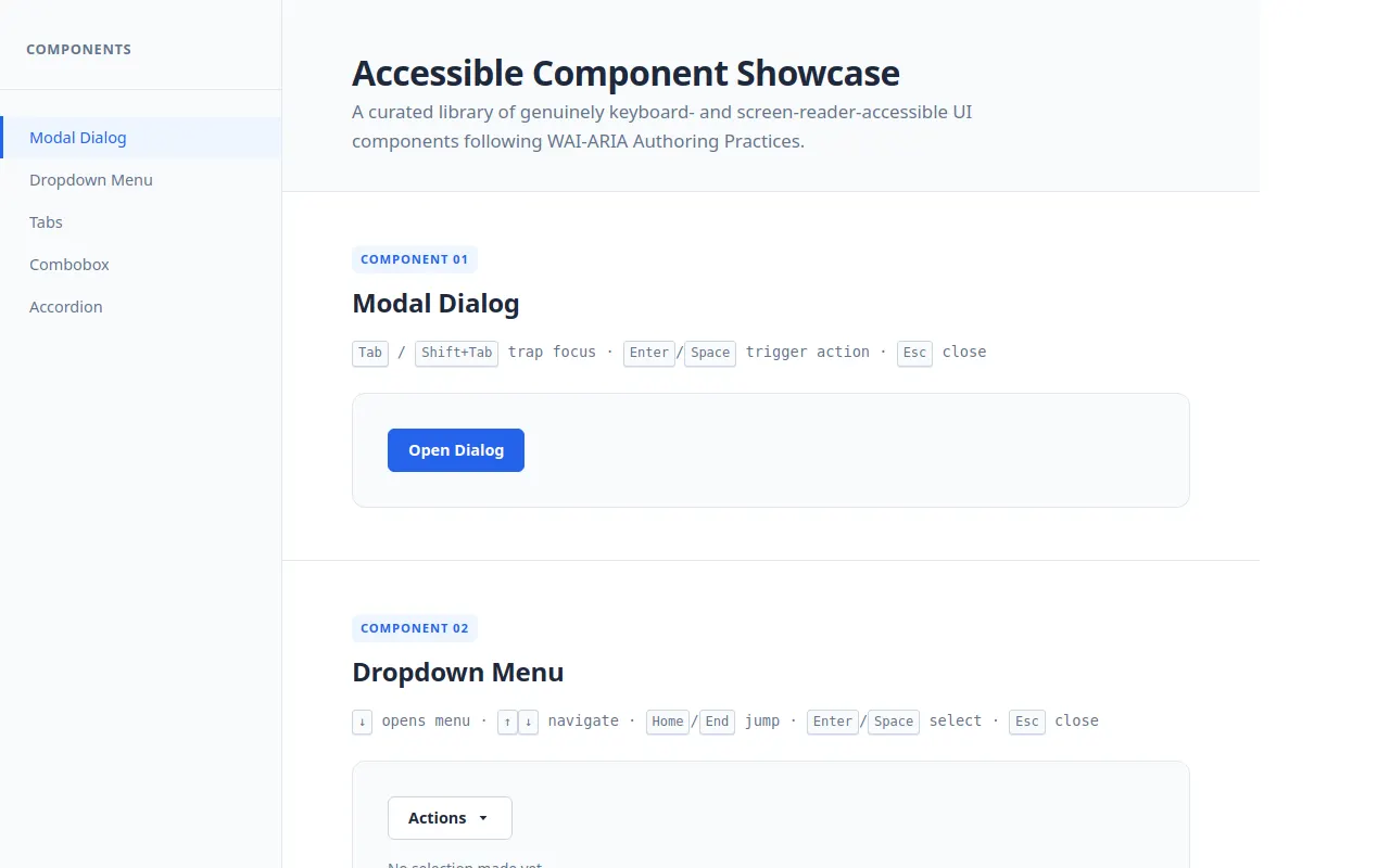
<h1>Accessible Component Showcase</h1>
<p>A curated library of genuinely keyboard- and screen-reader-accessible UI components following WAI-ARIA Authoring Practices.</p>
</header>
<!-- Modal Dialog -->
<section class="section" id="modal" aria-labelledby="modal-heading">
<span class="section-label">Component 01</span>
<h2 id="modal-heading">Modal Dialog</h2>
<p class="caption"><kbd>Tab</kbd> / <kbd>Shift+Tab</kbd> trap focus · <kbd>Enter</kbd>/<kbd>Space</kbd> trigger action · <kbd>Esc</kbd> close</p>
<div class="demo-area">
<button class="btn btn-primary" id="modal-trigger">Open Dialog</button>
<div class="result-display" id="modal-result" hidden="">Dialog was closed successfully.</div>
</div>
</section>
<!-- Dropdown Menu -->
<section class="section" id="dropdown" aria-labelledby="dropdown-heading">
<span class="section-label">Component 02</span>
<h2 id="dropdown-heading">Dropdown Menu</h2>
<p class="caption"><kbd>↓</kbd> opens menu · <kbd>↑</kbd><kbd>↓</kbd> navigate · <kbd>Home</kbd>/<kbd>End</kbd> jump · <kbd>Enter</kbd>/<kbd>Space</kbd> select · <kbd>Esc</kbd> close</p>
<div class="demo-area">
<div class="flex-center" style="position: relative;">
<button class="btn btn-secondary dropdown-trigger" id="dropdown-trigger" aria-haspopup="menu" aria-expanded="false">
Actions
<svg width="16" height="16" viewBox="0 0 16 16" fill="currentColor" aria-hidden="true"><path d="M4.5 6l3.5 4 3.5-4z"></path></svg>
</button>
</div>
<div class="selection-stat" id="dropdown-result">No selection made yet.</div>
</div>
</section>
<!-- Tabs -->
<section class="section" id="tabs" aria-labelledby="tabs-heading">
<span class="section-label">Component 03</span>
<h2 id="tabs-heading">Tabs</h2>
<p class="caption"><kbd>←</kbd><kbd>→</kbd> switch tabs · Tab enters panel content</p>
<div class="demo-area">
<div role="tablist" aria-label="Example tabs" class="tablist" id="tablist">
<button role="tab" aria-selected="true" aria-controls="tabpanel-1" id="tab-1" tabindex="0">Overview</button>
<button role="tab" aria-selected="false" aria-controls="tabpanel-2" id="tab-2" tabindex="-1">Features</button>
<button role="tab" aria-selected="false" aria-controls="tabpanel-3" id="tab-3" tabindex="-1">Usage</button>
</div>
<div class="tab-panel" role="tabpanel" id="tabpanel-1" aria-labelledby="tab-1" tabindex="0">
<p>This component follows WAI-ARIA Authoring Practices for the tab pattern. Exactly one tab is in the tab order at a time — the active tab has <code>tabindex="0"</code> while inactive tabs have <code>tabindex="-1"</code>. Arrow keys move between tabs horizontally.</p>
</div>
<div class="tab-panel" role="tabpanel" id="tabpanel-2" aria-labelledby="tab-2" tabindex="0" hidden="">
<ul style="padding-left: var(--space-lg);">
<li>Keyboard-navigable tab switching</li>
<li>Roving tabindex management</li>
<li>Correct ARIA relationship wiring</li>
<li>Hidden panels use the <code>hidden</code> attribute</li>
<li>Arrow key movement between adjacent tabs</li>
</ul>
</div>
<div class="tab-panel" role="tabpanel" id="tabpanel-3" aria-labelledby="tab-3" tabindex="0" hidden="">
<p>Import the tabs module and call <code>initTabs(tablistEl)</code> on your tablist element. The implementation provides a cleanup function you can call when unmounting. All state (active tab, visible panel) is synchronized through shared properties.</p>
</div>
</div>
</section>
<!-- Combobox -->
<section class="section" id="combobox" aria-labelledby="combobox-heading">
<span class="section-label">Component 04</span>
<h2 id="combobox-heading">Combobox</h2>
<p class="caption">Type to filter · <kbd>↑</kbd><kbd>↓</kbd> highlight · <kbd>Enter</kbd> select · <kbd>Esc</kbd> close & revert</p>
<div class="demo-area">
<div class="combobox-wrapper">
<input type="text" role="combobox" id="combobox-input" aria-autocomplete="list" aria-expanded="false" aria-controls="combobox-listbox" aria-activedescendant="" placeholder="Search countries..." autocomplete="off">
<div role="listbox" id="combobox-listbox" aria-hidden="true"></div>
</div>
<div class="selection-stat" id="combobox-result">Select a country or clear with <kbd>Esc</kbd>.</div>
</div>
</section>
<!-- Accordion -->
<section class="section" id="accordion" aria-labelledby="accordion-heading">
<span class="section-label">Component 05</span>
<h2 id="accordion-heading">Accordion</h2>
<p class="caption"><kbd>Enter</kbd>/<kbd>Space</kbd> toggle · <kbd>↑</kbd><kbd>↓</kbd> move between triggers · Multiple sections open at once</p>
<div class="demo-area">
<div role="region" aria-labelledby="accordion-heading" id="accordion-container">
<div class="accordion-item">
<button class="accordion-trigger" aria-expanded="true" aria-controls="accordion-panel-1" id="accordion-btn-1">
What makes these components accessible?
<svg class="accordion-chevron" viewBox="0 0 20 20" fill="currentColor" aria-hidden="true"><path fill-rule="evenodd" d="M5.293 7.293a1 1 0 011.414 0L10 10.586l3.293-3.293a1 1 0 111.414 1.414l-4 4a1 1 0 01-1.414 0l-4-4a1 1 0 010-1.414z"></path></svg>
</button>
<div class="accordion-region" id="accordion-panel-1" aria-labelledby="accordion-btn-1" role="region">
<div class="accordion-region-inner">Every component adheres to WAI-ARIA Authoring Practices. This includes proper role attributes, correct labeling relationships via aria-labelledby and aria-controls, keyboard interaction patterns that match visual metaphors, and appropriate focus management. Screen readers announce component states accurately because every visual change is paired with an ARIA state update.</div>
</div>
</div>
<div class="accordion-item">
<button class="accordion-trigger" aria-expanded="false" aria-controls="accordion-panel-2" id="accordion-btn-2">
How does focus trapping work in modals?
<svg class="accordion-chevron" viewBox="0 0 20 20" fill="currentColor" aria-hidden="true"><path fill-rule="evenodd" d="M5.293 7.293a1 1 0 011.414 0L10 10.586l3.293-3.293a1 1 0 111.414 1.414l-4 4a1 1 0 01-1.414 0l-4-4a1 1 0 010-1.414z"></path></svg>
</button>
<div class="accordion-region" id="accordion-panel-2" aria-labelledby="accordion-btn-2" role="region" hidden="">
<div class="accordion-region-inner">A focus trap listens for the Tab and Shift+Tab keys within the modal. When you press Tab on the last focusable element, it wraps to the first one. Similarly, Shift+Tab on the first element wraps to the last. Additionally, the page behind the dialog is given the inert attribute, making all its elements non-focusable while the modal is open. On close, focus returns to whichever element triggered the dialog to open.</div>
</div>
</div>
<div class="accordion-item">
<button class="accordion-trigger" aria-expanded="false" aria-controls="accordion-panel-3" id="accordion-btn-3">
What about reduced motion preferences?
<svg class="accordion-chevron" viewBox="0 0 20 20" fill="currentColor" aria-hidden="true"><path fill-rule="evenodd" d="M5.293 7.293a1 1 0 011.414 0L10 10.586l3.293-3.293a1 1 0 111.414 1.414l-4 4a1 1 0 01-1.414 0l-4-4a1 1 0 010-1.414z"></path></svg>
</button>
<div class="accordion-region" id="accordion-panel-3" aria-labelledby="accordion-btn-3" role="region" hidden="">
<div class="accordion-region-inner">All animations respect the prefers-reduced-motion media query. When a user has enabled this preference, transitions are reduced to near-zero duration. Modals still appear instantly but without the scale-and-slide animation. Accordion panels expand/collapse immediately rather than animating their height. Dropdowns and combobox lists render instantly. No motion is lost — the content transition is just instantaneous instead of animated.</div>
</div>
</div>
</div>
</div>
</section>
</main>
</div>
<!-- Modal Overlay (created by JS) -->
<div class="modal-backdrop" id="modal-overlay" aria-hidden="true">
<div class="modal-overlay" id="modal-bg-close"></div>
<div class="modal-dialog" role="dialog" aria-modal="true" aria-labelledby="modal-title" id="modal-dialog">
<div class="modal-header">
<h3 id="modal-title">Confirm Action</h3>
<button class="btn btn-icon btn-secondary" id="modal-close-x" aria-label="Close dialog">×</button>
</div>
<div class="modal-body">
<p>This demonstrates a fully accessible modal dialog. Focus is trapped within this dialog while it's open. Try pressing Tab repeatedly — you won't be able to reach any elements behind the dialog. Press Escape to close, or click the backdrop outside this dialog.</p>
<p>The focus will return to the "Open Dialog" button when you close it.</p>
</div>
<div class="modal-footer">
<button class="btn btn-secondary" id="modal-cancel">Cancel</button>
<button class="btn btn-primary" id="modal-confirm">Confirm</button>
</div>
</div>
</div>
<script>
(function () {
'use strict';
var __mods = {};
var __cache = {};
var __map = {"src/main.ts":{"./focus-trap":"src/focus-trap.ts"},"src/modal.ts":{"./focus-trap":"src/focus-trap.ts"}};
function __require(id) {
if (__cache[id]) return __cache[id].exports;
var module = __cache[id] = { exports: {} };
var factory = __mods[id];
if (!factory) throw new Error("Module not found: " + id);
factory(module.exports, function (spec) {
var target = (__map[id] && __map[id][spec]) || spec;
return __require(target);
}, module);
return module.exports;
}
// ── module: src/main.ts ──
__mods["src/main.ts"] = function (exports, require, module) {
"use strict";
/**
* Entry point — wires up all components and initializes sidebar navigation.
*/
Object.defineProperty(exports, "__esModule", { value: true });
const focus_trap_1 = require("./focus-trap");
// ============================================================
// Sidebar Navigation - Active section tracking
// ============================================================
function initSidebarNavigation() {
const links = document.querySelectorAll('#sidebar-nav a[data-section]');
const sections = Array.from(document.querySelectorAll('.section'));
const observerOptions = {
root: null,
rootMargin: '-20% 0px -60% 0px',
threshold: 0,
};
const observer = new IntersectionObserver((entries) => {
entries.forEach(entry => {
if (entry.isIntersecting) {
const id = entry.target.id;
links.forEach(link => {
const isActive = link.dataset.section === id;
link.classList.toggle('active', isActive);
link.setAttribute('aria-current', isActive ? 'true' : '');
});
}
});
}, observerOptions);
sections.forEach(section => observer.observe(section));
}
// ============================================================
// Modal Dialog
// ============================================================
let modalCleanupFn = null;
let pageInertRestore = false;
function openModal() {
const backdrop = document.getElementById('modal-overlay');
const dialog = document.getElementById('modal-dialog');
if (!backdrop || !dialog)
return;
// Activate focus trap with escape support
modalCleanupFn = (0, focus_trap_1.activateFocusTrap)(dialog, {
autoFocus: 'first',
onEscape: closeModal,
});
// Show modal
backdrop.style.display = 'flex';
backdrop.setAttribute('aria-hidden', 'false');
document.body.style.overflow = 'hidden';
pageInertRestore = true;
}
function closeModal() {
const backdrop = document.getElementById('modal-overlay');
if (!backdrop)
return;
// Clean up focus trap
if (modalCleanupFn) {
modalCleanupFn();
modalCleanupFn = null;
}
backdrop.removeAttribute('aria-hidden');
document.body.style.overflow = '';
pageInertRestore = false;
// Return focus to trigger button
const triggerBtn = document.getElementById('modal-trigger');
setTimeout(() => triggerBtn?.focus(), 16);
}
function initModalComponent() {
const backdrop = document.getElementById('modal-overlay');
const bgClose = document.getElementById('modal-bg-close');
const closeX = document.getElementById('modal-close-x');
const cancel = document.getElementById('modal-cancel');
const confirm = document.getElementById('modal-confirm');
if (bgClose) {
bgClose.addEventListener('click', () => {
if (backdrop.style.display !== 'none' && backdrop.style.display !== '') {
closeModal();
}
});
}
if (closeX)
closeX.addEventListener('click', closeModal);
if (cancel)
cancel.addEventListener('click', closeModal);
if (confirm)
confirm.addEventListener('click', closeModal);
const trigger = document.getElementById('modal-trigger');
if (trigger) {
trigger.addEventListener('click', openModal);
}
// Expose for testing
window.__openModal = openModal;
window.__closeModal = closeModal;
}
const menuState = { isOpen: false, activeIndex: -1 };
let menuKeydownHandler = null;
function initDropdownMenuComponent() {
const trigger = document.getElementById('dropdown-trigger');
const result = document.getElementById('dropdown-result');
if (!trigger || !result)
return;
// Create menu element
const flexContainer = document.querySelector('[id="dropdown"] .demo-area > .flex-center');
if (!flexContainer)
return;
const menuEl = document.createElement('div');
menuEl.className = 'dropdown-menu';
flexContainer.appendChild(menuEl);
const items = [
{ label: 'Edit...' },
{ label: 'Duplicate' },
{ label: 'Archive' },
{ separator: true },
{ label: 'Share' },
{ label: 'Delete...' },
];
const buildDOM = () => {
menuEl.innerHTML = '';
menuEl.setAttribute('role', 'menu');
menuEl.setAttribute('aria-labelledby', trigger.id);
items.forEach((item, idx) => {
if (item.separator) {
const sep = document.createElement('div');
sep.className = 'menu-separator';
sep.setAttribute('role', 'separator');
menuEl.appendChild(sep);
}
else {
const btn = document.createElement('button');
btn.className = 'menu-item';
btn.setAttribute('role', 'menuitem');
btn.setAttribute('tabindex', '-1');
btn.textContent = item.label ?? '';
btn.dataset.index = String(idx);
btn.addEventListener('click', () => handleSelect(item));
menuEl.appendChild(btn);
}
});
};
const getMenuButtons = () => {
return Array.from(menuEl.querySelectorAll('button[role="menuitem"]'));
};
const clearActive = () => {
getMenuButtons().forEach(b => b.classList.remove('active'));
};
const setActive = (idx) => {
clearActive();
const list = getMenuButtons();
if (list.length === 0)
return;
if (idx < 0)
idx = list.length - 1;
if (idx >= list.length)
idx = 0;
list[idx].classList.add('active');
list[idx].setAttribute('tabindex', '0');
};
const handleOpen = () => {
if (menuState.isOpen)
return;
buildDOM();
menuState.isOpen = true;
trigger.setAttribute('aria-expanded', 'true');
menuEl.style.display = 'block';
menuEl.setAttribute('data-visible', 'true');
clearActive();
menuState.activeIndex = 0;
setActive(0);
// Bind keydown
menuKeydownHandler = (e) => {
if (!menuState.isOpen)
return;
const list = getMenuButtons();
switch (e.key) {
case 'Escape':
e.preventDefault();
handleClose();
break;
case 'ArrowDown':
e.preventDefault();
menuState.activeIndex = ((menuState.activeIndex + 1) % list.length + list.length) % list.length;
setActive(menuState.activeIndex);
list[menuState.activeIndex].focus();
break;
case 'ArrowUp':
e.preventDefault();
menuState.activeIndex = ((menuState.activeIndex - 1 + list.length) % list.length);
setActive(menuState.activeIndex);
list[menuState.activeIndex].focus();
break;
case 'Home':
e.preventDefault();
menuState.activeIndex = 0;
setActive(0);
list[0].focus();
break;
case 'End':
e.preventDefault();
menuState.activeIndex = list.length - 1;
setActive(menuState.activeIndex);
list[list.length - 1].focus();
break;
case 'Tab':
handleClose();
break;
case 'Enter':
case ' ':
e.preventDefault();
handleSelect(items[menuState.activeIndex]);
break;
}
};
document.addEventListener('keydown', menuKeydownHandler);
};
const handleClose = () => {
if (!menuState.isOpen)
return;
menuState.isOpen = false;
trigger.setAttribute('aria-expanded', 'false');
menuEl.removeAttribute('data-visible');
setTimeout(() => { menuEl.style.display = 'none'; }, 50);
clearActive();
menuState.activeIndex = -1;
if (menuKeydownHandler) {
document.removeEventListener('keydown', menuKeydownHandler);
menuKeydownHandler = null;
}
trigger.focus();
};
const handleSelect = (item) => {
if (item && !item.separator && item.label) {
result.textContent = `Selected: ${item.label}`;
}
handleClose();
};
trigger.addEventListener('click', () => {
if (menuState.isOpen)
handleClose();
else
handleOpen();
});
trigger.addEventListener('keydown', (e) => {
if (!menuState.isOpen && (e.key === 'ArrowDown' || e.key === 'Enter' || e.key === ' ')) {
e.preventDefault();
handleOpen();
}
});
window.__openDropdown = handleOpen;
window.__closeDropdown = handleClose;
}
const tabsState = { activeIndex: 0 };
function initTabsComponent() {
const tablist = document.getElementById('tablist');
if (!tablist)
return;
const getTabs = () => {
return Array.from(tablist.querySelectorAll('button[role="tab"]'));
};
const getPanels = () => {
return getTabs()
.map(t => {
const id = t.getAttribute('aria-controls');
return id ? document.getElementById(id) : null;
})
.filter((p) => p !== null);
};
const setActiveTab = (idx) => {
const tabs = getTabs();
const panels = getPanels();
if (idx < 0 || idx >= tabs.length)
return;
tabsState.activeIndex = idx;
tabs.forEach((tab, i) => {
const selected = i === idx;
tab.setAttribute('aria-selected', String(selected));
tab.tabIndex = selected ? 0 : -1;
const panel = panels[i];
if (panel) {
if (selected)
panel.removeAttribute('hidden');
else
panel.setAttribute('hidden', '');
}
});
};
const onKeyDown = (e) => {
const tabs = getTabs();
let newIndex;
switch (e.key) {
case 'ArrowRight':
e.preventDefault();
newIndex = (tabsState.activeIndex + 1) % tabs.length;
break;
case 'ArrowLeft':
e.preventDefault();
newIndex = ((tabsState.activeIndex - 1 + tabs.length) % tabs.length);
break;
case 'Home':
e.preventDefault();
newIndex = 0;
break;
case 'End':
e.preventDefault();
newIndex = tabs.length - 1;
break;
default:
return;
}
setActiveTab(newIndex);
tabs[newIndex].focus();
};
tablist.addEventListener('keydown', onKeyDown);
// Click handling
tablist.addEventListener('click', (e) => {
const tab = e.target.closest('button[role="tab"]');
if (!tab)
return;
const tabs = getTabs();
const idx = tabs.indexOf(tab);
if (idx !== -1) {
setActiveTab(idx);
tab.focus();
}
});
}
// ============================================================
// Combobox
// ============================================================
const COUNTRIES = [
'Argentina', 'Australia', 'Austria', 'Belgium', 'Brazil',
'Canada', 'China', 'Denmark', 'Egypt', 'Finland',
'France', 'Germany', 'Greece', 'India', 'Indonesia',
'Ireland', 'Italy', 'Japan', 'Kenya', 'Malaysia',
'Mexico', 'Netherlands', 'New Zealand', 'Nigeria', 'Norway',
'Peru', 'Philippines', 'Poland', 'Portugal', 'Romania',
'Russia', 'South Africa', 'South Korea', 'Spain', 'Sweden',
'Switzerland', 'Thailand', 'Turkey', 'United Kingdom', 'Vietnam',
];
const comboState = {
isOpen: false,
filtered: [...COUNTRIES],
activeIndex: -1,
currentValue: '',
};
let comboOutsideListener = null;
function initComboboxComponent() {
const input = document.getElementById('combobox-input');
const listbox = document.getElementById('combobox-listbox');
const result = document.getElementById('combobox-result');
if (!input || !listbox)
return;
comboState.currentValue = input.value;
let optionElements = [];
const clearActive = () => {
optionElements.forEach(o => o.classList.remove('active'));
input.removeAttribute('aria-activedescendant');
comboState.activeIndex = -1;
};
const setHighlight = (idx) => {
if (optionElements.length === 0)
return;
const clamped = ((idx % optionElements.length) + optionElements.length) % optionElements.length;
clearActive();
optionElements[clamped].classList.add('active');
input.setAttribute('aria-activedescendant', optionElements[clamped].id);
comboState.activeIndex = clamped;
optionElements[clamped].scrollIntoView({ block: 'nearest' });
};
const buildList = () => {
listbox.innerHTML = '';
if (comboState.filtered.length === 0) {
const noResults = document.createElement('div');
noResults.className = 'option-count';
noResults.textContent = 'No countries found';
listbox.appendChild(noResults);
optionElements = [];
clearActive();
updateListVisibility();
return;
}
const header = document.createElement('div');
header.className = 'option-count';
header.textContent = `Showing ${comboState.filtered.length} of ${COUNTRIES.length}`;
listbox.appendChild(header);
comboState.filtered.forEach((country, idx) => {
const btn = document.createElement('button');
btn.className = 'listbox-option';
btn.setAttribute('role', 'option');
btn.id = `cb-option-${idx}`;
btn.setAttribute('tabindex', '-1');
btn.textContent = country;
btn.addEventListener('click', () => selectOption(idx));
listbox.appendChild(btn);
});
optionElements = Array.from(listbox.querySelectorAll('button.listbox-option'));
updateListVisibility();
};
const updateListVisibility = () => {
if (comboState.isOpen && input.value.trim().length > 0 && comboState.filtered.length > 0) {
listbox.setAttribute('data-visible', 'true');
listbox.setAttribute('aria-hidden', 'false');
}
else {
listbox.removeAttribute('data-visible');
listbox.setAttribute('aria-hidden', 'true');
}
};
const filterAndOpen = () => {
const query = input.value;
comboState.currentValue = query;
comboState.filtered = COUNTRIES.filter(c => c.toLowerCase().includes(query.toLowerCase()));
comboState.activeIndex = -1;
if (query.trim().length > 0) {
comboState.isOpen = true;
input.setAttribute('aria-expanded', 'true');
buildList();
}
else {
comboState.filtered = [...COUNTRIES];
closeList(true);
}
};
const closeList = (revert = false) => {
comboState.isOpen = false;
input.setAttribute('aria-expanded', 'false');
if (revert) {
input.value = comboState.currentValue;
}
clearActive();
updateListVisibility();
};
const selectOption = (idx) => {
if (idx < 0 || idx >= optionElements.length)
return;
const selected = optionElements[idx].textContent;
if (selected) {
comboState.currentValue = selected;
input.value = selected;
result.innerHTML = `Selected: <strong>${selected}</strong>`;
}
closeList();
};
const handleInput = () => {
filterAndOpen();
};
const handleKeyDown = (e) => {
if (e.key === 'ArrowDown') {
e.preventDefault();
if (!comboState.isOpen) {
if (comboState.currentValue.length > 0)
filterAndOpen();
else
return;
}
if (optionElements.length > 0)
setHighlight(comboState.activeIndex + 1);
}
else if (e.key === 'ArrowUp') {
e.preventDefault();
if (!comboState.isOpen)
return;
if (optionElements.length > 0)
setHighlight(comboState.activeIndex - 1);
}
else if (e.key === 'Enter') {
e.preventDefault();
if (comboState.isOpen && optionElements.length > 0 && comboState.activeIndex >= 0) {
selectOption(comboState.activeIndex);
}
}
else if (e.key === 'Escape') {
e.preventDefault();
closeList(true);
}
};
const handleClickOutside = (e) => {
if (comboState.isOpen && !input.contains(e.target) && !listbox.contains(e.target)) {
closeList(true);
}
};
input.addEventListener('input', handleInput);
input.addEventListener('keydown', handleKeyDown);
input.addEventListener('blur', () => {
setTimeout(() => {
const focused = document.activeElement;
if (focused?.closest(`#${listbox.id}`))
return;
if (comboState.isOpen)
closeList(true);
}, 50);
});
comboOutsideListener = handleClickOutside;
document.addEventListener('click', comboOutsideListener);
window.__selectCombo = selectOption;
window.__getComboActivedescendant = () => input.getAttribute('aria-activedescendant');
}
// ============================================================
// Accordion
// ============================================================
function initAccordionComponent() {
const container = document.getElementById('accordion-container');
if (!container)
return;
const triggers = Array.from(container.querySelectorAll('button.accordion-trigger'));
const toggleRegion = (trigger, forceClose) => {
const panelId = trigger.getAttribute('aria-controls');
if (!panelId)
return;
const panel = document.getElementById(panelId);
if (!panel)
return;
const isExpanded = trigger.getAttribute('aria-expanded') === 'true';
const willBeOpen = forceClose !== undefined ? !forceClose : !isExpanded;
trigger.setAttribute('aria-expanded', String(willBeOpen));
if (willBeOpen) {
// Opening: measure height, animate from 0
panel.style.height = 'auto';
const scrollHeight = panel.scrollHeight;
panel.style.height = '0px';
panel.removeAttribute('hidden');
requestAnimationFrame(() => {
panel.style.height = `${scrollHeight}px`;
});
const onEnd = () => {
panel.removeEventListener('transitionend', onEnd);
if (trigger.getAttribute('aria-expanded') === 'true') {
panel.style.height = 'auto';
}
};
panel.addEventListener('transitionend', onEnd);
}
else {
// Closing: collapse to 0, then add hidden
panel.style.height = `${panel.scrollHeight}px`;
panel.offsetHeight; // Force reflow
requestAnimationFrame(() => {
panel.style.height = '0px';
});
const onEnd = () => {
panel.removeEventListener('transitionend', onEnd);
if (trigger.getAttribute('aria-expanded') === 'false') {
panel.setAttribute('hidden', '');
panel.style.height = '';
}
};
panel.addEventListener('transitionend', onEnd);
}
};
triggers.forEach(trigger => {
// Initialize regions based on aria-expanded
const panelId = trigger.getAttribute('aria-controls');
if (panelId) {
const panel = document.getElementById(panelId);
if (panel) {
const isExpanded = trigger.getAttribute('aria-expanded') === 'true';
if (!isExpanded) {
panel.setAttribute('hidden', '');
panel.style.height = '0px';
}
else {
panel.style.height = 'auto';
}
}
}
trigger.addEventListener('click', () => toggleRegion(trigger));
// Arrow key navigation between triggers
trigger.addEventListener('keydown', (e) => {
const currentIndex = triggers.indexOf(trigger);
switch (e.key) {
case 'ArrowDown':
e.preventDefault();
triggers[(currentIndex + 1) % triggers.length].focus();
break;
case 'ArrowUp':
e.preventDefault();
triggers[(currentIndex - 1 + triggers.length) % triggers.length].focus();
break;
case 'Home':
e.preventDefault();
triggers[0].focus();
break;
case 'End':
e.preventDefault();
triggers[triggers.length - 1].focus();
break;
}
});
});
}
// ============================================================
// Run all initialization
// ============================================================
initSidebarNavigation();
initModalComponent();
initDropdownMenuComponent();
initTabsComponent();
initComboboxComponent();
initAccordionComponent();
};
// ── module: src/constants.ts ──
__mods["src/constants.ts"] = function (exports, require, module) {
"use strict";
Object.defineProperty(exports, "__esModule", { value: true });
exports.MODAL_ATTRS = exports.ANIMATIONS = exports.COLORS = void 0;
/** Tunable design constants */
exports.COLORS = {
primary: '#2563eb',
primaryHover: '#1d4ed8',
focusRing: 'rgba(37, 99, 235, 0.4)',
};
exports.ANIMATIONS = {
fast: 150,
normal: 250,
slow: 350,
};
exports.MODAL_ATTRS = ['href', 'tabindex', 'data-focus-guard'];
};
// ── module: src/focus-trap.ts ──
__mods["src/focus-trap.ts"] = function (exports, require, module) {
"use strict";
/**
* Reusable focus trap utility.
* Traps Tab/Shift+Tab within a container and optionally focuses the first
* or last element on activation/deactivation.
*/
Object.defineProperty(exports, "__esModule", { value: true });
exports.activateFocusTrap = activateFocusTrap;
exports.deactivateAllFocusTraps = deactivateAllFocusTraps;
/** Focusable selector including common interactive elements */
const FOCUSABLE_SELECTOR = [
'a[href]',
'button:not([disabled])',
'input:not([disabled]):not([type="hidden"])',
'select:not([disabled])',
'textarea:not([disabled])',
'[tabindex]:not([tabindex="-1"])',
'[contenteditable]',
].join(', ');
let activeTraps = [];
/**
* Activate a focus trap on `container`. Returns a cleanup function.
*/
function activateFocusTrap(container, options = {}) {
const { autoFocus = 'first', onEscape } = options;
const getFocusableElements = () => {
return Array.from(container.querySelectorAll(FOCUSABLE_SELECTOR))
.filter(el => el.offsetParent !== null || el === document.activeElement);
};
const handleKeydown = (e) => {
if (e.key !== 'Tab')
return;
const focusables = getFocusableElements();
if (focusables.length === 0)
return;
const first = focusables[0];
const last = focusables[focusables.length - 1];
if (e.shiftKey) {
if (document.activeElement === first) {
e.preventDefault();
last.focus();
}
}
else {
if (document.activeElement === last) {
e.preventDefault();
first.focus();
}
}
};
const handleEscape = (e) => {
if (e.key === 'Escape') {
e.stopPropagation();
onEscape?.();
}
};
document.addEventListener('keydown', handleKeydown);
document.addEventListener('keydown', handleEscape);
const cleanup = () => {
document.removeEventListener('keydown', handleKeydown);
document.removeEventListener('keydown', handleEscape);
const idx = activeTraps.indexOf(cleanup);
if (idx !== -1)
activeTraps.splice(idx, 1);
};
// Auto-focus
if (autoFocus === 'first') {
const focusables = getFocusableElements();
if (focusables.length > 0) {
setTimeout(() => focusables[0].focus(), 16);
}
}
else if (autoFocus === 'last') {
const focusables = getFocusableElements();
if (focusables.length > 0) {
setTimeout(() => focusables[focusables.length - 1].focus(), 16);
}
}
activeTraps.push(cleanup);
return cleanup;
}
/** Remove all currently active focus traps */
function deactivateAllFocusTraps() {
activeTraps.forEach(fn => fn());
activeTraps = [];
}
};
// ── module: src/aria-manager.ts ──
__mods["src/aria-manager.ts"] = function (exports, require, module) {
"use strict";
/**
* Reusable aria-activedescendant manager for listbox/combobox patterns.
* Tracks which option is highlighted and updates the source element's
* aria-activedescendant accordingly.
*/
Object.defineProperty(exports, "__esModule", { value: true });
exports.createAriaManager = createAriaManager;
let activeManagers = [];
/**
* Create an aria-activedescendant manager. Returns a cleanup function.
* Caller must call update() after DOM changes (filtering, etc.)
*/
function createAriaManager(options) {
const { container, options: optList } = options;
const getActiveEl = () => {
const activeId = container.getAttribute('aria-activedescendant');
if (!activeId)
return null;
return document.getElementById(activeId);
};
const setAriaActiveDescendant = (el) => {
if (el) {
container.setAttribute('aria-activedescendant', el.id);
}
else {
container.removeAttribute('aria-activedescendant');
}
};
// Remove old active styles
const clearActiveOption = () => {
optList.forEach(opt => {
opt.classList.remove('active');
opt.setAttribute('tabindex', '-1');
});
};
const update = () => {
const current = getActiveEl();
if (current) {
const idx = Array.from(optList).indexOf(current);
if (idx !== -1) {
clearActiveOption();
setAriaActiveDescendant(optList[idx]);
// Scroll into view
optList[idx].scrollIntoView({ block: 'nearest' });
}
}
else {
clearActiveOption();
}
};
const setActiveIndex = (idx) => {
if (optList.length === 0)
return;
const clampedIdx = ((idx % optList.length) + optList.length) % optList.length;
const target = optList[clampedIdx];
clearActiveOption();
target.classList.add('active');
setAriaActiveDescendant(target);
target.scrollIntoView({ block: 'nearest' });
};
const cleanup = () => {
const idx = activeManagers.indexOf(cleanup);
if (idx !== -1)
activeManagers.splice(idx, 1);
};
activeManagers.push(cleanup);
return { update, setActiveIndex };
}
};
// ── module: src/modal.ts ──
__mods["src/modal.ts"] = function (exports, require, module) {
"use strict";
/**
* Modal Dialog Component
* Implements focus trapping, inert overlay, escape-to-close, and
* focus restoration to trigger on close.
*/
Object.defineProperty(exports, "__esModule", { value: true });
exports.getModalState = getModalState;
exports.initModal = initModal;
const focus_trap_1 = require("./focus-trap");
let activeCleanup = null;
let triggerButton = null;
let pageInertRestore = false;
const state = { isOpen: false };
function getModalState() { return state; }
function initModal(config) {
const { backdrop, dialog, focusContainer, closeButton, bgClose } = config;
const handleBackdropClick = (e) => {
if (e.target === bgClose && state.isOpen) {
close();
}
};
const open = () => {
if (state.isOpen)
return;
triggerButton = document.activeElement || null;
state.isOpen = true;
// Make everything else inert
document.body.style.overflow = 'hidden';
pageInertRestore = true;
// Activate focus trap with escape support
activeCleanup = (0, focus_trap_1.activateFocusTrap)(focusContainer, {
autoFocus: 'first',
onEscape: () => close(),
});
// Show modal
backdrop.setAttribute('aria-hidden', 'false');
backdrop.removeAttribute('aria-hidden');
// Bind backdrop click
bgClose.addEventListener('click', handleBackdropClick);
};
const close = () => {
if (!state.isOpen)
return;
state.isOpen = false;
// Clean up focus trap
if (activeCleanup) {
activeCleanup();
activeCleanup = null;
}
// Remove backdrop listener
bgClose.removeEventListener('click', handleBackdropClick);
// Hide modal
backdrop.setAttribute('aria-hidden', 'true');
// Restore body scroll
document.body.style.overflow = '';
pageInertRestore = false;
// Return focus to trigger
if (triggerButton) {
setTimeout(() => triggerButton?.focus(), 16);
}
};
// Wire close button
closeButton.addEventListener('click', close);
return { open, close };
}
};
// ── module: src/dropdown-menu.ts ──
__mods["src/dropdown-menu.ts"] = function (exports, require, module) {
"use strict";
/**
* Dropdown Menu Component
* Implements arrow-key navigation, home/end jump, escape-to-close, and
* proper aria-haspopup / aria-expanded state management.
*/
Object.defineProperty(exports, "__esModule", { value: true });
exports.getMenuState = getMenuState;
exports.initDropdownMenu = initDropdownMenu;
const state = { isOpen: false, activeIndex: -1 };
function getMenuState() { return state; }
let cleanupKeydown = null;
function initDropdownMenu(config) {
const { trigger, menu, items, onSelect } = config;
// Build menu DOM
menu.innerHTML = '';
menu.setAttribute('role', 'menu');
menu.setAttribute('aria-labelledby', trigger.id);
items.forEach((item, idx) => {
if (item.separator) {
const sep = document.createElement('div');
sep.className = 'menu-separator';
sep.setAttribute('role', 'separator');
menu.appendChild(sep);
}
else {
const btn = document.createElement('button');
btn.className = 'menu-item';
btn.setAttribute('role', 'menuitem');
btn.setAttribute('tabindex', '-1');
btn.dataset.index = String(idx);
btn.textContent = item.label ?? '';
menu.appendChild(btn);
}
});
const menuItems = () => {
return Array.from(menu.querySelectorAll('button[role="menuitem"]'));
};
const clearActive = () => {
menuItems().forEach(item => item.classList.remove('active'));
};
const setActive = (idx) => {
clearActive();
const list = menuItems();
if (idx < 0)
idx = list.length - 1;
if (idx >= list.length)
idx = 0;
list[idx].classList.add('active');
list[idx].setAttribute('tabindex', '0');
};
const openMenu = () => {
if (state.isOpen)
return;
state.isOpen = true;
trigger.setAttribute('aria-expanded', 'true');
menu.style.display = 'block';
menu.setAttribute('data-visible', 'true');
// Reset and activate first item
menuItems().forEach(item => item.setAttribute('tabindex', '-1'));
state.activeIndex = 0;
setActive(0);
bindKeyDown();
};
const closeMenu = () => {
if (!state.isOpen)
return;
state.isOpen = false;
trigger.setAttribute('aria-expanded', 'false');
menu.removeAttribute('data-visible');
setTimeout(() => { menu.style.display = 'none'; }, 50);
clearActive();
menuItems().forEach(item => item.setAttribute('tabindex', '-1'));
state.activeIndex = -1;
unbindKeyDown();
trigger.focus();
};
const selectItem = (idx) => {
const item = items[idx];
if (item && !item.separator) {
onSelect(item);
}
closeMenu();
};
const handleTriggerClick = () => {
if (state.isOpen) {
closeMenu();
}
else {
openMenu();
}
};
const onKeyDown = (e) => {
if (!state.isOpen)
return;
const list = menuItems();
switch (e.key) {
case 'Escape':
e.preventDefault();
closeMenu();
break;
case 'ArrowDown':
e.preventDefault();
state.activeIndex = ((state.activeIndex + 1) % list.length + list.length) % list.length;
setActive(state.activeIndex);
list[state.activeIndex].focus();
break;
case 'ArrowUp':
e.preventDefault();
state.activeIndex = ((state.activeIndex - 1 + list.length) % list.length);
setActive(state.activeIndex);
list[state.activeIndex].focus();
break;
case 'Home':
e.preventDefault();
state.activeIndex = 0;
setActive(0);
list[0].focus();
break;
case 'End':
e.preventDefault();
state.activeIndex = list.length - 1;
setActive(state.activeIndex);
list[list.length - 1].focus();
break;
case 'Tab':
closeMenu();
break;
case 'Enter':
case ' ':
e.preventDefault();
selectItem(state.activeIndex);
break;
}
};
const bindKeyDown = () => {
cleanupKeydown = () => { };
const handler = (e) => {
if (e.key === 'Escape' || e.key === 'ArrowDown' || e.key === 'ArrowUp' ||
e.key === 'Home' || e.key === 'End' || e.key === 'Tab') {
onKeyDown(e);
}
};
document.addEventListener('keydown', handler);
cleanupKeydown = () => document.removeEventListener('keydown', handler);
};
const unbindKeyDown = () => {
if (cleanupKeydown) {
cleanupKeydown();
cleanupKeydown = null;
}
};
trigger.addEventListener('click', handleTriggerClick);
// Handle keyboard on trigger
trigger.addEventListener('keydown', (e) => {
if (!state.isOpen && (e.key === 'ArrowDown' || e.key === 'Enter' || e.key === ' ')) {
e.preventDefault();
openMenu();
}
});
return { close: closeMenu };
}
};
// ── module: src/tabs.ts ──
__mods["src/tabs.ts"] = function (exports, require, module) {
"use strict";
/**
* Tabs Component
* Implements correct tablist/tab/tabpanel relationships, roving tabindex,
* and arrow key navigation between horizontally-arranged tabs.
*/
Object.defineProperty(exports, "__esModule", { value: true });
exports.getTabsState = getTabsState;
exports.initTabs = initTabs;
const state = { activeIndex: 0 };
function getTabsState() { return state; }
function initTabs(config) {
const { tablist } = config;
const getTabs = () => {
return Array.from(tablist.querySelectorAll('button[role="tab"]'));
};
const getPanels = () => {
const tabs = getTabs();
return tabs.map(tab => {
const panelId = tab.getAttribute('aria-controls');
return panelId ? document.getElementById(panelId) : null;
}).filter((p) => p !== null);
};
const setActiveTab = (idx) => {
const tabs = getTabs();
const panels = getPanels();
if (idx < 0 || idx >= tabs.length)
return;
state.activeIndex = idx;
tabs.forEach((tab, i) => {
const isSelected = i === idx;
tab.setAttribute('aria-selected', String(isSelected));
tab.tabIndex = isSelected ? 0 : -1;
// Show/hide panels
const panel = panels[i];
if (panel) {
if (isSelected) {
panel.removeAttribute('hidden');
}
else {
panel.setAttribute('hidden', '');
}
}
});
};
const onKeyDown = (e) => {
const tabs = getTabs();
let newIndex = state.activeIndex;
switch (e.key) {
case 'ArrowRight':
e.preventDefault();
newIndex = (state.activeIndex + 1) % tabs.length;
break;
case 'ArrowLeft':
e.preventDefault();
newIndex = ((state.activeIndex - 1 + tabs.length) % tabs.length);
break;
case 'Home':
e.preventDefault();
newIndex = 0;
break;
case 'End':
e.preventDefault();
newIndex = tabs.length - 1;
break;
default:
return;
}
setActiveTab(newIndex);
tabs[newIndex].focus();
};
tablist.addEventListener('keydown', onKeyDown);
// Click on tabs for mouse users
tablist.addEventListener('click', (e) => {
const tab = e.target.closest('button[role="tab"]');
if (!tab)
return;
const tabs = getTabs();
const idx = tabs.indexOf(tab);
if (idx !== -1) {
setActiveTab(idx);
tab.focus();
}
});
return {
cleanup: () => {
tablist.removeEventListener('keydown', onKeyDown);
tablist.removeEventListener('click', () => { });
},
};
}
};
// ── module: src/combobox.ts ──
__mods["src/combobox.ts"] = function (exports, require, module) {
"use strict";
/**
* Combobox (Autocomplete) Component
* Implements aria-activedescendant pattern for listbox selection,
* client-side filtering, and proper keyboard interaction semantics.
*/
Object.defineProperty(exports, "__esModule", { value: true });
exports.getComboboxState = getComboboxState;
exports.initCombobox = initCombobox;
const COUNTRIES = [
'Argentina', 'Australia', 'Austria', 'Belgium', 'Brazil',
'Canada', 'China', 'Denmark', 'Egypt', 'Finland',
'France', 'Germany', 'Greece', 'India', 'Indonesia',
'Ireland', 'Italy', 'Japan', 'Kenya', 'Malaysia',
'Mexico', 'Netherlands', 'New Zealand', 'Nigeria', 'Norway',
'Peru', 'Philippines', 'Poland', 'Portugal', 'Romania',
'Russia', 'South Africa', 'South Korea', 'Spain', 'Sweden',
'Switzerland', 'Thailand', 'Turkey', 'United Kingdom', 'Vietnam',
];
const state = {
isOpen: false,
filtered: [...COUNTRIES],
activeIndex: -1,
};
function getComboboxState() { return state; }
let allOptions = [];
let currentInputValue = '';
let outsideClickListener = null;
function initCombobox(config) {
const { input, listbox, onSelect, resultDisplay } = config;
allOptions = [];
currentInputValue = input.value;
// Initial filter
state.filtered = [...COUNTRIES];
const buildList = () => {
listbox.innerHTML = '';
if (state.filtered.length === 0) {
const noResults = document.createElement('div');
noResults.className = 'option-count';
noResults.textContent = 'No countries found';
listbox.appendChild(noResults);
allOptions = [];
clearActive();
updateVisibility();
return;
}
// Show option count header
const header = document.createElement('div');
header.className = 'option-count';
header.textContent = `Showing ${state.filtered.length} of ${COUNTRIES.length}`;
listbox.appendChild(header);
state.filtered.forEach((country, idx) => {
const btn = document.createElement('button');
btn.className = 'listbox-option';
btn.setAttribute('role', 'option');
btn.id = `cb-option-${idx}`;
btn.setAttribute('tabindex', '-1');
btn.textContent = country;
btn.dataset.country = country;
btn.addEventListener('click', () => selectItem(idx));
listbox.appendChild(btn);
});
allOptions = Array.from(listbox.querySelectorAll('button.listbox-option'));
updateVisibility();
};
const clearActive = () => {
allOptions.forEach(opt => opt.classList.remove('active'));
input.removeAttribute('aria-activedescendant');
state.activeIndex = -1;
};
const setActiveAndHighlight = (idx) => {
if (allOptions.length === 0)
return;
const clampedIdx = ((idx % allOptions.length) + allOptions.length) % allOptions.length;
clearActive();
allOptions[clampedIdx].classList.add('active');
input.setAttribute('aria-activedescendant', allOptions[clampedIdx].id);
state.activeIndex = clampedIdx;
allOptions[clampedIdx].scrollIntoView({ block: 'nearest' });
};
const updateVisibility = () => {
if (state.isOpen && input.value.trim().length > 0 && state.filtered.length > 0) {
listbox.setAttribute('data-visible', 'true');
listbox.setAttribute('aria-hidden', 'false');
}
else {
listbox.removeAttribute('data-visible');
listbox.setAttribute('aria-hidden', 'true');
}
};
const openList = () => {
if (input.value.trim().length === 0)
return;
state.isOpen = true;
input.setAttribute('aria-expanded', 'true');
buildList();
updateVisibility();
};
const closeList = (revert = false) => {
state.isOpen = false;
input.setAttribute('aria-expanded', 'false');
if (revert) {
input.value = currentInputValue;
}
clearActive();
updateVisibility();
};
const filterItems = (query) => {
const lower = query.toLowerCase();
state.filtered = COUNTRIES.filter(c => c.toLowerCase().includes(lower));
state.activeIndex = -1;
};
const selectItem = (idx) => {
if (idx < 0 || idx >= allOptions.length)
return;
const selected = allOptions[idx].dataset.country;
if (selected) {
currentInputValue = selected;
input.value = selected;
onSelect(selected);
resultDisplay.textContent = `Selected: ${selected}`;
}
closeList();
};
const handleInput = () => {
currentInputValue = input.value;
if (currentInputValue.length > 0) {
filterItems(currentInputValue);
openList();
}
else {
state.filtered = [...COUNTRIES];
clearActive();
closeList(true);
}
};
const handleKeyDown = (e) => {
if (e.key === 'ArrowDown') {
e.preventDefault();
if (!state.isOpen) {
if (currentInputValue.length > 0)
openList();
else
return;
}
if (allOptions.length > 0) {
setActiveAndHighlight(state.activeIndex + 1);
}
}
else if (e.key === 'ArrowUp') {
e.preventDefault();
if (!state.isOpen)
return;
if (allOptions.length > 0) {
setActiveAndHighlight(state.activeIndex - 1);
}
}
else if (e.key === 'Enter') {
e.preventDefault();
if (state.isOpen && allOptions.length > 0 && state.activeIndex >= 0) {
selectItem(state.activeIndex);
}
}
else if (e.key === 'Escape') {
e.preventDefault();
closeList(true);
}
};
const handleClickOutside = (e) => {
if (state.isOpen && !input.contains(e.target) && !listbox.contains(e.target)) {
closeList(true);
}
};
// Bind events
input.addEventListener('input', handleInput);
input.addEventListener('keydown', handleKeyDown);
outsideClickListener = handleClickOutside;
document.addEventListener('click', outsideClickListener);
// Close on focusout (with slight delay to allow click propagation)
input.addEventListener('blur', () => {
setTimeout(() => {
const relatedTarget = document.activeElement;
if (relatedTarget?.closest(`#${listbox.id}`)) {
return;
}
if (state.isOpen) {
closeList(true);
}
}, 50);
});
return {
cleanup: () => {
input.removeEventListener('input', handleInput);
input.removeEventListener('keydown', handleKeyDown);
input.removeEventListener('blur', () => { });
if (outsideClickListener) {
document.removeEventListener('click', outsideClickListener);
outsideClickListener = null;
}
},
};
}
};
// ── module: src/accordion.ts ──
__mods["src/accordion.ts"] = function (exports, require, module) {
"use strict";
/**
* Accordion / Disclosure Group Component
* Each trigger toggles its associated region. Multiple sections may be open.
* Animates height transition, then toggles hidden attribute for correctness.
*/
Object.defineProperty(exports, "__esModule", { value: true });
exports.initAccordion = initAccordion;
function initAccordion(config) {
const { container } = config;
// Respect prefers-reduced-motion
const mediaQuery = window.matchMedia('(prefers-reduced-motion: reduce)');
const handleTriggerClick = (trigger) => {
const isExpanded = trigger.getAttribute('aria-expanded') === 'true';
toggleRegion(trigger, isExpanded);
};
const toggleRegion = (trigger, forceClose) => {
const panelId = trigger.getAttribute('aria-controls');
if (!panelId)
return;
const panel = document.getElementById(panelId);
if (!panel)
return;
const isCurrentlyOpen = trigger.getAttribute('aria-expanded') === 'true';
const willBeOpen = forceClose !== undefined ? !forceClose : !isCurrentlyOpen;
trigger.setAttribute('aria-expanded', String(willBeOpen));
if (willBeOpen) {
// Open: measure full height, set it explicitly, animate
panel.style.height = 'auto';
const scrollHeight = panel.scrollHeight;
panel.style.height = '0px';
panel.removeAttribute('hidden');
requestAnimationFrame(() => {
panel.style.height = `${scrollHeight}px`;
});
// When animation ends, set auto height and remove transition
const onTransitionEnd = () => {
panel.removeEventListener('transitionend', onTransitionEnd);
if (trigger.getAttribute('aria-expanded') === 'true') {
panel.style.height = 'auto';
// Remove transition for closed state to be instant when closing
setTimeout(() => {
panel.style.transition = '';
}, 50);
}
};
panel.addEventListener('transitionend', onTransitionEnd);
}
else {
// Close: measure current height, then collapse to 0 with transition
panel.style.height = `${panel.scrollHeight}px`;
// Force reflow
panel.offsetHeight;
requestAnimationFrame(() => {
panel.style.height = '0px';
});
const onTransitionEnd = () => {
panel.removeEventListener('transitionend', onTransitionEnd);
if (trigger.getAttribute('aria-expanded') === 'false') {
panel.setAttribute('hidden', '');
panel.style.height = '';
// Reset transition for next open
setTimeout(() => {
panel.style.transition = '';
}, 50);
}
};
panel.addEventListener('transitionend', onTransitionEnd);
}
};
// Keyboard navigation between accordion triggers using arrow keys
const getTriggers = () => {
return Array.from(container.querySelectorAll('button.accordion-trigger'));
};
const handleKeyDown = (e) => {
const triggers = getTriggers();
const currentTrigger = e.target;
if (!currentTrigger || !currentTrigger.classList.contains('accordion-trigger'))
return;
const currentIndex = triggers.indexOf(currentTrigger);
switch (e.key) {
case 'ArrowDown':
e.preventDefault();
triggers[(currentIndex + 1) % triggers.length].focus();
break;
case 'ArrowUp':
e.preventDefault();
triggers[(currentIndex - 1 + triggers.length) % triggers.length].focus();
break;
case 'Home':
e.preventDefault();
triggers[0].focus();
break;
case 'End':
e.preventDefault();
triggers[triggers.length - 1].focus();
break;
}
};
// Bind click handlers to all triggers
const triggers = getTriggers();
const clickHandlers = new Map();
triggers.forEach(trigger => {
// Initialize first item's region based on aria-expanded
const panelId = trigger.getAttribute('aria-controls');
if (panelId) {
const panel = document.getElementById(panelId);
if (panel) {
const isExpanded = trigger.getAttribute('aria-expanded') === 'true';
if (!isExpanded) {
panel.setAttribute('hidden', '');
panel.style.height = '0px';
}
else {
panel.style.height = 'auto';
}
}
}
const handler = () => handleTriggerClick(trigger);
trigger.addEventListener('click', handler);
trigger.addEventListener('keydown', handleKeyDown);
clickHandlers.set(trigger, handler);
});
// Expose toggle for external use
container.__toggleAccordion = toggleRegion;
container.__getTriggers = getTriggers;
container.__cleanupTriggers = () => {
triggers.forEach((t, i) => {
const h = clickHandlers.get(t);
if (h)
t.removeEventListener('click', h);
t.removeEventListener('keydown', handleKeyDown);
});
clickHandlers.clear();
};
}
};
// ── entry ──
__require("src/main.ts");
})();
</script>
</body>
</html>