Accessible Components
ornith 1.0 35b · typescript
Reviews & generation details
Reviews
No human review yet. Unreviewed does not mean unsuccessful.
Generation context
Imported historical artifact. Its exact original instructions and lineage are not known.
Generation prompt · exact text unavailable
See the current prompt for reference. It may differ from the instructions used to generate this artifact.
Inspect original source 60,406 bytes · SHA-256 0998fca96017
<!doctype html>
<html lang="en">
<head>
<meta charset="utf-8">
<meta name="viewport" content="width=device-width, initial-scale=1">
<title>Accessible Component Showcase</title>
<style>
/* ── css: base ── */
/* ===== Reset & Base Styles ===== */
*, *::before, *::after {
box-sizing: border-box;
margin: 0;
padding: 0;
}
:root {
--accent-primary: #2563eb;
--accent-primary-hover: #1d4ed8;
--accent-primary-light: #dbeafe;
--text-primary: #1e293b;
--text-secondary: #64748b;
--text-muted: #94a3b8;
--bg-body: #f8fafc;
--bg-surface: #ffffff;
--bg-hover: #f1f5f9;
--bg-active: #e2e8f0;
--border-color: #e2e8f0;
--border-focus: #2563eb;
--radius-sm: 4px;
--radius-md: 8px;
--radius-lg: 12px;
--shadow-sm: 0 1px 2px rgba(0, 0, 0, 0.05);
--shadow-md: 0 4px 6px -1px rgba(0, 0, 0, 0.1), 0 2px 4px -2px rgba(0, 0, 0, 0.1);
--shadow-lg: 0 10px 15px -3px rgba(0, 0, 0, 0.1), 0 4px 6px -4px rgba(0, 0, 0, 0.1);
--shadow-xl: 0 20px 25px -5px rgba(0, 0, 0, 0.1), 0 8px 10px -6px rgba(0, 0, 0, 0.1);
--font-sans: 'Inter', -apple-system, BlinkMacSystemFont, 'Segoe UI', system-ui, sans-serif;
--font-mono: 'JetBrains Mono', 'Fira Code', 'Cascadia Code', monospace;
--transition-fast: 150ms ease;
--transition-normal: 250ms ease;
}
html {
font-size: 16px;
-webkit-text-size-adjust: 100%;
}
body {
font-family: var(--font-sans);
color: var(--text-primary);
background: var(--bg-body);
line-height: 1.6;
min-height: 100vh;
}
/* ===== Focus Styles (never remove) ===== */
:focus-visible {
outline: 3px solid var(--border-focus);
outline-offset: 2px;
}
button:focus-visible,
a:focus-visible,
input:focus-visible,
[role="menuitem"]:focus-visible,
[role="tab"]:focus-visible,
[role="listbox"] [role="option"]:focus-visible {
outline: 3px solid var(--border-focus);
outline-offset: 2px;
}
/* ===== Screen Reader Only ===== */
.sr-only {
position: absolute;
width: 1px;
height: 1px;
padding: 0;
margin: -1px;
overflow: hidden;
clip: rect(0, 0, 0, 0);
white-space: nowrap;
border: 0;
}
/* ===== Skip Link ===== */
.skip-link {
position: absolute;
top: -100%;
left: 50%;
transform: translateX(-50%);
z-index: 10000;
padding: 12px 24px;
background: var(--accent-primary);
color: #ffffff;
font-weight: 600;
text-decoration: none;
border-radius: 0 0 var(--radius-md) var(--radius-md);
transition: top var(--transition-fast);
}
.skip-link:focus {
top: 0;
outline: 3px solid var(--border-focus);
outline-offset: -3px;
}
/* ===== Typography ===== */
h1, h2, h3, h4, h5, h6 {
line-height: 1.2;
font-weight: 700;
color: var(--text-primary);
}
h2 {
font-size: 1.75rem;
margin-bottom: 0.5rem;
}
h3 {
font-size: 1.25rem;
}
h4 {
font-size: 1.1rem;
margin-bottom: 0.75rem;
}
p {
margin-bottom: 1rem;
color: var(--text-secondary);
}
caption, th, td, dt, dd {
text-align: left;
color: var(--text-secondary);
}
code, pre {
font-family: var(--font-mono);
font-size: 0.875em;
}
/* ===== Utility Classes ===== */
.result-text {
margin-top: 1rem;
padding: 0.75rem 1rem;
background: var(--bg-hover);
border-radius: var(--radius-sm);
font-size: 0.875rem;
color: var(--text-secondary);
}
table {
width: 100%;
border-collapse: collapse;
margin: 1rem 0;
font-size: 0.9rem;
}
th, td {
padding: 0.5rem 0.75rem;
border: 1px solid var(--border-color);
}
th {
background: var(--bg-hover);
font-weight: 600;
color: var(--text-primary);
}
dl {
display: grid;
grid-template-columns: auto 1fr;
gap: 0.5rem 1rem;
margin: 1rem 0;
}
dt {
font-weight: 600;
color: var(--text-primary);
}
dd {
color: var(--text-secondary);
}
ul {
padding-left: 1.5rem;
margin-bottom: 1rem;
}
li {
margin-bottom: 0.25rem;
color: var(--text-secondary);
}
/* ── css: layout ── */
/* ===== Layout: Sidebar + Main Content ===== */
.layout {
display: grid;
grid-template-columns: 260px 1fr;
min-height: 100vh;
}
.sidebar {
position: sticky;
top: 0;
height: 100vh;
overflow-y: auto;
background: var(--bg-surface);
border-right: 1px solid var(--border-color);
padding: 2rem 1.5rem;
}
.sidebar-title {
font-size: 0.75rem;
text-transform: uppercase;
letter-spacing: 0.08em;
color: var(--text-muted);
margin-bottom: 1rem;
padding-left: 0.5rem;
}
.sidebar-nav {
list-style: none;
padding: 0;
margin: 0;
}
.sidebar-nav li {
margin-bottom: 2px;
}
.sidebar-nav a {
display: block;
padding: 0.5rem 0.75rem;
color: var(--text-secondary);
text-decoration: none;
border-radius: var(--radius-sm);
font-size: 0.9rem;
transition: background var(--transition-fast), color var(--transition-fast);
}
.sidebar-nav a:hover {
background: var(--bg-hover);
color: var(--text-primary);
}
.sidebar-nav a:focus-visible {
outline: 3px solid var(--border-focus);
outline-offset: -2px;
}
.content {
padding: 3rem 4rem;
max-width: 900px;
}
.component-section {
margin-bottom: 4rem;
scroll-margin-top: 1rem;
}
.component-section h2 {
margin-bottom: 0.5rem;
}
.caption {
font-size: 0.875rem;
color: var(--text-muted);
margin-bottom: 1.5rem;
padding-bottom: 1.5rem;
border-bottom: 1px solid var(--border-color);
}
.demo-area {
background: var(--bg-surface);
border: 1px solid var(--border-color);
border-radius: var(--radius-lg);
padding: 2rem;
box-shadow: var(--shadow-sm);
}
/* ===== Responsive ===== */
@media (max-width: 768px) {
.layout {
grid-template-columns: 1fr;
}
.sidebar {
position: relative;
height: auto;
border-right: none;
border-bottom: 1px solid var(--border-color);
padding: 1rem;
}
.content {
padding: 2rem 1.5rem;
}
.component-section {
margin-bottom: 3rem;
}
}
/* ── css: components ── */
/* ===== Shared Component Styles ===== */
/* Buttons */
.btn {
display: inline-flex;
align-items: center;
justify-content: center;
gap: 0.5rem;
padding: 0.625rem 1.25rem;
font-size: 0.9rem;
font-weight: 500;
line-height: 1.4;
border: 1px solid transparent;
border-radius: var(--radius-md);
cursor: pointer;
transition: background var(--transition-fast), border-color var(--transition-fast), box-shadow var(--transition-fast);
font-family: inherit;
}
.btn-primary {
background: var(--accent-primary);
color: #ffffff;
border-color: var(--accent-primary);
}
.btn-primary:hover {
background: var(--accent-primary-hover);
border-color: var(--accent-primary-hover);
}
.btn-primary:focus-visible {
outline: 3px solid var(--border-focus);
outline-offset: 2px;
}
.btn-secondary {
background: var(--bg-surface);
color: var(--text-primary);
border-color: var(--border-color);
}
.btn-secondary:hover {
background: var(--bg-hover);
border-color: var(--text-muted);
}
.btn-secondary:focus-visible {
outline: 3px solid var(--border-focus);
outline-offset: 2px;
}
/* ===== Modal Dialog ===== */
.modal-backdrop {
position: fixed;
inset: 0;
background: rgba(15, 23, 42, 0.5);
z-index: 999;
animation: fadeIn var(--transition-normal);
}
.modal {
position: fixed;
top: 50%;
left: 50%;
transform: translate(-50%, -50%);
background: var(--bg-surface);
border-radius: var(--radius-lg);
box-shadow: var(--shadow-xl);
z-index: 1000;
padding: 2rem;
max-width: 480px;
width: calc(100% - 2rem);
animation: slideUp var(--transition-normal);
}
.modal h3 {
margin-bottom: 0.75rem;
font-size: 1.25rem;
}
.modal p {
margin-bottom: 1.5rem;
}
.modal-actions {
display: flex;
gap: 0.75rem;
justify-content: flex-end;
}
/* ===== Dropdown Menu ===== */
.dropdown-wrapper {
position: relative;
display: inline-block;
}
.dropdown-btn {
min-width: 200px;
}
.dropdown-menu {
position: absolute;
top: calc(100% + 4px);
left: 0;
background: var(--bg-surface);
border: 1px solid var(--border-color);
border-radius: var(--radius-md);
box-shadow: var(--shadow-lg);
list-style: none;
padding: 0.25rem 0;
min-width: 200px;
z-index: 100;
}
.dropdown-item {
display: block;
width: 100%;
padding: 0.5rem 1rem;
border: none;
background: none;
text-align: left;
font-size: 0.9rem;
color: var(--text-primary);
cursor: pointer;
transition: background var(--transition-fast);
}
.dropdown-item:hover,
.dropdown-item[aria-selected="true"] {
background: var(--accent-primary-light);
color: var(--accent-primary);
}
/* ===== Tabs ===== */
.tablist {
display: flex;
border-bottom: 2px solid var(--border-color);
gap: 0;
margin-bottom: 0;
}
.tab {
padding: 0.75rem 1.25rem;
background: none;
border: none;
border-bottom: 2px solid transparent;
margin-bottom: -2px;
font-size: 0.9rem;
font-weight: 500;
color: var(--text-secondary);
cursor: pointer;
transition: color var(--transition-fast), border-color var(--transition-fast);
font-family: inherit;
}
.tab:hover {
color: var(--text-primary);
}
.tab[aria-selected="true"] {
color: var(--accent-primary);
border-bottom-color: var(--accent-primary);
font-weight: 600;
}
.tab:focus-visible {
outline: 3px solid var(--border-focus);
outline-offset: -2px;
border-radius: var(--radius-sm) var(--radius-sm) 0 0;
}
.tablist:focus-within .tab[aria-selected="true"] {
outline: none;
}
.tabpanel {
padding: 1.5rem 0;
animation: fadeIn var(--transition-normal);
}
/* ===== Combobox ===== */
.combobox-wrapper {
position: relative;
max-width: 400px;
}
.combo-input {
width: 100%;
padding: 0.625rem 1rem;
font-size: 0.9rem;
border: 1px solid var(--border-color);
border-radius: var(--radius-md);
background: var(--bg-surface);
color: var(--text-primary);
transition: border-color var(--transition-fast), box-shadow var(--transition-fast);
font-family: inherit;
}
.combo-input:focus {
outline: none;
border-color: var(--accent-primary);
box-shadow: 0 0 0 3px var(--accent-primary-light);
}
.combo-listbox {
position: absolute;
top: calc(100% + 4px);
left: 0;
right: 0;
background: var(--bg-surface);
border: 1px solid var(--border-color);
border-radius: var(--radius-md);
box-shadow: var(--shadow-lg);
list-style: none;
padding: 0.25rem 0;
max-height: 240px;
overflow-y: auto;
z-index: 100;
}
.combo-listbox [role="option"] {
padding: 0.5rem 1rem;
cursor: pointer;
transition: background var(--transition-fast);
font-size: 0.9rem;
}
.combo-listbox [role="option"][aria-selected="true"],
.combo-listbox [role="option"]:hover {
background: var(--accent-primary-light);
color: var(--accent-primary);
}
/* ===== Accordion ===== */
.accordion-wrapper {
border: 1px solid var(--border-color);
border-radius: var(--radius-md);
overflow: hidden;
}
.accordion-item + .accordion-item {
border-top: 1px solid var(--border-color);
}
.accordion-header {
margin: 0;
font-size: 1rem;
}
.accordion-trigger {
display: flex;
align-items: center;
justify-content: space-between;
width: 100%;
padding: 1rem 1.25rem;
background: none;
border: none;
font-size: 0.95rem;
font-weight: 500;
color: var(--text-primary);
cursor: pointer;
text-align: left;
transition: background var(--transition-fast);
font-family: inherit;
}
.accordion-trigger:hover {
background: var(--bg-hover);
}
.accordion-icon {
display: inline-flex;
align-items: center;
justify-content: center;
width: 24px;
height: 24px;
font-size: 1rem;
color: var(--text-muted);
transition: transform var(--transition-normal);
}
.accordion-trigger[aria-expanded="true"] .accordion-icon {
transform: rotate(45deg);
}
.accordion-panel {
overflow: hidden;
}
.accordion-panel-inner {
padding: 0 1.25rem 1.25rem;
color: var(--text-secondary);
font-size: 0.9rem;
line-height: 1.6;
}
/* ===== Animations ===== */
@keyframes fadeIn {
from { opacity: 0; }
to { opacity: 1; }
}
@keyframes slideUp {
from {
opacity: 0;
transform: translate(-50%, -48%);
}
to {
opacity: 1;
transform: translate(-50%, -50%);
}
}
/* ===== Reduced Motion ===== */
@media (prefers-reduced-motion: reduce) {
*, *::before, *::after {
animation-duration: 0.01ms !important;
animation-iteration-count: 1 !important;
transition-duration: 0.01ms !important;
scroll-behavior: auto !important;
}
.modal {
transform: translate(-50%, -50%);
}
}
</style>
</head>
<body>
<div id="app">
<a href="#main-content" class="skip-link">Skip to main content</a>
<div class="layout">
<nav class="sidebar" aria-label="Component navigation">
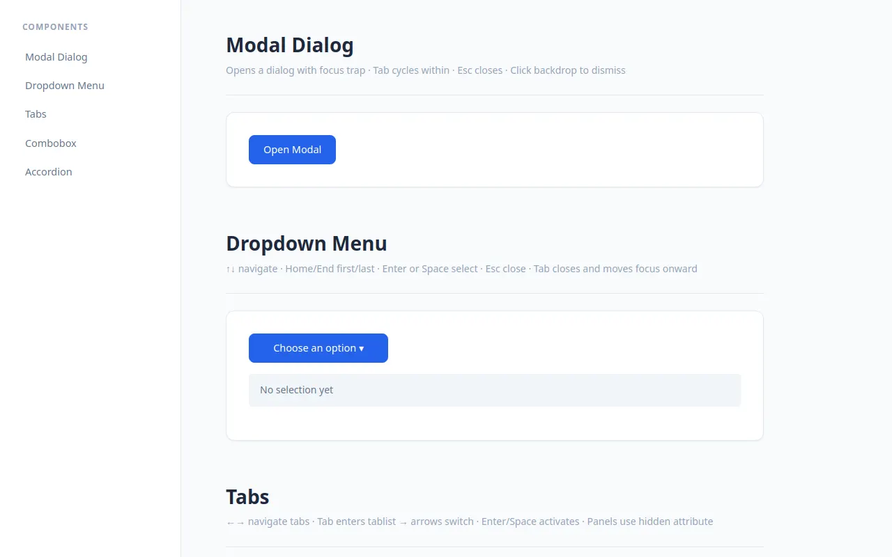
<h2 class="sidebar-title">Components</h2>
<ul class="sidebar-nav">
<li><a href="#modal-section">Modal Dialog</a></li>
<li><a href="#dropdown-section">Dropdown Menu</a></li>
<li><a href="#tabs-section">Tabs</a></li>
<li><a href="#combobox-section">Combobox</a></li>
<li><a href="#accordion-section">Accordion</a></li>
</ul>
</nav>
<main id="main-content" class="content">
<!-- Modal Dialog -->
<section id="modal-section" class="component-section">
<h2>Modal Dialog</h2>
<p class="caption">Opens a dialog with focus trap · Tab cycles within · Esc closes · Click backdrop to dismiss</p>
<div class="demo-area">
<button id="open-modal-btn" class="btn btn-primary">Open Modal</button>
<div id="modal-backdrop" class="modal-backdrop" hidden=""></div>
<div id="modal-dialog" role="dialog" aria-modal="true" aria-labelledby="modal-title" aria-describedby="modal-desc" class="modal" hidden="">
<h3 id="modal-title">Confirm Action</h3>
<p id="modal-desc">Are you sure you want to proceed? This action cannot be undone.</p>
<div class="modal-actions">
<button id="modal-cancel-btn" class="btn btn-secondary">Cancel</button>
<button id="modal-confirm-btn" class="btn btn-primary">Confirm</button>
</div>
</div>
</div>
</section>
<!-- Dropdown Menu -->
<section id="dropdown-section" class="component-section">
<h2>Dropdown Menu</h2>
<p class="caption">↑↓ navigate · Home/End first/last · Enter or Space select · Esc close · Tab closes and moves focus onward</p>
<div class="demo-area">
<div id="dropdown-container" class="dropdown-wrapper">
<button id="dropdown-trigger" aria-haspopup="menu" aria-expanded="false" aria-controls="dropdown-listbox" class="btn btn-primary dropdown-btn">
Choose an option ▾
</button>
<ul id="dropdown-listbox" role="menu" class="dropdown-menu" hidden="">
<li role="none"><span role="menuitem" tabindex="-1" data-value="edit" class="dropdown-item">Edit</span></li>
<li role="none"><span role="menuitem" tabindex="-1" data-value="duplicate" class="dropdown-item">Duplicate</span></li>
<li role="none"><span role="menuitem" tabindex="-1" data-value="delete" class="dropdown-item">Delete</span></li>
<li role="none"><span role="menuitem" tabindex="-1" data-value="rename" class="dropdown-item">Rename</span></li>
<li role="none"><span role="menuitem" tabindex="-1" data-value="share" class="dropdown-item">Share</span></li>
</ul>
</div>
<p id="dropdown-result" class="result-text">No selection yet</p>
</div>
</section>
<!-- Tabs -->
<section id="tabs-section" class="component-section">
<h2>Tabs</h2>
<p class="caption">←→ navigate tabs · Tab enters tablist → arrows switch · Enter/Space activates · Panels use hidden attribute</p>
<div class="demo-area">
<div id="tabs-container" class="tabs-wrapper">
<div role="tablist" aria-label="File operations" class="tablist">
<button role="tab" id="tab-overview" aria-selected="true" aria-controls="panel-overview" tabindex="0" class="tab active">Overview</button>
<button role="tab" id="tab-details" aria-selected="false" aria-controls="panel-details" tabindex="-1" class="tab">Details</button>
<button role="tab" id="tab-settings" aria-selected="false" aria-controls="panel-settings" tabindex="-1" class="tab">Settings</button>
</div>
<div role="tabpanel" id="panel-overview" aria-labelledby="tab-overview" class="tabpanel active">
<h4>Project Overview</h4>
<p>This is a showcase of accessible web components built with vanilla JavaScript. Each component follows WAI-ARIA Authoring Practices for keyboard interaction and screen reader compatibility.</p>
<ul>
<li>Modal Dialog — focus trap, inert page behind</li>
<li>Dropdown Menu — arrow key navigation, wrapping</li>
<li>Tabs — roving tabindex pattern</li>
<li>Combobox — aria-activedescendant pattern</li>
<li>Accordion — disclosure group with animation</li>
</ul>
</div>
<div role="tabpanel" id="panel-details" aria-labelledby="tab-details" hidden="" class="tabpanel">
<h4>Technical Details</h4>
<p>Built with TypeScript, organized into modular components. No external dependencies — pure HTML, CSS, and JavaScript.</p>
<table>
<thead><tr><th>Feature</th><th>Status</th></tr></thead>
<tbody>
<tr><td>Keyboard accessible</td><td>✓ Complete</td></tr>
<tr><td>Screen reader tested</td><td>✓ ARIA compliant</td></tr>
<tr><td>Reduced motion support</td><td>✓ Respected</td></tr>
<tr><td>200% zoom safe</td><td>✓ Fluid layout</td></tr>
</tbody>
</table>
</div>
<div role="tabpanel" id="panel-settings" aria-labelledby="tab-settings" hidden="" class="tabpanel">
<h4>Configuration Options</h4>
<p>All components support theming through CSS custom properties. Animation durations and colors are tunable constants at the top of the source.</p>
<dl>
<dt>Accent Color</dt><dd>Customizable via --accent-primary</dd>
<dt>Animation Duration</dt><dd>Configurable in constants module</dd>
<dt>Focus Style</dt><dd>High-contrast outline, never removed</dd>
</dl>
</div>
</div>
</div>
</section>
<!-- Combobox -->
<section id="combobox-section" class="component-section">
<h2>Combobox (Autocomplete)</h2>
<p class="caption">Type to filter · ↓↑ highlight options · Enter selects · Esc closes and reverts · Focus out closes</p>
<div class="demo-area">
<div id="combobox-container" class="combobox-wrapper">
<label for="combo-input" class="sr-only">Select a programming language</label>
<input id="combo-input" role="combobox" aria-expanded="false" aria-controls="combo-listbox" aria-activedescendant="" autocomplete="off" placeholder="Type to search languages..." class="combo-input">
<ul id="combo-listbox" role="listbox" class="combo-listbox" hidden="">
</ul>
</div>
<p id="combo-result" class="result-text">No language selected</p>
</div>
</section>
<!-- Accordion -->
<section id="accordion-section" class="component-section">
<h2>Accordion (Disclosure Group)</h2>
<p class="caption">Enter or Space toggles sections · Multiple open at once · Animated height with hidden attribute</p>
<div class="demo-area">
<div id="accordion-container" class="accordion-wrapper" role="region" aria-label="Frequently asked questions">
<div class="accordion-item">
<h3 class="accordion-header">
<button id="acc-btn-1" aria-expanded="false" aria-controls="acc-panel-1" class="accordion-trigger">
<span>What is this showcase?</span>
<span class="accordion-icon" aria-hidden="true">+</span>
</button>
</h3>
<div id="acc-panel-1" role="region" aria-labelledby="acc-btn-1" hidden="" class="accordion-panel">
<p>This is a demonstration of accessible web components built with vanilla JavaScript. Every widget follows WAI-ARIA Authoring Practices for keyboard interaction and screen reader compatibility.</p>
</div>
</div>
<div class="accordion-item">
<h3 class="accordion-header">
<button id="acc-btn-2" aria-expanded="false" aria-controls="acc-panel-2" class="accordion-trigger">
<span>Do I need any dependencies?</span>
<span class="accordion-icon" aria-hidden="true">+</span>
</button>
</h3>
<div id="acc-panel-2" role="region" aria-labelledby="acc-btn-2" hidden="" class="accordion-panel">
<p>No! Everything is built with vanilla HTML, CSS, and JavaScript. There are no external libraries, frameworks, or CDN dependencies. The code is organized into TypeScript modules for clarity.</p>
</div>
</div>
<div class="accordion-item">
<h3 class="accordion-header">
<button id="acc-btn-3" aria-expanded="false" aria-controls="acc-panel-3" class="accordion-trigger">
<span>How is keyboard navigation handled?</span>
<span class="accordion-icon" aria-hidden="true">+</span>
</button>
</h3>
<div id="acc-panel-3" role="region" aria-labelledby="acc-btn-3" hidden="" class="accordion-panel">
<p>Each component implements its own keyboard contract following WAI-ARIA patterns. Shared utilities handle focus trapping and aria-activedescendant management. Every interactive element has visible focus indicators.</p>
</div>
</div>
<div class="accordion-item">
<h3 class="accordion-header">
<button id="acc-btn-4" aria-expanded="false" aria-controls="acc-panel-4" class="accordion-trigger">
<span>Does it support reduced motion?</span>
<span class="accordion-icon" aria-hidden="true">+</span>
</button>
</h3>
<div id="acc-panel-4" role="region" aria-labelledby="acc-btn-4" hidden="" class="accordion-panel">
<p>Yes. All animations respect the prefers-reduced-motion media query. When this preference is set, components transition instantly without any visual animation while maintaining full functionality.</p>
</div>
</div>
</div>
</div>
</section>
<!-- Live region for announcements -->
<div id="live-announcer" aria-live="polite" aria-atomic="true" class="sr-only"></div>
</main>
</div>
</div>
<script>
(function () {
'use strict';
var __mods = {};
var __cache = {};
var __map = {"src/main.ts":{"./components/modal.js":"src/components/modal.ts","./components/dropdown.js":"src/components/dropdown.ts","./components/tabs.js":"src/components/tabs.ts","./components/combobox.js":"src/components/combobox.ts","./components/accordion.js":"src/components/accordion.ts"},"src/components/modal.ts":{"../utils/focus-trap.js":"src/utils/focus-trap.ts","../utils/announce.js":"src/utils/announce.ts"},"src/components/dropdown.ts":{"../utils/announce.js":"src/utils/announce.ts"},"src/components/tabs.ts":{"../utils/announce.js":"src/utils/announce.ts"},"src/components/combobox.ts":{"../utils/announce.js":"src/utils/announce.ts"},"src/components/accordion.ts":{"../utils/announce.js":"src/utils/announce.ts"}};
function __require(id) {
if (__cache[id]) return __cache[id].exports;
var module = __cache[id] = { exports: {} };
var factory = __mods[id];
if (!factory) throw new Error("Module not found: " + id);
factory(module.exports, function (spec) {
var target = (__map[id] && __map[id][spec]) || spec;
return __require(target);
}, module);
return module.exports;
}
// ── module: src/main.ts ──
__mods["src/main.ts"] = function (exports, require, module) {
"use strict";
/**
* Entry Point — Accessible Component Showcase
*
* Initializes all component modules after DOM is ready.
*/
Object.defineProperty(exports, "__esModule", { value: true });
exports.start = start;
const modal_js_1 = require("./components/modal.js");
const dropdown_js_1 = require("./components/dropdown.js");
const tabs_js_1 = require("./components/tabs.js");
const combobox_js_1 = require("./components/combobox.js");
const accordion_js_1 = require("./components/accordion.js");
function start() {
// Initialize all components
(0, modal_js_1.initModal)();
(0, dropdown_js_1.initDropdown)();
(0, tabs_js_1.initTabs)();
(0, combobox_js_1.initCombobox)();
(0, accordion_js_1.initAccordion)();
// Smooth scroll for sidebar navigation links
document.querySelectorAll('.sidebar-nav a').forEach((link) => {
link.addEventListener('click', (event) => {
const href = link.getAttribute('href');
if (href?.startsWith('#')) {
event.preventDefault();
const target = document.querySelector(href);
if (target instanceof HTMLElement) {
target.scrollIntoView({ behavior: 'smooth', block: 'start' });
// Update URL without jumping
history.pushState(null, '', href);
// Move focus to the section for accessibility
target.setAttribute('tabindex', '-1');
target.focus();
}
}
});
});
console.log('Accessible Component Showcase initialized.');
}
// Boot on DOM ready
start();
};
// ── module: src/constants.ts ──
__mods["src/constants.ts"] = function (exports, require, module) {
"use strict";
/**
* Tunable design system constants.
* Colors, spacing scale, animation durations — all centralized here.
*/
Object.defineProperty(exports, "__esModule", { value: true });
exports.focus = exports.animation = exports.spacing = exports.theme = void 0;
exports.theme = {
accent: {
primary: '#2563eb',
hover: '#1d4ed8',
light: '#dbeafe',
},
text: {
primary: '#1e293b',
secondary: '#64748b',
muted: '#94a3b8',
},
bg: {
body: '#f8fafc',
surface: '#ffffff',
hover: '#f1f5f9',
active: '#e2e8f0',
},
border: {
default: '#e2e8f0',
focus: '#2563eb',
},
};
exports.spacing = {
xs: '4px',
sm: '8px',
md: '16px',
lg: '24px',
xl: '32px',
xxl: '48px',
};
exports.animation = {
fast: 150,
normal: 250,
slow: 400,
};
exports.focus = {
width: '3px',
offset: '2px',
color: '#2563eb',
};
};
// ── module: src/utils/focus-trap.ts ──
__mods["src/utils/focus-trap.ts"] = function (exports, require, module) {
"use strict";
/**
* Focus Trap Utility
*
* Traps keyboard focus within a container element.
* Tab/Shift+Tab cycles through all focusable elements inside the trap.
*/
Object.defineProperty(exports, "__esModule", { value: true });
exports.createFocusTrap = createFocusTrap;
const FOCUSABLE_SELECTOR = [
'a[href]',
'button:not([disabled])',
'input:not([disabled]):not([type="hidden"])',
'select:not([disabled])',
'textarea:not([disabled])',
'[tabindex]:not([tabindex="-1"])',
'[contenteditable="true"]',
].join(', ');
/**
* Creates a focus trap that cycles focus within `container`.
* Returns a handle with activate/deactivate methods.
*/
function createFocusTrap(options) {
const { container, onEscape, returnFocus = true } = options;
let previouslyFocused = null;
let isActive = false;
function getFocusableElements() {
const elements = Array.from(container.querySelectorAll(FOCUSABLE_SELECTOR));
// Filter out hidden/disabled elements
return elements.filter((el) => {
if (el.offsetParent === null && !el.closest('[hidden]'))
return false;
if (el.hasAttribute('disabled') || el.getAttribute('aria-disabled') === 'true')
return false;
const style = window.getComputedStyle(el);
if (style.display === 'none' || style.visibility === 'hidden')
return false;
return true;
});
}
function handleKeyDown(event) {
if (!isActive)
return;
// Escape handled by caller via onEscape callback
if (event.key === 'Escape') {
event.stopPropagation();
onEscape?.();
return;
}
const focusable = getFocusableElements();
if (focusable.length === 0)
return;
const firstEl = focusable[0];
const lastEl = focusable[focusable.length - 1];
const active = document.activeElement;
if (event.key === 'Tab') {
event.preventDefault();
event.stopPropagation();
if (event.shiftKey) {
// Shift+Tab: if on first element, wrap to last
if (active === firstEl || !container.contains(active)) {
lastEl.focus();
}
else {
const idx = focusable.indexOf(active);
if (idx > 0)
focusable[idx - 1].focus();
else
lastEl.focus();
}
}
else {
// Tab: if on last element, wrap to first
if (active === lastEl || !container.contains(active)) {
firstEl.focus();
}
else {
const idx = focusable.indexOf(active);
if (idx < focusable.length - 1)
focusable[idx + 1].focus();
else
firstEl.focus();
}
}
}
}
return {
activate() {
if (isActive)
return;
isActive = true;
if (returnFocus) {
previouslyFocused = document.activeElement;
}
container.setAttribute('data-focus-trap', 'active');
document.addEventListener('keydown', handleKeyDown, true);
// Focus the first focusable element
const focusable = getFocusableElements();
if (focusable.length > 0) {
focusable[0].focus();
}
else {
container.setAttribute('tabindex', '-1');
container.focus();
}
},
deactivate() {
if (!isActive)
return;
isActive = false;
container.removeAttribute('data-focus-trap');
document.removeEventListener('keydown', handleKeyDown, true);
// Return focus to the previously focused element
if (returnFocus && previouslyFocused instanceof HTMLElement) {
try {
previouslyFocused.focus();
}
catch {
// Element may have been removed from DOM
}
}
},
};
}
};
// ── module: src/utils/announce.ts ──
__mods["src/utils/announce.ts"] = function (exports, require, module) {
"use strict";
/**
* Live Region Announcer
*
* Provides a helper to announce status messages to screen readers
* via an aria-live region.
*/
Object.defineProperty(exports, "__esModule", { value: true });
exports.announce = announce;
exports.announceAssertive = announceAssertive;
let announcer = null;
function getAnnouncer() {
if (announcer)
return announcer;
announcer = document.getElementById('live-announcer');
if (!announcer) {
announcer = document.createElement('div');
announcer.id = 'live-announcer';
announcer.setAttribute('aria-live', 'polite');
announcer.setAttribute('aria-atomic', 'true');
announcer.className = 'sr-only';
document.body.appendChild(announcer);
}
return announcer;
}
/**
* Announce a message to screen readers.
* Uses a timeout to ensure the live region is cleared before next announcement.
*/
function announce(message, priority = 'polite') {
const el = getAnnouncer();
// Clear first to ensure re-announcement of same text works
el.textContent = '';
el.setAttribute('aria-live', priority);
requestAnimationFrame(() => {
el.textContent = message;
});
}
/**
* Announce an important status change immediately.
*/
function announceAssertive(message) {
announce(message, 'assertive');
}
};
// ── module: src/components/modal.ts ──
__mods["src/components/modal.ts"] = function (exports, require, module) {
"use strict";
/**
* Modal Dialog Component
*
* Implements WAI-ARIA dialog pattern:
* - role="dialog" with aria-modal="true"
* - Focus trap within the dialog
* - Focus returns to trigger on close
* - Escape closes, backdrop click closes
* - Page behind is inert while open
*/
Object.defineProperty(exports, "__esModule", { value: true });
exports.initModal = initModal;
const focus_trap_js_1 = require("../utils/focus-trap.js");
const announce_js_1 = require("../utils/announce.js");
const TRIGGER_ID = 'open-modal-btn';
const DIALOG_ID = 'modal-dialog';
const BACKDROP_ID = 'modal-backdrop';
const CANCEL_ID = 'modal-cancel-btn';
const CONFIRM_ID = 'modal-confirm-btn';
let focusTrap = null;
function getTrigger() {
return document.getElementById(TRIGGER_ID);
}
function getDialog() {
return document.getElementById(DIALOG_ID);
}
function getBackdrop() {
return document.getElementById(BACKDROP_ID);
}
function initModal() {
const trigger = getTrigger();
const dialog = getDialog();
const backdrop = getBackdrop();
// Set up focus trap
focusTrap = (0, focus_trap_js_1.createFocusTrap)({
container: dialog,
onEscape: () => closeModal(),
});
function setInert() {
// Set inert on everything outside the dialog
const sidebar = document.querySelector('.sidebar');
const skipLink = document.querySelector('.skip-link');
if (sidebar instanceof HTMLElement)
sidebar.setAttribute('inert', '');
if (skipLink instanceof HTMLElement)
skipLink.setAttribute('inert', '');
// Set inert on all section elements EXCEPT the modal section
const sections = document.querySelectorAll('.component-section');
sections.forEach(section => {
if (section.id !== 'modal-section') {
section.setAttribute('inert', '');
}
});
}
function clearInert() {
document.querySelectorAll('[inert]').forEach(el => el.removeAttribute('inert'));
}
function openModal() {
// Show backdrop and dialog
backdrop.removeAttribute('hidden');
dialog.removeAttribute('hidden');
// Make page behind inert (except the modal itself)
setInert();
// Activate focus trap (focuses first element inside dialog)
if (focusTrap)
focusTrap.activate();
(0, announce_js_1.announce)('Dialog opened: Confirm Action');
}
function closeModal() {
// Hide backdrop and dialog
backdrop.setAttribute('hidden', '');
dialog.setAttribute('hidden', '');
// Clear inert from page
clearInert();
// Deactivate focus trap (returns focus to trigger)
if (focusTrap)
focusTrap.deactivate();
(0, announce_js_1.announce)('Dialog closed');
}
function handleBackdropClick(event) {
if (event.target === backdrop) {
closeModal();
}
}
trigger.addEventListener('click', openModal);
backdrop.addEventListener('click', handleBackdropClick);
document.getElementById(CANCEL_ID)?.addEventListener('click', closeModal);
document.getElementById(CONFIRM_ID)?.addEventListener('click', () => {
(0, announce_js_1.announce)('Action confirmed');
closeModal();
});
}
};
// ── module: src/components/dropdown.ts ──
__mods["src/components/dropdown.ts"] = function (exports, require, module) {
"use strict";
/**
* Dropdown Menu Component
*
* Implements WAI-ARIA menu pattern:
* - Button with aria-haspopup="menu" and aria-expanded
* - Arrow key navigation (wrapping) within the menu
* - Home/End to first/last item
* - Escape closes, Tab closes naturally
* - Enter/Space selects an item
*/
Object.defineProperty(exports, "__esModule", { value: true });
exports.initDropdown = initDropdown;
const announce_js_1 = require("../utils/announce.js");
const TRIGGER_ID = 'dropdown-trigger';
const MENU_ID = 'dropdown-listbox';
const RESULT_ID = 'dropdown-result';
function getTrigger() {
return document.getElementById(TRIGGER_ID);
}
function getMenu() {
return document.getElementById(MENU_ID);
}
function getResult() {
return document.getElementById(RESULT_ID);
}
function getItems() {
const menu = getMenu();
return Array.from(menu.querySelectorAll('[role="menuitem"]'));
}
function initDropdown() {
const trigger = getTrigger();
let state = { isOpen: false, activeIndex: -1 };
function openMenu() {
getMenu().removeAttribute('hidden');
trigger.setAttribute('aria-expanded', 'true');
state.isOpen = true;
// Focus first item on keyboard open
const items = getItems();
if (items.length > 0) {
setItemActive(items, 0);
(0, announce_js_1.announce)(`Menu opened. ${items[0].textContent} selected.`);
}
}
function closeMenu(returnFocus = true) {
getMenu().setAttribute('hidden', '');
trigger.setAttribute('aria-expanded', 'false');
state.isOpen = false;
state.activeIndex = -1;
if (returnFocus) {
trigger.focus();
}
}
function toggleMenu() {
if (state.isOpen) {
closeMenu();
}
else {
openMenu();
}
}
function selectItem(item) {
const value = item.dataset.value || item.textContent;
getResult().textContent = `Selected: ${value}`;
(0, announce_js_1.announce)(`${item.textContent} selected`);
closeMenu(true);
}
function setItemActive(items, index) {
// Remove active from all items
items.forEach((item) => {
item.removeAttribute('aria-selected');
item.setAttribute('tabindex', '-1');
});
if (index >= 0 && index < items.length) {
const target = items[index];
target.setAttribute('aria-selected', 'true');
target.setAttribute('tabindex', '0');
state.activeIndex = index;
// Scroll into view if needed
target.scrollIntoView({ block: 'nearest' });
}
}
function handleKeyDown(event) {
const items = getItems();
if (items.length === 0)
return;
switch (event.key) {
case 'ArrowDown':
event.preventDefault();
if (!state.isOpen) {
openMenu();
setItemActive(items, 0);
}
else {
const nextIndex = state.activeIndex < items.length - 1
? state.activeIndex + 1
: 0; // Wrap to first
setItemActive(items, nextIndex);
(0, announce_js_1.announce)(`${items[nextIndex].textContent} highlighted`);
}
break;
case 'ArrowUp':
event.preventDefault();
if (state.isOpen) {
const prevIndex = state.activeIndex > 0
? state.activeIndex - 1
: items.length - 1; // Wrap to last
setItemActive(items, prevIndex);
(0, announce_js_1.announce)(`${items[prevIndex].textContent} highlighted`);
}
break;
case 'Home':
event.preventDefault();
if (state.isOpen) {
setItemActive(items, 0);
(0, announce_js_1.announce)(`${items[0].textContent} highlighted`);
}
break;
case 'End':
event.preventDefault();
if (state.isOpen) {
setItemActive(items, items.length - 1);
(0, announce_js_1.announce)(`${items[items.length - 1].textContent} highlighted`);
}
break;
case 'Enter':
case ' ':
event.preventDefault();
if (state.isOpen && state.activeIndex >= 0) {
selectItem(items[state.activeIndex]);
}
break;
case 'Escape':
event.preventDefault();
closeMenu(true);
(0, announce_js_1.announce)('Menu closed');
break;
case 'Tab':
// Tab naturally closes the menu and moves focus onward
if (state.isOpen) {
closeMenu(false);
}
break;
}
}
function handleItemClick(event) {
const target = event.target;
if (target.hasAttribute('role') && target.getAttribute('role') === 'menuitem') {
selectItem(target);
}
}
trigger.addEventListener('click', toggleMenu);
trigger.addEventListener('keydown', handleKeyDown);
getMenu().addEventListener('click', handleItemClick);
}
};
// ── module: src/components/tabs.ts ──
__mods["src/components/tabs.ts"] = function (exports, require, module) {
"use strict";
/**
* Tabs Component
*
* Implements WAI-ARIA tabs pattern:
* - role="tablist" with roving tabindex on tabs
* - Arrow key navigation (wrapping) between tabs
* - Each tab controls a panel via aria-controls/aria-labelledby
* - Hidden panels use the hidden attribute
*/
Object.defineProperty(exports, "__esModule", { value: true });
exports.initTabs = initTabs;
const announce_js_1 = require("../utils/announce.js");
const TABLIST_ID = 'tabs-container';
function getTablist() {
return document.getElementById(TABLIST_ID);
}
function getTabs() {
const tablist = getTablist();
return Array.from(tablist.querySelectorAll('[role="tab"]'));
}
function getPanels() {
const tablist = getTablist();
const tabs = tablist.querySelectorAll('[role="tab"]');
const panels = new Map();
tabs.forEach((tab) => {
const panelId = tab.getAttribute('aria-controls');
if (panelId) {
const panel = document.getElementById(panelId);
if (panel) {
panels.set(tab.id, panel);
}
}
});
return panels;
}
function initTabs() {
let tabs = [];
let activeIndex = 0;
function refreshState() {
tabs = getTabs();
const currentIndex = tabs.findIndex((t) => t.getAttribute('aria-selected') === 'true');
if (currentIndex >= 0) {
activeIndex = currentIndex;
}
}
function activateTab(index, announceText) {
refreshState();
const panels = getPanels();
// Update all tabs
tabs.forEach((tab, i) => {
const isActive = i === index;
tab.setAttribute('aria-selected', String(isActive));
tab.setAttribute('tabindex', isActive ? '0' : '-1');
// Update corresponding panel
const panelId = tab.getAttribute('aria-controls');
if (panelId) {
const panel = document.getElementById(panelId);
if (panel) {
if (isActive) {
panel.removeAttribute('hidden');
}
else {
panel.setAttribute('hidden', '');
}
}
}
});
activeIndex = index;
// Announce tab change
const text = announceText || tabs[index].textContent?.trim() || 'Tab';
(0, announce_js_1.announce)(`${text} tab selected`);
}
function handleKeyDown(event) {
refreshState();
if (tabs.length === 0)
return;
let newIndex = -1;
switch (event.key) {
case 'ArrowRight':
event.preventDefault();
newIndex = activeIndex < tabs.length - 1 ? activeIndex + 1 : 0; // Wrap
break;
case 'ArrowLeft':
event.preventDefault();
newIndex = activeIndex > 0 ? activeIndex - 1 : tabs.length - 1; // Wrap
break;
case 'Home':
event.preventDefault();
newIndex = 0;
break;
case 'End':
event.preventDefault();
newIndex = tabs.length - 1;
break;
default:
return;
}
if (newIndex >= 0) {
activateTab(newIndex);
// Move focus to the new tab
const newTab = document.getElementById(tabs[newIndex].id);
if (newTab instanceof HTMLElement) {
newTab.focus();
}
}
}
function handleTabClick(event) {
const target = event.target;
if (target.hasAttribute('role') && target.getAttribute('role') === 'tab') {
const index = tabs.findIndex((t) => t.id === target.id);
if (index >= 0) {
activateTab(index, target.textContent?.trim());
}
}
}
// Initialize: ensure only first tab is active
refreshState();
if (tabs.length > 0 && activeIndex !== 0) {
activateTab(0);
}
const tablist = getTablist();
tablist.addEventListener('keydown', handleKeyDown);
tablist.addEventListener('click', handleTabClick);
}
};
// ── module: src/components/combobox.ts ──
__mods["src/components/combobox.ts"] = function (exports, require, module) {
"use strict";
/**
* Combobox (Autocomplete) Component
*
* Implements WAI-ARIA combobox pattern with aria-activedescendant:
* - Input with role="combobox" and aria-controls/listbox
* - Typing filters options in real-time
* - Arrow keys move highlight via aria-activedescendant
* - Enter selects, Escape closes (reverting value)
* - Focus out closes the list
* - Listbox is never keyboard-focusable itself
*/
Object.defineProperty(exports, "__esModule", { value: true });
exports.initCombobox = initCombobox;
const announce_js_1 = require("../utils/announce.js");
const INPUT_ID = 'combo-input';
const LISTBOX_ID = 'combo-listbox';
const RESULT_ID = 'combo-result';
// ~20 programming language options
const ALL_OPTIONS = [
'JavaScript', 'TypeScript', 'Python', 'Java', 'C++',
'C#', 'Go', 'Rust', 'Swift', 'Kotlin',
'Ruby', 'PHP', 'Scala', 'Haskell', 'Elixir',
'Lua', 'Perl', 'R', 'MATLAB', 'Julia',
];
function getInput() {
return document.getElementById(INPUT_ID);
}
function getListbox() {
return document.getElementById(LISTBOX_ID);
}
function getResult() {
return document.getElementById(RESULT_ID);
}
function initCombobox() {
const input = getInput();
let state = {
isOpen: false,
activeIndex: -1,
filteredOptions: [...ALL_OPTIONS],
originalValue: '',
};
function renderOptions(options) {
const listbox = getListbox();
listbox.innerHTML = '';
options.forEach((option, index) => {
const li = document.createElement('li');
li.id = `combo-option-${index}`;
li.setAttribute('role', 'option');
li.setAttribute('aria-selected', String(index === state.activeIndex));
li.textContent = option;
listbox.appendChild(li);
});
// Update aria-activedescendant if open
if (state.isOpen && options.length > 0) {
const activeIdx = Math.max(0, state.activeIndex);
input.setAttribute('aria-activedescendant', `combo-option-${activeIdx}`);
}
else {
input.removeAttribute('aria-activedescendant');
}
}
function filterOptions(query) {
const lower = query.toLowerCase();
state.filteredOptions = ALL_OPTIONS.filter((opt) => opt.toLowerCase().includes(lower));
}
function openListbox() {
getListbox().removeAttribute('hidden');
input.setAttribute('aria-expanded', 'true');
state.isOpen = true;
// Move highlight to first option if none active
if (state.activeIndex < 0 && state.filteredOptions.length > 0) {
state.activeIndex = 0;
}
renderOptions(state.filteredOptions);
// Set aria-activedescendant after rendering
if (state.isOpen && state.filteredOptions.length > 0 && state.activeIndex >= 0) {
const optionId = `combo-option-${state.activeIndex}`;
input.setAttribute('aria-activedescendant', optionId);
// Scroll into view
const el = document.getElementById(optionId);
if (el)
el.scrollIntoView({ block: 'nearest' });
(0, announce_js_1.announce)(`${state.filteredOptions[state.activeIndex]} highlighted`);
}
}
function closeListbox(restoreValue = false) {
getListbox().setAttribute('hidden', '');
input.setAttribute('aria-expanded', 'false');
state.isOpen = false;
state.activeIndex = -1;
input.removeAttribute('aria-activedescendant');
if (restoreValue) {
input.value = state.originalValue;
}
}
function selectOption(option) {
input.value = option;
getResult().textContent = `Selected: ${option}`;
(0, announce_js_1.announce)(`${option} selected`);
closeListbox(false);
}
function handleInput(event) {
const target = event.target;
state.originalValue = target.value;
filterOptions(target.value);
state.activeIndex = -1;
if (target.value.length > 0) {
openListbox();
}
else {
closeListbox(false);
}
}
function handleKeyDown(event) {
const listbox = getListbox();
const options = state.filteredOptions;
switch (event.key) {
case 'ArrowDown':
event.preventDefault();
if (!state.isOpen && options.length > 0) {
openListbox();
return;
}
if (state.isOpen && options.length > 0) {
const nextIndex = state.activeIndex < options.length - 1
? state.activeIndex + 1
: 0; // Wrap
state.activeIndex = nextIndex;
const optionId = `combo-option-${nextIndex}`;
input.setAttribute('aria-activedescendant', optionId);
// Scroll into view
const el = document.getElementById(optionId);
if (el)
el.scrollIntoView({ block: 'nearest' });
(0, announce_js_1.announce)(`${options[nextIndex]} highlighted`);
}
break;
case 'ArrowUp':
event.preventDefault();
if (state.isOpen && options.length > 0) {
const prevIndex = state.activeIndex > 0
? state.activeIndex - 1
: options.length - 1; // Wrap
state.activeIndex = prevIndex;
const optionId = `combo-option-${prevIndex}`;
input.setAttribute('aria-activedescendant', optionId);
// Scroll into view
const el = document.getElementById(optionId);
if (el)
el.scrollIntoView({ block: 'nearest' });
(0, announce_js_1.announce)(`${options[prevIndex]} highlighted`);
}
break;
case 'Enter':
event.preventDefault();
if (state.isOpen && state.activeIndex >= 0 && options[state.activeIndex]) {
selectOption(options[state.activeIndex]);
}
break;
case 'Escape':
event.preventDefault();
closeListbox(true); // Revert value
(0, announce_js_1.announce)('Closed without selection');
break;
case 'Tab':
// If open and an option is highlighted, select it
if (state.isOpen && state.activeIndex >= 0 && options[state.activeIndex]) {
selectOption(options[state.activeIndex]);
}
else if (state.isOpen) {
closeListbox(false);
}
break;
}
}
function handleFocusOut() {
// Close on focus out, but not when clicking an option
setTimeout(() => {
const active = document.activeElement;
if (active && getListbox().contains(active))
return;
closeListbox(true);
}, 0);
}
function handleOptionClick(event) {
const target = event.target;
if (target.hasAttribute('role') && target.getAttribute('role') === 'option') {
const optionText = target.textContent || '';
selectOption(optionText);
}
}
// Initialize listbox with all options (hidden)
filterOptions('');
renderOptions(state.filteredOptions);
input.addEventListener('input', handleInput);
input.addEventListener('keydown', handleKeyDown);
input.addEventListener('focusout', handleFocusOut);
getListbox().addEventListener('click', handleOptionClick);
}
};
// ── module: src/components/accordion.ts ──
__mods["src/components/accordion.ts"] = function (exports, require, module) {
"use strict";
/**
* Accordion (Disclosure Group) Component
*
* Implements WAI-ARIA disclosure pattern:
* - Buttons with aria-expanded and aria-controls
* - Enter/Space toggles sections
* - Multiple sections can be open simultaneously
* - Animated height transition, hidden attribute toggled at end
* - Respects prefers-reduced-motion
*/
Object.defineProperty(exports, "__esModule", { value: true });
exports.initAccordion = initAccordion;
const announce_js_1 = require("../utils/announce.js");
const ACCORDION_ID = 'accordion-container';
function getContainer() {
return document.getElementById(ACCORDION_ID);
}
function getItems() {
const container = getContainer();
return Array.from(container.querySelectorAll('.accordion-item'));
}
function isReducedMotion() {
return window.matchMedia('(prefers-reduced-motion: reduce)').matches;
}
function initAccordion() {
const items = getItems();
function toggleItem(item) {
const trigger = item.querySelector('.accordion-trigger');
if (!trigger)
return;
const panelId = trigger.getAttribute('aria-controls');
let panel = null;
if (panelId) {
const el = document.getElementById(panelId);
if (el instanceof HTMLElement)
panel = el;
}
if (!panel)
return;
const isExpanded = trigger.getAttribute('aria-expanded') === 'true';
const willExpand = !isExpanded;
// Update button state immediately
trigger.setAttribute('aria-expanded', String(willExpand));
// Get the content height by measuring visible children
function getContentHeight(p) {
const clone = p.cloneNode(true);
clone.style.position = 'absolute';
clone.style.visibility = 'hidden';
clone.style.display = 'block';
clone.removeAttribute('hidden');
clone.style.height = '';
clone.style.overflow = '';
document.body.appendChild(clone);
const height = clone.scrollHeight;
document.body.removeChild(clone);
return height;
}
if (willExpand) {
// Expand: measure content, animate from 0 to full height
panel.removeAttribute('hidden');
const scrollHeight = getContentHeight(panel);
panel.style.height = '0px';
panel.style.overflow = 'hidden';
if (isReducedMotion()) {
panel.style.transition = 'none';
panel.style.height = `${scrollHeight}px`;
requestAnimationFrame(() => {
panel.style.transition = '';
panel.removeAttribute('style');
// Panel stays visible — do NOT set hidden on expand
});
}
else {
panel.style.transition = `height ${250}ms ease`;
void panel.offsetHeight; // Force reflow
panel.style.height = `${scrollHeight}px`;
const onEnd = () => {
panel.removeEventListener('transitionend', onEnd);
panel.removeAttribute('style');
// Panel stays visible — do NOT set hidden on expand
};
panel.addEventListener('transitionend', onEnd);
}
(0, announce_js_1.announce)(`${trigger.querySelector('span')?.textContent} expanded`);
}
else {
// Collapse: measure current height, animate to 0, then hide
const currentHeight = getContentHeight(panel);
panel.removeAttribute('hidden');
panel.style.height = `${currentHeight}px`;
panel.style.overflow = 'hidden';
if (isReducedMotion()) {
panel.style.transition = 'none';
requestAnimationFrame(() => {
panel.style.transition = '';
panel.setAttribute('hidden', '');
});
}
else {
panel.style.transition = `height ${250}ms ease`;
void panel.offsetHeight; // Force reflow
panel.style.height = '0px';
const onEnd = () => {
panel.removeEventListener('transitionend', onEnd);
panel.removeAttribute('style');
panel.setAttribute('hidden', '');
};
panel.addEventListener('transitionend', onEnd);
}
(0, announce_js_1.announce)(`${trigger.querySelector('span')?.textContent} collapsed`);
}
}
function handleTriggerClick(event) {
const target = event.target;
if (target.closest('.accordion-trigger')) {
const trigger = target.closest('.accordion-trigger');
if (trigger) {
const item = trigger.closest('.accordion-item');
if (item)
toggleItem(item);
}
}
}
function handleKeyDown(event) {
// Accordion buttons are naturally focusable, so they get Enter/Space natively.
// No special keyboard handling needed beyond the click handler.
}
const container = getContainer();
container.addEventListener('click', handleTriggerClick);
container.addEventListener('keydown', handleKeyDown);
}
};
// ── entry ──
__require("src/main.ts");
})();
</script>
</body>
</html>
<!-- agent-meta {"model":"ornith-1.0-35b","provider":"lmstudio","persona":"typescript","sessionId":"a99b1efa-0855-40c6-9173-0d66d577c96a","tokensIn":7648482,"tokensOut":60143,"tokensTotal":7708625,"turns":152,"toolCalls":151,"failedToolCalls":3,"timestamp":"2026-07-31T05:47:21.714Z"} -->