Accessible Components
ling 3.0 tiny:free · full
Reviews & generation details
Reviews
No human review yet. Unreviewed does not mean unsuccessful.
Generation context
Imported historical artifact. Its exact original instructions and lineage are not known.
Generation prompt · exact text unavailable
See the current prompt for reference. It may differ from the instructions used to generate this artifact.
Inspect original source 54,240 bytes · SHA-256 fa906dfe9563
<!DOCTYPE html>
<html lang="en">
<head>
<meta charset="UTF-8">
<meta name="viewport" content="width=device-width, initial-scale=1.0">
<title>Accessible Component Showcase</title>
<style>
/* ============================================================
CSS Custom Properties — Tunable Design Tokens
============================================================ */
:root {
--clr-bg: #f5f3ef;
--clr-surface: #ffffff;
--clr-surface-alt: #eae8e3;
--clr-text: #2c2c2c;
--clr-text-muted: #6b6b6b;
--clr-accent: #4a6d7c;
--clr-accent-light: #8bb5c6;
--clr-accent-hover: #3a5969;
--clr-danger: #c0504a;
--clr-danger-hover: #a0403a;
--clr-success: #4a7040;
--clr-success-bg: #e6f0e6;
--clr-warning: #c09030;
--clr-warning-bg: #fdf3e0;
--radius-sm: 6px;
--radius-md: 10px;
--radius-lg: 14px;
--shadow-sm: 0 1px 3px rgba(0,0,0,0.06);
--shadow-md: 0 4px 16px rgba(0,0,0,0.08);
--shadow-lg: 0 8px 32px rgba(0,0,0,0.12);
--space-xs: 4px;
--space-sm: 8px;
--space-md: 16px;
--space-lg: 24px;
--space-xl: 32px;
--space-2xl: 48px;
--font-sans: system-ui, -apple-system, 'Segoe UI', Roboto, Helvetica, Arial, sans-serif;
--font-mono: 'SF Mono', 'Fira Code', 'Courier New', monospace;
--transition-fast: 0.15s ease;
--transition-smooth: 0.25s ease;
--transition-slow: 0.35s ease;
--sidebar-w: 240px;
--sidebar-collapsed-w: 0px;
--focus-ring-color: #4a6d7c;
--focus-ring-offset: 2px;
}
/* ============================================================
Reset & Base
============================================================ */
*, *::before, *::after { box-sizing: border-box; margin: 0; padding: 0; }
html { font-size: 100%; }
body {
font-family: var(--font-sans);
background: var(--clr-bg);
color: var(--clr-text);
line-height: 1.6;
min-height: 100vh;
overflow-x: hidden;
}
/* ============================================================
Skip Link
============================================================ */
.skip-link {
position: fixed;
top: -100px;
left: 8px;
background: var(--clr-accent);
color: #fff;
padding: var(--space-sm) var(--space-md);
border-radius: var(--radius-sm);
z-index: 10000;
font-weight: 600;
text-decoration: none;
transition: top var(--transition-smooth);
}
.skip-link:focus {
top: 8px;
outline: 3px solid var(--clr-accent-light);
outline-offset: 2px;
}
/* ============================================================
Layout — Sticky Sidebar
============================================================ */
.app-layout {
display: flex;
min-height: 100vh;
}
.sidebar {
position: sticky;
top: 0;
width: var(--sidebar-w);
height: 100vh;
background: var(--clr-surface);
border-right: 1px solid var(--clr-surface-alt);
padding: var(--space-lg) var(--space-md);
overflow-y: auto;
z-index: 100;
display: flex;
flex-direction: column;
gap: var(--space-md);
}
.sidebar-logo {
font-size: 1.25rem;
font-weight: 700;
color: var(--clr-accent);
letter-spacing: -0.02em;
margin-bottom: var(--space-xs);
}
.sidebar-nav {
list-style: none;
display: flex;
flex-direction: column;
gap: 2px;
}
.sidebar-nav a {
display: block;
padding: var(--space-sm) var(--space-md);
border-radius: var(--radius-sm);
color: var(--clr-text-muted);
text-decoration: none;
font-size: 0.9rem;
transition: background var(--transition-fast), color var(--transition-fast);
border: 2px solid transparent;
}
.sidebar-nav a:hover {
background: var(--clr-surface-alt);
color: var(--clr-text);
}
.sidebar-nav a.active {
background: var(--clr-accent);
color: #fff;
font-weight: 600;
}
.sidebar-nav a:focus-visible {
outline: 3px solid var(--focus-ring-color);
outline-offset: 2px;
}
.sidebar-footer {
margin-top: auto;
padding-top: var(--space-md);
font-size: 0.8rem;
color: var(--clr-text-muted);
}
/* ============================================================
Main Content
============================================================ */
.main-content {
flex: 1;
padding: var(--space-xl) var(--space-2xl);
max-width: 860px;
}
.page-header {
margin-bottom: var(--space-xl);
}
.page-header h1 {
font-size: 2rem;
font-weight: 700;
color: var(--clr-accent);
letter-spacing: -0.02em;
margin-bottom: var(--space-xs);
}
.page-header p {
color: var(--clr-text-muted);
font-size: 1rem;
}
/* ============================================================
Component Sections
============================================================ */
.component-section {
background: var(--clr-surface);
border: 1px solid var(--clr-surface-alt);
border-radius: var(--radius-lg);
padding: var(--space-lg) var(--space-xl);
margin-bottom: var(--space-lg);
box-shadow: var(--shadow-sm);
}
.section-header {
display: flex;
align-items: center;
gap: var(--space-md);
margin-bottom: var(--space-lg);
}
.section-header h2 {
font-size: 1.25rem;
font-weight: 700;
color: var(--clr-accent);
letter-spacing: -0.01em;
}
.section-header .kbd {
font-size: 0.75rem;
background: var(--clr-surface-alt);
padding: 2px 8px;
border-radius: 4px;
font-family: var(--font-mono);
color: var(--clr-text-muted);
border: 1px solid var(--clr-surface-alt);
white-space: nowrap;
}
/* ============================================================
Card — Component Example
============================================================ */
.component-card {
display: flex;
flex-direction: column;
gap: var(--space-md);
}
/* ============================================================
Button — Base (for all component buttons)
============================================================ */
.btn {
display: inline-flex;
align-items: center;
gap: var(--space-sm);
padding: var(--space-sm) var(--space-md);
font-family: var(--font-sans);
font-size: 0.9rem;
font-weight: 600;
border: 2px solid transparent;
border-radius: var(--radius-sm);
cursor: pointer;
background: var(--clr-surface-alt);
color: var(--clr-text);
transition: background var(--transition-fast), border-color var(--transition-fast), box-shadow var(--transition-fast);
white-space: nowrap;
user-select: none;
}
.btn:focus-visible {
outline: 3px solid var(--focus-ring-color);
outline-offset: 2px;
}
.btn-primary {
background: var(--clr-accent);
color: #fff;
border-color: var(--clr-accent);
}
.btn-primary:hover {
background: var(--clr-accent-hover);
}
.btn-ghost {
background: transparent;
color: var(--clr-accent);
border-color: var(--clr-accent);
}
.btn-ghost:hover {
background: var(--clr-surface-alt);
}
.btn-danger {
background: var(--clr-danger);
color: #fff;
border-color: var(--clr-danger);
}
.btn-danger:hover {
background: var(--clr-danger-hover);
}
.btn-sm {
padding: 4px 12px;
font-size: 0.8rem;
}
.btn-icon {
padding: 6px 8px;
min-width: 36px;
justify-content: center;
}
.btn:disabled {
opacity: 0.5;
cursor: not-allowed;
}
/* ============================================================
Input — Base
============================================================ */
.input-group {
display: flex;
flex-direction: column;
gap: var(--space-xs);
}
.input-label {
font-size: 0.85rem;
font-weight: 600;
color: var(--clr-text-muted);
}
input[type="text"], input[type="search"], input[type="email"],
input[type="tel"], input[type="url"] {
font-family: var(--font-sans);
font-size: 1rem;
padding: var(--space-sm) var(--space-md);
border: 2px solid var(--clr-surface-alt);
border-radius: var(--radius-sm);
background: var(--clr-surface);
color: var(--clr-text);
transition: border-color var(--transition-fast), box-shadow var(--transition-fast);
width: 100%;
}
input:focus {
border-color: var(--clr-accent);
box-shadow: 0 0 0 3px rgba(74,109,124,0.15);
outline: none;
}
input:disabled {
opacity: 0.5;
cursor: not-allowed;
}
/* ============================================================
===== MODAL DIALOG =====
============================================================ */
.modal-overlay {
position: fixed;
inset: 0;
background: rgba(0,0,0,0.45);
display: flex;
align-items: center;
justify-content: center;
z-index: 2000;
padding: var(--space-lg);
opacity: 0;
visibility: hidden;
transition: opacity var(--transition-smooth), visibility var(--transition-smooth);
}
.modal-overlay.open {
opacity: 1;
visibility: visible;
}
.modal-dialog {
background: var(--clr-surface);
border-radius: var(--radius-lg);
box-shadow: var(--shadow-lg);
width: 100%;
max-width: 520px;
max-height: 85vh;
display: flex;
flex-direction: column;
transform: translateY(20px);
transition: transform var(--transition-smooth);
outline: none;
}
.modal-overlay.open .modal-dialog {
transform: translateY(0);
}
.modal-header {
padding: var(--space-md) var(--space-lg);
border-bottom: 1px solid var(--clr-surface-alt);
display: flex;
align-items: center;
justify-content: space-between;
}
.modal-header h3 {
font-size: 1.1rem;
font-weight: 700;
color: var(--clr-accent);
}
.modal-close {
background: none;
border: none;
font-size: 1.3rem;
cursor: pointer;
color: var(--clr-text-muted);
padding: 4px 8px;
border-radius: var(--radius-sm);
line-height: 1;
transition: background var(--transition-fast), color var(--transition-fast);
}
.modal-close:hover {
background: var(--clr-surface-alt);
color: var(--clr-text);
}
.modal-close:focus-visible {
outline: 3px solid var(--focus-ring-color);
outline-offset: 2px;
}
.modal-body {
padding: var(--space-lg);
overflow-y: auto;
flex: 1;
}
.modal-body p {
margin-bottom: var(--space-md);
}
.modal-body .info {
background: var(--clr-surface-alt);
padding: var(--space-md);
border-radius: var(--radius-sm);
font-size: 0.9rem;
}
.modal-footer {
padding: var(--space-md) var(--space-lg);
border-top: 1px solid var(--clr-surface-alt);
display: flex;
justify-content: flex-end;
gap: var(--space-sm);
}
.modal-backdrop {
position: fixed;
inset: 0;
background: rgba(0,0,0,0.45);
z-index: 1999;
}
/* ============================================================
===== DROPDOWN MENU =====
============================================================ */
.dropdown {
position: relative;
display: inline-block;
}
.dropdown-trigger {
display: inline-flex;
align-items: center;
gap: var(--space-sm);
padding: var(--space-sm) var(--space-md);
font-family: var(--font-sans);
font-size: 0.9rem;
font-weight: 600;
border: 2px solid var(--clr-surface-alt);
border-radius: var(--radius-sm);
background: var(--clr-surface);
cursor: pointer;
color: var(--clr-text);
transition: border-color var(--transition-fast), box-shadow var(--transition-fast);
white-space: nowrap;
}
.dropdown-trigger:hover {
border-color: var(--clr-accent);
}
.dropdown-trigger:focus-visible {
outline: 3px solid var(--focus-ring-color);
outline-offset: 2px;
}
.dropdown-trigger[aria-expanded="true"] {
border-color: var(--clr-accent);
background: var(--clr-accent);
color: #fff;
}
.dropdown-trigger[aria-expanded="true"] .dropdown-arrow {
transform: rotate(180deg);
}
.dropdown-arrow {
display: inline-block;
width: 10px;
height: 10px;
border-right: 2px solid currentColor;
border-bottom: 2px solid currentColor;
transform: rotate(0deg);
transition: transform var(--transition-fast);
flex-shrink: 0;
}
.dropdown-menu {
position: absolute;
top: calc(100% + var(--space-sm));
left: 0;
min-width: 200px;
background: var(--clr-surface);
border: 1px solid var(--clr-surface-alt);
border-radius: var(--radius-md);
box-shadow: var(--shadow-md);
list-style: none;
padding: var(--space-xs) 0;
z-index: 1500;
opacity: 0;
visibility: hidden;
transform: translateY(-4px);
transition: opacity var(--transition-fast), visibility var(--transition-fast), transform var(--transition-fast);
}
.dropdown-menu.open {
opacity: 1;
visibility: visible;
transform: translateY(0);
}
.dropdown-item {
display: block;
width: 100%;
padding: var(--space-sm) var(--space-md);
text-align: left;
border: none;
background: none;
font-family: var(--font-sans);
font-size: 0.9rem;
color: var(--clr-text);
cursor: pointer;
transition: background var(--transition-fast), color var(--transition-fast);
outline: none;
}
.dropdown-item:hover,
.dropdown-item:focus-visible {
background: var(--clr-surface-alt);
color: var(--clr-accent);
}
.dropdown-item[aria-selected="true"] {
background: var(--clr-accent);
color: #fff;
font-weight: 600;
}
.dropdown-item:focus-visible {
outline: 2px solid var(--focus-ring-color);
outline-offset: -2px;
}
/* ============================================================
===== TABS =====
============================================================ */
.tab-list {
display: flex;
border-bottom: 2px solid var(--clr-surface-alt);
margin-bottom: var(--space-md);
}
.tab {
flex: 1;
padding: var(--space-sm) var(--space-md);
font-family: var(--font-sans);
font-size: 0.9rem;
font-weight: 600;
background: none;
border: none;
border-bottom: 3px solid transparent;
cursor: pointer;
color: var(--clr-text-muted);
transition: color var(--transition-fast), border-color var(--transition-fast);
outline: none;
position: relative;
}
.tab:hover {
color: var(--clr-accent);
}
.tab:focus-visible {
outline: 3px solid var(--focus-ring-color);
outline-offset: -2px;
border-radius: var(--radius-sm);
}
.tab[aria-selected="true"] {
color: var(--clr-accent);
border-bottom-color: var(--clr-accent);
}
.tab[aria-selected="true"]::after {
content: '';
position: absolute;
bottom: -2px;
left: 0;
right: 0;
height: 3px;
background: var(--clr-accent);
border-radius: 2px 2px 0 0;
}
.tab-panel {
display: none;
}
.tab-panel[hidden] {
display: none;
}
.tab-panel:not([hidden]) {
display: block;
}
.tab-panel p {
margin-bottom: var(--space-md);
line-height: 1.7;
}
.tab-panel p:last-child {
margin-bottom: 0;
}
/* ============================================================
===== COMBOBOX =====
============================================================ */
.combobox-wrap {
position: relative;
display: inline-block;
width: 100%;
max-width: 400px;
}
.combobox-input {
display: flex;
align-items: center;
gap: var(--space-sm);
padding: var(--space-sm) var(--space-md);
border: 2px solid var(--clr-surface-alt);
border-radius: var(--radius-sm);
background: var(--clr-surface);
font-family: var(--font-sans);
font-size: 1rem;
color: var(--clr-text);
transition: border-color var(--transition-fast), box-shadow var(--transition-fast);
width: 100%;
}
.combobox-input:focus {
border-color: var(--clr-accent);
box-shadow: 0 0 0 3px rgba(74,109,124,0.15);
outline: none;
}
.combobox-input::placeholder {
color: var(--clr-text-muted);
font-weight: 400;
}
.combobox-input[aria-expanded="true"] {
border-color: var(--clr-accent);
border-width: 2px;
}
.combobox-input .combo-arrow {
display: inline-block;
width: 10px;
height: 10px;
border-right: 2px solid currentColor;
border-bottom: 2px solid currentColor;
transform: rotate(45deg);
flex-shrink: 0;
pointer-events: none;
}
.combobox-options {
position: absolute;
top: calc(100% + var(--space-xs));
left: 0;
right: 0;
background: var(--clr-surface);
border: 1px solid var(--clr-surface-alt);
border-radius: var(--radius-sm);
box-shadow: var(--shadow-md);
max-height: 250px;
overflow-y: auto;
z-index: 1500;
opacity: 0;
visibility: hidden;
transform: translateY(-4px);
transition: opacity var(--transition-fast), visibility var(--transition-fast), transform var(--transition-fast);
list-style: none;
}
.combobox-options.open {
opacity: 1;
visibility: visible;
transform: translateY(0);
}
.combobox-option {
padding: var(--space-sm) var(--space-md);
cursor: pointer;
font-size: 0.9rem;
border: none;
background: none;
width: 100%;
text-align: left;
color: var(--clr-text);
font-family: var(--font-sans);
transition: background var(--transition-fast), color var(--transition-fast);
outline: none;
}
.combobox-option:hover,
.combobox-option:focus-visible {
background: var(--clr-surface-alt);
color: var(--clr-accent);
}
.combobox-option[aria-selected="true"] {
background: var(--clr-accent);
color: #fff;
font-weight: 600;
}
.combobox-option[hidden] {
display: none;
}
.combobox-option[aria-selected="true"] + .combobox-option[hidden] {
display: none;
}
/* ============================================================
===== ACCORDION =====
============================================================ */
.accordion-group {
margin-bottom: var(--space-md);
border: 1px solid var(--clr-surface-alt);
border-radius: var(--radius-md);
overflow: hidden;
}
.accordion-item {
border-bottom: 1px solid var(--clr-surface-alt);
}
.accordion-item:last-child {
border-bottom: none;
}
.accordion-trigger {
width: 100%;
display: flex;
align-items: center;
justify-content: space-between;
gap: var(--space-sm);
padding: var(--space-md) var(--space-lg);
background: var(--clr-surface);
border: none;
font-family: var(--font-sans);
font-size: 0.95rem;
font-weight: 600;
color: var(--clr-text);
cursor: pointer;
text-align: left;
transition: background var(--transition-fast);
outline: none;
}
.accordion-trigger:hover {
background: var(--clr-surface-alt);
}
.accordion-trigger:focus-visible {
outline: 3px solid var(--focus-ring-color);
outline-offset: -2px;
border-radius: var(--radius-sm);
}
.accordion-trigger[aria-expanded="true"] {
color: var(--clr-accent);
background: var(--clr-accent);
color: #fff;
}
.accordion-trigger[aria-expanded="true"] .accordion-icon {
transform: rotate(180deg);
}
.accordion-icon {
width: 20px;
height: 20px;
border-radius: 50%;
background: var(--clr-accent);
display: flex;
align-items: center;
justify-content: center;
color: #fff;
font-size: 0.7rem;
flex-shrink: 0;
transition: transform var(--transition-smooth);
}
.accordion-body {
max-height: 0;
overflow: hidden;
transition: max-height var(--transition-slow) ease;
background: var(--clr-surface);
}
.accordion-body[hidden] {
display: none;
}
.accordion-body:not([hidden]) {
display: block;
}
.accordion-body-inner {
padding: var(--space-md) var(--space-lg);
font-size: 0.9rem;
color: var(--clr-text-muted);
line-height: 1.7;
}
/* ============================================================
Misc & Utilities
============================================================ */
.sr-only {
position: absolute;
width: 1px;
height: 1px;
padding: 0;
margin: -1px;
overflow: hidden;
clip: rect(0,0,0,0);
white-space: nowrap;
border: 0;
}
.kbd {
display: inline-flex;
align-items: center;
justify-content: center;
min-width: 22px;
height: 22px;
padding: 0 5px;
font-size: 0.7rem;
font-family: var(--font-mono);
background: var(--clr-surface-alt);
border: 1px solid var(--clr-surface-alt);
border-radius: 3px;
color: var(--clr-text-muted);
line-height: 1;
}
.hint {
font-size: 0.8rem;
color: var(--clr-text-muted);
margin-top: var(--space-xs);
}
/* ============================================================
Reduced Motion
============================================================ */
@media (prefers-reduced-motion: reduce) {
*, *::before, *::after {
transition-duration: 0.01ms !important;
animation-duration: 0.01ms !important;
animation-iteration-count: 1 !important;
}
}
/* ============================================================
Responsive
============================================================ */
@media (max-width: 640px) {
.sidebar {
width: var(--sidebar-collapsed-w);
position: fixed;
left: 0;
top: 0;
bottom: 0;
z-index: 2000;
transform: translateX(-100%);
transition: transform var(--transition-smooth);
}
.sidebar.open {
transform: translateX(0);
}
.main-content {
padding: var(--space-md);
}
.modal-overlay {
padding: var(--space-md);
}
}
/* ============================================================
Focus visible — global
============================================================ */
:focus-visible {
outline: 3px solid var(--focus-ring-color);
outline-offset: 2px;
}
/* ============================================================
Live region for announcements
============================================================ */
.live-region {
position: absolute;
width: 1px;
height: 1px;
padding: 0;
margin: -1px;
overflow: hidden;
clip: rect(0,0,0,0);
white-space: nowrap;
border: 0;
}
</style>
</head>
<body>
<!-- Skip to main content -->
<a href="#main-content" class="skip-link">Skip to main content</a>
<!-- Live region for dynamic announcements -->
<div id="aria-live" class="sr-only" aria-live="polite" aria-atomic="true"></div>
<div class="app-layout">
<!-- Sidebar -->
<aside class="sidebar" aria-label="Component navigation">
<div class="sidebar-logo" aria-hidden="true">🏠 Components</div>
<ul class="sidebar-nav" role="navigation">
<li><a href="#section-modal" class="active" aria-current="page">Modal</a></li>
<li><a href="#section-dropdown">Dropdown</a></li>
<li><a href="#section-tabs">Tabs</a></li>
<li><a href="#section-combobox">Combobox</a></li>
<li><a href="#section-accordion">Accordion</a></li>
</ul>
<div class="sidebar-footer">
<p><strong>Keyboard Contract</strong></p>
<p style="font-size:0.75rem;margin-top:4px;">
Modal: Tab trap · Esc to close<br>
Dropdown: ↓ arrow, Enter, Esc, Tab<br>
Tabs: Arrow keys, Enter, Esc<br>
Combobox: Arrow, Enter, Esc<br>
Accordion: Enter/Space, Esc
</p>
</div>
</aside>
<!-- Main content -->
<main id="main-content" class="main-content" tabindex="-1">
<header class="page-header">
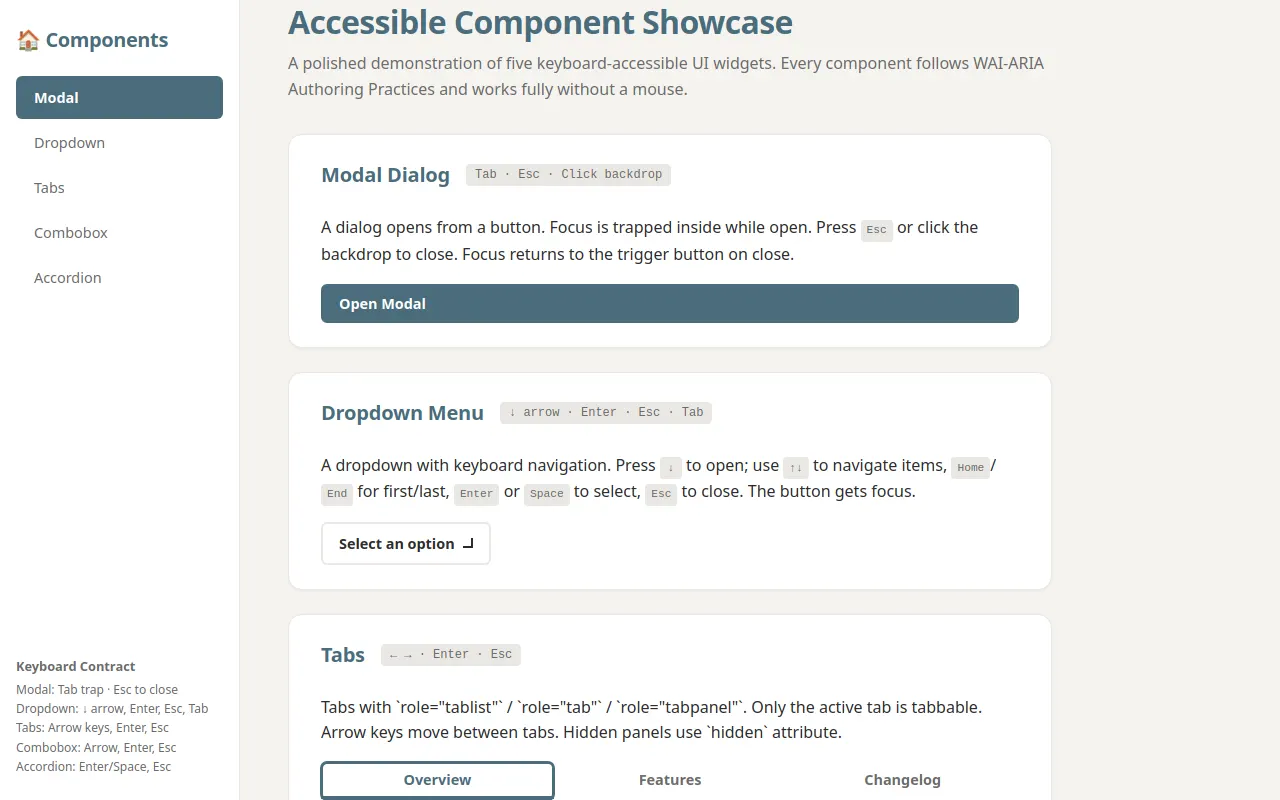
<h1>Accessible Component Showcase</h1>
<p>A polished demonstration of five keyboard-accessible UI widgets. Every component follows WAI-ARIA Authoring Practices and works fully without a mouse.</p>
</header>
<!-- 1. Modal -->
<section id="section-modal" class="component-section" aria-labelledby="h-modal">
<div class="section-header">
<h2 id="h-modal">Modal Dialog</h2>
<span class="kbd">Tab · Esc · Click backdrop</span>
</div>
<div class="component-card">
<p>A dialog opens from a button. Focus is trapped inside while open. Press <span class="kbd">Esc</span> or click the backdrop to close. Focus returns to the trigger button on close.</p>
<button class="btn btn-primary" id="btn-modal-open" aria-haspopup="dialog" aria-modal="true" aria-labelledby="modal-title">
Open Modal
</button>
<div id="modal-dialog" class="modal-overlay" role="dialog" aria-modal="true" aria-labelledby="modal-title" aria-hidden="true">
<div class="modal-dialog">
<div class="modal-header">
<h3 id="modal-title">Welcome to the Modal</h3>
<button class="modal-close" id="modal-close" aria-label="Close dialog">✕</button>
</div>
<div class="modal-body">
<p>This is a modal dialog. It is a <strong>focus trap</strong> — Tab and Shift+Tab cycle only within the dialog.</p>
<p>The page behind the dialog is inert. You cannot tab out of it.</p>
<div class="info">
<strong>Keyboard contract:</strong> Tab → focus trap · Esc → close · Backdrop click → close · Focus moves in on open, back on trigger on close.
</div>
</div>
<div class="modal-footer">
<button class="btn btn-ghost btn-sm" id="modal-cancel" aria-label="Cancel">Cancel</button>
<button class="btn btn-primary btn-sm" id="modal-ok">Confirm</button>
</div>
</div>
</div>
</div>
</section>
<!-- 2. Dropdown -->
<section id="section-dropdown" class="component-section" aria-labelledby="h-dropdown">
<div class="section-header">
<h2 id="h-dropdown">Dropdown Menu</h2>
<span class="kbd">↓ arrow · Enter · Esc · Tab</span>
</div>
<div class="component-card">
<p>A dropdown with keyboard navigation. Press <span class="kbd">↓</span> to open; use <span class="kbd">↑↓</span> to navigate items, <span class="kbd">Home</span>/<span class="kbd">End</span> for first/last, <span class="kbd">Enter</span> or <span class="kbd">Space</span> to select, <span class="kbd">Esc</span> to close. The button gets focus.</p>
<div class="dropdown" id="dropdown-menu">
<div class="dropdown-trigger" id="dropdown-trigger" role="button" aria-haspopup="menu" aria-expanded="false" aria-label="Select an option">
<span>Select an option</span>
<span class="dropdown-arrow" aria-hidden="true"></span>
</div>
<ul class="dropdown-menu" role="menu" aria-labelledby="dropdown-trigger" id="dropdown-list">
<li><button class="dropdown-item" role="menuitem" tabindex="-1">Item One</button></li>
<li><button class="dropdown-item" role="menuitem" tabindex="-1">Item Two</button></li>
<li><button class="dropdown-item" role="menuitem" tabindex="-1">Item Three</button></li>
<li><button class="dropdown-item" role="menuitem" tabindex="-1">Item Four</button></li>
<li><button class="dropdown-item" role="menuitem" tabindex="-1">Item Five</button></li>
<li><button class="dropdown-item" role="menuitem" tabindex="-1">Item Six</button></li>
</ul>
</div>
</div>
</section>
<!-- 3. Tabs -->
<section id="section-tabs" class="component-section" aria-labelledby="h-tabs">
<div class="section-header">
<h2 id="h-tabs">Tabs</h2>
<span class="kbd">← → · Enter · Esc</span>
</div>
<div class="component-card">
<p>Tabs with `role="tablist"` / `role="tab"` / `role="tabpanel"`. Only the active tab is tabbable. Arrow keys move between tabs. Hidden panels use `hidden` attribute.</p>
<div class="tab-list" role="tablist" id="tablist" aria-label="Sample tabs">
<button class="tab" role="tab" aria-selected="true" aria-controls="panel-1" id="tab-1" tabindex="0">Overview</button>
<button class="tab" role="tab" aria-selected="false" aria-controls="panel-2" id="tab-2" tabindex="-1">Features</button>
<button class="tab" role="tab" aria-selected="false" aria-controls="panel-3" id="tab-3" tabindex="-1">Changelog</button>
</div>
<div class="tab-panel" id="panel-1" role="tabpanel" aria-labelledby="tab-1" hidden>
<p>This is the <strong>Overview</strong> tab. It shows the main content of the page.</p>
<p>All content is keyboard-accessible. The active tab receives focus when you tab into it.</p>
</div>
<div class="tab-panel" id="panel-2" role="tabpanel" aria-labelledby="tab-2" hidden>
<p>This is the <strong>Features</strong> tab. Here you'll find detailed feature descriptions.</p>
<p>Each feature is described with full keyboard support. You can navigate between tabs using arrow keys.</p>
</div>
<div class="tab-panel" id="panel-3" role="tabpanel" aria-labelledby="tab-3" hidden>
<p>This is the <strong>Changelog</strong> tab. See the history of changes and updates.</p>
<p>All content is reachable via Tab. Hidden panels are not focusable.</p>
</div>
</div>
</section>
<!-- 4. Combobox -->
<section id="section-combobox" class="component-section" aria-labelledby="h-combobox">
<div class="section-header">
<h2 id="h-combobox">Combobox (Autocomplete)</h2>
<span class="kbd">↑ ↓ · Enter · Esc · Type</span>
</div>
<div class="component-card">
<p>A text input with autocomplete. Typing filters a list of ~20 options. Use <span class="kbd">↑↓</span> to navigate, <span class="kbd">Enter</span> to select, <span class="kbd">Esc</span> to close. The listbox is never focusable — <code>aria-activedescendant</code> manages the highlight.</p>
<div class="combobox-wrap" id="combobox-wrap">
<input class="combobox-input" id="combobox-input" role="combobox" aria-expanded="false" aria-controls="combobox-list" aria-activedescendant="" aria-label="Search and select from a list" autocomplete="off" type="text">
<ul class="combobox-options" id="combobox-list" role="listbox" aria-label="Search options" hidden>
</ul>
</div>
<p class="hint">Tip: Focus the input and start typing to filter. Use <span class="kbd">↑↓</span> to navigate, <span class="kbd">Enter</span> to select.</p>
</div>
</section>
<!-- 5. Accordion -->
<section id="section-accordion" class="component-section" aria-labelledby="h-accordion">
<div class="section-header">
<h2 id="h-accordion">Accordion / Disclosure</h2>
<span class="kbd">Enter · Space · Esc</span>
</div>
<div class="component-card">
<p>Multiple accordion items can be open simultaneously. Use <span class="kbd">Enter</span> or <span class="kbd">Space</span> to toggle. Each accordion has a trigger button with `aria-expanded` and `aria-controls`, and the body animates closed without removing `hidden`.</p>
<div class="accordion-group">
<div class="accordion-item">
<button class="accordion-trigger" aria-expanded="false" aria-controls="accordion-body-1" id="accordion-trigger-1">
<span>How to use the dropdown?</span>
<span class="accordion-icon" aria-hidden="true">▼</span>
</button>
<div class="accordion-body" id="accordion-body-1" hidden>
<div class="accordion-body-inner">
<p>To open the dropdown, click the button or press <span class="kbd">Enter</span> or <span class="kbd">Space</span>.</p>
<p>Use <span class="kbd">↓</span> to move through items and <span class="kbd">↑</span> to go up. Press <span class="kbd">Esc</span> to close.</p>
</div>
</div>
</div>
<div class="accordion-item">
<button class="accordion-trigger" aria-expanded="false" aria-controls="accordion-body-2" id="accordion-trigger-2">
<span>What is a focus trap?</span>
<span class="accordion-icon" aria-hidden="true">▼</span>
</button>
<div class="accordion-body" id="accordion-body-2" hidden>
<div class="accordion-body-inner">
<p>A focus trap keeps the keyboard focus within the open element — tab cycles only inside it.</p>
<p>While a modal is open, the page behind is not focusable. The modal's focus returns to the trigger on close.</p>
</div>
</div>
</div>
<div class="accordion-item">
<button class="accordion-trigger" aria-expanded="false" aria-controls="accordion-body-3" id="accordion-trigger-3">
<span>What are ARIA attributes?</span>
<span class="accordion-icon" aria-hidden="true">▼</span>
</button>
<div class="accordion-body" id="accordion-body-3" hidden>
<div class="accordion-body-inner">
<p>ARIA attributes (role, aria-*) describe the widget's semantics to assistive technologies.</p>
<p>Key attributes: `role` defines the widget type, `aria-expanded` reflects state, `aria-controls` points to the controlled region.</p>
</div>
</div>
</div>
<div class="accordion-item">
<button class="accordion-trigger" aria-expanded="false" aria-controls="accordion-body-4" id="accordion-trigger-4">
<span>How to animate open/close?</span>
<span class="accordion-icon" aria-hidden="true">▼</span>
</button>
<div class="accordion-body" id="accordion-body-4" hidden>
<div class="accordion-body-inner">
<p>Animate height for smooth transitions. Use `hidden` attribute for accessibility — the element should not be in the tab order while closed.</p>
<p>The `hidden` attribute is the accessibility way to hide content. Animate the height while keeping `hidden` off.</p>
</div>
</div>
</div>
</div>
</div>
</section>
</main>
</div>
<script>
/* ============================================================
Accessible Component Showcase — Application Logic
============================================================ */
(function () {
'use strict';
/* ---------- Constants ---------- */
const STORAGE_KEY = 'accessible-showcase-state';
const REDUCED_MOTION = window.matchMedia('(prefers-reduced-motion: reduce)').matches;
/* ---------- Utility: announce to screen readers ---------- */
const announce = (message) => {
const live = document.getElementById('aria-live');
if (live) {
live.textContent = '';
setTimeout(() => { live.textContent = message; }, 50);
}
};
/* ---------- Utility: focus trap ---------- */
let _focusTrapCleanup = null;
function trapFocus(container) {
if (_focusTrapCleanup) _focusTrapCleanup();
const focusable = container.querySelectorAll(
'button, [href], input, select, textarea, [tabindex]:not([tabindex="-1"])'
);
const first = focusable[0];
const last = focusable[focusable.length - 1];
function onTab(e) {
if (e.key !== 'Tab') return;
if (e.shiftKey) {
// Shift+Tab: if focus is on first, wrap to last
if (document.activeElement === first) {
e.preventDefault();
last.focus();
}
} else {
// Tab: if focus is on last, wrap to first
if (document.activeElement === last) {
e.preventDefault();
first.focus();
}
}
}
// Remove any existing handler and add new
container.addEventListener('keydown', onTab);
// Focus the first focusable element when opened
if (first) first.focus();
return () => {
container.removeEventListener('keydown', onTab);
document.activeElement?.blur();
};
}
/* ---------- Utility: roving tabindex for combobox ---------- */
let _rovingIndex = 0;
function rovingActiveDescendant(listbox) {
const options = listbox.querySelectorAll('.combobox-option');
const visible = Array.from(options).filter(opt => !opt.hidden);
if (visible.length === 0) return;
const current = document.activeElement;
if (current && current.getAttribute('role') === 'option') {
// Already inside the listbox
return;
}
// Activate the first visible option
const target = visible[0];
listbox.setAttribute('aria-activedescendant', target.id);
target.setAttribute('tabindex', '0');
target.focus();
}
/* ============================================================
1. Modal
============================================================ */
const modalOverlay = document.getElementById('modal-dialog');
const modalTrigger = document.getElementById('btn-modal-open');
const modalClose = document.getElementById('modal-close');
const modalCancel = document.getElementById('modal-cancel');
const modalOk = document.getElementById('modal-ok');
let modalActive = false;
let modalFocusTrap = null;
let modalTriggerBtn = null;
function openModal() {
modalActive = true;
modalTriggerBtn = document.activeElement;
modalOverlay.setAttribute('aria-hidden', 'false');
modalOverlay.classList.add('open');
modalOverlay.setAttribute('aria-hidden', 'false');
// Trap focus within modal
modalFocusTrap = trapFocus(modalOverlay);
modalOverlay.addEventListener('keydown', modalKeyHandler);
// Focus the first focusable element in the modal
const focusableInModal = modalOverlay.querySelectorAll(
'button, [href], input, select, textarea, [tabindex]:not([tabindex="-1"])'
);
if (focusableInModal[0]) focusableInModal[0].focus();
// If the trigger button has focus, move it out
if (document.activeElement === modalTrigger) {
modalTriggerBtn.focus();
}
announce('Modal dialog opened. Press Esc to close.');
}
function closeModal() {
modalActive = false;
modalOverlay.classList.remove('open');
modalOverlay.setAttribute('aria-hidden', 'true');
modalOverlay.removeEventListener('keydown', modalKeyHandler);
if (modalFocusTrap) {
modalFocusTrap();
modalFocusTrap = null;
}
// Return focus to trigger
if (modalTriggerBtn) {
modalTriggerBtn.focus();
modalTriggerBtn = null;
}
announce('Modal dialog closed.');
}
function modalKeyHandler(e) {
if (e.key === 'Escape') {
e.preventDefault();
closeModal();
return;
}
// Trap focus within modal
if (e.key === 'Tab') {
const focusable = modalOverlay.querySelectorAll(
'button, [href], input, select, textarea, [tabindex]:not([tabindex="-1"])'
);
const first = focusable[0];
const last = focusable[focusable.length - 1];
if (document.activeElement === first && e.shiftKey) {
e.preventDefault();
last.focus();
} else if (document.activeElement === last && !e.shiftKey) {
e.preventDefault();
first.focus();
}
}
}
function handleModalBackdropClick(e) {
if (e.target === modalOverlay) {
closeModal();
}
}
// Modal event listeners
modalTrigger.addEventListener('click', openModal);
modalClose.addEventListener('click', closeModal);
modalCancel.addEventListener('click', closeModal);
modalOk.addEventListener('click', closeModal);
modalOverlay.addEventListener('click', handleModalBackdropClick);
/* ============================================================
2. Dropdown
============================================================ */
const dropdownTrigger = document.getElementById('dropdown-trigger');
const dropdownList = document.getElementById('dropdown-list');
let dropdownOpen = false;
function openDropdown() {
if (dropdownOpen) return;
dropdownOpen = true;
dropdownTrigger.setAttribute('aria-expanded', 'true');
dropdownList.classList.add('open');
dropdownList.setAttribute('aria-hidden', 'false');
dropdownList.setAttribute('aria-expanded', 'true');
// Focus first item
const firstItem = dropdownList.querySelector('.dropdown-item');
if (firstItem) {
firstItem.setAttribute('aria-selected', 'true');
firstItem.focus();
}
announce('Dropdown menu opened.');
}
function closeDropdown() {
dropdownOpen = false;
dropdownTrigger.setAttribute('aria-expanded', 'false');
dropdownList.classList.remove('open');
dropdownList.setAttribute('aria-hidden', 'true');
// Clear aria-selected from all items
dropdownList.querySelectorAll('.dropdown-item').forEach(item => {
item.removeAttribute('aria-selected');
item.setAttribute('tabindex', '-1');
});
announce('Dropdown menu closed.');
}
function toggleDropdown() {
if (dropdownOpen) {
closeDropdown();
} else {
openDropdown();
}
}
dropdownTrigger.addEventListener('click', toggleDropdown);
dropdownTrigger.addEventListener('keydown', (e) => {
if (e.key === 'Enter' || e.key === ' ') {
e.preventDefault();
toggleDropdown();
}
});
// Keyboard navigation inside dropdown
dropdownList.addEventListener('keydown', (e) => {
if (e.key === 'Escape') {
e.preventDefault();
closeDropdown();
dropdownTrigger.focus();
return;
}
if (e.key === 'ArrowDown') {
e.preventDefault();
openDropdown();
const items = dropdownList.querySelectorAll('.dropdown-item');
const currentItem = dropdownList.querySelector('[aria-selected="true"]');
const currentIdx = Array.from(items).indexOf(currentItem);
// Focus first item
if (currentIdx < items.length - 1) {
items[currentIdx + 1].focus();
} else {
items[0].focus();
}
return;
}
if (e.key === 'ArrowUp') {
e.preventDefault();
openDropdown();
const items = dropdownList.querySelectorAll('.dropdown-item');
const currentItem = dropdownList.querySelector('[aria-selected="true"]');
const currentIdx = Array.from(items).indexOf(currentItem);
// Focus last item
if (currentIdx > 0) {
items[currentIdx - 1].focus();
} else {
items[items.length - 1].focus();
}
return;
}
if (e.key === 'Home') {
e.preventDefault();
openDropdown();
const items = dropdownList.querySelectorAll('.dropdown-item');
if (items.length > 0) items[0].focus();
return;
}
if (e.key === 'End') {
e.preventDefault();
openDropdown();
const items = dropdownList.querySelectorAll('.dropdown-item');
if (items.length > 0) items[items.length - 1].focus();
return;
}
});
// Click on dropdown item
dropdownList.addEventListener('click', (e) => {
const item = e.target.closest('.dropdown-item');
if (item) {
item.setAttribute('aria-selected', 'true');
dropdownList.querySelectorAll('.dropdown-item').forEach(i => i.removeAttribute('aria-selected'));
closeDropdown();
announce('Selected: ' + item.textContent);
}
});
// Keyboard on dropdown item
dropdownList.addEventListener('keydown', (e) => {
if (e.key === 'Enter' || e.key === ' ') {
e.preventDefault();
const item = e.target.closest('.dropdown-item');
if (item) {
item.setAttribute('aria-selected', 'true');
dropdownList.querySelectorAll('.dropdown-item').forEach(i => i.removeAttribute('aria-selected'));
closeDropdown();
announce('Selected: ' + item.textContent);
}
}
});
// Arrow key navigation within dropdown items (for keyboard accessibility)
dropdownList.addEventListener('keydown', (e) => {
if (e.key === 'ArrowDown') {
const items = dropdownList.querySelectorAll('.dropdown-item');
const currentIdx = Array.from(items).indexOf(dropdownList.querySelector('[aria-selected="true"]'));
if (currentIdx < items.length - 1) {
e.preventDefault();
items[currentIdx + 1].focus();
}
}
if (e.key === 'ArrowUp') {
const items = dropdownList.querySelectorAll('.dropdown-item');
const currentIdx = Array.from(items).indexOf(dropdownList.querySelector('[aria-selected="true"]'));
if (currentIdx > 0) {
e.preventDefault();
items[currentIdx - 1].focus();
}
}
});
/* ============================================================
3. Tabs
============================================================ */
const tablist = document.getElementById('tablist');
const tabs = tablist.querySelectorAll('.tab');
const panels = tablist.querySelectorAll('.tab-panel');
let activeTab = tabs[0];
function switchTab(tab) {
tabs.forEach(t => {
t.setAttribute('aria-selected', 'false');
t.setAttribute('tabindex', '-1');
});
panels.forEach(p => {
p.setAttribute('hidden', 'true');
});
tab.setAttribute('aria-selected', 'true');
tab.setAttribute('tabindex', '0');
const panelId = tab.getAttribute('aria-controls');
const panel = document.getElementById(panelId);
if (panel) {
panel.removeAttribute('hidden');
}
// Focus the tab
tab.focus();
announce('Tab switched to: ' + tab.textContent);
}
tablist.addEventListener('click', (e) => {
const tab = e.target.closest('.tab');
if (tab && tab !== activeTab) {
switchTab(tab);
}
});
tablist.addEventListener('keydown', (e) => {
if (e.key === 'ArrowRight' && e.ctrlKey) {
e.preventDefault();
const idx = Array.from(tabs).indexOf(activeTab);
const next = tabs[(idx + 1) % tabs.length];
switchTab(next);
}
if (e.key === 'ArrowLeft' && e.ctrlKey) {
e.preventDefault();
const idx = Array.from(tabs).indexOf(activeTab);
const prev = tabs[(idx - 1 + tabs.length) % tabs.length];
switchTab(prev);
}
if (e.key === 'ArrowRight' && !e.ctrlKey) {
e.preventDefault();
const idx = Array.from(tabs).indexOf(activeTab);
const next = tabs[(idx + 1) % tabs.length];
switchTab(next);
}
if (e.key === 'ArrowLeft' && !e.ctrlKey) {
e.preventDefault();
const idx = Array.from(tabs).indexOf(activeTab);
const prev = tabs[(idx - 1 + tabs.length) % tabs.length];
switchTab(prev);
}
if (e.key === 'Home') {
e.preventDefault();
switchTab(tabs[0]);
}
if (e.key === 'End') {
e.preventDefault();
switchTab(tabs[tabs.length - 1]);
}
if (e.key === 'Enter' || e.key === ' ') {
e.preventDefault();
switchTab(activeTab);
}
if (e.key === 'Escape') {
e.preventDefault();
// Hide all panels, move focus to trigger
panels.forEach(p => p.setAttribute('hidden', 'true'));
tabs.forEach(t => t.setAttribute('aria-selected', 'false'));
activeTab.setAttribute('tabindex', '-1');
activeTab.focus();
announce('Tab deselected.');
}
});
// Initialize: ensure first tab is visible
switchTab(tabs[0]);
/* ============================================================
4. Combobox
============================================================ */
const comboboxInput = document.getElementById('combobox-input');
const comboboxList = document.getElementById('combobox-list');
const comboboxWrap = document.getElementById('combobox-wrap');
let comboboxOpen = false;
let comboboxOptions = [];
let comboboxHighlightIdx = -1;
const comboboxOptionsData = [
'A', 'B', 'C', 'D', 'E', 'F', 'G', 'H', 'I', 'J',
'K', 'L', 'M', 'N', 'O', 'P', 'Q', 'R', 'S', 'T',
'U', 'V', 'W', 'X', 'Y', 'Z'
];
function buildComboboxOptions(filter) {
comboboxOptions = comboboxOptionsData.filter(opt =>
opt.toLowerCase().includes((filter || '').toLowerCase())
);
comboboxHighlightIdx = -1;
comboboxList.innerHTML = comboboxOptions.map((opt, idx) =>
`<li class="combobox-option${idx === 0 ? ' aria-selected' : ''}" id="combobox-opt-${idx}" role="option" tabindex="-1">${opt}</li>`
).join('');
// Store the option elements for roving tabindex
comboboxOptions.forEach((opt, idx) => {
comboboxList.querySelector(`#combobox-opt-${idx}`).id = `combobox-opt-${idx}`;
});
if (comboboxOpen && comboboxOptions.length > 0) {
// Show first option
comboboxHighlightIdx = 0;
updateComboboxHighlight();
}
comboboxInput.setAttribute('aria-activedescendant', comboboxOptions.length > 0 ? `combobox-opt-${comboboxHighlightIdx}` : '');
}
function updateComboboxHighlight() {
const options = comboboxList.querySelectorAll('.combobox-option');
options.forEach(opt => {
opt.setAttribute('aria-selected', 'false');
opt.setAttribute('tabindex', '-1');
});
if (comboboxHighlightIdx >= 0 && comboboxHighlightIdx < comboboxOptions.length) {
const highlighted = comboboxList.querySelector(`#combobox-opt-${comboboxHighlightIdx}`);
if (highlighted) {
highlighted.setAttribute('aria-selected', 'true');
highlighted.setAttribute('tabindex', '0');
highlighted.focus();
}
}
comboboxInput.setAttribute('aria-activedescendant', comboboxOptions.length > 0 ? `combobox-opt-${comboboxHighlightIdx}` : '');
}
function closeCombobox() {
comboboxOpen = false;
comboboxInput.setAttribute('aria-expanded', 'false');
comboboxInput.value = '';
comboboxList.setAttribute('hidden', 'true');
comboboxList.innerHTML = '';
comboboxInput.removeAttribute('aria-activedescendant');
comboboxWrap.classList.remove('open');
announce('Combobox list closed.');
}
function openCombobox() {
comboboxOpen = true;
comboboxInput.setAttribute('aria-expanded', 'true');
comboboxList.removeAttribute('hidden');
comboboxList.innerHTML = '';
comboboxWrap.classList.add('open');
comboboxInput.focus();
buildComboboxOptions('');
announce('Combobox list opened.');
}
comboboxInput.addEventListener('input', () => {
buildComboboxOptions(comboboxInput.value);
});
comboboxInput.addEventListener('focus', () => {
if (comboboxOptions.length > 0) {
openCombobox();
}
});
comboboxInput.addEventListener('blur', () => {
// Delay to allow focus to move back to the input
setTimeout(() => {
if (!comboboxWrap.contains(document.activeElement) && comboboxInput.getAttribute('aria-expanded') !== 'true') {
closeCombobox();
}
}, 200);
});
// Keyboard navigation in combobox
comboboxInput.addEventListener('keydown', (e) => {
if (!comboboxOpen) {
if (e.key === 'ArrowDown' || e.key === 'ArrowUp') {
openCombobox();
}
return;
}
const options = comboboxList.querySelectorAll('.combobox-option');
if (e.key === 'ArrowDown') {
e.preventDefault();
if (comboboxHighlightIdx < comboboxOptions.length - 1) {
comboboxHighlightIdx++;
updateComboboxHighlight();
} else {
comboboxHighlightIdx = 0;
updateComboboxHighlight();
}
}
if (e.key === 'ArrowUp') {
e.preventDefault();
if (comboboxHighlightIdx > 0) {
comboboxHighlightIdx--;
updateComboboxHighlight();
} else {
comboboxHighlightIdx = comboboxOptions.length - 1;
updateComboboxHighlight();
}
}
if (e.key === 'Enter') {
e.preventDefault();
if (comboboxHighlightIdx >= 0 && comboboxHighlightIdx < comboboxOptions.length) {
comboboxInput.value = comboboxOptions[comboboxHighlightIdx];
closeCombobox();
announce('Selected: ' + comboboxOptions[comboboxHighlightIdx]);
}
}
if (e.key === 'Escape') {
e.preventDefault();
closeCombobox();
comboboxInput.focus();
}
});
// Click to select
comboboxList.addEventListener('click', (e) => {
const option = e.target.closest('.combobox-option');
if (option) {
comboboxInput.value = option.textContent;
closeCombobox();
announce('Selected: ' + option.textContent);
}
});
// Keyboard on combobox options
comboboxList.addEventListener('keydown', (e) => {
if (e.key === 'Escape') {
e.preventDefault();
closeCombobox();
comboboxInput.focus();
}
});
// Initialize combobox options
buildComboboxOptions('');
/* ============================================================
5. Accordion
============================================================ */
document.querySelectorAll('.accordion-trigger').forEach(trigger => {
trigger.addEventListener('click', () => {
const expanded = trigger.getAttribute('aria-expanded') === 'true';
trigger.setAttribute('aria-expanded', String(!expanded));
// Toggle the panel visibility
const body = document.getElementById(trigger.getAttribute('aria-controls'));
if (body) {
body.toggleAttribute('hidden');
}
// If expanding, focus the trigger
if (!expanded) {
trigger.focus();
}
announce(trigger.textContent.trim() + (expanded ? ' closed' : ' opened'));
});
// Keyboard: Enter or Space toggles
trigger.addEventListener('keydown', (e) => {
if (e.key === 'Enter' || e.key === ' ') {
e.preventDefault();
trigger.click();
}
});
});
/* ============================================================
Sidebar nav linking
============================================================ */
document.querySelectorAll('.sidebar-nav a').forEach(link => {
link.addEventListener('click', (e) => {
e.preventDefault();
document.querySelectorAll('.sidebar-nav a').forEach(a => {
a.classList.remove('active');
a.removeAttribute('aria-current');
});
link.classList.add('active');
link.setAttribute('aria-current', 'page');
// Scroll to section
const id = link.getAttribute('href').replace('#', '');
const target = document.getElementById(id);
if (target) {
target.scrollIntoView({ behavior: 'smooth', block: 'start' });
// Set focus on the target section
target.setAttribute('tabindex', '-1');
target.focus({ preventScroll: true });
}
});
});
/* ============================================================
Initialize: set first tab as active on load
============================================================ */
switchTab(tabs[0]);
/* ============================================================
Keyboard shortcut: Ctrl+K or / to focus combobox
============================================================ */
comboboxInput.addEventListener('keydown', (e) => {
if ((e.ctrlKey || e.metaKey) && e.key === 'k') {
e.preventDefault();
comboboxInput.focus();
}
});
/* ============================================================
Keyboard shortcut: / to focus combobox
============================================================ */
document.addEventListener('keydown', (e) => {
if (e.key === '/' && document.activeElement !== comboboxInput && comboboxInput.getAttribute('aria-expanded') !== 'true') {
comboboxInput.focus();
}
});
})();
</script>
</body>
</html>